Separation of chats and search in Telegram
In my previous publication, I described 5 controversial UX / UI solutions in Telegram and it turned out to be rather ambiguous (just look at its rating of 16 vs. 13). The main reason for indignation was the absence of a division of chats in my list, which at first caused me a certain bewilderment, and later, after rethinking everything thoroughly, I understood the problem and tried to find an optimal solution for it.

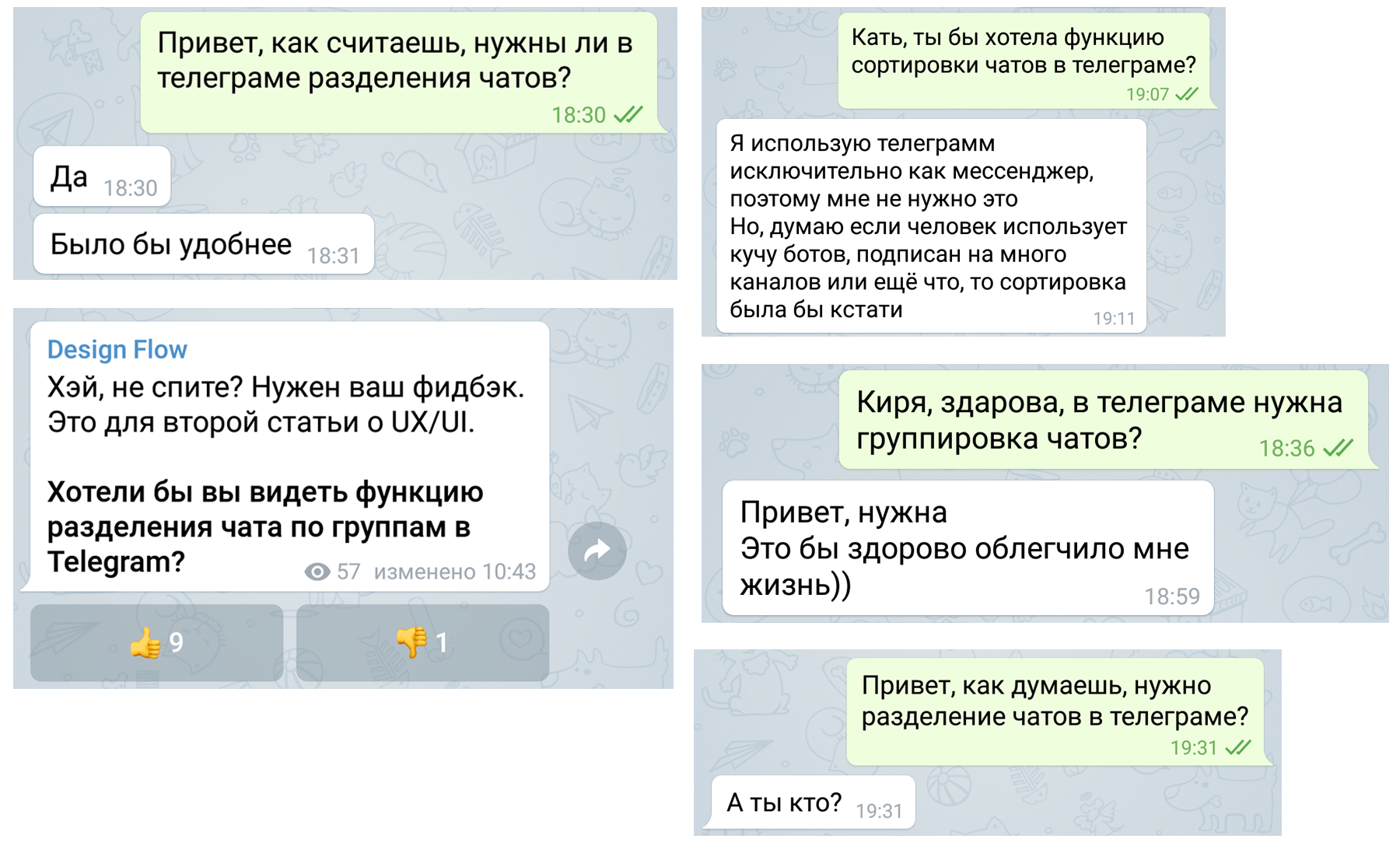
Until a certain time, I didn’t see anything bad in the absence of chats separation in the application and it seemed to me that the introduction of additional tabs or groups into it would only adversely affect usability. Having conducted oral and written surveys of my friends, acquaintances and subscribers, as well as adding myself more and more new bots and channel subscriptions, I was convinced of the opposite.
Separation is needed. But how to implement it more literally? I personally really like the concept of the Telegram team to make one simple message screen that is sorted according to the relevance of the information and it is unlikely that it will abandon it in the foreseeable future, but also to have such an “information dump” constantly digging into it in search of the right chat, also output.
What to do? Our goal is to introduce chat sorting with minimal changes in the interface structure and user experience with it .
To solve this problem, you must first understand why we are doing this sorting. It is needed for better user orientation among their chats, as well as for quick access to them. In other words, sorting is needed for quick search and corresponding selection of the required chat.
The option with a swipe between the tabs was dropped immediately. Too many mechanical actions would have to be performed. Groups on the main page is also not an option.
And then the idea came to me: "Why not redo the search screen and not implement in it the division of chats into groups using drop-down lists?" Thereby keeping the screen familiar to everyone with “everything in a row” and at the same time enable the user to quickly find the right chat and start interacting with it, which everyone lacked. And also give him the opportunity to group and create lists of important chats for him. It should look something like this:

Again. This is not a replacement for the main screen. This is a converted search screen.
As you can see, the search function has not disappeared anywhere, but the “Recent” section, which has less significance, has been transformed into the form of the former “Chats” section and will always be glued to the bottom of the screen. In place of the "Chat" came the "Group". If the user has lost some chat, then he can quickly find it for 2 tapas.
Functions that groups should have:
- Adding and deleting drop-down lists, their names, and also chats in them (you can make a floating button for this).
- Drag and drop chats up and down within the list (to create user priority chats).
- The opened drop-down list should not be minimized even after a complete exit from the application, only the user manipulates his state (thus, you can always keep the required list open and quickly access the chat rooms in it).
- The list of "Unassorted" should contain all other chats that the user has not grouped.
Of course, these are only my schematic sketches that are far from ideal, but in general the idea and concept are understandable.
Conclusion
Total - conceptually, we introduced the possibility of sharing chats to Telegram so desired by users without drastically changing the interface and user interaction experience (a person should get used to any minimal change in the interface), which is beneficial both for the Telegram team and for us users.
')
Source: https://habr.com/ru/post/346404/
All Articles