How we raiffeisen.ru redesigned
Listen, I do not remember how it happened, but decided to launch a new Raiffeisenbank website. The past was with a vertical menu on the left, you might even remember it. And by the way, he was not bad overall, for his time. Everybody loved him dearly, like an old blind dog, got used to it, you understand? But he did not catch mice any more, not a dog in the sense, but a website, of course. I'm talking about business problems. Navigation is some kind of curve, an abundance of dead-end pages. Well, if they were talking about the representation of the bank in Sierra Leone, so no, about the product page. And there was an understanding, it’s impossible to live like this anymore, the business has developed, we have long been at a low start. With users it is more difficult: they do not like changes, as is known. Here we are, in a sense, acting as missionaries, carrying the gospel, so to speak. In general, set to work.
Well, it all started with a tender, as usual. Naturally, venerable agencies are different. In short, there was plenty to choose from. There was a discussion, and then a certain cognitive dissonance emerges. Here you and a century-old tradition, an international group, the father of Raiffeisen, finally! On the other hand, progress, blockchain, Fintech, Germanoskarovich with Olegyurievich. Although, if you look at it, and what prevents us from combining all this, why, in fact, a respected bank cannot be innovative and progressive? “Or maybe!” - we decided, and began to choose the winner of the tender.
')
They looked around at all the presentations, well, that is, they both looked over and overlooked carefully. And there everything, in general, as usual, pictures, PDF, loud phrases, the promise of everything at once, quickly, cheaply, oh ... Oh, it was a difficult choice, I mean. But one presentation captivated everyone, here you are both minimalism, video, and animation are cool, in general, a good example of how to make presentations. On the whole, the visual part corresponded to the spirit of Raifazenbank, good universal solutions, everything was thought out (then it seemed like absolutely everything). The notorious mobile first again, everything went. And the name of the studio is well known, and if we add here the fact that Aic made many websites specifically for banks, I would like to shake hands in American films and loudly announce “Deal!”. As you know, something like this happened.
I wanted to do everything quickly and abruptly, “Veni Vidi Vici”, as one famous Roman politician used to say. After discussing with stakeholders, they almost immediately switched to design, using prototyping used ready-made blocks in the design, so the presentation did not suffer from an abundance of empty rectangles with black edging, on the contrary, it pleased the eye with juicy elements and neat chopped dies. You ask: "And what kind of design is, whose will?". Everything is simple: in style there is something in between metro-design and material, all this is relevant and gradually evolving towards the final victory of functionality over decoration, the battle was unequal from the beginning. Plus, the same block method of building pages. Well, our own is already Futura as a font, the puzzle evolved. Not for nothing, we were discussing Swiss design with the project manager of the agency; here it was obvious where it was coming from and what was growing. Architecturally there were a couple of puzzles, but then it seemed insignificant, a piece of cake!
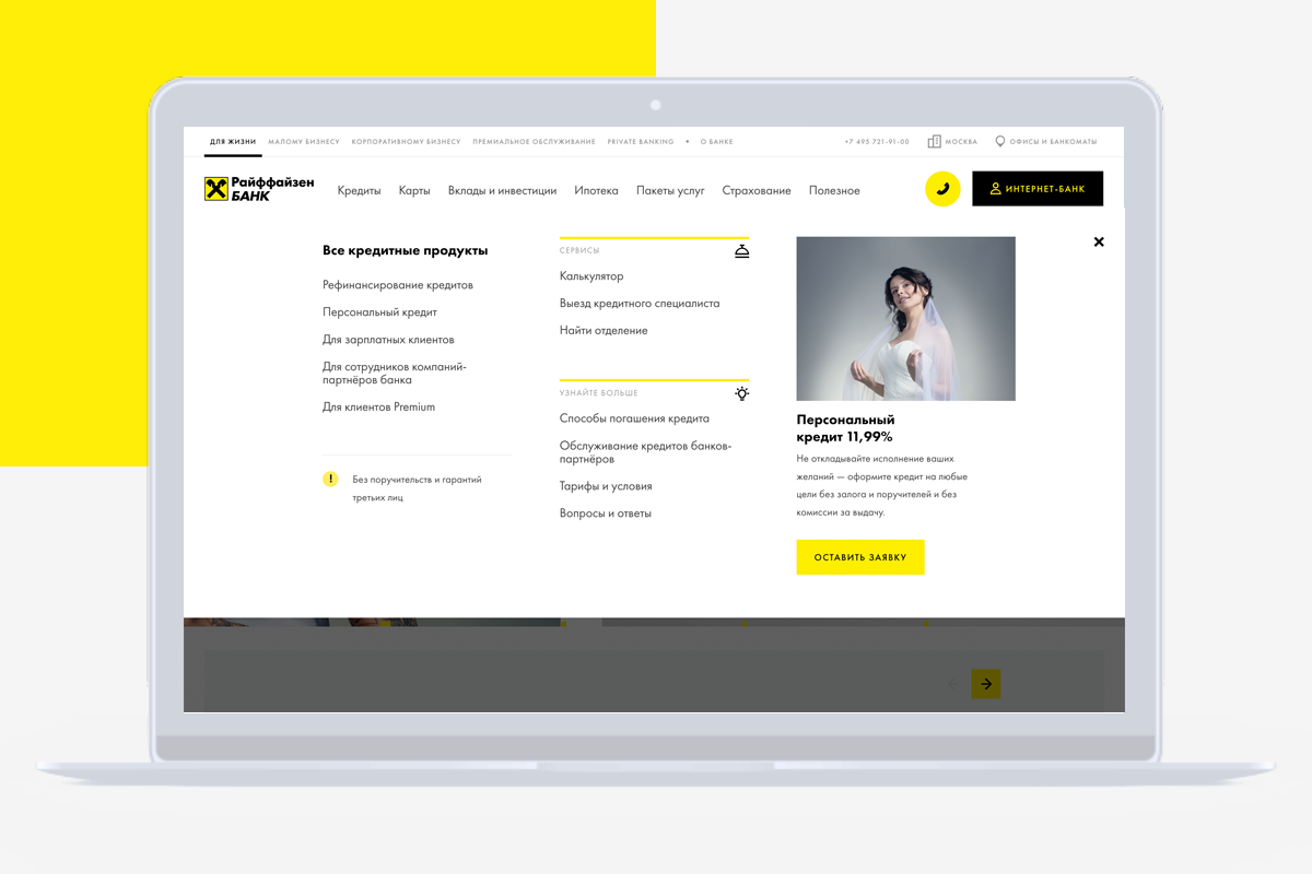
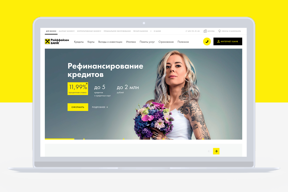
The number of layouts grew, a common skeleton appeared. The main navigation solution codenamed “megamenu” was designed to simplify user interaction with the site. And it (megamenus) can sell, for this flagship products made directly into it. These three columns are universal, you see, you can put key links here, you can put direct links to services, cross-sell and a mini-card of one sentence with a button. Yes, the idea with the button is not new, but if it is best practice, then why not use it? In general, the block structure unleashes in terms of the implementation of certain pages, if you want - collect tricky landings, if you want - strict food, or you can quickly roll out any information template. Now all this allows you to quickly collect this or that content into a working layout, and this, you see, is important. On raiffeisen.ru a lot of animation and video, and there will be even more. By the way, this is not just a blind attempt to follow trends, on the contrary, it really does often simplify life in terms of UX. Such uncomplicated (“Actually cunning”, our Dev lead tells me) manipulations can save usable space, and the animation presented wisely is an excellent anchor element for attracting attention. But here, of course, the main thing is not to overdo it, one wrong step - and you are a site aggregator, the edge is very thin. And it is not only about the number of moving objects on the page, but also about the filing of each of them. Pulled and harsh effects are clearly not beneficial to the cause, especially if you are a bank.
Initially, the concept laid a large number of videos, in some places we abandoned it, but for the most part we retained the original idea.

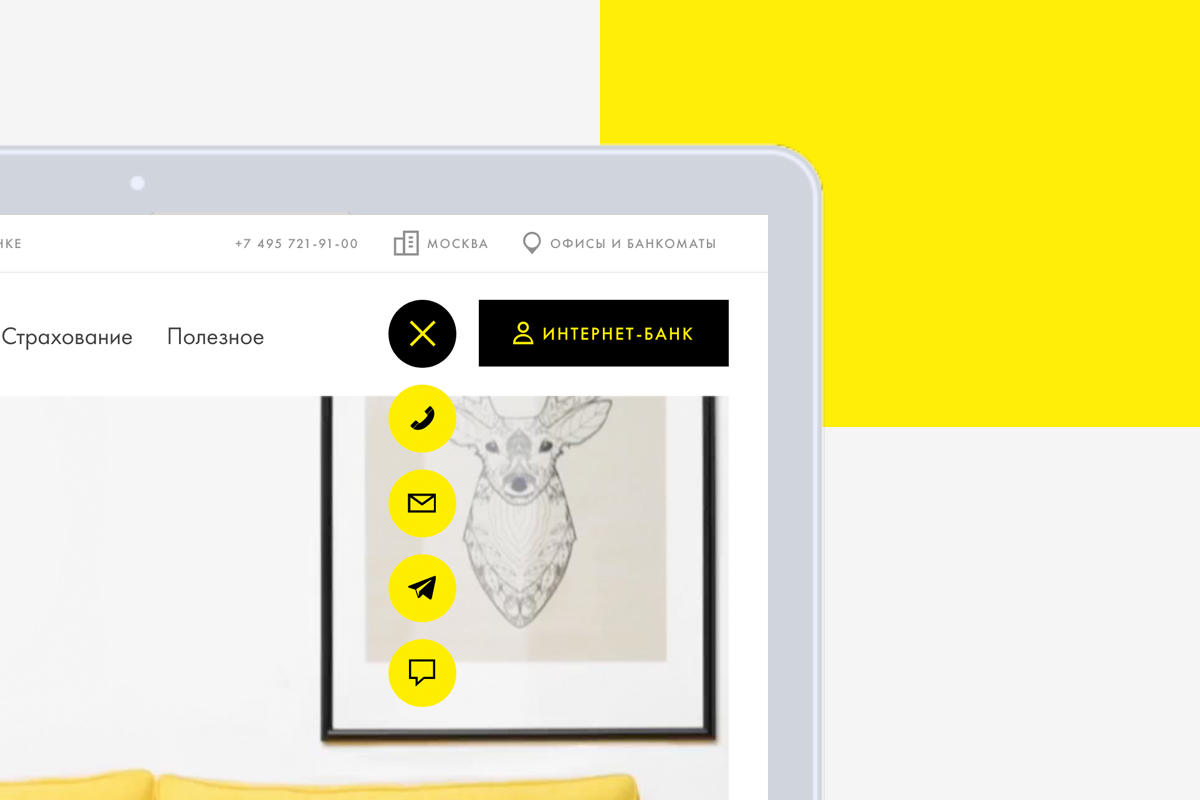
By the way about innovations. We implemented several features “along the way of the opera,” for example, the omnichannel button. We thought for a long time where to screw it. As a result, we decided to inject straight into the cap. Yes, this is not a very familiar place, but, on the other hand, the functionality is important, significantly simplifies life for clients, and nobody canceled testing. A riding hat with a conversion button also did not appear immediately, this is again from the category of patterns found on the Internet, for a modern banking site it looks like a function marked “Must have”. Especially the most amusing story came out with the main page of the mobile adaptation, here in general Shakespearean passions. Literally before the launch, it became clear that the solution for the main one does not suit us. Testing for a productive version has shown that this is not the correct scenario. And literally a couple of days before the release, I had to look for a new solution, imagine! Well, by an exception method, we chose the same option. The main thing is to take into account all the requirements of customers and put it in adaptive formats, without undue modesty.
Continuing the theme of the adaptation, we did not bypass the tablet version, even if this format dies slowly, but still has its 5%. Yes, and Mobile first as it obliges. And in the light of recent events, I would like to tell you about web guides separately.
Now, however, most call it the “design system.” So, we began to cut the “design system” before the site launch, there are UI whales, all the blocks, and elements in the form of layered layouts. In general, these are full-fledged quality guides, without too much pathos. Convenient, functional, as you like. All on the shelves, plus a library of icons and unique design elements. Over the design of the guide itself, too, worked, well, so that we ourselves were pleased to use it all.

I will also tell you about the pictures. Here the main idea - to try to avoid overt runoff. As it usually happens: colleagues come to you and say: “We found a cool picture here, smiling boy with glasses, and let’s add it to our email list!”. And you are: "Well, come on." And then you walk along the street and see how the same boy in the same glasses exactly smiles at you from the announcement of the Khimki Housing Office for example. And still you think to yourself: “No, well, with a picture I’ve put it on, but what’s the boy with glasses and the Khimki housing office in general?”. So, in order to avoid such incidents, the concept of “lifestyle photo” was proposed. This is when the page about the loan, and in the picture the sun goes into the sunset instead of endless smiling people. It is clear that such a line at times requires exceptions, but we try to support it with all our strength.
Summarize. The launch itself went smoothly, the transition from the old version was seamless. It was possible to avoid strong problems and serious bugs. Of course, all this required a serious effort of the team, but we were satisfied with the result. And even the UX study conducted prior to launch did not reveal critical problems. All this, however, does not mean that we are going to relax on our laurels. On the contrary, from the very first day of the release of the new version, ideas began to come in how and what can be done even better and more efficiently. And we already have a bunch of improvements that we will make in stages.
The first approaches according to statistics inspire cautious optimism, the usual drawdown of 10-15% for new sites passed us by, even a slight increase is observed. In general, the future and the A / B tests will show the correctness of our solutions. It remains to wait a bit. As for user reviews, everything is interesting here, the polarity of opinions speaks about the absence of indifference, and this is exactly what we wanted.
Well, it all started with a tender, as usual. Naturally, venerable agencies are different. In short, there was plenty to choose from. There was a discussion, and then a certain cognitive dissonance emerges. Here you and a century-old tradition, an international group, the father of Raiffeisen, finally! On the other hand, progress, blockchain, Fintech, Germanoskarovich with Olegyurievich. Although, if you look at it, and what prevents us from combining all this, why, in fact, a respected bank cannot be innovative and progressive? “Or maybe!” - we decided, and began to choose the winner of the tender.
')
They looked around at all the presentations, well, that is, they both looked over and overlooked carefully. And there everything, in general, as usual, pictures, PDF, loud phrases, the promise of everything at once, quickly, cheaply, oh ... Oh, it was a difficult choice, I mean. But one presentation captivated everyone, here you are both minimalism, video, and animation are cool, in general, a good example of how to make presentations. On the whole, the visual part corresponded to the spirit of Raifazenbank, good universal solutions, everything was thought out (then it seemed like absolutely everything). The notorious mobile first again, everything went. And the name of the studio is well known, and if we add here the fact that Aic made many websites specifically for banks, I would like to shake hands in American films and loudly announce “Deal!”. As you know, something like this happened.
I wanted to do everything quickly and abruptly, “Veni Vidi Vici”, as one famous Roman politician used to say. After discussing with stakeholders, they almost immediately switched to design, using prototyping used ready-made blocks in the design, so the presentation did not suffer from an abundance of empty rectangles with black edging, on the contrary, it pleased the eye with juicy elements and neat chopped dies. You ask: "And what kind of design is, whose will?". Everything is simple: in style there is something in between metro-design and material, all this is relevant and gradually evolving towards the final victory of functionality over decoration, the battle was unequal from the beginning. Plus, the same block method of building pages. Well, our own is already Futura as a font, the puzzle evolved. Not for nothing, we were discussing Swiss design with the project manager of the agency; here it was obvious where it was coming from and what was growing. Architecturally there were a couple of puzzles, but then it seemed insignificant, a piece of cake!
The number of layouts grew, a common skeleton appeared. The main navigation solution codenamed “megamenu” was designed to simplify user interaction with the site. And it (megamenus) can sell, for this flagship products made directly into it. These three columns are universal, you see, you can put key links here, you can put direct links to services, cross-sell and a mini-card of one sentence with a button. Yes, the idea with the button is not new, but if it is best practice, then why not use it? In general, the block structure unleashes in terms of the implementation of certain pages, if you want - collect tricky landings, if you want - strict food, or you can quickly roll out any information template. Now all this allows you to quickly collect this or that content into a working layout, and this, you see, is important. On raiffeisen.ru a lot of animation and video, and there will be even more. By the way, this is not just a blind attempt to follow trends, on the contrary, it really does often simplify life in terms of UX. Such uncomplicated (“Actually cunning”, our Dev lead tells me) manipulations can save usable space, and the animation presented wisely is an excellent anchor element for attracting attention. But here, of course, the main thing is not to overdo it, one wrong step - and you are a site aggregator, the edge is very thin. And it is not only about the number of moving objects on the page, but also about the filing of each of them. Pulled and harsh effects are clearly not beneficial to the cause, especially if you are a bank.
Initially, the concept laid a large number of videos, in some places we abandoned it, but for the most part we retained the original idea.
By the way about innovations. We implemented several features “along the way of the opera,” for example, the omnichannel button. We thought for a long time where to screw it. As a result, we decided to inject straight into the cap. Yes, this is not a very familiar place, but, on the other hand, the functionality is important, significantly simplifies life for clients, and nobody canceled testing. A riding hat with a conversion button also did not appear immediately, this is again from the category of patterns found on the Internet, for a modern banking site it looks like a function marked “Must have”. Especially the most amusing story came out with the main page of the mobile adaptation, here in general Shakespearean passions. Literally before the launch, it became clear that the solution for the main one does not suit us. Testing for a productive version has shown that this is not the correct scenario. And literally a couple of days before the release, I had to look for a new solution, imagine! Well, by an exception method, we chose the same option. The main thing is to take into account all the requirements of customers and put it in adaptive formats, without undue modesty.
Continuing the theme of the adaptation, we did not bypass the tablet version, even if this format dies slowly, but still has its 5%. Yes, and Mobile first as it obliges. And in the light of recent events, I would like to tell you about web guides separately.
Now, however, most call it the “design system.” So, we began to cut the “design system” before the site launch, there are UI whales, all the blocks, and elements in the form of layered layouts. In general, these are full-fledged quality guides, without too much pathos. Convenient, functional, as you like. All on the shelves, plus a library of icons and unique design elements. Over the design of the guide itself, too, worked, well, so that we ourselves were pleased to use it all.
I will also tell you about the pictures. Here the main idea - to try to avoid overt runoff. As it usually happens: colleagues come to you and say: “We found a cool picture here, smiling boy with glasses, and let’s add it to our email list!”. And you are: "Well, come on." And then you walk along the street and see how the same boy in the same glasses exactly smiles at you from the announcement of the Khimki Housing Office for example. And still you think to yourself: “No, well, with a picture I’ve put it on, but what’s the boy with glasses and the Khimki housing office in general?”. So, in order to avoid such incidents, the concept of “lifestyle photo” was proposed. This is when the page about the loan, and in the picture the sun goes into the sunset instead of endless smiling people. It is clear that such a line at times requires exceptions, but we try to support it with all our strength.
Summarize. The launch itself went smoothly, the transition from the old version was seamless. It was possible to avoid strong problems and serious bugs. Of course, all this required a serious effort of the team, but we were satisfied with the result. And even the UX study conducted prior to launch did not reveal critical problems. All this, however, does not mean that we are going to relax on our laurels. On the contrary, from the very first day of the release of the new version, ideas began to come in how and what can be done even better and more efficiently. And we already have a bunch of improvements that we will make in stages.
The first approaches according to statistics inspire cautious optimism, the usual drawdown of 10-15% for new sites passed us by, even a slight increase is observed. In general, the future and the A / B tests will show the correctness of our solutions. It remains to wait a bit. As for user reviews, everything is interesting here, the polarity of opinions speaks about the absence of indifference, and this is exactly what we wanted.
Source: https://habr.com/ru/post/345228/
All Articles