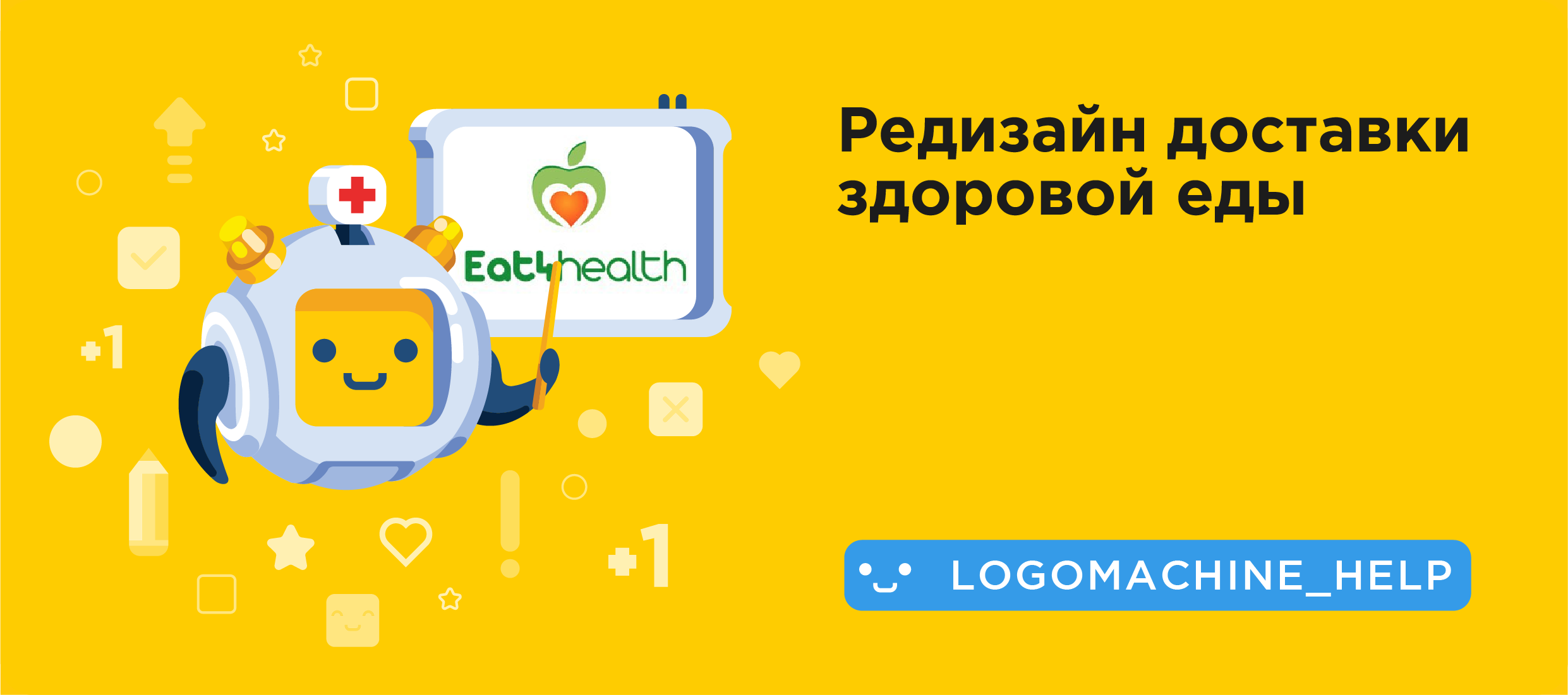
Helping food delivery: logo redesign and corporate identity development
Log machine to the rescue! For those who do not know: in VC Public, we help with advice to those who send their designs for analysis. How it looks you can see here . But recently, once a month, we began to choose one lucky one and arrange a complete pumping logo: make a new logo and think over the corporate style.
This time the winner was the delivery of tasty and healthy food - Eat4health.
')
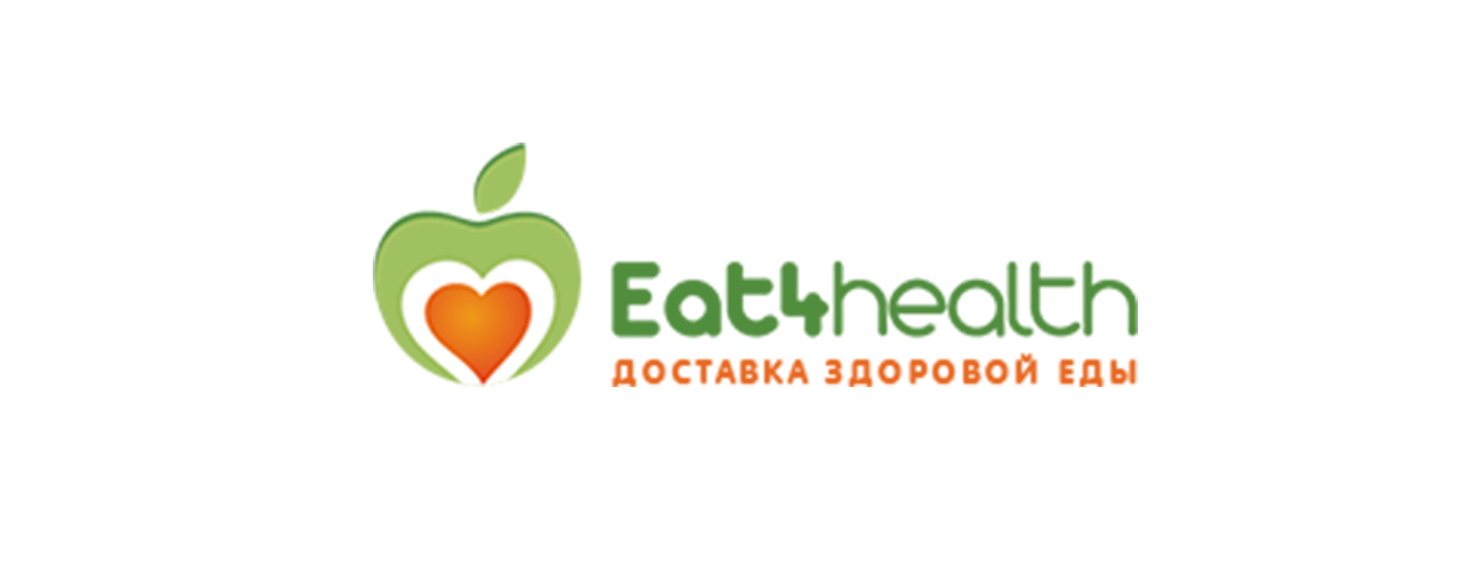
Eat4health uses the logo, and still green and orange colors - this is not bad, the guys are trying to make "brand" on the touch points with the client. But all attempts of Eat4health are not brought to the end: shades of orange and green are different everywhere, like fonts.
Sometimes a pattern appears, but it always does it all of a sudden, so it’s difficult to remember these branded elements:
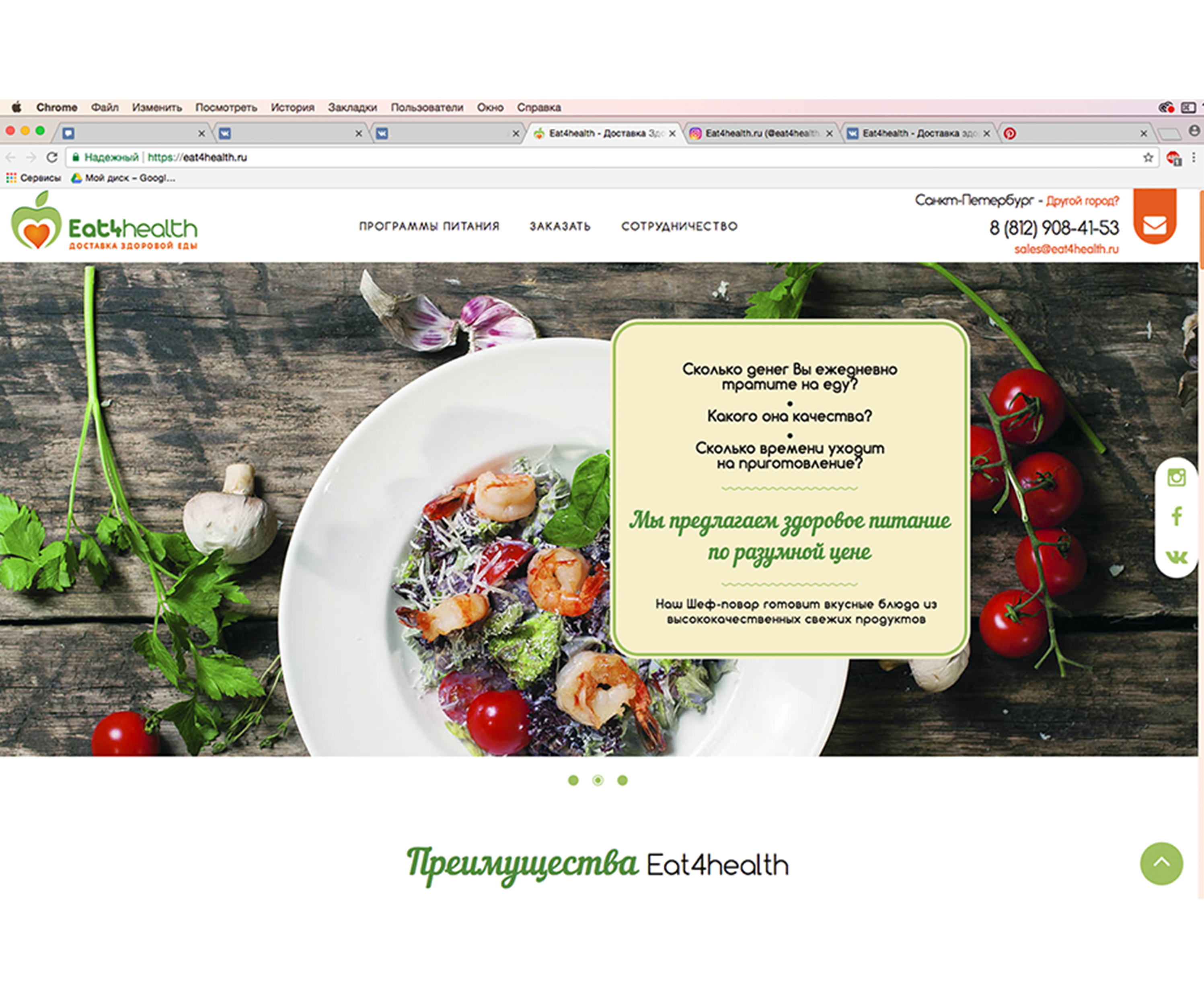
Eat4health website

Vkontakte Eat4health
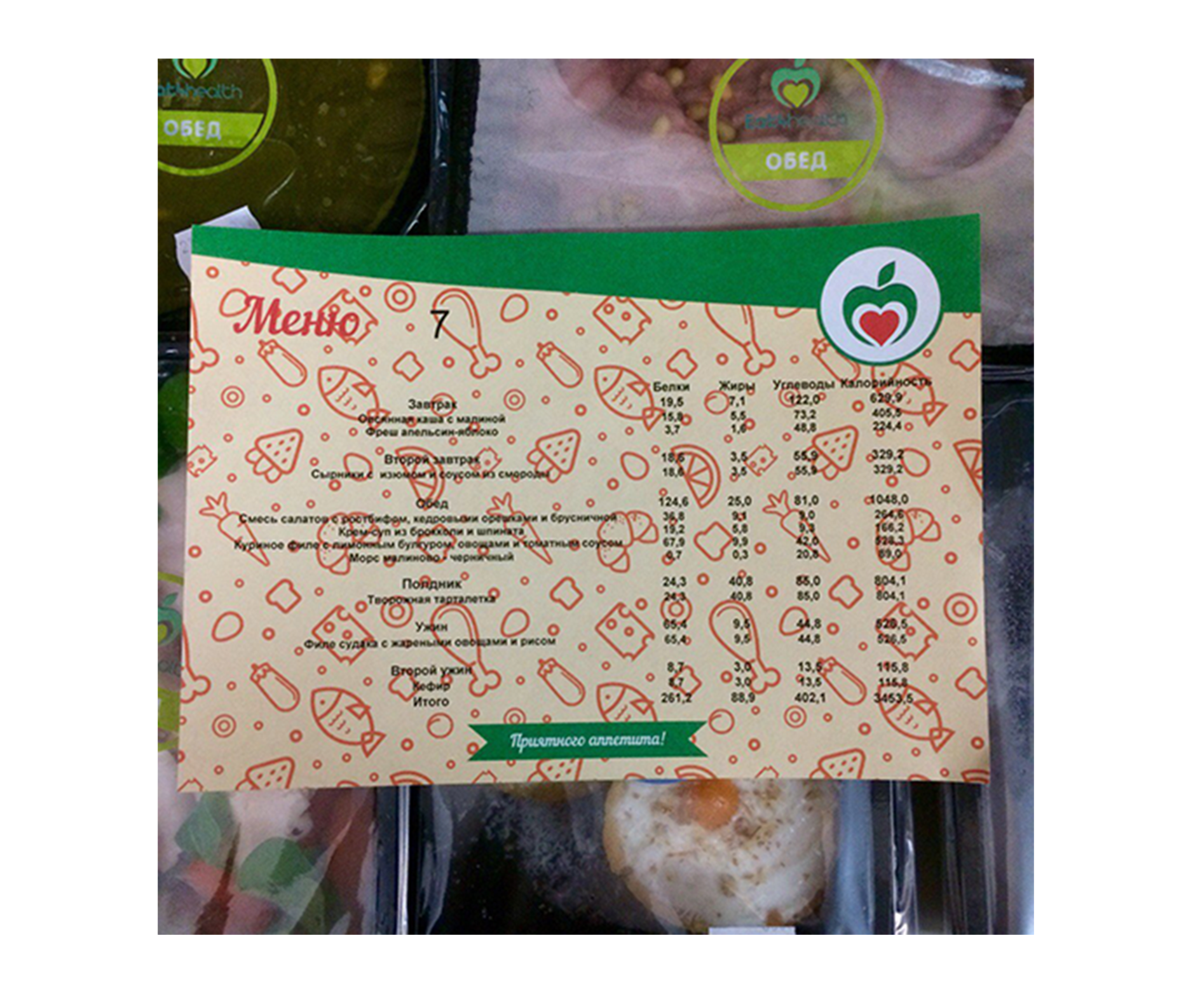
Eat4health menu
To help Eat4health, you need to bring everything to a single style: determine the color, shapes, fonts, and other elements of the company. In this issue we will help to determine.
Eat4health Solution
Let's start with the logo: it is overloaded as much as possible - an apple, a heart, a word-case sign, a different fat content of the text, 2 different bright colors, also the number 4 in the title. The one who made the logo, tried to fit the maximum meaning in the sign, but the logo did not really help:
There is a tip:
No need to try to reflect in the logo all the information about the company. Instead, it is better to additionally develop several elements of corporate identity to the logo.
For example, the same colors and fonts that will be used everywhere: on the website, in social networks, promotional materials. So it will be easier to remember the brand and everything connected with it.
We decided to make a minimalist and neat logo for Eat4health, and put more emphasis on other elements of corporate identity.
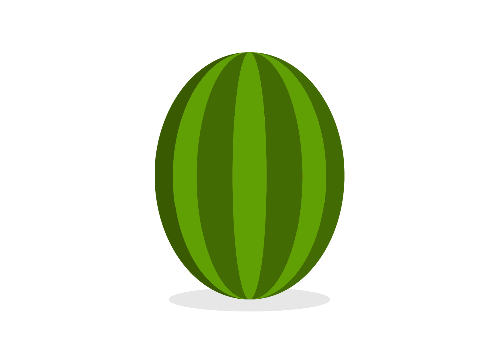
New delivery logo: apple heart, simple font and juicy green:
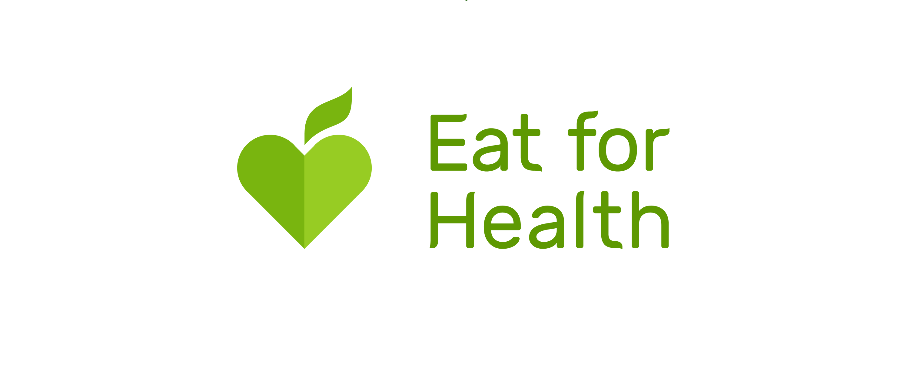
The core of the logotype is its functionality. The sign should be easy to enter in any format - on the site, avatar, business card, signboard and so on. At the same time, it should not lose readability and turn into something incomprehensible.
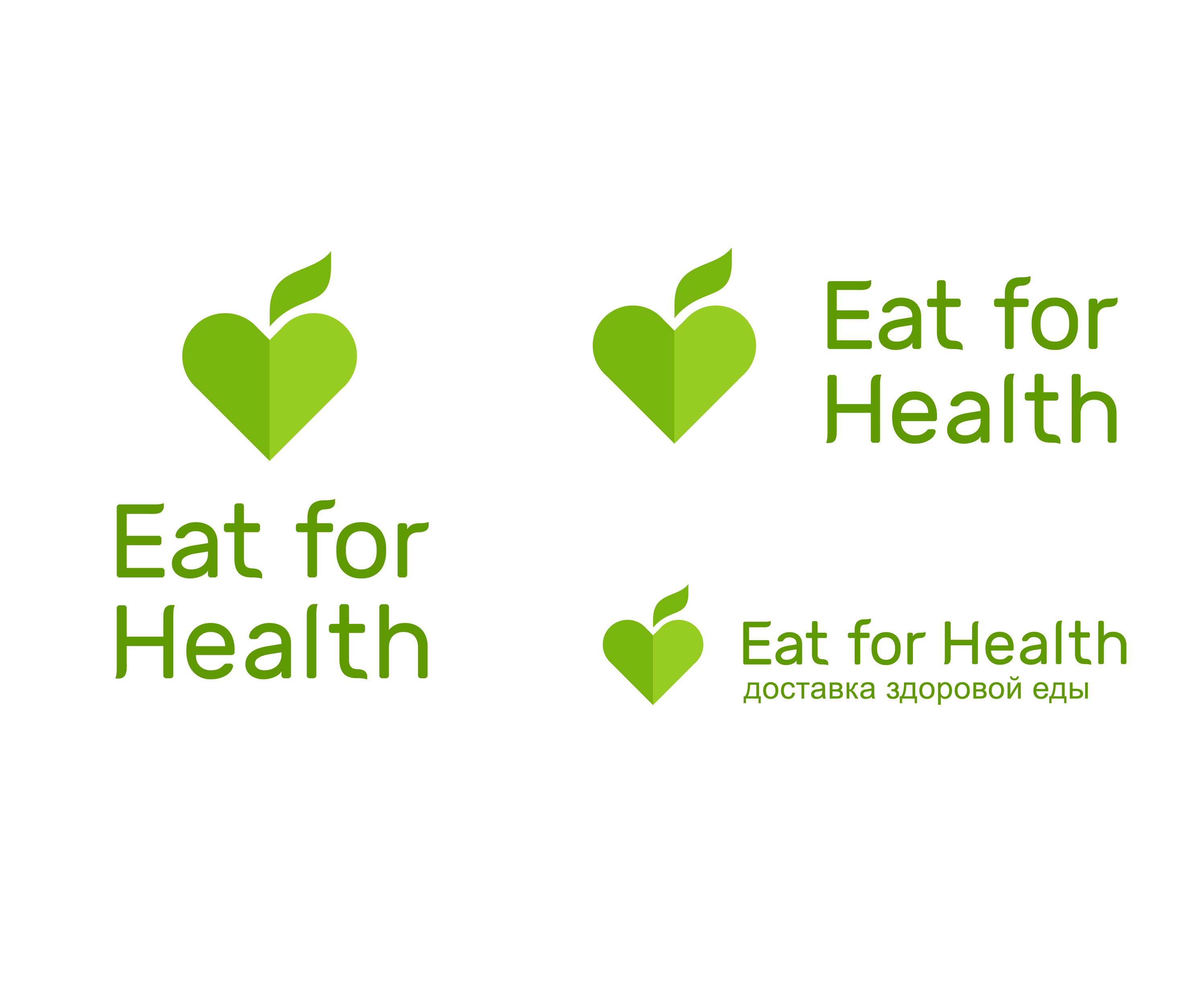
Prepare several options for the layout of the sign:
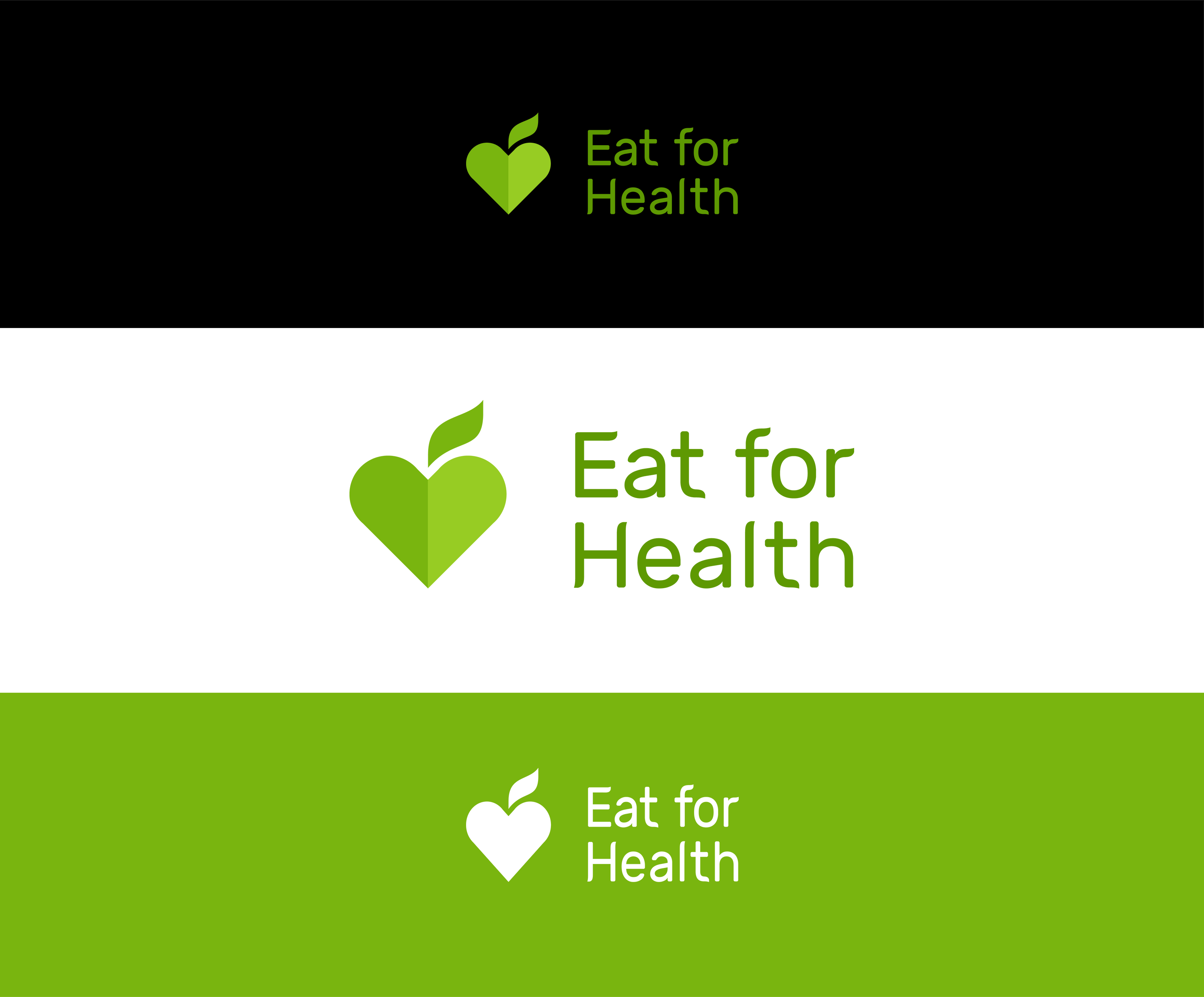
Another important point: it will not always be possible to use the logo on a white background, so it is worth preparing alternative versions of the sign:
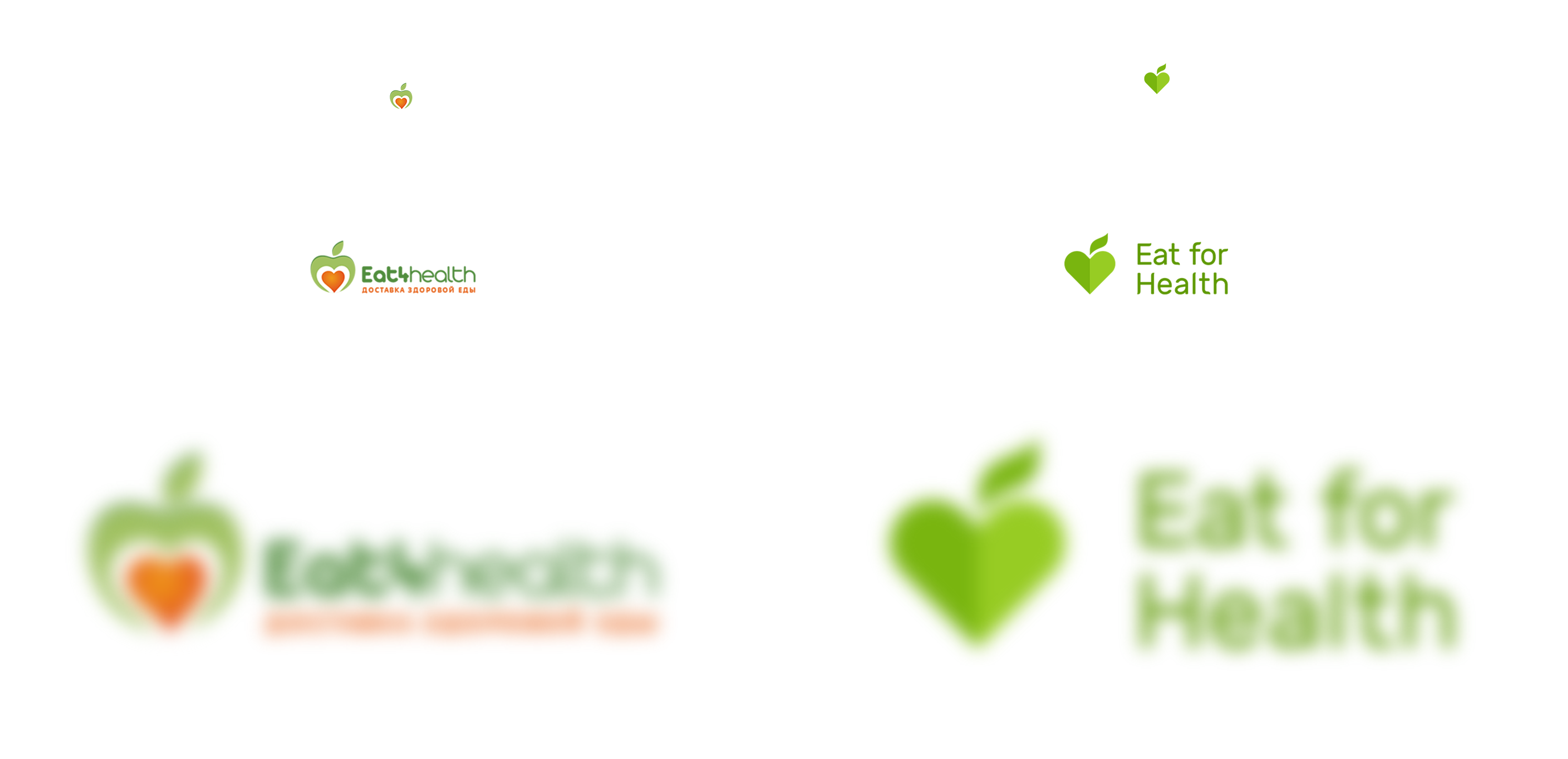
The logo should be well read in a small size and when driving:
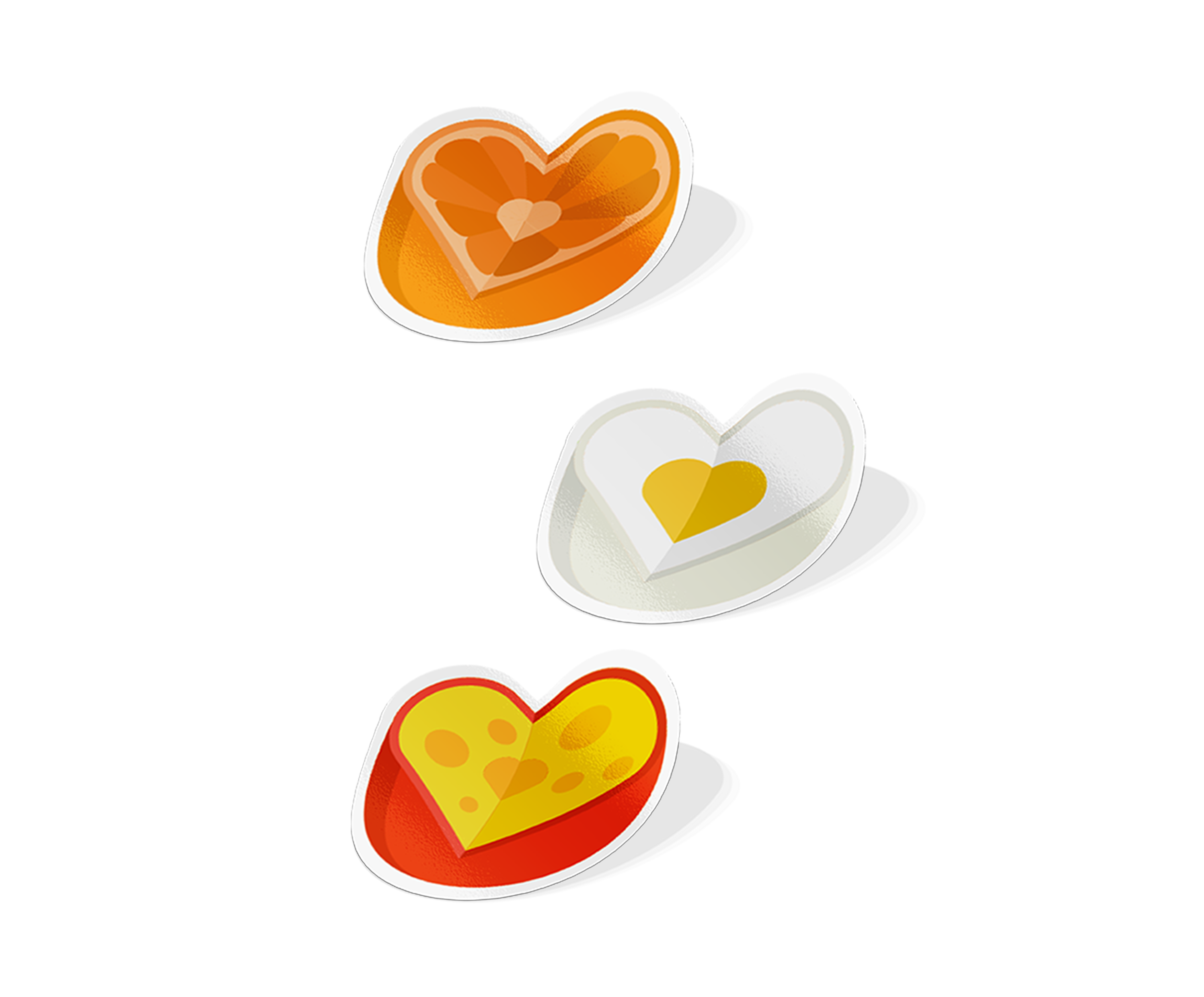
With the logo figured out - it is simple and easy to use. But the food is a tasty and positive topic. We decided to make a bright pattern with images of healthy food.
If you constantly use it, after a while this style will begin to be recognized and associated with Eat4health:
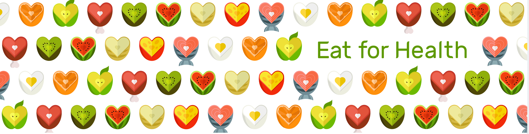
The pattern can be used for any purpose: from the design of social networks to printing on uniforms and promotional materials:
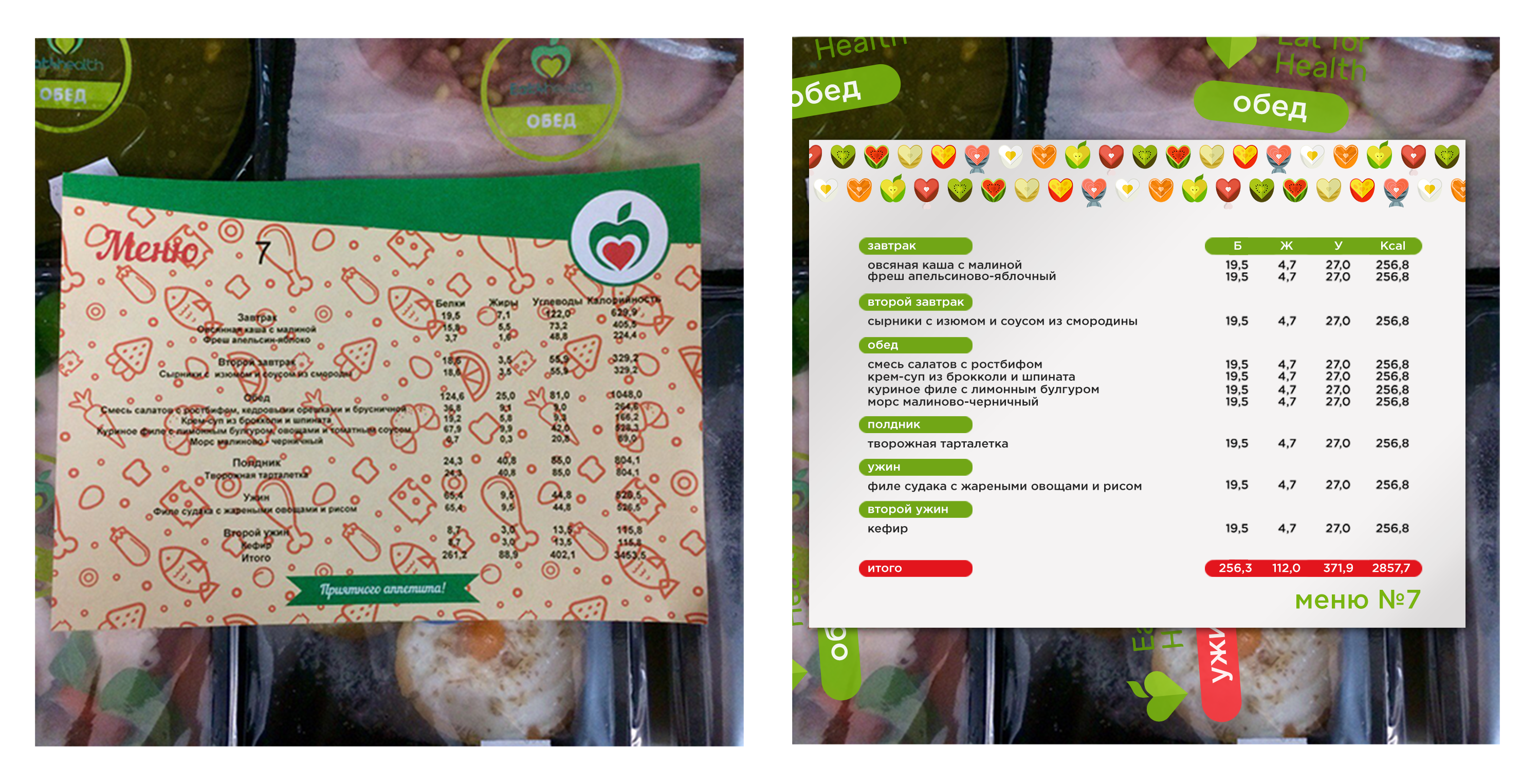
One of the important carriers for Eat4Health is the menu. In the original version, it is, unfortunately, completely unreadable. Black and red letters on the colored substrate are the most difficult to read, the desire to find out what is in the menu disappears completely.
Do not arrange such a clever quest for customers. We make it easier - the background is white, with the company colors we highlight the main thing, in large print we write in large numbers. For even more corporate add our bright pattern.
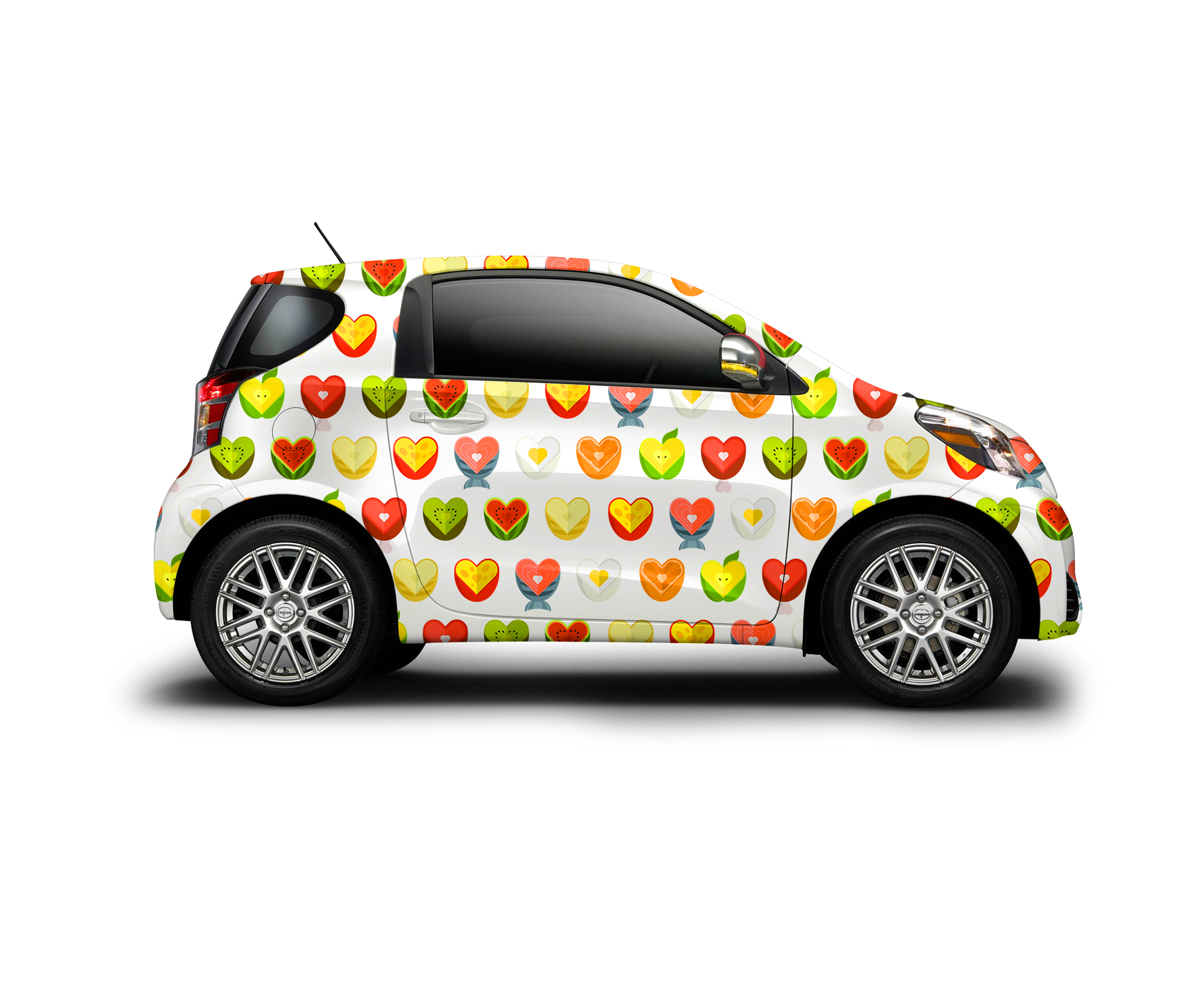
With the help of the pattern, you can arrange machines for food delivery:
Stickers are a useful thing, they will help to make any carrier brand in a second.
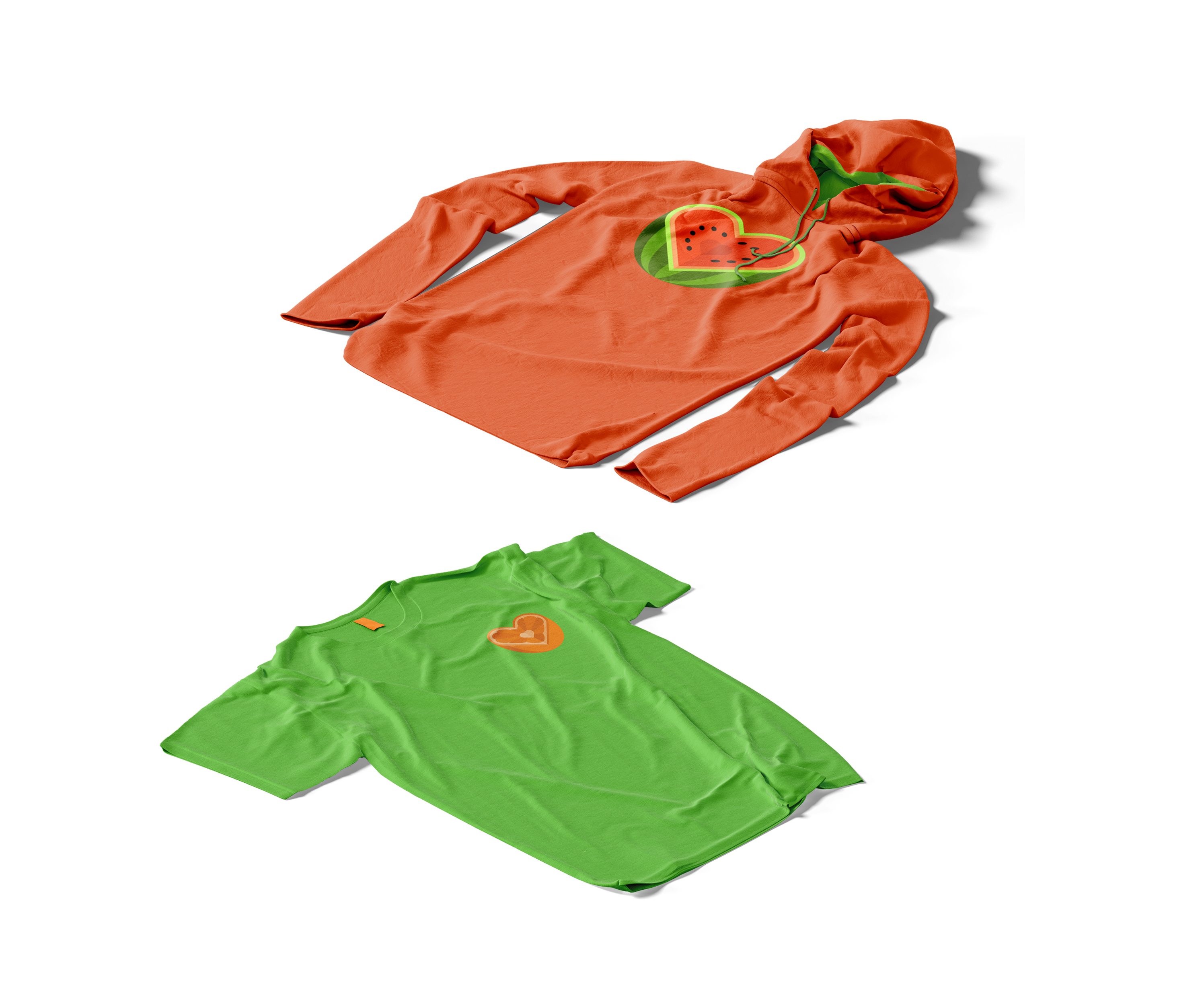
Such hoodies can be done for couriers or play on the social network during the contest - walking advertisement:
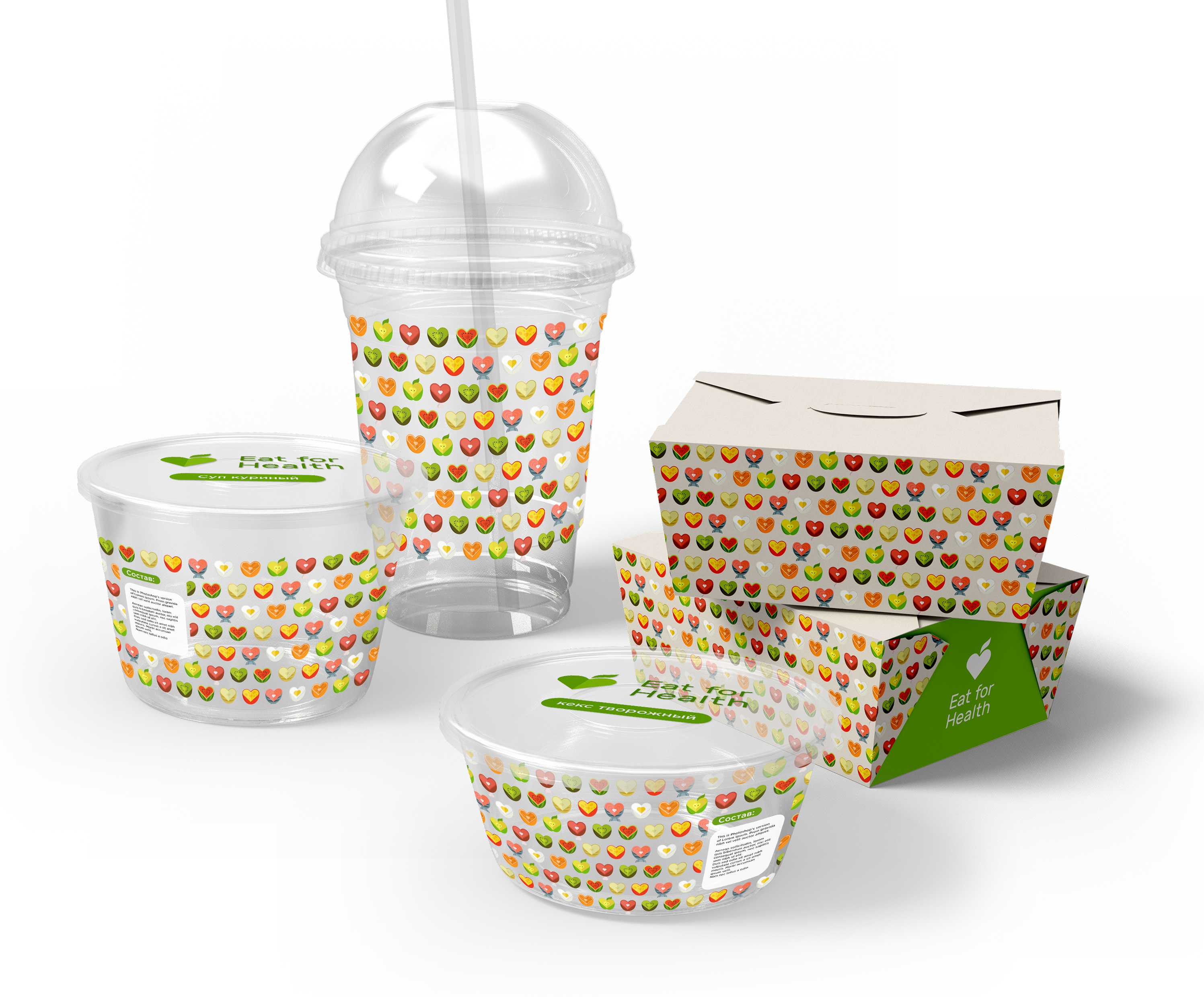
We are trying on the packaging for the delivery - the pattern makes all the boxes and jars more fun, we don’t forget about the logo, but it’s not the main thing:
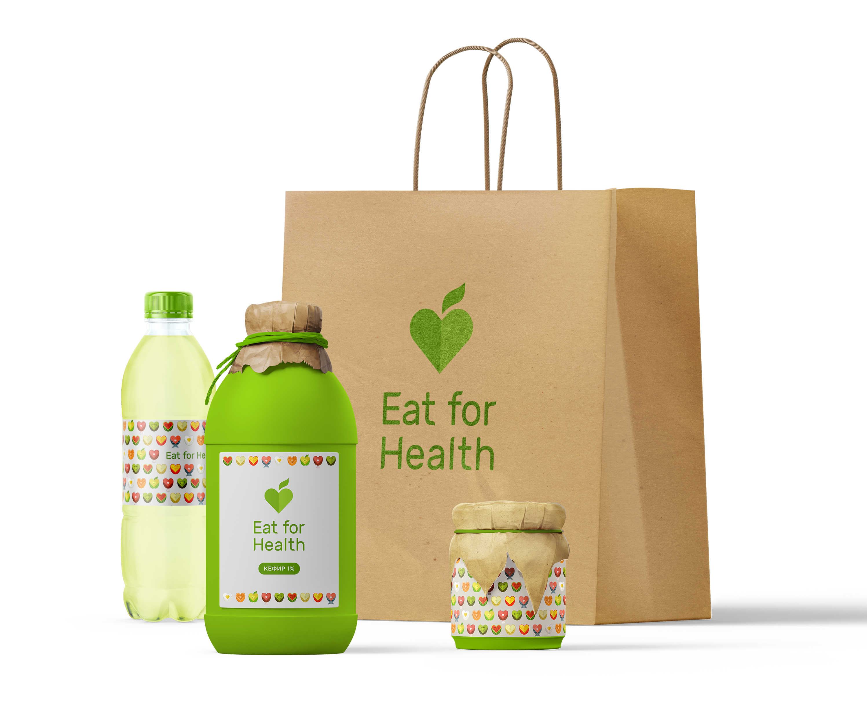
Craft packages, fresh green color, delicious corporate pattern:
Variant of animation for the site:

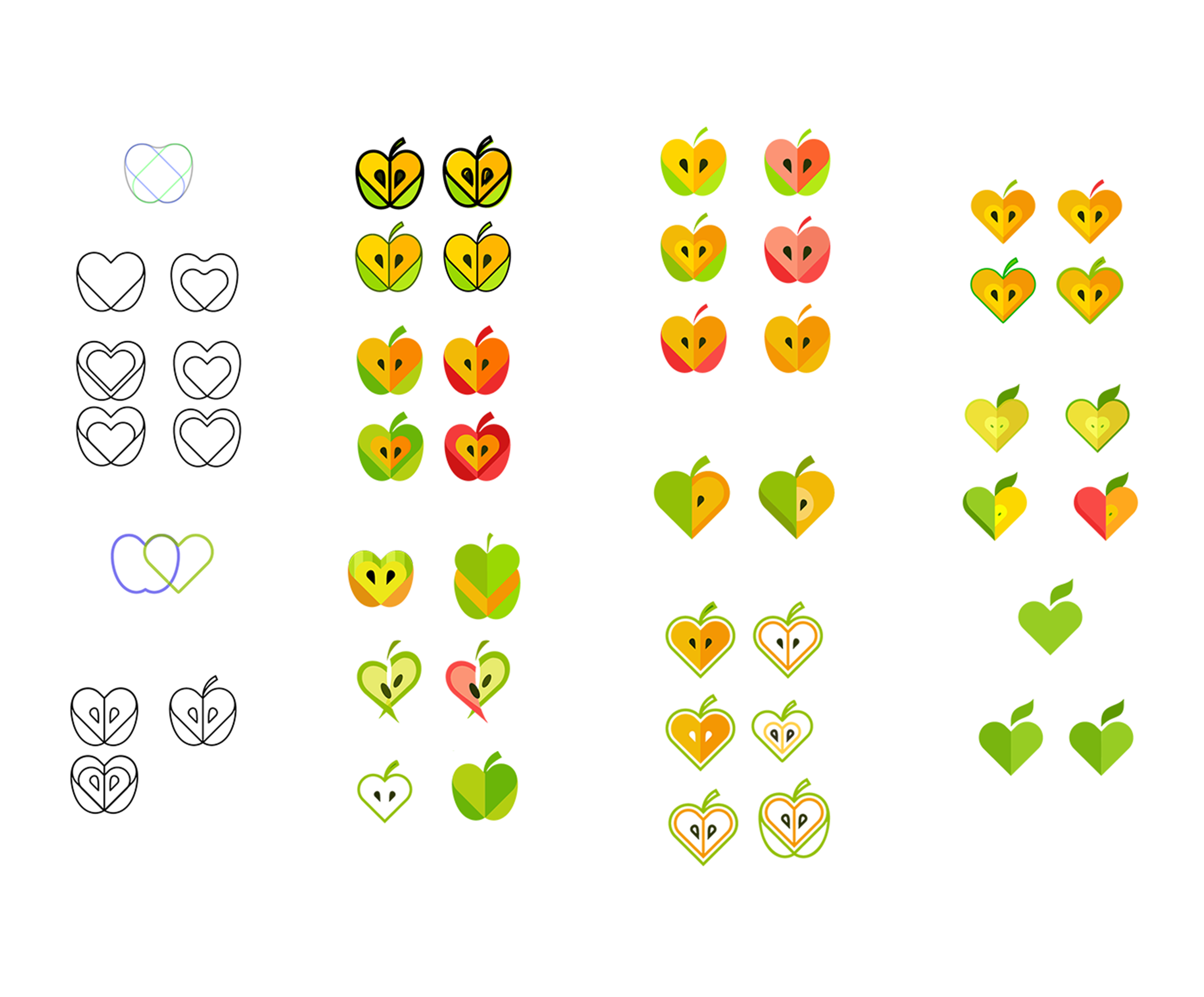
Bonus - logo sketches:
Conclusion
- After the changes, the Eat4health logo has become more adaptable and easier to use; now it is easy to place on the package for delivery or on the website;
- Eat4health has the basic elements of corporate identity: logo, colors, fonts, pattern. Now, by combining these elements, one can brand and make recognizable any carrier of the company;
- After completion, it is possible to bring all social platforms and points of contact with the company's customers into a single view
Subscribe to our public , there are many interesting things. And, as always, good luck to you and your projects!
Previous release
Source: https://habr.com/ru/post/345180/
All Articles