How to predict the exchange rate of the ruble to the dollar using SAP Predictive Analytics
SAP in recent years has focused on the development of machine learning, big data processing and the development of the Internet of things. These are the three most important technological areas that the company develops in its decisions. SAP is working not only on the development tool, but also on the application of these technologies in practice. The presence of a large number of customers who have automated their business processes on SAP products allows analyzing customer needs in a comprehensive manner, proposing new approaches in using customer data to increase the efficiency of business processes.
Let's take a look at how data analysis looks like using the predictive analytics tool from SAP.
')
Let's try to use the desktop version of SAP Predictive Analytics to analyze the ruble against the dollar. Attempts at such an analysis have been made repeatedly and with the use of various tools. But this does not prevent repeating the analysis once again on the new toolkit to demonstrate the capabilities of this solution.
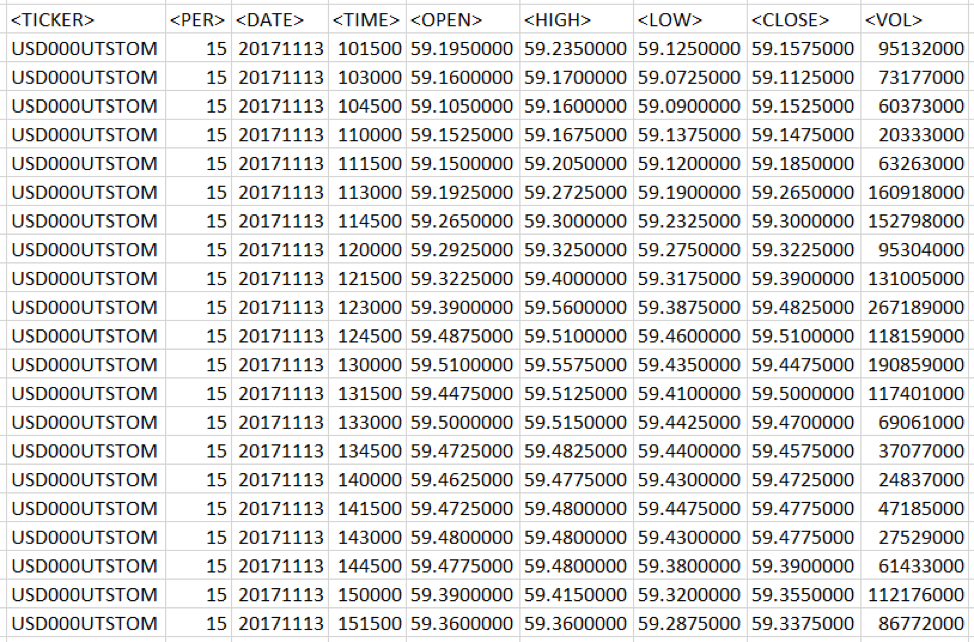
Fig. 1 Data of trade quotes. Information downloaded from Finam site.
The data have a 15 minute granularity. Open, High, Low, Close, respectively, the price of the beginning of the 15-minute interval, the maximum price for a period of time, the minimum price and the closing price. The Volume value is the trading volume.
For the simulation data was loaded for the year and have more than 14 thousand lines.
Data preparation
You can simply load the time series into the data analysis tool, but without preliminary data processing, the resulting model will be of low quality. When preparing data, two processing steps are necessary. The first stage is Data Engineering, that is, the collection, understanding, cleaning and initial processing of data. The second stage - Feature Engineering, the formation of descriptive characteristics of the data, with information about various aspects of the behavior of the object whose model is being built. In terms of the CRISP-DM methodology, these steps are similar to Data Understanding and Data Preparation.
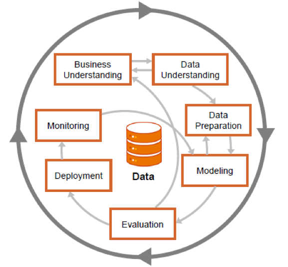
Fig. 2 Steps of CRISP-DM methodology with possible transition directions between stages
The visualization of information about quotes is in the form of short lines, the size and position of which reflects how the price moved during a specified period of time.
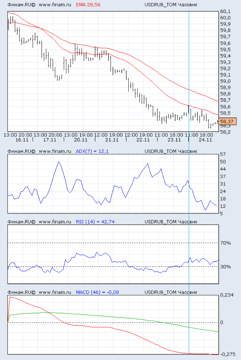
Fig. 3 This is the visualization of the price range (top chart). Red lines - exponential smoothing. The other three graphs show the change in various indicators of technical analysis.
What will we predict? The price range contains a lot of noise. In order to see a sufficiently strong change in price, you must wait a few hours. Therefore, the prediction of where the price will move in the next 15 minutes makes little sense. The useful signal will drown in the noise. What to do?
Technical analysts have come up with an indicator ZigZag. It shows how to trade in order to get the maximum profit. This is similar to the Grail, but in order to calculate it, you need to know the future price change. It looks like this:
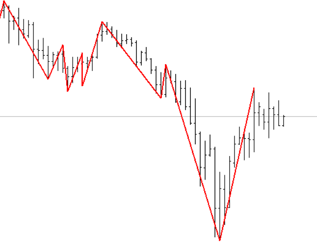
Fig. 4 ZigZag indicator. The line is drawn between the extreme points of price change.
Although from the point of view of trade ZigZag is useless, but it can provide information about how it was necessary to trade in the past. It is also used to generate a target row. If the price has grown, then the value of the objective function in this period of time takes 1, if it declined, then 0. As a result, the markup for the time series of prices is obtained.
In addition to the price, you can calculate a set of values for technical analysis indicators. For example, a simple moving average SMA14 averages the price of the last 14 samples. And the ratio of the current price to the moving average shows whether the current price is higher or lower with respect to the average 14 counts.
A detailed description of the various indicators will be left out of this article - this is a separate subject area. A more detailed immersion in this topic can be started from here .
To summarize, the indicators of Technical Analysis are digital filters superimposed on a time series. The calculation of the values of technical analysis indicators for a number of ruble prices was performed using the R language, where there is a library for calculating technical analysis indicators. In addition, similar information allows to obtain platforms for technical analysis. The process of calculating the values of the indicators is also omitted. A detailed description of this process can be found in this article.
As a result of preparation and processing, the following set of technical analysis indicators was obtained.
Table 1.
The list of technical analysis indicators calculated for the task of predicting the exchange rate
Do not be afraid of the figure of 62 calculated values. In real-life tasks, hundreds or even thousands of signs can be automatically generated. For modern methods of machine learning, their number becomes irrelevant. For each feature, significance is automatically calculated — the certainty that the change in value affects the forecast of the target variable.
Feature selection
An integral part of the initial stages of the machine learning process is feature selection, i.e. variables on the basis of which the model is trained. Selection can be carried out using various tools, as well as depend on many factors, such as the correlation of signs with the target variable, or the quality of data. The next (and more advanced) step can be the creation of new signs based on existing ones, the so-called. feature engineering - the creation of features. This operation may allow to improve the quality of the model, at the same time having received a more complete explanation of the data, in case the model is interpretable. In our case, the first step in building a model in SAP Predictive Analytics was the creation of new features using the embedded Data Manager solution.
The prepared dataset contains indicators of indicators that affect the target variable at the current time. However, additional information can be obtained if we establish the influence of these indicators for a certain period up to the current moment. In our case, the time intervals were chosen: 1 hour and 1 day before the current point in time, and new variables were created taking into account this “time lag”. Even more informative may be the degree of change of indicators from the moment in the past to the current moment. The natural logarithm of the private current indicators and indicators with a time lag of 1 hour and 2 days was chosen as the method. Thus, it was possible to obtain the degree of change of the indicator from the moment in the past (it increased or decreased), and if so, how much.
Summarizing, it was possible to establish not only the relationship between the current values of indicators and the target variable, but also to take into account these indicators in the past, as well as the degree of their change.
Implementation in Data Manager
A new data manipulation is created on the Data Manager tab.
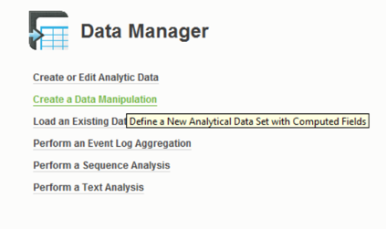
Fig. 5 SAP Predictive Analytics model selection interface
After loading a pre-formed dataset, the prefix “NOW” (Rename -> Add Prefix) was added to the name of the predictors - this way we label the predictors for the current time.
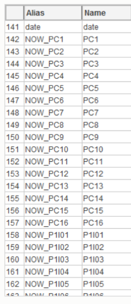
Fig. 6 Renaming variables to simplify subsequent manipulations.
To create a time delay, we will generate new date_MIN1HR and date_MIN1DAY variables with the appropriate dependence on the date variable. Used by expression editor:
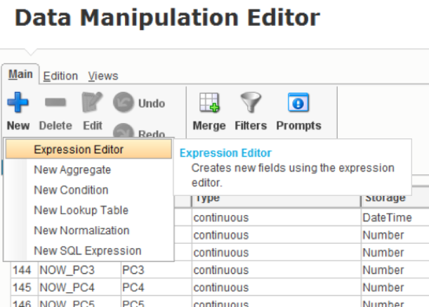
Fig. 7 Creating a New Expression in Data Manipulation Editor
The Expression Editor adds a date shift function by hours (for the second variable by days), for each of which a dependent date field is set (from which the calculation is performed), as well as a -1 parameter, because we are interested in the past.
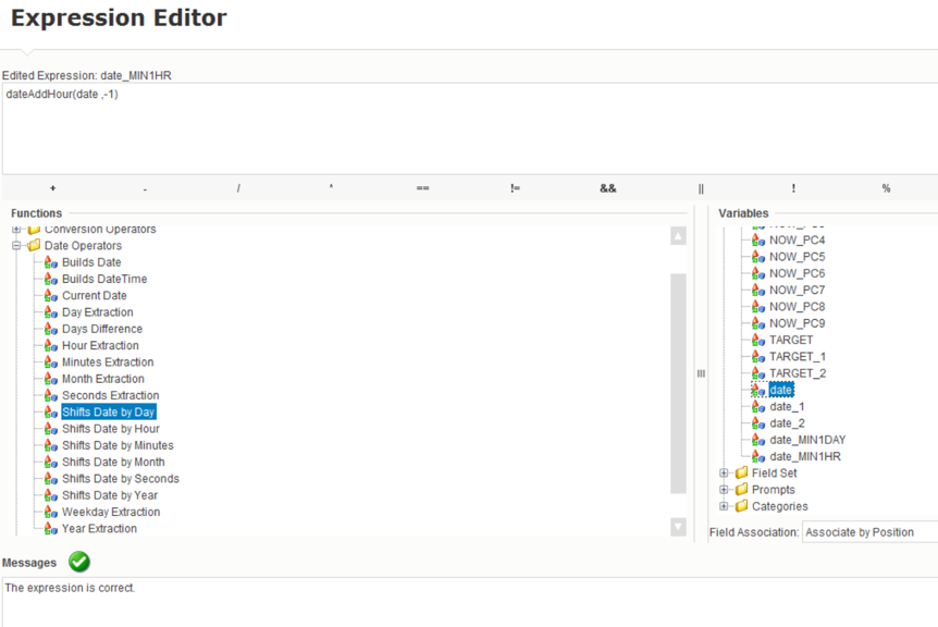
Fig. 8 Created variable with date shifted
After creating these variables, they appear in the fields:
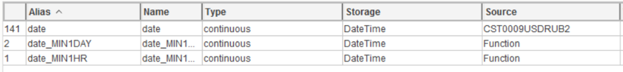
Fig. 9 Calculated date fields have become available in the general list of variables.
You can visually see the dependency on the data set:
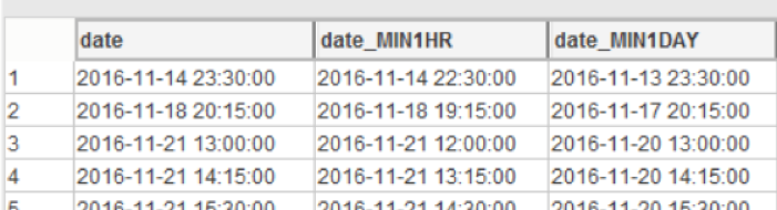
Fig. 10 Visualization of the time shift in 1 hour and 1 day
Further, the table fields (indicators) are attached to the same table, while the key field of each table being joined is the date field with an offset. There are 2 join'a: predictors with a shift of 1 hour ago and 1 day ago using the “Merge” function:
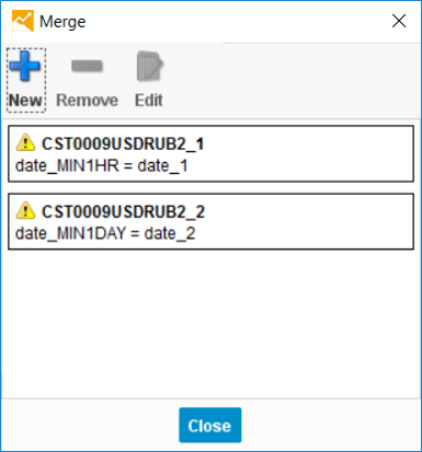
Fig. 11 Generating a Connection of Data Sets with Different Shifts in Time
When the table was attached, the corresponding fields were assigned prefixes (“MIN1HR” and “MIN1DAY”):
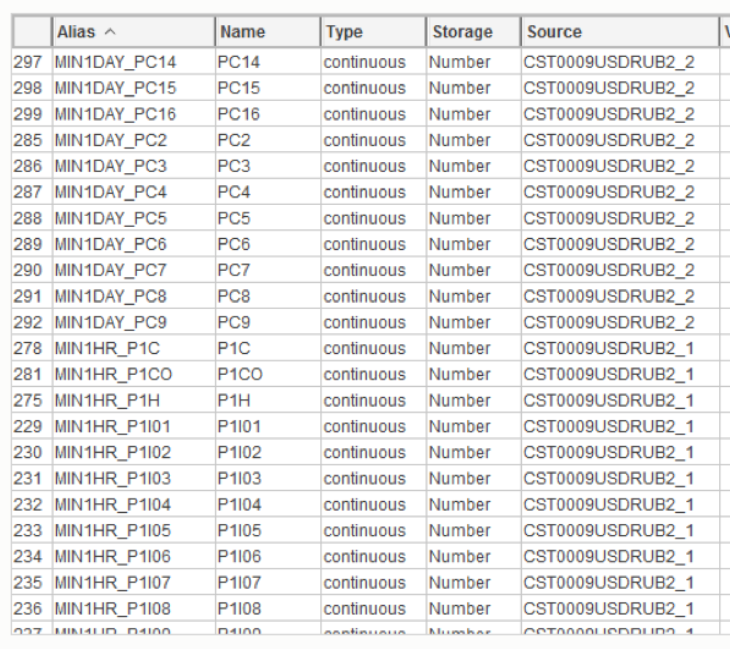
Fig. 12 Formed list of signs after merging by time
It is worth noting the source of the variables (Column “Source”). And compare these values with the values in the “Merge” window. The variables from the source “CST0009USDRUB2_1” are connected across the “date_MIN1HR” field and have the prefix “MIN1HR”, which is correct.
To create a trend of changes of variables for different periods of time, it is necessary to take the natural logarithm from the ratio of the current value of the indicator to its past value. With the help of expression editor, the following dependency is built:

Fig. 13. Determination of the group logarithmic function for the ratio of change of values with time.
Where the function ln is the natural logarithm from the ratio of the current value of all predictors to their value 1 hour ago. Thus, the characters “@” and “$” in the figure above are wildcards indicating the end of the variable name after the prefix. This function saves a lot of time, automatically matching pairs of predictors and creating 69 new variables (69 = number of predictors with the prefix):
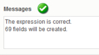
Fig. 14 Report on the success of the next step of generating new features
It is important to point out that it is necessary to compare predictors “by value” in such a way that the value of a specific predictor is correctly compared with the value of the same predictor 1 hour ago:
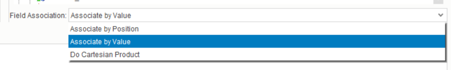
Fig. 15 Required setting for successful attribute matching
The result is a set of additional variables that were used to build the model.
Example: the variable "P1 | 25" is currently, 1 hour ago, 1 day ago, and the trend (the ratio of the current value to the value 1 hour and 1 day ago):
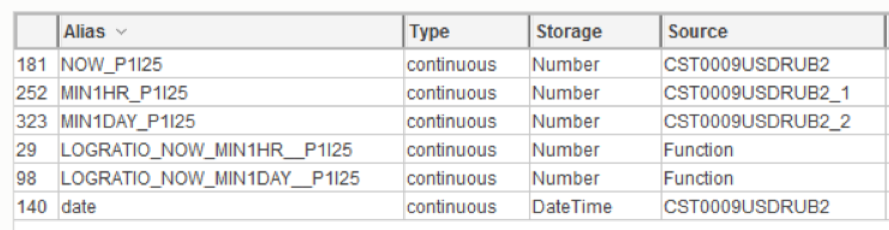
Fig. 16 As a result of manipulations in SAP Predictive Analytic, additional features were created to the initial value of the variable.
Model building
A standard model was built in SAP Predictive Analytics. The degree of the ridge polynomial regression = 1, automatic selection of variables is included. The result of the model is as follows:
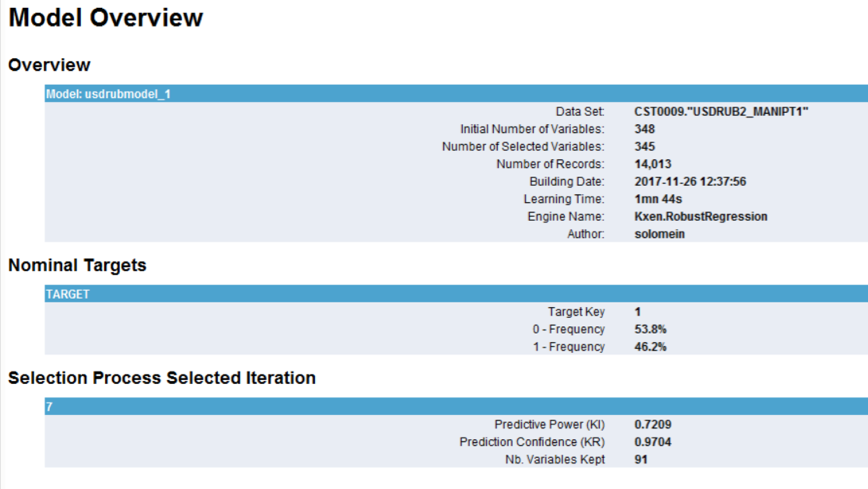
Fig. 17 Basic statistics of the calculated model
Of the 345 variables in the final equation with the least error, 91 variables were left. The best iteration of selection of variables is number 7. The final predictive power of the model = 0.7209, robustness (stability of the result to new data sets) = 0.9704. This means that the model is qualitative and stable.
Diagram of the degree of influence of variables in the model is presented in Fig.18. The higher the predictor in the list, the more significant it is when deciding on the final model.
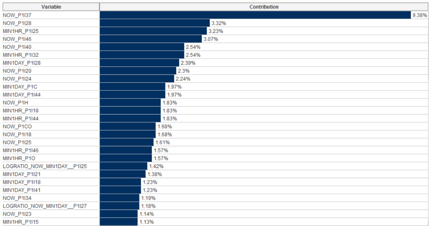
Fig. 18 Significance of predictors for the final model. The 37th basic predictor “Stochastic Momentum Index SMI 13 2” has the greatest predictive power.
In the predictors, one can see both current indicators (NOW prefix) and indicators 1 hour and 1 day before the current moment (MIN1HR and MIN1DAY prefixes), as well as the trend of indicator change (LOGRATIO prefix).
For example, the indicator P1 | 25 has the greatest impact 1 hour before the current observation (3rd from the top). Whereas its current value is not so important (see NOW_P1 | 25). Also relevant, though not too high, is the ratio of the current indicator P1 | 25 to it 1 day ago (LOGRATIO_NOW_MIN1DAY__P1 | 25).
The most significant indicator is P1 | 37 at the current time.
Predictive Analytics automatically divides the explanatory variables into categories (puts the values of a continuous variable in the scope of intervals, the so-called “binning”) and builds a graph of the influence of these categories on the target variable. In this case, it can be seen that the indicator P1 | 37 has the greatest impact on the target variable at the current time, being in the interval from 33.39 to 67.97, and the smallest - in the interval from -26.6 to -10.7.
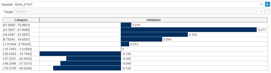
Fig. 19 The effect of different ranges of characteristic values on the target variable
Considering another variable, the degree of change of the indicator P1 | 25, it becomes clear that as the indicator decreases relative to yesterday's value (negative logarithm, category from -2.29 to -0.47), the effect on the target variable increases. If the indicator shows growth, the effect decreases.
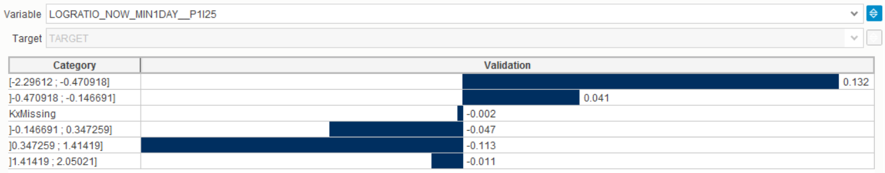
Fig. 20 Another example of the analysis of characteristic values by ranges.
Instead of conclusion
The article demonstrated approaches to data analysis and the ability of SAP Predictive Analytics to analyze market data. The high level of automation and ease of interpretation can not only create a qualitative model, but also explain the causes of the event, as well as specific ranges of influencing variables.
Predictive analytics is located at the interface of data warehouses, business problems and mathematics. The synergy of these areas allows a new look at the already familiar and well-established business processes. As a rule, they were built on the basis of a person's ideas about the factors influencing the process. But a person can analyze without the use of special tools only a small number of the most significant factors. Artificial intelligence can create a model with a much larger number of significant factors. This allows you to more accurately identify the impact and predict the development of events.
The authors of the article are Andrey Rzhaksinsky and Pavel Solomein. Andrey Rzhaksinsky is engaged in data warehousing, predictive analytics, analysis of client activity, works in the team of SAP Analytics & Insights. Pavel Solomein is a forecast analytics consultant for SAP Digital Business Services.
Let's take a look at how data analysis looks like using the predictive analytics tool from SAP.
')
Let's try to use the desktop version of SAP Predictive Analytics to analyze the ruble against the dollar. Attempts at such an analysis have been made repeatedly and with the use of various tools. But this does not prevent repeating the analysis once again on the new toolkit to demonstrate the capabilities of this solution.
Fig. 1 Data of trade quotes. Information downloaded from Finam site.
The data have a 15 minute granularity. Open, High, Low, Close, respectively, the price of the beginning of the 15-minute interval, the maximum price for a period of time, the minimum price and the closing price. The Volume value is the trading volume.
For the simulation data was loaded for the year and have more than 14 thousand lines.
Data preparation
You can simply load the time series into the data analysis tool, but without preliminary data processing, the resulting model will be of low quality. When preparing data, two processing steps are necessary. The first stage is Data Engineering, that is, the collection, understanding, cleaning and initial processing of data. The second stage - Feature Engineering, the formation of descriptive characteristics of the data, with information about various aspects of the behavior of the object whose model is being built. In terms of the CRISP-DM methodology, these steps are similar to Data Understanding and Data Preparation.
Fig. 2 Steps of CRISP-DM methodology with possible transition directions between stages
The visualization of information about quotes is in the form of short lines, the size and position of which reflects how the price moved during a specified period of time.
Fig. 3 This is the visualization of the price range (top chart). Red lines - exponential smoothing. The other three graphs show the change in various indicators of technical analysis.
What will we predict? The price range contains a lot of noise. In order to see a sufficiently strong change in price, you must wait a few hours. Therefore, the prediction of where the price will move in the next 15 minutes makes little sense. The useful signal will drown in the noise. What to do?
Technical analysts have come up with an indicator ZigZag. It shows how to trade in order to get the maximum profit. This is similar to the Grail, but in order to calculate it, you need to know the future price change. It looks like this:
Fig. 4 ZigZag indicator. The line is drawn between the extreme points of price change.
Although from the point of view of trade ZigZag is useless, but it can provide information about how it was necessary to trade in the past. It is also used to generate a target row. If the price has grown, then the value of the objective function in this period of time takes 1, if it declined, then 0. As a result, the markup for the time series of prices is obtained.
In addition to the price, you can calculate a set of values for technical analysis indicators. For example, a simple moving average SMA14 averages the price of the last 14 samples. And the ratio of the current price to the moving average shows whether the current price is higher or lower with respect to the average 14 counts.
A detailed description of the various indicators will be left out of this article - this is a separate subject area. A more detailed immersion in this topic can be started from here .
To summarize, the indicators of Technical Analysis are digital filters superimposed on a time series. The calculation of the values of technical analysis indicators for a number of ruble prices was performed using the R language, where there is a library for calculating technical analysis indicators. In addition, similar information allows to obtain platforms for technical analysis. The process of calculating the values of the indicators is also omitted. A detailed description of this process can be found in this article.
As a result of preparation and processing, the following set of technical analysis indicators was obtained.
| Input | Technical name | Technical Analysis Indicator |
|---|---|---|
| I01 | EMA5Cross | EMA5 intersection and opening price |
| I02 | EMA17Cross | EMA17 intersection and opening price |
| I03 | EMA5_17Cross | Intersection of EMA17 and EMA5 |
| I04 | VolumeROC1 | Rate of Change / Momentum |
| I05 | CCI12 | Commodity Channel Index 12 |
| I06 | MFI14 | Money Flow Index 14 |
| I07 | MOM | Momentum 3 / Rate of Change |
| I08 | Lag1 | Price movement on the current bar (1) |
| I09 | Lag2 | Price movement on the current bar (2) |
| I10 | Lag3 | Price movement on the current bar (3) |
| I11 | Lag4 | Price movement on the current bar (4) |
| I12 | Lag5 | Price movement on the current bar (5) |
| I13 | fastK | Stochastic Fast% K |
| I14 | fastD | Stochastic Fast% D |
| I15 | slowD | Stochastic Slow% D |
| I16 | stochWPR | William's% R |
| I17 | RSI14 | Relative Strength Index (open) 14 |
| I18 | williamsAD | Williams Accumulation / Distribution |
| I19 | WPR | William's% R 14 |
| I20 | AO | (Awesome Oscillator, AO) SMA5 - SMA34 |
| I21 | AC | AO smoothed 5-period average AO - SMA (AO, 5) |
| I22 | MACD | EMA12 - EMA26 |
| I23 | MACD_SMA9 | MACD smoothed 9-period sliding MACD-SMA (MACD, 9) |
| I24 | Dip | The positive direction index |
| I25 | DIn | The negative Direction Index. |
| I26 | Dx | The direction index |
| I27 | ADX | The Average Direction Index (trend strength) |
| I28 | ar | aroon (HL, n) - 1 out (oscillator) |
| I29 | chv16 | Chaikin Volatility - chaikin Volatility (HLC, n) - 1 out |
| I30 | cmo16 | Chande Momentum Oscillator - CMO (Med, n) - 1 out |
| I31 | macd12_26 | MACD Oscillator 12, 26, 9 |
| I32 | osma | Moving Average of Oscillator |
| I33 | rsi16 | Relative Strength Index med 16 |
| I34 | fastK14_3_3 | Stochastic Oscillator 14 3 3 fastK |
| I35 | fastD14_3_3 | Stochastic Oscillator 14 3 3 fastD |
| I36 | slowD14_3_3 | Stochastic Oscillator 14 3 3 slowD |
| I37 | smi13_2SMI | Stochastic Momentum Index SMI 13 2 |
| I38 | smi13_2signal | Stochastic Momentum Index signal 13 2 |
| I39 | vol16 | Volatility 16 |
| I40 | SMA24Cross | Logarithm of the open price relation and SMA24 |
| I41 | SMA60Cross | Logarithm of the open price relation and SMA60 |
| I42 | SMA24_60Cross | Logarithm ratios SMA24 and SMA60 |
| I43 | SMA24Trand | The logarithm of the SMA24 ratio compared with the previous value |
| I44 | SMA60Trand | The logarithm of the SMA24 ratio compared with the previous value |
| I45 | MOM24 | Momentum 24 / Rate of Change |
| I46 | MOM60 | Momentum 60 / Rate of Change |
| PCA | PC1-PC16 | Compression of features I01-I46 by the principal component method in 16 values |
Table 1.
The list of technical analysis indicators calculated for the task of predicting the exchange rate
Do not be afraid of the figure of 62 calculated values. In real-life tasks, hundreds or even thousands of signs can be automatically generated. For modern methods of machine learning, their number becomes irrelevant. For each feature, significance is automatically calculated — the certainty that the change in value affects the forecast of the target variable.
Feature selection
An integral part of the initial stages of the machine learning process is feature selection, i.e. variables on the basis of which the model is trained. Selection can be carried out using various tools, as well as depend on many factors, such as the correlation of signs with the target variable, or the quality of data. The next (and more advanced) step can be the creation of new signs based on existing ones, the so-called. feature engineering - the creation of features. This operation may allow to improve the quality of the model, at the same time having received a more complete explanation of the data, in case the model is interpretable. In our case, the first step in building a model in SAP Predictive Analytics was the creation of new features using the embedded Data Manager solution.
The prepared dataset contains indicators of indicators that affect the target variable at the current time. However, additional information can be obtained if we establish the influence of these indicators for a certain period up to the current moment. In our case, the time intervals were chosen: 1 hour and 1 day before the current point in time, and new variables were created taking into account this “time lag”. Even more informative may be the degree of change of indicators from the moment in the past to the current moment. The natural logarithm of the private current indicators and indicators with a time lag of 1 hour and 2 days was chosen as the method. Thus, it was possible to obtain the degree of change of the indicator from the moment in the past (it increased or decreased), and if so, how much.
Summarizing, it was possible to establish not only the relationship between the current values of indicators and the target variable, but also to take into account these indicators in the past, as well as the degree of their change.
Implementation in Data Manager
A new data manipulation is created on the Data Manager tab.
Fig. 5 SAP Predictive Analytics model selection interface
After loading a pre-formed dataset, the prefix “NOW” (Rename -> Add Prefix) was added to the name of the predictors - this way we label the predictors for the current time.
Fig. 6 Renaming variables to simplify subsequent manipulations.
To create a time delay, we will generate new date_MIN1HR and date_MIN1DAY variables with the appropriate dependence on the date variable. Used by expression editor:
Fig. 7 Creating a New Expression in Data Manipulation Editor
The Expression Editor adds a date shift function by hours (for the second variable by days), for each of which a dependent date field is set (from which the calculation is performed), as well as a -1 parameter, because we are interested in the past.
Fig. 8 Created variable with date shifted
After creating these variables, they appear in the fields:
Fig. 9 Calculated date fields have become available in the general list of variables.
You can visually see the dependency on the data set:
Fig. 10 Visualization of the time shift in 1 hour and 1 day
Further, the table fields (indicators) are attached to the same table, while the key field of each table being joined is the date field with an offset. There are 2 join'a: predictors with a shift of 1 hour ago and 1 day ago using the “Merge” function:
Fig. 11 Generating a Connection of Data Sets with Different Shifts in Time
When the table was attached, the corresponding fields were assigned prefixes (“MIN1HR” and “MIN1DAY”):
Fig. 12 Formed list of signs after merging by time
It is worth noting the source of the variables (Column “Source”). And compare these values with the values in the “Merge” window. The variables from the source “CST0009USDRUB2_1” are connected across the “date_MIN1HR” field and have the prefix “MIN1HR”, which is correct.
To create a trend of changes of variables for different periods of time, it is necessary to take the natural logarithm from the ratio of the current value of the indicator to its past value. With the help of expression editor, the following dependency is built:
Fig. 13. Determination of the group logarithmic function for the ratio of change of values with time.
Where the function ln is the natural logarithm from the ratio of the current value of all predictors to their value 1 hour ago. Thus, the characters “@” and “$” in the figure above are wildcards indicating the end of the variable name after the prefix. This function saves a lot of time, automatically matching pairs of predictors and creating 69 new variables (69 = number of predictors with the prefix):
Fig. 14 Report on the success of the next step of generating new features
It is important to point out that it is necessary to compare predictors “by value” in such a way that the value of a specific predictor is correctly compared with the value of the same predictor 1 hour ago:
Fig. 15 Required setting for successful attribute matching
The result is a set of additional variables that were used to build the model.
Example: the variable "P1 | 25" is currently, 1 hour ago, 1 day ago, and the trend (the ratio of the current value to the value 1 hour and 1 day ago):
Fig. 16 As a result of manipulations in SAP Predictive Analytic, additional features were created to the initial value of the variable.
Model building
A standard model was built in SAP Predictive Analytics. The degree of the ridge polynomial regression = 1, automatic selection of variables is included. The result of the model is as follows:
Fig. 17 Basic statistics of the calculated model
Of the 345 variables in the final equation with the least error, 91 variables were left. The best iteration of selection of variables is number 7. The final predictive power of the model = 0.7209, robustness (stability of the result to new data sets) = 0.9704. This means that the model is qualitative and stable.
Diagram of the degree of influence of variables in the model is presented in Fig.18. The higher the predictor in the list, the more significant it is when deciding on the final model.
Fig. 18 Significance of predictors for the final model. The 37th basic predictor “Stochastic Momentum Index SMI 13 2” has the greatest predictive power.
In the predictors, one can see both current indicators (NOW prefix) and indicators 1 hour and 1 day before the current moment (MIN1HR and MIN1DAY prefixes), as well as the trend of indicator change (LOGRATIO prefix).
For example, the indicator P1 | 25 has the greatest impact 1 hour before the current observation (3rd from the top). Whereas its current value is not so important (see NOW_P1 | 25). Also relevant, though not too high, is the ratio of the current indicator P1 | 25 to it 1 day ago (LOGRATIO_NOW_MIN1DAY__P1 | 25).
The most significant indicator is P1 | 37 at the current time.
Predictive Analytics automatically divides the explanatory variables into categories (puts the values of a continuous variable in the scope of intervals, the so-called “binning”) and builds a graph of the influence of these categories on the target variable. In this case, it can be seen that the indicator P1 | 37 has the greatest impact on the target variable at the current time, being in the interval from 33.39 to 67.97, and the smallest - in the interval from -26.6 to -10.7.
Fig. 19 The effect of different ranges of characteristic values on the target variable
Considering another variable, the degree of change of the indicator P1 | 25, it becomes clear that as the indicator decreases relative to yesterday's value (negative logarithm, category from -2.29 to -0.47), the effect on the target variable increases. If the indicator shows growth, the effect decreases.
Fig. 20 Another example of the analysis of characteristic values by ranges.
Instead of conclusion
The article demonstrated approaches to data analysis and the ability of SAP Predictive Analytics to analyze market data. The high level of automation and ease of interpretation can not only create a qualitative model, but also explain the causes of the event, as well as specific ranges of influencing variables.
Predictive analytics is located at the interface of data warehouses, business problems and mathematics. The synergy of these areas allows a new look at the already familiar and well-established business processes. As a rule, they were built on the basis of a person's ideas about the factors influencing the process. But a person can analyze without the use of special tools only a small number of the most significant factors. Artificial intelligence can create a model with a much larger number of significant factors. This allows you to more accurately identify the impact and predict the development of events.
The authors of the article are Andrey Rzhaksinsky and Pavel Solomein. Andrey Rzhaksinsky is engaged in data warehousing, predictive analytics, analysis of client activity, works in the team of SAP Analytics & Insights. Pavel Solomein is a forecast analytics consultant for SAP Digital Business Services.
Source: https://habr.com/ru/post/345108/
All Articles