Modular grid layout from scratch: analysis, calculation and construction
Brief background
Hi, Habr. I have been reading you for almost 10 years, but I have never written articles. At first there was nothing to say, then there was no time. But today the stars came together and turned up a suitable topic. Modular grid.
It would seem that to sketch a grid is a matter of five minutes. Everything is chewed up to us, and there are bootstraps for every taste, and “Annushka has already shed her butter ...”. But in practice, designers often have questions. Many people are even stunned by small digressions from the usual 12-column grids, because the principles of construction are not fully understood.
Once this topic was well disclosed by the cycle of articles by Alexei Cherenkevich, but the texts disappeared from open access. And although they can still be found in the archives , the texts themselves have become somewhat outdated over the years.
In a word, once again answering the question on the modular grid and not finding any suitable links, I decided to somehow summarize in the note everything that was smeared on dozens of comments on different sites.
How the grid works
Any layout contains elements. And sometimes a lot of them. Optical connections and attractions arise between the elements, which obey the proximity theory and, in particular, the external and internal rules .
The grid helps to follow this rule without calculating each distance and size separately. You lay the key patterns once, when building a grid, and then just stick to them.
Unlike the columnar, the modular grid sets the vertical rhythm and basic proportions of the elements, supporting them throughout the layout. It is a convenient, flexible and fairly simple system. Provided that you have sufficiently understood its principles.
What determines the structure of the grid
The modular grid is built in two directions: horizontal and vertical. Roughly speaking, it is a combination of columns and rows with a layout lined up in rows.
The last is intuitively clear to all elderly aksakals who have been using a pencil and a ruler to draw hundreds of horizontal lines on sheets for abstracts. However, I would not be surprised if students still do it.
So, if you need to build a grid from scratch, you will build on two things. First, from the content that needs to be placed in the layout: texts, illustrations, tables, lists, media files. Secondly, on the proportions and area of the carrier: a sheet of paper, a screen, a canvas or something more exotic.
If the content is simple and unchanged, and is known to you in advance, then the easiest way will be to start from it. If the content is complex and unpredictable (for example, user-generated is user-defined), then the grid will largely be determined by the media format and the general principles of typography and composition.
Start building. Vertical rhythm
When it comes to websites or print products, design depends a lot on typography and text properties. Therefore, the construction of the grid is convenient to start with a vertical rhythm .
First of all, you need to grope for two interrelated key parameters: the base line height and the base font size . Simply put (hee-hee), basic leading and size. And this simple task constantly brings people into a stupor. “How can I find out the desired height of the line?”, “And which font should I take?”, “How many lines should I make for a booklet? And for business cards? ”Etc.
Option "A". Approach "from the line"
If your carrier has a fixed size and you already know all the key content, then leading can be estimated in advance.
For this you need to imagine that each design element, including indents, occupies a certain number of abstract lines in height. Then put all the lines together and divide the layout height into them. And then each abstract line should be split into N real lines corresponding to the necessary leading - so that the specified text can adequately fit into them.
Suppose you need to list on the A4 sheet a list of the best employees of the month. You have three of them. For each employee you make a block card: on the left photo, on the right text. The photo is larger, so the height of the card is equal to its height. In addition, on the sheet you need to place the header with the title, and below - the block of contact information [of the union of geniuses].
You analyze the task and mentally estimate the relative heights of all elements. You assume, let's say, that the future cap in height will take about half the height of the photo. And in the basement there will be a lot of things, and it will turn out to be somewhere equal to the photos in height. Plus or minus shovel. You recount it again if necessary.
If you now take the height of the header for one "line", it turns out that all your content takes 9 abstract "lines". If it is difficult for you to abstract from leading, call these "lines" in rows or horizontal blocks. Suppose you still want to add 1/2 line of air in front of the top and bottom edges of the sheet. Total, your layout should be divided into 10 lines:
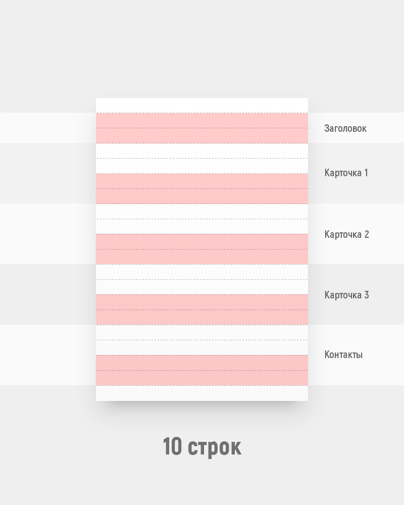
As a result, you divide your carrier (A4 sheet) by 10 lines in height. Blocks are about 3 centimeters high. Obviously, this is too large a razlinovka to impose on her texts, contact information and other trivia.
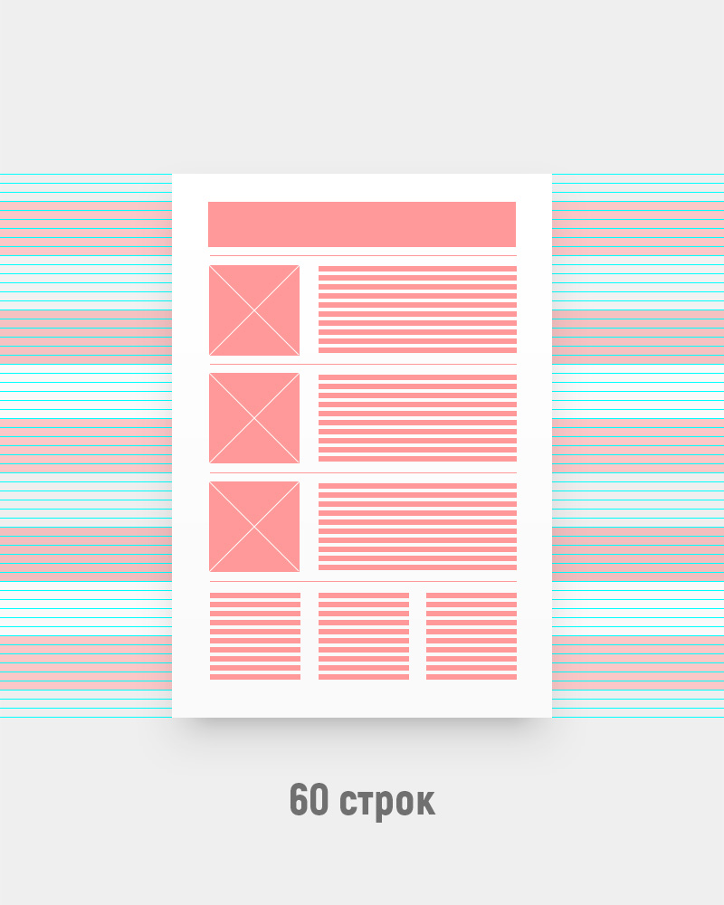
You look at your text and understand that next to each photo you get a description somewhere in the 10-12 lines of text. That is, each unit must be divided into another 5-6 parts. Suppose you are reinsured and take greater importance, so that one line is spent on the indents. Bingo. Now your layout is 10 blocks of 6 lines each. That is 60 lines. Taking into account the height of the sheet (~ 300 mm), each line turned out to be ~ 5 mm high. Everything, you can prototype a prototype, and then design a design.
But what about the font size? Oh, now everything is very simple! According to the same logic of “external and internal rules,” leading should be about 150–200% of the pin height. That is, the size of your font will be 1.5-2 times smaller than the height of the line. And this is from 2.5 to 3.3mm. This size is easy to find in points or even just by eye.
I emphasize that it is not necessary to measure out thousandths with a calculator. You have an eye and a sense of proportion - they should be enough. And even if they are not yet developed, after a hundred or two more layouts you will be able to get into the grid with your finger with an accuracy of 1-2 pixels, even with hidden guides and snapping off. And do not forget that the human eye perceives the size and distance with amendments to the physiology. Therefore, the grid itself is not a dogma, but only a rough help in the calculations. The last word is always for optical compensation. This topic will come back below.
Another moment. It so happens that after all the calculations it turns out that the font is too large or interline is too small. In this case, you either recalculate the grid, or simply use proportional values. As a rule, a compromise option is a half or one and a half leading.
Option "B". Point Approach
Not always you will have predictable content and a fixed canvas. In web design you work much more often with total uncertainty.
Sometimes it looks like artistic modeling of snot. The height of your layout is conditionally infinite, the width is floating, the main content is custom, the embedded widgets are provided by the Pupkin and Sons cooperative, and the customer is going to show you the actual text of the pages about a day before the site launch. But it is not exactly.
In such conditions, obviously, it makes no sense to try to determine the number of rows. But you can dance on the reverse: on the font size (size). And it is even easier.
All you need to do is choose a base size for the project that is large enough to read well and compact enough to fit 7-8 words into a line of basic text blocks. Strictly speaking, 5-6 words are enough for the Russian language, because on average we are, of course, longer and harder. But this is a guide, not a dogma. You need to rely on a specific layout, a specific font, plus your own vision and experience.
In general, your baseline for desktop versions of the site will be in the range from 14 to 22 pixels. And the trend is in the direction of integration .
For pedants, I’ll note: yes, for point size, relative units of measurement have already been invented, and that’s fine. But if we delve into it here, then old age will come unnoticed, and our young reader will finish the first grid around the time when he fully feels the futility of his contributions to the pension fund. Therefore, both here and further in the text "px" are simple square pixels. Without taking into account retin, without taking into account adaptability, as well as "without columns, without amplifiers and without protection against the fool who you are lying around here."
Immediately answer to the frequent question: "basic" does not mean "the smallest." In any layout, there will almost always be less noticeable inscriptions: footnotes, footnotes, subscripts, etc. Here we are talking about the font, which you will gain the bulk of the text. Recall any text editor. You open a new file and start typing with some kind of “just font”, devoid of any special formatting - this is the base font, basefont. If you need to make the inscription smaller, no one forbids the use of small size, this is normal.
So, we decided on the base font. What's next? And then - leading. According to the already mentioned traditions of modern typography, it will be 150-200% of the size. And sometimes more.
(I will emphasize: we are talking about modern realities. Please do not reproach Bringhurst and other classics of book typography - they certainly blew up their dance floor, but since then the world has changed a little. Those 120-180% were still calculated for books, and even Latin).
Thus, your baseline link will almost always be somewhere in the range of 22 to 40 pixels.
From personal experience, for simple commercial sites, the basic leading 15px is quite convenient. (30px is implied, but at the layout level it’s more convenient to work with the half at once, since it gives good indentations of 15px and 45px. It is important to understand that in the context of the 15 and 30 grid the essence is the same - you just work with half value of "thirty", or with the integer value of "tag"). Although with all my love for classic modular grids, I do not deny the advantages of the same trend 4-pixel grid for UI-design. The nets are different, the nets are different. It is a tool, not a religion.
Vertical result
Now that we have a basic leading, we can line up the layout and follow, finally, the vertical rhythm. This means that each design element will occupy a certain number of lines in height. With the rhythm it becomes convenient and easy to work. No need to calculate exact values in pixels. You measure everything in lines. The first level heading is 4 lines, illustration is 8 lines, avatar is 3 lines, button is 3 lines, menu is 5 lines, indent is 1 line, etc. (I hope you understand that this is a figurative example, and not a recipe for success).
By the way, the hard rhythm is especially convenient for layout with CSS-preprocessors. It is enough for the coder to replace one variable with the basic leading in order for the entire site to proportionally decrease or increase. This does not mean that his work will end there, but it will relieve a ton of routine operations to adapt each component of the design separately.
Columns and column spacing
What determines the number of columns
First of all, from the content. Here everything is easier than with height. If we are talking about printed products, in most cases you can assume the number of columns at the stage of the first drafts.
For example, if you impose a block on the seasons, your magic number will probably be 4. You can group them in one row or two. In this case, the number of columns will be a multiple of either two or four. That is, it makes sense to rely on the numbers 2, 4, 6, 8, 12 or 16.
Let's complicate. Suppose you have a block with three advertisements under the block with the seasons. Obviously, for this part of the layout it would be more convenient to have a number of columns multiple of three: 3, 6, 12 ... But the grid in 3 columns is clearly unsuccessful for the seasons. Therefore, we must look for some common denominator for them. The previous paragraph suggests that you need a grid of 6 or 12 columns.
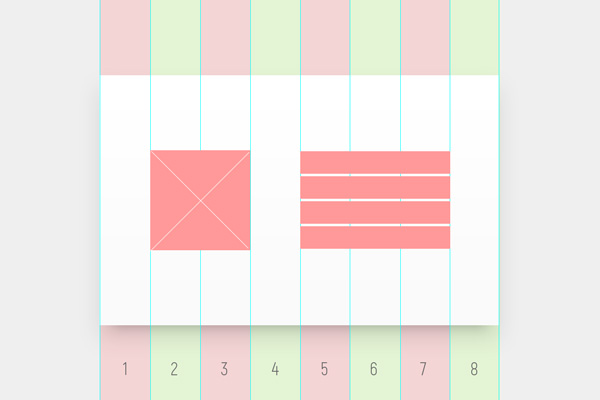
* Another example. You need to create a typical business card block consisting of a logo / avatar (left) and contact information (right). How many columns are needed? Let's estimate.
If we want to make an equilibrium composition, we can even get by with two columns. In this case, the alignment of the logo will be central, and the text will have to be placed on the eye. And we can assume that the width of the text takes about twice as much as the logo, and accordingly make a block in three columns. And you can go even further and lay in the grid also indents. Suppose there are 1 column on the left and on the right, the logo will take 2 columns, text 4, plus 1 column indent between the logo and text - a total of 8 columns. *
In such a simple way you argue while thinking over the grid. If there is a lot of content, but the eye is not intended, you can fly the first time and, as you work through the details of the layout, understand that the grid is not suitable. This is normal. Nothing wrong.
When it comes to a single layout, it is not difficult to adjust the design to the new grid. If the project is large and involves an abundance of pages or layouts with a single canvas (website, brochure, book, etc.), it is better to lay some margin of safety in the grid and carefully test it with random content from different pages. Safety factor, as a rule, is achieved by a multiple increase in the number of columns: for example, you now only need 3, and you lay 6 or 9.
I will note one nuance. If you do something with a pronounced central composition and actively use horizontal centering, it is more profitable to make the number of columns odd. This will allow even distribution of indents and content. The advice also applies to the internal crushing of columns. In the example above, if you had 3 columns and you needed to detail them, with the central composition you will break each column by 3 more, but with symmetrical - by 2 or 4. As a result, in the first case there will be 9 columns, and in the second - 6 or 12.
Why everyone loves 12-column nets
It's simple. The number 12 is divided into: 12, 6, 4, 3, 2, 1. Therefore, the grid is flexible and allows you to organically make up blocks of almost any number or width. Moreover, by discarding 1 or 2 columns at the edges of the layout as fields, you get a block in the center, which is also divided into 10, 5 or 8.
From personal experience I will add that it is very convenient to draw adaptive layouts, starting from the width of 1200 pixels, especially without inter-column spacing. You get 12 columns with a nice width of exactly 100 pixels and constantly orgasm from round numbers in the process. And when you need to place a button on a layout, you don’t drag the boundaries of the rectangle back and forth, but instantly and without thinking you drive in a size: 300 by 60 and click on the layout. By the way, it is useful to teach yourself to position the elements not with the mouse and arrows, but by inserting the number of indents on the X and the little game — the layouts will become tidier.
If the content does not imply end-to-end layout, it is convenient to make 24 columns and work with them in the same way as with column spacing, simply by retreating a full 50px column if necessary. This creates enough air around the content, and the layout looks expensive. If a smaller interval is required, exactly half of the column is taken, that is, 25px. All calculations on the fly, the numbers are comfortable.
Column Distance (gutter)
Why and when do I need to indent between columns?
We do not always make a mosaic. Most often, the content is not butt-mounted - there must be some distance between the two blocks so that they do not stick together and do not overlap each other.
In addition, to relieve the load from the viewer's eye, air is needed, a white space. When there is not enough space in the layout and a lot of information (in a newspaper, for example), increasing the column spacing becomes almost the only way to somehow delimit text-graphic porridge.
In most cases, the column spacing is significantly smaller than the column width. Its size is also determined by the features of the content. If you are creating an interface where there are many classic controls, the narrow distance between columns serves as a convenient separator. For example, between the search line and the button, or between the checkbox and its label. (Although on the whole it makes sense to think about a “square” grid: 4px or another, without any columns at all, and there are also reasons for this). If you make up a page with large text blocks organized in only 2-3 columns, then it makes sense to make the intercolumn distance large enough to give the content maximum air.
As mentioned above, from personal experience, very many things can be made up with a zero intercolumn distance with a large number of columns. In this case, the width of the whole column is taken as indentation, and all marginals are large, characteristic of "noble" typography.
Just don't let the pleasant word “noble” bribe you - in the commercial segment such a design is not always good. In general, the more active and aggressive the sales scheme, the hungrier and angrier the customer’s marketers, the denser the layout will be and the less air will remain there. The limiting (or, rather, the ultimate) case is the newspaper free advertisements a la “From hand to hand”, where the occupied area directly determines earnings. Of course, there is no need for aesthetic delights with giant fields. With the same success, you can just get into the founder’s pocket and borrow a couple of hundred dollars from there until next winter. There is no difference, but agree less.
Module
Actually, it is in such an uneasy way that you and I got to the defining concept of “module”, after which the modular grid was named. Usually they start with it, but judging by the questions of designers, this approach does not work. So what is this all about and why is it needed?
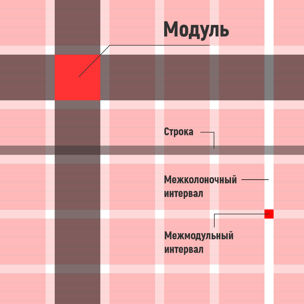
In fact, it is just a proportion. The width of the module is equal to the width of the column, and the height is several lines. How many? Depends on your design and on the effect you want to achieve.
* A few years ago I happened to make a site dedicated to pylons - pole for dancing. Naturally, the module there was strongly extended vertically. I used a ratio of width and height of almost 1: 3. Firstly, because the overwhelming majority of illustrations were of portrait orientation and were also drawn out. Secondly, because the product itself and the whole style assumed a certain amount of phallic symbolism. A module is defined by content, composition, and style.
If you do something “stable”, then vice versa: it makes sense to think about a module that is slightly stretched horizontally. If you are creating a huge long table that serves as the main content in the layout, then it is obvious that you need to take one or two basic lines of this table as a module. In a word, think. *
In principle, no one bothers you to build more complex grids. In them, for example, modules of different heights can alternate. The main thing is that there should be some kind of logic and regularity that preserves the vertical rhythm.
Let's say you make a portal. You have a menu with a height of 3 lines, followed by a banner of the main news with a height of 9 lines, then a row of some numbers (exchange rates, weather, etc.) in 3 lines, then a row of several news items of the second plan for 9 lines. That is, all the content alternates: 3-9-3-9-3-9-3 ... In practice, this technique is rarely justified, it is not very flexible. But keep in mind that the rhythm can be difficult.
Grid in the grid
Yes, it happens. When the project is complex and multi-component, you can use several nested grids. The simplest example: the general layout of the layout (layout) uses giant columns with large text, and inside one of them is the form of a calculator with a bunch of controls, laid out on a 4px square grid. There is nothing particularly criminal about this.
Moreover, when it comes to websites, some of your content can be completely foreign and embedded: players, online maps, widgets, payment frames, etc. Million options. These elements will have their own internal grids that you do not control. And this is also normal.
What you can do is observe the internal and external rules for containers containing these blocks. More specifically, to give around enough air (including vertically) so that they do not cling to the rest of the content, look apart and not drag extraneous elements into their visual zone. All distances and proportions in your layout are relative, therefore, roughly speaking, you can balance someone else’s content “outside” almost as well as you would if you resized the size of its content “inside”.
Optical compensation
Perfectionist designers find it difficult to understand this point. A grid is simply a methodology to simplify calculations. This is not a symbol of faith, not the law of the universe, and not a panacea. Moreover, mathematical proportions for purely physiological reasons are not ideal for human perception. The grid does not take into account the occurrence of optical illusions and distortions.
Therefore, if your eye tells you that some element needs to be moved a couple of pixels to the right of the guide grid, you can do it. (Not the fact that the layout designer will notice and keep your optical crutch, but still).
A separate important point: the elements in the grid are aligned on the visual mass, and not on the overall boundaries. This means that (ideally) a circle aligned to the left field will almost always be a few pixels left of the square, which is aligned to the same field. A small subscript under a large heading almost always needs to be shifted to the right, because the optically left edge of the first letter of the heading will be to the right than “according to calculations”. This particular optical compensation .
There are quite a few such subtleties. But it is important to understand that in the case of web design you almost never get the perfect picture. Web layout is often formalized, it relies on the formula dependencies of frameworks to flexibly adapt to different devices and platforms. And it is almost impossible to scale up your 3-pixel header offset adequately with all the features of anti-aliasing, anti-aliasing and other abusive words. This should be taken philosophically.
Summary
Perhaps, everything is all right. The text is already voluminous, special conclusions are not needed: either to delve into it or not. In any case, thank you for your attention and interest in the basics of design and typography. Successes.
')
Source: https://habr.com/ru/post/344910/
All Articles