Interface Cheat Sheet
Have you ever faced the situation: “Can you make it even better?”, Having only your own head and a certain piece of time at your disposal? There was a desire to improve the existing interface, but did not know where to start? If so, the article will be useful to you.
I will say right away: the knowledge is completely taken from the book “User Interface Design. The art of washing an elephant ”by V.Golovach. For me, the material turned out to be so useful and cool that I wanted to share it. If you have already read the book, you will not find anything new, if not, welcome tackle. The article turned out to be quite a big one, but it's worth it.
So, in order to improve a certain part of the interface, the author advises asking yourself pre-prepared blocks of questions in a certain sequence.
1. Is it possible to speed up user interaction with this interface?
')
2. Where in this interface are places that can produce human errors?
Is it possible to change these fragments?
3. What in this interface is not conducive to learning? What the user needs to know
to successfully interact with this interface? Does this list
something that the interface itself does not tell the user?
These three questions must be asked one by one. If after the answers it is clear that the interface needs to be changed, the remaining questions need to be asked again after the rework.
If we managed to give a negative answer to all three questions, we will start
4. Do I know anything about users that makes this interface bad?
5. Does this interface satisfy all the user's motives known to me?
6. Is this interface compatible with the environment in which users work?
If everything is fine on these issues, we proceed to check how the users tasks are performed in the interface.
7. Are there any tasks that are inefficiently handled by the interface?
As a rule, it is enough to speak out loud (and even better to write), as in this interface the user performs all his tasks (the best way is to write about yourself and not about an abstract user, for example, “From the Document menu, I open the zeta transformation settings window, enter the value 40 in the field Number of people, then open ... ").
This check reveals a lot of inconsistencies or simply missing pieces.
If this happens, go back to the very first question. If not, ask
8. Is this interface sexy and can it be made even sexier?
As you can see, there are only eight questions and there is nothing particularly scary about them. There is only one trick: any product has many functions and, accordingly, whole "pieces" of the interface. Questions must be asked for each piece.
For example, use the program from the delivery of Windows - Calculator (normal, non-engineering, mode).
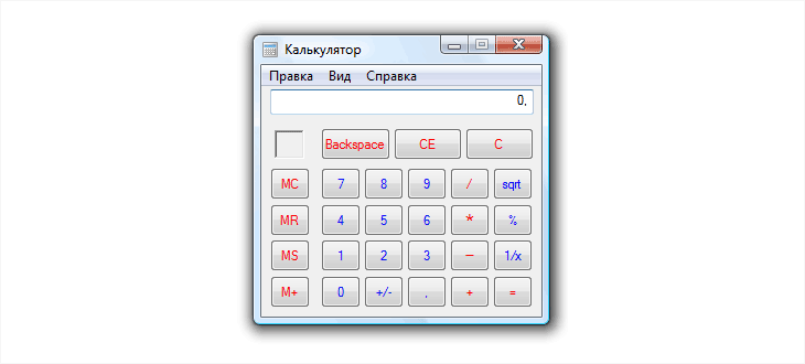
We divide this interface into fragments for separate verification.
They are: the main menu, the display of results and the panel itself with numbers. Accordingly, you need to ask yourself 32 questions: 24 for individual parts of the interface and another 8 for the program as a whole.
Its only non-standard element is the switch “Number of digits in a group”. If you turn it on, long numbers will be divided into parts of three digits.
Start asking questions:
When asking yourself these questions, you should always remember that there is a risk of giving the wrong, or, more often, incomplete answer.
“When analyzing the calculator interface, I personally missed such a common task as calculating with brackets. Traditional calculators do not know how to perform it (most likely, the traditional design was formed when the memory registers needed for the brackets were an unaffordable luxury). The MC, MR, MS, and M + buttons (and the memory usage indicator) were a clumsy attempt to solve this (in particular) problem. For our calculator, such a calculation is not a problem, so in an amicable way, the MC and MR buttons should just be replaced ” - author's note.
So, in the Calculator program is at least:
As you can see, eight magic questions in just a few minutes allow you to make a solid list of desired improvements - which, in fact, is required to start a design.
I would like to say that no other method provides such high efficiency.
Unfortunately, there is an intellectual trap here. The fact that you now know these questions does not help or contribute to anything. Their knowledge is not enough - they need to be asked. If you do not ask them yourself - questions will not help you. For this knowledge to work, it must be actively implemented in its project activities (as, strictly speaking, any other knowledge).
I will say right away: the knowledge is completely taken from the book “User Interface Design. The art of washing an elephant ”by V.Golovach. For me, the material turned out to be so useful and cool that I wanted to share it. If you have already read the book, you will not find anything new, if not, welcome tackle. The article turned out to be quite a big one, but it's worth it.
So, in order to improve a certain part of the interface, the author advises asking yourself pre-prepared blocks of questions in a certain sequence.
Block one:
1. Is it possible to speed up user interaction with this interface?
')
2. Where in this interface are places that can produce human errors?
Is it possible to change these fragments?
3. What in this interface is not conducive to learning? What the user needs to know
to successfully interact with this interface? Does this list
something that the interface itself does not tell the user?
These three questions must be asked one by one. If after the answers it is clear that the interface needs to be changed, the remaining questions need to be asked again after the rework.
If we managed to give a negative answer to all three questions, we will start
The second block of questions:
4. Do I know anything about users that makes this interface bad?
5. Does this interface satisfy all the user's motives known to me?
6. Is this interface compatible with the environment in which users work?
If everything is fine on these issues, we proceed to check how the users tasks are performed in the interface.
7. Are there any tasks that are inefficiently handled by the interface?
As a rule, it is enough to speak out loud (and even better to write), as in this interface the user performs all his tasks (the best way is to write about yourself and not about an abstract user, for example, “From the Document menu, I open the zeta transformation settings window, enter the value 40 in the field Number of people, then open ... ").
This check reveals a lot of inconsistencies or simply missing pieces.
If this happens, go back to the very first question. If not, ask
Last question:
8. Is this interface sexy and can it be made even sexier?
As you can see, there are only eight questions and there is nothing particularly scary about them. There is only one trick: any product has many functions and, accordingly, whole "pieces" of the interface. Questions must be asked for each piece.
Usage example
For example, use the program from the delivery of Windows - Calculator (normal, non-engineering, mode).
We divide this interface into fragments for separate verification.
They are: the main menu, the display of results and the panel itself with numbers. Accordingly, you need to ask yourself 32 questions: 24 for individual parts of the interface and another 8 for the program as a whole.
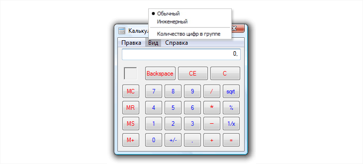
Menu
Its only non-standard element is the switch “Number of digits in a group”. If you turn it on, long numbers will be divided into parts of three digits.
Start asking questions:
- Is it possible to speed up user interaction with this menu? - Not.
- Where are the places in this menu that can produce human errors? Is it possible to change these fragments? - The name of the item “Number of numbers in a group” is difficult to make completely understandable. You can, of course, rename it to "Split long numbers into groups", but this is very long. Maybe the item should be thrown out of the menu, including the default division?
- What in this menu is not conducive to learning? - If we throw out the element "The number of digits in the group" - nothing.
- Do I know anything about users that makes this menu bad? - Not.
- Does this menu satisfy all the user's motives known to me? - Yes.
- Is this menu compatible with the environment in which users work? - Yes.
- We proclaim a list of all the tasks that the user can solve using the menu. It seems that there is nothing problematic.
- Is it a sexy menu? - No, not sexy. The standard cannot be sexual at all. But here it is not necessary.
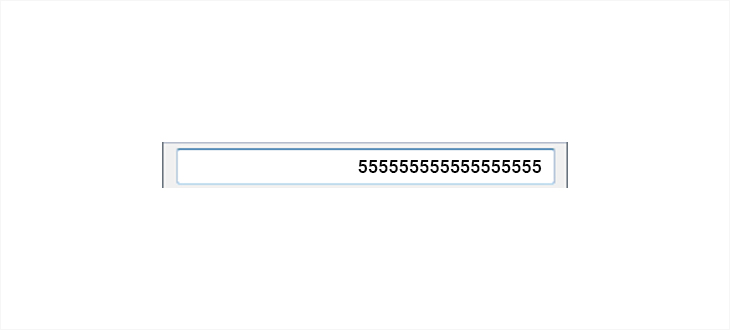
Display the output of the result:
- Is it possible to speed up user interaction with the output field? - Obviously yes, because long numbers are slowly scanned with a look. It is necessary to enable the split mode of long numbers by default.
- Where in this field are there places that can produce human errors? Is it possible to change these fragments? - If the user needs to read the result of the calculation, and not just copy it into another program, showing long numbers in a box can cause errors. It is necessary to turn on the splitting mode of long numbers by default. In addition, it is useful to increase the size of the digits in order to improve their intelligibility. The current interface does not help verify the results of your calculations: the only way to self-test is to repeat the calculations and compare the results for an unreasonably long time. Any self-checking mechanism is needed, for example, it is possible to show intermediate results of calculations.
- What does not encourage learning in this field? - Seems OK.
- Do I know about users anything that makes this field bad? - Not.
- Does this output field satisfy all the user's motives known to me? - Yes.
- Is this field compatible with the environment in which users work? - On monitors with a large number of dots per inch (for example, on many modern laptops) the numbers can be so small that they will be difficult to read. Worth increasing.
- We pronounce the list of all tasks that the user can solve with the help of the block showing the result. It seems that there is nothing problematic.
- Is this interface sexy? - No, not sexy, because it is standard, but it doesn’t cost anything to change: for example, increase the size of the numbers or choose a font with specific numbers. Or do both.
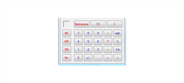
The panel with numbers:
- Is it possible to speed up user interaction with this panel? - Unlikely.
- Where in this panel are there places that can produce human errors? Is it possible to change these fragments? - The intelligibility of the multiply and subtract buttons (pictograms * and -) is not very high, which can produce errors. Increase the size of the icons in the buttons of arithmetic operations.
- What does not encourage learning in this panel? - The names of the MC, MR, MS and M + buttons do not tell the user anything if he does not know their purpose. This is normal for the engineering version of the calculator, but not acceptable for the normal one. It is necessary to increase the size of the buttons so that the best names fit into them (or even abandon them altogether, since there is still a clipboard). What is the difference between button C and button CE? Maybe this CE can be implemented in the output field?
- Do I know anything about users that makes this interface bad? - Users obviously use this interface inconsistently (complex calculations will still have to be done in the engineering version of the calculator, and for a frequent account a real calculator with large keys giving tactile feedback is more convenient). Unnecessary terms on the buttons from the previous paragraph are clearly not suitable for ever-inexperienced users.
- Does this interface satisfy all the motives of users known to me? - Yes.
- Is this panel compatible with the environment in which users work? - Not; At least for new monitors with high resolution and small screen size, it does not fit - too small controls (their size was optimized at the time of 15-inch screens at 800x600 pixels).
- We proclaim a list of all the tasks that the user can solve using the keypad. It seems that there is nothing problematic.
- Is this panel sexy? - No, not sexy. However, it is not clear how this can be fixed.
When asking yourself these questions, you should always remember that there is a risk of giving the wrong, or, more often, incomplete answer.
“When analyzing the calculator interface, I personally missed such a common task as calculating with brackets. Traditional calculators do not know how to perform it (most likely, the traditional design was formed when the memory registers needed for the brackets were an unaffordable luxury). The MC, MR, MS, and M + buttons (and the memory usage indicator) were a clumsy attempt to solve this (in particular) problem. For our calculator, such a calculation is not a problem, so in an amicable way, the MC and MR buttons should just be replaced ” - author's note.
Conclusion
So, in the Calculator program is at least:
- Show the results of calculations divided into groups of numbers (317543 => 317 543) by default, removing the corresponding menu item.
- Increase the size of the numbers in the results field.
- Increase the legibility of math operations buttons.
- Beat the memory operation buttons, but insert the buttons for the brackets and do something with the square root button.
- Ideally, when starting, ask the OS for the screen resolution and increase the size of all elements if the resolution is too large.
- Implement showing intermediate calculation results.
- Make the window always floating on top of other windows (by setting). This interface has a problem: if you need to make a series of calculations, copying the results into another window, the calculator window will disappear all the time, overlapping the window into which the results are copied. The user will have to spend time every time returning to the calculator window.
As you can see, eight magic questions in just a few minutes allow you to make a solid list of desired improvements - which, in fact, is required to start a design.
I would like to say that no other method provides such high efficiency.
Unfortunately, there is an intellectual trap here. The fact that you now know these questions does not help or contribute to anything. Their knowledge is not enough - they need to be asked. If you do not ask them yourself - questions will not help you. For this knowledge to work, it must be actively implemented in its project activities (as, strictly speaking, any other knowledge).
Source: https://habr.com/ru/post/344768/
All Articles