Criticism 1C
I want to criticize the 1C platform and configuration, because there are problems, and there is some silence on the network, as if everyone is happy with everything. Sorry, but not satisfied. I want the article to be read by ordinary 1C programmers (not employees of 1C), and maybe even supported me.
First, not a lot about yourself. I want to say that I personally like 1C, and I will certainly use it, wherever I go. I am familiar with 1C from version 7.7. I am a certified v8 platform specialist. I am a developer and participated in the development of several configurations. There are knowledge of different programming languages (from ++ go js, etc.) and ready-made crafts in production. I have an independent system engineering thinking.
Artemy Lebedev, as he said, never reads praise, but always reads criticism, because criticism will allow him to become better. I hope you will take my criticism in the same way. I do not want to offend anyone, and I apologize in advance if I was too emotional.
')
I want to criticize the platform and configuration. Here, many will immediately object if you criticize the offer. Yes, I will offer. And I think my suggestions may be useful to you. I will try to be interesting.
Criticism of the Platform 1C v8
1. Platform Releases
If you go to the 1C website in the software update section, then you can see that in October 2017, the 1C company released as many as 2 releases of the platform 8.3.10.2639 and 8.3.10.2650.
- Why is it so much?
- But how much we want so much and release!
That's right, only it turns out that each new release removes old errors and adds new errors. I fell for it. Once the configuration asked me to install a fresher platform release, and I did it. And there were mistakes in this release. I had to wait and put the next release. Of course the errors were corrected. But new ones appeared - others! I had to put the next release. Well, and so on, well, you understand me. And in the office of 100 computers, and even 10 remote points - a huge zoo in general. I don’t want to install releases often. And so I think that you do not need so many releases, let them be less, and let there be a minimum number of errors.
Sentence:
Just give 1 time per year 1 stable release. And so that configurations can only ask for a stable release, but no more. Once a year, you can reinstall everything, this is just the perfect balance. Came out on the January holidays, and without stopping the business, everything quickly reinstalled. Yes, a lot of development companies do this - they release a stable release and a bunch of releases at their own peril and risk.
Surprisingly, but a fact!
It is quite normal to take money for an ITS subscription every month, and not to release releases every month. (No, well, suddenly you do not know.)
Just note
When they told about a serious problem in one sentence, then surely they would not even pay attention to it. On the idea of a serious problem, you need to talk a lot, so that your opponent will understand that it is serious.
2. Main menu
There are two problems with the main menu in managed forms: it is vertical and in the horizontal there are icons that interfere!
If the main menu is vertical, then it takes up a lot of space . And we need more users workplace.
To emphasize that this is important, I repeat once again: We need more workplace!
In addition, all programs have a horizontal menu, it is familiar, convenient, this solution is time tested.
They will say to me: “Well, make it horizontal, there is such an opportunity!”
That's the point, if you make it horizontal it will be too long. I have 2 1C programs side by side, one on the left side of the screen, and the other on the right, which is sometimes necessary. And when I do that, I want to see the entire menu. And the entire menu on the half screen is not included. I do not want to click on the button scrolling menu.
I just want my main menu to be compact!
Do you know why? Because I do not admire the main menu, I work with it.
Here is a screenshot of half the screen. As you can see, the Accounting configuration menu on ordinary forms is included in the half of the screen, but not on the managed ones!

I also want to note that the usual ordinary accountant does not even know that the vertical menu can be turned into horizontal. Surprised?
Sentence:
Make the main menu horizontal by default. Honestly, I would have thrown out the vertical menu mode altogether (but who would let me). We make this menu as compact as possible. To do this, throw out the icons from the main menu, and make the intervals between words minimal. But the icons are entered in the submenu to be beautiful.
Also, each item in the main menu should consist of one word. Two words are already bad. Well, why do we need the menu item "Financial result and controlling"? Well, forgive this some Ponte. What is the word "Reports" are not satisfied?
The horizontal menu is now too high, making it smaller in height.
The main menu on the usual forms is beautiful, take it as a basis and redraw the style of a taxi.
If now the main menu is bad, then the submenu is just good. The idea that the submenu should be full screen is wonderful. So develop this idea. Allow me to create icons in the submenu, both for the group and for the menu item. Plus more free location on the screen.
Axiom
The commands in the menu and submenu should always be in the same place. They do not need to shuffle. Memorized once and all. And then you can click on the menu item without even reading it. You know where it is, click and the result. This greatly facilitates the work.
3. Determining the type of metadata object by color
Sometimes you look at the form and do not understand what kind of metadata object is in front of you - especially in some Salary. It is not clear what is in front of you: a report, processing, document or reference book, and maybe something else. And you have to strain, grasp. Yes, sometimes even after reading everything, you can not guess which object of metadata is in front of you. But if you know what object is in front of you, then comes an understanding of what can be expected from this object, and how approximately it works.
And I want to know what kind of object without straining. For example, I open an unfamiliar configuration, open any form from the menu, and use the header color to determine which object is in front of me: a reference book, a document, and maybe a report. This will greatly facilitate the recognition of forms, and work in general.
I also want to note that a taxi is of a different color, not only yellow, but also light yellow, white, black, gray. I even saw a pink taxi.
Britannia

Japan

Russia

Germany

Different colors will not disturb your stylistics at all Taxi, but will fill the form with color sense.
Sentence:
- Directories - Web Colors. Silver
- Document Logs and Document Lists - Web Colors. Light Heavenly Blue
- Documents - no change or some kind of steel
- Reports - WebColors. LightGold
- Treatments - Web Color. Pink
- Residual registers and information registers - Web Colors. Light Green
We make a standard style for the platform and assign it as the default for any form. Not at the configuration level, but at the platform level. And for an object, if any other style is not selected, then the form uses the standard style.
Well, look at how our forms cool played. Do the same for Taxi. And the color for the usual forms and for the managed ones should be the same.
Just a fact!
When you remember which color corresponds to which form you do not want to part with it.
4. The choice of period
What a pity that the period selection button does not have a hot key . Here the button "Add" has the same Ins. So why not add a hotkey to the period selection button? Well, for example, F5, or some other. At the platform level, of course.
But there were a lot of windows for choosing the 1C period, but everything was not that, and there was always confusion and vacillation.
Here is an example and it seems not bad

or here

or here
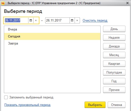
We need one thing, but which will allow me to choose any period for the minimum number of mouse clicks . In simple cases, in just one click.
Let me introduce you to this window. Immediately make a reservation that this window conveys only the idea of how to do it. On this window, of course, you still need to work to make it both beautiful and perfect. And besides, I was limited to elements from the configurator set. And low-level developers themselves can develop any elements.
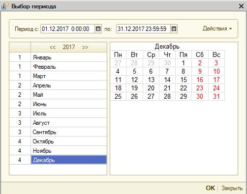
In this window, the period is selected for the minimum number of clicks. If you need to select the Month period, this is just a double click, for example, on December. If you need to select a quarter, double click on the number of the quarter. It is also easy to choose a day.
If you need to select two months, then multiple selection is used.

And yes, it looks like your calendar window.
I also want to note that in this window there should be hot keys, so that the period can be typed without a mouse. If we print numbers, then the beginning and end of the period are typed in sequence. The left arrow or right arrow keys will change this sequence. The up arrow or down arrow keys allow you to move the month selection cursor. And if you press with Shift, then there is a multiple choice. Page up, page down is the change of the year.
5. All functions.
The "All functions" window does not have a hotkey. It's a pity.
Sentence
I think everyone would suit Ctrl + P
The "All functions" window is slow! It is very slow. And the speed of its opening is different. Sometimes slowly, sometimes a little faster, but still slowly. I have an SSD drive, damn it, I want this window to open instantly. In the ERP on the SSD drive opened a record 8 seconds, but usually 2-3 seconds metering on the eye.
Well, is it really difficult to read all the objects at boot time and store them in memory. And then you can open such a window instantly, without reading anything from where.
On a note
When the system slows down, it is wildly annoying.
Window "All functions" unfortunately modal . This is bad. It limits my freedom. It may be necessary to open many documents or reference books at once. And what, I have to tire every time to open this window through the menu, wait for a long 2-3 seconds when it opens, and then look for the desired document in the long list even longer?
Sentence
Yes, make it not modal ! You are welcome! Well, if you want a deal, then let it be not for everyone, let it be only for the elect.
The "All functions" window has no filter . And this is terrible. Directories, documents, various registers and reports in the hundreds of configurations. How in these hundreds to quickly and easily find the right? It is desirable for me to look in such a way as not to tire my eyes. To do this, use a filter. A filter is such a search field where we type the text, and the filter leaves us in the list only those lines that contain our entered text. Ha, I know that you know what a filter is. I just wanted to excite you a little, so that you feel what I feel when looking for the document I need without a filter.
And you know, it happens in an unfamiliar configuration, you can search for some report, but you do not know how exactly it is called. And then the filter just doesn’t really help.
In addition, in the configuration where there is an ID, Synonym and Comment field it would not be bad to insert the “ Keywords ” field. And then in the “All functions” window it would be great to search for objects, not only by synonyms, but also by keywords.
Sentence
The offer is very unexpected. Insert in the window "All functions" filter! In addition, I would add selection buttons for metadata objects. You click on the "Documents Only" button and only documents are displayed. You click on the “Directories Only” button. Well, you understand me))
What was the result of the window "All functions":
- hot key
- instant opening
- not modal
- filter and selection buttons for metadata objects
- keywords
6. Search in the Configuration window
How terrible is the search in the Configuration window in the configurator.

To hell, it was necessary to highlight the found line in red, and draw some lines in gray. This is really hard to read. You know, if 1C programmers take to organize a filter, then they do it. I do not need to prove backlighting that you did everything right. I believe you, then.
The second problem here is this: why was it necessary to organize a search by details? Some nomenclature is contained in a huge number of objects. That's the point of this search. In the configuration window, configuration developers want to quickly find exactly metadata objects, but not details and tabular parts.
Sentence
Remove the backlight in red and gray.
Remove search by details. Filtering should be by metadata objects only.
I strongly doubt that you need a search for details, but if you need it, then this function should be in the global search.
7. Window about the program
You know how it happens sometimes. You call to far away lands, it’s about 500 km. There, the aunt who had just milked the cow, her head was crammed with some other things, and now she ran into the office of a remote point, and something broke inside her. She asks for help. So I want to make sure that she launched the configuration. I dictate to her how to open the About window in order to read the configuration name and release number there. But she can not find there, neither the name nor the release number. But it is there! Just imagine, there are such people. And so I think it would be great if the window about the program would be presented as a table of values. Conveniently, clearly, everything is read. No need to look for anything. Even a simple milkmaid will figure it out.

And I tell you seriously about the milkmaid, this is no trolling.
Sentence
It is necessary to alter the window "About the program" so that it is understandable to an unprepared user. For example, decorated in a table of values.
8. License window
At the moment, information on licenses looks like this.

That is a window the size of a postage stamp, in which nothing is clear at all. What do you feel sorry for the new window?
Make a new window in which the licenses will be displayed beautifully - in the form of a table of values. What is HASP4 ORGL8 1?
The words are important: A hardware license, or a software license, so that an untrained person can read this.
But there was another case.
- Well, what is written there?
- And then something is written in English.
- Yes, do not worry, read.
- I taught German at school!
Haha, programmers, ate yes. She taught German at school.
And you know, she said it, with such pleasure.
9. Syntax Assistant
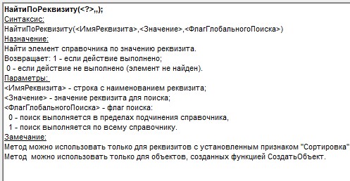
Now the syntax assistant issues articles like this:

That is, we see a terrible wall of text that does not help me quickly to see what I need. But I do not want to read this text completely. I just want to quickly get to the right information, using only formatting.
The order of the blocks in the article is important. And it should be like this:
- Syntax
- Description
- Return value
- Options
- Availability
- Note
- Example
So the way was in 1C 77. Here is a screenshot.
And by the way it was good. Satisfied. Why it was necessary to redo it.
Design your article in a new way. Well, isn't that better?

What makes the function SearchProRequest - the eye finds immediately. There are no corner brackets to tear out the eyes, they are not needed, there is no secret meaning in them. Everything is separate and easy to read. Pretty.
It is a pity that the syntax helper does not really remake? Yes? And if we allow increasing the price for an ITS subscription by a thousand, for example, can it be?
But if you still think about it, then in the help you need to be sure more examples. I want to see not just an example of a function, but also its environment. I want to go to help, and just copy the example into my code, then a little bit corrected, and I'm great.
Suddenly.
It’s quite normal to sell a program without books at the same price. A reworked quality help system can easily replace books. Books in the delivery platform extra load and extra costs. But you can save money.
I almost forgot. If you type Record in any module, stand on it with cursors, and press Ctrl + F1, the system will show a window with a long list. Well, of course, because the function Record refers to a large number of objects. However, I do not want to read the resulting wall of the text. I think in this window you also need a filter field. This window requires serious processing.
Dessert
11. Window to full screen
Not the first in the list, but the first in importance . Very often, almost every day, you come across the fact that you need to see two or three windows at the same time.
What for?
To compare two reports
To compare report and document
To compare document, movements and report
To compare documents
Both sums and values of reference books can be compared, for example, whether goods or customers are the same. I can compare whole columns. In general, there are plenty of scenarios for this.
Well, compare:
3486286.45 = 3480286.45
Zhilstroyproekt PGK PAO = Zhilstroyproekt PGK PAO
Cigarettes Marlboro Touch MLT blue and blue. metal = Marlboro Touch MLT cigarettes blue and blue metal
Or a column of numbers compare:
458902.34 = 458902.34
5678221.43 = 5678221.43
673324.88 = 673354.88
2238769.89 = 2238769.89
Now imagine that these values are in different forms. Really fun, huh?
Previously, 2 windows at the same time could not be viewed at all, in controlled forms. But then the good 1C took pity and resolved. But damn! Still not comfortable!
Firstly, these windows are narrow, and you have to move the scroll bars - and this is not convenient.
Secondly, to open the windows you need to strain the mosque , which is not acceptable for such an operation. And on the usual forms, to do this, I did not strain anything. Yes, it seems that there is easy. But you need to know about such an opportunity, to know about such a split button. Tagged into her. Yes, and you need to select the window on the open panel. And when you opened it all up, you see that you still need to tune the windows with scroll bars.
Well, imagine a person for work has 100 units of attention. And let's say, to set up 2 windows you need 5 units of attention. It seems to be a little bit, but gradually consumes our limit of attention, and this is tiring. And on ordinary forms, I did not even think about such an operation, and spent zero units of attention.
On ordinary forms we could see several windows at the same time, so we (users) also want to see on managed forms. And this is so important functionality that it outweighs the other arguments. Well, because of what you can not do it? Because managed forms are displayed in a browser? Or maybe it will break some beauty and style? Or is it difficult to do technological limitations? And maybe some important leader comes up?
I am sure that this can be done technically. And if it's a browser, then in the end you can leave the browser as it is.
If you make this functionality, you really facilitate the work of users.
It is necessary, just necessary, and do not argue.
Another note.
Run two 1C programs to solve this problem does not offer! Because this method uses another license.
12
...
13. Client server interaction.
First, let's deal with the definitions.
In 1C now there are 2 types of forms: the usual forms and managed. Managed forms are such a complex collective concept. The managed form is stored both on the client and on the server, itself created by the platform according to certain rules. And in order to explain everything to me, I will break the concept of a controllable form into two: 1 Method of describing form. 2 Client server interaction.
The way to describe the form is the way we draw it, and what we need to store for it.
In ordinary forms, this method is called coordinate . We store the coordinates of each element of the form, and draw each element along the coordinates.
In managed forms, this method is called declarative . We declare that there is a certain element on the form and the system draws it itself according to certain rules. Elements follow each other, they do not need coordinates. The idea of a declarative form description is beautiful. The elements themselves are arranged, look smooth and beautiful, no need to bother, as they have to spend, spend time on it. Automation.
Both methods are needed, they both fall on the farm.
The second concept of Managed Forms is Client-server interaction .
If on ordinary forms the code was written like this:
 ()
	// -
:
&
 ()
	//   .


&
 ()
	();
:
- &
- &
- &
- &
, . , . , .
! !
. . .
, .
1. .
, . . . ++ auto .
:
«, , , ».
Go, . Go .
, 1 , .
1 -, -. , .
, . .
. .
. . .
!
.
.
, ? . 1 — . .
— .
1: — ?
, 1, . , , , . , . , , .
?
, .
? , , . , , . , , , . .
, , , .
, .
“Company viewer”. «team viewer» «radmin», . , teamviewer Windows, , . , Windows, 1, , . , jpeg . . .
, “Company viewer” 2 : ( 1) ( ).
“Company viewer” , , . , 1 . , 1 . .
:
, . ( , , , .)
, . , , . , . - . , .
1 , - , . — , , , .
, Windows, 1, .
, 1. « ».
, -, . ? . .
, , .
!
, web 1 , . — , , 1 . – , 500, 1000. . , , . — , 1 — .
, , !
- .
«Company viewer»
, , , . ? v9? .
, , , ERP, , . , . . , . . . . , , , 1, , , , « », . .
. , :
« ;
:
-.»
. . .
Keyn
Source: https://habr.com/ru/post/344616/
All Articles