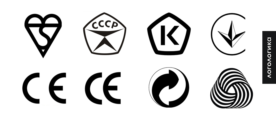
Quality marks - design and history
For marking products that meet certain standards, use special marks, which are called marks of certification, marks of quality standards, or, simply, marks of quality. Such marks are national, international, industry or special. Many of them are examples of good graphic design, so I propose to consider some.
The mark was used for marking high-quality serial products produced by enterprises of the USSR, was introduced in 1967 with the aim of improving the quality and production efficiency.
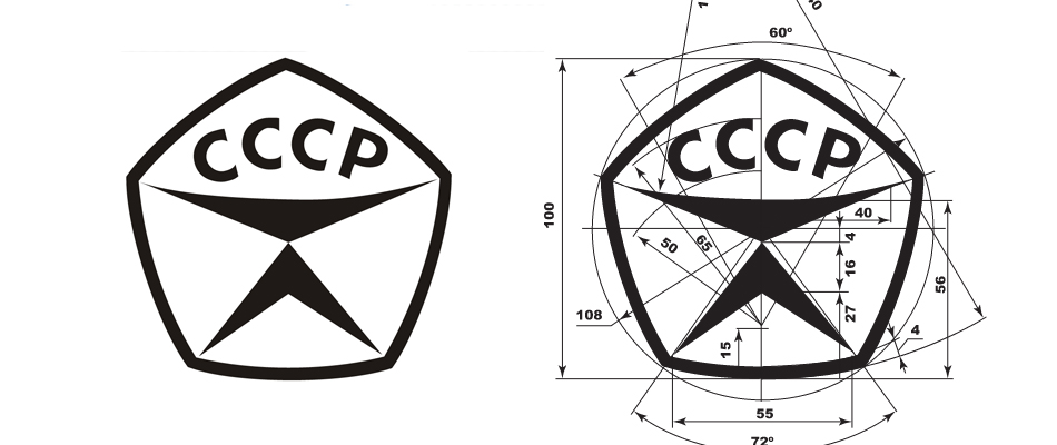
The general shape of the sign - the pentagon - refers to the five-pointed star, the main heraldic symbol of the Soviet Union. In addition to the abbreviation, there is a symbol in the pentagon that presumably combines several meanings: the scale, the letter “K” (quality, rotated 90 °), the silhouette of a person. One of the authors of the sign is the People's Artist of the USSR Valery Akopov.
')
In 2013, the Ministry of Trade and Industry made a decision to revive the certification system in Russia according to the principle of the Soviet. To this end, a competition was held in 2014, which resulted in the selection of a sign drawn by designer Dmitry Mordvintsev, a colleague of Valery Akopov.
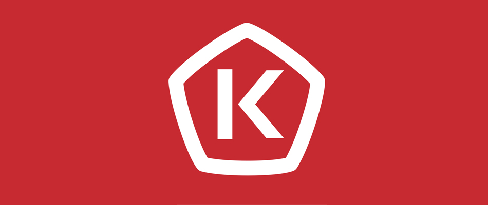
The sign clearly refers to the Soviet mark of quality, and, in fact, is its primitive rephrasing.
CE-mark is used in EU countries and the USA and guarantees product safety. Such labeling is mandatory for all products in the European market, in contrast to certification for compliance with quality standards.
The mark CE-mark is a composition of two letters "C" and "E", built on touching circles.
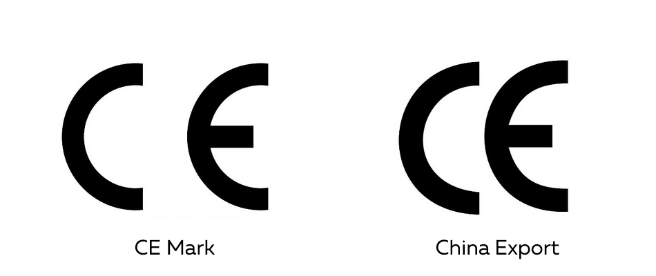
But the sign China Export, visually different from the CE-mark only by the distance between the letters, means only that the product was produced in China, and does not imply any standards compliance or certification. Coincidence? I do not think.
This expressive, from the point of view of graphic design, sign, which is also called “trefoil”, indicates that the product conforms to Ukrainian standards and regulatory documents.
The name of this sign is translated from German as "green dot". The sign depicts two arrows, twisted like the symbol "Yin-Yang", and has great expressive power and recognizability. Contrary to popular belief, this sign does not indicate that the product was made from recyclable materials or suitable for recycling. In fact, the Green Dot is set up by companies participating in the German recycling program, and therefore outside of Germany does not make any sense, although sometimes it is put on their products by unscrupulous foreign companies that are too lazy to understand its meaning.
Woolmark labeling means high quality products made from wool, established by the International Wool Secretariat (IWC). Woolmark is one of the most recognizable graphic signs in the world; for example, in Italy, it is ahead of the McDonald's, Nike and Mercedes signs.

The Woolmark badge was created by the Italian designer Francesco Saroll and first saw the light in the USA, Western Europe and Japan in 1964. Since then, the Woolmark mark has been distributed in more than a hundred countries of the world.
It is one of the oldest quality marks, registered in 1903 and is still in use. This name was given to the sign because of its similarity with the air sail (eng. Kite). In fact, these are the letters "B" and "S" - the British standard.
USSR State Quality Mark
The mark was used for marking high-quality serial products produced by enterprises of the USSR, was introduced in 1967 with the aim of improving the quality and production efficiency.
The general shape of the sign - the pentagon - refers to the five-pointed star, the main heraldic symbol of the Soviet Union. In addition to the abbreviation, there is a symbol in the pentagon that presumably combines several meanings: the scale, the letter “K” (quality, rotated 90 °), the silhouette of a person. One of the authors of the sign is the People's Artist of the USSR Valery Akopov.
')
Russian quality mark
In 2013, the Ministry of Trade and Industry made a decision to revive the certification system in Russia according to the principle of the Soviet. To this end, a competition was held in 2014, which resulted in the selection of a sign drawn by designer Dmitry Mordvintsev, a colleague of Valery Akopov.
The sign clearly refers to the Soviet mark of quality, and, in fact, is its primitive rephrasing.
CE-mark and China Export
CE-mark is used in EU countries and the USA and guarantees product safety. Such labeling is mandatory for all products in the European market, in contrast to certification for compliance with quality standards.
The mark CE-mark is a composition of two letters "C" and "E", built on touching circles.
But the sign China Export, visually different from the CE-mark only by the distance between the letters, means only that the product was produced in China, and does not imply any standards compliance or certification. Coincidence? I do not think.
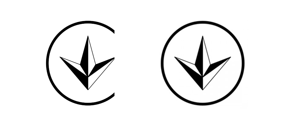
Ukrainian standardization mark
This expressive, from the point of view of graphic design, sign, which is also called “trefoil”, indicates that the product conforms to Ukrainian standards and regulatory documents.
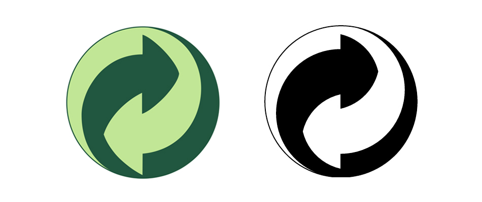
Der grune punkt
The name of this sign is translated from German as "green dot". The sign depicts two arrows, twisted like the symbol "Yin-Yang", and has great expressive power and recognizability. Contrary to popular belief, this sign does not indicate that the product was made from recyclable materials or suitable for recycling. In fact, the Green Dot is set up by companies participating in the German recycling program, and therefore outside of Germany does not make any sense, although sometimes it is put on their products by unscrupulous foreign companies that are too lazy to understand its meaning.
Woolmark sign
Woolmark labeling means high quality products made from wool, established by the International Wool Secretariat (IWC). Woolmark is one of the most recognizable graphic signs in the world; for example, in Italy, it is ahead of the McDonald's, Nike and Mercedes signs.
The Woolmark badge was created by the Italian designer Francesco Saroll and first saw the light in the USA, Western Europe and Japan in 1964. Since then, the Woolmark mark has been distributed in more than a hundred countries of the world.
British kitemark
It is one of the oldest quality marks, registered in 1903 and is still in use. This name was given to the sign because of its similarity with the air sail (eng. Kite). In fact, these are the letters "B" and "S" - the British standard.
Source: https://habr.com/ru/post/344448/
All Articles