“Is it a good design or not?” - how do I answer this question with the help of 3 categories
When you are the founder of the studio that made the most logos in Russia, you don’t get fame and women at all. You get a crowd of people who show their sites and logos with the question: "Is this a good design or not?"
The question is quite complicated, because the design has little objective and a lot of taste. Over the years I have seen, probably, a million signs, business cards and websites. In order not to go crazy, each time plunging into the details of the design, I needed a native and universal rating system. And I came up with it.
Design is always about interaction. There are no spherical logos in a vacuum, there are business cards, signs, websites. There is always an object with which we interact: we put a business card in our pocket, we are looking for a restaurant according to the sign, we fill in the form on the website.
')
Therefore, I came up with such a system: I will share the entire design that I meet, according to the impression of interaction. It turned out three large categories.
We have a lot of this kindness: unreadable fonts with shadows, illustrations from Google output, canvas of uniform text. All this repels interaction - reading, use, immersion. I want to leave the site as soon as possible, shove a business card into the general pile, and even reluctant to read the ad.
A good example is this poster:
Poster from the site kapustadizain.ru
I do not know about you, but I absolutely do not want to crawl through these dancing fonts in order to understand what the essence is. This poster does not want to look at. All the elements seem to be created so that, overlaying each other, create chaos. Layout is random, so it is not clear what is essential and what is minor. The design of the poster hinders the interaction with it.
Example from the network:
Screenshot syktyvkar-reklama.ru
I have a bad impression of this screen: I see soulless blocks of text that is inconvenient to read due to center alignment. Pictures are small and inexpressive - it is not interesting to look at them. I do not want to interact with this site.
A simple website with a logo in the left corner, a neat business card, a clear ad. It is immediately clear how to interact, what to click on, in what order to read. Illustrations in the subject. Makes a good impression. This can be called good design.
Real world example:
The spread of the book "Magic wardrobe", which was issued by Igor Shtang
Layout is clear, helps to read the text in the correct order, clear structure. The illustrations are not taken from Google for the request “aunt in the coat of stock”, but were photographed in the studio specifically for the book. The color wheel illustrates what the text is about.
An example from the virtual world.
Screenshot qlean.ru
It is easy for me to interact with such a design - I see the structure and understand how the elements work. The illustrations are large and bright, made specifically for the site. The buttons are contrasting, the controls are large.
Here I will give more examples, because this is a rare guest, especially in Russia. The main criterion: this design invites to interact with the object, even if the object itself is not needed for you, and you just walked past. Such a design attracts, adds value and leads to success. People say about him: "They did it with the soul."
A good example is this citrus juicer:
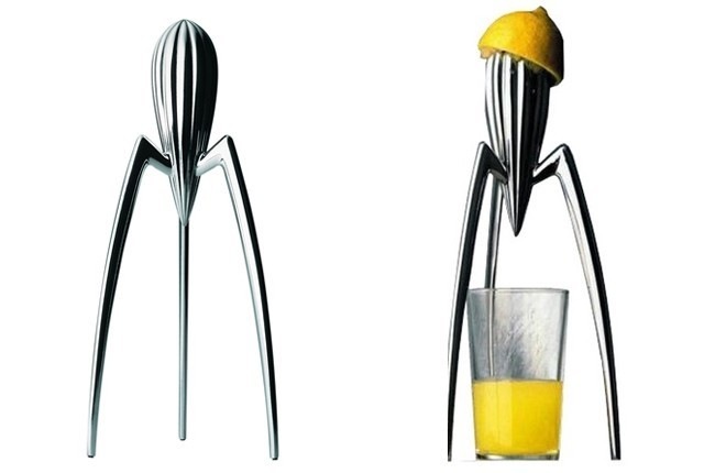
Philippe Starck's Juicer
It is unlikely that many people need such a juicer, and it is not very convenient. But the design turns it into an art object with which you want to interact - twist it in your hands or put it in the kitchen as decoration. It is design that makes all its value.
A simpler example is histography.ru interactive site:
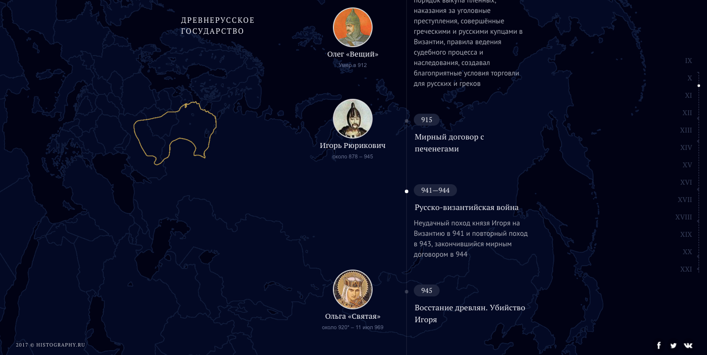
Interactive map of changing borders of Russia
Design that you want to interact with. It could be packaged in a hundred pages of boring text with pictures. But interactive scrolling through the centuries with the changing borders of Russia invites you to interact, even if you came by chance and are not interested in history. A good design is the value of this site.
An example from the world of logos - animated signs.

Cozy Lounge logo
Immodest to show the work that we did, but it perfectly illustrates the situation: the logo itself is not striking, there is nothing special in it, but the animation makes you look at it and makes a good impression. Therefore, we animate most of the logos. Animation just invites to interact with the logo.
An excellent example at the same time from industrial design, technical design and web.
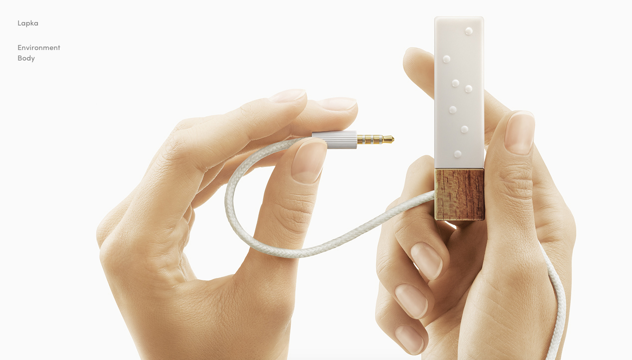
mylapka.com
Aesthetic design and beautiful photos from the site "Paws." The guys make environmental sensors for the iPhone and pay a lot of attention to design. Part of the sensor is made of real wood. It looks stylish, I want to buy such a thing. It is because of the sense of style that Startup Paw bought a completely non-core Airbnb. So the design brought them real and, probably, quite good money.
This simple coordinate system helps me quickly answer the question: “Is this a good design or not?” I just ask myself: “Do I want to interact with this object?” And then you can go deep: what exactly hinders interaction, how to fix and improve it.
Of course, this is all tied up with experience and artistic taste, and this too needs to be developed.
And as always: success to you and your projects!
The question is quite complicated, because the design has little objective and a lot of taste. Over the years I have seen, probably, a million signs, business cards and websites. In order not to go crazy, each time plunging into the details of the design, I needed a native and universal rating system. And I came up with it.
Design is always about interaction. There are no spherical logos in a vacuum, there are business cards, signs, websites. There is always an object with which we interact: we put a business card in our pocket, we are looking for a restaurant according to the sign, we fill in the form on the website.
')
Therefore, I came up with such a system: I will share the entire design that I meet, according to the impression of interaction. It turned out three large categories.
Design that interferes with the interaction
We have a lot of this kindness: unreadable fonts with shadows, illustrations from Google output, canvas of uniform text. All this repels interaction - reading, use, immersion. I want to leave the site as soon as possible, shove a business card into the general pile, and even reluctant to read the ad.
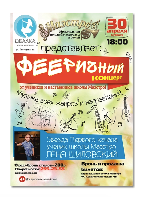
A good example is this poster:
Poster from the site kapustadizain.ru
I do not know about you, but I absolutely do not want to crawl through these dancing fonts in order to understand what the essence is. This poster does not want to look at. All the elements seem to be created so that, overlaying each other, create chaos. Layout is random, so it is not clear what is essential and what is minor. The design of the poster hinders the interaction with it.
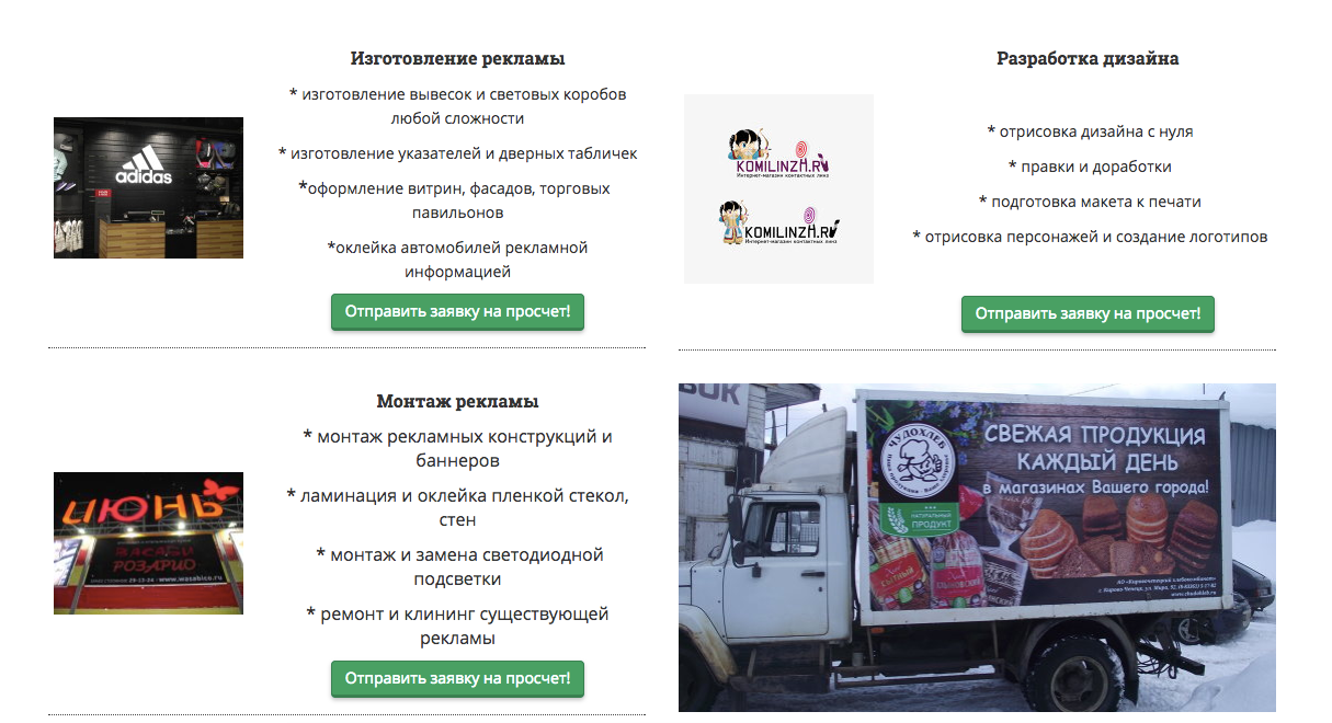
Example from the network:
Screenshot syktyvkar-reklama.ru
I have a bad impression of this screen: I see soulless blocks of text that is inconvenient to read due to center alignment. Pictures are small and inexpressive - it is not interesting to look at them. I do not want to interact with this site.
Design that helps interaction
A simple website with a logo in the left corner, a neat business card, a clear ad. It is immediately clear how to interact, what to click on, in what order to read. Illustrations in the subject. Makes a good impression. This can be called good design.
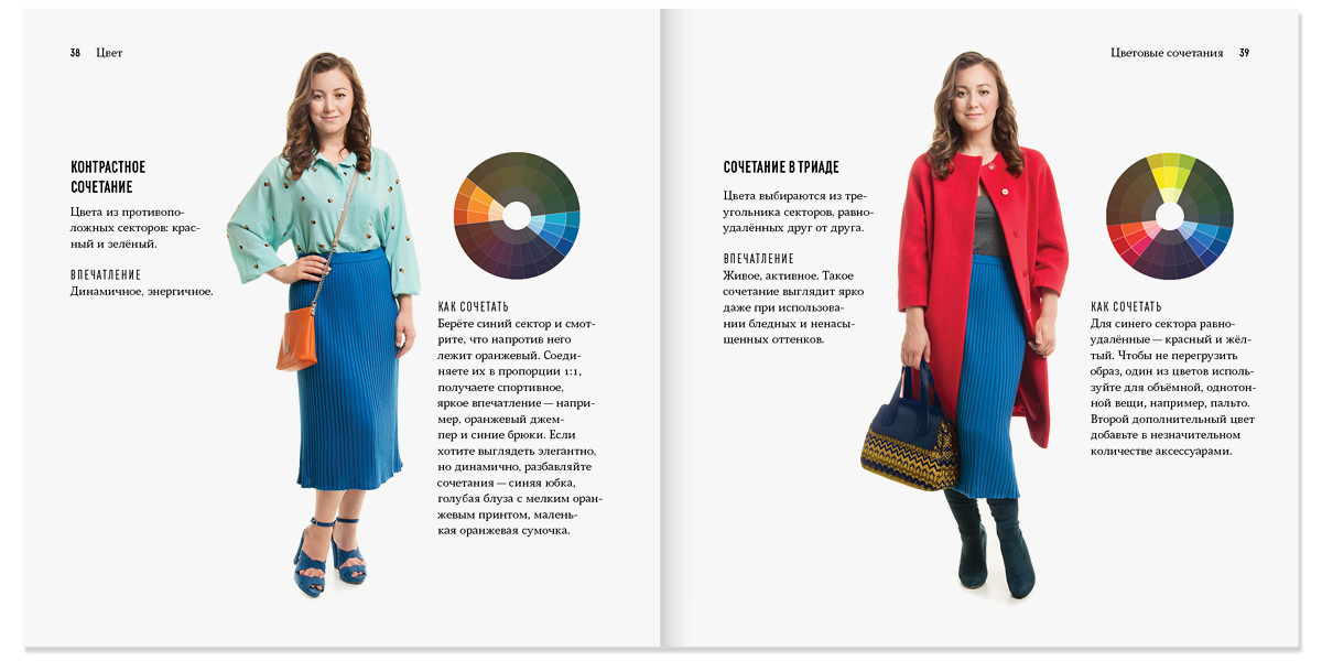
Real world example:
The spread of the book "Magic wardrobe", which was issued by Igor Shtang
Layout is clear, helps to read the text in the correct order, clear structure. The illustrations are not taken from Google for the request “aunt in the coat of stock”, but were photographed in the studio specifically for the book. The color wheel illustrates what the text is about.
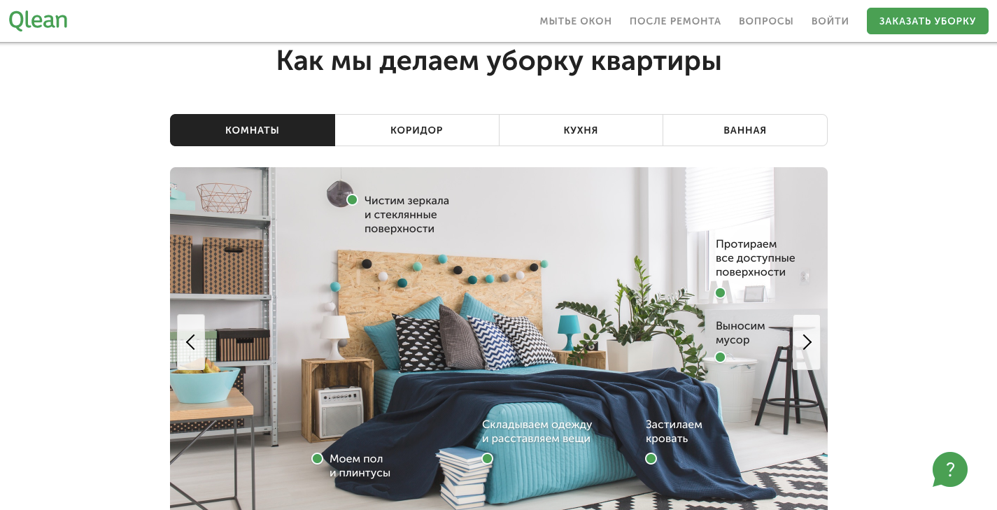
An example from the virtual world.
Screenshot qlean.ru
It is easy for me to interact with such a design - I see the structure and understand how the elements work. The illustrations are large and bright, made specifically for the site. The buttons are contrasting, the controls are large.
Design that invites interaction
Here I will give more examples, because this is a rare guest, especially in Russia. The main criterion: this design invites to interact with the object, even if the object itself is not needed for you, and you just walked past. Such a design attracts, adds value and leads to success. People say about him: "They did it with the soul."
A good example is this citrus juicer:
Philippe Starck's Juicer
It is unlikely that many people need such a juicer, and it is not very convenient. But the design turns it into an art object with which you want to interact - twist it in your hands or put it in the kitchen as decoration. It is design that makes all its value.
A simpler example is histography.ru interactive site:
Interactive map of changing borders of Russia
Design that you want to interact with. It could be packaged in a hundred pages of boring text with pictures. But interactive scrolling through the centuries with the changing borders of Russia invites you to interact, even if you came by chance and are not interested in history. A good design is the value of this site.
An example from the world of logos - animated signs.
Cozy Lounge logo
Immodest to show the work that we did, but it perfectly illustrates the situation: the logo itself is not striking, there is nothing special in it, but the animation makes you look at it and makes a good impression. Therefore, we animate most of the logos. Animation just invites to interact with the logo.
An excellent example at the same time from industrial design, technical design and web.
mylapka.com
Aesthetic design and beautiful photos from the site "Paws." The guys make environmental sensors for the iPhone and pay a lot of attention to design. Part of the sensor is made of real wood. It looks stylish, I want to buy such a thing. It is because of the sense of style that Startup Paw bought a completely non-core Airbnb. So the design brought them real and, probably, quite good money.
What is the result
This simple coordinate system helps me quickly answer the question: “Is this a good design or not?” I just ask myself: “Do I want to interact with this object?” And then you can go deep: what exactly hinders interaction, how to fix and improve it.
Of course, this is all tied up with experience and artistic taste, and this too needs to be developed.
And as always: success to you and your projects!
Source: https://habr.com/ru/post/344228/
All Articles