New life old pagination
When you are engaged in designing, already in the "autopilot" mode you notice not only interesting pieces, but also roughness in the interaction, things that I would like to fix on some sites. One of these things is pagination (let's call it that) or ways to feed and search for content on the site.
I have always been strained by the need to search for the next page when searching for something. I wanted to somehow easier to view the information, not to be distracted by the extra gestures.
If you also want to "somehow easier" - then you are here. In the article I want to talk about the new, invented, kind of pagination. To make it clear where the legs grow, with the introductory part of the comin a small story about the two most common types of content display. Their advantages and disadvantages. Then go to the bottom.
allows you to view the stream of content as a whole, without a visible finish line.
')

Advantages:
Disadvantages:
a mechanism that divides content into separate pages.
Advantages:
Disadvantages:
After analyzing the advantages and disadvantages of the two top species, she invented the third, which includes the advantages and turns off the shortcomings of the first two.
I hope everything is clear in the picture, but just in case, I give a step-by-step recipe of the dish:
Arrows down / up - the beginning / end of the page;
Height, width, appearance - to your taste. If there are many pages - again we use the classic pagination technique: 1 2 3 4 5 ... 10
Thus, we do not pull the user out of the information search flow, reduce the load, give control over the situation and location, show how many pages are found and already viewed, enable a quick transition to the beginning (end) of the list.
No magic, it's simple. But for some reason on the sites I did not see such a method.
In order not to fly in the clouds and check in battle, the new pagination was tested on users (4 people) when designing the online store product catalog.
When testing, users understood what this thing was and what it was for, switched / returned to the pages, knew where they were and how many pages were ahead.
My mini-testing did not find any problems with the element, therefore, I consider this a viable solution that will make life easier when searching (viewing) the site content and will not force the user to perform unnecessary actions.
If you find serious flaws, or, for some reason, this interface element seems uncomfortable to you, I will be glad to hear your opinion.
ps when writing an article was used material and images from this article
I have always been strained by the need to search for the next page when searching for something. I wanted to somehow easier to view the information, not to be distracted by the extra gestures.
If you also want to "somehow easier" - then you are here. In the article I want to talk about the new, invented, kind of pagination. To make it clear where the legs grow, with the introductory part of the comin a small story about the two most common types of content display. Their advantages and disadvantages. Then go to the bottom.
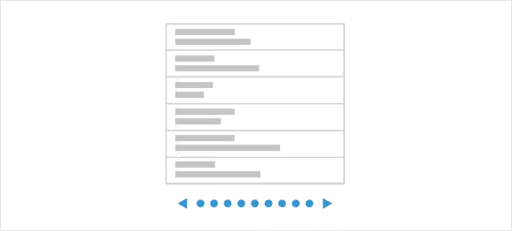
Endless scrolling
allows you to view the stream of content as a whole, without a visible finish line.
')
Advantages:
- Effective way to consume large amounts of information to search for something specific or just to kill time;
- Content is updated continuously, without requiring additional costs. No need to be distracted every time to click on the next page number;
- It is more convenient for users to scroll than click.
Disadvantages:
- It’s not possible to bookmark your location if you need to return later;
- After the site is closed, to get to this point again, you have to go all the way from the very beginning;
- It is impossible to determine one’s position and as a result, the whole experience of interaction with the product will deteriorate;
- Does not reflect the actual amount of data available;
- It's hard (impossible) to get to the footer.
Classic pagination
a mechanism that divides content into separate pages.
Advantages:
- It works well when the user searches for something specific in the list, and not just looks at the data stream;
- Gives a sense of control. You can see the total number of results, respectively, it is easier to estimate how long it will take to search for the right material
- The ability to keep in mind the location of the item. Naturally, users will not necessarily remember the exact page number, but they will roughly navigate the list of results, and numbered pages will help to get there faster;
- When you stop the search, always know exactly the number of viewed results and you can conclude where you stopped and how many results you need to study.
Disadvantages:
- Additional load in the form of a click;
- Interruption of the “flow” state when searching for information.
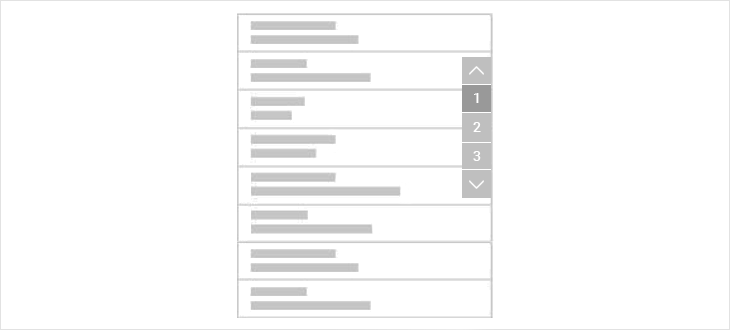
Newly Invented Pagination
After analyzing the advantages and disadvantages of the two top species, she invented the third, which includes the advantages and turns off the shortcomings of the first two.
I hope everything is clear in the picture, but just in case, I give a step-by-step recipe of the dish:
- We take pagination and “glue” it to the right edge of the site;
- We fix. When scrolling through the pages, the pagination remains, and the pages change. Alternatively, you can "glue" at the bottom of the screen.
Arrows down / up - the beginning / end of the page;
Height, width, appearance - to your taste. If there are many pages - again we use the classic pagination technique: 1 2 3 4 5 ... 10
Thus, we do not pull the user out of the information search flow, reduce the load, give control over the situation and location, show how many pages are found and already viewed, enable a quick transition to the beginning (end) of the list.
No magic, it's simple. But for some reason on the sites I did not see such a method.
In order not to fly in the clouds and check in battle, the new pagination was tested on users (4 people) when designing the online store product catalog.
When testing, users understood what this thing was and what it was for, switched / returned to the pages, knew where they were and how many pages were ahead.
My mini-testing did not find any problems with the element, therefore, I consider this a viable solution that will make life easier when searching (viewing) the site content and will not force the user to perform unnecessary actions.
If you find serious flaws, or, for some reason, this interface element seems uncomfortable to you, I will be glad to hear your opinion.
ps when writing an article was used material and images from this article
Source: https://habr.com/ru/post/344136/
All Articles