Master class “Why Steve Jobs loved fonts” (Alexey Kapterev)

Hi, Habr! For a long time in our blog there were no transcripts of master classes. Correct. In this post you will find a grand journey into the world of fonts from ancient times to the present day. If you want to understand how fonts affect our emotions and finally learn how to distinguish humanistic grotesque from ribbon antiqua - welcome under cat. And yes, there are a lot of pictures. Give the word to the author.
The joke written by the Times headset is 10% funnier than the one written by the Arial headset. Why? God knows. The best explanation I have seen is that humor is associated with aggression, with sharply one with sharp mind - and the Times looks sharper than Arial.
Another interesting experiment, which was attended by 45 thousand people. You visit the site, you are shown an article by David Deutsch, a British physicist. In the article, the author writes that today it is very difficult to die suddenly. For example, from an infectious disease or in a street fight. A hundred years ago, this happened much more often. The main conclusion of the article is that the world is safer than ever. On average, of course, because local military conflicts are constantly going on somewhere.
And after reading the article, you were asked if you agree with the statement that we live in an era of unprecedented security? Variants of the answer: "yes" and "no". The next question is: how confident are you in your answer? Variants of the answer: "not very sure", "pretty sure" and "completely sure."
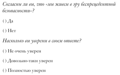
The subjects did not know that when entering the site, the algorithm randomly chooses one of the six fonts for them. The authors of the experiment wanted on a large number of participants to evaluate the effect of fonts on agreement with the text and confidence in the answer.
Fonts analyzed:
- Baskerville,
- Computer Modern (used in scientific journals),
- Georgia,
- Trebuchet
- Helvetica
- Comic Sans.
The degree of "persuasiveness" of the text depending on the font:
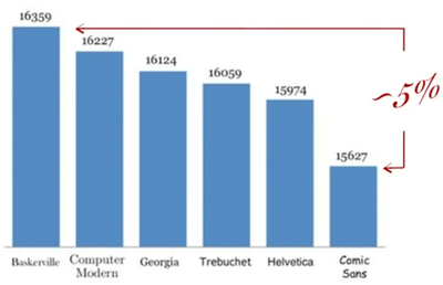
Between the two extreme positions the difference is 5%. Most people generally call Baskerville and Georgia identical fonts, but according to statistics one is 2% more “convincing” than the other.

If you put two texts side by side, the difference is barely perceptible. But somehow, our brain one of them inspires more confidence. Straight 25th frame in action! This is the effect of fonts on people's subconsciousness.
Did you hear that Google recently changed two pixels in its logo? Considering how many people visit the main page of the search engine every day and see the logo, perhaps this is not a pointless move - spending a lot of money on research and changing the logo. Even if you cannot distinguish between fonts, they still somehow somehow have a little effect on you. And if you can discern, then they influence quite strongly.
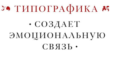
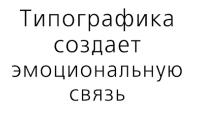
I do not know why this is happening, how this mechanism works. For me, this is a manifestation of some inner sensitivity. Typography creates an emotional connection between the author and the audience. This connection arises in any case, but its character depends on the chosen headset.
This can be called meta-communication. There is a text , but there is my attitude to what I write.
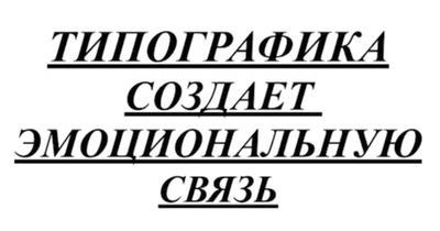
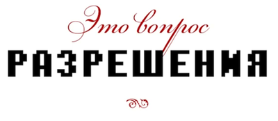
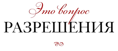
Even if you take a neutral, faceless font, it is also an attitude. Only neutral, detached. "I do not go to your arms":
Here they clearly don't like me, they just want to yell at me:
I often go to America, where the situation with the harmony of fonts is there - in general, as we do. Here, the man obviously wanted to scare me, I definitely will not come to him.

In Europe with better fonts.
Typography expresses the attitude to the audience. Here is an example of the announcement:

The one who came for the beer will turn around and leave in all three cases. But in some case, he will come back later, but in some not. And you need to write so that someone on a subconscious level like it.
Is it possible to control the influence of typography on people? I believe that it is possible, although not completely. For me, this is a matter of optical resolution. So that you can highlight subtle details, show some trivia.
You look, you distinguish something, and then you ask yourself: what do I feel when I see it? Does it affect some strings deep down?
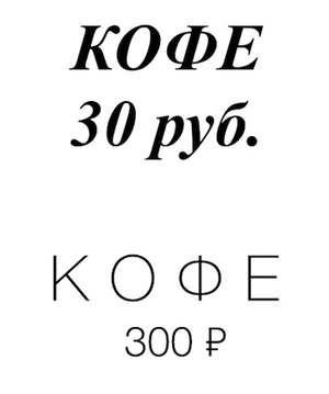
From this picture, some people will feel how different the taste of coffee will be, and realize that the price tag is justified.
Which of these adidas logos is closer to the present? I must say that everything is wrong. You will have no problems, everyone will easily answer which Adidas is more like a real one.
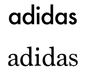
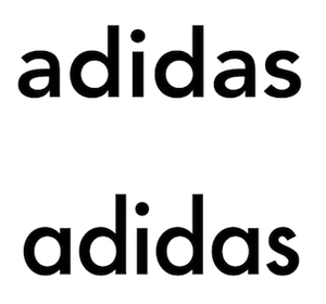
Here a little harder to decide.
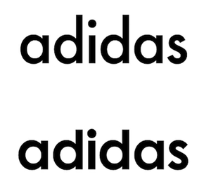
And here is quite difficult. Feel like something caught, and then more and more doubts?
Here is the real one:
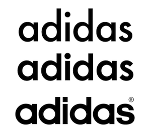
The medium font was taken as the basis for the logo and slightly redrawn. Usually, logos do this: take a well-known font and change some small elements to make the logo work better.
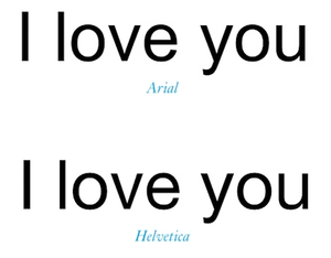
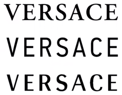
And almost no one is able to distinguish between these two phrases.
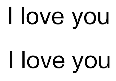
One of these fonts is called Arial, and the other is Helvetica. About him filmed a movie. As far as I know, this is the only font about which there is a film, and indeed an interesting one. All these logos are made with Helvetica font.
About Arial say:
“You can't create good typography with Arial”
- Matthew Butterick
I went to the site of Artemy Lebedev, searched for the word “Arial” and found a brilliant example .
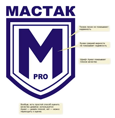
In the studio, Lebedev was sent a logo for review, and it says:
“Arial font shows poor quality”, “but in general, there is a simple way to evaluate the quality of a design. If Arial is used, the design is bad, no - you can proceed to the assessment. "
Here each letter is slightly different, but literally a couple of pixels. For example:
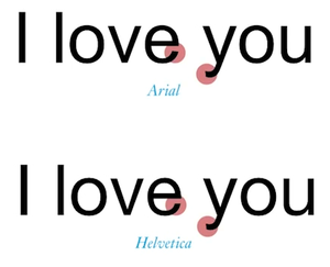

And this is the difference between epic fail and epic win.
Why, with a fright? The fact is that if you take two rules and apply them to a large number of letters, the results are completely different.
Another example: where is the real Lufthansa?
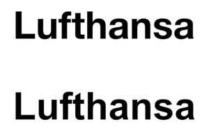
This top. Look at the combination of F and T. "Quadratisch. Praktisch. Gut. All very rovnenko and in German. And at the bottom of some mess.

Above is a regular Jeep, with a square jaw, so American. And below - with an open mouth. Not a Jeep. The top option is good, the bottom one is bad.
A sure sign of provincial design is the use of Arial in logos.

For me, fonts are traces left by people. Now almost everyone who has a computer uses fonts. I can understand something about a person on these tracks. See what he says is not what he writes. This is some kind of lost knowledge that we have forgotten. We stopped paying attention to minor details.
Let's try increasing the optical resolution.

I think everyone understands the difference between typed print and imitation of handwriting. Almost all of you distinguish between serif and sans serif fonts. And someone can distinguish between antique and squared? These are the two groups into which serif fonts are divided.
Antiquas are divided into old, transitional and new. The old ones are divided into Italian-French and Dutch.
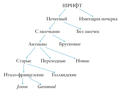
But I must say that there is no uniform font classification. In different countries, the fonts are classified in different ways. I will use my synthetic system.
In short, what is the font to beautiful?
The question is good, but it is very difficult to answer it. Beautiful for whom? For you and for the audience. Therefore, I will use such a measurement system. Steve Jobs in one of the presentations said that Apple is a company that stands at the crossroads between technology and the fine arts. Technology is closer, but fine arts are not forgotten. And we are all somewhere at this intersection, in this range. Of course, there are clinical techies and clinical humanities. But both of these extremes have long been hospitalized.
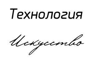
I will try to show you that fonts also have character. There are tech fonts, there are humanities fonts. Maybe you choose a font that suits you by character. Or which will reflect who you want to be in life
Above - idealized techie, below - Pushkin font, imitation of Pushkin’s handwriting.
And the second intersection is between the old and the new. Between the immortal classics and transient fashion. Between the past and the modern. It turns out a 2 × 2 matrix. In the middle there will be some normal, readable fonts, even boys, lawyers, economists. They, except dough, do not need anything. Pragmatists.
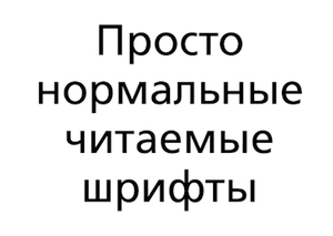
Obviously, we use pragmatic fonts for typing, fonts with character - for large inscriptions and logos. The probability of coincidence of these two tasks is very small. There are very few fonts that are both beautiful and well read. To invent and make such a font is the dream of every designer. Very rare case.
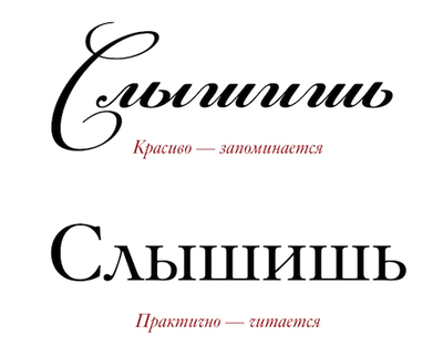
Here one font is more readable, the other is less. If we change their places and sizes, the situation will not change.

Why is the upper one unreadable? Because beauty is repetition. Beauty is when there is an even, predictable rhythm.
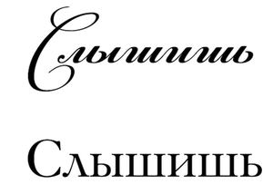
Look at the letters W and the letters I. In the upper font they are the same, but different in the lower font. Therefore, the bottom is easy to read, and the top is beautiful.
You can do everything the same: it would be nice, but not read. There is some simple rule of repetition. But if you repeat too often, it turns out already monotonous. Beautiful - remembered, practical - read. Such a basic conflict exists in the world of fonts.
What is good for the road sign, bad for the invitation, and vice versa. It is obvious.

And here the difference is not so obvious, but it is.
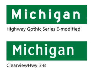
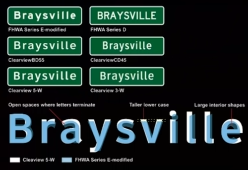
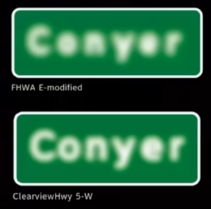
One of the fonts is much better read. So much so that in America they spent millions of dollars replacing pointers across the country, switched from one font to another. This is the bottom font, it is even called Clearview. Read about 12% better, more quickly perceived. People are less likely to miss their turns, less nervous, less get into an accident.

In Moscow, there is such an adventure: you are driving a car, and you need to make a decision in three seconds - right or left? And there is a junction on the Third Ring.

All letters are the same, the text merges into a right triangle, and cannot be distinguished from one another.
The classic solution for such cases:
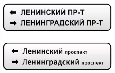
Due to the detailing element for the letter P, the lower word begins to differ markedly from the upper one. It takes on a different visual form, and people read it better. Adults usually perceive the word as a hieroglyph. You have already seen it before, and having met it again, you immediately “swallow” the familiar form. In the upper version, the form is simply killed, all the same.
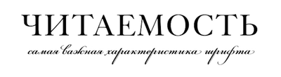
Readability
If you need the "most readable font", then it is not.
If you are developing applications, you need to test everything. Because on mobile devices, some laws display the text, on desktop computers - others, on paper - the third. What reads well on the index will be difficult to read in a book. It is always better to test.
But there are some general laws.
We know that serif fonts are better readable on paper, sans-serif on the screen. We also know that transitional antiqua and humanistic grotesque read well. A poorly read antiqua new style and geometric grotesque. If you care about readability, rely only on test results. Gather at least 30 people and stand above their souls with a stopwatch.
Unfortunately, it is impossible to confine one experiment for all occasions. Pragmatic fonts are boring. Their goal: so that people quickly read and go on. And everything else is interesting and memorable.
I will talk first about antiquities, which have a distinct historical flair. And then - about the grotesque, pretty modern fonts.
Where did the serifs come from and why are they needed?
To understand the soul of an antique, to feel it, you need to understand what a serif is. To do this, let's understand what a letter is. All modern writing of Western civilization is based on the Phoenician alphabet.
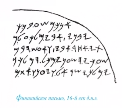
Please note: no capital letters, only lowercase. No serifs, just not up to it. It seems to me that people were tormented by such problems: “My God, they will kill us all today”.
Then came the Romans. They had a lot of free time. The Romans wrote on parchment with a reed pen.

When you lead a reed pen on paper, you get an uneven stroke. And the Romans began to write beautifully. They began to add decorative strokes at the ends of the letters for uniformity, which means for beauty. Then it turned out that it was also more convenient to read.
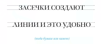
There are lines on which the glance is easy to slide without breaking. For paper and stone it turned out to be very important. It turned out beautiful, but slowly. I had to draw each letter for a long time. Therefore, the text was a bit.
That is, the fonts we use are the heirs of the reed pen, that archaic technology.
Where did the lowercase letters come from?
For a very long time - about nine centuries - they were not there. But the texts became more and more. And if you write a lot and for a long time, then lowercase letters are gradually formed from capital letters.
Somewhere it is immediately clear from which capital letters which lower case letters were formed. Somewhere less obvious, but you can guess.


And somewhere it is very difficult to understand how the lower case letters were formed.
15 centuries have passed. All over Europe they wrote like this:

In Italy, a little bit different, and in Germany, England, France, they wrote Gothic. She is very beautiful and quite comfortable to write. One single problem: absolutely unreadable.
Gutenberg already had lowercase letters. Capital letters are written in red. And then there was a Frenchman, Nicolas Janson, who invented a modern book.
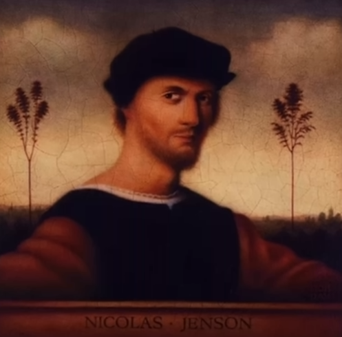
He was sent to study by the French king to Gutenberg. But when Janson came to Gutenberg, they already had a printing press taken away from him. So, apparently, Janson did not study with Gutenberg, but he spent a lot of time in Mainz and learned to print quite decently. Even created your own fonts.
Then the French king died, and Janson decided not to return, but to leave for Venice. There began the Renaissance, capitalism. Janson took the handwritten handwriting of the ninth century (at that time Charlemagne had a little Renaissance) in which only lowercase letters were found ...

... and added Roman caps.
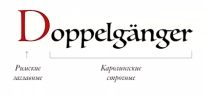
By the way, Janson was not the first to try such a trick, but he was the first to smile at commercial success.
I wonder how he came up with it. "Let's take the letters that are separated by nine centuries, just connect them and see what happens . " And it turned out the beauty that we still use.
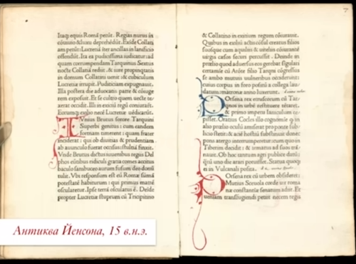
Here is an example of a rotunda made by Janson:
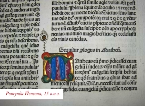
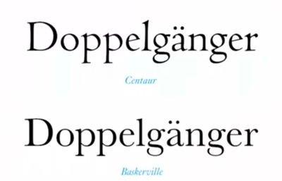
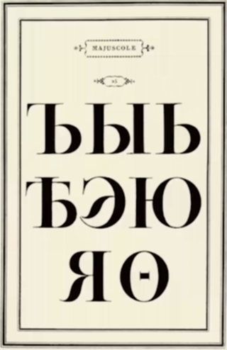
Mostly he was ordered historical and church texts. Today there are very similar fonts, for example Adobe Jenson - a digitized font of the fifteenth century, but without Cyrillic. It is in the Russian version of the font, which is called Centaur, or Venetian 301. You get all this Renaissance fleur, that novelty, eternal historical punk.
Where did italics come from
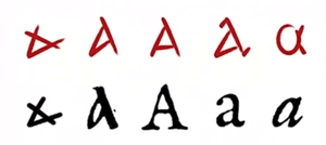
Italics are Italian handwriting relevant to Janson. In Italy at that time they wrote:
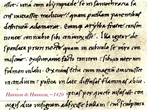
This is the handwriting of a man named Niccolò de Niccoli, who lived then. Please note: no capital letters, only lowercase. Someone took his handwriting and added capital letters. And the slanted caps came up only 50 years later in France. In that era, poetry was printed like this.

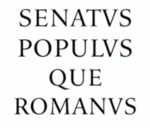
Why are all these fonts called "antiqua"? Because such a handwritten handwriting rewrote the ancient authors. Antiqua has a timeless historical fleur.
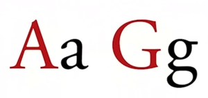
Look at the design of the letter G. I took a fragment of the image of the emperor Trajan's column. It can be seen that then G began to change, she had a vertical leg. But a snapshot from the Internet: the man clearly did not understand, just took a boring newspaper font and put it into production.
Where is the real Wikipedia?

Average. It has the characteristic construction of the letter W. It was a very reasonable, meaningful choice: since we are an encyclopedia, we need Renaissance energy when the heyday of science began.
And this is the choice of a company that wants to be a “humanist among techies,” which works a lot with education, cares about beauty. And for ten years Apple has used an old-style antiqua, the Garamond font. By the way, the first Apple logo was very angular, chopped. A sort of robot. And then they decided to carry beauty to the masses.
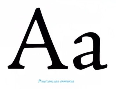
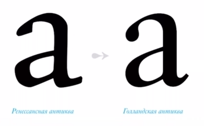
Please note that the antique of the Renaissance is incredibly koryava. The fact is that she inherited a lot from handwriting, and at that time they knew how to cast typographic headsets badly. If you need to find an antique in the old style, not a new one, then put an isosceles triangle inside the letter A, if it lies with the gaps - this is the old style.
Then people came with rulers. This happens: as soon as the artists do something and someone likes it, it starts to be sold, immediately people come with rulers and begin to optimize everything. One of them was the Franciscan monk Fra Luca Bartolomeo de Pacioli, who invented double entry, debit and credit.

In the field of font optimization, Leonardo da Vinci was noted.

Durer tried very much to design letters, looking for perfect proportions. Just in those days they invented the golden section.

But all this did not work, did not pass the test of time. Fonts turned out ugly, nobody uses them. Everything was not so simple. The optimizers wanted a simple solution, but it was not there. Gradually, the technology has improved, the style has become more equal, but the fonts have not changed. Only become clearer.
The next major revolution in typography is associated with the name of John Baskerville, an artist and businessman.

He studied calligraphy for a very long time, then owned a printing house. According to many people of that time, he made the best fonts in Europe.

In the first letter there are still some signs of a “feather” past, and the second is a completely different letter. There is not a single gram of handwriting. This is pure technology. Then newspapers appeared, and it was required that more text fit into the line. Fonts become narrower and more practical. The main thing is to read. Baskerville sharpened everything, made serifs clearer. Before him, it was also done, but not so well.

These are two computer fonts, but the top one is a manuscript, the bottom one is print.

In general, the bottom text reads better. , , , . — , , . .
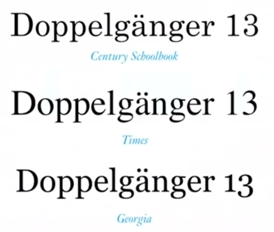
Century Schoolbook — , , . .

. . , . . , . , . , .
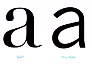
Baskerville, Bodoni:
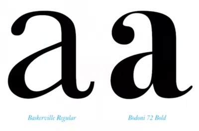
Bodoni . : « ». Baskerville — .
«» .

Giambattista Bodoni just turned up the extreme extreme contrast. And today we see it at every step in newsstands, in high fashion, on playbills.
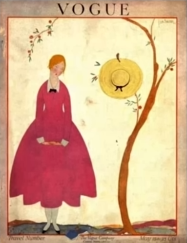
It turned out very cold. The Renaissance is warm, soulful and humane, and high-contrast fonts - all along the line and patterns, are very detached. You go to an expensive store, and you immediately see that they are not waiting for you there. And here is the same feeling: “Get away”. But beautiful. Here is the first issue of the magazine Vogue, the end of the nineteenth century, the font is generally no different.
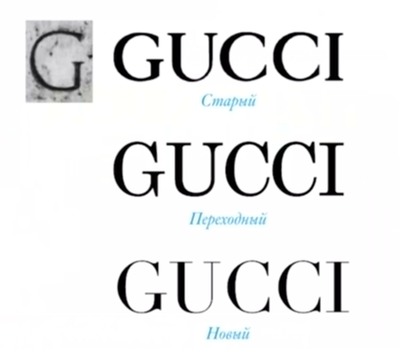
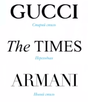
Where is the real Armani?

Down below. For once, I can easily explain it. Armani is not in the same mood as Gucci. Gucci is depraved, and Armani is like this: “Dude, get away. I'm beautiful". Gucci looks into your eyes. And in Armani visual materials black-and-white pictures are often used, ideally detached images, look into the distance. This is a completely different mood, a different font. Everything is very thoughtful.

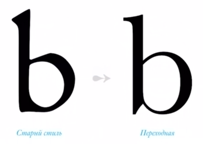
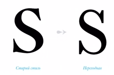
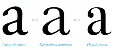
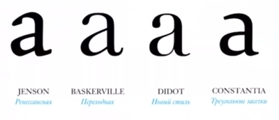
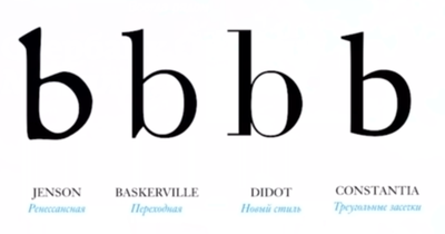
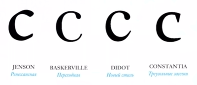
Now you know the difference between the old style, new and transitional. The most clumsy letter is the old one. The most beautiful is new. Neither this nor that - transitional antiqua. That is, in the middle is boring, newspaper font, on the left - warm tube beauty, and on the right - cool digital.
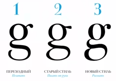
Where is the humanist, where is the transition, and where is the font of the new style?
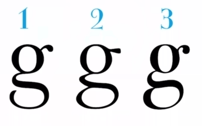
The third letter has the highest contrast: a combination of very wide and very narrow elements. This is a new style. The most clumsy letter is the second, old style. The first - neither one nor the other, transitional antiqua.
How would you classify it?

Such a task today often arises in the banking sector. You are a bank that has existed since the eighteenth century. On the one hand, you need to broadcast the reliability, stability and historicity that you have been here for ages. On the other hand, that you are comfortable for young people, that you have an online office. How to link these two opposing messages? By the way, in real estate the same difficulty.
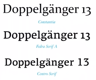
For such cases, most recently came up with another group of fonts. They have no established name yet. They are very conditionally called "antiqua with triangular serifs", although in fact serifs are not triangular, but rather trapezoid.
In a sense, this is a return to the old forms, an attempt to geometrize the first font, make it better.
In the first case, there is no serif, then serif, then serif , and then again there is no serif: return to the old, but in a more accurate, geometric form.
There are quite a few such fonts. If you have Word on your computer, you can take the Constantia font. Sberbank uses Fedra. Also very popular is Centro, the former Agora.
Antiqua is used in the following areas:
- Education.
- Fashion.
- Luxury goods trade.
- Banking. Although banks have recently begun to move to the grotesque, sans serif fonts.
Grotesque fonts (sans serif fonts)
The history of the grotesque is associated with the name of William Kazlon IV, the great-grandson of a very famous typographer. Great-grandson decided to make such a sans serif font.
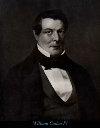
He was very much criticized, and, to be honest, it really turned out rather clumsy. The man really did not understand anything in the fonts. But gradually he improved his offspring.
At first such fonts were called “Egyptian”, because in time their appearance coincided with Napoleon’s Egyptian campaign. They were terrible. I look at these fonts and think: “Damn, who does that?” It's hard for me to explain why. Just some general disgust. Look at A: who beat her for so long that she is so exhausted?
At that time, the order of things was antiqua, people got used to the fact that the letter is beautiful. And then they throw out this.
The creators of these fonts simply took antiqua and made it monocontrast, leaving the configuration unchanged. It looked very strange. The public gave these groups of fonts the following names: Grotesque, that is, ridiculously grotesque, and Gothic, that is, Gothic (and not Gothic), barbaric.

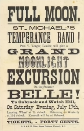
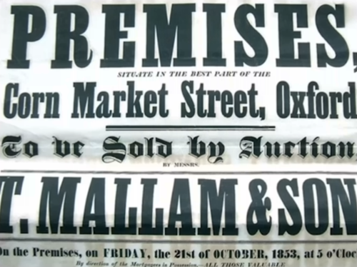
Then the industrial revolution began, there was a need for engineers. And the engineers needed drawings, where the new fonts would go perfectly, the antiques on the drawings do not work at all, nothing can be disassembled. And advertising became the second “consumer” of grotesque fonts. Here is an eighteenth-century ad for the sale of slaves.

With all due respect and love for antiqua fonts, they have little variation. All the same. And with the grotesque it became more interesting. First, people stopped selling. Secondly, readability is better. But grotesque fonts were used only for headlines. Nobody thought of typing such fonts.
Today there are three groups of grotesques:
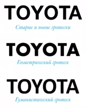
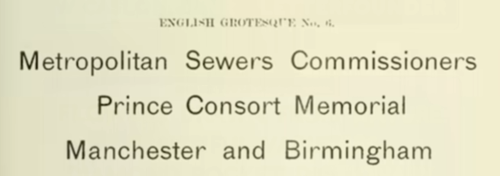
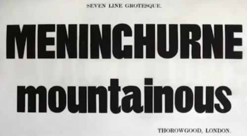
The first grotesques looked like this:
We still use it. For the most part, they were used for similar tasks:

Then in Russia there was a revolution of 1917. There was a new trend in the fonts, exclusively Russian trend. First, by hand, very carefully, drew two letters. Gradually it turned into a font. Thus, the notion of “Russian typographic revolution” entered into history: Suprematism, Dadaism, and so on. "Let's take a rectangle, and all the letters we will have as a rectangle." It turned out interesting. And this has been done quite a lot.
By the way, the school "Skolkovo" still uses Rodchenko font.
In Germany, Dürer died long ago, but people with lines remained. They said: the rectangle does not suit us, take the oval. More precisely, let's reduce everything to the form of a stadium.
This is the DIN font, created in Germany in 1923 for railway signs. Still alive. Thanks to DIN in the Latin alphabet happened its own revolution. People realized that the letter does not have to be the same as it was painted in the ninth or in the fourteenth century. People decided that they had a different font, they needed another letter. We got rid of all unnecessary elements: serifs, tails, undertail. Maximum simplification, maximum geometrization.
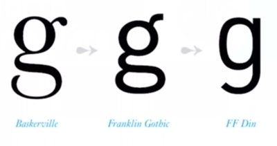

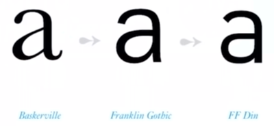
This font has been tested by time. Looks very modern. There is no feeling of old age, but he really is a hundred years old.

By the way, the first Cyrillic version of this font was made in 1943 by the Germans for the occupied territories, because they needed railway signs.
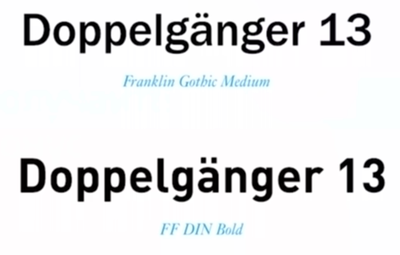
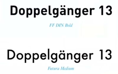
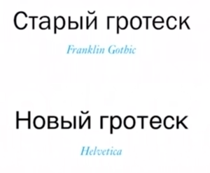
Franklin Gothic Medium is more traditional, FF DIN Bold is more modern. I also want to remind you that in Germany at that time the Bauhaus movement arose. One of his followers, Paul Renner, painted the Futura font. This is a very beautiful font, in it everything tends to the circle.
Futura is still very popular. The Germans have done a lot of such fonts.

At first, the Germans themselves associated these fonts with the Russians. Here is a parody of the old Soviet poster, the announcement of the exhibition of degenerative art, "liquid bolshevik": bolschewismus und jüdischer.
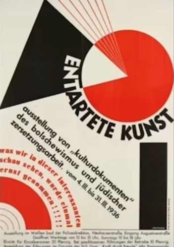
The Germans said it was all alien, but they used the fonts very willingly, including in propaganda. Because it is modernism, a certain ideal, the desire for simplification, for rationalization.
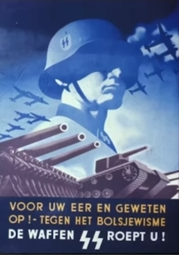
There were two fonts in the Nazi posters: a gothic German fracture and this is modern. It is almost impossible to read, but it works very well in a large, poster size.

It says: "German, drink German wine."
There are a lot of such fonts on your computer. For example, Century Gothic, which became the prototype for the Adidas logo. In one of the latest versions of macOS there is a very beautiful Avenir font. It was created after the war, it seems, in the 1970s.

We see the return of the normal letter A, but all the other letters still tend to the circle. In the 1960s, fonts like Phosphate were popular. Such a hipster retro. Write on the price tag "burger", and it will cost not a hundred rubles, but three hundred.
Germany, Russia, America:

In America, they decided that they did not like a rectangle, but a square, but with rounded edges. Although the whole idea is the same.
Where is the real Toshiba?

Hint: where more geometric font. Above. The Japanese are generally very bad with typography, because it is alien to them, western typography. But in this case it is a good choice. Proper Toshiba looks more technogenic, or something. The bottom font is Arial. We remember that you can't do good typography with the Arial font.
After the war, everyone understood that extreme geometry in fonts is very inhumane. Too smooth. And people are not like that. And the rollback began. Old grotesque redrawn in new.
It is exactly the same, just beautiful. For example, they returned the letter and the tail.

It is clumsy on the left, and on the right - people tried, just an ideal letter. Pay attention to the space inside the "tum", it is a drop. And the left letter is impossible to watch.
Before the advent of Helvetica, the average advertisement looked something like this:

And ten years after Helvetica, everything changed. It has become much clearer, more precisely, tougher, in the case, very briefly.
Font Helvetica changed posters. First, he reigned in the font posters, and then they added pictures to them. Now in IKEA you will see this:

IKEA is a modern, youth design. The 1960s Swiss design is still alive.
And then Jobs put Helvetica in our pocket. The interface font on the iPhone is Helvetica. After Helvetica, only one important event happened - a humanistic grotesque emerged.
Geometric fonts have been painted all over the world. And in England, people thought that they didn’t like geometry. They live in the former great empire. They want a return to the Renaissance. People again took feathers and tried to make sans serif fonts, starting from the pen outline.

See, what a strange beginning to the letter a ? This is a pen. No one is penetrated except the English. They said they adore it and will sculpt wherever possible and impossible. And the rest of the world sent them to FIG and remained faithful to geometry.

Johnston, who created the new English font, had a disciple of Eric Gill. He tried to geometrize something.

But, in fact, he geometrized the antique of the Renaissance. That is, he returned to the time of Zhanson and tried to redraw the old letters again, but not from the ninth century, but from the fifteenth. And it turned out interesting.


A slightly ridiculous form, but warm, lamp, lively, cool. In England, this font is used everywhere . And the world did not appreciate.
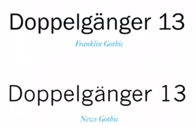
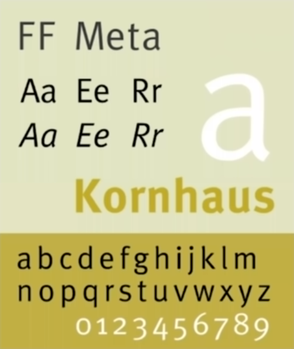
Then Eric Spiekermann, who lived in London for a long time and was inspired by British type ideas, returned to Germany and made a very cool font that changed everything a lot. This is a Meta font.
Why does Meta belong to the humanist grotesque? In the movie “Helvetica”, Spiekermann says: “A true typeface needs a rhythm, it needs a contrast that comes from a handwritten text ... And Helvetica has none of this . ” Spieckermann hates Helvetica. He was asked, why is this font so popular? Spiekermann replied that bad taste is omnipresent.
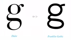
Eric returned the old form of the letter g, but drew it "correctly."

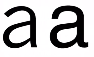
Helvetica has a very flat, neutral letter R. And in Meta, a vertical stick has two breaks at the ends: at the top and at the bottom. There is no secret meaning in it, just the feather went unevenly, and then broke off. And in general, the letter is narrower, because the handwritten handwriting is narrow, it does not seek to stretch out. All these are signs of a humanistic font. All humanistic fonts will be a bit cracked. Letters begin to differ from each other in small strokes, and readability improves.
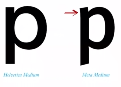
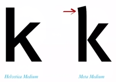

It turns out that all previous centuries of font development are not meaningless. Managed to create a really easy-to-read font. All letters are a little cut off, completely different drawing. And Helvetica is very correct, even. Sberbank loves Meta.

Apple's grocery font, which they all brand, is called Myriad Pro - this is also a humanistic grotesque. It is easy enough to explain why. Look, the letter U is slightly uneven. Why? The feather went that way.
Here is the American road sign. Here is the letter l, which differs markedly from the letter i. And in general, narrower letters and wider apertures.
If you model poor vision in Photoshop, the difference in readability of fonts will become obvious:
Apple adored the humanist grotesque fonts. However, all interface designers adore them.

On the left - the first font on a Mac, then it became a font on the iPod, in the middle and on the right - the second and third fonts on a Mac. By the way, on Windows now there is another font, but for a very long time Lucida was also used there. Very readable font, looks good on bad screens.
Here is the iPod:

The screen is bad, it was possible to make the font formal, but came up with a fantasy. Inside there is a variation of one pixel, and it reads well, looks good.
MTS is now:

Segoe is an interface font on Windows. Droid Sans is on Android. Ubuntu is on Ubuntu.

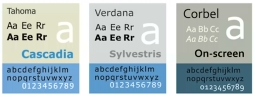
All Windows fonts are humanistic grotesques: Tahoma, Verdana, Corbel.
We get three groups: techies, pragmatists and humanities. The first ones are cold and optimal, the last ones are warm and lamp ones.

Where is the real iPhone?
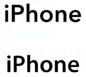
Look at the letter P. See, is it uneven on top? A characteristic sign of the humanistic grotesque. The letter R is very clearly visible.
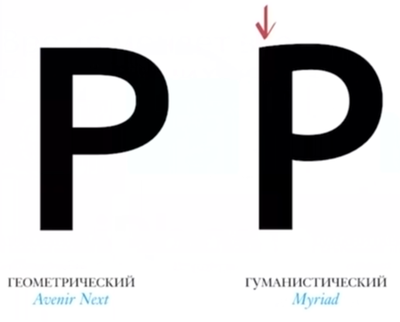
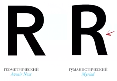

A geometric grotesque will almost always have just a straight leg down. Absolutely no fantasy. In the humanistic - unevenness, bending.
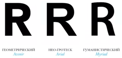

Arial also has a small bevel at the beginning. But Myriad is at the top, at the bowl, and another one at the very bottom of the oblique leg. What for? And so here. A little more elegant. And beautiful, and better read. And the eye somehow notices this, and the letters, of course, will be narrower.

There are bar fonts. Why bar is understandable: because the whole is made of bars. Such fonts appeared in the nineteenth century, simply thickened antiqua. Usually they are used in advertising to maximize the transfer of emotions, cry, sensation.

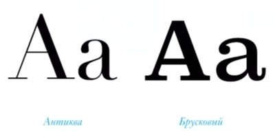


There was once a German Hermann Zapf, calligrapher. He painted very beautiful fonts. Then he found something on Zapf, and he cut off the serifs. And the tape turned antiqua, as the tape laid.


Many people say that this is a humanistic grotesque, but it seems to me that this is a ribbon antiqua.


If you want to read something about the Cyrillic letters, that is, the book by Yuri Gordon "The book about the letters from Aa to Yaya." She is fat, big and very beautiful. There's a lot about Cyrillic. Cyrillic has its own destiny, always some kind of strange. If you are a pragmatic person, then you can read the book Typography for Lawyers (Typography for Lawyers) (website and book). There are reasonable recommendations for choosing fonts and all that. That is, it is simply written by a designer for designers.
If you like some kind of font, you can install the WhatTheFont application. For iPhone for sure, for Android, I don’t know. Photograph the text, the program sends it to the server and returns the answer, what is the font.
If you want to combine the fonts with each other, I recommend to go to the Fonts in use website and search for the font that you like. If it is not there, do not use it. Most likely, it is bad.
Finally, there is the Font Squirrel website with a bunch of free fonts. There is a search in Cyrillic.
And the last. Samsung CEO said: “Design is a big priority for me, because this is what differentiates my business.” In my opinion, therefore, Samsung will always be No. 2 after Apple. Because Jobs never thought so. He just loved to be beautiful. Do you understand the difference? They are looking for meaning, but he just liked it. A person who just likes will always be one step ahead, because he will do senseless things that shoot in the long run. I think this is very important.
Video of the master class:
')
Source: https://habr.com/ru/post/344132/
All Articles