4 common design mistakes that are easy to fix

In our community Vkontakte there is a rubric #logomachine_help, in it we tell about the most frequent mistakes in design and show how to fix them. In this release we have combined errors into several groups, so that by their example we can show what to do with logos.
Sticking by color
The first common mistake is the so-called “sticking by color”. The easiest way to check if there is a problem with color or contrast is to translate the logo into monochrome. When using this method, you will immediately see problem areas where the form merges with the background.
')
1. SledHelp
We were sent to the public here is such a logo:

If the logo is translated into black and white, you can see its problem - the background color and the color of the husky are very close in tone:

Because of this, the forms merge, the composition turns into porridge:
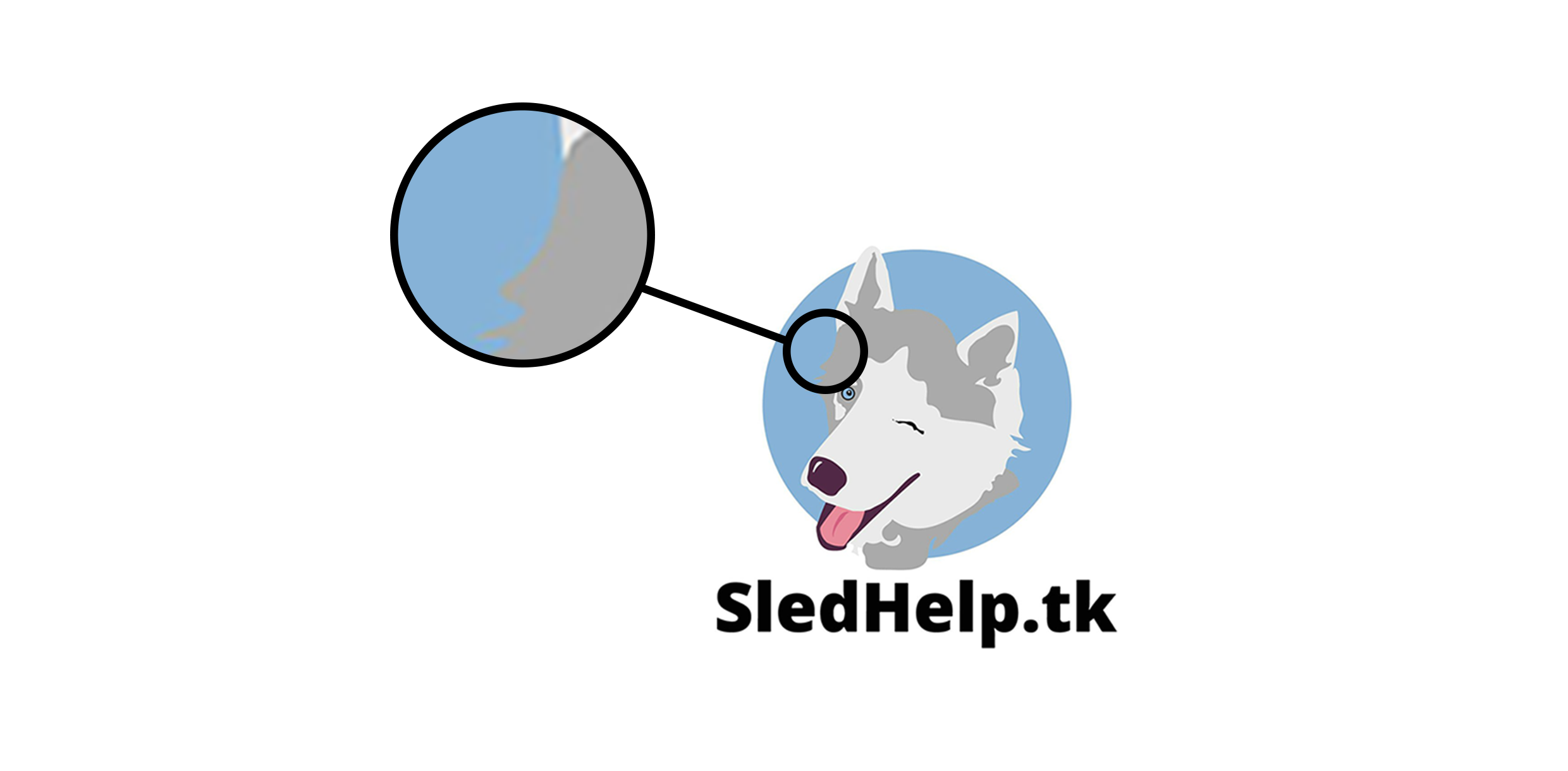
The problem is serious enough - if you need to use the monochrome version of the sign, then the logo will lose its shape, it will be difficult to read.
But there is good news - the problem is easy to fix. It is enough to increase the contrast between the elements and it is solved - the husky is read in any color. Again we test on monochrome:

Now at any distance you can understand that this is a husky. But our advice: it is necessary to refine the logo and think over elements of corporate identity.
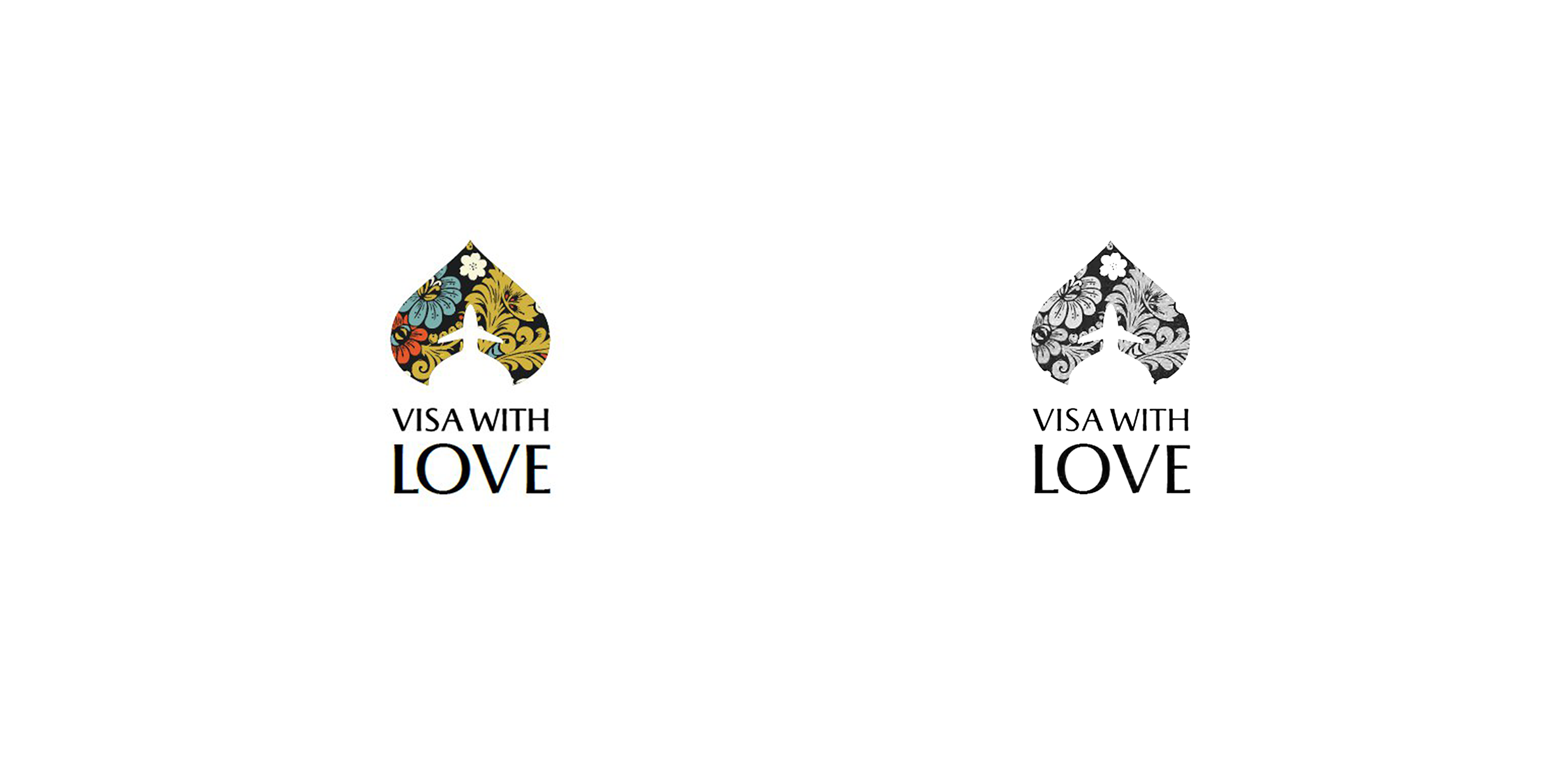
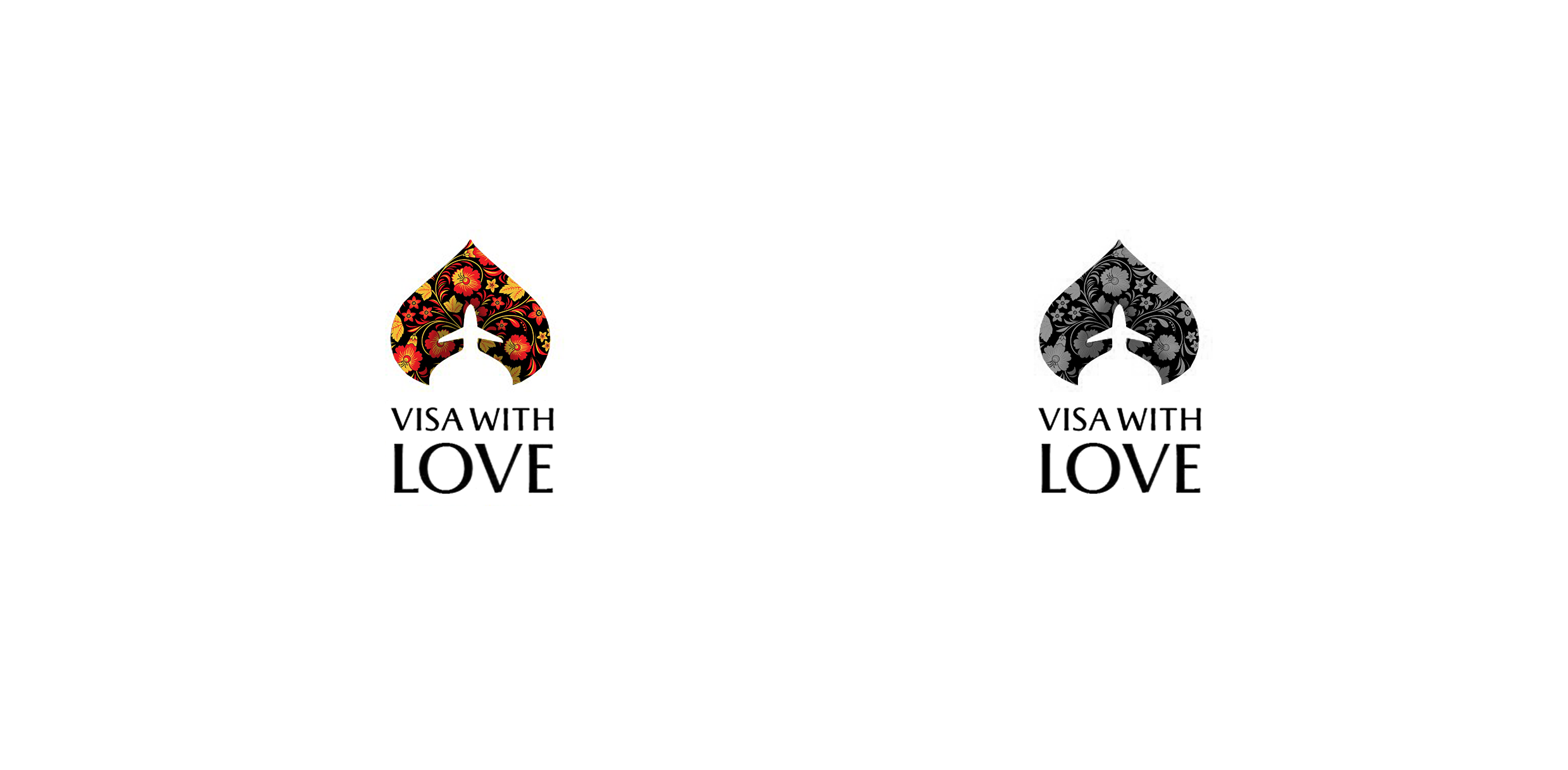
2. Visa with love
Every Thursday in public, we conduct live broadcasts and discuss the logos of those who send them for analysis. This logo is just from the stream:
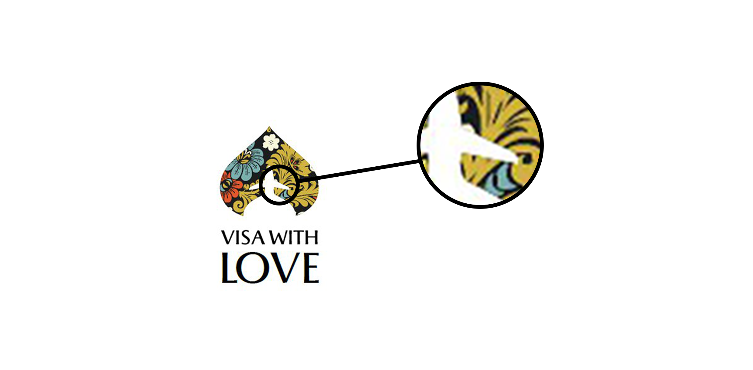
There are a lot of bright spots in the texture drawing, which is why it merges with the plane. This can be clearly seen if the logo is translated into monochrome - the plane is almost lost on the background of light texture:
To fix this, let's pick up another picture and arrange it correctly - let's make it so that the details close in tone don't touch each other, as in the initial version:
Now, in the monochrome version, you can see that the texture does not merge with the background, and the element in the center does not lose its shape:
3. Russian Tradition
This logo sticks at the same time in the sign and in the font. We translate the logo in monochrome to understand how it reads when the color changes:

The logo is made in the technique of “lowpoles” , but in the performance of many obvious mistakes: all triangles are painted in a random color, without taking into account the light and shadow. The mesh is poorly constructed - because of this, the bear is not recognizable and rather looks like Triceratops, which has swum away with fat.
The star symbol is used in the font part, but it is recognized with great difficulty. You could close your eyes to this if the star would not interfere with reading the name:
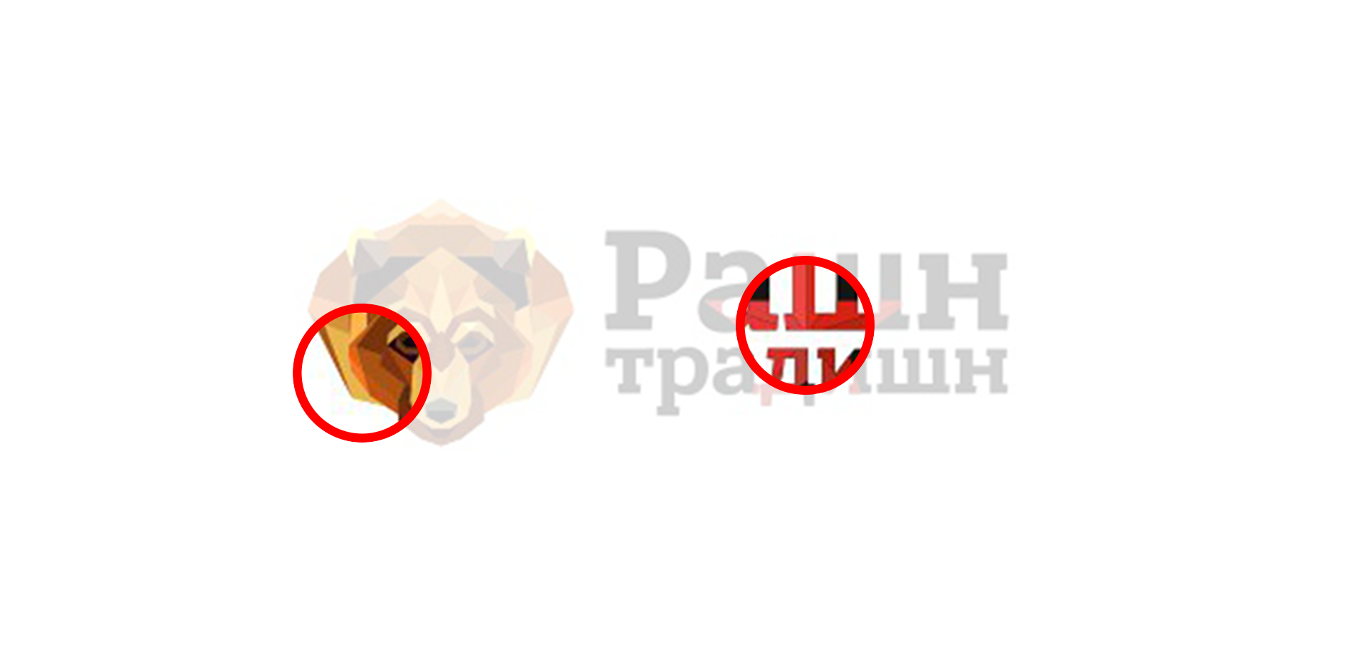
We fix the logo: we select for it the real “bearish” colors - shades of brown and beige. We leave the old grid, we do this in order to show that it is more important to work correctly with color, light and shadows.
We remove the star from the text - it is superfluous here, gives strange associations and makes it difficult to read the name:

We translate into monochrome:

Due to the well-chosen contrast, the bear remains a bear, even if the colors fade. The text is now read without problems.
Sticking to form
These were examples of sticking in color. Another situation is this: the elements are incorrectly in contact with each other, because of which the form is lost and the readability of the logo deteriorates. This is the "sticking form."
1. Kit-cat
This logo was sent to us for live broadcast in the community. The idea itself is pretty cute - a strange animal, both a whale and a cat, isn’t it lovely? But the performance kills the idea: the whale's tail merges with the head, the cat's ears immediately stick out.
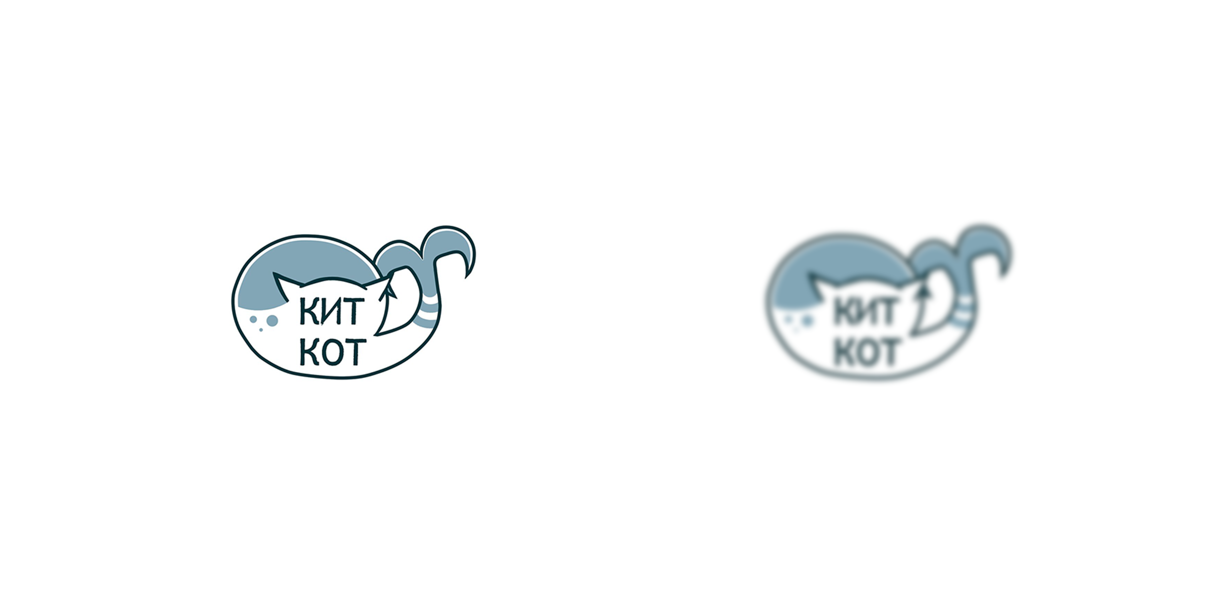
Because of this, the logo became a collection of random lines and lost its shape, as a result, both the whale and the cat are not well recognized:

What can be done? There is plenty of room for imagination: you can leave the cat inside the whale, or make a kotokit. It is possible, for example, to come up with an interesting form with the help of negative space.
But, since we give express advice, let’s go on a simple path: we will make a whale, but with cat ears and a mustache. The idea is not complicated, but reading it is easy, even if you don’t see or don’t know the name of the company:
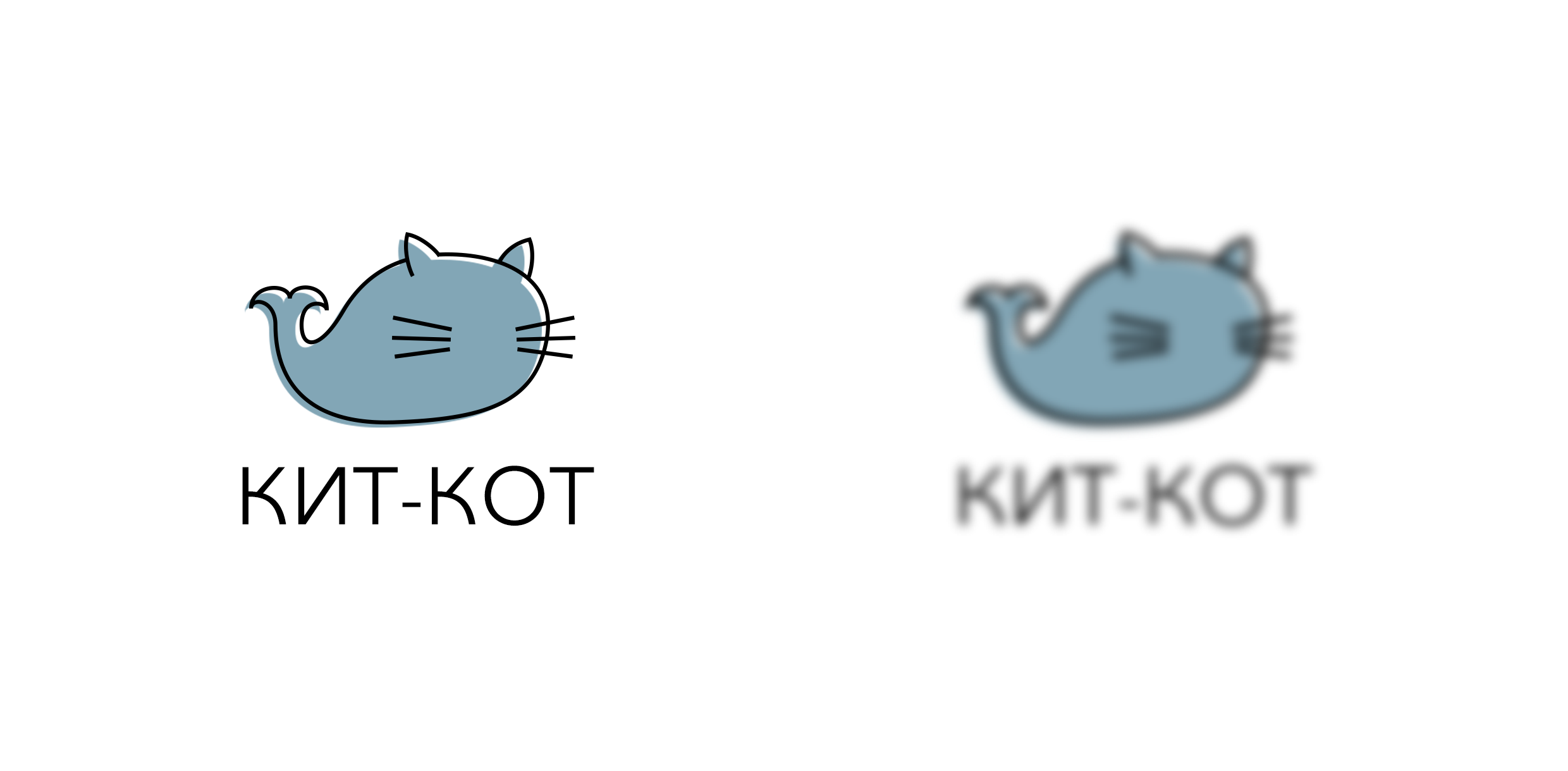
The form is read, corresponds to the name - and no random lines.
2. Oblako.rf
A similar problem with the logo of Cloud.org - there are a lot of elements, the distances are very small, all this gives not very pleasant associations and makes you feel like tripophobe (just don’t google what it is):
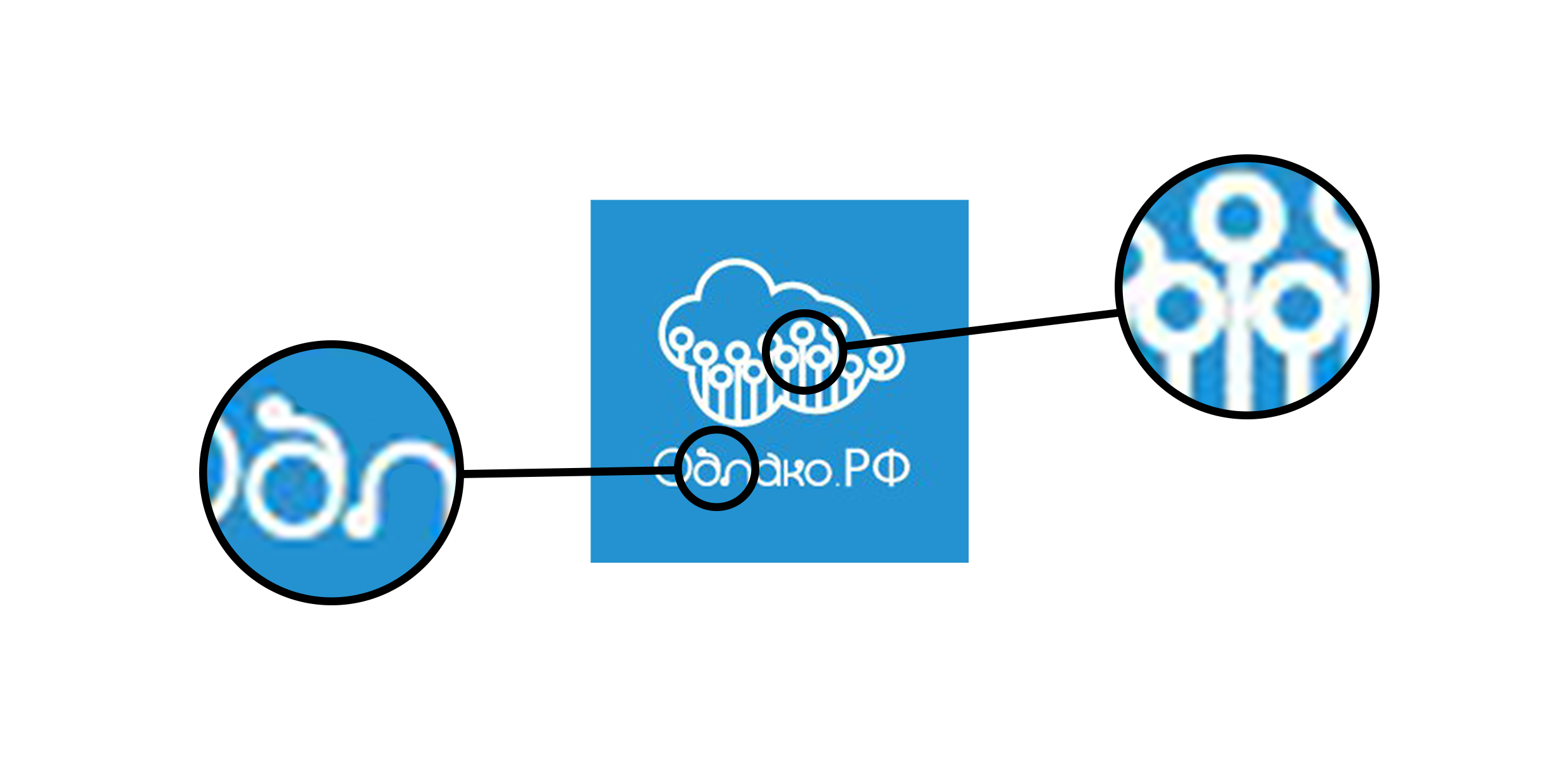
Blur testing helps to understand how the logo is perceived on the fly. There is not always time to consider a sign, so it must have a form that is easily recognized and remembered.
Oblako.rf could not stand the test for blur - the form turned into something incomprehensible, the name cannot be read:

We correct: we make the cloud shape classic, understandable at first glance. Inside the cloud we remove the extra elements, give more air to the logo and immediately test for blurring:

Now the unpleasant associations are gone, and the cloud remains a cloud, the elements inside do not turn the whole form into something incomprehensible, unpleasant.
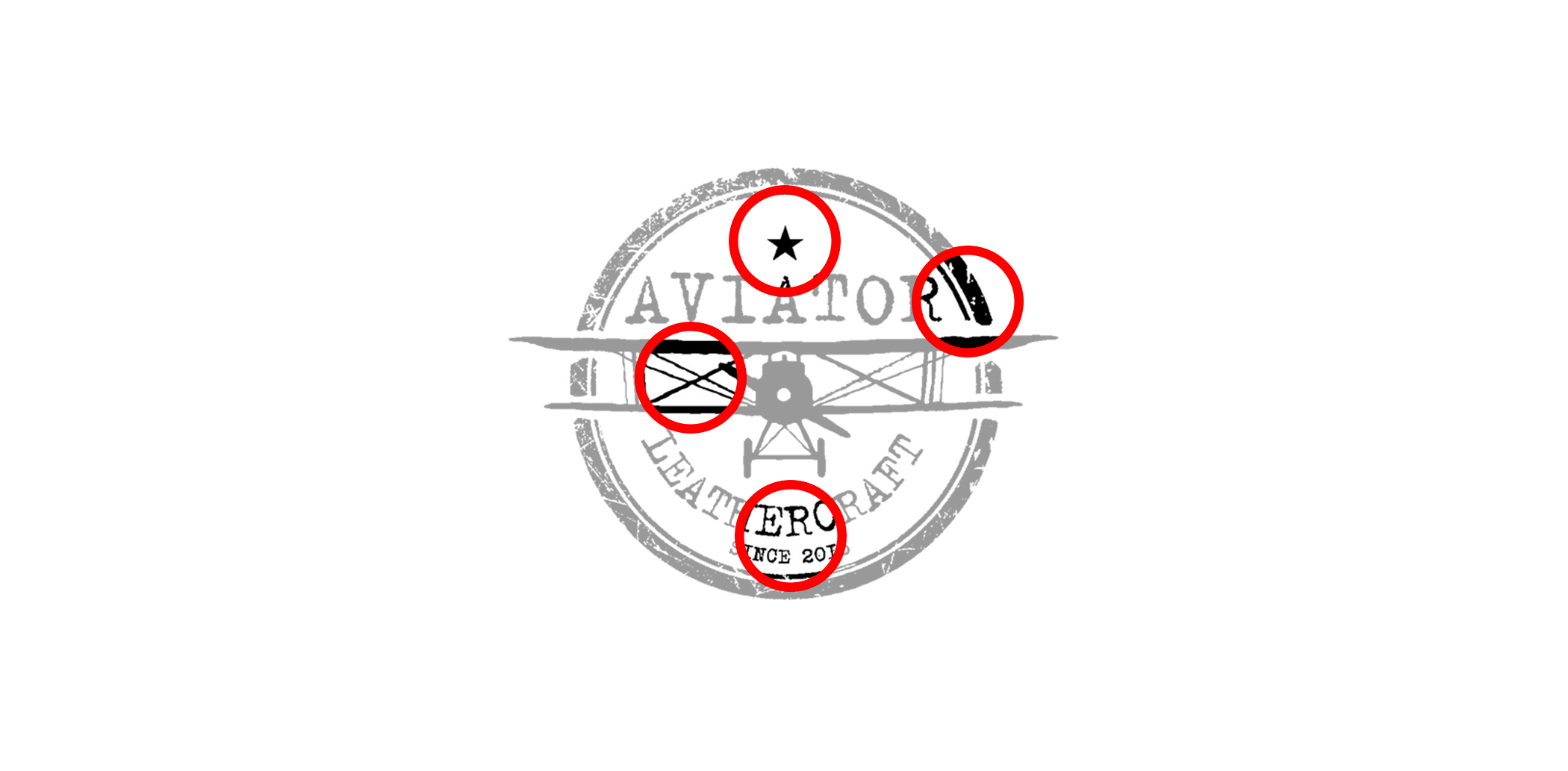
3. Aviator
And again - too many items! Why so many details? If you reduce the logo - for example, imagine that the logo will be a favicon (the site's icon in the browser tab), it becomes completely unclear what is happening:
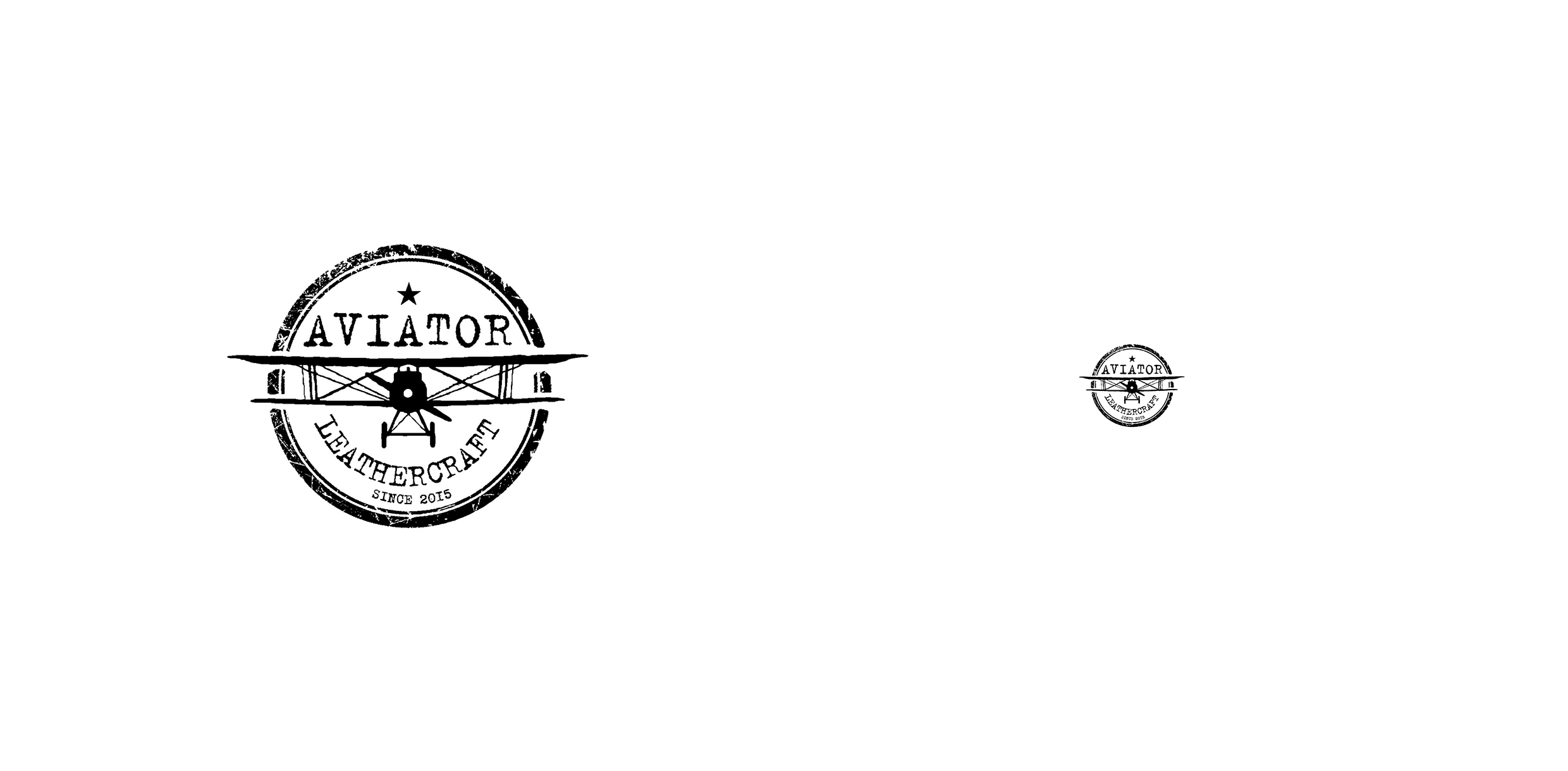
Sometimes extra items just need to be let go. We removed all the small details: the lines between the wings, two circles, an asterisk.
The remaining lines thickened and picked up the font without flirting with antiquity, it turned out like this:
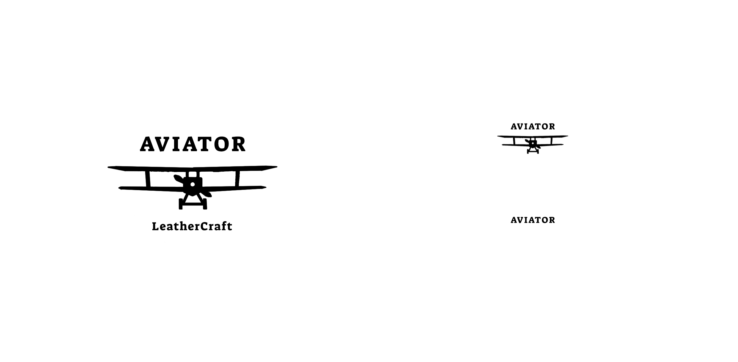
After the changes, the shape of the aircraft ceased to be lost, and the name is easy to read.
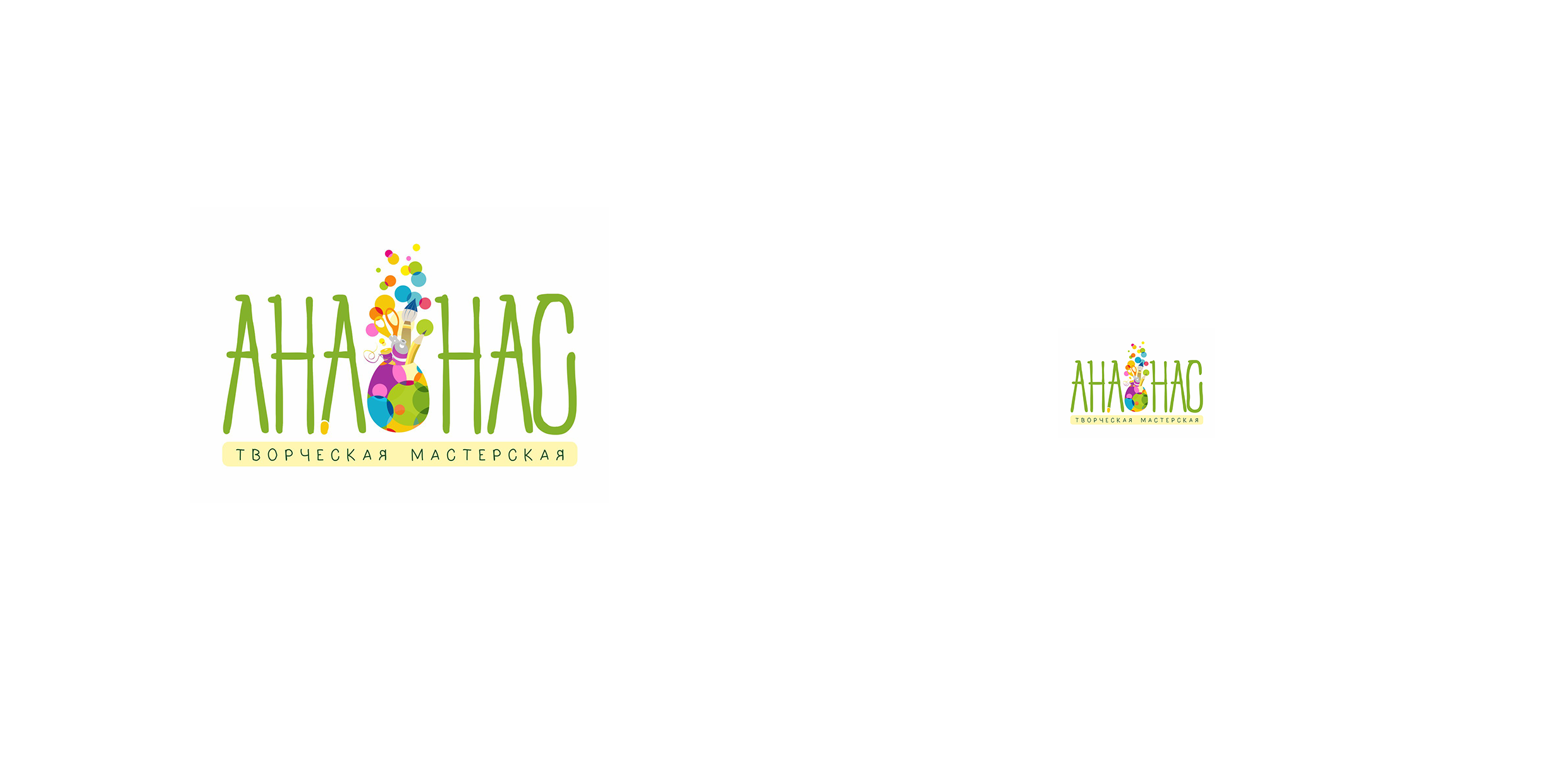
4. Pineapple
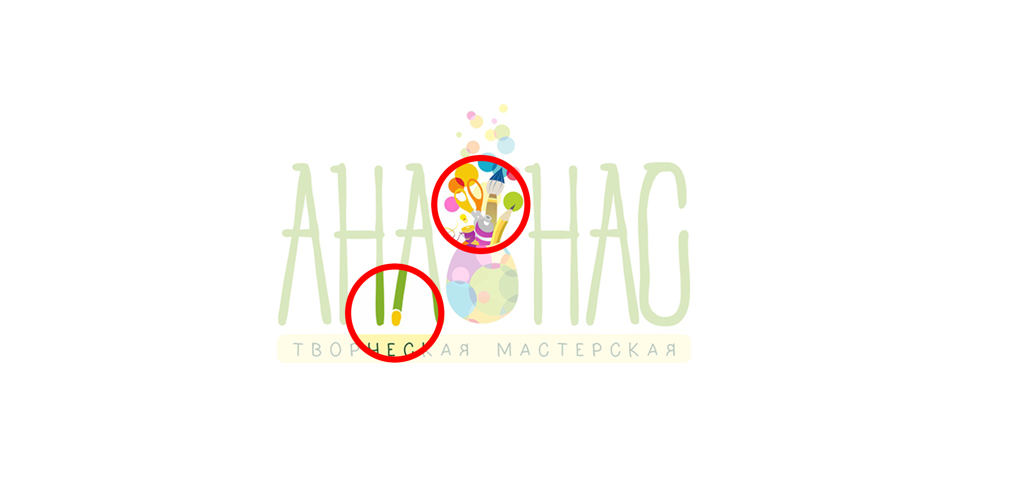
Creative studio Pineapple sent us our logo for live broadcast. In a small size, the element in the center of the logo turns into a shapeless spot. Read what is written under the name is impossible:
The sign has many small forms and a huge, no, HUGE number of colors. There is little air, poor contrast and overlapping elements:
The ideal solution would be to completely redo the sign, but you can try to simplify this one.
We say goodbye to unnecessary details that do not add anything to the logo. We take out the sign from the font and put it next to the name, make it not so colorful, test for size:
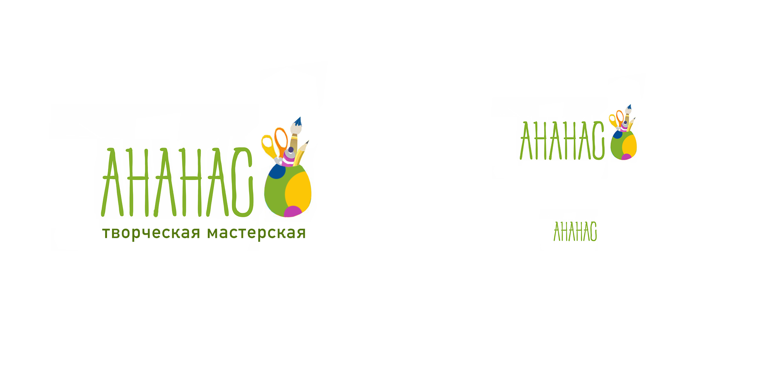
Now the logo has become more harmonious, the forms are recognizable - it can be used both in large and in small format.
Extra items
The next common problem in the design of logos - extra elements. Often people try to place in the logo all the information about the company. What this leads to, let's look at an example.
1. Gotti
Logo sent to stream:
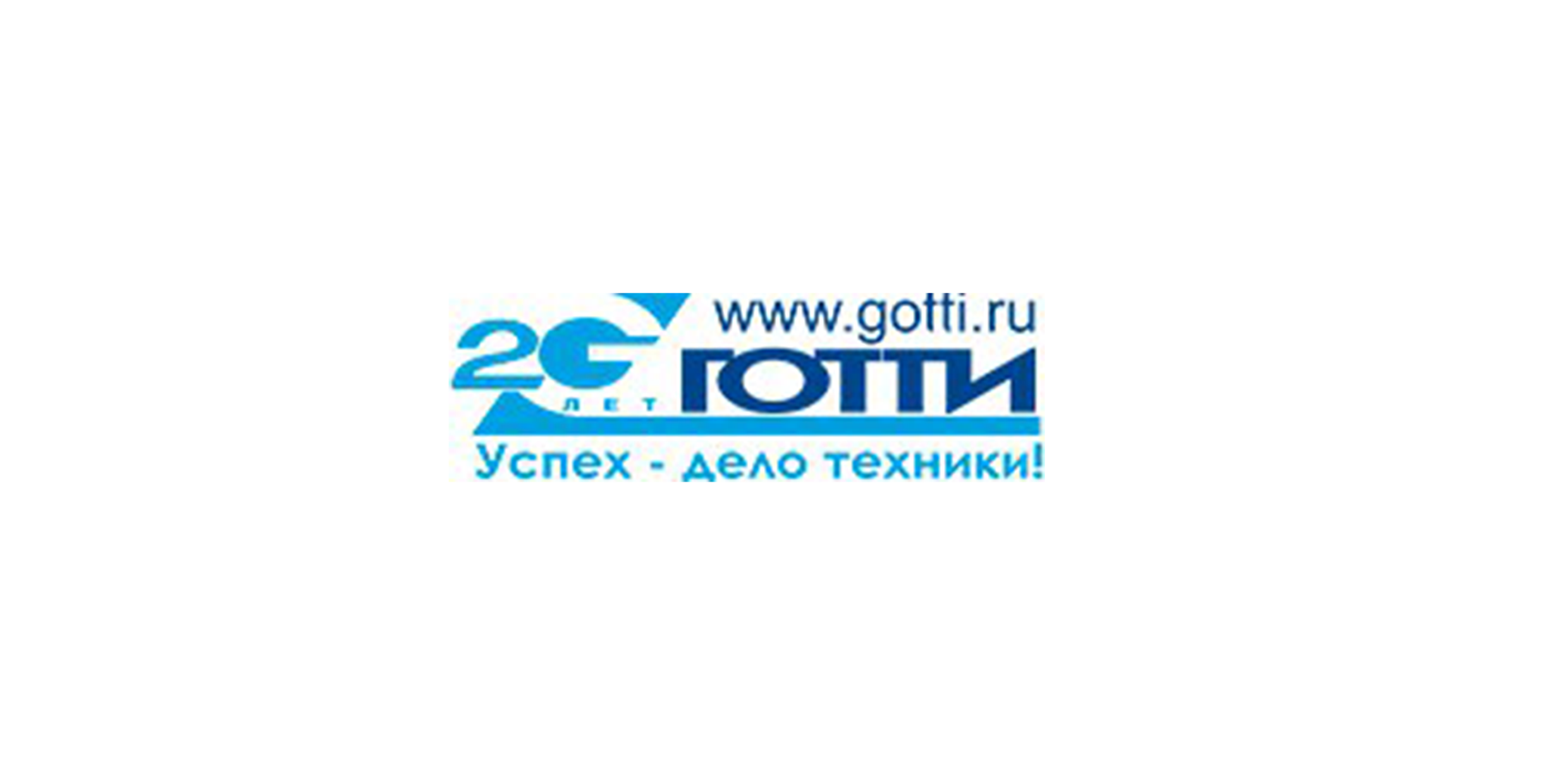
What kind of frankenstein? Everything is here: name, website, slogan in one logo. Why such violence?
No need to try to put in the logo all the information about the company. We make cosmetic repairs:
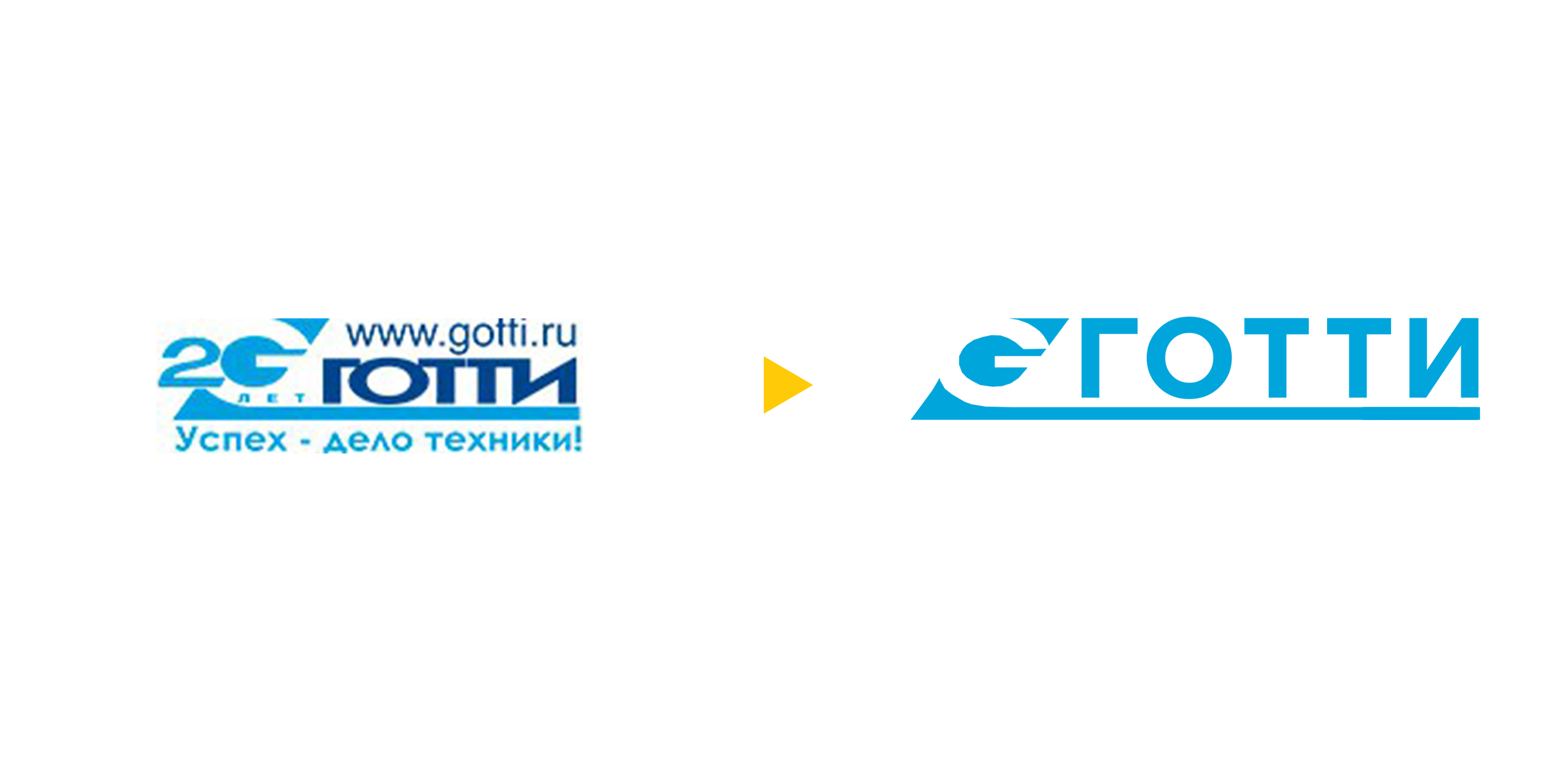
It would be better if you leave the name and, for example, one interesting detail - the letter “G” in the corner.
Now the logo is easy to use on any surface or carrier, and all additional information can always be indicated alongside.
Now the logo is easy to use on any surface or carrier, and all additional information can always be indicated alongside.
Bad readability
Without readability there will be no recognition. This is due to the following error in the design of logos.
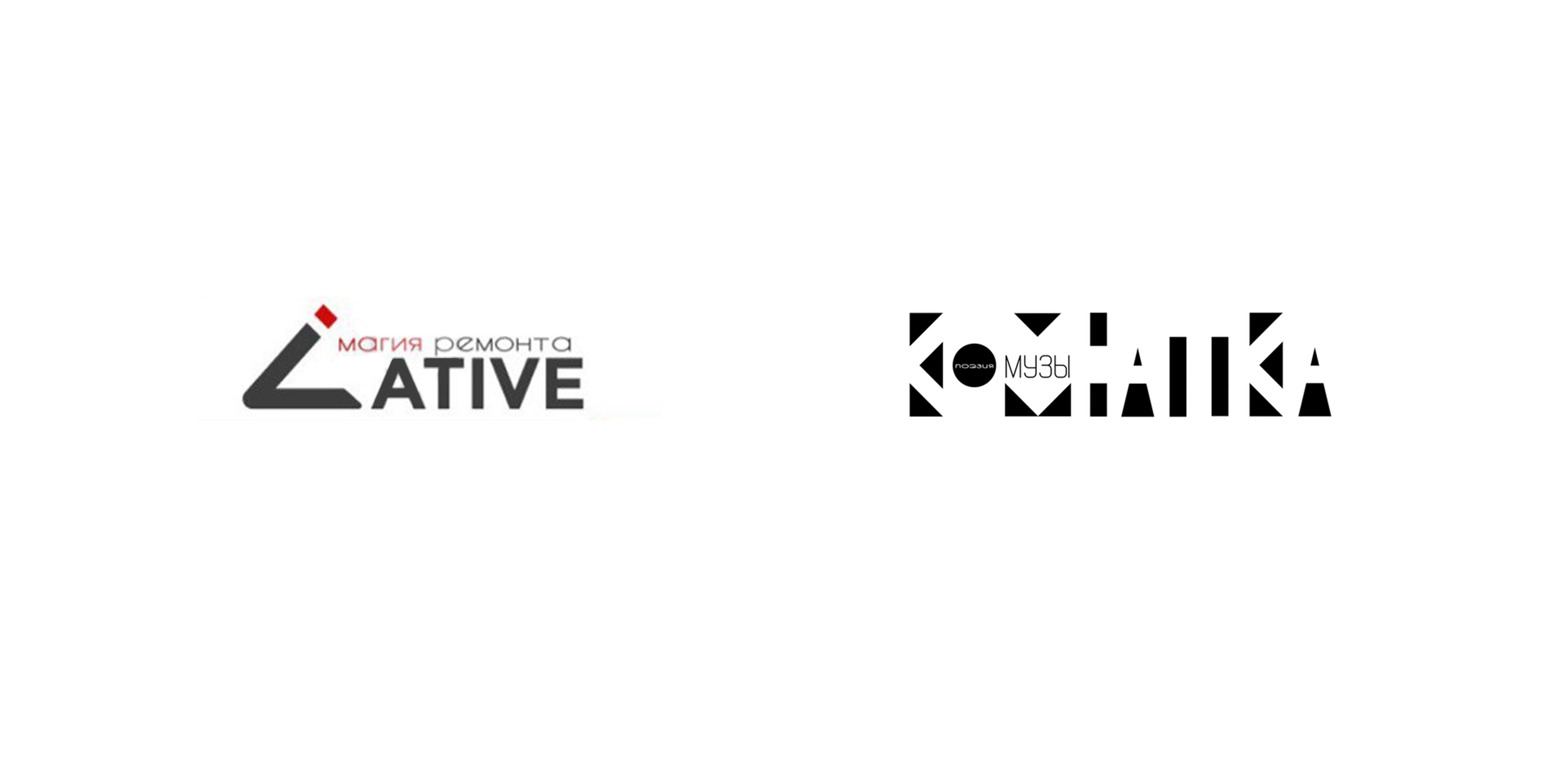
1. Lative and Room Muse
These logos were sent to us in #logomachine_help and shown on the stream. Here the same problem - it is very difficult to read the name of the companies.
In the case of Lative, it is enough to make the first letter more similar to “L”. No need for flirting, they do not help the sign and do not add anything:
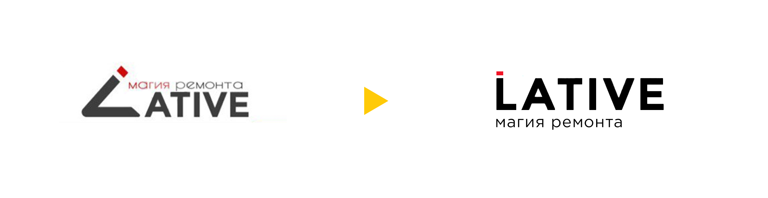
It is important that the name was read easily and clearly - otherwise how then to recall the name of the company, if the name is not read?
Room muse - incorrectly used negative space technique. You need to add more dark spots and calm the inscription - make the letters the same.
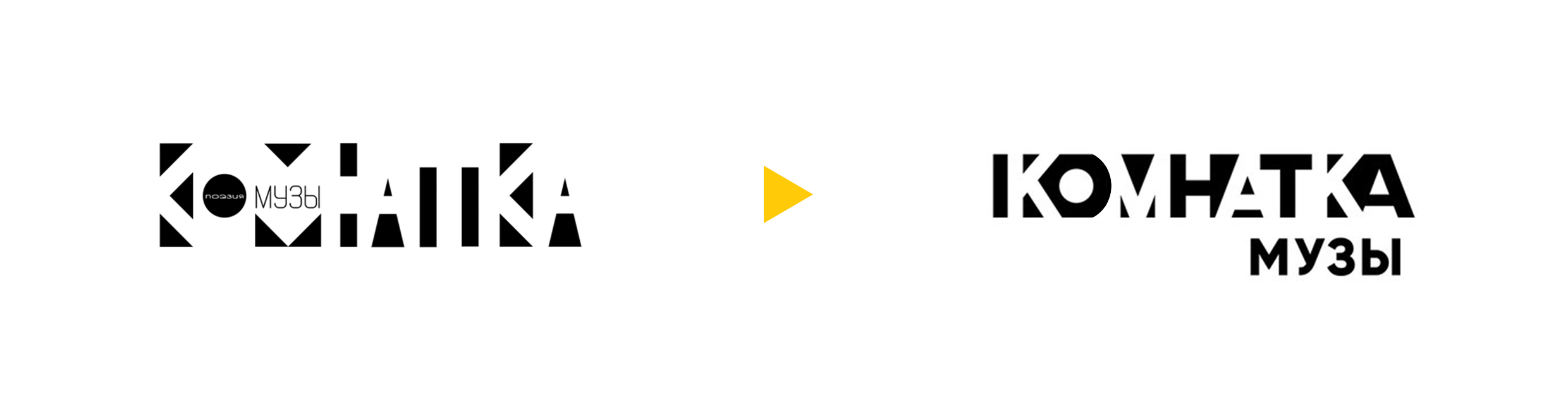
Now there is no doubt that the Room of the Muse is a room, and not something else.
As a result:
- It is important to check whether the logo loses readability when translated to monochrome, when blurring or when decreasing;
- It is necessary to remember and know where, in what size and on what background, the logo will be used;
- It must be remembered that the logo must remain the logo. It should not contain the website address, slogan, hashtags or other information that is not an integral part of it. Like for example the descriptor.
Do not forget to share these simple tips on social networks. And, as always, good luck to you and your projects!
Prepared by Slepchevich Victoria for Log Machine
Source: https://habr.com/ru/post/344114/
All Articles