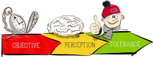
Performance as Perception: Managing Patience

How to expand the possibilities of optimizing the frontend, when from a technical point of view there is nothing more to optimize? To do this, refer to the management of psychology and user perception.
Waiting may consist of active and passive phases. In order for the user’s perception to be shorter, we usually increase the active phase and decrease the passive one. But what to do when an event does not contain an active phase at all, being fully passive waiting?

Table of contents of the Performance as Perception series:
The author of the article is Denis Mishunov, a frontend developer from Norway, who often gives presentations (including at the HolyJS conference in Moscow and St. Petersburg). Denis has two education: engineering and art, he is interested in psychology, physics, history, painting. In his daily work, he always tries to get to the essence of things and processes, to focus on optimizing the performance of all front-end developer tools.
')
So, waiting without an active phase occurs in the real world quite often: waiting for a queue at the ticket office, waiting for a bus, a queue at an amusement park, etc. Scientists have proved: the longer a person has to wait, the worse he reacts to it. User response to the expectation in the online world is no different from offline . Research based on an analysis of over a thousand cases revealed 14 different types of waiting situations on the Internet. Since we are dependent on the loyalty of our users, we cannot let them face passive expectation.
In this article, we will look at what pure passive waiting on the Internet is , how we can cope with it and what can be done to keep the level of user satisfaction high even when they cannot get the requested service fast enough. To better understand the psychology of online waiting, we turn to the psychology of waiting queues, customer satisfaction, and other research that has been conducted on expectations in the real world.

Psychological time: tolerance management
In the first half of the 20th century, build managers received complaints that people had to wait too long for them to use the elevator. The managers did not know what to do, as there was no simple technical solution. In order to respond to user requests, it was necessary to consider a costly and time consuming technical solution. And then someone (the designers say that it was a designer, the engineers say it was an engineer) thought up how to solve the problem from a different, non-technical point of view.
The solution found was much simpler and cheaper: install mirrors in the elevators and floor-to-ceiling mirrors in the lobby. After the installation of mirrors, the number of complaints dropped to almost zero without any changes to the waiting time. Why?
“White Rabbit: She will be furious if I am late! She will come exactly there! ”
Lewis Carroll, Alice's Adventures in Wonderland
I think most of you will be able to answer this question. Simply put, the solution replaced the pure, passive expectation that people felt in front of closed elevator doors with an active one, when people were able to look at themselves (and also quietly view others). This decision did not try to convince people that they became smaller in front of the elevator, did not change the objective waiting time or event markers. Instead, people were transferred from the very beginning to the active phase, making them much more tolerant of waiting.
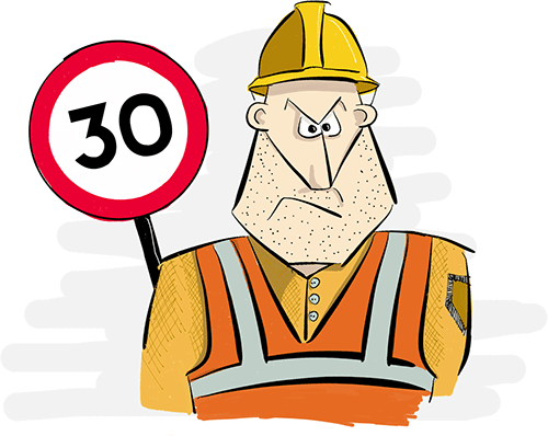
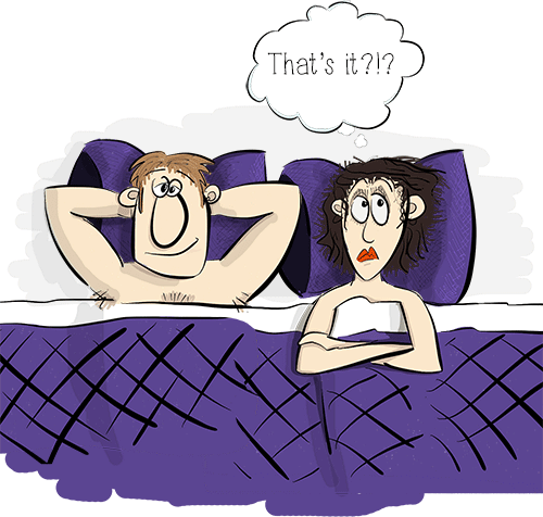
Now let's go down the rabbit hole waiting problems. Let's face it: it is not always easy to convince the user that there is less to wait than it actually is. However, the need for waiting does not have a negative effect on the assessment of the website by the client if the waiting time is well regulated . So why do people not like to wait?
In 1985, David Meister formulated eight “principles” (which were confirmed in the experiments of P. Jones and E. Peppiatt and others) concerning the psychology of expectation. Despite the fact that Davis, Heineke and Peppiatt later added two more principles to the list , for simplicity, we will call all principles the Meister list . Below we provide this list along with possible recommendations on how we can cope with each of the principles.
| Principle | Recommendation / comment | |
| When people are not engaged in anything, time lasts longer than when they are busy. | Balance between active and passive phases. This is how the elevator problem was solved. | |
| P2 | People want to start (waiting until the beginning of the process lasts longer than waiting in the middle of the process). | The use of early termination techniques (short passive phase at the beginning and switching to a longer active) and anticipatory onset (long active phase at the beginning and shorter passive at the end) |
| P3 | Anxiety makes waiting time longer. | Very subjective and difficult to manage online when there is no real contact with the user. |
| P4 | Uncertain expectations are longer than expectations, the end of which is visible. | |
| P5 | Unexplained expectations are longer than those explained. | |
| P6 | Unfair expectations are longer than fair. | Meet user expectations: match your waiting time with your competitors, or at least neutralize the waiting time for your services due to various factors (reliability, convenience) if there are no other ways. |
| P7 | The more valuable the service, the longer the customer will wait. | Increasing the value of your services is beyond the scope of this article. |
| P8 | Waiting alone seems longer than waiting in a group. | We can assume that most users are “standing in line” alone in front of their computers, therefore, we cannot control this principle. |
| P9 | If the client is uncomfortable while waiting, time lasts longer than when it is convenient for him. | The word "comfortable" has a broad meaning and is very subjective. |
| New users, as well as those who log in infrequently, it seems that they are waiting more than those who log in constantly. | Here we must meet the expectations of users (see P6), thinking about a hypothetical user who came to the site for the first time. |
Points P3, P8, P9 and P10 cannot be influenced in any way from the point of view of the development of the frontend or from the point of view of managing the website. For points P4 and P5 there are no management tools at all. These two principles tell us that one of the main reasons why people are unhappy while waiting is a different kind of uncertainty : how long will it take? What is happening now? Will there be a result? To answer these questions, we turn to the management of patience.
Show me the process
“I wonder how long I flew? - Alice said loudly. “Probably, I'm already somewhere near the center of the Earth!”
Lewis Carroll, Alice's Adventures in Wonderland
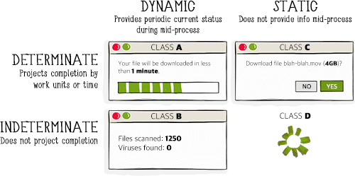
To partially eliminate uncertainty and provide information about the waiting time and the current state of the process, we have good performance indicators at our disposal. User behavior researcher Stephen S. Sev proposes to divide progress bars into two main groups: dynamic (updating information with time) and static (unchanging over time). Each of them can be divided into two subgroups: deterministic (reflect project completion by time, work units, or in some other way) and uncertain (do not reflect project completion).
Now the question arises: when to use them ? Obviously, if we show the class A indicator for each action that the user performs, it will soon become annoying. So we need some guidelines. There are certain static time intervals that can be compared with the corresponding indicators.
- Instantly (0.1-0.2 s)
This is the reaction time of an ordinary person to a simple irritant, for example, to catch a falling pen or pull a hand off a hot cup.
For what is perceived as instantaneous, you do not need to display the indicator, and this is obvious.
- Immediately (0.5-1 s)
As A. Miller found out, most adults can store from five to nine simple elements in short-term memory. Studies confirmed by a number of experiments, in particular, the experiment of M. Green and A. Oliva from the Massachusetts Institute of Technology, show that "processing of complex natural images and visual recognition of objects" takes no more than a tenth of a second. This means that the processing of five to nine elements by short-term memory should take from 0.5 to 0.9 seconds. Thus, 1 second is considered the maximum time during which the thought flow of the user remains continuous.
Displaying any complex indicator in this range will interrupt the flow of thoughts. But usually, displaying a simple indicator without textual information will not hurt. Class D indicators, such as spinners or a very primitive indicator of the operation (simplified class A), look natural without interrupting the flow of thoughts of the user and at the same time smoothly hinting that the system is active.
- Optimum time (2-5 s)
The optimal load time may be different and depends on the subjective parameters, but if the execution time of most tasks exceeds the interval from 2 to 5 seconds, the user's concentration decreases. That is why we consider two seconds the optimal page load time.
In this interval, we need to let users know that the request is being processed and that the system is responding. Again, it is optimal to use the class D indicator or the simplified class A indicator - there is no need to draw the user's attention to additional information.

- Attention interval (5–10 s)
This is the threshold limit of the user's patience and, accordingly, it requires a more complete solution. For events that occur in this interval or longer, we need to show more information than just a general indicator “working on it”: users need to know how much more time they need to wait. Therefore, we must show a dynamic indicator of class A or B, where the process is visible.

Summing up, we can formulate our guidelines as follows:
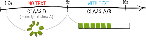
- For events with a duration of 0.5-1 seconds, it is recommended to display the class D indicator (spinner) or the simplified class A indicator (progress bar). The choice depends on each case.
- For events of 1-5 seconds duration , a class D indicator (spinner) or a simplified class A indicator (progress bar) is required.
- For events longer than 5 seconds it is recommended to use a class A or B dynamic indicator.
Often, progress indicators for an operation can be complex and include indicators of different classes and their combinations. This makes it possible to take into account different principles from the list of Meister.

The Slack application includes two levels of task progress indicators. In the second, an emotional component is added to the process so that users receive a positive message .
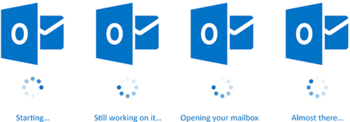
Some, such as the webmail of the University of Oslo, combine the spinner with information about what is happening at the moment. Although in most cases this information is incorrect and does not reflect real actions (the text is updated solely according to how much time the user has been waiting for), this is a good solution if it helps users in the process of waiting.
Little Big Room is a great site with a page loading indicator that improves your mood, reduces anxiety (P3 in Meister's list) and creates comfortable feelings (P9) for further waiting on the site.
Please note that in cases when you use other distracting tools (for example, animation) during the whole waiting period, an additional progress indicator may not be needed: users are already busy processing the animation and thus, by default, they tolerate waiting more easily.
Progress indicators can provide enough information to mitigate uncertainty in accordance with P4 and P5. But can we do something more than just display the progress of the download? Can we cope with several principles? Sure, we can.
Tolerance outside performance indicators
Alice was silent: never in her life had she confronted so much, and she felt that she was losing patience.
Lewis Carroll, Alice's Adventures in Wonderland
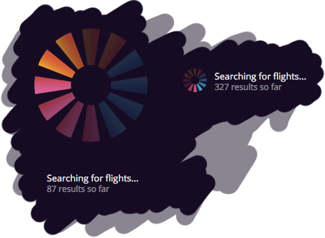
Let's turn to a rather interesting service: tripmydream.com . Users can search for flights and hotel deals worldwide, based on a predetermined budget. After performing basic operations, such as choosing the theme of the trip and the desired dates, the user sets the budget for the trip and goes to the search page.
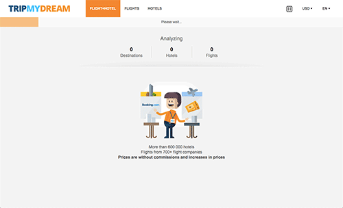
On the search page tripmydream.com implemented several techniques to manage patience.
From a performance point of view, finding combinations of flights and hotels around the world, and even according to a predetermined budget, is not an easy task. According to the developer’s tools, the results for the query we made continued to flow for two minutes. Consider what is being done to manage tolerance in this case.
First of all, the method of early termination is applied: the information is displayed as soon as the first results matching the search criteria are found. But early completion alone is not enough: the first relevant result was displayed after almost ten seconds of waiting.
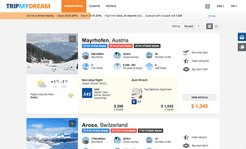
The early termination method alone did not save tripmydream.com: the first search results were displayed after 10 seconds.
Earlier, we came to the conclusion that for such long processes a dynamic progress indicator should be shown. For tripmydream.com, this is a complex class B indicator, consisting of an orange progress bar and an Analyzing block just below it.
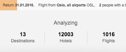
A comprehensive class B indicator consists of a progress indicator and a block reporting processed directions.
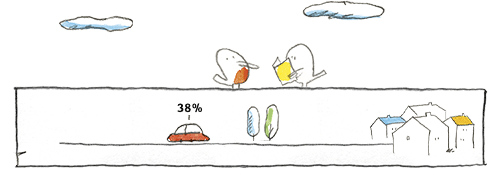
Finally, consider the cartoon character below. The character is designed to cope with P9 (uncomfortable waiting lasts longer than comfortable): as a rule, smiling cartoon characters evoke emotions associated with carefree childhood memories, and thus generate more comfortable feelings while waiting. A character can even partially solve P8 (waiting alone seems longer than the company) for those of us who spend more time with virtual friends in front of the computer than with real people. However, keep in mind that the use of a cartoon character should not contradict the expectations of service users: such a character on the bank’s website, for example, would be inappropriate.
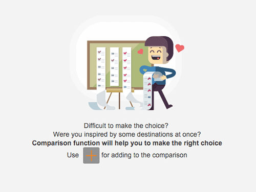
Cartoon characters can help make waiting more tolerable.
In general, early termination helps manage user acceptance of latency in accordance with P1 and P2; integrated progress indicator deals with P4 and P5; and the cartoon character down below is trying to deal with P9 and P8. Many destructive principles of expectations are under control here!
But not everything is so smooth with the cartoon character on this page: it not only calms, but also communicates, providing the user with additional textual information . And here we have a problem. Since the character and the corresponding text in this element is changed to a new one every six seconds or so, in most cases users do not have time to read the full text.
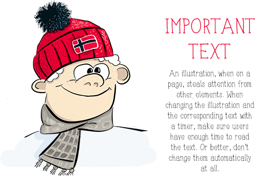
When placing the text next to the picture, make sure that you give users enough time to read. When the text is removed during the reading, we no longer manage patience, but we get frustrated.
There are many good and bad examples of tolerance management on the Internet. But we will look at two who are trying to achieve the same result using different approaches.
SlideShare and Speaker Deck are, perhaps, the two most popular services for downloading slide presentations. Such services are very convenient for those who hold presentations, since after the event they can share their slides with a wider audience. Both services have their fans, who prefer one or the other for aesthetic or historical reasons, but from the user's point of view, the services are very similar in functionality. We are especially interested in the process of uploading presentation files to these services.
From a technical point of view, the process is the same in both cases: the user selects the file, uploads it, specifies the title and other meta-information, then presses the button to publish the presentation. From the psychological point of view, the process is the same: file loading is purely passive waiting, since the user does not control the loading process at all. He can do nothing except cancel the download. But the interfaces for this process are different for SlideShare and Speaker Deck.
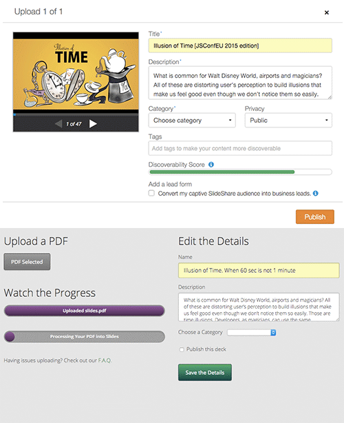
First about the good. Looking at these screenshots, we see how the services use patience management for the file upload process: it is proposed to fill in the meta information not after, but during the file download, thus working with the P1 principles (when people are not busy, the time drags on longer than when they are busy) and P2 (people want to start) from Meister's list. Instead of leaving the user in a passive waiting, they launch the active phase of the brain, offering to fill this form.
But do you see the difference between the two indicators? I'm sure you can see: two different progress indicators on the Speaker Deck. And here the situation is out of control. The second progress bar not only adds some confusion to the interface, but also significantly slows down the process in the user's perception. In the case of SlideShare, my presentation file was uploaded at the moment when I finished filling out the form, so I did not notice any delays or passive waiting. But with Speaker Deck, even though my file was loaded relatively quickly (the first download indicator), I still had to wait for the second process to complete before my slides were displayed. And even if I click on the Save the Details button, it does just that - it only saves the details while my presentation is still being processed. The situation is worsening, because nothing in the interface tells the user what to expect after completing the “processing”: will the user get any advantage that is worth the wait ?
In this comparison, SlideShare demonstrates an impressive use of the patience management method : users barely notice passive waiting when uploading files to the service. On the other hand, Speaker Deck at the first stage uses the same method, but its success is leveled due to the unsuccessful continuation of the process.
So, using patience management, we can expand our performance optimization strategy and get a complete picture of the basic methods for managing objective time, perception, and tolerance in our projects.
Read about other methods in the first parts of the series “Performance as Perception”: “Perception of Time” and “ Management of Perception ”.
However, regardless of whether we are guided by objective or psychological aspects, should we do everything as quickly as possible? As you can imagine, this is not the end.
Easy, Tiger!
“Are there any moments when deliberately adding a few extra seconds improves the experience?” Asks Stephen P. Anderson in his article “Wait for It ...” . Let's see.
Not so long ago, there was a discussion about the alleged loading indicator on the website of the first National Bank of South Africa , during which some respected people claimed that it was some kind of nonsense. But let's not rush to conclusions.

First of all, as William McEwan writes : “Faster can be better, but only when speed is exactly what the client wants. Not all customers want to complete every contact with the company at lightning speed. ” Do you like it when the bank site hurries you? A website is an online interface for offline interaction that relates to the user's real life. Users have expectations regarding these operations and, as a rule, such interactions with banks do not occur at the speed of light.
Secondly, by adding this loading indicator, the bank tries to develop a special emotional quality of design : the idea of a complex product with many advantages. “Many things that really have value take time,” says Darrell Worfi, assistant, assistant professor of psychology at the University of Texas. This is consistent with the list of Meister P7: the higher the value of the service, the longer the customer will wait. The bank does not sell fast food - they do not expect instant delivery from it. By simply delaying its response to an ordinary user, the bank tries to manage user expectations by building the perceived value of the service. By the way, the download indicators on the site Little Big Room, which were mentioned above, like the load indicator of the First National Bank, are also not related to any real process: they manage expectations, and not just show the progress of the operation.
This leads us to the following - if you don’t implement a truly new way of interacting or working, your users already have certain expectations about it. Sometimes speeding up the process limits these expectations and disables the user, greatly reducing the perceived value of your service. In the long run, this can be more destructive than a slower process.
In some cases, speeding up the process significantly reduces the perceived value of your service .
"There is a moral in everything, only you have to be able to find it!" , Said the Duchess in Alice's Adventures in Wonderland . And this article modestly tries to bring its lesson. The performance and speed of our projects are certainly very important. But they must meet the expectations and needs of users before we quench our thirst for speed. A good developer knows how to make a website faster; A great developer knows when and why to do it. Learn new tools, study your users and give them the best.
Interested in optimizing performance frontend? Welcome to our conference HolyJS 2018 Piter ! More than 500 JS-developers under the same roof will gather to discuss the present and future of the JavaScript community with world experts: Douglas Crockford, Lea Verou, Azat Mardan, Gerard Sans, Minko Gechev, Vitaly Friedman - several dozen reports on the frontend and not only . Let's touch both the backend and the desktop. All the details on the conference website .
Source: https://habr.com/ru/post/343974/
All Articles