How to quickly design a site using CSS Grid
The CSS Grid module is a fantastic tool for creating website layouts. It allows you to experiment with mockups faster than any other tool I have tried.
In this article I will teach you how to do it.
')
First, I will explain the HTML and CSS we need for this task, which I have broken into four parts. As soon as you figure this out, we will move on to experimenting with mockups.
If you are completely unfamiliar with CSS Grid, you may need to review my previous article Learn CSS Grid in 5 minutes .
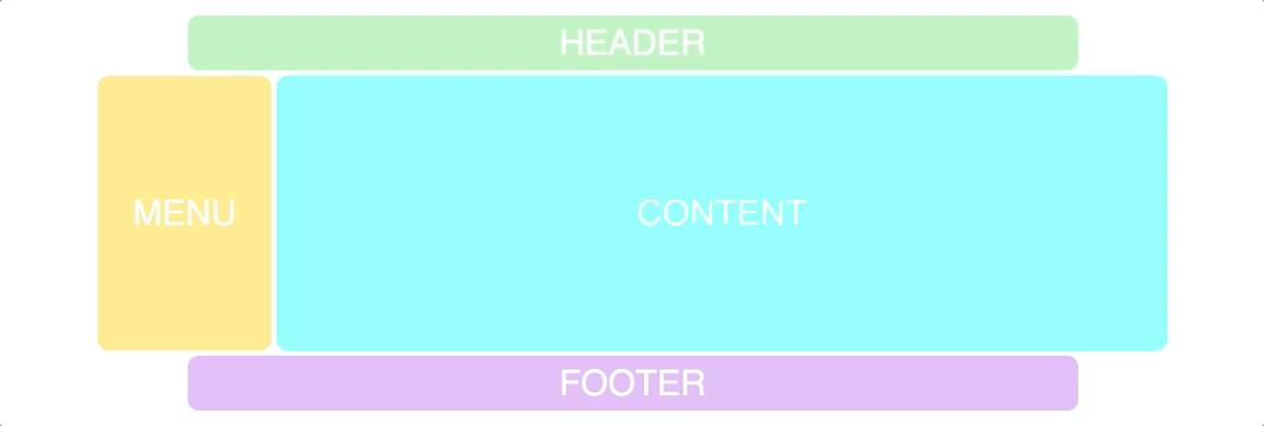
Our grid
We are going to start with a very simple grid that mimics a classic website:
I have a little stylized our example, but this has nothing to do with the CSS Grid, so I leave it.
1. Markup
The first thing we need is some HTML. The container (the element that we turn into a grid) and the elements (header, menu, content, footer).
<div class="container"> <div class="header">HEADER</div> <div class="menu">MENU</div> <div class="content">CONTENT</div> <div class="footer">FOOTER</div> </div> 2. Basic CSS setting
Then we need to customize our grid and specify how many rows and columns we need. Here is the original CSS for this:
.container { display: grid; grid-template-columns: repeat(12, 1fr); grid-template-rows: 50px 350px 50px; grid-gap: 5px; } I'm going to add more, but first I want you to figure it out.
Here is what the above code says: create a grid with twelve columns, each with a width of a fraction of a unit (1/12 of the total width). Create three lines where the first one will be 50px tall, the second 350px and the third 50px. Finally, add a gap between the elements in the grid.
3. Adding grid-template-areas
The function that allows us to experiment with the layout easily is called a template.
To add it to the Grid, we simply give the container the
grid-template-areas property. The syntax may be a bit odd, since it is different from any other CSS syntax. Here he is: .container { display: grid; grid-gap: 5px; grid-template-columns: repeat(12, 1fr); grid-template-rows: 50px 350px 50px; grid-template-areas: "hhhhhhhhhhhh" "mmcccccccccc" "ffffffffffff"; } The logic of the grid-template-areas property is that you create a visual representation of your grid in code. As you can see, it has three rows and twelve columns, just as we defined in
grid-template-columns and grid-template-rows .Each line of code represents a line in the layout, and each of the characters (h, m, c, f) represents a grid cell.Each of the four letters now forms a rectangular
grid-area .As you might have guessed, I chose the characters
h, m, c, f, because our Grid consists of header , menu , content and footer . Of course, I could name them the way I want, but it makes sense to use the first character of the elements that they describe.4. Providing areas for items
Now we need to associate these characters with our elements in the grid. For this we will use the
grid-area property: .header { grid-area: h; } .menu { grid-area: m; } .content { grid-area: c; } .footer { grid-area: f; } Here is what we get:
Mockup experiments
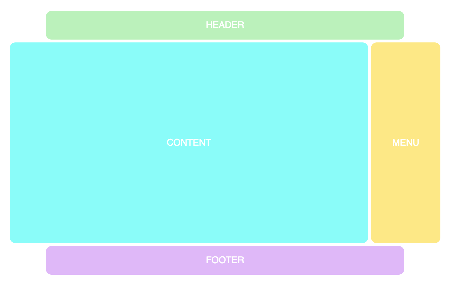
Now we have finally achieved the beauty of this feature, since we can easily experiment with the layout. These are simply changes to the position of the symbols in the
grid-template-areas property. For example, let's move the menu to the right: grid-template-areas: “hhhhhhhhhhhh” "ccccccccccmm” “ffffffffffff”; Here is the result in this layout:

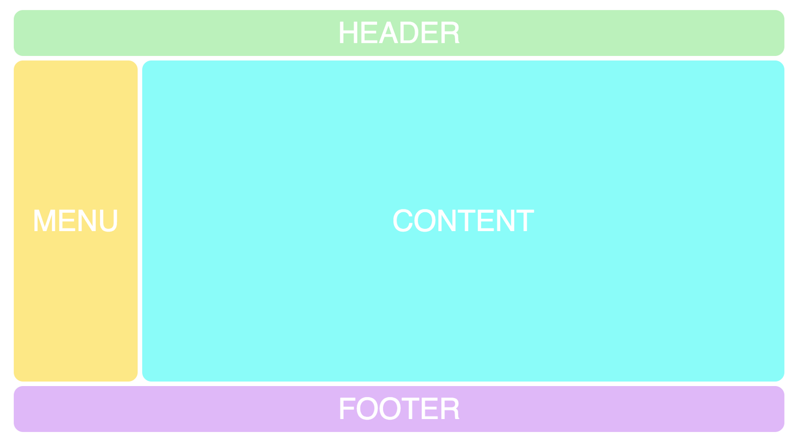
We can use points to create empty grid cells.
grid-template-areas: “. hhhhhhhhhh .” "ccccccccccmm” “. ffffffffff .”; Here is what it will look like:
Now I recommend you to see this screencast of my CSS Grid course , where you can experiment with the code yourself.
Adding Adaptability
Combining this with adaptability is also a killer feature, since it simply could not be possible only with HTML and CSS. Suppose you want the menu to go up to the header when the page is viewed on a mobile device. In this case, you can simply do this:
@media screen and (max-width: 640px) { .container { grid-template-areas: "mmmmmmhhhhhh" "cccccccccccc" "ffffffffffff"; } } And this will lead to the following:
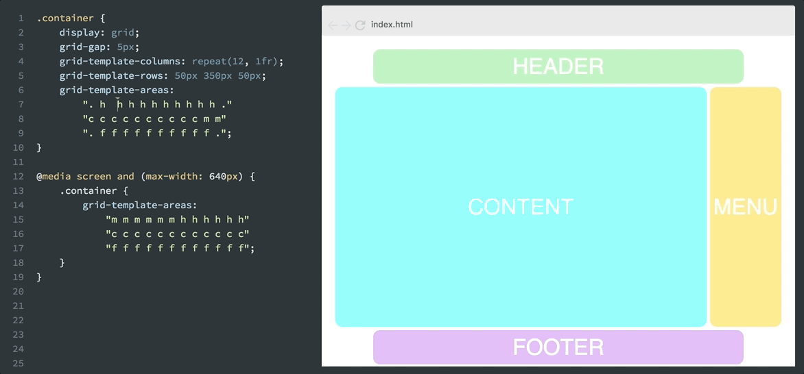
Remember that all these changes are made using pure CSS, without touching HTML. We can move elements the way we want, no matter how the div tags are in the markup.
This is called source independence, and this is a huge step forward for CSS.
This allows HTML to be what it was intended for: content markup. Not for styling, as this is the work of CSS.
Access to the free course CSS Grid from the author of the post.
Course preview
The translation was made with the support of the company EDISON Software , which is professionally engaged in the development of websites on Amiro.CMS and WordPress and for large customers.
Source: https://habr.com/ru/post/343796/
All Articles