Lecture Yandex: Advanced UI, Part One
We will publish several lectures of the Mobile Development School 2017. This school is part of the Yandex Mobilization project. Here you can find video courses compiled on the basis of the "Mobilization" of the last year.
The lecture “Advanced UI” was read by Dmitry Svirikhin, a developer from the Yandex.Mail mobile team. Dmitry explains how to solve the most common problems when developing the Android application interface.
- You have been studying for a month at Mobilization School and learned a lot during this month, including about UI. Today I will try to uncover some things that you could already know, and also try to tell something new. I hope it will be interesting.
')
My lecture will consist of two parts, and in it we will first put some problem, and then look for ways to solve it.
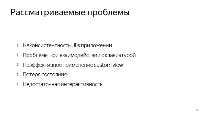
Let's see what problems we will explore today.
First, we will look at the problem of UI inconsistency in our application and the means to solve this inconsistency.
Secondly, one of the rather major problems of Android development is interaction with the keyboard. What to do when a keyboard appears on the screen, how to live with it.
Third, we explore how we can effectively apply custom views. You have already been in one of the lectures and are roughly aware of how we should create custom views, what are the rules for this. But today we will slightly open this topic and logically continue it. We also examine a little the loss of state when it is possible. Of course, you already know how to behave when we have a loss of state during the re-creation of an activity. You need to save some things in the bundle and then after recreating the activity, use them in some way.
But nevertheless, you still sometimes have problems, and we will try to take these problems into account today.
We will also consider the problem of insufficient interactivity of our UI, see how to make it more interactive and understandable to respond to any actions that the user does.
Let's start from the very beginning - about inconsistency.
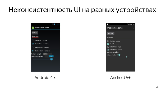
UI inconsistency can be of several types. First, we may have inconsistency UI on different devices in Android. For example, the same view on our different devices may look different. You all know that Android has a rather extensive fleet of devices, and because of this, we have quite a high fragmentation of Android versions. Accordingly, on Android 4, the UI may look one way, on Android 5, another. This causes inconsistency of the UI on different devices.
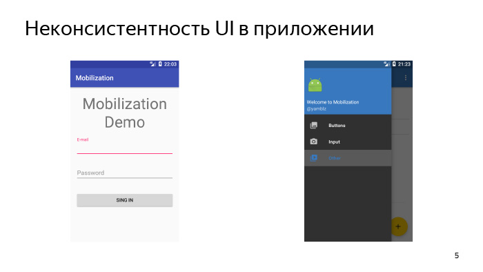
But this is probably not the main problem, because UI inconsistency can also be in the application, when on different screens we have a toolbar of a different color, or the toolbar can still not be combined with the color that we have in Navigation Drawer, which leaves on the left side of the screen. And there is some way by which we can, if not solve this problem, then at least greatly simplify its solution.
These are themes and styles.

We start with that. And let's first define what a topic is.
The theme is a kind of global configuration of our entire Android UI. The theme attributes can include, for example, some window lags relative to which our entire UI is built, some global colors and images that are also used to construct the UI, and even whole styles for individual views and subtopics, for example, for conversations.
There are about 300 attributes in a topic, and even more, but when we define our topic, we don’t need to redefine all 300 attributes, we simply don’t have to do that. To do this, the platform provides such a way that we must inherit from some already prepared system theme and redefine what we need.
Let's see what topics we can inherit from.
At the very beginning, it is best to connect the AppCompat library, which is part of the support library, and inherit our own theme from one of those already provided for in this library. Accordingly, Theme.AppCompat you may need in order to make a dark UI, and Theme.AppCompat.Light for light. And after you do this - inherit your own theme from one of these predefined topics - you will have already solved the problem of UI inconsistency on different devices. On your fourth, fifth, and higher Android UI, it may be not identical, but very similar, and the inconsistency problem on different devices will already be solved.
So, we have created our own theme, inherited from some kind of system. What do we need to do next?

The feature of theme attributes is that all internal themes and styles are somehow tied to each other, and initially we need to define a certain subset of attributes, some basic attributes. On the slide they are presented. Let's deal with each of them.
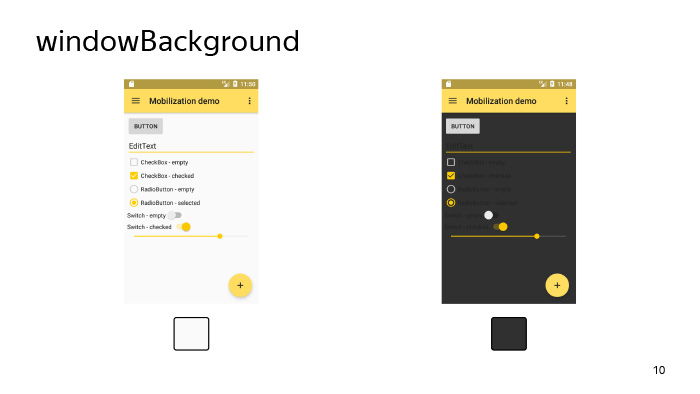
Firstly, windowBackground, on the slide you can see how the look of our application will change with given different backgrounds. windowBackground Just sets the main background for our application, setting the color or drawable, which we passed to the windowBackground parameter as the windows background, in which all our views are drawn.
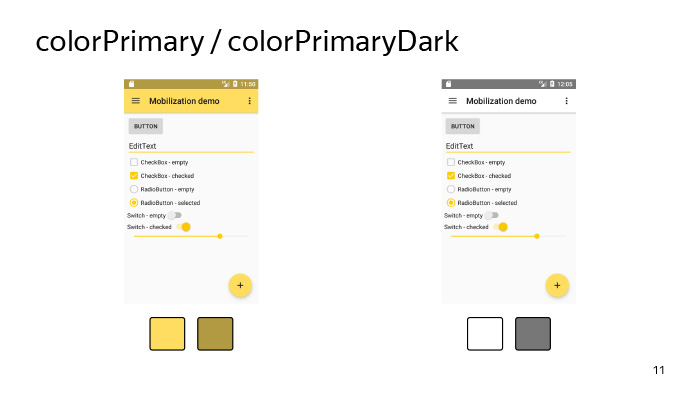
There are also options such as colorPrimary and colorPrimaryDark. According to their name, you might think that these are some very important parameters, but, in fact, the only thing for which they are needed is to simply set some colors for our tool bar and status bar. They can also be used in the same toolbar when it goes into Action Mode here. Using these attributes, the separator between the toolbar and the content is colored.

Therefore, we turn to the more interesting attribute - colorAccent. As the name implies, it is needed in order to focus the user's attention on some important parts of the UI. What could it be? For example, it can be FloatingActionButton, it can be an edittext that the user is currently editing, it can be the selected checkbox, etc.
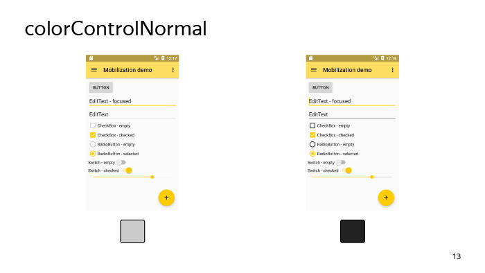
colorControlNormal determines the color of the UI-elements in the inactive state. By an inactive state, we mean an unfocused edittext, for example, or an unselected checkbox, etc.
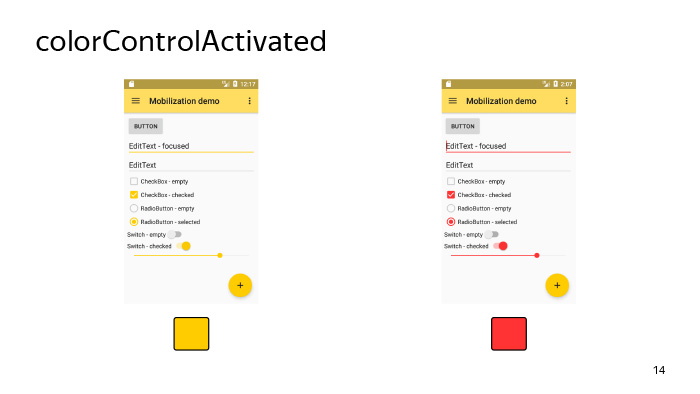
colorControlActivated, on the contrary, determines the color of the focused edittext, the selected checkbox, etc. As a rule, we do not need to redefine this attribute, because it is tied to colorAccent, by default it uses the same resource as colorAccent, and we touch it not necessary, but, nevertheless, it is still useful to know about him.
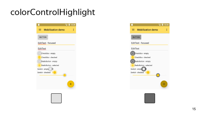
colorControlHighlight defines the color with which our view will be highlighted when we tap on it. In fact, this is the same color ripple that we have when we tap on the view and wait some time.
It should be noted that this color must have an alpha channel set in order for us to have such a beautiful effect.

There is also a list of attributes that is needed for styling, for example, buttons - this is colorButtonNormal. Buttons, they are not subject to the colorControlNormal attribute, which we considered earlier, because they are somewhat different for the guides, and a separate attribute was invented for it.
Also, for example, there is a similar attribute for the Switch. Therefore, when you specify some attributes like colorControlNormal, if something is not painted on you - it doesn't matter, most likely there are some attributes that will help you also solve the created problem.
And let's talk a little about the parameters, about the text.
There is such a parameter in the system as textColorPrimary (the main text color of the application) and textColorHighlight, which determines the color of the text selection. In general, there are quite a number of parameters associated with the text, and it is not always immediately possible to guess, as a given parameter, the text color attribute will affect many views in our system, therefore there are two options. If the textColorPrimary parameter does not work, you can either determine by experience which attribute with the text you need, or climb into the interior of the AppCompat library and find out what color your view ultimately depends on.

Let's now look at how it happens that we set the color in the theme, and at the same time, we generally paint the backgrounds of all the views in our layout. In fact, it happens as follows, and there is no magic here.
Initially, the system contains some bitmap, usually black, or on new Android, it is set using a vector, and the selector attached to it is in the form of tint for this view. For example, for a checkbox, such a selector can be attached here, as shown on the slide, which shows that, in the Checked state, we need to paint the background of our view in the color specified in the colorControlActivated attribute. Accordingly, if our view - in this case, the checkbox - accepts the Checked attribute, then it will be painted exactly in this color. This is how our checkbox will look like if under colorControlActivated we set the color to yellow.
And one more important point, which is worth noting about the attributes - we can refer to them directly in our layout. Here is the most common way presented on the slide, when we want to make a triple effect for some layout in our hierarchy. We can simply give it a selectableItemBackground background, and then, tapping on this frame layout, the user will see ripple. It will be on Android 5 and higher, and on Android 4 it will just change the background on tapu.
Let's summarize all of the above about the topic. We need to stylize uniform UI elements with themes, without needing to write the whole theme from scratch, we can inherit from some system theme and initially set a certain subset of attributes for this theme.
Then, if we do not have enough of it, we can change some other attributes to a point in order to achieve the desired result. And also, if necessary, you can use attributes directly in your layout.
So, we figured out how to write a topic. Let's see where we can use it. We can set the theme for our application and activity directly in the manifest using the android: theme attribute. When can we use each of these cases? In the application, we can set, for example, a bright theme. Quite often now all applications look with a light theme. And while it is quite fashionable now to make galleries, which, on the contrary, have a dark color. Thus, we can set the main theme and then separately in the activity in which we want to see our gallery, make, for example, a dark theme.
But there are also other situations.
Here we have some layout, so it looks like with themes by default. In general, everything is not bad, but we do not like it. We or our designer wants a slightly different theme - he wants our toolbar to be so dark. It turns out that in the main part of the application we use a light theme - this is a light background with dark text, but the toolbar suddenly became with a dark theme and with light text.
For this, Android provided the ability to set themes at the view level. What happens when we set a topic at the view level? Those attributes that are specified in this topic that we set in the view, they, respectively, will override the basic attributes of the activity in which this view is displayed.
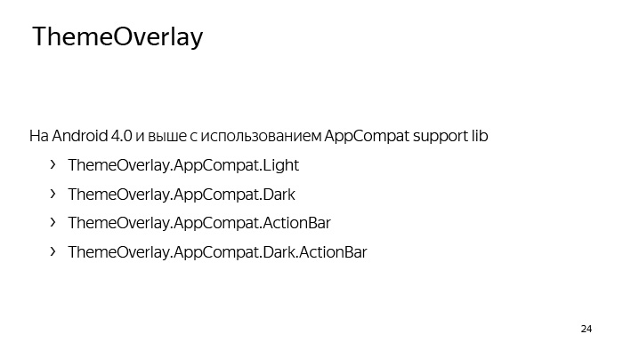
And for this, the system also provides for the so-called ThemeOverlay, from which we must inherit our own themes, which we are going to transmit in view, and also using the AppCompat library, we already have some list of those themes that we can use, from which we can be inherited. Accordingly, ThemeOverlay.AppCompat.Light is designed to override some part of the hierarchy from a dark theme to a light one, and ThemeOverlay.AppCompat.Dark - on the contrary, from a light to dark one. There are also already prepared Overlay for ActionBar and for DarkActionBar. Last we need to use in our example, which we considered earlier.
Now let's see this situation. What is the difference between themes and styles that we set at the view level? I think you all know what styles are, you have used them more than once, and let's say we set some styles for view B in this hierarchy, which is now represented on the slide. What happens then? All attributes that are inside this style will only be view B.
If we want to set a theme for view B, what will happen? All global attributes from this topic in turn will affect the entire hierarchy: not only on B, but also on all of its child'ov (in this case, D and E). But if D and E had other childs, the topic would also apply to them.
What happens if we set both the style and the theme for view B? Everything in general is pretty clear. The style will also work for this view B, and the theme will apply to B and all of her childs.
Now let's formally define what the difference is in style and theme, which can be set at the view level. The style is intended to set some subset of attributes that is adequate only for the given view, in which we set this style. For example, a style may be contained if we set it for a TextView, the TextAppearance or Background attribute. This is a normal example of a topic. And in general, initially the themes were intended so that we could eliminate duplication for the same type of view. If we set a topic for a view, it should be intended to redefine some global attributes for the entire hierarchy, in which we set this topic.
The theme may contain attributes such as, for example, colorControlNormal, which we reviewed earlier.
There is also another type of style called TextAppearance, which is designed to define a set of attributes associated exclusively with the text. It can be as color, size, font, even the shadow of the text. And they are used mainly for such views as EditText and TextView, but in general there is still some set of views where they are used. The main distinguishing feature is that these styles should be transferred to those attributes whose names contain the phrase TextAppearance. Pretty easy to remember.

These are the TextAppearance with us using the AppCompat library exist in the platform. You can use them. You can even tell your designers to use these styles to give you some kind of layouts.
In general, the topic of typography in Android is quite extensive. You can spend a whole lecture on them, but I will probably leave it to self-study. Below is a link where you can read various details about the text in Android, and he will go on to the next topic related directly to the development.
And the last thing I wanted to say about styles is about explicit and implicit inheritance of styles. Let's see, we have some layout. This is the usual login form. Accordingly, there is a field for entering e-mail and password. It seems that these fields look very similar, but, nevertheless, they have some kind of common part and style differences. Let's try to build a hierarchy of these styles.
We will select the common part using a style called AuthField, and then separately for the login and for the password we will create styles that will already be inherited in a familiar way. We also inherited topics. This is done using the parent attribute, and in general, everything is clear and simple. But we can do otherwise. We can make clearer, more visual way, which will allow us to follow the hierarchy of styles.
We can simply separate the common part through a dot and write styles derived from the common part in this way.
For your own hierarchies, this method seems more acceptable, because it is more visual and obvious, and generally use this method.
About the styles and themes, I said everything I wanted. (See the question and answer session in the video. - Ed.)
Since we are talking about text fields, let us see what the main problem may be when we have text fields. This problem is called a keyboard, which can overlap with us some part of the layout.
And this is not always good for the user, so let's deal with some parts that are related to the keyboard in the section "Interaction with the keyboard."

So, if at some point when you are developing your application, you want to determine the size of the keyboard, then in 99% of cases you don’t need to, you just don’t. This can be useful to you only if you are developing a chat, for example, and in all other cases it is not necessary. It is much easier to follow the change in the size of the layout and depending on this, somehow somehow adjust everything that you have on the screen to the size that you have left after the appearance of the keyboard.
It is also important to understand that the keyboard is a separate application that we can’t configure in any way, we can only accept the fact that it is there, so on any small device the keyboard can occupy 2/3 of the screen.
And what do we need to do if it will cover a fairly large part of our layout? layout ScrollView, , 2/3 , - layout.

, layout? OnLayoutChangeListener. ScrollView , view, , , - , .
? , , , , — . , . .

, . , - . , e-mail (@) . - , , e-mail. Wonderful.
. e-mail, , , . , «» . user «», , , . And that's not it. , -, , Sign In, , Done, layout, . .
: inputType imeOptions. inputType , - . This is the first. inputType Text Password, , , . , .
inputType - , , textEmailAddress, «» .
. , — , , , , .
imeOptions, , , . . , «», «», «», .
, inputType. textEmailAddress, «» — , e-mail.
inputType - . , - - .
inputType=”phone”, . , , — , , , . .
listener - , . Done. , . — .
Actiondone, , — .
, - . , Actionnext , . , , - , .
, . - , landscape, - . layout . fullscreen-, , - . , , , - , layout . . , , : « » ( e-mail), NoExtractUi imeOptions, Pipe, imeOptions , action . , .
, . layout, . .
-, UI- , , , , ScrollView. , , inputType imeOptions, XML, . , . ( . . — . .)
, , - , view.
, , - frame layout. view frame layout, .
- linear layout. view, .
- view. ?
view, , view , - , , - , view, . , . , . - , view.
-, view, , , . .
« custom view».
, view.
, — view - , . , , view , . , view. -, view - , - view . , , button . button - . .
Third. , view , Support Library, , - , , - .
view . - view, - : «, , - listener view, ». , , — view.
compound view. compound view? . Compound view compound components ( ). , view group .
? -, - layout, , , - -. . compound view, - linear layout, frame layout . . , performance . , - relative layout. , . , . view, view group, view .
, Android ́ view, , ConstraintLayout, CoordinatorLayout, FlexboxLayout ( , ). layout, , , - layout.

view. .
, , , Context , view .
, AttributeSet, , , view XML. LayoutInflater.
? , , , Button, , . , .
buttonStyle. What is it all about? , , , , view , .
? Android 5, . , , , .
-, , Button .

, , view . view - , - .
, , view. . , view , - . , , .

- obtainStyledAttributes, XML, XML. attrs, defStyleAttr defStyleRes — . styleable? XML, , declare-styleable , view . , obtainStyledAttributes .
TypedArray, , , , XML, - . TypedArray Recycle, TypedArray, view.
, , . , , , , 90% , . view, , , , . obtainStyledAttributes 0.
. - view, . , - , styleable.CustomView.
, . view , . , , , , - listener view. .
, view, , , , , .
, XML, view , .
view, view, layout, , .
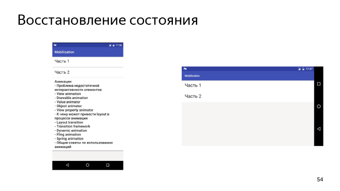
, , , - , , . , , . , . , — . , . ? , , Bundle OnSaveInstanceState , , , .
, , -, , , , , - . , , , Bundle.
.
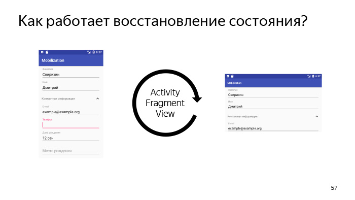
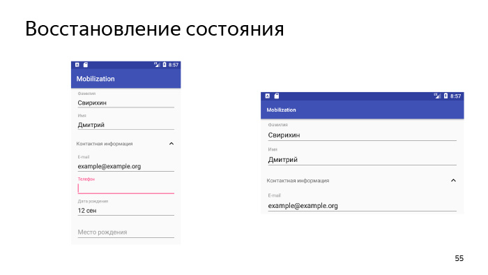
, state. , activity, , , , — activity , — - , activity, activity state. , , activity OnSaveInstanceState. , , - state , , , state .
state? activity, fragment, , , . view, - . view, , state.
?
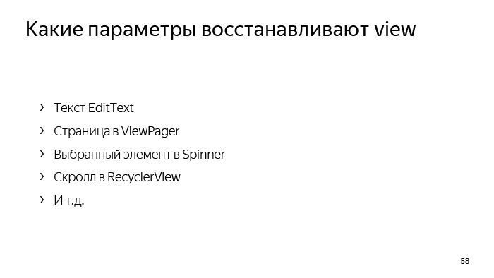
, - EditText, , , . ViewPager, , Spinner RecyclerView. view .
? , view.

, , view , . , , , — , view, , , — , . , Bundle , .
, drawable. drawable Bundle Parcelable, Parcelable, , Android 700 , . , drawable, , .
drawable Glide Picasso. , drawable .

? , view , , activity - , , , . , , . .
, , , -, .
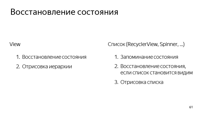
, . view, , . . view . , . RecyclerView, ListView. , .
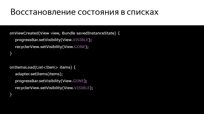
What follows from this? , , , , . , - — , — , - , , .
, , ProgressBar.
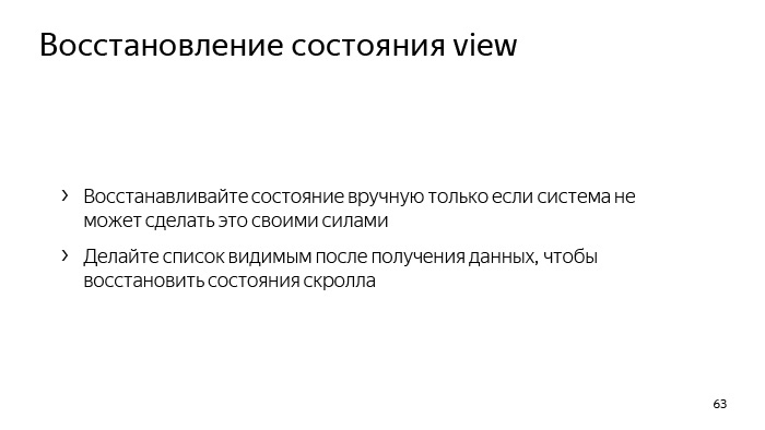
, view , . , . , , , .
- .
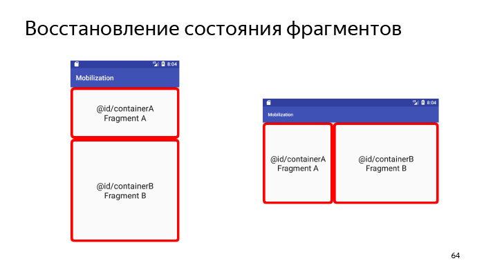
, , , OnSaveInstanceState - . , , , Fragment Manager, , layout, , Back Stack, . . Activity, Fragment Manager, . , , - , , . , . , , . How does this happen?
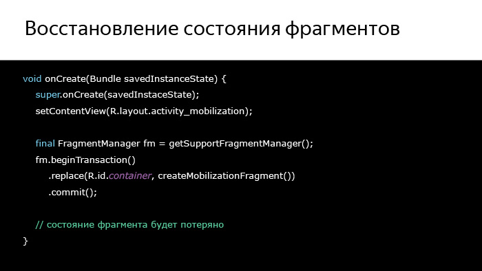
, , onCreate, , , , activity , , , , , , - .
, ?
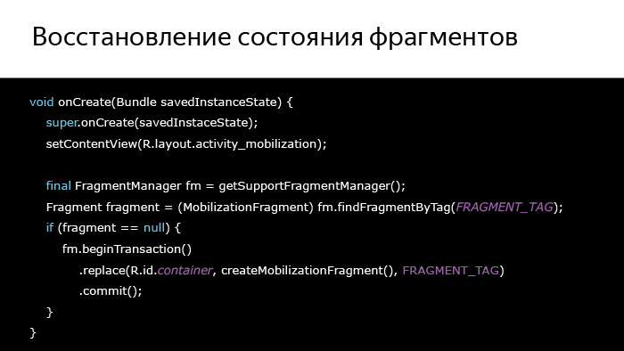
, , . . activity , - . , , , - . , , , .
, : Fragment Manager .
, , , , , DialogFragment. . , , , DialogFragment — , . .
. .
-, UI , .
-, layout, , layout, , , , .
-, view . — view? - XML view, - ?
— , . . , , , .
On this I would like to finish the first part. Thank you very much for your attention.
The lecture “Advanced UI” was read by Dmitry Svirikhin, a developer from the Yandex.Mail mobile team. Dmitry explains how to solve the most common problems when developing the Android application interface.
Let's summarize all of the above about the topic. We need to stylize uniform UI elements with themes, without needing to write the whole theme from scratch, we can inherit from some system theme and initially set a certain subset of attributes for this theme.
- You have been studying for a month at Mobilization School and learned a lot during this month, including about UI. Today I will try to uncover some things that you could already know, and also try to tell something new. I hope it will be interesting.
')
My lecture will consist of two parts, and in it we will first put some problem, and then look for ways to solve it.
Let's see what problems we will explore today.
First, we will look at the problem of UI inconsistency in our application and the means to solve this inconsistency.
Secondly, one of the rather major problems of Android development is interaction with the keyboard. What to do when a keyboard appears on the screen, how to live with it.
Third, we explore how we can effectively apply custom views. You have already been in one of the lectures and are roughly aware of how we should create custom views, what are the rules for this. But today we will slightly open this topic and logically continue it. We also examine a little the loss of state when it is possible. Of course, you already know how to behave when we have a loss of state during the re-creation of an activity. You need to save some things in the bundle and then after recreating the activity, use them in some way.
But nevertheless, you still sometimes have problems, and we will try to take these problems into account today.
We will also consider the problem of insufficient interactivity of our UI, see how to make it more interactive and understandable to respond to any actions that the user does.
Let's start from the very beginning - about inconsistency.
UI inconsistency can be of several types. First, we may have inconsistency UI on different devices in Android. For example, the same view on our different devices may look different. You all know that Android has a rather extensive fleet of devices, and because of this, we have quite a high fragmentation of Android versions. Accordingly, on Android 4, the UI may look one way, on Android 5, another. This causes inconsistency of the UI on different devices.
But this is probably not the main problem, because UI inconsistency can also be in the application, when on different screens we have a toolbar of a different color, or the toolbar can still not be combined with the color that we have in Navigation Drawer, which leaves on the left side of the screen. And there is some way by which we can, if not solve this problem, then at least greatly simplify its solution.
These are themes and styles.
We start with that. And let's first define what a topic is.
The theme is a kind of global configuration of our entire Android UI. The theme attributes can include, for example, some window lags relative to which our entire UI is built, some global colors and images that are also used to construct the UI, and even whole styles for individual views and subtopics, for example, for conversations.
There are about 300 attributes in a topic, and even more, but when we define our topic, we don’t need to redefine all 300 attributes, we simply don’t have to do that. To do this, the platform provides such a way that we must inherit from some already prepared system theme and redefine what we need.
Let's see what topics we can inherit from.
At the very beginning, it is best to connect the AppCompat library, which is part of the support library, and inherit our own theme from one of those already provided for in this library. Accordingly, Theme.AppCompat you may need in order to make a dark UI, and Theme.AppCompat.Light for light. And after you do this - inherit your own theme from one of these predefined topics - you will have already solved the problem of UI inconsistency on different devices. On your fourth, fifth, and higher Android UI, it may be not identical, but very similar, and the inconsistency problem on different devices will already be solved.
So, we have created our own theme, inherited from some kind of system. What do we need to do next?
The feature of theme attributes is that all internal themes and styles are somehow tied to each other, and initially we need to define a certain subset of attributes, some basic attributes. On the slide they are presented. Let's deal with each of them.
Firstly, windowBackground, on the slide you can see how the look of our application will change with given different backgrounds. windowBackground Just sets the main background for our application, setting the color or drawable, which we passed to the windowBackground parameter as the windows background, in which all our views are drawn.
There are also options such as colorPrimary and colorPrimaryDark. According to their name, you might think that these are some very important parameters, but, in fact, the only thing for which they are needed is to simply set some colors for our tool bar and status bar. They can also be used in the same toolbar when it goes into Action Mode here. Using these attributes, the separator between the toolbar and the content is colored.
Therefore, we turn to the more interesting attribute - colorAccent. As the name implies, it is needed in order to focus the user's attention on some important parts of the UI. What could it be? For example, it can be FloatingActionButton, it can be an edittext that the user is currently editing, it can be the selected checkbox, etc.
colorControlNormal determines the color of the UI-elements in the inactive state. By an inactive state, we mean an unfocused edittext, for example, or an unselected checkbox, etc.
colorControlActivated, on the contrary, determines the color of the focused edittext, the selected checkbox, etc. As a rule, we do not need to redefine this attribute, because it is tied to colorAccent, by default it uses the same resource as colorAccent, and we touch it not necessary, but, nevertheless, it is still useful to know about him.
colorControlHighlight defines the color with which our view will be highlighted when we tap on it. In fact, this is the same color ripple that we have when we tap on the view and wait some time.
It should be noted that this color must have an alpha channel set in order for us to have such a beautiful effect.
There is also a list of attributes that is needed for styling, for example, buttons - this is colorButtonNormal. Buttons, they are not subject to the colorControlNormal attribute, which we considered earlier, because they are somewhat different for the guides, and a separate attribute was invented for it.
Also, for example, there is a similar attribute for the Switch. Therefore, when you specify some attributes like colorControlNormal, if something is not painted on you - it doesn't matter, most likely there are some attributes that will help you also solve the created problem.
And let's talk a little about the parameters, about the text.
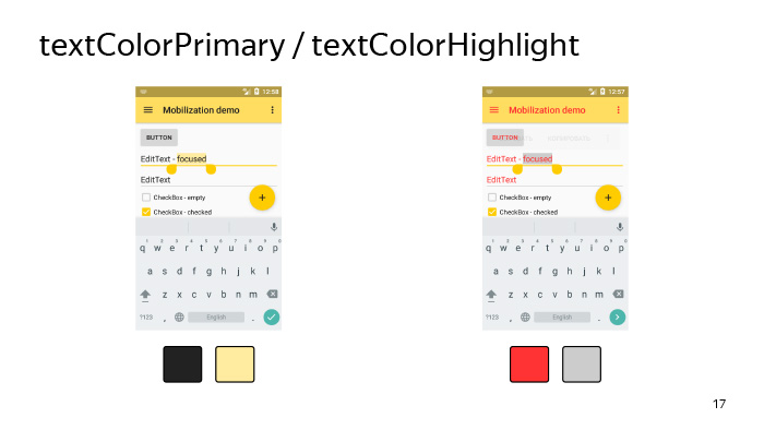
There is such a parameter in the system as textColorPrimary (the main text color of the application) and textColorHighlight, which determines the color of the text selection. In general, there are quite a number of parameters associated with the text, and it is not always immediately possible to guess, as a given parameter, the text color attribute will affect many views in our system, therefore there are two options. If the textColorPrimary parameter does not work, you can either determine by experience which attribute with the text you need, or climb into the interior of the AppCompat library and find out what color your view ultimately depends on.
Let's now look at how it happens that we set the color in the theme, and at the same time, we generally paint the backgrounds of all the views in our layout. In fact, it happens as follows, and there is no magic here.
Initially, the system contains some bitmap, usually black, or on new Android, it is set using a vector, and the selector attached to it is in the form of tint for this view. For example, for a checkbox, such a selector can be attached here, as shown on the slide, which shows that, in the Checked state, we need to paint the background of our view in the color specified in the colorControlActivated attribute. Accordingly, if our view - in this case, the checkbox - accepts the Checked attribute, then it will be painted exactly in this color. This is how our checkbox will look like if under colorControlActivated we set the color to yellow.
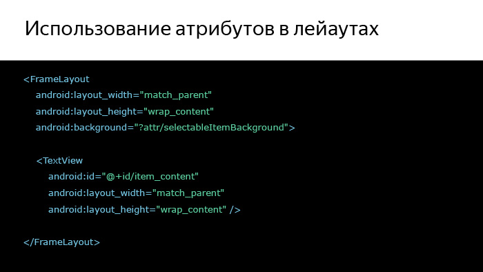
And one more important point, which is worth noting about the attributes - we can refer to them directly in our layout. Here is the most common way presented on the slide, when we want to make a triple effect for some layout in our hierarchy. We can simply give it a selectableItemBackground background, and then, tapping on this frame layout, the user will see ripple. It will be on Android 5 and higher, and on Android 4 it will just change the background on tapu.
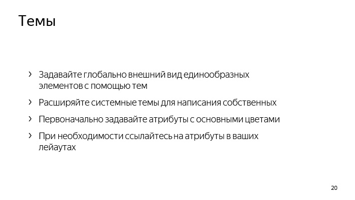
Let's summarize all of the above about the topic. We need to stylize uniform UI elements with themes, without needing to write the whole theme from scratch, we can inherit from some system theme and initially set a certain subset of attributes for this theme.
Then, if we do not have enough of it, we can change some other attributes to a point in order to achieve the desired result. And also, if necessary, you can use attributes directly in your layout.
So, we figured out how to write a topic. Let's see where we can use it. We can set the theme for our application and activity directly in the manifest using the android: theme attribute. When can we use each of these cases? In the application, we can set, for example, a bright theme. Quite often now all applications look with a light theme. And while it is quite fashionable now to make galleries, which, on the contrary, have a dark color. Thus, we can set the main theme and then separately in the activity in which we want to see our gallery, make, for example, a dark theme.
But there are also other situations.
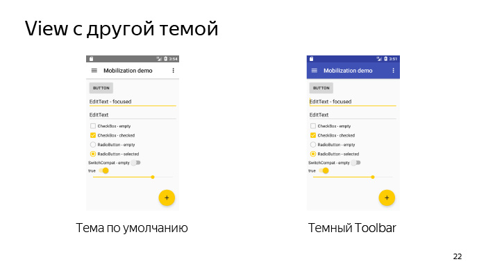
Here we have some layout, so it looks like with themes by default. In general, everything is not bad, but we do not like it. We or our designer wants a slightly different theme - he wants our toolbar to be so dark. It turns out that in the main part of the application we use a light theme - this is a light background with dark text, but the toolbar suddenly became with a dark theme and with light text.
For this, Android provided the ability to set themes at the view level. What happens when we set a topic at the view level? Those attributes that are specified in this topic that we set in the view, they, respectively, will override the basic attributes of the activity in which this view is displayed.
And for this, the system also provides for the so-called ThemeOverlay, from which we must inherit our own themes, which we are going to transmit in view, and also using the AppCompat library, we already have some list of those themes that we can use, from which we can be inherited. Accordingly, ThemeOverlay.AppCompat.Light is designed to override some part of the hierarchy from a dark theme to a light one, and ThemeOverlay.AppCompat.Dark - on the contrary, from a light to dark one. There are also already prepared Overlay for ActionBar and for DarkActionBar. Last we need to use in our example, which we considered earlier.
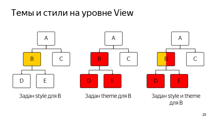
Now let's see this situation. What is the difference between themes and styles that we set at the view level? I think you all know what styles are, you have used them more than once, and let's say we set some styles for view B in this hierarchy, which is now represented on the slide. What happens then? All attributes that are inside this style will only be view B.
If we want to set a theme for view B, what will happen? All global attributes from this topic in turn will affect the entire hierarchy: not only on B, but also on all of its child'ov (in this case, D and E). But if D and E had other childs, the topic would also apply to them.
What happens if we set both the style and the theme for view B? Everything in general is pretty clear. The style will also work for this view B, and the theme will apply to B and all of her childs.
Now let's formally define what the difference is in style and theme, which can be set at the view level. The style is intended to set some subset of attributes that is adequate only for the given view, in which we set this style. For example, a style may be contained if we set it for a TextView, the TextAppearance or Background attribute. This is a normal example of a topic. And in general, initially the themes were intended so that we could eliminate duplication for the same type of view. If we set a topic for a view, it should be intended to redefine some global attributes for the entire hierarchy, in which we set this topic.
The theme may contain attributes such as, for example, colorControlNormal, which we reviewed earlier.
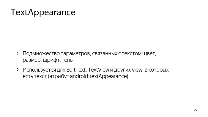
There is also another type of style called TextAppearance, which is designed to define a set of attributes associated exclusively with the text. It can be as color, size, font, even the shadow of the text. And they are used mainly for such views as EditText and TextView, but in general there is still some set of views where they are used. The main distinguishing feature is that these styles should be transferred to those attributes whose names contain the phrase TextAppearance. Pretty easy to remember.
These are the TextAppearance with us using the AppCompat library exist in the platform. You can use them. You can even tell your designers to use these styles to give you some kind of layouts.
In general, the topic of typography in Android is quite extensive. You can spend a whole lecture on them, but I will probably leave it to self-study. Below is a link where you can read various details about the text in Android, and he will go on to the next topic related directly to the development.
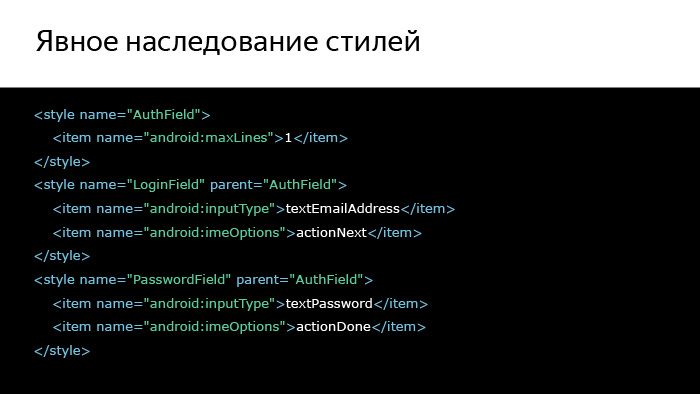
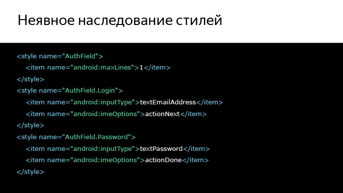
And the last thing I wanted to say about styles is about explicit and implicit inheritance of styles. Let's see, we have some layout. This is the usual login form. Accordingly, there is a field for entering e-mail and password. It seems that these fields look very similar, but, nevertheless, they have some kind of common part and style differences. Let's try to build a hierarchy of these styles.
We will select the common part using a style called AuthField, and then separately for the login and for the password we will create styles that will already be inherited in a familiar way. We also inherited topics. This is done using the parent attribute, and in general, everything is clear and simple. But we can do otherwise. We can make clearer, more visual way, which will allow us to follow the hierarchy of styles.
We can simply separate the common part through a dot and write styles derived from the common part in this way.
For your own hierarchies, this method seems more acceptable, because it is more visual and obvious, and generally use this method.
About the styles and themes, I said everything I wanted. (See the question and answer session in the video. - Ed.)
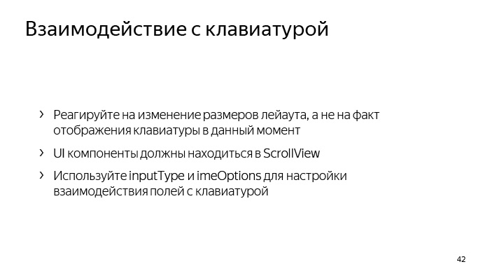
Since we are talking about text fields, let us see what the main problem may be when we have text fields. This problem is called a keyboard, which can overlap with us some part of the layout.
And this is not always good for the user, so let's deal with some parts that are related to the keyboard in the section "Interaction with the keyboard."
So, if at some point when you are developing your application, you want to determine the size of the keyboard, then in 99% of cases you don’t need to, you just don’t. This can be useful to you only if you are developing a chat, for example, and in all other cases it is not necessary. It is much easier to follow the change in the size of the layout and depending on this, somehow somehow adjust everything that you have on the screen to the size that you have left after the appearance of the keyboard.
It is also important to understand that the keyboard is a separate application that we can’t configure in any way, we can only accept the fact that it is there, so on any small device the keyboard can occupy 2/3 of the screen.
And what do we need to do if it will cover a fairly large part of our layout? layout ScrollView, , 2/3 , - layout.
, layout? OnLayoutChangeListener. ScrollView , view, , , - , .
? , , , , — . , . .
, . , - . , e-mail (@) . - , , e-mail. Wonderful.
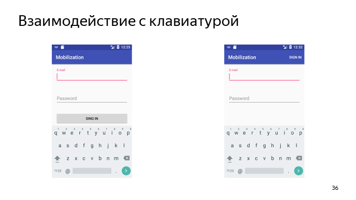
. e-mail, , , . , «» . user «», , , . And that's not it. , -, , Sign In, , Done, layout, . .
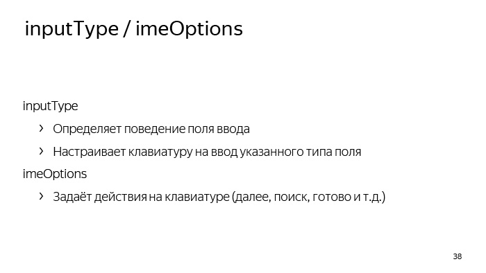
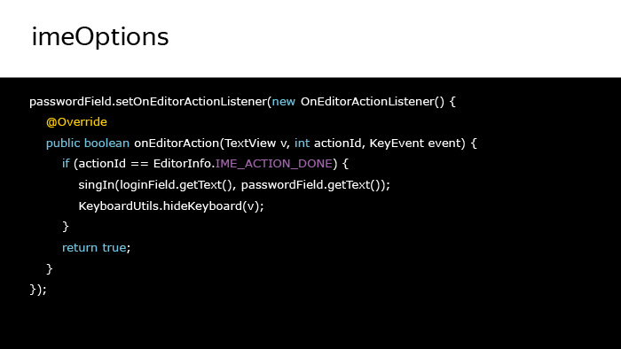
: inputType imeOptions. inputType , - . This is the first. inputType Text Password, , , . , .
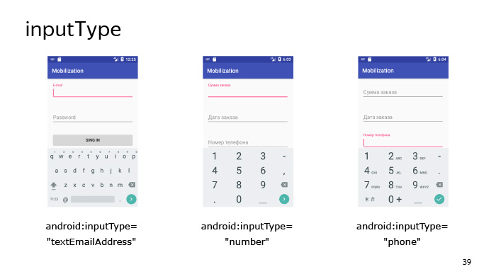
inputType - , , textEmailAddress, «» .
. , — , , , , .
imeOptions, , , . . , «», «», «», .
, inputType. textEmailAddress, «» — , e-mail.
inputType - . , - - .
inputType=”phone”, . , , — , , , . .
listener - , . Done. , . — .
Actiondone, , — .
, - . , Actionnext , . , , - , .
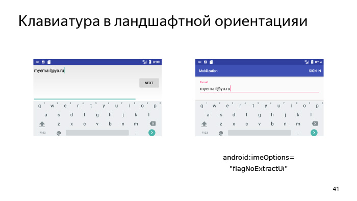
, . - , landscape, - . layout . fullscreen-, , - . , , , - , layout . . , , : « » ( e-mail), NoExtractUi imeOptions, Pipe, imeOptions , action . , .
, . layout, . .
-, UI- , , , , ScrollView. , , inputType imeOptions, XML, . , . ( . . — . .)
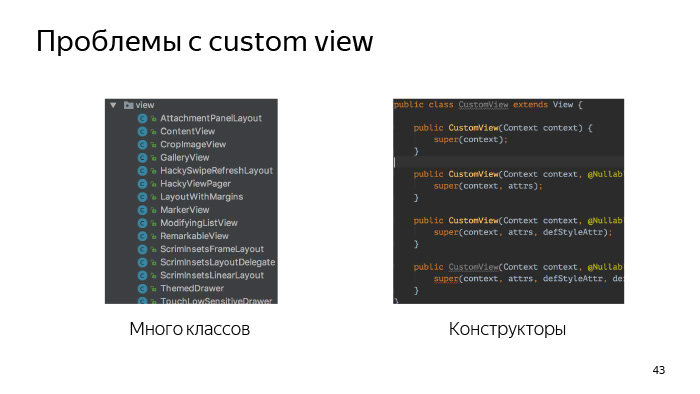
, , - , view.
, , - frame layout. view frame layout, .
- linear layout. view, .
- view. ?
view, , view , - , , - , view, . , . , . - , view.
-, view, , , . .
« custom view».
, view.
, — view - , . , , view , . , view. -, view - , - view . , , button . button - . .
Third. , view , Support Library, , - , , - .
view . - view, - : «, , - listener view, ». , , — view.
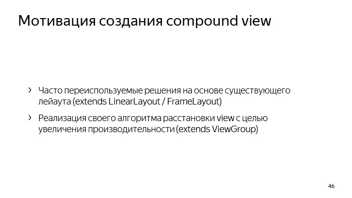
compound view. compound view? . Compound view compound components ( ). , view group .
? -, - layout, , , - -. . compound view, - linear layout, frame layout . . , performance . , - relative layout. , . , . view, view group, view .
, Android ́ view, , ConstraintLayout, CoordinatorLayout, FlexboxLayout ( , ). layout, , , - layout.
view. .
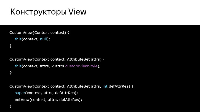
, , , Context , view .
, AttributeSet, , , view XML. LayoutInflater.
? , , , Button, , . , .
buttonStyle. What is it all about? , , , , view , .
? Android 5, . , , , .
-, , Button .
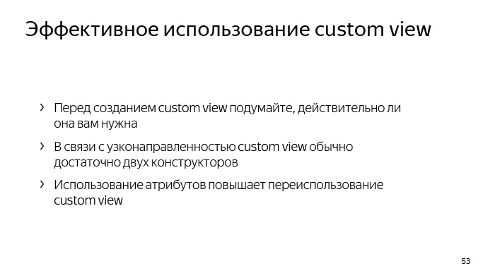
, , view . view - , - .
, , view. . , view , - . , , .
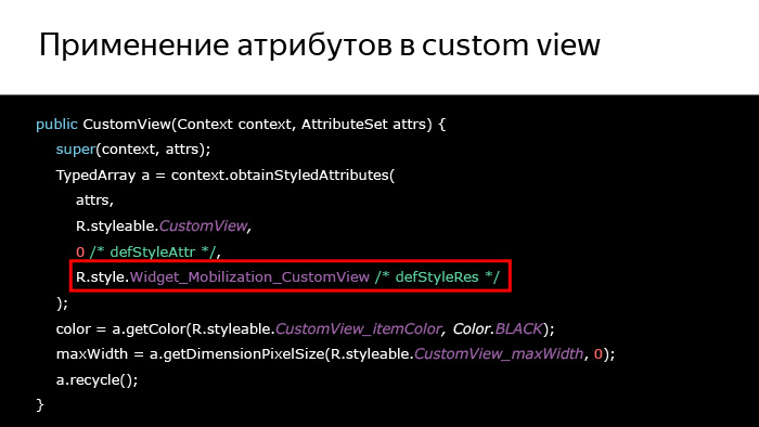
- obtainStyledAttributes, XML, XML. attrs, defStyleAttr defStyleRes — . styleable? XML, , declare-styleable , view . , obtainStyledAttributes .
TypedArray, , , , XML, - . TypedArray Recycle, TypedArray, view.
, , . , , , , 90% , . view, , , , . obtainStyledAttributes 0.
. - view, . , - , styleable.CustomView.
, . view , . , , , , - listener view. .
, view, , , , , .
, XML, view , .
view, view, layout, , .
, , , - , , . , , . , . , — . , . ? , , Bundle OnSaveInstanceState , , , .
, , -, , , , , - . , , , Bundle.
.
, state. , activity, , , , — activity , — - , activity, activity state. , , activity OnSaveInstanceState. , , - state , , , state .
state? activity, fragment, , , . view, - . view, , state.
?
, - EditText, , , . ViewPager, , Spinner RecyclerView. view .
? , view.
, , view , . , , , — , view, , , — , . , Bundle , .
, drawable. drawable Bundle Parcelable, Parcelable, , Android 700 , . , drawable, , .
drawable Glide Picasso. , drawable .
? , view , , activity - , , , . , , . .
, , , -, .
, . view, , . . view . , . RecyclerView, ListView. , .
What follows from this? , , , , . , - — , — , - , , .
, , ProgressBar.
, view , . , . , , , .
- .
, , , OnSaveInstanceState - . , , , Fragment Manager, , layout, , Back Stack, . . Activity, Fragment Manager, . , , - , , . , . , , . How does this happen?
, , onCreate, , , , activity , , , , , , - .
, ?
, , . . activity , - . , , , - . , , , .
, : Fragment Manager .
, , , , , DialogFragment. . , , , DialogFragment — , . .
. .
-, UI , .
-, layout, , layout, , , , .
-, view . — view? - XML view, - ?
— , . . , , , .
On this I would like to finish the first part. Thank you very much for your attention.
Source: https://habr.com/ru/post/343770/
All Articles