Must-have documentation for a mobile developer. Part 1

This is a series of articles “Must-have documentation for a mobile developer”: Part 1 and Part 2 .
I give the floor to Vyacheslav Chernikov.
In the first part, we will talk about why it is important to pay attention to technical design and describe the necessary minimum documentation that will allow you to create a "skeleton" of the project based on the user interface .
This article is an abbreviated version of the manual, available by reference at the end of the article.
Primary documents
The key idea with which we begin can be summarized as follows:
A mobile business application is primarily a user interface for interacting with an external service.
When developing technical documentation for a project, it is necessary to take this into account, since the interface is clear and on its basis it is easier to divide the project into sections. And the domain model itself is very well described by the interface - it is necessary to take into account basically the data (and their derivatives) that are entered by the user, displayed on the screen and control its behavior. Business scenarios are also directly tied to user interface behavior.
At the same time, most TK is prepared for business customers and do not describe specific screens or services, but whole business scenarios and blocks of functionality. In the future, this documentation and design specifications are used by the development team. For coding and subsequent implementation, repeated readings and retellings of TK are used.
In the following chapters, we will describe the minimum required set of documents that will allow the team to use simple checklists to monitor implementation.
Before we proceed to the analysis of artifacts and the extraction of useful data from them, let's consider the entire development process in its entirety. For simplicity, we will choose a linear development process, since using the cyclic or spiral methodologies the same classes of problems arise, only the sequence of their execution may differ.

So, the project usually distinguishes the following production classes of tasks:
- analysis;
- design and design;
- coding;
- testing;
- exploitation.
You can select more, but in fact they will be derived from the indicated.
At the stage of analytics, a search is made for the solution, a description of the general requirements for the application. At the exit from the analytics stage, specifications appear that are introductory for the design phase.
Since our manual is intended primarily for developers, we believe that you have a brief or basic ToR.

Then the fun begins - designing the user interface. This stage is key and with the right approach greatly simplifies and simplifies the development process. If this stage is missed, then further the success of the project will depend only on the experience of the team.
At the design stage, the most important thing is to think through the user interface and create screen schemes.
If you start immediately with the design (instead of the screen diagrams), you will have to constantly redo it (the design) for coordination with the customer. At the design stage, this will slow down the process greatly. The design is actually derived from UX and fills the original patterns with emotions, straightens the composition, adds animations and other aspects of appearance and visual behavior. Screen diagrams, in turn, create the structure of the application and data models - what data to display, how they will be grouped, how they will affect the behavior of the interface.

At the exit from the design stage, a set of necessary specifications and resources will be received, which together with the TK will go to the developer. It is reasonable to begin the coding stage with building the foundation - the basic structure of the project, in which understanding the key user scenarios will help us a lot.
Screens, data and logic
Recall once again that mobile applications are primarily a user interface, therefore, it is better to start designing with screen diagrams and transition sequences between them. This is necessary in order to determine the set of steps that the user must follow to obtain the desired result. After all, a business application is created for a specific set of key scenarios (sequence of user actions), with the help of which a person can solve his tasks.
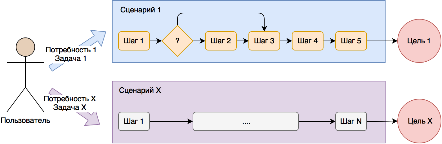
Since the average contact time of a person with a smartphone is only a few minutes, the number of steps in business applications should not be large - it is first of all important for the user to get a result (complete the task or satisfy the need) during the contact with the device. For complex applications with lots of functionality, this factor should be considered. A good choice would be to divide the application into relatively short scenarios with no more than 10 steps each.

In order to determine the depth of key scenarios, you can use a map of transitions and states, which will be discussed in more detail in the following sections. But first you need to put in order the structure of the interface.
Screen grouping and naming
So, we have on our hands there are schemes of screens from designers / designers and the sequence of transitions between them.

In order to break the application into parts (sections of the subject area), we will go from the screens. Once again, we recall that a mobile application is primarily a user interface, so our screens are a direct reflection of the domain model available to it.

The first thing you need to select the screens that are interconnected, usually they have to go one after the other in user scenarios. For example, in applications you can often select the Account section with viewing and editing all information related to a user profile.

If you are an experienced programmer, then easily cope with the division of the list of screens into related sections. In any case, take a little practice.
So, we can get the following sections:
- Account
- Help
- Checkout
- Catalog
Each section should have a name and number. Section names should be used for horizontal separation of the data management layer, business logic, and user interface. This will make it easier to further develop the project.
For example, the data management layer (groups of methods for different server APIs) in this case will be divided into sections (repositories, if you are so familiar), each of which will serve its own set of screens:
DAL \ DataServices (Repositories)
AccountDataService.cs (or AccountRepository.cs)
HelpDataService.cs
CheckoutDataService.cs
CatalogDataService.cs
In the future, each of the repositories can completely hide all work with the server, disk cache and local DBMS. This will allow at the business logic level to work with repositories as with black boxes.
Next to be numbered and call screens (pages, windows). At the output we will have a tree-like (albeit flat) interface structure without taking into account the sequence of transitions between screens and their nesting.

The names of the screens will be used in our class names for the respective pages (Page) and ViewModel (or Controller for MVC):
1.1 Profile
ProfilePage
ProfileViewModel
1.2 EmailLogin
EmailLoginPage
EmailLoginViewModel
First of all, it is important for developers who actually receive a ready-made project structure:
- The data access layer is divided into application sections - we create the Data Access Layer (DAL) structure
- Add the necessary Pages and ViewModels - this creates the structure of the layers of work with the user interface (UI) and business logic (BL).
As you can see, the skeleton project is already emerging. The DAL layer can easily be allocated to a separate library. If you use a typical architecture or a project template (Base-classes, NavigationService, etc.), consider that you already have the backbone of the application.
An example of the project structure is presented below.
UI (User Interface)
\ Pages
\ Account
ProfilePage.xaml
...
BL (Business Logic, business logic)
\ ViewModels
\ Account
ProfileViewModel.cs
...
')
DAL (Data Access Layer, data access)
\ DataObjects (Models)
ProfileObject.cs (ProfileModel.cs)
ProductObject.cs
...
\ DataServices (Repositories)
AccountDataService.cs
...
In order to further implement the behavior of the screens, we will need additional information, so we will continue to get acquainted with the necessary artifacts.
Screen table
After we have screen diagrams, we can also analyze them before the actual start of development. The next useful artifact for us will be a table of screens, which will be operated not only by developers, but also by testers. In the pivot table it is easy to put together all the text information The key columns of the table for us will be:
1. Screen number
2. Short name (Name)
3. List of possible states (States)
4. Input fields for validation (Validation)
5. Description of the screen and its behavior (Behavior)
As you can see, in the presented set of fields that information is collected that will allow you to correctly check the operation of each screen separately. You can also assign each section its own color - this will simplify the work with the map of transitions and states.

Additionally, the following columns can be added to this table:
6. List of pop-up notifications (alerts, sheets, dialogs)
7. Identifiers of UI controls (for example, LoginButton) for writing automated UI tests
8. Data Models Used (Models / Data Objects)
9. DAL methods used on each screen.
10. Styles used
On each screen, it is sufficient to simply enter short designations in columns, which will be used in the program code in the future and are understandable to developers first of all. In addition to the Behavior column (Screen description and its behavior), it is better not to do restrictions here.
Separately dwell on the states of the screens. Most modern applications work via the Internet, so it’s worthwhile to correctly display information about the download status to the user:
- display progress indicator download;
- display downloaded data;
- display a message about the absence of an Internet connection;
- display an error message (server is unavailable, server errors);
- display a stub if the server returned empty data (for example, an empty list).

It is considered good practice if each screen loading data from the network (or from a local DBMS) correctly displays each of the described conditions to the user. In fact, a separate state is described by its own set of visual elements (texts, images, buttons, other elements), and at the level of the program code it is easy to manage switching from one state to another. You can also record negative scenarios (download error, empty data) for further analysis and elimination on the server side or application.
You can take a rule and add switching of states on all screens loading data. This will simplify user interaction with the application. You can also use various animations or graphics in negative states (errors, empty data) to smooth out the effect.
So, we already have screen layouts, a list of Page and ViewModel, as well as detailed information on each screen. The framework of the application can be built, but now our screens are described independently of each other and there is no clear and understandable sequence of transitions. Therefore, the next useful artifact for us will be a map of transitions and states.
Map of transitions and states
In order to better understand the basic user scenarios, as well as to identify the links between the screens, you can use the map of transitions and states. The advantages of the card are its compactness and clarity. Even for large projects, a transition map can be printed out on an A4 printer and hung over the desktop.
So, the transition map starts from the starting point - the moment the user starts the application. There can be several start points, for example, one launch option for an authorized user, the second for an unauthorized, and the third from a push notification.
Next, add rectangles for each screen and are indicated by arrows of the sequence of transitions. You can add identifiers (AutomationId) of buttons or events that caused the transition, and for clarity, specify the data that will be transmitted to the new screen.
We also have a table of screens (previous chapter), where the possible states of each of them are indicated and which need to be displayed on the transition map. This will allow a better understanding of possible interruptions in user scripts, for example, in the case of errors or empty data. If the state is interrupted (the person cannot go further) the user scenario, then we denote it by a minus "-", if not interrupt, then the plus sign "+". Arrows "back" you can not add.
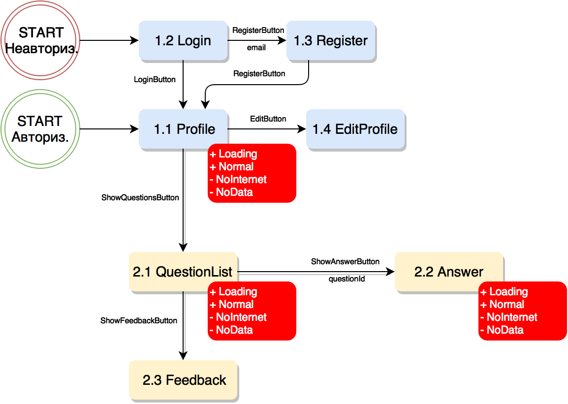
As we see, now we have practically all the information necessary for development in a compact form. These three online documents (screen list, screen, transition map) can be updated as the project progresses.
To create the artifacts described above, 3 online tools will be enough for us:
- text editor (Word Online)
- spreadsheet editor (Excel Online)
- graphic editor (Draw.io, Visio Online)
It takes no more than one day to prepare each of the artifacts, but in the future it greatly simplifies the process of developing, testing and developing the product. During the meditative preparation of documents and schemes, the team has a deeper understanding of the project as a whole and can already finally appreciate the complexity and duration of its development (numbers for internal use).
Continuation should be read ...
You can find the full version of the manual on the Medium "Technical Design of Mobile Applications" . You can talk directly with the author and the Xamarin-developer community in our cozy chat in Telegram .
In the second part we will talk about how to work with styles, background functionality and custom scripts. Stay in touch and ask your questions in the comments!
about the author
 Vyacheslav Chernikov - head of development at Binwell , Microsoft MVP and Xamarin Certified Developer. In the past, he was one of the Nokia Champion and Qt Certified Specialists, currently he is the Xamarin and Azure platform specialist. He came to the sphere of mobile in 2005, since 2008 he has been developing mobile applications: he started with Symbian, Maemo, Meego, Windows Mobile, then switched to iOS, Android and Windows Phone. Articles Vyacheslav you can also read the blog on Medium .
Other articles of the author can be found in our column #xamarincolumn .
Source: https://habr.com/ru/post/343660/
All Articles