How I applied the cohort analysis while participating in a weight loss competition
It all started with the fact that I challenged and took part in the competition. The fact of the matter is that my weight is transcendental and, of course, I want to seriously lose it.
Previously, there was the experience of getting rid of 20 kg, but then, due to lack of motivation, a lot came back. This time, for motivation to be serious, I challenged another person and got down to business.
Somehow reading Tim Ferris's book “The Body in 4 Hours” I found an interesting recommendation - to make a table with a schedule so that the progress of weight change can be seen.
I found this table and quickly made it along with the schedule in Google Docs:
')
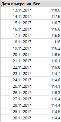
The data is true.
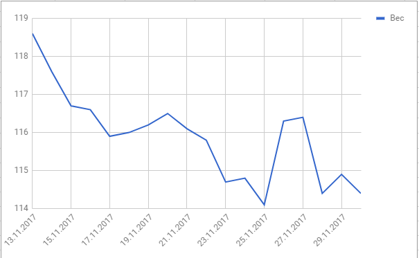
While making the graph, I suddenly asked myself the question: why not try to apply a cohort analysis here?
You have probably already seen the tables and graphs of cohort analysis. They are triangles and a bunch of lines that are difficult for an unprepared person to understand.
There is even an opinion that cohort analysis is too complicated and in reality it is useless.
While communicating with my work colleague, I even heard the following phrase from him: the cohort analysis is applicable ONLY when you have a lot of objects. If you measure one object, then the cohort analysis is not applicable at all.
Such a thing could not get away with him :-) and I decided to do a cohort analysis for my case: for me, one person, who measures his own weight during the competition.
Cohorts are arbitrary objects that have a birth date.
Actually, cohorts can be both users and anything else. The main thing is that we know when it was born.
In my case, the weight was the object, since He clearly had a birth date - the date of measurement / reading.
A cohort groups objects by some attribute. In my case, as a cohort, a grouping of measurements was performed by week:
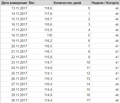
Week is considered a function = ISOWEEKNUM (measurement date)
Having dealt with the cohorts, the next step is to understand and what, in fact, to analyze with the help of them.
I have been looking for an analogy for using the cohorts for a long time.
At one time, many attempts were made to explain the essence of the cohorts, but most of them did not end very successfully, because the cohorts themselves are rather artificial and it is difficult to imagine them in my head .
I think one of the best analogies for cohorts is seasonality.
For example, seasonality of a business is when goods are sold better or worse at certain points (seasons).
Seasonality is determined by comparing periods (usually years) between each other.
We all know that the New Year in our country accounts for the peak of sales. This is a seasonal peak.
You also will not be difficult to submit an annual schedule of seasonality of sales, right? Cohorts are similar. To use them for the analysis of seasonality is the thing.
Naturally, everywhere has its own characteristics. Cohorts for users will work a little differently than for my weight case. But the essence does not change. In other words, the cohort analysis shows the behavior of objects .
So, the behavior of what can be analyzed in case my weight is measured?
Well, for example, the behavior of myself. Since the cohorts are broken down by weeks, the cohort analysis will show how I behave during the week.
Leading = how I lose weight in a week.
To do this, add to the table the column “delta” (weight change compared to the previous day) and “day number of the week” (from 1 to 7):
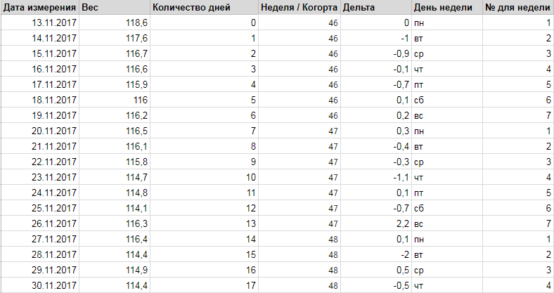
Weekday number = WEEKDAY (measurement date; 2)
A cohort analysis is easily performed using Pivot Tables. They are both in Excel and Google Docs (select the necessary columns, then Data / Pivot Table ..).
Here is what we get:
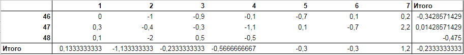
Columns - numbers of the days of the week. Lines - cohorts (week numbers).
“Total Right” shows the average weight change by week. “Total Bottom” shows the average delta by days of the week.
Each line shows how my weight has changed by weeks and allows you to compare the weeks with each other.
Now, using this table we build a graph:
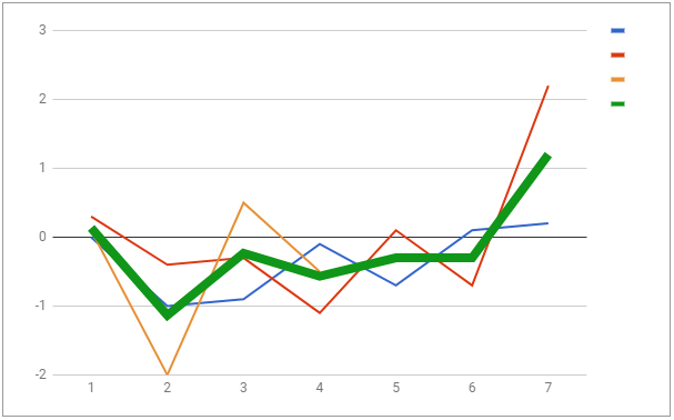
The bold green line shows “Total Bottom” - the average delta by day. The remaining colored lines are the values of each cohort (weeks).
In fact, this graph is a typical example of a seasonality graph, only instead of years, weeks are compared with each other.
The green line shows my typical behavior in the week - on which days I usually lose weight and which ones I gain.
It is evident that on weekends, I specifically otzhirayus. And indeed it is. Saturday is my fasting day. On Sunday, I actively dump the gained weight, but I obviously do not do it actively enough.
My task is to make the graph as even as possible so that it becomes a horizontal line in the negative area. This will mean that I do not break the rules and I am fine with losing weight.
You can change the type of graph and present it in a slightly different form:
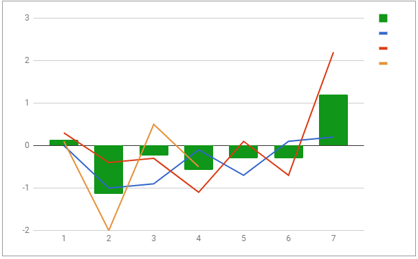
The green columns are the same as the green line in the previous graph. It just seems to me that you can see it better.
Actually, I wanted to see my behavior in the week - I saw him. And I realized that when and how I need to change.
This is how I applied the cohort analysis for my competition. I’m waiting, I’m not waiting when I fill in the table with even more data and make my green line even.
In fact, cohort analysis is not a substitute for slice or average graphs that we are used to. This is just another look at the same object.
A cohort is a look at the typical behavior (seasonality) of the analyzed object.
As you can see, in the cohorts, in fact, there is nothing difficult and they can be quite independently calculated and analyzed in Excel and even Google Docs.
You can see for yourself the table I made in GDocs .
If the article has benefited you, I will be grateful for the like and repost.
Previously, there was the experience of getting rid of 20 kg, but then, due to lack of motivation, a lot came back. This time, for motivation to be serious, I challenged another person and got down to business.
Somehow reading Tim Ferris's book “The Body in 4 Hours” I found an interesting recommendation - to make a table with a schedule so that the progress of weight change can be seen.
I found this table and quickly made it along with the schedule in Google Docs:
')
The data is true.
While making the graph, I suddenly asked myself the question: why not try to apply a cohort analysis here?
You have probably already seen the tables and graphs of cohort analysis. They are triangles and a bunch of lines that are difficult for an unprepared person to understand.
There is even an opinion that cohort analysis is too complicated and in reality it is useless.
While communicating with my work colleague, I even heard the following phrase from him: the cohort analysis is applicable ONLY when you have a lot of objects. If you measure one object, then the cohort analysis is not applicable at all.
Such a thing could not get away with him :-) and I decided to do a cohort analysis for my case: for me, one person, who measures his own weight during the competition.
Select the cohorts
Cohorts are arbitrary objects that have a birth date.
Actually, cohorts can be both users and anything else. The main thing is that we know when it was born.
In my case, the weight was the object, since He clearly had a birth date - the date of measurement / reading.
A cohort groups objects by some attribute. In my case, as a cohort, a grouping of measurements was performed by week:
Week is considered a function = ISOWEEKNUM (measurement date)
Having dealt with the cohorts, the next step is to understand and what, in fact, to analyze with the help of them.
What to analyze using the cohort
I have been looking for an analogy for using the cohorts for a long time.
At one time, many attempts were made to explain the essence of the cohorts, but most of them did not end very successfully, because the cohorts themselves are rather artificial and it is difficult to imagine them in my head .
I think one of the best analogies for cohorts is seasonality.
For example, seasonality of a business is when goods are sold better or worse at certain points (seasons).
Seasonality is determined by comparing periods (usually years) between each other.
We all know that the New Year in our country accounts for the peak of sales. This is a seasonal peak.
You also will not be difficult to submit an annual schedule of seasonality of sales, right? Cohorts are similar. To use them for the analysis of seasonality is the thing.
Naturally, everywhere has its own characteristics. Cohorts for users will work a little differently than for my weight case. But the essence does not change. In other words, the cohort analysis shows the behavior of objects .
So, the behavior of what can be analyzed in case my weight is measured?
Well, for example, the behavior of myself. Since the cohorts are broken down by weeks, the cohort analysis will show how I behave during the week.
Leading = how I lose weight in a week.
To do this, add to the table the column “delta” (weight change compared to the previous day) and “day number of the week” (from 1 to 7):
Weekday number = WEEKDAY (measurement date; 2)
We conduct cohort analysis
A cohort analysis is easily performed using Pivot Tables. They are both in Excel and Google Docs (select the necessary columns, then Data / Pivot Table ..).
Here is what we get:
Columns - numbers of the days of the week. Lines - cohorts (week numbers).
“Total Right” shows the average weight change by week. “Total Bottom” shows the average delta by days of the week.
Each line shows how my weight has changed by weeks and allows you to compare the weeks with each other.
Now, using this table we build a graph:
The bold green line shows “Total Bottom” - the average delta by day. The remaining colored lines are the values of each cohort (weeks).
In fact, this graph is a typical example of a seasonality graph, only instead of years, weeks are compared with each other.
The green line shows my typical behavior in the week - on which days I usually lose weight and which ones I gain.
It is evident that on weekends, I specifically otzhirayus. And indeed it is. Saturday is my fasting day. On Sunday, I actively dump the gained weight, but I obviously do not do it actively enough.
My task is to make the graph as even as possible so that it becomes a horizontal line in the negative area. This will mean that I do not break the rules and I am fine with losing weight.
You can change the type of graph and present it in a slightly different form:
The green columns are the same as the green line in the previous graph. It just seems to me that you can see it better.
Conclusion
Actually, I wanted to see my behavior in the week - I saw him. And I realized that when and how I need to change.
This is how I applied the cohort analysis for my competition. I’m waiting, I’m not waiting when I fill in the table with even more data and make my green line even.
In fact, cohort analysis is not a substitute for slice or average graphs that we are used to. This is just another look at the same object.
A cohort is a look at the typical behavior (seasonality) of the analyzed object.
As you can see, in the cohorts, in fact, there is nothing difficult and they can be quite independently calculated and analyzed in Excel and even Google Docs.
You can see for yourself the table I made in GDocs .
If the article has benefited you, I will be grateful for the like and repost.
Source: https://habr.com/ru/post/343544/
All Articles