BDSL-2017: Tanya Bibikova on data visualization
This summer, the Data Laboratory made a raid on Baikal, where, among other things, I conducted a master class on data visualization at the Baikal Designer Special Camp . By the way, on Lake Baikal is overwhelming!

Video master class promised, but will not soon. Meanwhile, one of the camp participants deciphered the record of my speech. I give here the first part of the decoding of the lecture with minimal cosmetic changes and the outline of the second part, devoted to the algorithm Δλ, which we study in the course on data visualization.
Vela Tanya Bibikova from the Data Laboratory
Deciphered Misha Novikov
')
We will talk today about how to create cool visualizations - visualizations that reveal the nature of the data and reveal the patterns hidden in them. But in order to understand how to create good visualizations, let's first understand what visualizations we will consider good. I will show you some examples.
Earthquake history
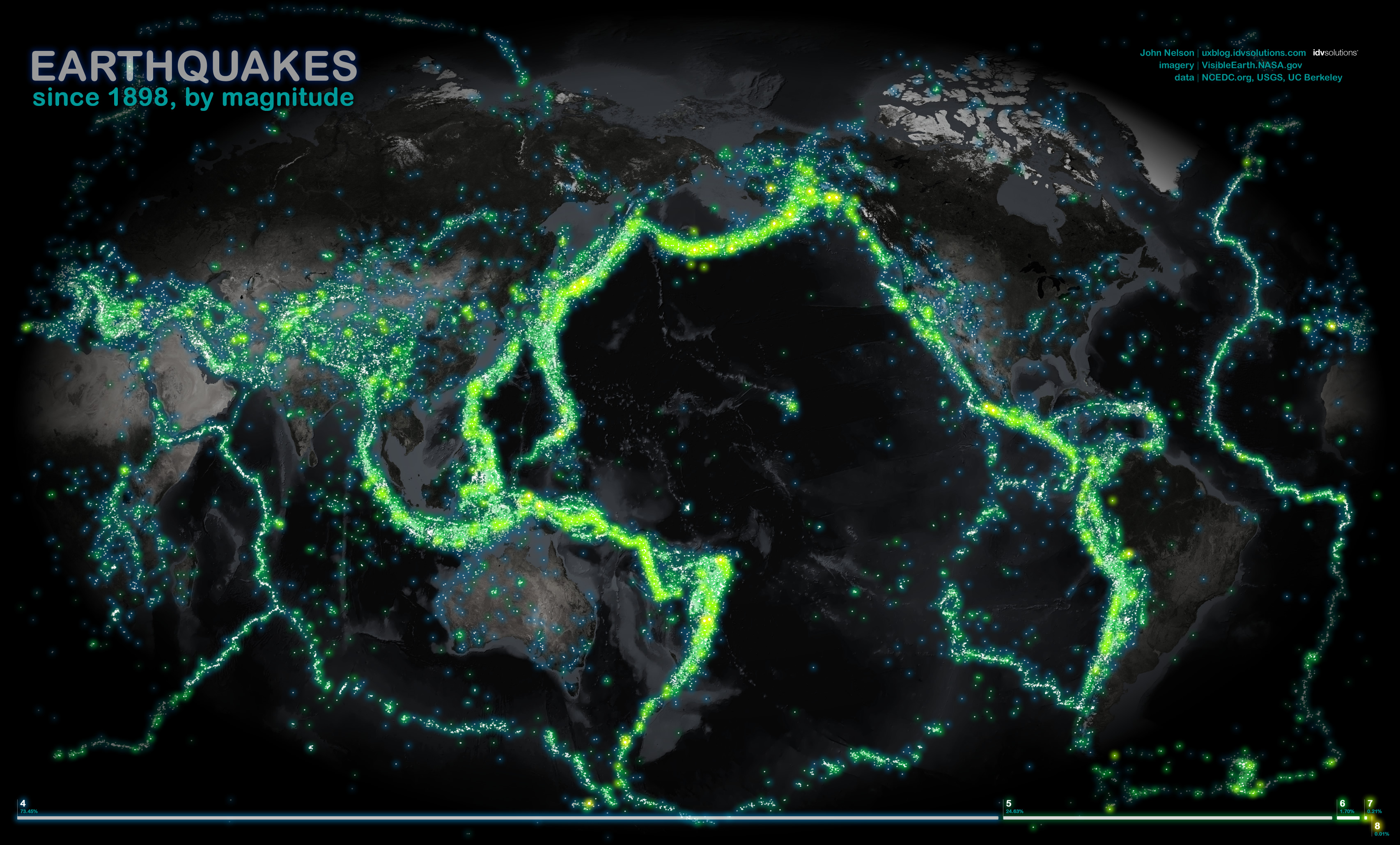
All earthquakes since 1898, shown on the map. We took the usual table with dry data, where there is a year, the date of the earthquake, the place and strength. Simply by placing this table on the map, we have shown a picture that no one has seen or can see with our own eyes: the outlines of tectonic plates appear behind the history of earthquakes
Results of the Moscow Marathon
The next work is our pride, we were given a bronze for it at Malofiej (prestigious competition in interactive graphics).
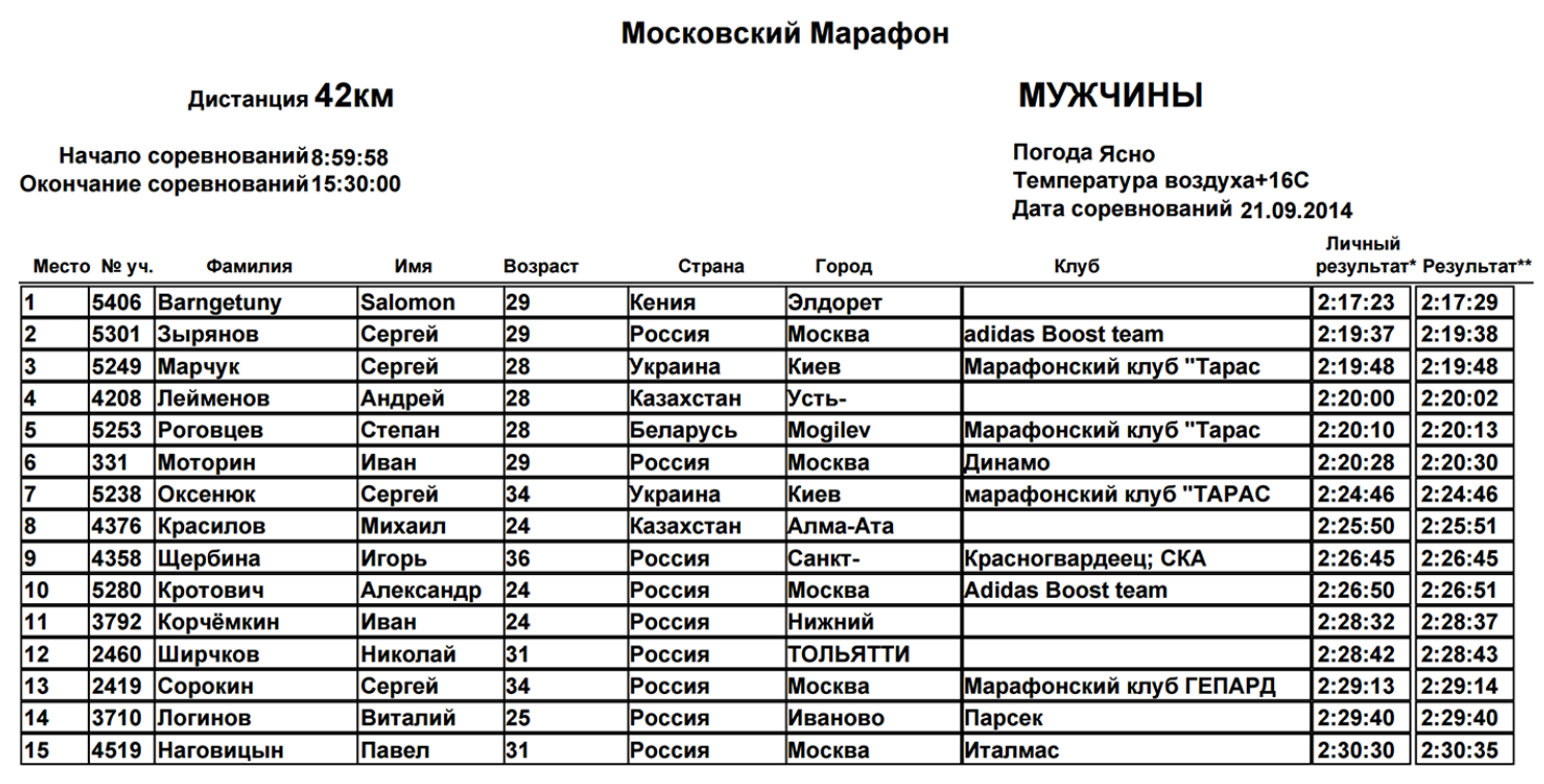
Given: marathon results that look like a table with fields - last name, first name, age, country.
Why did you want to do something with this data? In 2013, I myself was preparing for a marathon and participated in intermediate races. My first race inspired me very much, because this is a huge crowd of runners of different ages, running communities, teams. The most interesting thing happens during the race, because this is a huge crowd that runs along the route, forms groups. Someone tries very hard, laid out in full, someone does it for himself, at a relaxed pace. When, after my first official race, we were given a dry table that did not reflect everything that was happening, I wanted to do a visualization.
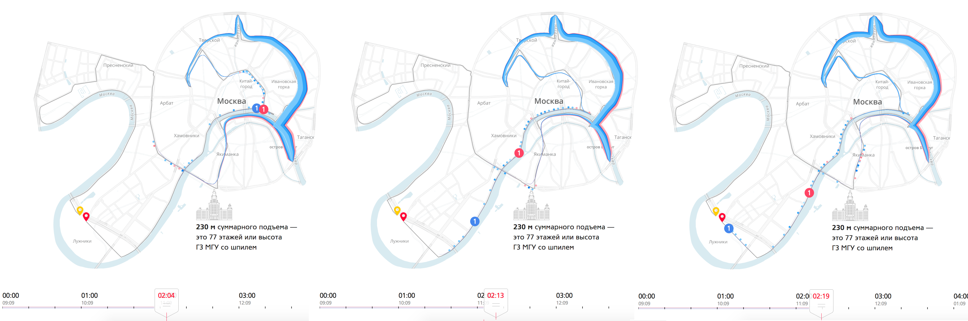
We have a crowd of runners, which runs along an interesting route through the entire center of Moscow. At the beginning, the crowd is big and thick, over time it stretches heavily along the route. When the runners are almost at the finish line, the tail just runs out of the garden ring.
There are a lot of data dimensions on this visualization. The crowd is divided by color - men and women, and by age, which is indicated by a touch of color - the darker the more mature. From this visualization you can extract interesting mini-stories. For example, pay attention to the winner. Here, when he runs out to the embankment, he is somewhere in the 7-8th place, already on the embankment he makes a jerk, overtakes everyone and finishes first.
Look: we took a dry table, added intermediate results (10, 15, 21 km, 30 and 35 km) and received a huge layer of new information, which we would have been difficult to extract from the table. We got a complete and coherent picture of what was happening.
In addition to reflecting the positions of the runners, we added small diagrams, distributed the runners by sex and age. On the finish histogram you can see how participants were distributed by finish time, to find those with whom you ran together. There is also a list of participants with the ability to filter (filters affect the main visualization). And the dynamics of the weather throughout the race, the weather for marathoners - this is very important, directly affects the result.
Question to the audience: Why is this visualization cool?
Answers:
- You can watch the dynamics
- It becomes visible new information, which was not in the table. For example, a jerk on the waterfront
- The map and the python due to clarity create a sense of simplicity and integrity of the story, of what really happened. This is not a fragmented set of graphs, but a holistic display of reality.
Comparison of tanks World Of Tanks
There are players, they are moving from level to level. At each new level, tank properties are improved, they become more armored and powerful. The main characteristics of the tank are attack, defense and speed.
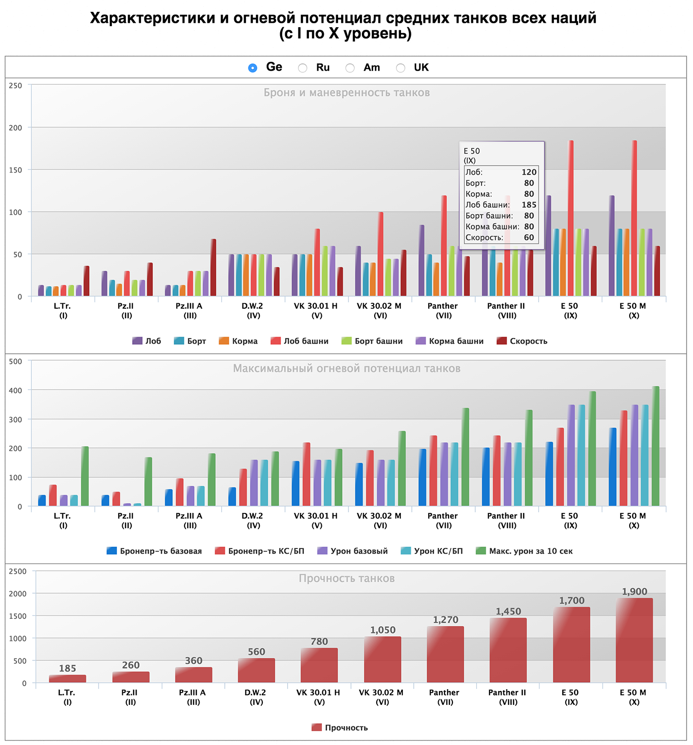
Here is a diagram devoted to the properties of tanks, I was sent to the analysis of one of the game lovers:
But the visualization that we did in the laboratory:
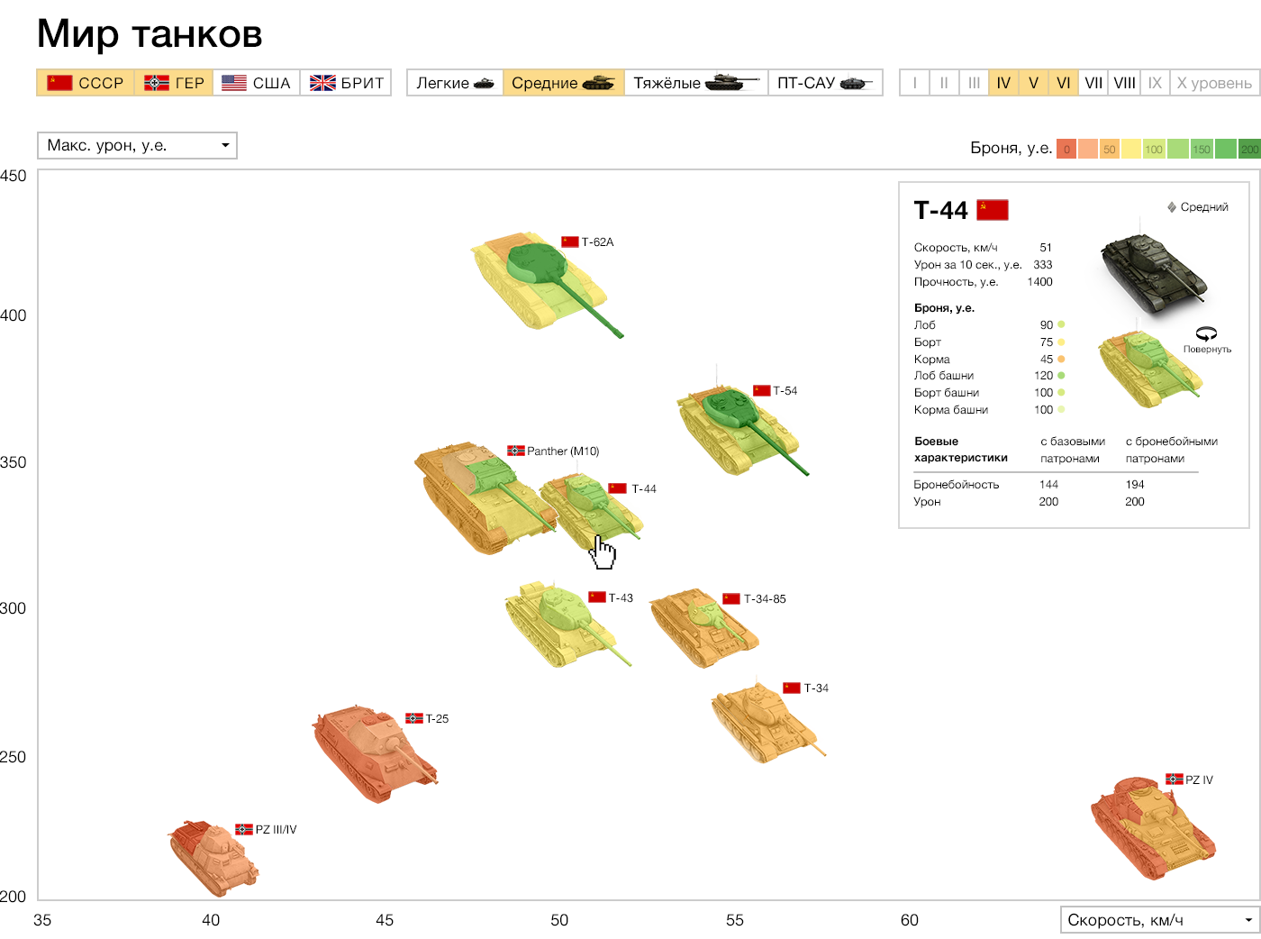
The horizontal speed, attack for 10 seconds of vertical, armor is shown in colors right on the image of the tank. More detailed features and real image on click. Top filters by country and class of tanks. Instead of dry charts, we look at the size and shape of the tanks.
Question from the audience: But not all parameters are always visible. In your version, unlike the first one, it is impossible to know which tank is cooler at first sight.
If desired, you can turn on all tanks of all levels. But we specifically cut the standard view, so as not to clog the screen, and not degrade perception. In the initial version, by the way, not all, either, but only ten in some unknown way of selected tanks - one for each level. The main conclusion that can be made there - with the increase in the level, the indicators are growing, the most noticeable deviation - one of the indicators did not grow in one of the tanks. On our own visualization, you can compare the tanks of the same and neighboring levels.
Commentary by Ilya Ruderman, player by WOT:
- It takes three to four days to pump the first three levels. But in order to pump from the fourth to the tenth it is necessary to spend a lot of time. You value your time, so you need to know as much as possible about the next tank in the development tree. The game has a large audience, and the slightest changes in the parameters and characteristics of the tanks greatly affect the gameplay. Therefore, players pay much attention to the characteristics. The job is cool. She has a large potential, but lacks several critical parameters.
Question to the audience: How good is this visualization?
Answers:
- Filters and parameters do not pile on a huge bunch of switches, and neatly spaced and built into the visualization. Little visual noise, and each element helps perception, but does not interfere
- In the first chart about tanks, we compared all the capacities of all tanks. This is not very useful, because if the tank is weak, what's the point of comparing it with the strong? In your version, you can easily filter them and get only important information.
- A motivated player will study the first chart, but your visualization has the potential to attract an ordinary player who is just interested.
The rhythm of life in big cities, Jawbone
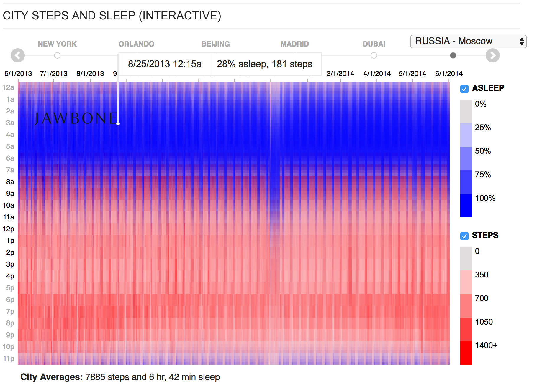
The diagram shows the activity of users in different cities. Horizontally - 365 days of the year, vertically - a day with a breakdown of 15 minutes. This is ... 365 x 24 x 4 = ~ 35 thousand data cells x 2 parameters: sleep and steps. It turns out ~ 70 thousand numbers that are reflected in one picture, 45 such pictures for 45 cities. These are average numbers for all users, imagine how much data was in the input!
What catches your eye? Sticks - the weekend, all sleep off. A noticeable sinking on January 1 - celebrate the New Year. On the original visualization, each year a few seconds are loaded; this makes it impossible to quickly compare. We took the original graphics and made it so that the data is loaded immediately and it is convenient to compare them.
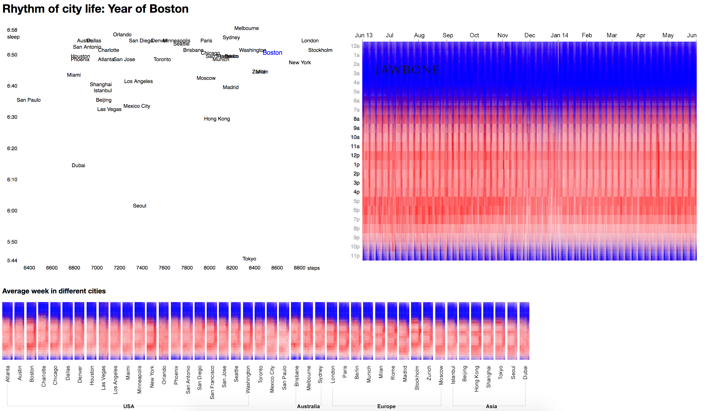
Try our version. See what happens in the summer in Stockholm and London, as far as London is more regular. They only change for the New Year. Now let's compare London and New York: there are long weekends, weekends in New York. And now look at Madrid, how their siesta after an hour of the day changes the whole picture. And now Miami or Phoenix, where everything is very even and there is not much difference between weekends and working days. In Dubai, for some reason, everyone sleeps in June. Perhaps this is the influence of some kind of religious fasting.
The bar below is the average week of one city. It shows, for example, that Charlotte in the United States is very distracted by the beginning of the day. And the evening in Tokyo smoothly turns into the night.
You can discern that in New York, Washington, Boston is actively expressed week and days off with a lot of activity, and on working days everything is rather sluggish.
An additional level of instantaneous comparison works well with the ability of our eyesight to notice changes in similar pictures (Tafti writes about this). The visuals are great in their own right, can be combined with other frameworks, linked interactively and get a more powerful communicative effect.
NYT Pro Basketball Visualization
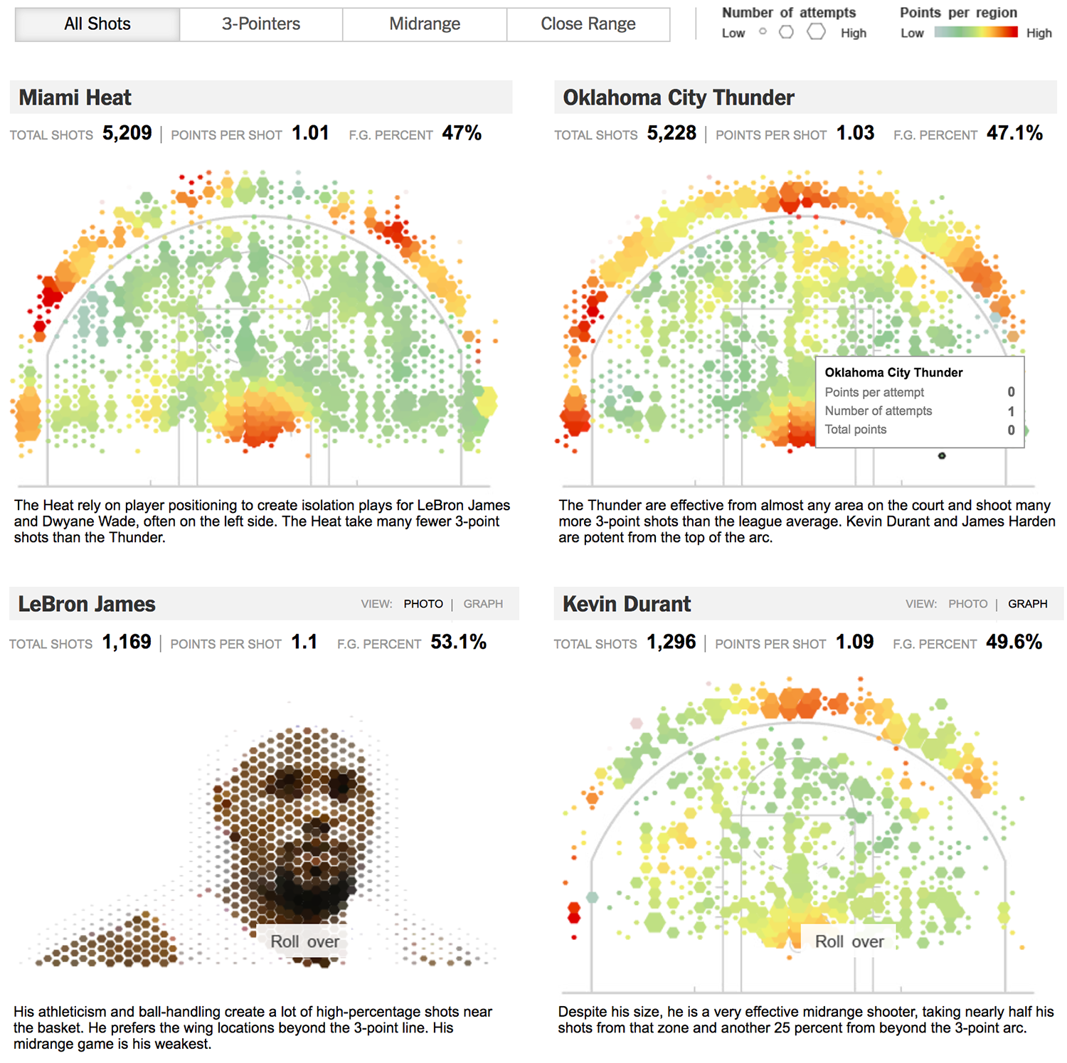
This shows the basketball court and the ring, and above it is the number of shots from different points of the court and the impact of the shots. The size of the hexagon is the number of shots from the position, the color - the redder, the more hits from here. Statistics collected for two different teams, there is a summary of data: the total number of throws, points for a throw, the percentage of hit.
When two pictures are near, we can rather easily compare two teams. We can notice some regularities: Oklahoma City Thunder throw three-pointers from the center, but Miami Heat does not. They have very low performance there. But the most interesting thing begins when we go to the statistics on the players. [When hovering over images of players, they fly away and turn into charts, from the audience enthusiastic sighs.]
Comparison by players is more interesting, here the wow effect does not interfere with perception and fits very well into the schedule. Kevin Durant is a three-pointer special, and LeBron James throws it from under the ring. You can compare and see the technique of different players and get an understanding of the style of the game. You can still see who is left-handed and who is right-handed.
Question from the audience: And how do they record all this?
Now more and more sports analysts and TV channels are beginning to understand the power of visualization and are spending resources on collecting and aggregating such data. As a last resort, you can find the records of all the heads, and create a dataset manually.
Cash turnover visualization
Further boring table finances:

On the table are the subjects of the Russian Federation and their cash turnover on individuals / legal entities, residents / non-residents, cash withdrawal / deposit and the amount of turnover. The Central Bank analysts are not interested in operations at any particular time, but they are interested in anomalies and outliers. For example, a sharp jump in cash withdrawal in some entity is a reason for suspicion of fraudulent schemes.

Color coding we did for anomaly. The internal algorithm calculates the percentage of anomaly and colors the region in accordance with the index.
In the Novgorod region, some values deviate from the average, and we see this anomaly on the map. When we saw the anomaly, we can try to sort it out and fall deeper. Anomaly here was extradited. These were large withdrawals from residents in March, May and January. This visualization does not allow to dig even deeper, but here we can watch the temporal dynamics of the season. This is hardly a tourist activity, tourists will not grab nine billion rubles. Perhaps this is a reason for the proceedings. This is not real data, the institute generated a conditional set for test work.
Here is a classic example of a combination of formats. When we work with the map, the graph comes to life in dynamics. And when we work with the schedule, the map changes, we can see that in April 2013 there was an anomaly in the Tomsk region.
At the customer, all this information is stored on 30 sheets in Excel, and to see such a picture they travel on these 30 sheets. There is a special person who is oriented in this Excel and digs out the necessary information. Plus visualization in that you can pack a huge amount of data in a concise form.
Map of Venice
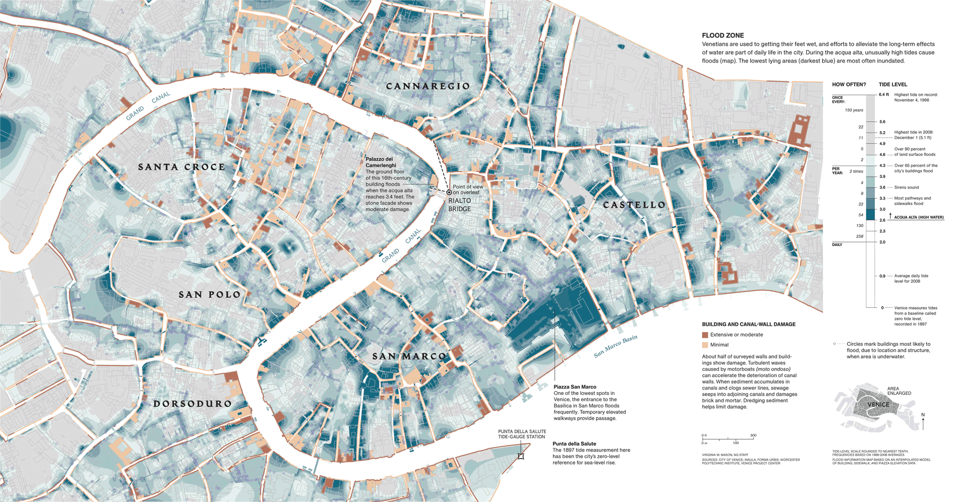
A great example of communication data and color on the map. The color fills of areas are areas that are flooded with different frequency. Some areas are flooded more often. Interesting combination of two types of data. On the one hand, this is the water level, and on the other, on the same scale, the frequency of flooding. In addition to filling areas, there is another sense unit - at home. Bright are shown buildings that are poorly affected by flooding, dark, which are destroyed very much
Who is marrying
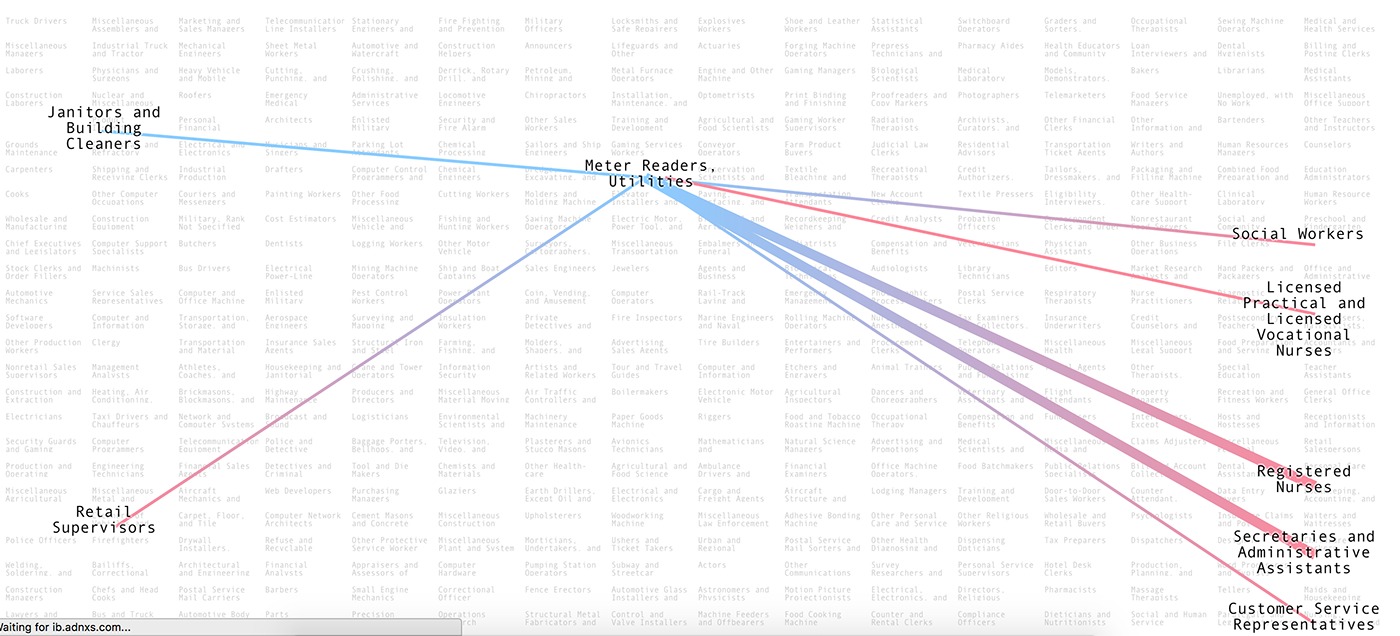
The grid on the background is made up of different professions. On the left - more masculine professions, on the right - more feminine ones. When you hover on a profession, we see lines of communication of different thickness, which show how often people from this profession marry people from another profession. Circles mean that people get married inside the same profession. The color of the gradient shows the floor inside the pair.
Firefighters marry kindergarten teachers. Designers marry sales managers.
Such graphics are not at all tied to the classical formats of information representation. But it takes into account the peculiarities of the data that underlie the visualization, and makes it super-visual what we want to show - the frequency of marriage. It turns out very minimalist. And this joke is really interesting to learn.
Question from the audience: And how are professions scattered horizontally from more masculine to more feminine?
Most likely, some tricky algorithm that distributes depending on the proximity of the professions, so that the final picture looks good.
Cool visualization, conclusions
Question to the audience: All the examples are very different. What unites them and makes visualization cool?
Answers from the audience:
- The data does not cease to be uninteresting and alive because the topic is dry and uninteresting.
- When the visualization is done well, I want to explore it and ask questions.
- When multidimensional data are connected, a new meaning is born from their comparison.
...
Here is my understanding.
In an interesting visualization, in the one in which there is a sense of "magic", there are always many dimensions on a flat screen. We use different expressive means and methods and techniques to make perception convenient.
In this case, when we show all these measurements, we maintain visibility. It should not be a mechanical coding "aha, I have a height property, I encode it with color, I have a length property, I encode it with hatching." Try to think what real things are behind the data. If this tank armor draw directly on the tank, where it is located. Choose coding methods as close to reality as possible, closer to intuitive ideas about colors (boys - blue, girls - pink). The more intuitive coding you use, the easier it will be to perceive the work, even if it has many dimensions of data. It will not be necessary to make signatures and guides “How to read the graph”; huge legends will not be needed. Perhaps the minimalist legend itself will become a diagram. In this case, the schedule lives well without a legend.
It does not always work. Sometimes a new type of visualization is better suited, which is not immediately clear, but solves the problem very well. So too can be done. But ideally one should strive for clarity and intuition.
When these principles are observed, a certain general picture is born, we can cast a glance at the data as a whole, without switching over the thirty tabs, without switching the cities of the country, we can see the whole picture, what is called, big picture. In the big picture we see patterns, anomalies, connections. It is easy to make comparisons. If we do not have a general picture, but only five separate graphs - the benefits and effects of visualization will be completely different. After we have seen the pattern, we can fall deeper and start exploring (cash flow, jawbone cities). See the picture as a whole, notice the patterns and go deep into and answer questions about this pattern. This is the strength, and the guarantee of classroom visualization.
We looked at cool examples of visualizations, now let's talk about how our process is organized inside the laboratory. Most of the results of working with data are not at all like the examples that we looked at. At the word “visualization”, dashboards, scattered graphs, circular, bar charts, and sometimes sankey are usually immediately presented.
I have a hypothesis why this happens. Analytics, data manipulation and visualization are often perceived as boring and dreary, because the data is stored in tables or databases. And these data sheets and tables look the same. The same problem with standard types of visualization.
All data is unique. They are alive, something always happens inside - objects interact, their properties change. If we put this life in the table, we fix it with a dead cut. When we try to visualize this slice, we get moderately informative, but rather dull, lifeless dashboards. Such a straightforward approach, although the most logical, but leads to dry and primitive results.
Although it is not always as simple as it seems. There are a lot of nuances, and analysts get a lot of money to work correctly with the display of data.
To create a “sense of magic,” which we talked about in the first part, you need to turn on the imagination and go beyond the tables. It is necessary to imagine what is behind these tables, which generates this data.
Data reality is a collection of processes that occur in a physical space and generate data.
Here, Katie Ledeka breaks the record and wins Olympic gold in the 800-meter freestyle swimming:

This is an excellent example of how to connect the reality of the data, you can visualize what actually happened. How a boring table turns into a piece that is hard to take your eyes off.
And one more example, but from another area. Map of Italy's Antoine Corbino Specialties:

It is difficult to call it data visualization, but it is a good example of not having to be afraid of taking real objects, as in the example with tanks or a basketball court. Do not be afraid to place everything on the map, tied to some real physical space.
We try to use the real “landscape” and transfer elements from our physical reality to visualization. This greatly enhances visibility and brings us closer to the overall picture.
Defining the reality of the data, including imagination and imagining what is behind the dry tables, having seen this picture, we take a step to show the essence of the phenomenon, and not the dead and dry section. The reality of the data helps to see the nature of the data behind uniform tables.
A data particle is an approach from the micro level, it is an elementary data block that allows you to unravel a tangle of data of any complexity. There may be several, but most often one. This is an analytical work, to find an entity, a unit that will allow you to work with data as flexibly as possible.
Presenting the reality of the data and isolating the data particle is the first step of our algorithm Δλ. Present the picture as a whole, and find the smallest brick. Data turns into a set of particles that we can group together in any convenient way.
Then we go to the two-dimensional plane of the screen and begin to decompose the particles on it as you like. This is the second step of the algorithm - the selection of the framework and the visual atom.
A frame is a way of organizing two dimensions of a screen that transmits the properties of a data particle due to its position on the screen and a change in this position. The frame distributes the data particles on the plane so that they can be compared with each other.
Visual atom- a visual embodiment of a particle of data on the screen. Visual atoms show data parameters using color coding, size, shape of objects, and other visual attributes.
Why these complexities with frameworks and atoms? The ability to separate spatial measurements and visual, as if the own properties of the particle significantly increases the flexibility of our approach to displaying data. Any visual atom can be on any frame. Even if we consider a small set of basic frames, familiar to everyone, in combination with graphic primitives (point, figure, line ...), we get an impressive table of possible visualization formats:

Why am I not starting a lecture with this wonderful table? It seems to me that this table pushes us to go along the standard path and choose a visualization from a large set of graphs so that we can stuff our data into it. And when we try to stuff the data into a predefined form, we do not take into account their essence, their features, and we lose a lot. I want us to dance from the data and therefore I pay so much attention to the first part. Data is more complicated and more interesting than all standard formats. In general, I have a feeling that the data has its own idea of the form in which it is better to be :) What is for each data set, taking into account their internal features, has its most suitable way of representation. I do not want you to perceive this table as a tool to push data into some format.
The third step of the algorithmafter we dumped the data on the frame. We are starting to add interface elements, filtering tools. Perhaps we got too many points and they are rippling, then we can merge the points among themselves into shapes. After we have distributed the data on the frame, we can add controls based on the scenarios, how we want to work with the data.
Very cool algorithm decomposes on the example of visualizing the losses of the Second World War: The algorithm will now seem to occur before our eyes, in real time (turn on the video).
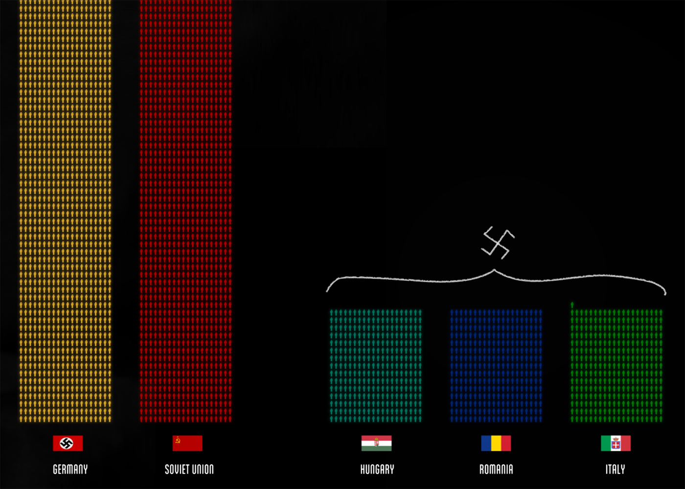
The video begins with an introductory word - this is the reality of the data. Now they have chosen a piece of data - a civilian and a soldier. The first step of the algorithm is passed. The visual atom is a human figurine in which 1000 lives are coded. And two different figures - a soldier with a gun and an unarmed civilian. From individual people get a lot of data. At some point, all data is located on the time axis. We see how the number of casualties grows over time and how it is distributed in different battles. This is the second step, we scatter the visual atom in different frames, we see different pictures.
Another grouping method is applied to the same particle - by color, which means other meaningful parts. It turns out that among themselves the particles of data are the same, but we can easily compare them with each other and draw conclusions. Pay attention to the scenario - the thought is repeated that all these are living people, and not points on the graph.
After this, the points turned into bars (the third step), because the scale is too large. On this example, as well as on the famous map of Minar , the power of the holistic picture is shown, on which we see every point, every death. It resonates much more than the dry figure of 87 million, or bars.
***
For more information about the algorithm, read "Algorithm for visualization of complex data . "
I invite everyone who read the note to the end to the course on data visualization . On the course, we understand deeper the concepts of reality and data particles, get even closer acquainted with the frames, visual atoms and principles of working with them. In addition, the participants learn visualization tools - the Scoreboard and the d3.js library, and on the last day of the course they create visualization under the guidance of teachers. To activate the discount of 5 thousand rubles. , when writing in a comment, make a note “from the habr”.
Video master class promised, but will not soon. Meanwhile, one of the camp participants deciphered the record of my speech. I give here the first part of the decoding of the lecture with minimal cosmetic changes and the outline of the second part, devoted to the algorithm Δλ, which we study in the course on data visualization.
Master class on data visualization, July 22, 2017, BDSL
Vela Tanya Bibikova from the Data Laboratory
Deciphered Misha Novikov
')
We will talk today about how to create cool visualizations - visualizations that reveal the nature of the data and reveal the patterns hidden in them. But in order to understand how to create good visualizations, let's first understand what visualizations we will consider good. I will show you some examples.
Earthquake history
All earthquakes since 1898, shown on the map. We took the usual table with dry data, where there is a year, the date of the earthquake, the place and strength. Simply by placing this table on the map, we have shown a picture that no one has seen or can see with our own eyes: the outlines of tectonic plates appear behind the history of earthquakes
Results of the Moscow Marathon
The next work is our pride, we were given a bronze for it at Malofiej (prestigious competition in interactive graphics).
Given: marathon results that look like a table with fields - last name, first name, age, country.
Why did you want to do something with this data? In 2013, I myself was preparing for a marathon and participated in intermediate races. My first race inspired me very much, because this is a huge crowd of runners of different ages, running communities, teams. The most interesting thing happens during the race, because this is a huge crowd that runs along the route, forms groups. Someone tries very hard, laid out in full, someone does it for himself, at a relaxed pace. When, after my first official race, we were given a dry table that did not reflect everything that was happening, I wanted to do a visualization.
We have a crowd of runners, which runs along an interesting route through the entire center of Moscow. At the beginning, the crowd is big and thick, over time it stretches heavily along the route. When the runners are almost at the finish line, the tail just runs out of the garden ring.
There are a lot of data dimensions on this visualization. The crowd is divided by color - men and women, and by age, which is indicated by a touch of color - the darker the more mature. From this visualization you can extract interesting mini-stories. For example, pay attention to the winner. Here, when he runs out to the embankment, he is somewhere in the 7-8th place, already on the embankment he makes a jerk, overtakes everyone and finishes first.
Look: we took a dry table, added intermediate results (10, 15, 21 km, 30 and 35 km) and received a huge layer of new information, which we would have been difficult to extract from the table. We got a complete and coherent picture of what was happening.
In addition to reflecting the positions of the runners, we added small diagrams, distributed the runners by sex and age. On the finish histogram you can see how participants were distributed by finish time, to find those with whom you ran together. There is also a list of participants with the ability to filter (filters affect the main visualization). And the dynamics of the weather throughout the race, the weather for marathoners - this is very important, directly affects the result.
Question to the audience: Why is this visualization cool?
Answers:
- You can watch the dynamics
- It becomes visible new information, which was not in the table. For example, a jerk on the waterfront
- The map and the python due to clarity create a sense of simplicity and integrity of the story, of what really happened. This is not a fragmented set of graphs, but a holistic display of reality.
Comparison of tanks World Of Tanks
There are players, they are moving from level to level. At each new level, tank properties are improved, they become more armored and powerful. The main characteristics of the tank are attack, defense and speed.
Here is a diagram devoted to the properties of tanks, I was sent to the analysis of one of the game lovers:
But the visualization that we did in the laboratory:
The horizontal speed, attack for 10 seconds of vertical, armor is shown in colors right on the image of the tank. More detailed features and real image on click. Top filters by country and class of tanks. Instead of dry charts, we look at the size and shape of the tanks.
Question from the audience: But not all parameters are always visible. In your version, unlike the first one, it is impossible to know which tank is cooler at first sight.
If desired, you can turn on all tanks of all levels. But we specifically cut the standard view, so as not to clog the screen, and not degrade perception. In the initial version, by the way, not all, either, but only ten in some unknown way of selected tanks - one for each level. The main conclusion that can be made there - with the increase in the level, the indicators are growing, the most noticeable deviation - one of the indicators did not grow in one of the tanks. On our own visualization, you can compare the tanks of the same and neighboring levels.
Commentary by Ilya Ruderman, player by WOT:
- It takes three to four days to pump the first three levels. But in order to pump from the fourth to the tenth it is necessary to spend a lot of time. You value your time, so you need to know as much as possible about the next tank in the development tree. The game has a large audience, and the slightest changes in the parameters and characteristics of the tanks greatly affect the gameplay. Therefore, players pay much attention to the characteristics. The job is cool. She has a large potential, but lacks several critical parameters.
Question to the audience: How good is this visualization?
Answers:
- Filters and parameters do not pile on a huge bunch of switches, and neatly spaced and built into the visualization. Little visual noise, and each element helps perception, but does not interfere
- In the first chart about tanks, we compared all the capacities of all tanks. This is not very useful, because if the tank is weak, what's the point of comparing it with the strong? In your version, you can easily filter them and get only important information.
- A motivated player will study the first chart, but your visualization has the potential to attract an ordinary player who is just interested.
The rhythm of life in big cities, Jawbone
The diagram shows the activity of users in different cities. Horizontally - 365 days of the year, vertically - a day with a breakdown of 15 minutes. This is ... 365 x 24 x 4 = ~ 35 thousand data cells x 2 parameters: sleep and steps. It turns out ~ 70 thousand numbers that are reflected in one picture, 45 such pictures for 45 cities. These are average numbers for all users, imagine how much data was in the input!
What catches your eye? Sticks - the weekend, all sleep off. A noticeable sinking on January 1 - celebrate the New Year. On the original visualization, each year a few seconds are loaded; this makes it impossible to quickly compare. We took the original graphics and made it so that the data is loaded immediately and it is convenient to compare them.
Try our version. See what happens in the summer in Stockholm and London, as far as London is more regular. They only change for the New Year. Now let's compare London and New York: there are long weekends, weekends in New York. And now look at Madrid, how their siesta after an hour of the day changes the whole picture. And now Miami or Phoenix, where everything is very even and there is not much difference between weekends and working days. In Dubai, for some reason, everyone sleeps in June. Perhaps this is the influence of some kind of religious fasting.
The bar below is the average week of one city. It shows, for example, that Charlotte in the United States is very distracted by the beginning of the day. And the evening in Tokyo smoothly turns into the night.
You can discern that in New York, Washington, Boston is actively expressed week and days off with a lot of activity, and on working days everything is rather sluggish.
An additional level of instantaneous comparison works well with the ability of our eyesight to notice changes in similar pictures (Tafti writes about this). The visuals are great in their own right, can be combined with other frameworks, linked interactively and get a more powerful communicative effect.
NYT Pro Basketball Visualization
This shows the basketball court and the ring, and above it is the number of shots from different points of the court and the impact of the shots. The size of the hexagon is the number of shots from the position, the color - the redder, the more hits from here. Statistics collected for two different teams, there is a summary of data: the total number of throws, points for a throw, the percentage of hit.
When two pictures are near, we can rather easily compare two teams. We can notice some regularities: Oklahoma City Thunder throw three-pointers from the center, but Miami Heat does not. They have very low performance there. But the most interesting thing begins when we go to the statistics on the players. [When hovering over images of players, they fly away and turn into charts, from the audience enthusiastic sighs.]
Comparison by players is more interesting, here the wow effect does not interfere with perception and fits very well into the schedule. Kevin Durant is a three-pointer special, and LeBron James throws it from under the ring. You can compare and see the technique of different players and get an understanding of the style of the game. You can still see who is left-handed and who is right-handed.
Question from the audience: And how do they record all this?
Now more and more sports analysts and TV channels are beginning to understand the power of visualization and are spending resources on collecting and aggregating such data. As a last resort, you can find the records of all the heads, and create a dataset manually.
Cash turnover visualization
Further boring table finances:
On the table are the subjects of the Russian Federation and their cash turnover on individuals / legal entities, residents / non-residents, cash withdrawal / deposit and the amount of turnover. The Central Bank analysts are not interested in operations at any particular time, but they are interested in anomalies and outliers. For example, a sharp jump in cash withdrawal in some entity is a reason for suspicion of fraudulent schemes.
Color coding we did for anomaly. The internal algorithm calculates the percentage of anomaly and colors the region in accordance with the index.
In the Novgorod region, some values deviate from the average, and we see this anomaly on the map. When we saw the anomaly, we can try to sort it out and fall deeper. Anomaly here was extradited. These were large withdrawals from residents in March, May and January. This visualization does not allow to dig even deeper, but here we can watch the temporal dynamics of the season. This is hardly a tourist activity, tourists will not grab nine billion rubles. Perhaps this is a reason for the proceedings. This is not real data, the institute generated a conditional set for test work.
Here is a classic example of a combination of formats. When we work with the map, the graph comes to life in dynamics. And when we work with the schedule, the map changes, we can see that in April 2013 there was an anomaly in the Tomsk region.
At the customer, all this information is stored on 30 sheets in Excel, and to see such a picture they travel on these 30 sheets. There is a special person who is oriented in this Excel and digs out the necessary information. Plus visualization in that you can pack a huge amount of data in a concise form.
Map of Venice
A great example of communication data and color on the map. The color fills of areas are areas that are flooded with different frequency. Some areas are flooded more often. Interesting combination of two types of data. On the one hand, this is the water level, and on the other, on the same scale, the frequency of flooding. In addition to filling areas, there is another sense unit - at home. Bright are shown buildings that are poorly affected by flooding, dark, which are destroyed very much
Who is marrying
The grid on the background is made up of different professions. On the left - more masculine professions, on the right - more feminine ones. When you hover on a profession, we see lines of communication of different thickness, which show how often people from this profession marry people from another profession. Circles mean that people get married inside the same profession. The color of the gradient shows the floor inside the pair.
Firefighters marry kindergarten teachers. Designers marry sales managers.
Such graphics are not at all tied to the classical formats of information representation. But it takes into account the peculiarities of the data that underlie the visualization, and makes it super-visual what we want to show - the frequency of marriage. It turns out very minimalist. And this joke is really interesting to learn.
Question from the audience: And how are professions scattered horizontally from more masculine to more feminine?
Most likely, some tricky algorithm that distributes depending on the proximity of the professions, so that the final picture looks good.
Cool visualization, conclusions
Question to the audience: All the examples are very different. What unites them and makes visualization cool?
Answers from the audience:
- The data does not cease to be uninteresting and alive because the topic is dry and uninteresting.
- When the visualization is done well, I want to explore it and ask questions.
- When multidimensional data are connected, a new meaning is born from their comparison.
...
Here is my understanding.
In an interesting visualization, in the one in which there is a sense of "magic", there are always many dimensions on a flat screen. We use different expressive means and methods and techniques to make perception convenient.
In this case, when we show all these measurements, we maintain visibility. It should not be a mechanical coding "aha, I have a height property, I encode it with color, I have a length property, I encode it with hatching." Try to think what real things are behind the data. If this tank armor draw directly on the tank, where it is located. Choose coding methods as close to reality as possible, closer to intuitive ideas about colors (boys - blue, girls - pink). The more intuitive coding you use, the easier it will be to perceive the work, even if it has many dimensions of data. It will not be necessary to make signatures and guides “How to read the graph”; huge legends will not be needed. Perhaps the minimalist legend itself will become a diagram. In this case, the schedule lives well without a legend.
It does not always work. Sometimes a new type of visualization is better suited, which is not immediately clear, but solves the problem very well. So too can be done. But ideally one should strive for clarity and intuition.
When these principles are observed, a certain general picture is born, we can cast a glance at the data as a whole, without switching over the thirty tabs, without switching the cities of the country, we can see the whole picture, what is called, big picture. In the big picture we see patterns, anomalies, connections. It is easy to make comparisons. If we do not have a general picture, but only five separate graphs - the benefits and effects of visualization will be completely different. After we have seen the pattern, we can fall deeper and start exploring (cash flow, jawbone cities). See the picture as a whole, notice the patterns and go deep into and answer questions about this pattern. This is the strength, and the guarantee of classroom visualization.
Algorithm Δλ
We looked at cool examples of visualizations, now let's talk about how our process is organized inside the laboratory. Most of the results of working with data are not at all like the examples that we looked at. At the word “visualization”, dashboards, scattered graphs, circular, bar charts, and sometimes sankey are usually immediately presented.
I have a hypothesis why this happens. Analytics, data manipulation and visualization are often perceived as boring and dreary, because the data is stored in tables or databases. And these data sheets and tables look the same. The same problem with standard types of visualization.
All data is unique. They are alive, something always happens inside - objects interact, their properties change. If we put this life in the table, we fix it with a dead cut. When we try to visualize this slice, we get moderately informative, but rather dull, lifeless dashboards. Such a straightforward approach, although the most logical, but leads to dry and primitive results.
Although it is not always as simple as it seems. There are a lot of nuances, and analysts get a lot of money to work correctly with the display of data.
To create a “sense of magic,” which we talked about in the first part, you need to turn on the imagination and go beyond the tables. It is necessary to imagine what is behind these tables, which generates this data.
Data reality is a collection of processes that occur in a physical space and generate data.
Here, Katie Ledeka breaks the record and wins Olympic gold in the 800-meter freestyle swimming:
This is an excellent example of how to connect the reality of the data, you can visualize what actually happened. How a boring table turns into a piece that is hard to take your eyes off.
And one more example, but from another area. Map of Italy's Antoine Corbino Specialties:
It is difficult to call it data visualization, but it is a good example of not having to be afraid of taking real objects, as in the example with tanks or a basketball court. Do not be afraid to place everything on the map, tied to some real physical space.
We try to use the real “landscape” and transfer elements from our physical reality to visualization. This greatly enhances visibility and brings us closer to the overall picture.
Defining the reality of the data, including imagination and imagining what is behind the dry tables, having seen this picture, we take a step to show the essence of the phenomenon, and not the dead and dry section. The reality of the data helps to see the nature of the data behind uniform tables.
A data particle is an approach from the micro level, it is an elementary data block that allows you to unravel a tangle of data of any complexity. There may be several, but most often one. This is an analytical work, to find an entity, a unit that will allow you to work with data as flexibly as possible.
Presenting the reality of the data and isolating the data particle is the first step of our algorithm Δλ. Present the picture as a whole, and find the smallest brick. Data turns into a set of particles that we can group together in any convenient way.
Then we go to the two-dimensional plane of the screen and begin to decompose the particles on it as you like. This is the second step of the algorithm - the selection of the framework and the visual atom.
A frame is a way of organizing two dimensions of a screen that transmits the properties of a data particle due to its position on the screen and a change in this position. The frame distributes the data particles on the plane so that they can be compared with each other.
Visual atom- a visual embodiment of a particle of data on the screen. Visual atoms show data parameters using color coding, size, shape of objects, and other visual attributes.
Why these complexities with frameworks and atoms? The ability to separate spatial measurements and visual, as if the own properties of the particle significantly increases the flexibility of our approach to displaying data. Any visual atom can be on any frame. Even if we consider a small set of basic frames, familiar to everyone, in combination with graphic primitives (point, figure, line ...), we get an impressive table of possible visualization formats:
Why am I not starting a lecture with this wonderful table? It seems to me that this table pushes us to go along the standard path and choose a visualization from a large set of graphs so that we can stuff our data into it. And when we try to stuff the data into a predefined form, we do not take into account their essence, their features, and we lose a lot. I want us to dance from the data and therefore I pay so much attention to the first part. Data is more complicated and more interesting than all standard formats. In general, I have a feeling that the data has its own idea of the form in which it is better to be :) What is for each data set, taking into account their internal features, has its most suitable way of representation. I do not want you to perceive this table as a tool to push data into some format.
The third step of the algorithmafter we dumped the data on the frame. We are starting to add interface elements, filtering tools. Perhaps we got too many points and they are rippling, then we can merge the points among themselves into shapes. After we have distributed the data on the frame, we can add controls based on the scenarios, how we want to work with the data.
Very cool algorithm decomposes on the example of visualizing the losses of the Second World War: The algorithm will now seem to occur before our eyes, in real time (turn on the video).
The video begins with an introductory word - this is the reality of the data. Now they have chosen a piece of data - a civilian and a soldier. The first step of the algorithm is passed. The visual atom is a human figurine in which 1000 lives are coded. And two different figures - a soldier with a gun and an unarmed civilian. From individual people get a lot of data. At some point, all data is located on the time axis. We see how the number of casualties grows over time and how it is distributed in different battles. This is the second step, we scatter the visual atom in different frames, we see different pictures.
Another grouping method is applied to the same particle - by color, which means other meaningful parts. It turns out that among themselves the particles of data are the same, but we can easily compare them with each other and draw conclusions. Pay attention to the scenario - the thought is repeated that all these are living people, and not points on the graph.
After this, the points turned into bars (the third step), because the scale is too large. On this example, as well as on the famous map of Minar , the power of the holistic picture is shown, on which we see every point, every death. It resonates much more than the dry figure of 87 million, or bars.
***
For more information about the algorithm, read "Algorithm for visualization of complex data . "
I invite everyone who read the note to the end to the course on data visualization . On the course, we understand deeper the concepts of reality and data particles, get even closer acquainted with the frames, visual atoms and principles of working with them. In addition, the participants learn visualization tools - the Scoreboard and the d3.js library, and on the last day of the course they create visualization under the guidance of teachers. To activate the discount of 5 thousand rubles. , when writing in a comment, make a note “from the habr”.
Source: https://habr.com/ru/post/343034/
All Articles