Psychology of perception of form in logos
Your potential customer will get acquainted with your brand through the eyes. Probably. The first thing he sees is your logo. The meaning of the image that broadcasts the logo plays a huge role in shaping the relationship between the customer and the brand. What tools can we use to influence the formation of this image?
What if I tell you that there are rules based on psychology, according to which certain graphic forms create the required images? Moreover, all major brands use these rules, and you, as a designer, or as an owner of a brand, can also use these psychological techniques.
Be sure that the shape of the logos of the largest brands was not chosen by chance - the game follows certain rules of psychological perception. In this article I will show how to reasonably use these rules when creating your brand logo.
We subconsciously respond to different forms in a certain way. An experienced designer can manipulate the perception of a potential client, forming the image of the brand through the shape of the logo.

')
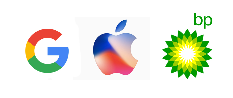
If you want to show such qualities as community, friendship, globality - use a circle or an oval. The ring can symbolize relationship and unity. Imagine how people join hands, form a circle, or gather around a fire, and you will understand the meaning of this image.
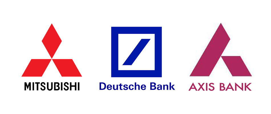
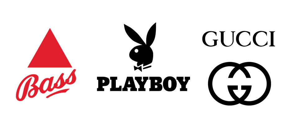
These forms symbolize stability and sustainability. Both the square and the triangle have a base that allows them to maintain a stable position. Straight lines symbolize dedication. Also, the triangle has special meanings associated with power and masculinity (remember the pyramids), and the inverted triangle, on the contrary, is associated with femininity.
Vertical and horizontal lines.
Vertical lines are perceived as a symbol of masculinity, growth, development, while the horizontal ones symbolize calm and stability.
A graphic sign is usually supplemented with a text logo, so it is possible to modulate the perception formed by a graphic sign using a text logo. For example, the oblique font will add dynamics, and a serif font will announce the legacy and the history of the brand.
You can also use color to modulate a message, but remember that form design should always be at the heart of your design. Practically it can be justified by the fact that the logo will not always be reproduced in color and with the text part. Imagine, for example, an application icon - a very relevant example today.
An experienced designer can manipulate more than just a form. Have you heard of gestalt psychology? Perhaps, but most likely you do not know that this technique also works in the design of logos.
The basic principle of Gestalt psychology says that the perception of the whole is different from the perception of the sum of the elements that add it (correct me in the comments if you disagree). Applied to logos, this theory is realized as an effect of perception of the relationship of form and counterform. Our brain completes the picture and awards us for the work done, so that the logo is remembered.
Study the psychology of form perception to create effective logos if you are a designer, or entrust the work to professionals if you need a quality logo.
The main tool is a form
What if I tell you that there are rules based on psychology, according to which certain graphic forms create the required images? Moreover, all major brands use these rules, and you, as a designer, or as an owner of a brand, can also use these psychological techniques.
Be sure that the shape of the logos of the largest brands was not chosen by chance - the game follows certain rules of psychological perception. In this article I will show how to reasonably use these rules when creating your brand logo.
We subconsciously respond to different forms in a certain way. An experienced designer can manipulate the perception of a potential client, forming the image of the brand through the shape of the logo.
Circle and oval
')
If you want to show such qualities as community, friendship, globality - use a circle or an oval. The ring can symbolize relationship and unity. Imagine how people join hands, form a circle, or gather around a fire, and you will understand the meaning of this image.
Square and triangle
These forms symbolize stability and sustainability. Both the square and the triangle have a base that allows them to maintain a stable position. Straight lines symbolize dedication. Also, the triangle has special meanings associated with power and masculinity (remember the pyramids), and the inverted triangle, on the contrary, is associated with femininity.
Vertical and horizontal lines.
Vertical lines are perceived as a symbol of masculinity, growth, development, while the horizontal ones symbolize calm and stability.
Text logo
A graphic sign is usually supplemented with a text logo, so it is possible to modulate the perception formed by a graphic sign using a text logo. For example, the oblique font will add dynamics, and a serif font will announce the legacy and the history of the brand.
Colour
You can also use color to modulate a message, but remember that form design should always be at the heart of your design. Practically it can be justified by the fact that the logo will not always be reproduced in color and with the text part. Imagine, for example, an application icon - a very relevant example today.
Want to go further?
An experienced designer can manipulate more than just a form. Have you heard of gestalt psychology? Perhaps, but most likely you do not know that this technique also works in the design of logos.
The basic principle of Gestalt psychology says that the perception of the whole is different from the perception of the sum of the elements that add it (correct me in the comments if you disagree). Applied to logos, this theory is realized as an effect of perception of the relationship of form and counterform. Our brain completes the picture and awards us for the work done, so that the logo is remembered.
Study the psychology of form perception to create effective logos if you are a designer, or entrust the work to professionals if you need a quality logo.
Source: https://habr.com/ru/post/342994/
All Articles