How to create a stable and harmonious system of indentation in the design for faster development
Translation " I love FE "
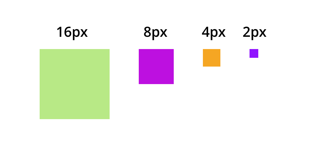
I recently worked on creating a system of indents and sizes for a single health care product to improve the readability of the text and achieve consistency on all pages. I derived three rules for indentation (the Rule of three "K" ) and four sizes ( 16px, 8px, 4px, 2px ), which worked harmoniously with the new typography system.
In this article, you will learn how to use distances consciously for consistency in design and faster development.
Problem
- We used indents in 5px, 10px, 15px, 20px, while we did not have clear rules on when to use each of these values.
- Indents (outer
marginand innerpadding) are just one of the puzzle elements. Leading also adds enough space to the user interface. Previously, in the design, we did not specify leading, and developers had to guess which values to set and which indents should be added to make the design look more or less the same. This led to different indents throughout the product. - The same components and blocks of content looked different. As a result, there was no stability in the design and this interfered with the readability of the text due to the density of the data.
Placing the elements vertically, the designer cannot leave it to chance or uncertainty. Too often, designers rely on vertical indents, which is the default in Photoshop (5px, 10px). Such an approach is permissible when creating a horizontal rhythm, if the columns are multiples of 10px, but this is unlikely to correspond to typography.
Robert Bringhurst, author of The Basics of Style in Typography
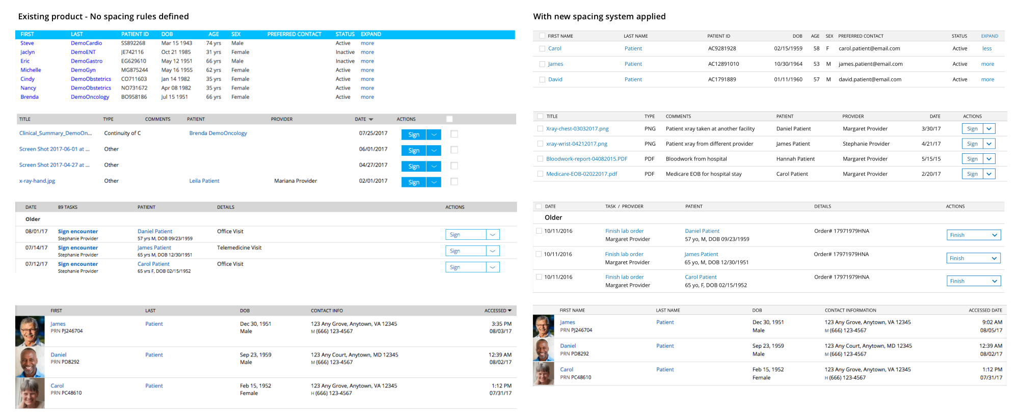
Interface before and after the introduction of the indentation system
Start
Once again I will quote the words of Robert Bringhurst:
Do not create without scale. It is the font that should be the measure that determines everything else.
So, the font and leading is the basis on which we will build our system of distances.
Step 1. Define leading for the main text (and the grid that will work for you)
I started with the hypothesis that the popular 8-pixel grid suits us (that is, distances that are multiples or divisible by 8). As an experiment, I took the main font size of 13px and leading in the size of 16px and 24px. But these values did not fit. In the first case, the distances were too small, in the second - too large.
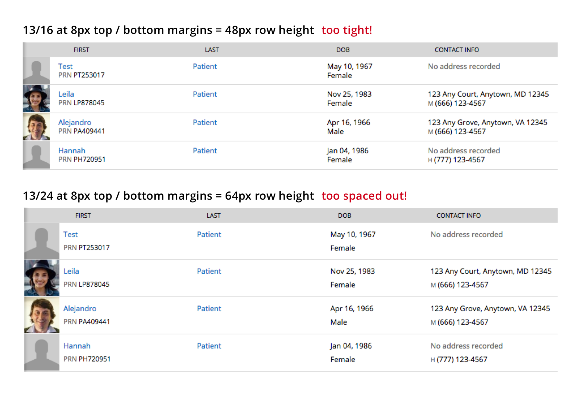
13 / 16px + 8px top and bottom padding = 48px line width. Too closely!
13 / 24px + 8px top and bottom padding = 64px line width. This is too loose!
Then I decided to combine the 13px font with even values from 16 to 24px as leading. At first I tried 18px. If it worked, it meant that I would use a 6-pixel grid (with distances of 2, 3, 6, 12, 18, 24 ...). Then I tried leading at 20px, and it fit perfectly. So, I will apply a 4-pixel grid (with distances of 2, 4, 8, 12, 16, 20 ...).
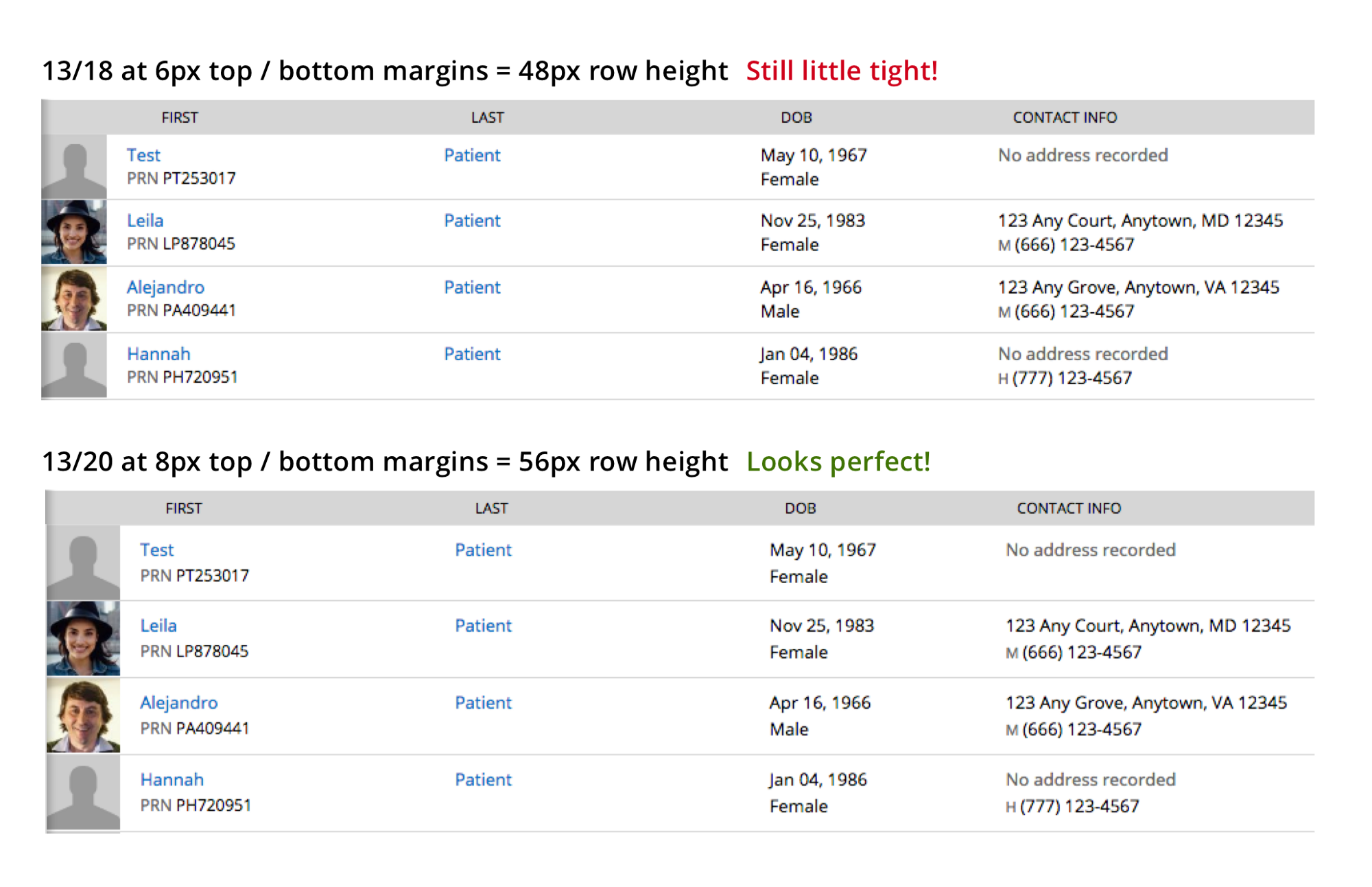
13 / 18px + padding 6px at the top and bottom = 48px line width. Still too crowded!
13 / 20px + 8px padding at the top and bottom = 56px line width. Just right!
Step 2. Hick's law and geometric progression to determine distances
The greater the number of options, the harder it is to make a choice.
Hick's law
To create a sustainable system that simplifies the choice, you need to use the minimum required number of options.
- All distances must be multiples of the base number of the grid, for example, in my case, 4. So, I can choose any values from this series: 2, 4, 8, 12, 16, 20, 24, 28 ...
- Usually, 4–5 options will be enough even for complex corporate products. But if you really need, you can choose additional values.
- I decided to choose the first four values obtained using a geometric progression, as this gives more visually tangible intervals (to emphasize the hierarchy) . So, I received the following numbers: 2, 4, 8, 16.
You can read more about how to choose values in this post from Nathan Curtis ( translation ).
How to use these values to create a sustainable system? Comes to the aid of the Rule of three "K"
I was greatly influenced by the terms that Nathan introduced in his article: external indents ( Insets ), stacks ( Stacks ), and lowercase indents ( Inline ). I decided to add another layer to this to make it easier for my team to understand where each of these elements is used. I have broken all the rules for distances into three groups starting with “K”: Containers, Content and Components.
- Containers use square inset (16px) (Square Inset).
- The content uses stacks (from the top - 2px, from the bottom - 0, 4, 8, 16px, depending on the type of content).
- The components use indented indents (in most cases - 8px, rarely - 4px, when the elements are connected).
First "K" - Rules for Containers
Containers are frames in your interface that contain content within themselves. Usually these are pages, cards, modal windows, panels, etc. Since they are at the very top of the hierarchy, it is necessary that they have the largest indents from all sides (in my case - 16px). Nathan calls this square indent. Tip : never include the border in your calculations ( this article explains why well).
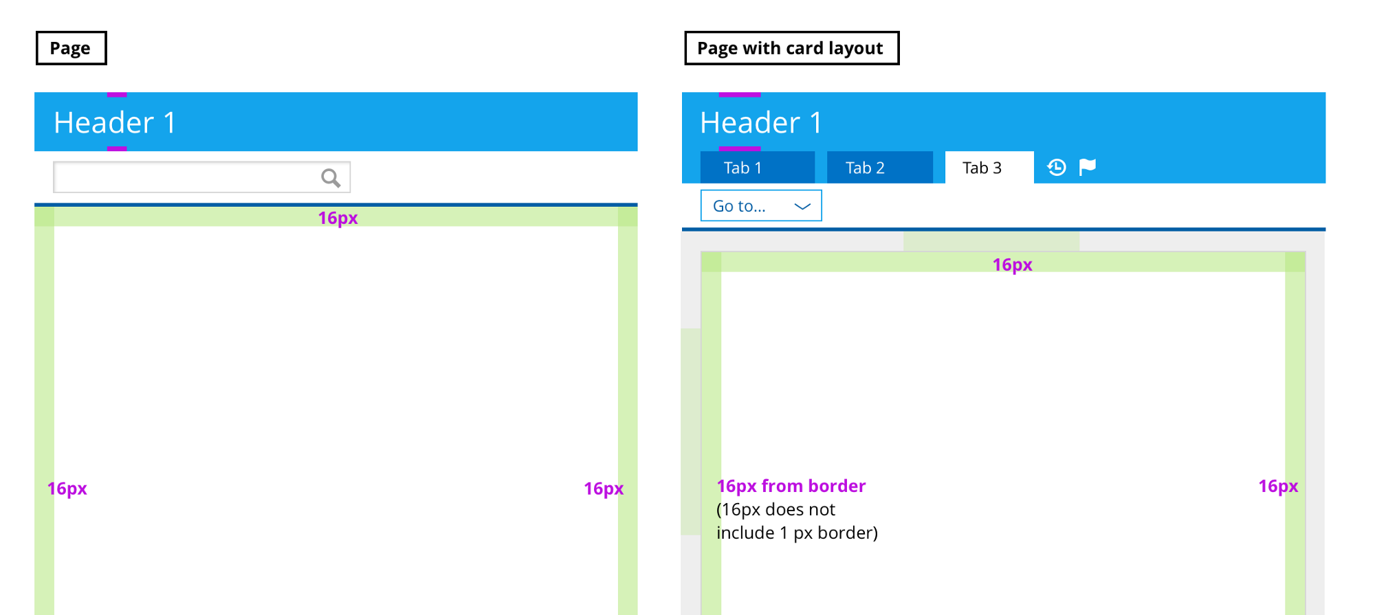
Page, page with card, panel with details, modal window
The second "K" - Rules for Content
Content lives inside the container. Content contains:
- headers (h1, h2, h3, h4, h5),
- different data in the form of paragraphs, lists, forms, tables (they are lower in the hierarchy than the headings, so in the future I will call them “node”).
Content is vertically aligned. But leading (the distance between the lines) also adds space. Nathan tells in his article how to avoid it using mixin. But I could not figure out how to use this approach on an ongoing basis, so I came up with my own taking into account both leading and indents at the same time. Here he is:
A) First, deal with indents for headings.
As you can see in the picture below, I start with two leading options for headers. The ratio of the main font (13px) to the main leading (20px) is ~ 1.54. We take this value to calculate leading for other fonts. And rounded to the nearest multiples of 4 (the base number of the grid).

To facilitate the choice between the two options, I decided to use leading 1.5 and above. I still doubted that it was better to choose, but after some searches, we and the team decided which option was right for us.
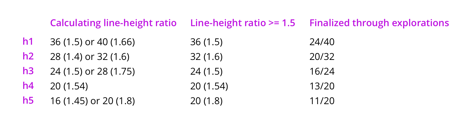
We calculate the correlation of leading. Choose options with a value of 1.5 and above. By searching, we find the final solution.
A little about the search itself
I started with the h1 header and tried different indents of 0px, 2px, 4px, 8px. Most of the 36px line spacing was too narrow. But the 4px indent at 40px is exactly what you need.

Then I switched to h2. In our product, h2 is the first heading in a white page container. According to the rule for containers, the first h2 header is indented at the top by 16px. I decided to make the same indent before all h2 headers, since in this case the hierarchy between the sections is clearly visible.
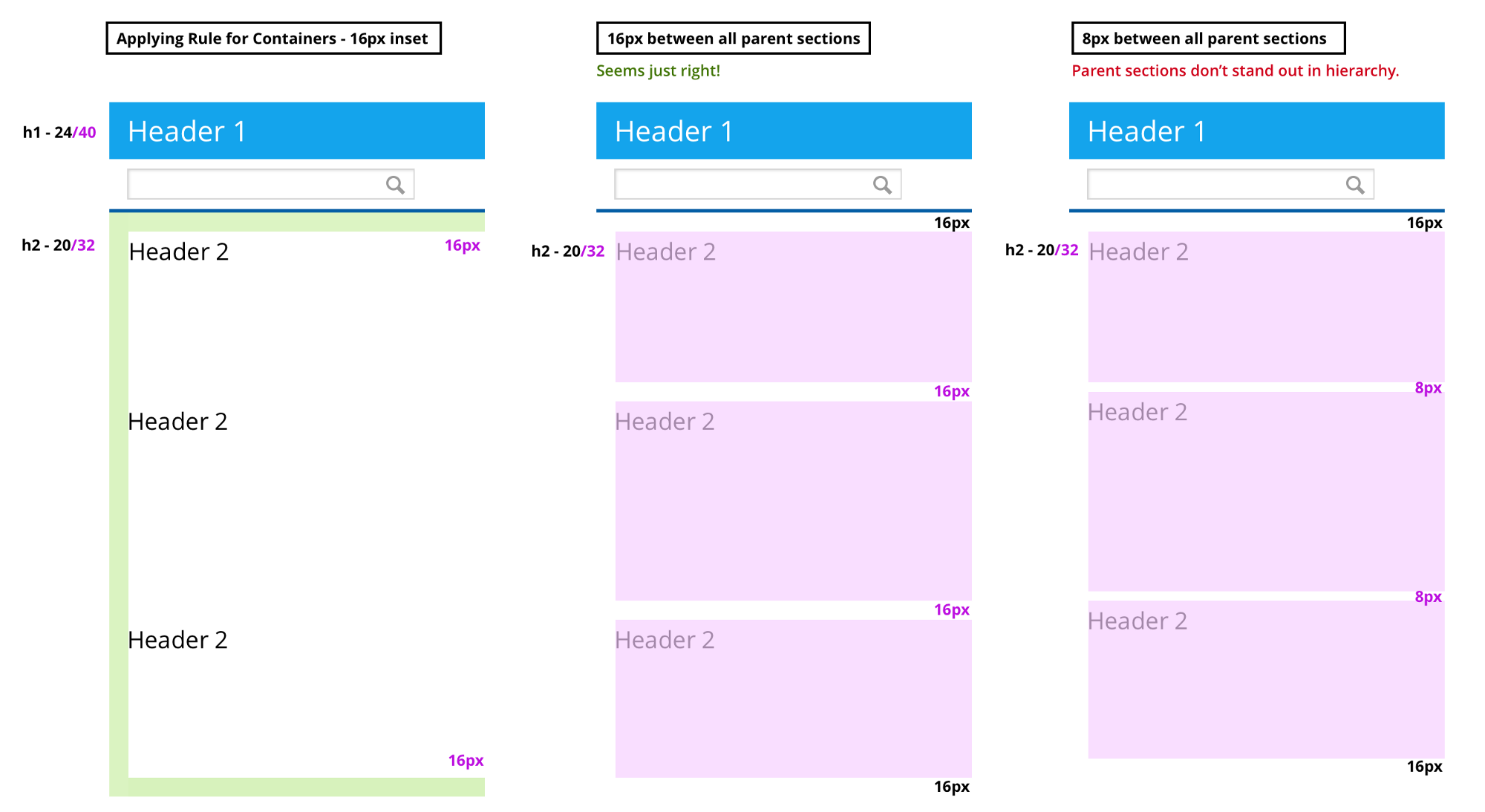
We apply the rule for containers and indent 16px around the edges. Indent 16px between sections. If you indent 8px between sections, then the hierarchy is lost.
Then I experimented with all the indents (from 0 to 8px) between the headers from h2 to h5 and content nodes (paragraphs, lists, forms, tables). The indents of 2px and 4px were quite close, but we still thought that the indent of 2px looked a bit better.
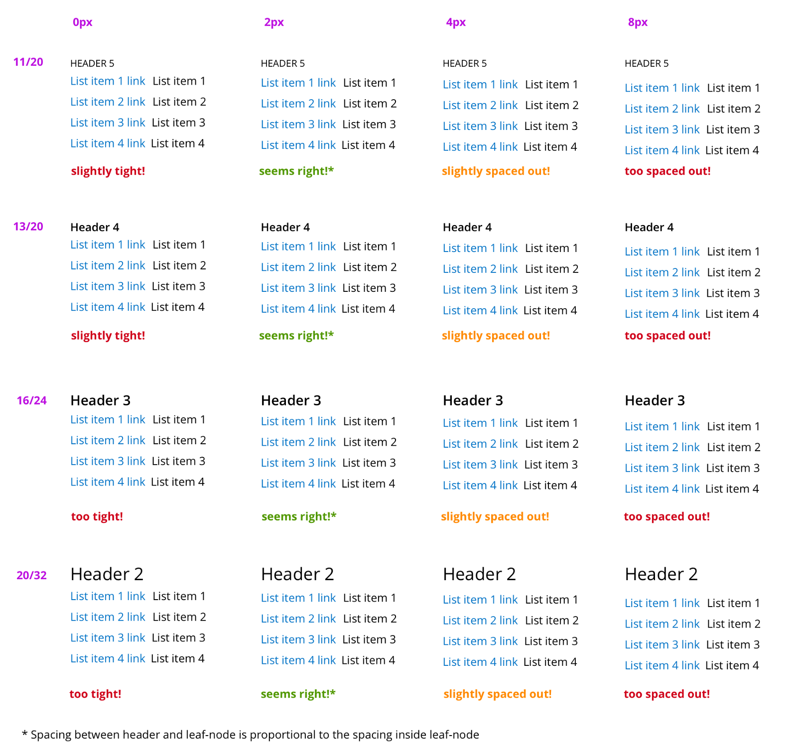
The distance between the title and the content node is proportional to the distances within the node.
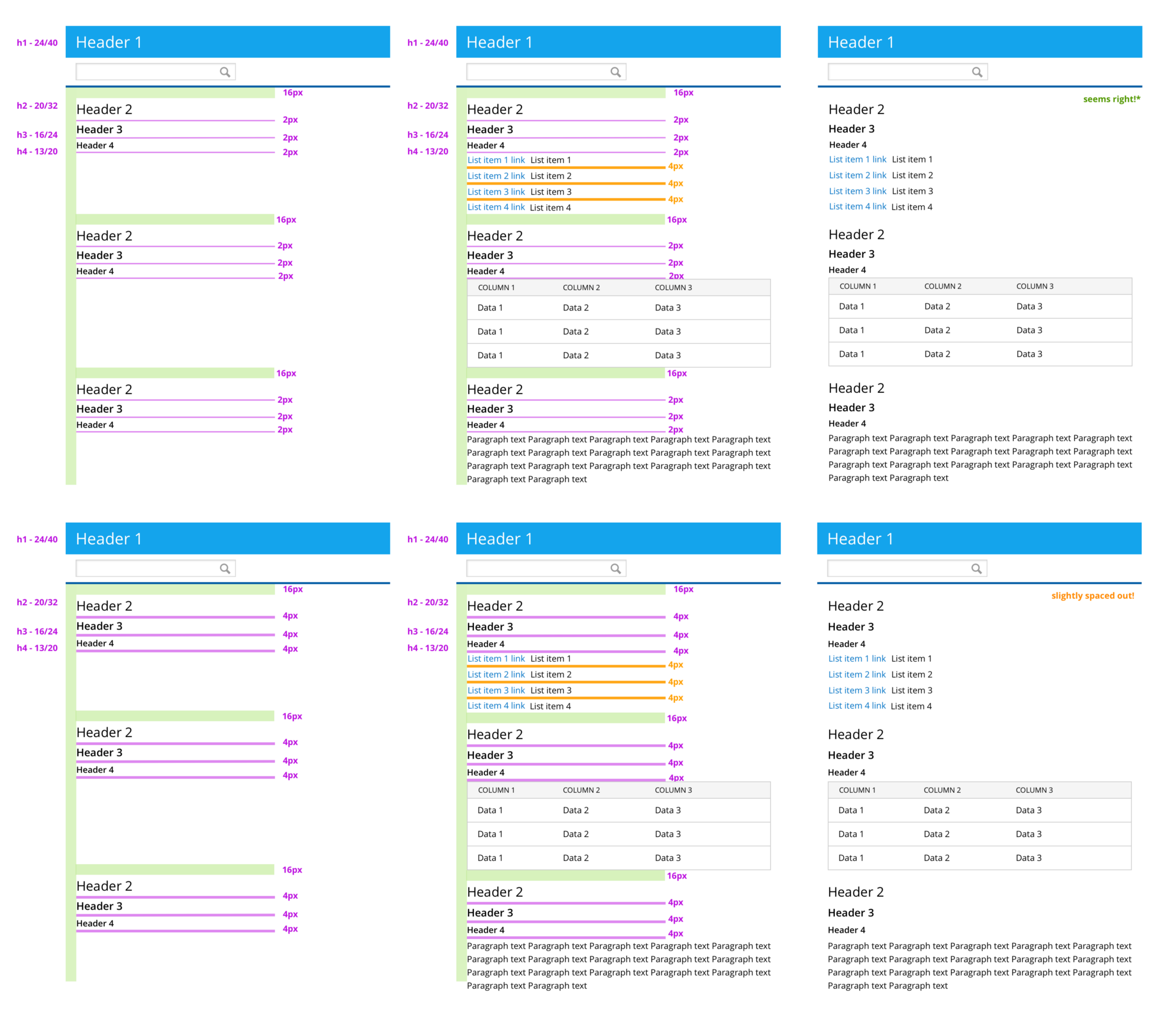
Header Stacks, 2px and 4px Distances
B) Then deal with the indents of the nodes
There are four main types of content in our product:
- tables (about 50%),
- lists (about 30%),
- forms (about 15%),
- paragraphs (another 5%).
I started with the simplest kind of content - with a paragraph.
Indenting paragraphs
This is the easiest - just make sure that the distance between the two lines inside the paragraph is 0px. Any elements within a paragraph (for example, two separate lines in a table) that did not look like a list, were indented to 0px.
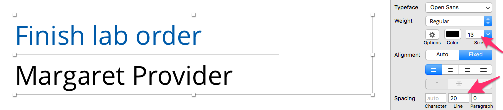
Paragraph Settings in Sketch
Indent between two paragraphs
My first desire was to use as a space between paragraphs the distance equal to leading - 20px. But then I stumbled upon the recommendations of WCAG SC 1.4.8 , where it says: “Leading within a paragraph should be 150%. The distance between paragraphs should be (minimum) 1.5 times longer than leading - by this we mean that the distance from the top line of the last line of the first paragraph to the top line of the first line of the next paragraph should be 250%. ” Assuming that these percentages are calculated from the base font at 13px, I calculated the value for the distance between paragraphs:
13px X 250% - 13px X 150% = 13px.
This value will be specified in CSS as margin-bottom: 13px . But we do not have such an indent among those that we defined in step 2. Therefore, I took the nearest value at 16px.
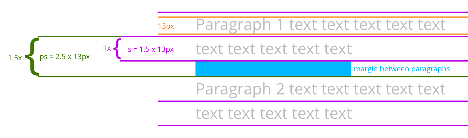
Determine the distance between paragraphs based on WCAG SC 1.4.8

Settings for indents between paragraphs in Sketch
If I doubt the calculations, I always check them visually. The distance between paragraphs of 16px looks better compared to other options. (It seemed to me that 12px fits even better, but I began to introduce another indentation only for such cases, since there are not so many paragraphs in our product, and paragraphs that follow each other, especially.)

Indents between list items
A list is a node that consists of several elements of homogeneous data. Since all these elements are grouped in the list , it is important that the distance between them is less than the distance between paragraphs (for example, 16px), which usually include heterogeneous data. At the same time, the elements of the list should be separated from each other, otherwise they will look like a single paragraph. I took values from 0 to 16px, there were only three - 2, 4 and 8px. The 4px indent looked best for the hierarchy.
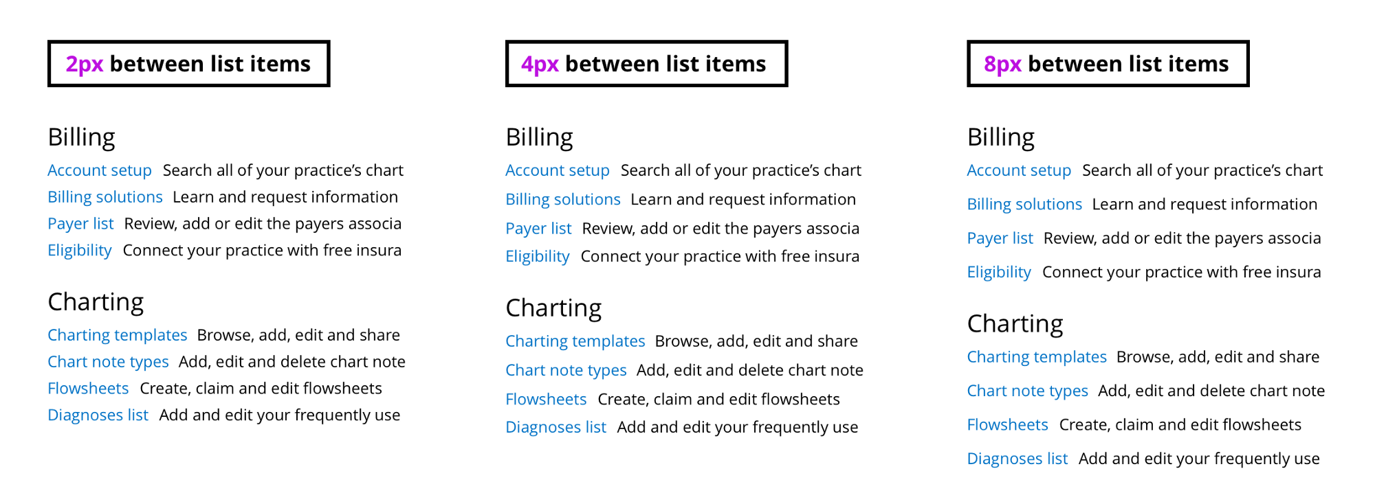
The distance between the list items is 2, 4 and 8px
Indentation between two inputs with labels
The fields inside the form stack up one by one.
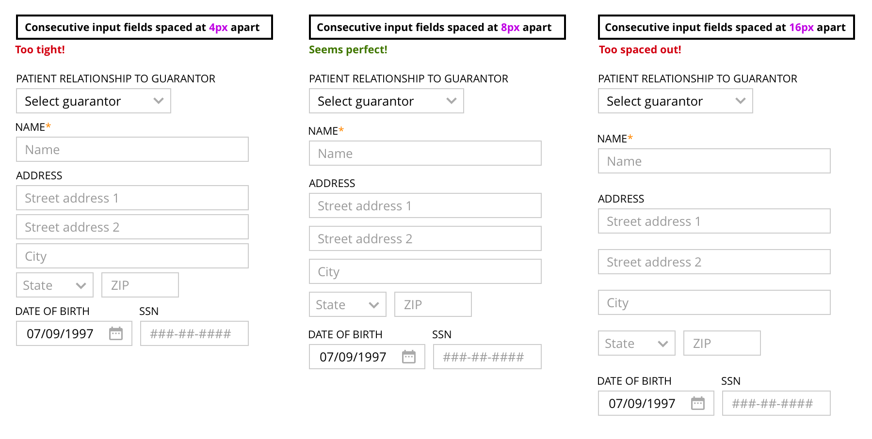
The 4px distance looks too closely, 16px too loose, 8px just right.
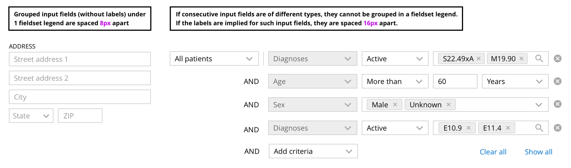
Indentation between two inputs without labels
Do not use labels - this is not a good practice in terms of interface availability. However, in some situations it is better not to show them (but continue to use them), for example:
- when several inputs refer to the same object (for example, the address in the image below consists of several fields that are grouped under one label),
- when the label is too obvious or repeated (for example, search or query filters).
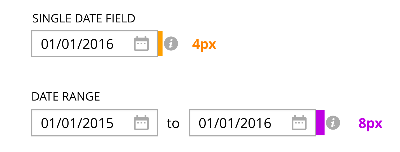
In this case, depending on the situation, a different distance is used. If the inputs belong to the same object, then it is better to use a distance of 8px. If they logically refer to different things, then it is better to use 16px, as is the case with paragraphs.
Indents in tables
Tables, as well as lists, are well suited for grouping homogeneous data. However, the information in the tables is usually more dense and has many parameters. Therefore, the indents in the table are different. If the data is too close, it will be difficult to read them, being distracted by the next line. Using an indent of 8px between the text and the border of the table, we get a distance of 16px between the text in two lines. This is the same distance that is used between paragraphs.
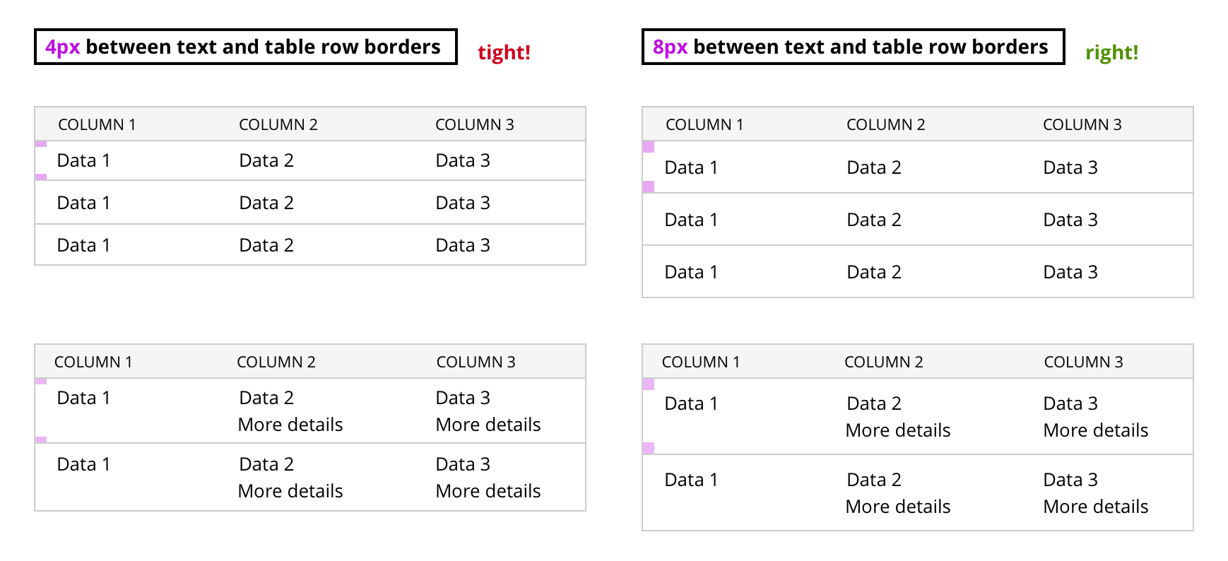
The distance between the text and the table border is 4px - too closely, 8px - just right.
Third “K” - Rules for Components
Components are buttons, inputs, icons, and so on. Usually they are arranged horizontally one after another ( in a row ). All components are a multiple of 4 (and 8). Therefore, the height of buttons and inputs is 24px (with a border of 26px). When the font and all components lie on a grid of base lines and have a proportional size, the whole design becomes harmonious .
Indentation between the two components
I adhered to the simple rule of using 8px indent in most cases between the two components. Sometimes I used 4px indentation to show a closer connection between them (according to the law of proximity in Gestalt psychology).
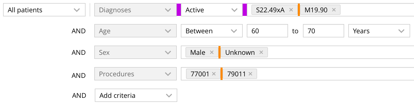
Distance of 8px (purple) and 4px (orange)
Indentation inside components
For all components, I used 8px padding on the right and left side.
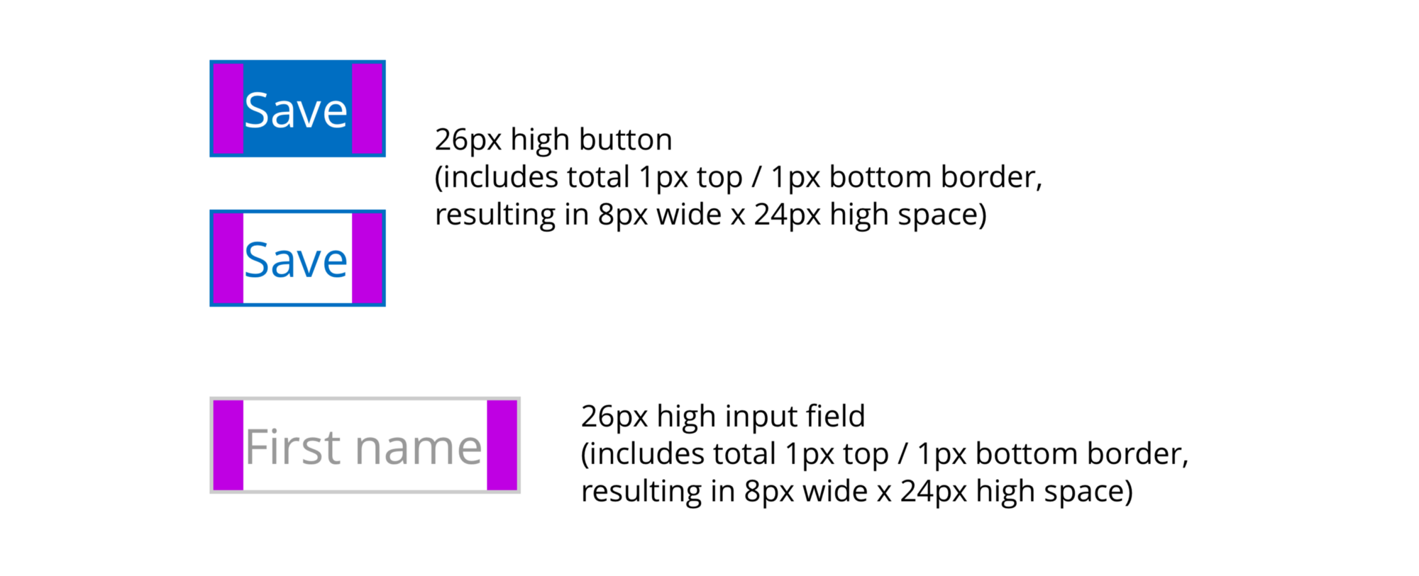
26px button and input (including 1px border at the top and bottom and 8px padding on the sides)
Indents inside components with icons
Once again, based on the law of proximity, I indent between the icons inside the component in 4px, instead of 8px.
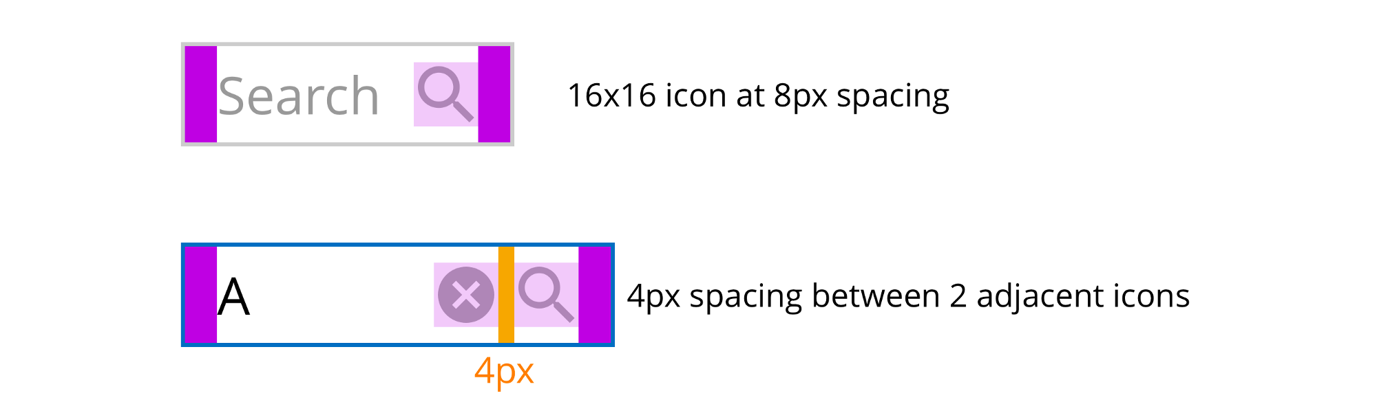
Indents between components and icons
If the icon belongs to a component, then it is placed at a distance of 4px from it, to show the connection with this component (according to the law of proximity). If the icon belongs to a group of components, then it is located at a distance of 8px to show the connection with the group, and not with a separate component.
Conclusion
Using these principles:
- You will create a system of indents with a limited number of options and limited application rules (Hick's law), which will be easy to remember.
- In your interface, you will use distances that help convey a visual hierarchy and comply with WCAG 1.4.8 recommendations. This will allow people with different capabilities to receive information from your site.
- This will speed up the development process, as developers will know the rules for applying indents and will be able to correctly transfer them from the layout.
- Designers will not need to correct the layout, developers will not need to learn layouts using tools such as Zeplin.
useful links
If you have links on the topic in addition to those that I have already mentioned in the article, send them in the comments.
')
Source: https://habr.com/ru/post/342952/
All Articles