Perlin's noise
I used Perlin's noise to create a fog effect and the main screen in Under Construction . I tweeted about my efforts to optimize the algorithm , and several people responded that they did not understand how Perlin noise worked and what it really is.
I admit that I (a little) understand Perlin’s noise primarily because I implemented it earlier, and it took me a few days to dive into the clumsy explanations of half a dozen developers more interested in showing their own demos than in a real explanation. Several useful resources that I found often contained errors and did not give me an intuitive sense of understanding how and why it still works.
What is Perlin noise
In the domestic sense, "noise" is a random trash. Here is some pixel noise.

This is white noise. Roughly speaking, this means that all pixels are random and independent of each other. The average color value for these pixels should be # 808080, gray color - for this picture it is equal to # 848484, which is pretty close.
Noise is useful for generating random patterns, especially for unpredictable natural phenomena. The image above can be a good starting point for creating, for example, gravel texture.
However, most things are not purely random. Smoke, clouds, the landscape may have some element of randomness, but they were created as a result of very complex interactions of many tiny particles. White noise contains independent particles (or pixels). To generate something more interesting than gravel, we need a different kind of noise.
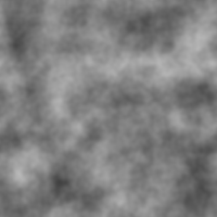
Often this noise is Perlin’s noise, which looks like this:
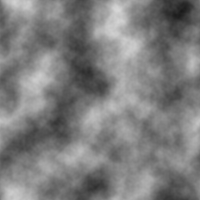
I hope that you are familiar with this picture, even if as a result of the corresponding filter in Photoshop. (I created it in GIMP using the menu Filters → Render → Clouds → Solid Noise.)
The most obvious difference is that the picture looks "cloudy." If we talk about technical details, it is continuous - if you greatly increase its scale, the gradient will always be smooth. There are no abrupt transitions from black to white, so the algorithm works surprisingly well when something “random” is needed, but not too much. Here is the sky, which can be quickly made from the same picture:

All I did was add the bottom layer of blue and use the levels to cut out the darkest parts of the noise. It could have been done better, but for ten seconds of work it will come down. You can even tile the plane seamlessly with this image!
Perlin's noise from scratch
You can create Perlin noise in any number of measurements. The image above is, of course, two-dimensional, but it is much easier to explain in one dimension, where there is only one input and one output. You can easily illustrate the explanation on a regular chart.
To begin, choose for each integer x = 0 , 1 , 2 , 3 , . . . , random real out of range [ - 1 ; 1 ] . This will be the slope (tangent of the angle of inclination) of a straight line passing through a given point on the number axis, which I drew in blue:
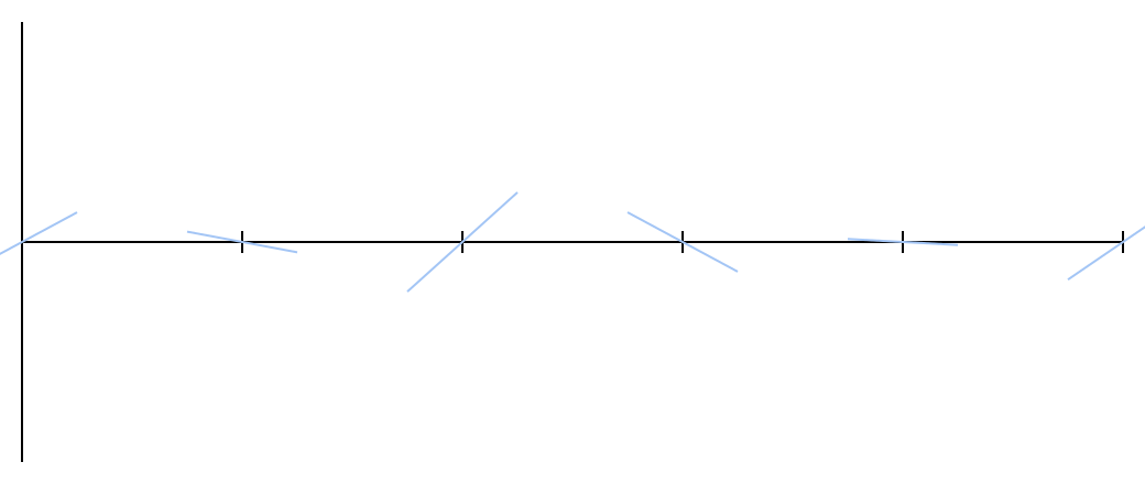
No matter how many points you choose. Each segment — the space between two serif points — will be processed in the same way. As long as you can memorize the angles of inclination of the straight lines, you can continue to set the notches on both sides of the number axis. These lines are enough to create Perlin noise.
Each x lies between two serifs and, consequently, between two straight lines. Let the straight lines have slopes a and b . The equation of a line can be written as y = m ( x - x 0 ) where m - tilt
x 0 - meaning x where the straight line intersects the x-axis.
Armed with this knowledge, it is easy to find where these two straight lines intersect the given x . For simplicity, I will assume that the left serif is in x = 0 and right in x = 1 ; it will give points a x and b ( x - 1 ) .
I drew a pack of orange dots for example. You can see how they continue two sloping lines on each side.
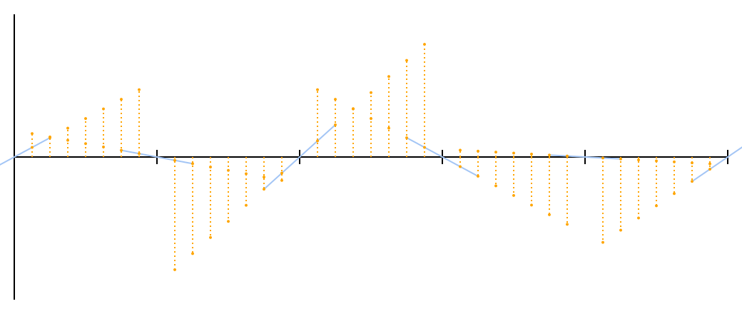
Now the question arises: how can these pairs of points for each x turn into a smooth curve? The most obvious answer is to average them, but a quick glance at the graph shows that this approach does not work. The “average” of two straight lines is simply a straight line with an average slope passing through the intersection point, and the segment of this straight line for each such segment will not even touch the same segment in the adjacent segment.
We need a way to increase the contribution of the left end to the “average” for points closer to it, and to reduce this contribution when we are closer to the right end. The easiest way to do this is linear interpolation .
Linear interpolation is extremely simple: if you are at the point t on the way out A at B , linear interpolation will be equal to A + t ( B - A ) equivalent to A ( 1 - t ) + B t . For t = 0 , You'll get A ; for t=1 , You'll get B ; for t=0.5 , You'll get 0.5(A+B) , average.
Let's try it. I marked the interpolated points in red.
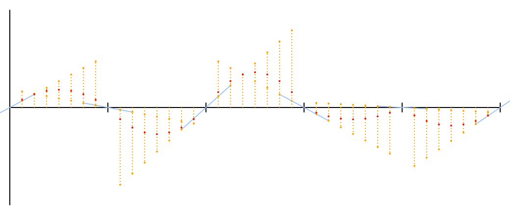
Not bad for a start. This is not the noise of Perlin; There is one small problem that may not immediately catch the eye at the sight of these points. I can make it more visible if you forgive me for a brief digression.
Each of these curves is a parabola given by the equation y = ( a - b ) ( x - x ² ) . I wanted to be able to draw the parabolas exactly, rather than approximate them with dots, that is, figure out how to portray the parabolas using Bezier curves.
Bezier curves are the same curves that you use to draw paths in vector graphics editors like Inkscape, Illustrator or Flash. (Or in the SVG vector format that I used to create all these illustrations.) You can select the start and end points, and the program will display additional “handles” attached to each point. Dragging these “handles” changes the shape of the curve. These are cubic Bezier curves, which are so called due to the fact that they are actually curves of the third order, but in principle it is possible to draw a Bezier curve of any order.
When studying the mathematics of Bezier curves, I learned a few interesting things:
- SVG supports quadratic Bezier curves! This is convenient because I have quadratic functions.
- Bezier curves are set by repeated linear interpolation! In fact, there is even such a thing as a linear Bezier "curve" - a straight line between two given points. The quadratic Bezier curve has three support points; you interpolate linearly between the first / second and second / third points, then interpolate between these two new points. A cubic Bezier curve has four control points and does one more iteration, and so on. Amazing.
- Parabolas passing through red dots are very easy to draw with Bezier curves - in fact, Perlin noise has a striking resemblance to Bezier curves! There is even some explanation. In the first step, we get the values ax and b(x−1) that can be written as −b(1−x) and it resembles linear interpolation. In the second step, the linear interpolation goes the most. And two rounds of linear interpolation is, by definition, a second-order Bezier curve.
I think I have a geometric interpretation of what is actually happening.
Consider a segment. It has rays (halves of straight lines) that extend from its ends and are directed toward the center of the segment. Reflect them relative to the middle of the segment, thus obtaining another beam at each end. At each end, fold the slopes of the beams and get two new beams; they are a mirror image of each other relative to the middle of the segment, since they are derived from the sum of the original beam and the reflection of the other. Finally draw a curve between these rays.
Below, I illustrated these steps. Dotted lines - reflected rays; blue - the rays received after summation; the blue points are their intersections (and the third reference point of the quadratic Bezier curve); The red arc is the exact curve that passes through the red dots. If you know the basics of differential calculus, you can make sure that the slope of the left beam is equal to a−b , the slope of the right beam is b−a , and it does indicate their symmetry about the center of the segment.

I hope, now the problem is more obvious: these curves do not transform into each other smoothly.
In each serif a kink is clearly visible. That break, where both curves look down, is especially bad.
Linear interpolation, as it turns out, is insufficient. Even if we are too close to one end, the other still has a significant effect, which protrudes the curve from the original random guide. This effect should fade away more sharply at the ends of the segments.
Fortunately, someone has already figured it out for us. Before we do linear interpolation,
we can shift t using the smoothstep function. This is an s-shaped curve that looks like a diagonal line. y=x but flattened at zero and one. In the middle, it does not change very much - 0.5 remains 0.5 - but she strongly shifts the ends. At the point 0.9 she is equal 0.972 .
The resulting curve has a fourth degree, which does not allow it to be accurately drawn in the SVG using native Bezier curves, so the gray line is a rough approximation. I compensated for this by adding a large number of dots that are black. By the way, these points are derived from Ken Perlin's original noise1 ; This is the real noise of Perlin.
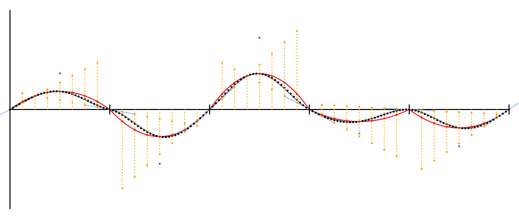
New points are close to the red quadratic curves, but in the serif area they are closer to the original blue guides. Middle points exactly match because smoothstep doesn't change 0.5 .
(Now the curve equation for each segment looks like y=2(a−b)x4−(3a−5b)x3−3bx2+ax fuck you will utter. Feel free to take the derivative and make sure that at the end of the segment it is exactly equal a and b .)
If you want to get a better intuitive understanding of what is happening, here is the same schedule, only interactive ! Click and drag to play around with the slopes.
Octave
You may have noticed that these smooth elevations and valleys are not so similar to the “cloudy” noise that I advertised at the beginning of the article.
Suddenly, “cloudiness” is not part of Perlin’s noise. This is a tricky thing to do with it .
Create another Perlin curve (or reuse the same one), but double the resolution - now the random oblique lines will be in points x=0,0.5,1,... . Divide output values by two and add to the original curve. It turns out something like this:
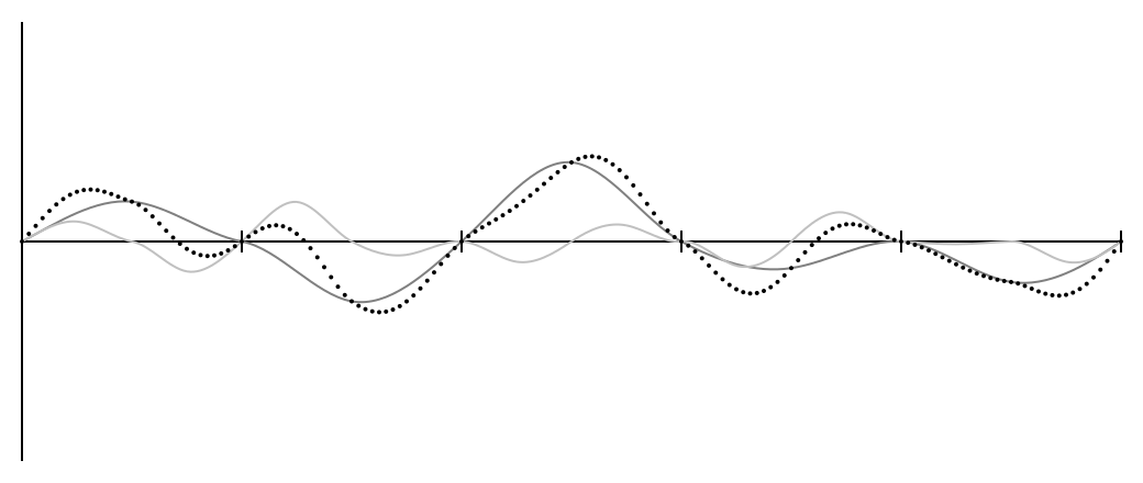
The entire schedule has been reduced to half size and repeated twice.
You can repeat it as many times as you like, making each new schedule half the size of the previous one. Each separate graph is called an octave (as in music, where each octave has a frequency twice as large as the previous one), and the results are pleasant and rough after 4-5 octaves.

Expand to 2D
The idea is the same, but instead of a numerical axis with oblique lines, we have a grid at the input.
Also, to expand the concept of “slope” in two changes, a vector appears at each grid node:
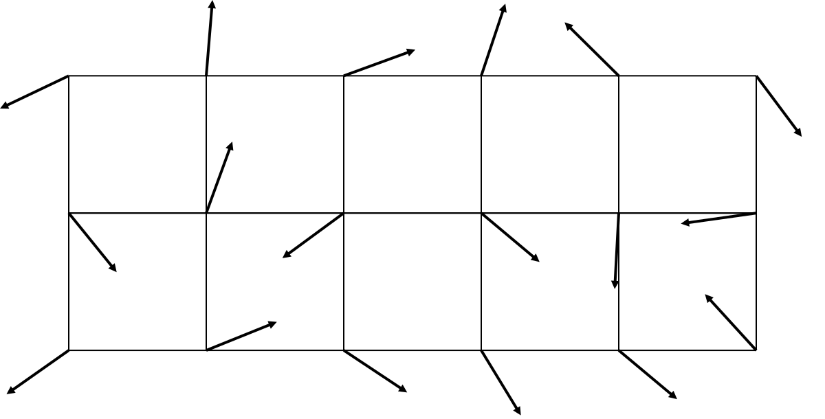
I shortened the arrows so that they fit into the picture and do not overlap each other, but I mean that unit vectors are depicted - that is, each vector actually has a length of 1, and only the information about the direction, not the length, is important to us. About the generation of vectors, I will tell later.
It looks like it, but there is an important difference. Previously, the entrance was horizontal - the position on the x-axis - and the output was vertical. Now the entrance is two-dimensional - where are we?
A rough algorithm for what we did before:
- Find the distance to the nearest point to the left and multiply it by the slope at that point.
- Do the same for the point on the right.
- Interpolate these values.
It requires a couple of big changes in order for the algorithm to work in two dimensions. Each point now has four adjacent grid points, and some semblance of tilt and distance is still required.

The solution is to use scalar products. If you have two vectors (a,b) and (c,d) , their scalar product is equal to the sum of pairwise products of the corresponding components: ac+bd . In the diagram above, each grid point has two outgoing vectors: a random one and pointing to the current point. The product of the slope by the distance can be replaced by the scalar product of these two vectors.
But why ? Good question.
The geometrical explanation of the scalar product says that it is the product of the lengths of the vectors and the cosine of the angle between them. This doesn’t really clarify anything for me, and it’s impossible to draw a graphic graph here, but let's think about it a little.
All our random vectors are single, their length is 1. This does not contribute to the product. Therefore, there remains a (scalar) distance from the current point to the grid point multiplied by the cosine of the angle between the vectors.
Cosine tells you how small this angle is - or, in our case, how close the two vectors are. If they point in one direction, the cosine is equal to one. As they are removed, the cosine decreases: for a right angle, it vanishes (and the scalar product is zero), and if they point in opposite directions, the cosine will be –1.
To visualize what this means, I drew a single scalar product between the point and the grid node nearest to it. This is the equivalent of the orange dots from the one-dimensional graph.
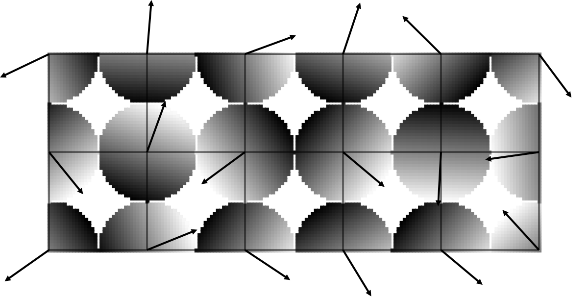
It already looks interesting. Remember, this is something like a three-dimensional graphics, which we look at from above. Coordinates x and y - this is the input, the points we have selected, and the coordinate z - this is the way out. It is usually painted in shades of gray, as I did here, but you can also display it as depth. White dots come out of the screen in your direction, gray ones go deep into the screen.
In this sense, each mesh node has an inclined plane attached to it, as opposed to inclined lines in the one-dimensional case. The vector points towards the white end, the end that sticks out of the screen in your direction. For points close to the grid node, the scalar product is close to zero, as in the one-dimensional graph; for points farther from zero, the values are closer to extremes.
It may not be a surprise for you if I say that random vectors in this case are called gradients .
Now, when at each point there are four scalar products, we need to somehow combine them. Linear interpolation works only for two values, so we will do it in pairs. One round of interpolation will leave us with two values, the second will give one value, which will be our output.
I tried to make a diagram depicting an intermediate state, to show how to combine several gradients, but I couldn’t think of something meaningful.
In return, take this interactive mesh with Perlin noise , where you can also shuffle the arrows and see how this affects the final pattern.
Three or more measurements
From this point on it is not at all difficult to expand the idea to an arbitrary number of measurements.
Select more unit vectors in the required number of dimensions, calculate more scalar products, interpolate.
Do not forget about one thing: each interpolation round must “collapse” one of the axes.
Consider the plane where you need to calculate the scalar product for the four points: upper left, upper right, lower left, lower right. Two measurements, two rounds of interpolation.
You can interpolate between the two upper points and the lower two points; this will “collapse” the horizontal axis and leave only two values, upper and lower. Or you can do the opposite, “collapse” the left and right points, getting rid of the vertical axis and leaving the left and right points. Both are good.
But what exactly you can not do - crosswise interpolation. You need to know with which coefficient to interpolate, that is, how far you are from each point. Horizontal interpolation is good because we know the horizontal distance to the grid nodes. Vertical interpolation is good because we know the vertical distance. Interpolation on the diagonal? What does it mean? What value does it take t ? Even if we succeed, how will we do the second round of interpolation?
Three or more dimensions make it a little harder to keep track of such things, so be on your guard.
Variations
The idea of Perlin noise is quite simple, and almost any part of it can be changed to obtain different effects.
Gradient Selection
I know three ways to select gradients.
The most obvious way is to choose n random numbers from range [−1;1] (for n measurements), use the Pythagorean theorem to find the length of the vector, normalize the vector to the length. Voila, you have a unit vector. This is done in the original Ken Perlin code.
It works, but it gives more diagonal vectors than those directed along the axes, for the same reason as throwing two dice will most often give a sum of 7 points. You need a random angle , not a coordinate.
For two dimensions, this is easy: take a random angle! Choose a random number from the range [0;2 pi] . Call it theta . Your vector ( cos theta, sin theta) . Is done.
For the three dimensions ... uh
Well, I looked at MathWorld and found a solution that, I think, works in any dimension. The principle is the same: take n random numbers and normalize the vector derived from them. The difference is that the numbers are taken from the normal distribution - that is, the Gaussian distribution is used. In Python, there is a random.gauss () function for this; in C, well, I think you can simulate this function by calculating the sum of a heap of numbers from a uniform distribution. Anyway, the idea is to throw the dice many times.
This does not work well for a single measurement, where normalization will always give 1 or –1, and the result will look awful. In this case, you just need to take one random number.
The third method proposed by Ken Perlin in “Improving Noise” suggests not to choose random gradients at all! Instead, use a fixed set of vectors and choose random ones.
Why do so? One of the reasons is to solve the problem of “sticking”, which, I believe, was partially due to a shift in the orientation of the gradients towards the diagonal ones. But the other reason was ...
Optimization
I forgot to mention the key feature of Ken Perlin's original implementation. She did not create a set of random gradients for each grid point; she created a set of random gradients of a fixed size, then used a selection scheme from this set of gradients for each individual grid point. This saved memory and worked very quickly, but still allowed points to have arbitrarily low or high values.
The proposal for "improvement" has done away with random gradients for good, offering instead (for the three-dimensional case) a set of 16 gradients, in which one coordinate is zero and the other two take values pm1 . These vectors are no longer single, but scalar products are much easier to read. The element of randomness is provided by the gradient selection scheme at each particular grid point. For the generation of large pieces of noise, it turned out that it works well.
None of these optimizations are necessary for obtaining Perlin noise, but they may be useful to you if you are going to generate a lot of noise in real time.
Smootherstep
The choice of the function smoothstep is quite arbitrary; You can use any function that flattens at zero and one.
Improving Noise offers an alternative called smootherstep , which looks like this: 6x5−15x4+10x3 . You can create similar polynomials of higher order, although they, of course, will increase the running time of the algorithm.
There is no reason not to use, say, a sine wave interpolation: 0.5 s i n ( p i ( x - 0.5 ) ) + 0.5 . Despite its impracticality and significantly lower speed compared to polynomials, this is quite a valid interpolation version.
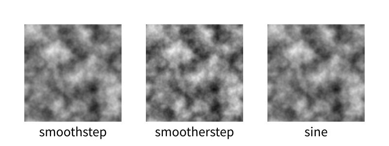
For me, it's pretty similar. smootherstep , .
; . - .
, . !
, . .
-
, . : , , smoothstep.
- , . , 4 8. 5 16.
, , - .
.
— . , , , , .
— ! — [ - 1 ; 1 ] . ± 0.5 √n where n — . [ - 0.5 ; 0.5 ] ( , , ), ± 0.5 √2 ≈±0.707 ( ). , , .
, , . 50%; — 75%; — 87.5% .
, . , GIMP:

, ; . , , ⅛ . , , : , — . .
, , … , smoothstep. [ 0 , 1 ] .
, , .
. , . roguelike-. , . Under Construction — , , .
, , . , — () :
Well, here you are, of course. Here is the implementation in Python . I do not know if I can substantiate the selection in a separate module, and somehow it is too lazy.
Some cool stuff:
- Unlimited range
- Unlimited measurements
- Native octave support
- Native tiling support
- A bunch of comments, some may even be true.
- Maybe too slow
Here is the code that creates the above animation:
from perlin import PerlinNoiseFactory import PIL.Image size = 200 res = 40 frames = 20 frameres = 5 space_range = size//res frame_range = frames//frameres pnf = PerlinNoiseFactory(3, octaves=4, tile=(space_range, space_range, frame_range)) for t in range(frames): img = PIL.Image.new('L', (size, size)) for x in range(size): for y in range(size): n = pnf(x/res, y/res, t/frameres) img.putpixel((x, y), int((n + 1) / 2 * 255 + 0.5)) img.save("noiseframe{:03d}.png".format(t)) print(t) Runs at 1:40 for PyPy 3.
')
Source: https://habr.com/ru/post/342906/
All Articles