Web application on Node and Vue, part 4: code reuse
This is the fourth part of a series of materials devoted to the development of the Budget Manager web application using Node.js, Vue.js and MongoDB. The first , second and third parts dealt with the creation of the main server and client components of the application. Today we will continue to develop the project, namely, we will deal with the lists of documents and clients. In addition, it is impossible not to notice that a lot has been done so far, so it is quite possible to take a critical look at what happened and work on reusing the code.

Let's start by changing the name of the
Open the file component
')
Here we have changed the name of the class so that it corresponds to the name of the component. In addition, we changed the names of the slots.
Open the
Here, again, we changed the class names, as well as edited the template, setting it to display data from properties (
Now come the turn of the
We also prepared this component for reuse by enabling data output from properties.
Now open the
Here we changed the import commands and tags, aligned them with the renamed components, added the
We will use
Now, instead of transmitting the document data directly, we use the new method:
This method, as the first argument, takes an array and an arbitrary number of arguments that will form an
The method will take each item from the array, in this case it is the documents, and create a new
This object will contain the data of the
And finally, we catch errors (if any) by activating the
Now you need to edit the router code, to do this, go to the
Here we corrected import commands, component names, tags and paths, and also made some improvements in
Instead of creating a new page for listing clients, we’ll use an existing
Now add a new method:
Call this method when mounting the component:
How now to display information about customers? Very simple. It is enough to make some more changes to the
Now we pass the budgetVisible variable to the
So now let's make improvements to
Now the header color will depend on the state of the
In addition, the color and the inscription on the button will change depending on the
In addition, we made some changes to scss.
And finally,
The changes made here are similar to the ones we made in the
Here is what the list of documents now looks like:
And here is a list of clients:
Now that we can see the lists of registered documents and clients, we will create a floating button (Floating Action Button, FAB), which will contain buttons that allow you to work with the list. While still in the
The FAB contains three buttons. The first acts as an activator for FAB, the second serves to add documents, the third - to add clients. Now add a new logical value for FAB to the data of the
Here we have added the logical value
Today we made some improvements to the components, reworked them with an eye to reuse the code, added the functionality to display the list of customers. The full version of the application, as usual, can be found in the project repository .
In the next article we will continue to work on the application, and, most likely, we will complete it.
Dear readers! Do you seek reusability when working on your projects?
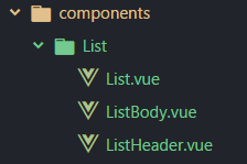
Component development
Let's start by changing the name of the
Budget folder to the List . In addition, rename the three components that are in this folder. Namely, the BudgetList will now be named List , the BudgetListHeader will be called the ListHeader , and the BudgetListBody — ListBody . As a result, the folder and component files should look like the one below.Open the file component
List and bring it to this form:')
<template> <section class="l-list-container"> <slot name="list-header"></slot> <slot name="list-body"></slot> </section> </template> <script> export default {} </script> Here we have changed the name of the class so that it corresponds to the name of the component. In addition, we changed the names of the slots.
Open the
ListHeader component ListHeader and make the following changes to it: <template> <header class="l-list-header"> <div class="md-list-header white--text" v-if="headers != null" v-for="header in headers"> {{ header }} </div> </header> </template> <script> export default { props: ['headers'] } </script> <style lang="scss"> @import "./../../assets/styles"; .l-list-header { display: none; width: 100%; @media (min-width: 601px) { margin: 25px 0 0; display: flex; } .md-list-header { width: 100%; background-color: $background-color; border: 1px solid $border-color-input; padding: 0 15px; display: flex; height: 45px; align-items: center; justify-content: center; font-size: 22px; @media (min-width: 601px) { justify-content: flex-start; } } } </style> Here, again, we changed the class names, as well as edited the template, setting it to display data from properties (
props ). So we can reuse this component on other pages.Now come the turn of the
ListBody component: <template> <section class="l-list-body"> <div class="md-list-item" v-if="data != null" v-for="item in data"> <div class="md-info white--text" v-for="info in item" v-if="info != item._id"> {{ info }} </div> <div class="l-actions"> <v-btn small flat color="light-blue lighten-1"> <v-icon small>visibility</v-icon> </v-btn> <v-btn small flat color="yellow accent-1"> <v-icon>mode_edit</v-icon> </v-btn> <v-btn small flat color="red lighten-1"> <v-icon>delete_forever</v-icon> </v-btn> </div> </div> </section> </template> <script> export default { props: ['data'] } </script> <style lang="scss"> @import "./../../assets/styles"; .l-list-body { display: flex; flex-direction: column; .md-list-item { width: 100%; display: flex; flex-direction: column; margin: 15px 0; @media (min-width: 960px) { flex-direction: row; margin: 0; } .md-info { flex-basis: 25%; width: 100%; background-color: rgba(0, 175, 255, 0.45); border: 1px solid $border-color-input; padding: 0 15px; display: flex; height: 35px; align-items: center; justify-content: center; &:first-of-type, &:nth-of-type(2) { text-transform: capitalize; } &:nth-of-type(3) { text-transform: uppercase; } @media (min-width: 601px) { justify-content: flex-start; } } .l-actions { flex-basis: 25%; display: flex; background-color: rgba(0, 175, 255, 0.45); border: 1px solid $border-color-input; align-items: center; justify-content: center; .btn { min-width: 45px !important; margin: 0 5px !important; } } } } </style> We also prepared this component for reuse by enabling data output from properties.
Now open the
Home component file and edit it: <template> <main class="l-home-page"> <app-header></app-header> <div class="l-home"> <h4 class="white--text text-xs-center my-0"> Focus Budget Manager </h4> <list> <list-header slot="list-header" :headers="budgetHeaders"></list-header> <list-body slot="list-body" :data="budgets"></list-body> </list> </div> <v-snackbar :timeout="timeout" bottom="bottom" color="red lighten-1" v-model="snackbar"> {{ message }} </v-snackbar> </main> </template> <script> import Axios from 'axios' import Authentication from '@/components/pages/Authentication' import ListHeader from './../List/ListHeader' import ListBody from './../List/ListBody' const BudgetManagerAPI = `http://${window.location.hostname}:3001` export default { components: { 'list-header': ListHeader, 'list-body': ListBody }, data () { return { budgets: [], clients: [], budgetHeaders: ['Client', 'Title', 'Status', 'Actions'], clientHeaders: ['Client', 'Email', 'Phone', 'Actions'], snackbar: false, timeout: 6000, message: '' } }, mounted () { this.getAllBudgets() }, methods: { getAllBudgets () { Axios.get(`${BudgetManagerAPI}/api/v1/budget`, { headers: { 'Authorization': Authentication.getAuthenticationHeader(this) }, params: { user_id: this.$cookie.get('user_id') } }).then(({data}) => { this.budgets = this.dataParser(data, '_id', 'client', 'title', 'state') }).catch(error => { this.snackbar = true this.message = error.message }) }, dataParser (targetedArray, ...options) { let parsedData = [] targetedArray.forEach(item => { let parsedItem = {} options.forEach(option => (parsedItem[option] = item[option])) parsedData.push(parsedItem) }) return parsedData } } } </script> <style lang="scss" scoped> @import "./../../assets/styles"; .l-home { background-color: $background-color; margin: 25px auto; padding: 15px; min-width: 272px; } </style> Here we changed the import commands and tags, aligned them with the renamed components, added the
snackbar , which makes it possible to show error messages in case we fail to get the data. In addition, we added a new array for the component data, budgetHeaders , as well as the data needed for the snackbar .We will use
budgetHearders to display list headings. In addition, we made some changes to the getAllBudgets method: getAllBudgets () { Axios.get(`${BudgetManagerAPI}/api/v1/budget`, { headers: { 'Authorization': Authentication.getAuthenticationHeader(this) }, params: { user_id: this.$cookie.get('user_id') } }).then(({data}) => { this.budgets = this.dataParser(data, '_id', 'client', 'title', 'state') }).catch(error => { this.snackbar = true this.message = error.message }) }, Now, instead of transmitting the document data directly, we use the new method:
dataParser (targetedArray, ...options) { let parsedData = [] targetedArray.forEach(item => { let parsedItem = {} options.forEach(option => (parsedItem[option] = item[option])) parsedData.push(parsedItem) }) return parsedData } This method, as the first argument, takes an array and an arbitrary number of arguments that will form an
options array using the extension operator.The method will take each item from the array, in this case it is the documents, and create a new
parsedItem object.This object will contain the data of the
options array; after its preparation is completed, it will be placed into the parsedData array, which we return from this method.And finally, we catch errors (if any) by activating the
snackbar .Now you need to edit the router code, to do this, go to the
router folder and open index.js : import Vue from 'vue' import Router from 'vue-router' import * as Auth from '@/components/pages/Authentication' // Pages import Home from '@/components/pages/Home' import Authentication from '@/components/pages/Authentication/Authentication' // Global components import Header from '@/components/Header' import List from '@/components/List/List' // Register components Vue.component('app-header', Header) Vue.component('list', List) Vue.use(Router) const router = new Router({ routes: [ { path: '/', name: 'Home', components: { default: Home, header: Header, list: List } }, { path: '/login', name: 'Authentication', component: Authentication } ] }) router.beforeEach((to, from, next) => { if (to.path !== '/login') { if (Auth.default.user.authenticated) { next() } else { router.push('/login') } } else { next() } }) export default router Here we corrected import commands, component names, tags and paths, and also made some improvements in
router.beforeEach , since we are going to protect any route other than login , we remove the meta from the route of the Home page.Customer Information Display
Instead of creating a new page for listing clients, we’ll use an existing
Home page. Therefore, let’s go back to the Home component and create a new array in the component data, giving it the name clients , and also create the clientHeaders array and the clientHeaders logical variable: return { budgets: [], clients: [], budgetHeaders: ['Client', 'Title', 'Status', 'Actions'], clientHeaders: ['Client', 'Email', 'Phone', 'Actions'], budgetsVisible: true, snackbar: false, timeout: 6000, message: '' } Now add a new method:
getAllClients () { Axios.get(`${BudgetManagerAPI}/api/v1/client`, { headers: { 'Authorization': Authentication.getAuthenticationHeader(this) }, params: { user_id: this.$cookie.get('user_id') } }).then(({data}) => { this.clients = this.dataParser(data, '_id', 'client', 'email', 'phone') }).catch(error => { this.snackbar = true this.message = error.message }) }, Call this method when mounting the component:
mounted () { this.getAllBudgets() this.getAllClients() }, How now to display information about customers? Very simple. It is enough to make some more changes to the
Home component: <template> <main class="l-home-page"> <app-header :budgetsVisible="budgetsVisible" @toggleVisibleData="budgetsVisible = !budgetsVisible"></app-header> <div class="l-home"> <h4 class="white--text text-xs-center my-0"> Focus Budget Manager </h4> <list> <list-header slot="list-header" :headers="budgetsVisible ? budgetHeaders : clientHeaders"></list-header> <list-body slot="list-body" :budgetsVisible="budgetsVisible" :data="budgetsVisible ? budgets : clients"> </list-body> </list> </div> <v-snackbar :timeout="timeout" bottom="bottom" color="red lighten-1" v-model="snackbar"> {{ message }} </v-snackbar> </main> </template> <script> import Axios from 'axios' import Authentication from '@/components/pages/Authentication' import ListHeader from './../List/ListHeader' import ListBody from './../List/ListBody' const BudgetManagerAPI = `http://${window.location.hostname}:3001` export default { components: { 'list-header': ListHeader, 'list-body': ListBody }, data () { return { budgets: [], clients: [], budgetHeaders: ['Client', 'Title', 'Status', 'Actions'], clientHeaders: ['Client', 'Email', 'Phone', 'Actions'], budgetsVisible: false, snackbar: false, timeout: 6000, message: '' } }, mounted () { this.getAllBudgets() this.getAllClients() }, methods: { getAllBudgets () { Axios.get(`${BudgetManagerAPI}/api/v1/budget`, { headers: { 'Authorization': Authentication.getAuthenticationHeader(this) }, params: { user_id: this.$cookie.get('user_id') } }).then(({data}) => { this.budgets = this.dataParser(data, '_id', 'client', 'title', 'state') }).catch(error => { this.snackbar = true this.message = error.message }) }, getAllClients () { Axios.get(`${BudgetManagerAPI}/api/v1/client`, { headers: { 'Authorization': Authentication.getAuthenticationHeader(this) }, params: { user_id: this.$cookie.get('user_id') } }).then(({data}) => { this.clients = this.dataParser(data, 'name', 'client', 'email', 'phone') }).catch(error => { this.snackbar = true this.message = error.message }) }, dataParser (targetedArray, ...options) { let parsedData = [] targetedArray.forEach(item => { let parsedItem = {} options.forEach(option => (parsedItem[option] = item[option])) parsedData.push(parsedItem) }) return parsedData } } } </script> <style lang="scss" scoped> @import "./../../assets/styles"; .l-home { background-color: $background-color; margin: 25px auto; padding: 15px; min-width: 272px; } </style> Now we pass the budgetVisible variable to the
Header and, in addition, we use this variable in the ternary comparison operator to display the necessary data. The variable toggleVisibleData also gets into toggleVisibleData , where we invert the value of budgetsVisible . The reason why we pass properties to Header is that, thanks to this approach, we can make some more improvements, which we will discuss below. In addition, in the list-header and list-body slots we use ternary comparison operators.So now let's make improvements to
Header : <template> <header class="l-header-container"> <v-layout row wrap :class="budgetsVisible ? 'l-budgets-header' : 'l-clients-header'"> <v-flex xs12 md5> <v-text-field v-model="search" label="Search" append-icon="search" :color="budgetsVisible ? 'light-blue lighten-1' : 'green lighten-1'"> </v-text-field> </v-flex> <v-flex xs12 offset-md1 md1> <v-btn block :color="budgetsVisible ? 'light-blue lighten-1' : 'green lighten-1'" @click.native="$emit('toggleVisibleData')"> {{ budgetsVisible ? "Clients" : "Budgets" }} </v-btn> </v-flex> <v-flex xs12 offset-md1 md2> <v-select label="Status" :color="budgetsVisible ? 'light-blue lighten-1' : 'green lighten-1'" v-model="status" :items="statusItems" single-line> </v-select> </v-flex> <v-flex xs12 offset-md1 md1> <v-btn block color="red lighten-1 white--text" @click.native="submitSignout()">Sign out</v-btn> </v-flex> </v-layout> </header> </template> <script> import Authentication from '@/components/pages/Authentication' export default { props: ['budgetsVisible'], data () { return { search: '', status: '', statusItems: [ 'All', 'Approved', 'Denied', 'Waiting', 'Writing', 'Editing' ] } }, methods: { submitSignout () { Authentication.signout(this, '/login') } } } </script> <style lang="scss"> @import "./../assets/styles"; .l-header-container { background-color: $background-color; margin: 0 auto; padding: 0 15px; min-width: 272px; .l-budgets-header { label, input, .icon, .input-group__selections__comma { color: #29b6f6!important; } } .l-clients-header { label, input, .icon, .input-group__selections__comma { color: #66bb6a!important; } } .input-group__details { &:before { background-color: $border-color-input !important; } } .btn { margin-top: 15px; } } </style> Now the header color will depend on the state of the
budgetsVisible variable. If the documents are visible, the heading will have a light blue color, if not - green.In addition, the color and the inscription on the button will change depending on the
budgetVisible value, budgetVisible , the corresponding event handler is called, changing the state of the logical variable.In addition, we made some changes to scss.
And finally,
ListBody 's do the ListBody component: <template> <section class="l-list-body"> <div class="md-list-item" v-if="data != null" v-for="item in data"> <div :class="budgetsVisible ? 'md-budget-info white--text' : 'md-client-info white--text'" v-for="info in item" v-if="info != item._id"> {{ info }} </div> <div :class="budgetsVisible ? 'l-budget-actions white--text' : 'l-client-actions white--text'"> <v-btn small flat color="light-blue lighten-1"> <v-icon small>visibility</v-icon> </v-btn> <v-btn small flat color="yellow accent-1"> <v-icon>mode_edit</v-icon> </v-btn> <v-btn small flat color="red lighten-1"> <v-icon>delete_forever</v-icon> </v-btn> </div> </div> </section> </template> <script> export default { props: ['data', 'budgetsVisible'] } </script> <style lang="scss"> @import "./../../assets/styles"; .l-list-body { display: flex; flex-direction: column; .md-list-item { width: 100%; display: flex; flex-direction: column; margin: 15px 0; @media (min-width: 960px) { flex-direction: row; margin: 0; } .md-budget-info { flex-basis: 25%; width: 100%; background-color: rgba(0, 175, 255, 0.45); border: 1px solid $border-color-input; padding: 0 15px; display: flex; height: 35px; align-items: center; justify-content: center; &:first-of-type, &:nth-of-type(2) { text-transform: capitalize; } &:nth-of-type(3) { text-transform: uppercase; } @media (min-width: 601px) { justify-content: flex-start; } } .md-client-info { @extend .md-budget-info; background-color: rgba(102, 187, 106, 0.45)!important; &:nth-of-type(2) { text-transform: none; } } .l-budget-actions { flex-basis: 25%; display: flex; background-color: rgba(0, 175, 255, 0.45); border: 1px solid $border-color-input; align-items: center; justify-content: center; .btn { min-width: 45px !important; margin: 0 5px !important; } } .l-client-actions { @extend .l-budget-actions; background-color: rgba(102, 187, 106, 0.45)!important; } } } </style> The changes made here are similar to the ones we made in the
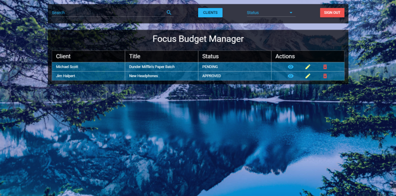
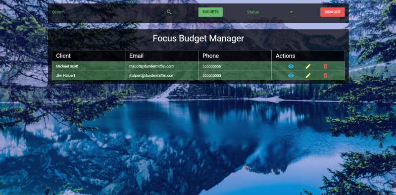
Header component code.Interim results
Here is what the list of documents now looks like:
And here is a list of clients:
Now that we can see the lists of registered documents and clients, we will create a floating button (Floating Action Button, FAB), which will contain buttons that allow you to work with the list. While still in the
Home component code, add the following code below the v-snackbar : <v-fab-transition> <v-speed-dial v-model="fab" bottom right fixed direction="top" transition="scale-transition"> <v-btn slot="activator" color="red lighten-1" dark fab v-model="fab"> <v-icon>add</v-icon> <v-icon>close</v-icon> </v-btn> <v-tooltip left> <v-btn color="light-blue lighten-1" dark small fab slot="activator"> <v-icon>assignment</v-icon> </v-btn> <span>Add new Budget</span> </v-tooltip> <v-tooltip left> <v-btn color="green lighten-1" dark small fab slot="activator"> <v-icon>account_circle</v-icon> </v-btn> <span>Add new Client</span> </v-tooltip> </v-speed-dial> </v-fab-transition> The FAB contains three buttons. The first acts as an activator for FAB, the second serves to add documents, the third - to add clients. Now add a new logical value for FAB to the data of the
Home component: data () { return { budgets: [], clients: [], budgetHeaders: ['Client', 'Title', 'Status', 'Actions'], clientHeaders: ['Client', 'Email', 'Phone', 'Actions'], budgetsVisible: true, snackbar: false, timeout: 6000, message: '', fab: false } }, Here we have added the logical value
fab , which is used to indicate whether the floating button is active or not.Results
Today we made some improvements to the components, reworked them with an eye to reuse the code, added the functionality to display the list of customers. The full version of the application, as usual, can be found in the project repository .
In the next article we will continue to work on the application, and, most likely, we will complete it.
Dear readers! Do you seek reusability when working on your projects?
Source: https://habr.com/ru/post/342402/
All Articles