CatalogBox - the idea of ComboBox development
The programmer should simplify the life of the user, not himself.
(of course there are nuances)
The author of the article
The article describes the idea of a visual web control for selecting an item from a list. This idea of how
This is an idea whose implementation is only partial and only for ASP.NET Web Forms in conjunction with devexpress - since I have a great background on this bundle of technologies.
')
This article is not for those who want to copy the code, press F5 and see the result. It would most correctly be attributed to documents that are called Functional Requirements or even Functional Design . Therefore, if you are interested in a look at the evolution of convenience, then I hope the article will be useful.
First, I will provide a list of handy features that are already in good implementations of visual controls. In this paragraph there is nothing new, only a description of the functionality already implemented in the advanced libraries of visual controls.
For example, devexpress features relatively
Using the listed possibilities, I gradually came to the conclusion that the
Practically in any web application, the first 4 points are very necessary - the button “reset value”, highlighting changes, a link to the page of the selected element and a choice with full-fledged filters. The remaining additions are needed by no means to all projects. But for a large information system, all the points seem to be necessary in any case.
Colleagues, I ask you, if you know where the similar functionality of selecting an object is implemented using a fully functional catalog page, write in comments. I have never - at least in the web world - seen such implementations.
(of course there are nuances)
The author of the article
There was a combobox
The article describes the idea of a visual web control for selecting an item from a list. This idea of how
ComboBox can evolve (it’s DropDown , it’s also select in html) to increase the convenience of the software product for the user - so that the selection control becomes much more convenient and friendlier when choosing complex objects from large and not-so-great lists. After all, the programmer’s task is to continuously improve and simplify the user's life.This is an idea whose implementation is only partial and only for ASP.NET Web Forms in conjunction with devexpress - since I have a great background on this bundle of technologies.
')
This article is not for those who want to copy the code, press F5 and see the result. It would most correctly be attributed to documents that are called Functional Requirements or even Functional Design . Therefore, if you are interested in a look at the evolution of convenience, then I hope the article will be useful.
ComboBox Evolution - what already exists
First, I will provide a list of handy features that are already in good implementations of visual controls. In this paragraph there is nothing new, only a description of the functionality already implemented in the advanced libraries of visual controls.
For example, devexpress features relatively
select in html such (in order, in my opinion, reducing the need, that is, first the most important):- Filter by input string:

As characters are added to the control list is filtered. Here are the comments:
- By what fields to check the occurrence of the entered string? If you check for those that are not displayed in the control, the user may not be obvious behavior. But sometimes this may be required. And if the user enters a string that contains the boundary when concatenating fields? That is, if the employee’s full name is displayed, say, “Chernyaev Konstantin”, and the first and last names are stored in different data fields, and the user enters “iaev cons” (hereinafter the character register does not matter - I think that when searching for text, this is de facto). Friendly on the part of the control would find this post:
- Usually sorting is done alphabetically. And when the user enters a string (say, “table”), and there is such an element in the list, and there are also elements that contain this line, but are not equal to it (“ table b”, “apo table ”, “pi table em "), It turns out that the user has to scroll through the list, choosing the right one (and the order in this example will be:" apo table "," table pi "," table "," table b "). And to clarify the request and narrow down the list is impossible. If the list is large, this is a big minus to friendliness.
The solution to this problem will be sorting on the basis of equality / occurrence. That is, the first entries should be equal to the entered string, and then the rest. I would even go further - first equal, then starting from this line, then the rest. - Autocompletion, auto selection of the first found:

As you type, the control filters the data, displays it, and complements the input text.
first found. If you lose focus, it will be selected.
Note - if the user enters characters not from the beginning of the line he needs, he will not be able to select it automatically. - You can enable the mode when you can write a new value that is not in the list. Otherwise, you cannot enter text for which no items were found. As if the mode of prompts, when you can enter not only what prompts.
This mode simplifies the user's life when he should have the ability to add a new value, which is not a complex object - just a line. For example, the name. Or a position at a previous job - it can be any, but there is a list of already known posts. - The data source , that is, the list itself can be either a javascript array on the client (that is, already downloaded data), or an ajax request to the server (that is, when the client downloads the data exactly on request).
- Virtual scrolling - scrolls the list without downloading all the data. Continuation of the previous paragraph. If there is a lot of data, then only visible items are downloaded or with a small margin, and when scrolling through the list, the necessary ones are downloaded.
If there are a lot of items in the list, then you should not store them all on the client - let them pull up as needed. And if it’s not enough, you can download them in advance, when the page loads, and store them in the browser’s memory. How many are few, and how many are many - one cannot say ahead of time, an optimization balance is needed when comparing “download all data at once” vs “when you scroll through the visible data window, download the next page”. - It is possible to program the buttons in the control, for example, “reset value”, “next / previous element”. Or any other desired action by the user. An example of adding custom buttons:

In the screenshot, the usual triangle button is removed
but added three custom. - Tabular list view :
You can structure the displayed data and display not only the name of the element, but several of its fields.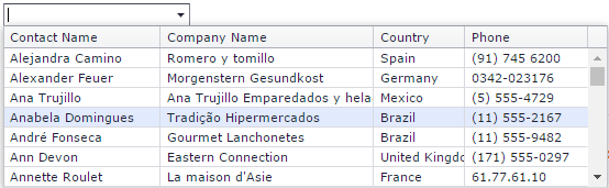
- Styles for cells in tabular form, icons , element templates :

- You can also mention the possibility of selecting
ComboBox'as an element from the hierarchical list, but this is a different control ( DropDownEdit , although its title is Tree List Lookup ).
ComboBox Evolution - New
Using the listed possibilities, I gradually came to the conclusion that the
ComboBox 's further evolution was not enough:- Easy addition of “ Reset Value ” button. No programming.
Such a button is needed quite often, so it is convenient when it is added by assigning a simplebooleanproperty to the control:<comboBox showResetButton=”true” />
- Show that the selected value has been changed .
Almost any text editor shows that the file has been modified and not saved. This feature also seems convenient on the edit controls. This concerns, of course, not onlyComboBox'a, but in general of all editor.
It may be worth adding the ability to roll back the change in edit control. As if cntr + z. - Link to the page of the selected item . If, of course, the essence of the elements of the list has its own page.
For example, a user places an order and selects a pickup item. And it is natural to want when choosing, and even after choosing, to get full information about the selected point (address, how to get, scheme and photo) without unnecessary gestures. Having once realized this possibility, I already want it to be in any combination.
It seems most convenient to write a regular tag next to the visual control.<a href='entity?id=...'>i</a>
You can also make the text of the selected value a link, but you shouldn’t, because when you click on a combo, a selection list usually opens. Although they do this, then to open the list, the user needs to click on the triangle button .
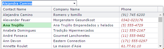
An example of the implementation of these three points:
The asterisk means that the value has been changed (it can be shown both in thecaptionand to the right of the control, this is a matter of style for a particular project - usually the asterisk means that the value is necessary for selection), the red cross - the “Reset value” button, i - link to the card of the selected branch, the button with the ellipsis for item 4. - If an entity has a catalog page with the capabilities of various filters, convenient visualization, paging, sorting, etc., make a choice with the help of this catalog page . This dramatic improvement makes
ComboBoxCatalogBox'om -ComboBox' of the XXI century.
For example, the client user chooses to substitute into the contract and theComboBoxsearches for output data (say, client number and name), and the user does not know the name, only, for example, an TIN, or a telephone, or even just the name of the director of the legal entity. Then it opens the client catalog page, searches for the desired one using filters, copies the client number / code / name, closes the catalog, inserts from the buffer into theComboBox. But our task is to make the user more convenient (see the epigraph).
And for the user it will be convenient to open the catalog in the modal window when clicking on a special button onCatalogBox'e (theCatalogBoxbutton ).
).
Sample catalog page:
In the screenshot, the catalog is open in the modal window after clicking on the ellipsis.
But the catalog page itself should not be tied to the modality - it should be opened separately and independently, and in a modal window. In the modal window, the grid should have the opportunity to select one selected line (or several), after which the “Select” button becomes active (in the screenshot it isdisabled, because the choice was not made). When pressed, the selected value is substituted in theComboBox, that is, nowCatalogBox. - Sometimes you need to make a selection of several items from the list. Like
CheckBoxList( pictures ), but since there is aCatalogBoxand you can make a choice with convenient filters, you want a multipleCatalogBox. There are natural functions: add, remove. Sometimes you need to enter a validation for the number of selected elements - the extension isrequired.
For example, you need to add products to the order and you want to allow the user to select several of them at once, butCheckBoxListinconvenient due to the large number of products. Then the user will be comfortable in the catalog using filters to select several products, click "Add", and then, if necessary, add more.
Visual example: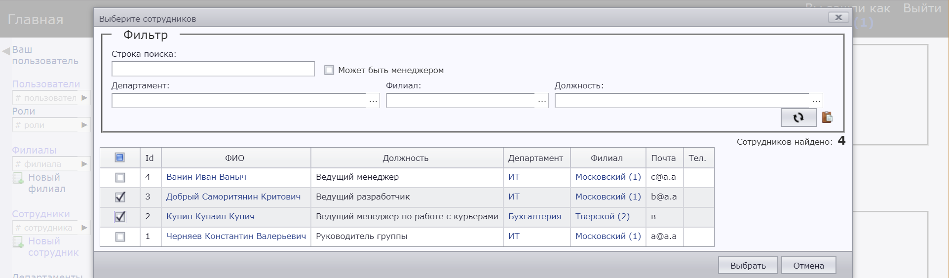
As you can see, there is aCheckBoxin the left column of the grid - in this way you can select several elements.
This feature already breaks theComboBoxcompletely - it is not intended to store multiple selected values. For the general case, we obtain a creative inventive problem, variable in implementation.
I will give a visual example of the choice made.
- If 1 item is selected: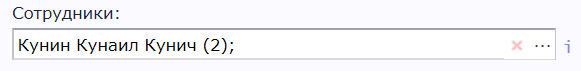
- If 2 items are selected:
- And so you can view the list of selected items and delete unnecessary: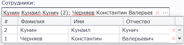
- Sometimes you need to be able to select a single item from two lists .
For example, you need to choose who will deliver the order - either a third-party company or your courier. You can enter a common parent entity (“delivery executor”), but there is no point in the directory page for it. Therefore, it turns out that you need to choose oneComboBoxfrom different lists.
It is most convenient for the user to implement this choice on oneCatalogBoxcontrol, but to make 2 (or more) buttons that open different pages-directories (of different entities). And as a value to store not only the selected object, but also its essence.
Example:
Otherwise, everything is the same as before - it’s just that the selection buttons are added to the button-ellipsis. - As a combination of the previous two points, a heterogeneous multiple choice .
For example, if you need to select several delivery artists from the example in the previous section.
Practically in any web application, the first 4 points are very necessary - the button “reset value”, highlighting changes, a link to the page of the selected element and a choice with full-fledged filters. The remaining additions are needed by no means to all projects. But for a large information system, all the points seem to be necessary in any case.
Full Functional Requirements
CatalogBox
- Triangle button (showing the list as a normal drop-down list):
a. Ability to set the settings to show or not the button-triangle.
For large lists, the "show the whole list" button may not matter much, only the filtered list matters. And to choose a criterion, whether this is a big list or not, the interface architect should, and not the control itself, so a configuration is needed.
b. For a heterogeneous choice (choosing a value from two lists), you must either make more than one triangle button, or none if the ellipsis buttons are created (opening a modal page-directory).
c. Whether to open the list when you click on the control.
d. Whether to open the list with the focus on control. - Cross button (resets selected value).
a. Associated with validation. If the choice is required - then there should not be a cross.
b. For multiple selection, clear the selection completely. It is also worth making a button to delete one selected value. - Enter text in the control and select an item:
This behavior seems ideal. The user enters the text, the elements are searched, the found ones are shown (taking into account the authorization filter, the specified filter, the filter from the selection of values in other controls, the virtual scrolling window settings). When losing focus is selected:
- Nothing found: the choice does not change.
- Found 1 item: it is selected.
- Found more than 1: setting: either the first one or the one selected before is selected.
Element selection by mouse, scrolling, arrow-enter. The list is either full or swapped as needed (virtual scrolling). - Search for elements, filters:
Filtering by the entered string - sorting: 1) the name is equal to the entered string, 2) the name starts with it, 3) ends with it, 4) inside it.
Required filters:
a. The specified constant filter for this instance control;
b. Produced by other page controls filter;
c. Authorization filter. This filter should be imposed on the server side - this is a security rule.
Passing all of these filters to the directory page indicating that the user cannot change them. - Display of found items:
a. Possibility of tabular view, cell templates, styles / formats.
b. Selection of the found text in the element. - Displays the selected (selected when multiple selection) item:
Theoretically possible options:
- template forjsanalogstring.Formatwith the path (for example, "{Name} ({Id})");
- textjsfunction;
- Html template.
If we stay within the source htmlselecttag, then only textual variants are possible, and if the markup is completely custom, then there is room for imagination. - The value changed marker shows the old value in the
title(tooltip). Titleorbaloonto display information about the selected item that does not fit in the visible area of the box.- Link to the page of the selected item.
Note that not all entities have a page (but all elements, if an entity has one). - Button is ellipsis.
Opens the directory page of this entity in a modal window. After selecting an item in the catalog, it is transferred to the CatalogBox. - Heterogeneous choice.
More than one ellipsis button that opens different directories in a modal window. Customize icons for buttons,title. - Multiple choice.
Display more than one selected value, delete one or all at once. - Heterogeneous multiple choice.
- If the style of the site requires this, then show the buttons only when you hover the mouse on the
CatalogBox. - Validation. Show invalid status only after pressing the button.
Directory Page
- It can be opened either independently, by reference, or modally, by clicking on the button, ellipsis.
- Filter as an external parameter in the querystring. Filter capabilities should allow the filtering required for
CatalogBox. - Button “save filter to clipboard” - to send a link that will open exactly the selected list.
Also in the querystring you can save sorting and paging. - The parameter that determines whether the passed filter to the user can be changed (only passed). It is
CatalogBoxthat theCatalogBoxcould open its catalog in which the user could not choose anything prohibited. - For modal mode, the parameter is single / multiple selection.
For multiple selection, most likely, the most convenient option for the user is to display acheckboxfor each item. - The way the items are displayed is usually the
grid. But it could be alistor atree. - The "update" button - so that you can update the list without refreshing the page, that is, without dropping the selected filters.
- Button "reset filter". But do not reset the filters in the external parameter from n2.
For modal mode (that is, whenCatalogBoxwithCatalogBox's): - Without caps, without footer, menus and other things that do not concern directly the choice of an element.
- All links on the page should open in a new window / tab (
target=”_blank”). - Button "select". No item has been selected yet,
disabled. When the first is selected, it becomes active. When you click in any way, it sends the selected item (or elements) to the originatingCatalogBox'y. - Cancel button. When clicked, closes the modal window. Just like the button-cross.
- When you re-open, there are two options - to reload the page or not to reload, so that the filters / sorting / paging remain selected.
- Display with authorization - some part of the list of elements may not be available to the user. Or even some filters. But this is the rule for the entire site, the page directory here is no different.
PS
Colleagues, I ask you, if you know where the similar functionality of selecting an object is implemented using a fully functional catalog page, write in comments. I have never - at least in the web world - seen such implementations.
Source: https://habr.com/ru/post/342184/
All Articles