Just about D3.js

70 thousand stars on the githaba and hundreds of interesting projects. It seems that D3 is something big and very complex, but it is not. I will talk about the basics of D3 and share the experience of developing a Burostat infographic.
What is D3
D3 is not a simple library, where a function call with the desired configuration builds a graph. D3 is a toolkit for data visualization. It consists of several dozen small modules , each of which solves its own problem. In addition to modules for building various shapes, inside D3 there are modules for working with elements on the page (a simple analog of jQuery), loading data (similar to fetch / $. Ajax, sharpened to csv, json, xml and others), formatting and scaling data, mathematical functions and others.
Svg
Visualization in the web, most often, is built in a vector format. Usually in SVG format. It allows you to create simple shapes and work with them: transform, position and influence a little through CSS. A simple example:

<rect width="30" height="30"></rect> <circle cx="50" cy="15" r="15" ></circle> <path d="M105,0L105,30L135,30"></path> <path d="M70,0l0,30l30,0"></path> To build simple shapes, you can use the tags rect, circle and a few others .
Difficult figures are under construction on coordinates. There are two options for writing coordinates: absolute and relative. In the first case, the coordinates are calculated relative to the entire graph, and in the second relative to the last point. The entire path is written in letters and numbers. The relative variant is indicated by a lowercase letter, the absolute - in the upper case.
<path d="M70,0l0,30l30,0"></path> Starting at point 70 0, we move relative to this point by 0 pixels in x and 30 in y. Once again. The starting point is indicated by the letter M , the next coordinate by the letter l .

Instead of simple broken lines you can build curves. For example, the Bezier curve can be constructed as follows: C x1 y1, x2 y2, x y. Here x1, y and x, y are the start and end points, and x2, y2 is the point through which the curve passes.
<path d="M0 20 C 0 0, 10 0, 50 20" stroke="black" fill="none"/> D3 will help to abstract from the coordinates and build a full path, thinking only about the data.
D3 features
Data
The simplest example you can write to d3 is a histogram. Since all elements in svg are counted from the upper left corner, histogram bars are drawn from top to bottom.

<svg> <rect width="20" height="20" x="0"></rect> <rect width="20" height="100" x="20"></rect> <rect width="20" height="60" x="40"></rect> <rect width="20" height="40" x="60"></rect> <rect width="20" height="70" x="80"></rect> </svg> // var data = [20, 100, 60, 40, 70] // var barWidth = 20 // document.querySelector('svg') $('svg') d3.select("svg") // . // D3 . .selectAll("rect") .data(data) .enter() // 5 . . // rect , // . jQuery. .append("rect") .attr("width", barWidth) .attr("height", d => d) // // 0,0 // x, [barWidth * i] .attr("x", (d, i) => barWidth * i) Scale
But let's imagine that dates came as data. They need to be transformed into coordinates. For this, you need the d3-scale module.
var x = d3.scaleTime() // : 1 9 2017 .domain([new Date(2017, 0, 1), new Date(2017, 0, 9)]) // 1000 .range([0, 1000]) // 5 500 x(new Date(2017, 0, 5)) // 500 The y coordinate displays numbers in the range from 1 to 13 million and a width of 480 pixels. Then the point 2 million will be on the coordinate 80
var y = d3.scaleLinear() .domain([1000000, 13000000]) .range([0, 480]); y(2000000); // 80 The module also allows you to calculate the color relative to the data.
Data upload
d3.json, d3.json, d3.csv, ... is an analogue of fetch or $ .ajax with processing the desired data format.
d3.csv('data.csv', (err, res) => { }) Axles
Add marks on the axes allows the module d3-axis . Literally two lines.
g.append("g") .call(d3.axisLeft(y)) Developments
D3 syntax is sometimes similar to jQuery. The code below adds the li element to the list, which is removed by clicking on it.
d3.select("ul") .append("li") .on('click', function (d) { d3.select(this) .remove() }) Line
D3 provides some abstraction that helps not to think about the coordinates.
var data = [ {date: 1510299186768, value: 10}, {date: 1510299195000, value: 40} ] // x var x = d3.scaleTime() // d3.extent(data, d => d.date) // .domain(d3.extent(data, d => d.date)) .range([0, width]) // y var y = d3.scaleLinear() .domain(d3.extent(data, d => +d.value)) .range([height, 0]) // var line = d3.line() .x(d => x(d.date)) .y(d => y(d.value)) // line path.attr('d', line) Other graphics
Most often, complex visualization is a set of simple shapes, text, and graphs neatly positioned on a page. In addition to simple lines, there are enough tools in D3 for building complex graphs:
Burostat
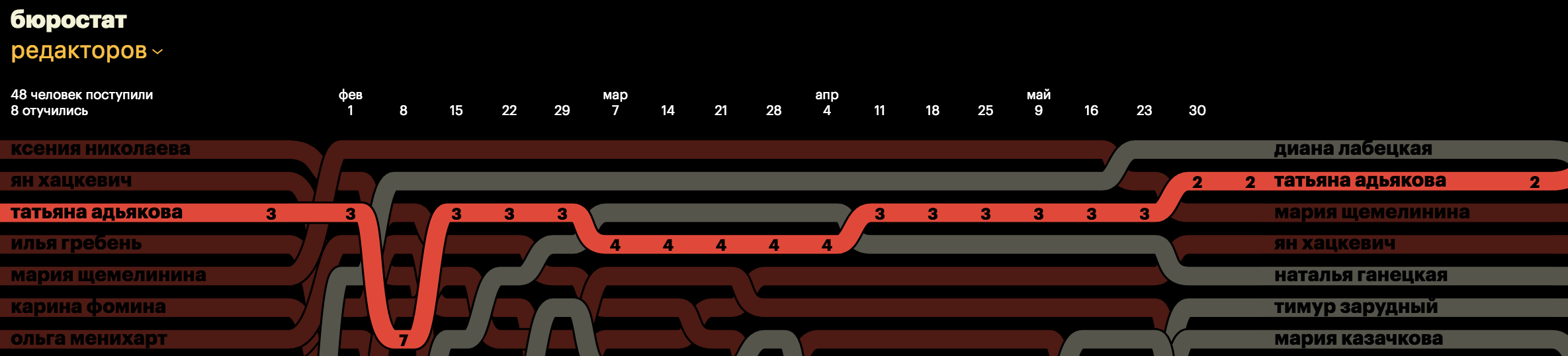
Infographics consists of three levels, each of which has a list of names, a chart and position numbers. Position numbers are initially hidden and appear on the hover. Above is an axis with dates.
Difficulties
Data
The original data was stored in exel-files in open access. They just needed to be converted into a large json-file, having calculated the position of the student on the desired day. Unfortunately, the data was a mess. A small list of things to check in the dataset:
- e and e in different places
- multiple data for one term
- short names
- she married and changed her last name
- different header formats
- random repetition of people
Custom line

The line in infographics is non-standard: 15 pixels for the transition between dates, 15 pixels straight. In D3, there are initially several variations of curves , they can be selected by the function curve.
var line = d3.line() .x(d => x(d.date)) .y(d => y(d.value)) .curve(d3.curveMonotoneX) The desired curve among the default was not. But, fortunately, D3 allows you to create your own custom curves. I took the simple curve as a basis and changed it a bit.
function point(that, x, y) { // , // , let concaveCenter = that._x1 - (that._x1 - that._x0) / 2 let convexCenter = that._x0 - (that._x0 - that._x1) / 2 let currentCenter = that._y1 > that._y0 ? convexCenter : concaveCenter // . that._context.bezierCurveTo( concaveCenter, that._y0, currentCenter, that._y1, that._x1, that._y1 ) // 15 that._context.lineTo(that._x1 + 15, that._y1) } Center alignment
text-align: center in svg does not work, but there is an analog. A text-anchor property with start, middle, and end values.
Nailed to the top hat
Dates must be nailed to the top. But the usual position: fixed does not help, because the block with dates should scroll horizontally. Solving the problem through js is not worth it, because it will slow down. There is a solution through css. It is enough to forbid scrolling the page vertically and give the opportunity to scroll instead the graph.
z-index
The z-index property does not work in svg. Z-index in svg is calculated from the position of the element in the code. The later the item, the higher it will be. In case you need to bring the line above all with a hover, you will have to re-sort the lines and bring the necessary one up.
But the worst thing is that this method will not help in the case of lines. The point is that the hover line is defined by the fill area. And this area is built between the end point and the starting point. As a result, if you constantly make the line up, then the graph will get a mess. Any line will necessarily redraw another.

To prevent this house from being in the lines, with a hover I bring up not the line itself, but its copy. After the hover has shifted to another line, I delete the previous copy.
If I need to process a click on the line, then it needs to be done not on the line, but on a copy.
Line Stroke

The stroke sets the line color, fill the fill color. There is no normal way to make a line around a line. outline, box-shadow, border do not work inside svg. The easiest way to make a stroke is to duplicate the code. That is, put a line with a stroke color under the main line. Another way, through svg filters, does not work very well and does not work if the stroke needs to be done only at the top and bottom.
Links
The story of the designer Misha Kapanaga about Burostat
')
Source: https://habr.com/ru/post/342106/
All Articles