Dashboard - what it is and why it will be useful to you or a modern way to make the secret explicit

Probably, few of us thought that almost from birth I used dashboards. We received some information, analyzed, made a decision or even experienced some emotions thanks to them. Yes, a thermometer that measures the temperature when you were sick; clock; The speedometer's arrow has crossed the 200 km / hour (well, it may not be for everyone) - all of these devices are in fact dashboards or their element. But I would like to talk about interactive analytical dashboards . And, most importantly, to show that in our time such dashboards can be useful to every person, not just large banks or corporations.
If you have data - it does not matter if you are a housewife with a pack of checks from purchasing products, an athlete with data on jogging from Strava or someone else - you can visualize it visually, evaluate important indicators, and as a result make better decisions.
')
You do not use dashboards and think that you do not need it? Opinion may change, and the horizon will expand, as further: what are dashboards, what goals are achieved with them, key concepts and areas of use, existing tools, many links to relevant resources on the topic, as well as a real example, as usual a look at the data, you can extract interesting knowledge ...
The origin and meaning of the term
An analytical panel, dashboard or even a dashboard, arose as a synthesis of powerful mathematical analytics and optimal graphical representation of the analysis results. The management of companies wanted to see key performance indicators , trends, dependencies and other metrics in an understandable compact form, as well as interactively change various parameters. In addition to visual data visualization, the main goals achieved with the help of dashboards are associated with the comparison of a particular indicator over time or evaluation relative to other indicators.
History reference
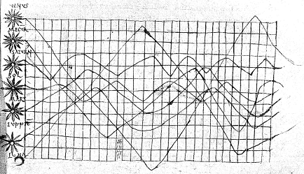
Most experts are counting the history of visualization of data from the graphs of the motion of celestial bodies (someone can argue, pointing to the ancient rock paintings). So, Howard Funkhouser discovered a diagram of the motion of celestial bodies dated to the 10th century, which is considered to be one of the first graphic images of data.Schedule of planetary movements from an unknown astronomer of the end of the 10th century
Michael Friendly divides the data visualization history into several periods:
before the 17th century - early maps and diagrams;
1600-1699 - measurements, theories, ideas;
1700-1799 - new graphic forms;
1800-1850 - the beginning of modern graphics;
1850-1900 - the golden era of statistical graphics;
1900-1950 - modern dark times;
1950-1975 - the rebirth of information visualization;
1975 is our time - high-precision, interactive and dynamic visualization.
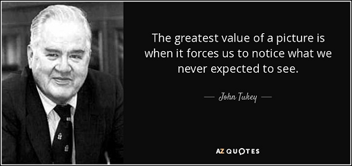
The revival of the visualization of information in the 50s was probably connected with the end of the Second World War, when the need to improve the economic condition of the participating countries became especially acute. In those years, terms such as data analysis and Business Intelligence (BI) were also born. In the modern sense, the concept of data analysis in 1961 was given by well-known statistician John Tukey , to whom we are also grateful for the introduction of the word “bit” (binary digit). In his works, he also pointed out the need to visualize statistical information.
The term Business Intelligence was first used in its 1958 article by IBM employee Hans Peter Lahn . In its current usage, as “concepts and methods for improving business decision making and business analysis,” this concept was formed during the development of decision support systems in the mid-80s, and then the first ideas of digital dashboards arose.
Dashboard Users Manifest
Dashboard users can be called both those who create them and those who use them later. Accordingly, software products for working with dashboards contain a viewer and editor for both categories of users.
Dashboard is the interface between the analytical engine and the one who acts as a user-analyst. Thus, all principles of building interfaces, methods of improving UX and increasing Usability are applicable to dashboard.Users of any interactive product want a fast and functional tool. Dashboards in modern conditions of high competition should also take into account the principles of “data visualization” and have a high User Experience , that is, they should have a “magic interface” . If you choose a tool for creating dashboards, but you cannot start working with it for half an hour, then I don’t think that its further use will bring you joy and results.
About the principles of data visualization
As a well-known dashboard expert Stefan Few says: “The best data analysis software, using which you forget about yourself, is so natural a continuation of your thinking that you can use it without thinking about the mechanics of the process.” He formulated the principles of interactive visualization, both for developers of tools and creators of dashboards [this is a free translation, read the original ]:
1) simplify - catch the essence and show easier;
2) compare - show the necessary visualizations alongside;
3) accompany - facilitate access to important data;
4) explore - let me see and find new knowledge;
5) look different - give different views of the same data, which will generate different ideas;
6) ask “why?” - more than “what is happening”, it is important to let know “why this is happening”, how this or that result of actions appeared;
7) be skeptical - give the opportunity to ask more questions and immediately get an answer to them;
8) respond - don't just answer questions, provide means to share knowledge.
Where the expression “data visualization” sounds, Edward Tufti is necessarily mentioned - visualization gurus, whom The New York Times calls “Leonardo da Vinci data”, and Bloomberg “Galileo graphics”. He came up with sparklines and wrote several popular books on visualization. The most famous of his two fundamental principles of visualization are very important for dashboards:
1) high ratio of graphics for data to the total space occupied by it (data-ink ratio) - increase the number of useful images in the space occupied by the visualization, i.e. Maximize the display of basic information, waste more “ink” on the data;
2) the absence of graphical garbage (chartjunk) - exclude non-important graphic elements, do not distract from the data with an extra design.
How is visibility achieved?
Analytical data is shown by different widgets from the table and chart to the dial gauges. Some tools allow the programmer to realize the desired visualization himself up to animations, videos or arbitrary infographics. The analytical data themselves are grouped and aggregated source data. It is possible to apply filters and sorting at different levels, cut off data by top values, create calculated fields of almost any complexity.
Basic concepts of analytical dashboards
1) grouping - a method of combining similar data (for some common basis, for example, the first letter of a word or a person's name);
2) aggregation (amount, minimum, maximum, quantity, etc.) - a way to display a column of facts from the source database (for example, a unique number of site visitors, or the amount of expenses for products);
3) sorting - ordering the already grouped data by a given attribute (except for the alphabet, you can sort the names of managers by their highest sales in a month, etc.);
4) filtering - the exclusion of data for a given attribute or a complex formula;
5) calculated column - a method of obtaining new data and knowledge using the methods of working with dates, rows, mathematical functions (for example, displaying the name and surname, calculating the age according to the date of birth and the current date);
6) top (best) values - a way to display the specified number of maximum or minimum values of this grouping (for example, the age of the three youngest employees of a large company, or five managers who provide maximum sales);
7) widgets (tables, charts, maps, etc.) - the actual way to visualize the above concepts.
Is any data can be analyzed?
Dashboards, as a rule, allow you to connect to an extensive list of data sources, ranging from an Excel file to multi-million BigData big data sources or social networking web services.
Often, a specialized analytics source called Data Warehouse or a multidimensional OLAP cube is prepared in advance. This is done in cases where a request for data to the source requires a large amount of time or the request overloads the server, which is unacceptable.
What means exist
Excel ... yes, MS Excel was ( and is! ) The main tool for data analysis for many. MS Office is a fairly inexpensive product (and in Russia, until recently, active piracy is free for many), it is available even to a student and, in general, provides a basic set of analysis tools and features for writing your own scripts.
Those who wish to integrate the full range of dashboard functionality (and other BI tools) into their workflow just look at the Gartner Magic Quadrant :

to select a product from one of the market leaders who provide powerful tools for data analysis, usually as final solutions with a fairly high cost.
The research company Gartner is the most authoritative publication, publishing the analysis of any market segment - they can be trusted.Also many of them - QlikSense , Tableau Public , Sisense , MicroSoft Power BI , etc. - provide public services or free versions for creating dashboards, usually with serious restrictions for use in real business, but powerful enough for personal / non-commercial purposes. .
Separately, it should be said about companies wishing to implement analytical panels directly into their internal software products. For such companies, it is more preferable to purchase a ready-made set of libraries (controls) for creating dashboards. Moreover, many companies, possibly yours, already have such a set of packages for their office applications and do not even realize that in a matter of minutes they can implement a powerful business analysis tool. Component libraries are designed specifically for implementation in the company's own software product according to the platform (Desktop / Web). In addition to lower cost, they have flexible licensing terms, since purchased on a single developer and can subsequently be used by an unlimited number of end users. There are many open source libraries (which can be found, for example, on GitHub ), but they usually allow you to solve only basic data analysis tasks.
How to understand that this manufacturer of dashboard suits you
Usually every BI tool maker has demo versions of dashboards. After seeing the demo versions on the manufacturer's website, you can initially assess how much they cover the required functionality.
1) sales - in which region a particular product is sold better, which branch or which of the company's managers gives the best result, how did the sales change compared to last year, etc .;
2) finance - stock quotes, exchange rates ... how everyone knows the rate of oil on the dollar exchange rate, but what impact on the rate of a particular stock has, for example, unrest in Syria, can be clearly seen by making the corresponding analytical dashboard;
3) personnel department - specialists can evaluate in one schedule how the number of refresher courses or the level of salary affects the turnover rate;
4) health care - the spread of diseases across regions, the effect of weather on the spread of viruses, the impact of toughening the policy of selling alcohol and tobacco on life expectancy, etc .;
5) industry (light, heavy, electronics, etc.) - display of promising regions by type of industry, increase in gas or oil production after installing new equipment, etc.
The list can still be continued, but usually these are all basic demos, which will allow you to compare already on the manufacturer's website, and it is also possible to see the solution to your similar tasks.
An example of building and using dashboards
I emphasize once again - there is data in any field of activity . And if there is data, then they can be analyzed. Using dashboards, you can extract new knowledge and improve performance, or even just look at this data every day “from a different angle”, thanks to a visual presentation and interactive analytics.
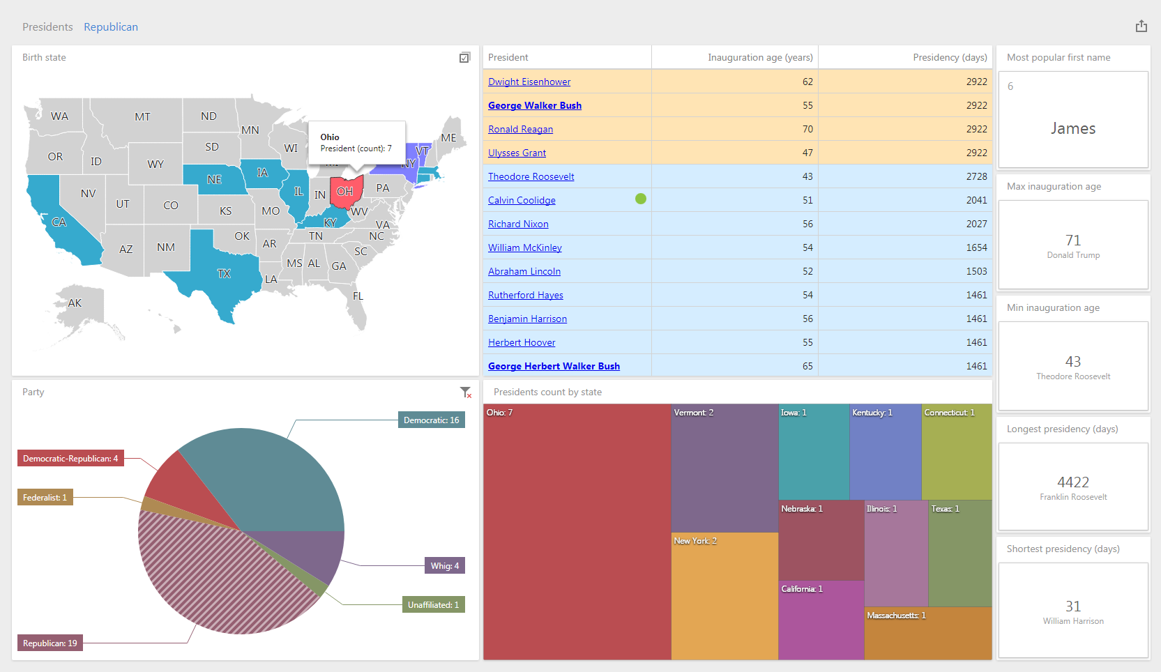
As an example, I decided to consider something fairly relevant, simple and accessible, while not entirely banal. By coincidence, not so long ago I was interested in the details of the election of the US presidents, in particular, who was the youngest and who was the oldest president. I came across a list of American presidents , which I decided to use as a data source for my example (I just added it with the dates of life and place of birth of the president).
For the simplest dashboard, I used several standard widgets: a map by state; party pie chart; table of presidents with links to Wikipedia and marks on the conditions with color coloring on the terms of the presidency; a tree for the number of people from certain states and a card for some marginal indicators. I made some widgets interactive - you can click on them and thus filter others according to the selected indicator. If you change the original data table, for example, enter the data on the new president - all indicators will be recalculated automatically.
Here you can try an example live, change or create your own dashboards on this data table, save them in a temporary session or download the resulting xml dashboards (there is also a separate view mode or you can download the project ):
How I did this dashboard
For more than seven years now, developing DevExpress products for Business Intelligence, I decided to also speak as a user and use a set of components to create DevExpress Web Dashboard dashboards, for which I:
1) downloaded the Universal package;
2) created an ASP.NET MVC application using a ready-made example as a basis ;
3) connected to the database, in my case the Excel table with data about the presidents (I implemented my version of the dashboard repository , so that you could save them in a temporary session);
4) launched the resulting application and created a new dashboard;
5) made calculated fields (age of taking office in years and terms of presidency in days, auxiliary for conditional formatting);
6) created widgets :
- map by states, coloring the states according to the number of presidents born there;
- a table and added conditional formatting : color by time of the board, bold type for the names of current presidents, icons for dates of birth / death equal to Independence Day;
- a pie chart by party affiliation and enabled interactive filtering: a click on a segment, a map and a table show the filtered data;
- a tree diagram also for the States and the number of presidents born there, I specifically wanted to show differences in the visualization of the same data;
- cards for displaying important indicators using top values .
It's clear that:
- several states (Virginia, Ohio, New York, Massachusetts) give more presidents than others;
- most were Republican presidents (19), and 7 of them were born in Ohio, but there were not much less Democrats (16), which indicates a fairly stable change of parties;
- 6 presidents named James (so any James from Virginia has more chances to become president than others);
- William Harrison was only 31 days in post, and Franklin Roosevelt was 4422 days, i.e. more than 12 years;
- Donald Trump is the oldest who joined the presidency at the age of 71, and Theodore Roosevelt is the youngest (43 years);
- Calvin Coolidge - the only president born on US Independence Day (July 4);
- Thomas Jefferson, James Monroe, and John Adams on Independence Day, the USA went into another world, and none of them was a pure Republican or Democrat;
- 5 former presidents living (James Carter, George Herbert Walker Bush, George Walker Bush, Bill Clinton and Barack Obama).
Of course, this is just an example and you will have other data, much more voluminous and diverse, but the essence and principles will not change: you can replace the dates of birth of the presidents at the dates of purchases of goods or bike races, terms of government - by the number of goods or time of training, staffs to shops or routes, etc. Look, the initially “raw” table of source data is processed by the analytical engine and transformed into visually perceptible entities.
Conclusion
In recent years, due to the development of digital and software technologies in all areas of human life, dashboards have found their application in new areas, such as, for example, social networks, fitness applications, etc. Even today, smart watches show dashboards, it’s not surprising if tomorrow you’ll see an interactive dashboard on your fridge with a mark, who most often opens the fridge and recommendations on how to use products to different family members.
List of used sources
[1] en.wikipedia.org/wiki/Dashboard_(business)
[2] uxmag.com/articles/the-future-of-information-dashboards
[3] en.wikipedia.org/wiki/Key_effectiveness indicators
[4] dashboardinsight.com/articles/digital-dashboards/fundamentals/what-is-a-dashboard.aspx
[5] en.wikipedia.org/wiki/Analysis_data
[6] en.wikipedia.org/wiki/Business_intelligence
[7] en.wikipedia.org/wiki/Exploratory_data_analysis
[8] en.wikipedia.org/wiki/John_Tukey
[9] en.wikipedia.org/wiki/Hans_Peter_Luhn
[10] en.wikipedia.org/wiki/Decision_support_system
[11] Chen C.-H., Hardle W., Unwin A. (Eds.) Handbook of Data Visualization. - Springer, 2008. - 936 p. - ISBN: 3540330364 / (chapter on historical part: www.datavis.ca/papers/hbook.pdf )
[12] azquotes.com/quote/593304
[13] interaction-design.org/literature/book/the-encyclopedia-of-human-computer-interaction-2nd-ed/data-visualization-for-human-perception
[14] uxmatters.com/mt/archives/2010/11/dashboard-design-101.php
[15] habrahabr.ru/company/devexpress/blog/280180/#habracut
[16] Stephen Few, Information Dashboard Design: The Effective Visual Communication of Data (O'Reilly, 2006)
[17] perceptualedge.com/blog
[18] tableau.com/blog/stephen-few-data-visualization
[19] www.edwardtufte.com/tufte
[20] Edward R. Tufte 'The Visual Display of Quantitative Information', Graphics Press, 2009;
[21] en.wikipedia.org/wiki/Data Storage
[22] en.wikipedia.org/wiki/OLAP- cube
[23] exceltip.ru/chto-takoy-dashbord-dashboard
[24] gartner.com/doc/3611117/magic-quadrant-business-intelligence-analytics
[25] powerbi.microsoft.com/ru-ru/blog/gartner-positions-microsoft-as-a-leader-in-bi-and-analytics-platforms-for-ten-consecutive-years
[26] en.wikipedia.org/wiki/Gartner
[27] predictiveanalyticstoday.com/open-source-dashboard-software
[28] some services, component sets, etc .:
qlikcloud.com
public.tableau.com/en-us
sisense.com/solutions/cloud-bi
powerbi.microsoft.com/ru-ru
componentsource.com
github.com/search?o=desc&q=dashboard&s=stars&type=Repositories
[29] en.wikipedia.org/wiki/President_List_US
[30] en.wikipedia.org/wiki/Internet- fridge
Pictures:
[1] devexpress.com/Products/NET/Dashboard/i/dashboard-banner.jpg
[2] upload.wikimedia.org/wikipedia/commons/6/61/Clm_14436_ecliptic_diagram.png
[3] azquotes.com/picture-quotes/quote-the-greatest-value-of-a-picture-is-when-it-forces-us-to-notice-what-we-never-expected-john-tukey -59-33-04.jpg
[4] info.microsoft.com/rs/157-GQE-382/images/EN-CNTNT-PowerBI-Gartner-MQ-2017.png
Source: https://habr.com/ru/post/341972/
All Articles