UX Writer: The Anatomy of a Unicorn
Anyone who often looks at the English-language platforms, probably heard of the mysterious UX-writer - not a copywriter, not a designer, not something average. The fashion for this profession began last year, when several large companies, from Amazon to Paypal, published the relevant vacancies, which caused a rapid response in the community. This fad did not reach the domestic IT sector, but the echoes of the discussions are periodically heard and puzzling - what is this, after all, a beast? In this article I want to summarize everything that I understood about the essence and content of the profession of a UX-writer from the study of foreign sources: why they are needed, what is their responsibility and what distinguishes them from ordinary people (that is, designers with copywriters).

Interest in the problem of the relationship of the text with the design has not waned for several years. Here you can recall the sacramental statement “Copywriting is dead” from Tony Brigull, and the growing supporters of the content content first approach, and, as a final chord, a recent speech by John Maeda , in which he stated that “designers do not understand the importance of words ”and called writing“ unicorn skill ”. In all this, one thought can be traced: the text plays a serious role not only in promoting the product, but also in the product itself; this is a critical component that requires attention and reflection, and not a set of stamped auxiliary elements.
In theory, everyone will probably agree with this, but in practice it usually turns out that in the development cycle, copywriting is huddled somewhere in the backyard - if they work on it at all, then most often it will have to and when it will. Andy Healey offers this scale with the gradation of teamwork:
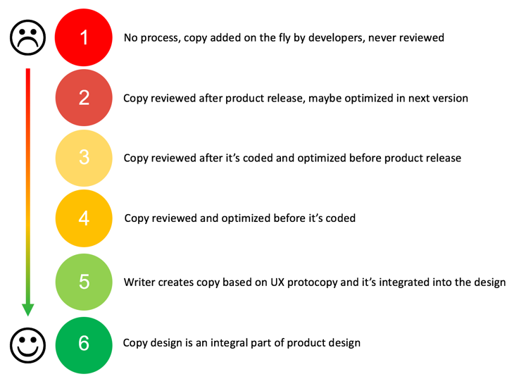
1 - There is no interaction, the text is added by the developers along the way and does not correct.
2 - The text is checked after the product launch, optimized in updates if necessary.
3 - Text is checked upon completion of development, optimized prior to launch.
4 - The text is checked and optimized before starting development.
5 - The copywriter writes the text on the basis of the prototext in the layout, then it is integrated into the design
6 - The text is considered as an integral part of product design.
')
According to the compiler, at the moment in most of the companies the interaction between designers and copywriters is no higher than the third step. If, over time, the team manages to bring it to the fourth or fifth - this can be considered a significant progress. The sixth is to be regarded as a distant, transcendental ideal.
The position of the UX-writer is an attempt to correct this state of affairs, to separate the work on the textual component of the interfaces into a separate function assigned to a specific member of the team, and thereby confirm its importance.
The working definition of a UX-writer, wandering from article to article, is “a specialist working on the textual component of user interaction points”. That is, above the captions above the buttons, hints and explanations to the data entry fields, the names of tabs, sections and other menu items, messages on pop-up windows, text for animations and transitional screens ...
The highest meaning of the post is clear, but those who hear about it for the first time often react with surprise, if not irony. Indeed, at first glance, there is not too much work here: the texts are short, simple and more or less standard. Of course, ideally everything should be at the level, but why allocate a whole bet on things like “Open history” and “You didn’t fill in all the form fields”? They will be mastered by any not too tongue-tied member of the team, but they will be corrected by a tongue-tied one on the pre-show. What will the new employee do all day?
I was also interested in this question, so I dived into the texts of vacancies and other materials from the giant companies to figure out what the work of the UX-writer is, what he is responsible for and what exactly optimizes in microtexts.
The first and most obvious thing for which the UX-writer is responsible for his head is literacy and regulatory design. Much has already been said about typos that treacherously slip into the final versions and undermine users' confidence in your professionalism. However, it’s not just about them, but also about the little things that the average person is unlikely to define as a “mistake”, but can be noted on a subconscious level as inaccuracy or sloppiness. What do you put after each item in the list - a point, nothing, or a semicolon? Do all the words in tab names start with a capital letter? Do I need a three-dot after dangling phrases like "Save As"?
In large companies for such cases there are special tedious guides, where all the rules of registration are stated (you will find links to examples at the end of the article). But even in this case, someone must draw up and update these rules, not to mention tracking their implementation. So, we will enter into the register of duties and this is responsibility for regulatory documents.
The next step is the uniformity of the language at all levels. Specific to the product or scope of the terms should be consistently reproduced in the entire line, on all platforms and in all iterations. Even simple, human words like “install” or “open” usability experts recommend repeating without any substitutions and synonyms at least within one operation. An experienced UX-writer, upon seeing that by clicking on the “Install” button, the “Download this application?” Window is displayed, will look with suspicion and begin to take measurements of the conversion. An unambiguous, unchanging description of operations gives the text transparency, speeds up interactions, and therefore works on the design as a whole.
Speaking of transparency: clarity is also one of the criteria for text optimization. Dropbox deals with this problem in its article: developers who know the mechanism of the product, are accustomed to a particular avian language, tend to delve too much into unnecessary and incomprehensible to the philistine details and use complex words where you can do simple. The care of a UX-writer is to translate text from a professional language to an everyday one, catch terms and jargon and ensure maximum clarity while maintaining accuracy. So "Failed authentication attempt" turns into "Password is entered incorrectly."
Another problem is closely connected with clarity - the determination of the amount of information necessary for the user at each specific step. This is a complex process of balancing between “unfolding a situation” and “overloading with details”, which requires hard work with data on user behavior. Both nedosol, and peresal lead to the same thing - a person is not entirely, or at least not immediately, it is clear what to do next. Consider two opposite examples that illustrate this rule well:
Here we see an example of redundancy. The interface details (and even complicated language) outlines what will happen under the hood, although, in fact, all that the user needs is to find out what is required of him and what restrictions are imposed.

In the event of an error, vague messages that simply summarize the situation in the spirit of "Something did not work out" leave the user in uncertainty and irritation. A technical report in the spirit of “Error No. 603 on port 5000” is unlikely to help here, but a call to action, even if it is self-evident (“Try again”) or at least encouragement (“The repair team is on the way”, “We are working on this problem ") will come in handy.
Moving on. Reading the examples in the paragraph above, of course, you could not help but notice that “We are working on the problem” sounds differently than the “Repair team is on the way”. What is more appropriate? For a solid company that works with serious people, probably the first. For a service that wants to emphasize its informality and closeness to the people, the second, perhaps, is better suited. Positioning and brand image determine which “voice” you will use with users, in which way to build interaction. The UX writer makes sure that in the process of using the product, people really feel all that is written in the marketing strategy.

An interesting example in this regard is Lisa Sanchez, comparing the booking screens from Lyft Line (left) and UberPOOL (right), which request the same information - the number of people booking a trip. The example is interesting, in particular, by the fact that there is no opposition “right / wrong”; Both companies formulate a request as required by the chosen communication style. Lyft Line draws up an interaction in the form of a friendly conversation: the user's response is written in the first person, the options sound informal and cause positive associations (“I'm with a friend”). Uber on its background is dry and laconic, it feels more restrained, businesslike approach: “friends” turn into “places”, and answers are reduced to a single digit.
In addition to the "voice" there is also a "tone." Ideally, the interface should form not only a heuristic user experience (suggest what the next step should be, help with the perception of information), but also an emotional one (not to get bored, to be encouraged for complex operations, to show empathy). Thus, the text also adapts to that particular moment in the interaction scenario to which it is attached.
It is rather difficult to calculate emotional reactions; accordingly, by building a text in the calculation of “compensating” one or another reaction, the UX-writer always takes a certain risk. Take this example from Tumblr, a social platform with a focus on graphical content:
When registering, the user is prompted to indicate his age. If the field indicates a number less than thirty, the interface displays the standard, grammatically correct phrase “I'm 29 years old”. If the user is older, the text is changed to a puns "I'm 30 years young". The logic is clear: after this milestone, age becomes a sore subject for many, and in a community where there are many young people and teenagers, this feeling can become aggravated. The game of words should amuse and dispel the user, distracting him from unpleasant experiences. If the calculation is correct, it is a good idea. On the other hand, to someone who is not particularly complex, this may seem like a silly coquetry, and to someone who is too sensitive - a mockery.
How, then, to act? Either pre-test the hypothesis, or introduce a new version at your own risk and monitor the percentage of failures. Accordingly, we add to the list of UX-writer's responsibilities work with analytics, correction and updating of text fragments based on feedback or in accordance with a changing strategy. By the way, you can also include a focused feedback gathering: viewing sessions is, of course, good, but comments from the control group give much more information.
Considering different aspects of the work of the UX-designer, we moved from simple to complex. It all began with primitive functions that can be performed at almost any development stage and require a minimum of resources, but soon optimization parameters began to emerge, associated not only with personal skills, but also with teamwork. As soon as we recognized the auxiliary labels as an important part of the interface, which can enhance the design and significantly improve the experience, it became clear: they really should be implemented early and in conjunction with other elements. To determine the sufficient amount of text, you need to know what information visual elements broadcast. “Voice” should be chosen taking into account the specifics of the target audience and market conventions, as well as to overlap with other elements, from the color gamut to the slogan. To constantly interact with other groups, to be aware of everything related to design and positioning, to participate in the development and implementation of the concept from the very beginning is the final aspect of the work of the UX-writer.
So, as a result, the following list of responsibilities is added:
It already looks more solid ...
... but perhaps still not enough.
The vacancy review shows that the terms of reference of the UX-writer are currently somewhat blurred. As we have already mentioned, this position is at the intersection of several areas at once: design, actual work with texts and marketing. An abstract UX writer in a vacuum should actively cooperate with the relevant teams, be well versed in their tools and techniques, solely to fulfill their narrow task. In fact, judging by the texts on the work sites, specialists in this role often receive additional workload - first of all, work on other texts (press releases, advertising booklets, sometimes technical instructions), less often - a marketing strategy or content plan.
This is not only the grin of capitalism, but also evidence that even in companies that recognize the importance of such a role, it is still considered too narrow - hence the attempt to artificially expand. In some respects this is true: a “pure” UX-writer will be consistently in demand in large companies that have such a huge and diverse staff that the unity of style becomes a serious problem, the product line is constantly replenished, and the attitude to the brand image is extremely reverent. In teams smaller and more modest, a separate position is unlikely to pay off. Rather, here you can talk about a side pool of duties, which will be considered as a higher priority, be assessed more critically - and will go to local multi-channel specialists.
Simply put, the skills of fashionable and trendy UX-writing in modern realities may not give you a new profession, but they will allow you to get a price for yourself in the current one.
Perspective tempting. It remains to understand how to get the right to at least claim this title. Good news: if you are a designer or copywriter, you already have a significant amount of basic knowledge and skills. It is only necessary to get the missing.
A designer, for example, can:
A copywriter would be worth:
And finally, here is a small list of materials that will be useful to both:
How did it all start?
Interest in the problem of the relationship of the text with the design has not waned for several years. Here you can recall the sacramental statement “Copywriting is dead” from Tony Brigull, and the growing supporters of the content content first approach, and, as a final chord, a recent speech by John Maeda , in which he stated that “designers do not understand the importance of words ”and called writing“ unicorn skill ”. In all this, one thought can be traced: the text plays a serious role not only in promoting the product, but also in the product itself; this is a critical component that requires attention and reflection, and not a set of stamped auxiliary elements.
In theory, everyone will probably agree with this, but in practice it usually turns out that in the development cycle, copywriting is huddled somewhere in the backyard - if they work on it at all, then most often it will have to and when it will. Andy Healey offers this scale with the gradation of teamwork:
1 - There is no interaction, the text is added by the developers along the way and does not correct.
2 - The text is checked after the product launch, optimized in updates if necessary.
3 - Text is checked upon completion of development, optimized prior to launch.
4 - The text is checked and optimized before starting development.
5 - The copywriter writes the text on the basis of the prototext in the layout, then it is integrated into the design
6 - The text is considered as an integral part of product design.
')
According to the compiler, at the moment in most of the companies the interaction between designers and copywriters is no higher than the third step. If, over time, the team manages to bring it to the fourth or fifth - this can be considered a significant progress. The sixth is to be regarded as a distant, transcendental ideal.
The position of the UX-writer is an attempt to correct this state of affairs, to separate the work on the textual component of the interfaces into a separate function assigned to a specific member of the team, and thereby confirm its importance.
The working definition of a UX-writer, wandering from article to article, is “a specialist working on the textual component of user interaction points”. That is, above the captions above the buttons, hints and explanations to the data entry fields, the names of tabs, sections and other menu items, messages on pop-up windows, text for animations and transitional screens ...
The highest meaning of the post is clear, but those who hear about it for the first time often react with surprise, if not irony. Indeed, at first glance, there is not too much work here: the texts are short, simple and more or less standard. Of course, ideally everything should be at the level, but why allocate a whole bet on things like “Open history” and “You didn’t fill in all the form fields”? They will be mastered by any not too tongue-tied member of the team, but they will be corrected by a tongue-tied one on the pre-show. What will the new employee do all day?
I was also interested in this question, so I dived into the texts of vacancies and other materials from the giant companies to figure out what the work of the UX-writer is, what he is responsible for and what exactly optimizes in microtexts.
What are they doing?
The first and most obvious thing for which the UX-writer is responsible for his head is literacy and regulatory design. Much has already been said about typos that treacherously slip into the final versions and undermine users' confidence in your professionalism. However, it’s not just about them, but also about the little things that the average person is unlikely to define as a “mistake”, but can be noted on a subconscious level as inaccuracy or sloppiness. What do you put after each item in the list - a point, nothing, or a semicolon? Do all the words in tab names start with a capital letter? Do I need a three-dot after dangling phrases like "Save As"?
In large companies for such cases there are special tedious guides, where all the rules of registration are stated (you will find links to examples at the end of the article). But even in this case, someone must draw up and update these rules, not to mention tracking their implementation. So, we will enter into the register of duties and this is responsibility for regulatory documents.
The next step is the uniformity of the language at all levels. Specific to the product or scope of the terms should be consistently reproduced in the entire line, on all platforms and in all iterations. Even simple, human words like “install” or “open” usability experts recommend repeating without any substitutions and synonyms at least within one operation. An experienced UX-writer, upon seeing that by clicking on the “Install” button, the “Download this application?” Window is displayed, will look with suspicion and begin to take measurements of the conversion. An unambiguous, unchanging description of operations gives the text transparency, speeds up interactions, and therefore works on the design as a whole.
Speaking of transparency: clarity is also one of the criteria for text optimization. Dropbox deals with this problem in its article: developers who know the mechanism of the product, are accustomed to a particular avian language, tend to delve too much into unnecessary and incomprehensible to the philistine details and use complex words where you can do simple. The care of a UX-writer is to translate text from a professional language to an everyday one, catch terms and jargon and ensure maximum clarity while maintaining accuracy. So "Failed authentication attempt" turns into "Password is entered incorrectly."
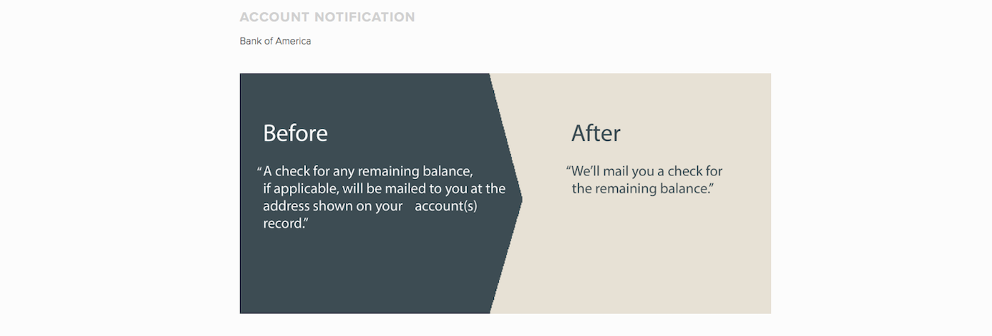
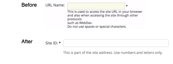
Another problem is closely connected with clarity - the determination of the amount of information necessary for the user at each specific step. This is a complex process of balancing between “unfolding a situation” and “overloading with details”, which requires hard work with data on user behavior. Both nedosol, and peresal lead to the same thing - a person is not entirely, or at least not immediately, it is clear what to do next. Consider two opposite examples that illustrate this rule well:
Here we see an example of redundancy. The interface details (and even complicated language) outlines what will happen under the hood, although, in fact, all that the user needs is to find out what is required of him and what restrictions are imposed.
In the event of an error, vague messages that simply summarize the situation in the spirit of "Something did not work out" leave the user in uncertainty and irritation. A technical report in the spirit of “Error No. 603 on port 5000” is unlikely to help here, but a call to action, even if it is self-evident (“Try again”) or at least encouragement (“The repair team is on the way”, “We are working on this problem ") will come in handy.
Moving on. Reading the examples in the paragraph above, of course, you could not help but notice that “We are working on the problem” sounds differently than the “Repair team is on the way”. What is more appropriate? For a solid company that works with serious people, probably the first. For a service that wants to emphasize its informality and closeness to the people, the second, perhaps, is better suited. Positioning and brand image determine which “voice” you will use with users, in which way to build interaction. The UX writer makes sure that in the process of using the product, people really feel all that is written in the marketing strategy.
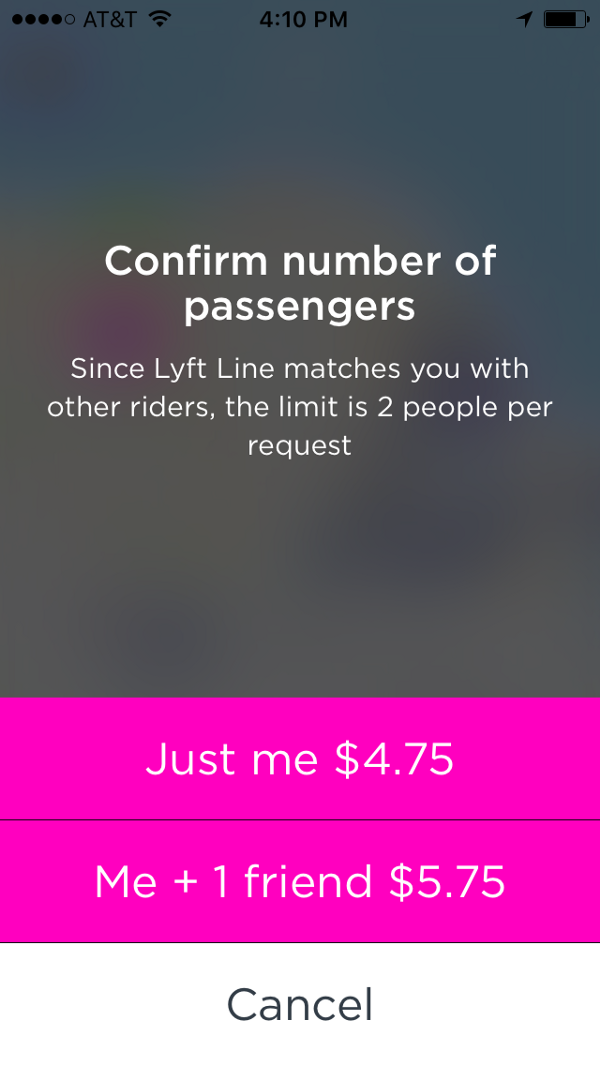
An interesting example in this regard is Lisa Sanchez, comparing the booking screens from Lyft Line (left) and UberPOOL (right), which request the same information - the number of people booking a trip. The example is interesting, in particular, by the fact that there is no opposition “right / wrong”; Both companies formulate a request as required by the chosen communication style. Lyft Line draws up an interaction in the form of a friendly conversation: the user's response is written in the first person, the options sound informal and cause positive associations (“I'm with a friend”). Uber on its background is dry and laconic, it feels more restrained, businesslike approach: “friends” turn into “places”, and answers are reduced to a single digit.
In addition to the "voice" there is also a "tone." Ideally, the interface should form not only a heuristic user experience (suggest what the next step should be, help with the perception of information), but also an emotional one (not to get bored, to be encouraged for complex operations, to show empathy). Thus, the text also adapts to that particular moment in the interaction scenario to which it is attached.
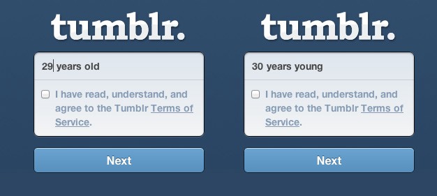
It is rather difficult to calculate emotional reactions; accordingly, by building a text in the calculation of “compensating” one or another reaction, the UX-writer always takes a certain risk. Take this example from Tumblr, a social platform with a focus on graphical content:
When registering, the user is prompted to indicate his age. If the field indicates a number less than thirty, the interface displays the standard, grammatically correct phrase “I'm 29 years old”. If the user is older, the text is changed to a puns "I'm 30 years young". The logic is clear: after this milestone, age becomes a sore subject for many, and in a community where there are many young people and teenagers, this feeling can become aggravated. The game of words should amuse and dispel the user, distracting him from unpleasant experiences. If the calculation is correct, it is a good idea. On the other hand, to someone who is not particularly complex, this may seem like a silly coquetry, and to someone who is too sensitive - a mockery.
How, then, to act? Either pre-test the hypothesis, or introduce a new version at your own risk and monitor the percentage of failures. Accordingly, we add to the list of UX-writer's responsibilities work with analytics, correction and updating of text fragments based on feedback or in accordance with a changing strategy. By the way, you can also include a focused feedback gathering: viewing sessions is, of course, good, but comments from the control group give much more information.
Considering different aspects of the work of the UX-designer, we moved from simple to complex. It all began with primitive functions that can be performed at almost any development stage and require a minimum of resources, but soon optimization parameters began to emerge, associated not only with personal skills, but also with teamwork. As soon as we recognized the auxiliary labels as an important part of the interface, which can enhance the design and significantly improve the experience, it became clear: they really should be implemented early and in conjunction with other elements. To determine the sufficient amount of text, you need to know what information visual elements broadcast. “Voice” should be chosen taking into account the specifics of the target audience and market conventions, as well as to overlap with other elements, from the color gamut to the slogan. To constantly interact with other groups, to be aware of everything related to design and positioning, to participate in the development and implementation of the concept from the very beginning is the final aspect of the work of the UX-writer.
So, as a result, the following list of responsibilities is added:
- writing and proofreading texts for the interface
- compilation of a universal guide to the design of texts
- text optimization to improve usability
- collection and analysis of information about user behavior, adaptation of texts to the circumstances of a specific interaction
- development of “voice” - an individual style of communication corresponding to the approved brand image
- work with feedback, surveys, A / B testing to continuously improve the quality of texts
- collaboration with designers and marketers, product management starting from the prototyping stage
It already looks more solid ...
So, what is next?
... but perhaps still not enough.
The vacancy review shows that the terms of reference of the UX-writer are currently somewhat blurred. As we have already mentioned, this position is at the intersection of several areas at once: design, actual work with texts and marketing. An abstract UX writer in a vacuum should actively cooperate with the relevant teams, be well versed in their tools and techniques, solely to fulfill their narrow task. In fact, judging by the texts on the work sites, specialists in this role often receive additional workload - first of all, work on other texts (press releases, advertising booklets, sometimes technical instructions), less often - a marketing strategy or content plan.
This is not only the grin of capitalism, but also evidence that even in companies that recognize the importance of such a role, it is still considered too narrow - hence the attempt to artificially expand. In some respects this is true: a “pure” UX-writer will be consistently in demand in large companies that have such a huge and diverse staff that the unity of style becomes a serious problem, the product line is constantly replenished, and the attitude to the brand image is extremely reverent. In teams smaller and more modest, a separate position is unlikely to pay off. Rather, here you can talk about a side pool of duties, which will be considered as a higher priority, be assessed more critically - and will go to local multi-channel specialists.
Simply put, the skills of fashionable and trendy UX-writing in modern realities may not give you a new profession, but they will allow you to get a price for yourself in the current one.
Perspective tempting. It remains to understand how to get the right to at least claim this title. Good news: if you are a designer or copywriter, you already have a significant amount of basic knowledge and skills. It is only necessary to get the missing.
A designer, for example, can:
- Work on literacy and syllable
- Understand resources for testing the use of words and phrases (Google Trends, NCRF)
- Get used to checking your texts with online tools (Flash index, Fogh index, Glavred)
- Practice analyzing the textual component of foreign interfaces (to mark interesting and amusing decisions, confusing presentation, incomprehensible moments, verbosity)
- If possible, optimize weak texts in interfaces (and save screenshots for portfolios)
A copywriter would be worth:
- Make a clear picture of the product development cycle (what happens at one stage or another, what adjustments are permissible and realizable at each stage)
- At least briefly to get acquainted with the software that designers use, primarily with tools for prototyping
- Learn to conduct A / B testing
- Delve into the topic of usability, read the basic list of references
- Offering help with the interface in the early stages of development is not just a proofreading, but also more extensive changes (for argumentation, it will be useful to know usability knowledge)
And finally, here is a small list of materials that will be useful to both:
- Examples of guidelines for writing texts for the interface: Apple , Alfresco , Material Design
- One day in the life of a UX writer (a good overview of daily duties, urgent and current tasks)
- Google on the principles of UX-writing
- Dropbox on UX writing principles
- Selection of vacancies from large companies (with an emphasis on duties and requirements)
- Assholedesign and Crappy Design with a collection of instructive examples
Source: https://habr.com/ru/post/341934/
All Articles