What are ghost buttons and why should you be afraid of them?
You decide to buy new shoes. Open a search engine, find your favorite site for selling shoes and hang a little on the main page. The picture on the banner looks good, but where to click to go to the pair you are interested in? Not on the same small square right in the middle of the picture?
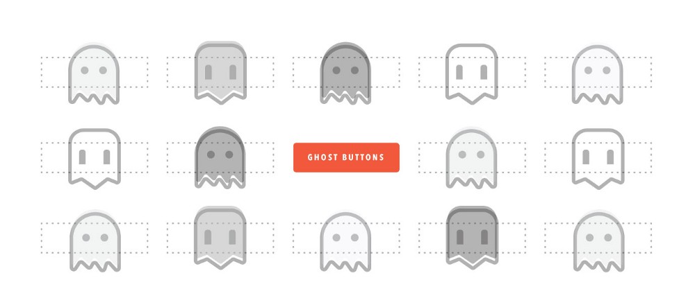
Ghost buttons, that is, buttons that have a border marked but no color filling, have recently become popular on the Web. Ghosts are called to emphasize their transparency - since they don’t have any color at all, they merge with the background image (often this is a photograph). But whenever he catches my eye, I involuntarily ask myself a question: did A / B designers perform testing? Maybe my experience in improving conversions is having an effect, and maybe it's because of their popularity in modern design — somehow, I have a difficult attitude towards them.
In this article, we’ll talk about how skeuomorphism has been replaced by a flat design, how ghost buttons have gained popularity in recent years and what effect they can have on conversion.

Ghost buttons did not appear vacuum - like any other element on the Web, they are a reflection of certain ideas about the user, technical limitations and aesthetic preferences. Therefore, to answer the question posed, we need a little historical context.
')
1984 - Apple released the first Macintosh
Not everyone, but many believe that it was the first Macintosh that became the device that first presented the graphical user interface to the public. Files on it were depicted as piles of paper, the containers in which the files were stored were presented in the form of folders, and groups of such containers formed directories. In 1984, personal computers have not yet taken root, they were among a few families. With the help of these visual metaphors, users could make a cognitive jump from objects of physical reality to digital objects.
Apple used a skeuomorphic approach to design, in which the designer portrays digital tools and concepts to resemble relevant objects in the real world. For example, early versions of the Apple Notes application designed the application to look like a yellow notepad. The idea was that a visual metaphor would allow users to quickly figure out how to work with the application: Notes is just a virtual version of a classic notebook.

2001 - the razorfish team launched audi.com , the first website able to adapt to the user's viewport.
2004 - Cameron Adams created an example of a design in which the location of the elements depends on the expansion.
2007 - the first Iphone was released.
The invention of the Iphone is important not only because it allowed more people to get acquainted with Apple's ske-morphic design and way of thinking, but also because it was a mobile device. From that moment began the mass distribution of smartphones and the focus began to shift towards mobile design.
2008 - every second inhabitant of the planet got a mobile phone.
2010 - released the first iPad.
2010 - Ethan Macrott coined the concept of “responsive web design” , implying flexible grids, adaptable images and the use of media queries. Instead of creating a separate architecture for mobile devices and a separate one for the desktop, the responsive design offers a single flexible architecture that can adapt to any screen size.
Although at first the search for responsive design focused on how to make web pages more flexible and flexible, and the general principles of how the system works, flat design supporters asked another question: how would it all look? At that time, flat design was considered a more modern, futuristic style, but it dates back to the 1950s and originates in Swiss style, modernism, and Bauhaus school. Flat design is associated with the desire to get rid of all unnecessary decorations. It is then that the ghost button comes onto the scene - all the decorative elements are eliminated, only the outline that outlines the rectangle with the text that indicates the action remains. Such a design decision definitely belongs to the “flat” variety.
Mention of ghost buttons began to appear on the web sometime in 2014. The websiteswithghostbuttons account started posting on the toggle switch, and Daniel Klopper posted the first-ever post with the hashtag #ghostbuttons.

There is a version that ghost buttons evolved from the heads-up-display design. Some similarities are indeed traceable; let's say that the HUD interfaces are usually non-contrast and designed to provide information without blocking the view to the pilot.
Having released Windows Phone 7 and Windows 8, Microsoft introduced a design system called Metro. This system was characterized by the use of bright colors, simple fonts and ... ghost buttons!

Of all the early followers of flat design, Apple with its iOS 7, perhaps, played the most important role in consolidating the trend. In their article on Wired , the Apple team placed particular emphasis on the fact that interfaces should be “unobtrusive and modest” in order for the design to “become more concise, bringing your content to the foreground,” rather than attract attention. Now, few people disagree with the philosophy of Apple - the main component should be the content, not those interface elements that support it.

Now that we have roughly established the origin of the ghost buttons, it's time to figure out how they turned into a full-fledged trend. Many designers would probably bring the following argument: simple design gives them flexibility. This is especially true when it comes to pictures in full screen or sites with a large number of video materials - in such cases, ghost buttons merge with the background and help to focus on images and text.
Buttons signs often have to be seen on the websites of creative agencies. Perhaps the point is their versatility - they are embedded both in simple, minimalist designs, and in more complex and rich ones. For example: the Crispin Porter and Bogusky page uses a ghost button in an even more simplified version - its upper border is erased.

It is very common to use ghost buttons as part of a duet, side by side with a button that is filled with color. With this “dual” approach, the color button, as a rule, carries the main call to action, while the ghost button is set aside for an additional, not so important operation. Some designers go even further and introduce a mixed set of buttons, with and without fill, to build a hierarchy and make the design more diverse.

Color or gradient fills as the background image has also been used more actively since the concept of flat design was born. Ghost buttons can be well combined with such backgrounds - the latter serve as a neutral element for them. Ghost buttons, as I already mentioned, are also a result of a flat design, so if the overall look fits into this aesthetics, from a visual point of view, they can be a good solution.
Although we have given reasonable reasons why designers opt for ghost buttons, there are some not very encouraging facts and static calculations that are not the best idea. Although ghost buttons can create a pleasant visual impression, they also cause problems that can negatively impact both user experience and company success. Angie Shotmaller, the former head of the conversion marketing department at Unbounce , spoke of it this way:
Readability . If the button is placed on a variegated image and does not have the necessary contrast, users will be difficult to disassemble the text of the call to action.

Contrast . If both the contour of the button and the surrounding text are, say, white and superimposed over the image, the page often lacks a hierarchy that would attract the user's gaze to the main element related to the target action. This can have real consequences for landings, affecting the conversion.

Clarity Here the text and the use of animation in interactions can help, but, nevertheless, it is not always obvious that this element is a button. If the context is lacking or your audience belongs to a certain age group, misunderstanding may arise.

Although all of the above deserves serious attention, the profit is primarily affected by what causes a drop in conversion. On the subject of how the conversion of the color button on the "ghost" affects the conversion, several studies have been conducted. Elevated Third organized a test in their mailing list: in one version they put ghost buttons, in the other - buttons with color fill. They found out that the second option shows the best result: the conversion was higher by 7%.

Another test on ConversionXL's website showed a 20% decrease in clicks (conclusions were drawn from 10,000 visits) when moving from the first option to the second:


Nielsen Norman Group recently published a study in which they came to the following conclusion: "Flat interface elements are less attractive and cause confusion." This study showed that users spend on sites with weak pointers (that is, without clearly presented buttons and links leading to action) by 22% more time. The experiment was based on targeted tasks related to information retrieval, and the user was set a goal to complete the task as quickly as possible. Accordingly, a large investment of time indicated that participants experienced greater cognitive load.
After the results were published, the NNG study triggered a debate on whether enough attention was paid to flat design. Sean Dexter of Cigna wrote an article entitled " Flat design: why not blindly trust Niels Norman's research on this trendy style ." In it, he says, in particular, that one of the most successful examples in the study is a comparison of an empty button with a color one, and the test, respectively, is devoted rather to contrast than to a flat design. The catch with this observation is that the author considers the use of ghost buttons as a separate problem, as if it is not closely related to the theme of flat design. In a statement that the study of NNG was originally devoted to the opposition of strong and weak pointers, there is some truth. However, it seems to me that one can safely say that many solutions in the style of flat design suffer from insufficient contrast.

These are narrow studies, the results of which may vary under the influence of a number of factors: market, audience, type of traffic, position on a page, text, and so on. And yet, if you widely use ghost buttons on your website or in your ezine, this information should push you to conduct A / B testing. Or maybe you have already performed it? I am pleased to hear about the results.
We considered the essence of ghost buttons, their possible origins, and the ways and consequences of their use. What should designers do to change their approach to creating websites and brand identity systems? Here are a few basic considerations to keep in mind the next time you think about turning on ghost buttons:
And most importantly: be aware of the consequences and do not make designs that rely on the use of ghost buttons. Talk to the management and make a test plan - it should start as early as possible and run as often as possible. Many designers are wary of attracting such data - perhaps the fear in them says that the results will set the wrong direction in which they would like to move. But statistics is not our enemy, and, closing our eyes to it, we endanger the user experience and brand image.
Of course, ghost buttons on their own will not destroy conversion and all chances for a positive user experience, however, if you use them thoughtlessly and enter without due care, this can be a significant factor. Our responsibility as digital designers is to recognize the consequences of our decisions. So next time, think twice before adding the ghost button, and do not be lazy to take the test!
Ghost buttons, that is, buttons that have a border marked but no color filling, have recently become popular on the Web. Ghosts are called to emphasize their transparency - since they don’t have any color at all, they merge with the background image (often this is a photograph). But whenever he catches my eye, I involuntarily ask myself a question: did A / B designers perform testing? Maybe my experience in improving conversions is having an effect, and maybe it's because of their popularity in modern design — somehow, I have a difficult attitude towards them.
In this article, we’ll talk about how skeuomorphism has been replaced by a flat design, how ghost buttons have gained popularity in recent years and what effect they can have on conversion.
Where did they come from?
Ghost buttons did not appear vacuum - like any other element on the Web, they are a reflection of certain ideas about the user, technical limitations and aesthetic preferences. Therefore, to answer the question posed, we need a little historical context.
')
1984 - Apple released the first Macintosh
Not everyone, but many believe that it was the first Macintosh that became the device that first presented the graphical user interface to the public. Files on it were depicted as piles of paper, the containers in which the files were stored were presented in the form of folders, and groups of such containers formed directories. In 1984, personal computers have not yet taken root, they were among a few families. With the help of these visual metaphors, users could make a cognitive jump from objects of physical reality to digital objects.
Apple used a skeuomorphic approach to design, in which the designer portrays digital tools and concepts to resemble relevant objects in the real world. For example, early versions of the Apple Notes application designed the application to look like a yellow notepad. The idea was that a visual metaphor would allow users to quickly figure out how to work with the application: Notes is just a virtual version of a classic notebook.
2001 - the razorfish team launched audi.com , the first website able to adapt to the user's viewport.
2004 - Cameron Adams created an example of a design in which the location of the elements depends on the expansion.
2007 - the first Iphone was released.
The invention of the Iphone is important not only because it allowed more people to get acquainted with Apple's ske-morphic design and way of thinking, but also because it was a mobile device. From that moment began the mass distribution of smartphones and the focus began to shift towards mobile design.
2008 - every second inhabitant of the planet got a mobile phone.
2010 - released the first iPad.
2010 - Ethan Macrott coined the concept of “responsive web design” , implying flexible grids, adaptable images and the use of media queries. Instead of creating a separate architecture for mobile devices and a separate one for the desktop, the responsive design offers a single flexible architecture that can adapt to any screen size.
Flat design
Although at first the search for responsive design focused on how to make web pages more flexible and flexible, and the general principles of how the system works, flat design supporters asked another question: how would it all look? At that time, flat design was considered a more modern, futuristic style, but it dates back to the 1950s and originates in Swiss style, modernism, and Bauhaus school. Flat design is associated with the desire to get rid of all unnecessary decorations. It is then that the ghost button comes onto the scene - all the decorative elements are eliminated, only the outline that outlines the rectangle with the text that indicates the action remains. Such a design decision definitely belongs to the “flat” variety.
When did they begin to appear?
Mention of ghost buttons began to appear on the web sometime in 2014. The websiteswithghostbuttons account started posting on the toggle switch, and Daniel Klopper posted the first-ever post with the hashtag #ghostbuttons.
There is a version that ghost buttons evolved from the heads-up-display design. Some similarities are indeed traceable; let's say that the HUD interfaces are usually non-contrast and designed to provide information without blocking the view to the pilot.
Having released Windows Phone 7 and Windows 8, Microsoft introduced a design system called Metro. This system was characterized by the use of bright colors, simple fonts and ... ghost buttons!
Of all the early followers of flat design, Apple with its iOS 7, perhaps, played the most important role in consolidating the trend. In their article on Wired , the Apple team placed particular emphasis on the fact that interfaces should be “unobtrusive and modest” in order for the design to “become more concise, bringing your content to the foreground,” rather than attract attention. Now, few people disagree with the philosophy of Apple - the main component should be the content, not those interface elements that support it.
How do designers use ghost buttons?
Now that we have roughly established the origin of the ghost buttons, it's time to figure out how they turned into a full-fledged trend. Many designers would probably bring the following argument: simple design gives them flexibility. This is especially true when it comes to pictures in full screen or sites with a large number of video materials - in such cases, ghost buttons merge with the background and help to focus on images and text.
Buttons signs often have to be seen on the websites of creative agencies. Perhaps the point is their versatility - they are embedded both in simple, minimalist designs, and in more complex and rich ones. For example: the Crispin Porter and Bogusky page uses a ghost button in an even more simplified version - its upper border is erased.
It is very common to use ghost buttons as part of a duet, side by side with a button that is filled with color. With this “dual” approach, the color button, as a rule, carries the main call to action, while the ghost button is set aside for an additional, not so important operation. Some designers go even further and introduce a mixed set of buttons, with and without fill, to build a hierarchy and make the design more diverse.
Color or gradient fills as the background image has also been used more actively since the concept of flat design was born. Ghost buttons can be well combined with such backgrounds - the latter serve as a neutral element for them. Ghost buttons, as I already mentioned, are also a result of a flat design, so if the overall look fits into this aesthetics, from a visual point of view, they can be a good solution.
Implications of using ghost buttons
Although we have given reasonable reasons why designers opt for ghost buttons, there are some not very encouraging facts and static calculations that are not the best idea. Although ghost buttons can create a pleasant visual impression, they also cause problems that can negatively impact both user experience and company success. Angie Shotmaller, the former head of the conversion marketing department at Unbounce , spoke of it this way:
“Ghost buttons get on my nerves. They harm usability. This concept is a trend, generated exclusively by designer imagination, and it should disappear from the face of the earth. The only situation in which this tactic can be useful is when a client demands to add two calls to action on a page, and I want to, in fact, eliminate one of them. From ghost buttons and conversion becomes ghostly. "Here are some common usability issues that may arise from using ghost buttons:
Readability . If the button is placed on a variegated image and does not have the necessary contrast, users will be difficult to disassemble the text of the call to action.
Contrast . If both the contour of the button and the surrounding text are, say, white and superimposed over the image, the page often lacks a hierarchy that would attract the user's gaze to the main element related to the target action. This can have real consequences for landings, affecting the conversion.
Clarity Here the text and the use of animation in interactions can help, but, nevertheless, it is not always obvious that this element is a button. If the context is lacking or your audience belongs to a certain age group, misunderstanding may arise.
Although all of the above deserves serious attention, the profit is primarily affected by what causes a drop in conversion. On the subject of how the conversion of the color button on the "ghost" affects the conversion, several studies have been conducted. Elevated Third organized a test in their mailing list: in one version they put ghost buttons, in the other - buttons with color fill. They found out that the second option shows the best result: the conversion was higher by 7%.
Another test on ConversionXL's website showed a 20% decrease in clicks (conclusions were drawn from 10,000 visits) when moving from the first option to the second:
Nielsen Norman Group recently published a study in which they came to the following conclusion: "Flat interface elements are less attractive and cause confusion." This study showed that users spend on sites with weak pointers (that is, without clearly presented buttons and links leading to action) by 22% more time. The experiment was based on targeted tasks related to information retrieval, and the user was set a goal to complete the task as quickly as possible. Accordingly, a large investment of time indicated that participants experienced greater cognitive load.
After the results were published, the NNG study triggered a debate on whether enough attention was paid to flat design. Sean Dexter of Cigna wrote an article entitled " Flat design: why not blindly trust Niels Norman's research on this trendy style ." In it, he says, in particular, that one of the most successful examples in the study is a comparison of an empty button with a color one, and the test, respectively, is devoted rather to contrast than to a flat design. The catch with this observation is that the author considers the use of ghost buttons as a separate problem, as if it is not closely related to the theme of flat design. In a statement that the study of NNG was originally devoted to the opposition of strong and weak pointers, there is some truth. However, it seems to me that one can safely say that many solutions in the style of flat design suffer from insufficient contrast.
These are narrow studies, the results of which may vary under the influence of a number of factors: market, audience, type of traffic, position on a page, text, and so on. And yet, if you widely use ghost buttons on your website or in your ezine, this information should push you to conduct A / B testing. Or maybe you have already performed it? I am pleased to hear about the results.
Next step: Make the design meaningful.
We considered the essence of ghost buttons, their possible origins, and the ways and consequences of their use. What should designers do to change their approach to creating websites and brand identity systems? Here are a few basic considerations to keep in mind the next time you think about turning on ghost buttons:
- Use them to call for less key actions.
- Watch for readability, contrast and clarity.
- Be consistent
- Conduct tests
And most importantly: be aware of the consequences and do not make designs that rely on the use of ghost buttons. Talk to the management and make a test plan - it should start as early as possible and run as often as possible. Many designers are wary of attracting such data - perhaps the fear in them says that the results will set the wrong direction in which they would like to move. But statistics is not our enemy, and, closing our eyes to it, we endanger the user experience and brand image.
Of course, ghost buttons on their own will not destroy conversion and all chances for a positive user experience, however, if you use them thoughtlessly and enter without due care, this can be a significant factor. Our responsibility as digital designers is to recognize the consequences of our decisions. So next time, think twice before adding the ghost button, and do not be lazy to take the test!
Source: https://habr.com/ru/post/341914/
All Articles