CSS history essays
When thinking about HTML and CSS, you probably imagine them as technologies that have always been together. However, years later, after Tim Berners-Lee created the World Wide Web in 1989, there was no CSS at all. The original concepts on which the web is built did not at all envisage any way of styling sites.

Here is a notorious post from the archives of old mailings. It was written by Marc Andreessen in 1994. He had a hand in creating the Mosaic and Netscape browsers. In this material, Andressen notes that since there is no way to style websites using HTML, the only thing he can tell web developers who ask him questions about graphic design was: “I'm sorry, but you are.”
')
A decade later, CSS was well under way to becoming a recognized web design tool. What happened over the years?
At the time of the emergence of the WWW, there were many ideas about how, in theory, you can design web pages. However, in the eyes of Berners-Lee, this was not the most important task. The fact is that his employers at CERN were mainly interested in the web as in a digital catalog in which, for example, their employees could publish their works. Instead of a certain standard, then there were several competing languages for prototyping web pages created by various developers, among whom were Pei-Yan Wei, Andriessen and Håkon Wium Li.
For example, Pei-Yang Wei created the ViolaWWW graphical browser in 1991. He has built his own style language right into the browser, trying to make this language the official standard for the web. This language has never reached such a level, but it has inspired developers of other technologies. Among these technologies could well be those who had a chance to grow to the standard level.
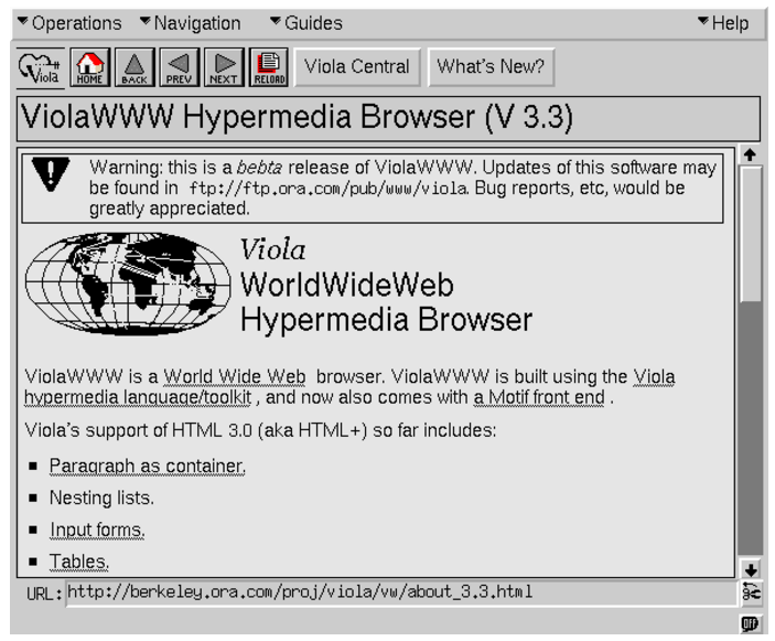
ViolaWWW browser immediately after release
Meanwhile, Andreessen, in his own Netscape Navigator browser, went the other way. Instead of creating a separate language for styling web pages, he simply expanded HTML to include non-standard tags that could be used for web design purposes. Unfortunately, it was not long before the web pages lost their semantic meaning and it looked like this:
Programmers quickly realized that such an approach would not last long. There were many alternative ideas, such as RRP, a style language that was characterized by brevity, or PSL96, a language that supported functions and conditional expressions. If you're curious to look at these technologies, read this publication by Zach Bloom, who explored ancient ways of styling web pages.
The idea that attracted everyone’s attention was first voiced by Håkon Wyum Lee in October 1994. What he proposed was called Cascading Style Sheets — Cascading Style Sheets, or simply CSS.
CSS is still alive thanks to its simplicity, especially when compared to some of its early competitors.
CSS is a declarative programming language. When we write the CSS code, we do not tell the browser how exactly it should display the page. Instead, we consistently describe the rules for the HTML document and allow the browser to render. Remember that the web was mostly built by non-professional programmers and ambitious amateurs. CSS is predictable, and, perhaps more importantly, it forgives mistakes. Practically anyone could use it. This is a feature of the language, not a lack of design.
CSS was, however, unique in one important aspect. Namely, it allowed to apply styles cascade. This feature is reflected in its name. “Cascading” applying styles means that styles can inherit and override other styles that were previously declared, following a rather complex hierarchy, which is called specificity. The breakthrough, however, was that CSS supported multiple stylesheets on the same page.
Notice the percentage in the above code snippet. This is, in fact, a very important feature. Lee believed that users and designers would set styles in different tables. Then the browser will play the role of an intermediary between these two stylesheets and resolve the “controversy” in rendering pages. This percentage shows only what “weight” is attached to a specific parameter set by the designer. The smaller this value is, the higher is the probability that it will be redefined by the user. When Lee first talked about CSS, he even showed a slider that allowed him to switch in the browser between user and developer styles.
All this caused a lot of discussion in those days. Some believed that the developer should have full control over the page. Others believed that the appearance of the page should be controlled by the user. As a result, the controversial percentages were removed in favor of more clearly defined rules regarding how some CSS styles override others. In any case, this is why there is what we call specificity.
Soon after Lee published his first sentence, he found an ally in the face of Bert Bose. Bose created the Argo browser, and, in the course of the work, his own style language, some fragments of which eventually entered into CSS. The two began working on a more detailed specification and eventually turned to the newly created HTML working group at the W3C for help.
It took several years, but by the end of 1996, the above code example changed and looked like this:
This is how CSS came about.
While CSS was still just a draft standard, Netscape already had embedded HTML presentation elements like
The situation has changed one interesting case.
When Tantek Selick joined the Internet Explorer development team for Macintosh in 1997, this team was rather small. A year later, he became the leading developer of the rendering engine, but at the same time his team was halved. Microsoft, for obvious reasons, was more interested in the Windows version of Internet Explorer, and the Macintosh team was practically left to the mercy of fate. As a result, starting with the development of version 5 in 2000, Selick and his team decided to focus on what nobody had previously done, namely, on support for CSS.
Internet Explorer
On completion of work on the 5th version of IE, the team took about two years. At this time, Selick often communicated with W3C members and web designers using the browser developed by his team. When everything fell into place, the IE development team for Mac checked, in all possible ways, the correctness of the chosen direction. And finally, in March 2002, they released IE 5 for Macintosh - the first browser with full support for CSS Level 1.
But keep in mind that in the Windows version of IE, CSS worked with errors, and a block model was used there that was distinguished by certain oddities. It was used to describe how the dimensions of the elements are calculated, and how these elements are then displayed on the screen. Internet Explorer supported attributes like
Selick knew that these differences needed to be reconciled in order to make CSS work normally. His decision came after a conversation with standards expert Todd Fahner. What happened is called document type switching and works as follows.
Everyone knows the tags of the document type declaration (
But in the old days it looked like this:
This is an example of a document type that conforms to standards. The most important thing here is
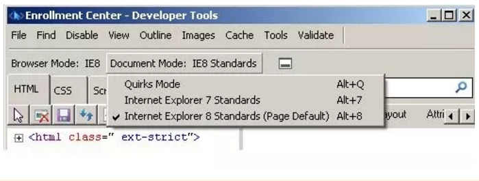
Document Display Modes
Eric Meyer, who is sometimes called the godfather of CSS, officially stated that switching the document type saved CSS. He may be right. Probably, we would still use browsers that carry the old CSS implementation errors if this simple solution had not been invented at one time.
It remains to understand one more thing. Document type switching worked well in modern browsers for displaying older websites, but not in older browsers (especially IE) for working with newer websites. Then came the so-called Box Model Hack , an ingenious solution to the problem Selick offered. The
Older browsers did not understand the
In 2001, Internet Explorer 6 came out. It eventually became the main problem for web developers, but it came with very impressive support for CSS and standards. Not to mention the fact that its market share was about 80%.
Now CSS was ready for practical work. All that was needed were web designers who would start using it.
For ten years the web has been going towards uniformity, without having a standard styling language, but this did not mean that the designers simply stopped working. Not all, at least. They relied on a bunch of browser-based hacks, on table-based layouts, and on embedded Flash files for styling pages that HTML could not provide. The standards-compliant CSS-based design was something completely new. The web needed pioneers who would pave the way for everyone else.
In those days, two large and well-known sites, with an interval of several months, have undergone a serious redesign. This is a web resource Wired and ESPN.
Douglas Bowman was responsible for the web design of Wired magazine. In 2002, he and his team analyzed the situation and came to the conclusion that no serious website yet uses CSS. Bowman felt almost a duty to the web community, to those who turn to Wired in search of the latest news from the world of high technology. He believed that the Wired site should use the latest standards in the field of HTML and CSS and pushed the team to design the site from scratch. In September 2002, they completed the work and showed the new site. He even passed the validation .
Updated Wired Website
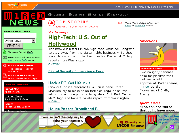
ESPN developers showed the new site in just a few months, using many of the same approaches, even if we look at everything in very general terms. These sites made a big bet on CSS, a technology that some people thought would not last long. But they won. If you ask anyone who has been working on this redesign, he will give you a list of CSS-long sheets. Among the advantages of CSS - the ability to quickly and efficiently change the design, the ability to reuse styles, and, most importantly, the fact is that CSS is great for the web. These possibilities were so fascinated by designers that on the Wired website, at the very beginning, they even changed color every day.
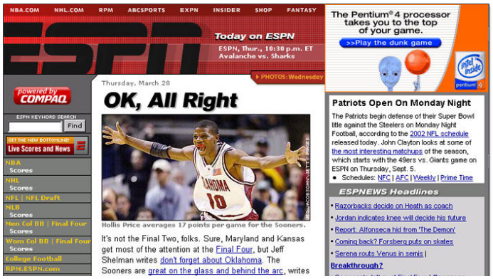
Updated ESPN site
If you dig into the code of these projects, you can find some hacks here. In those days, not many monitor resolutions were used to work with the web, so you will notice that both sites use fixed-width columns and relative and absolute positioning to arrange page elements on the screen. Instead of texts, images were often used here. However, these sites laid the foundation for the future.
The following year, namely, in 2003, Jeffrey Zeldman published the book Designing with Web Standards, which became something like a desktop reference book for web designers who want to do their work based on standards. Thanks to this book, designers could opt out of the “old school” techniques and see the possibilities of CSS. A year later, Dave Shea launched CSS Zen Garden, which suggested that designers take an ordinary HTML page and make its layout in different ways using CSS. The site has become a kind of museum of CSS achievements and played a role in bringing the idea of standards time to the web designers community.
The critical mass of CSS adoption grew slowly but surely. This language was developing, new attributes appeared in it. Browsers competed with each other in implementing the latest standards, and designers and developers added new techniques to their repertoire. As a result, CSS has become the norm. Now, without it, it is impossible to imagine web design and it seems that it has always been like this.
Dear readers! What do you like and dislike most about using CSS to style web pages?
Here is a notorious post from the archives of old mailings. It was written by Marc Andreessen in 1994. He had a hand in creating the Mosaic and Netscape browsers. In this material, Andressen notes that since there is no way to style websites using HTML, the only thing he can tell web developers who ask him questions about graphic design was: “I'm sorry, but you are.”
')
A decade later, CSS was well under way to becoming a recognized web design tool. What happened over the years?
Search for styling language
At the time of the emergence of the WWW, there were many ideas about how, in theory, you can design web pages. However, in the eyes of Berners-Lee, this was not the most important task. The fact is that his employers at CERN were mainly interested in the web as in a digital catalog in which, for example, their employees could publish their works. Instead of a certain standard, then there were several competing languages for prototyping web pages created by various developers, among whom were Pei-Yan Wei, Andriessen and Håkon Wium Li.
For example, Pei-Yang Wei created the ViolaWWW graphical browser in 1991. He has built his own style language right into the browser, trying to make this language the official standard for the web. This language has never reached such a level, but it has inspired developers of other technologies. Among these technologies could well be those who had a chance to grow to the standard level.
ViolaWWW browser immediately after release
Meanwhile, Andreessen, in his own Netscape Navigator browser, went the other way. Instead of creating a separate language for styling web pages, he simply expanded HTML to include non-standard tags that could be used for web design purposes. Unfortunately, it was not long before the web pages lost their semantic meaning and it looked like this:
<MULTICOL COLS="3" GUTTER="25"> <P><FONT SIZE="4" COLOR="RED">This would be some font broken up into columns</FONT></P> </MULTICOL> Programmers quickly realized that such an approach would not last long. There were many alternative ideas, such as RRP, a style language that was characterized by brevity, or PSL96, a language that supported functions and conditional expressions. If you're curious to look at these technologies, read this publication by Zach Bloom, who explored ancient ways of styling web pages.
The idea that attracted everyone’s attention was first voiced by Håkon Wyum Lee in October 1994. What he proposed was called Cascading Style Sheets — Cascading Style Sheets, or simply CSS.
Why do we use CSS
CSS is still alive thanks to its simplicity, especially when compared to some of its early competitors.
window.margin.left = 2cm font.family = times h1.font.size = 24pt 30% CSS is a declarative programming language. When we write the CSS code, we do not tell the browser how exactly it should display the page. Instead, we consistently describe the rules for the HTML document and allow the browser to render. Remember that the web was mostly built by non-professional programmers and ambitious amateurs. CSS is predictable, and, perhaps more importantly, it forgives mistakes. Practically anyone could use it. This is a feature of the language, not a lack of design.
CSS was, however, unique in one important aspect. Namely, it allowed to apply styles cascade. This feature is reflected in its name. “Cascading” applying styles means that styles can inherit and override other styles that were previously declared, following a rather complex hierarchy, which is called specificity. The breakthrough, however, was that CSS supported multiple stylesheets on the same page.
Notice the percentage in the above code snippet. This is, in fact, a very important feature. Lee believed that users and designers would set styles in different tables. Then the browser will play the role of an intermediary between these two stylesheets and resolve the “controversy” in rendering pages. This percentage shows only what “weight” is attached to a specific parameter set by the designer. The smaller this value is, the higher is the probability that it will be redefined by the user. When Lee first talked about CSS, he even showed a slider that allowed him to switch in the browser between user and developer styles.
All this caused a lot of discussion in those days. Some believed that the developer should have full control over the page. Others believed that the appearance of the page should be controlled by the user. As a result, the controversial percentages were removed in favor of more clearly defined rules regarding how some CSS styles override others. In any case, this is why there is what we call specificity.
Soon after Lee published his first sentence, he found an ally in the face of Bert Bose. Bose created the Argo browser, and, in the course of the work, his own style language, some fragments of which eventually entered into CSS. The two began working on a more detailed specification and eventually turned to the newly created HTML working group at the W3C for help.
It took several years, but by the end of 1996, the above code example changed and looked like this:
html { margin-left: 2cm; font-family: "Times", serif; } h1 { font-size: 24px; } This is how CSS came about.
Browser problem
While CSS was still just a draft standard, Netscape already had embedded HTML presentation elements like
multicol , layer and the dreaded blink tag. When working on Internet Explorer, on the other hand, it was decided to include some CSS features in it. However, their support was unstable, and, at that time, full of errors. This meant that in the early years, after CSS had been playing the role of official recommendation for five years, there were still no browsers with full support for CSS.The situation has changed one interesting case.
When Tantek Selick joined the Internet Explorer development team for Macintosh in 1997, this team was rather small. A year later, he became the leading developer of the rendering engine, but at the same time his team was halved. Microsoft, for obvious reasons, was more interested in the Windows version of Internet Explorer, and the Macintosh team was practically left to the mercy of fate. As a result, starting with the development of version 5 in 2000, Selick and his team decided to focus on what nobody had previously done, namely, on support for CSS.
Internet Explorer
On completion of work on the 5th version of IE, the team took about two years. At this time, Selick often communicated with W3C members and web designers using the browser developed by his team. When everything fell into place, the IE development team for Mac checked, in all possible ways, the correctness of the chosen direction. And finally, in March 2002, they released IE 5 for Macintosh - the first browser with full support for CSS Level 1.
Switch document type
But keep in mind that in the Windows version of IE, CSS worked with errors, and a block model was used there that was distinguished by certain oddities. It was used to describe how the dimensions of the elements are calculated, and how these elements are then displayed on the screen. Internet Explorer supported attributes like
border or padding , but the space for them was allocated inside the element. At the same time, the official CSS specification suggested that these values be added to the width and height of the elements. The same was done in IE 5 for Mac. If you ever experimented with box-sizing , you know for sure what the difference is.Selick knew that these differences needed to be reconciled in order to make CSS work normally. His decision came after a conversation with standards expert Todd Fahner. What happened is called document type switching and works as follows.
Everyone knows the tags of the document type declaration (
doctype ). They are located at the very top of the HTML documents: <!DOCTYPE html> But in the old days it looked like this:
<!DOCTYPE HTML PUBLIC "-//W3C//DTD HTML 4.0//EN" "http://www.w3.org/TR/REC-html40/strict.dtd"> This is an example of a document type that conforms to standards. The most important thing here is
//W3C//DTD HTML 4.0//EN . When a web designer adds this to his page, the browser knows that the page needs to be rendered in standard mode, and the CSS will conform to the specification. If there is no doctype tag, or it is outdated, the browser will switch to the compatibility mode (quirks mode) and will render the page in accordance with the old block model, with all its flaws remaining in its original form. Some developers specifically, for the sake of using the old block model, installed the appropriate type of document.Document Display Modes
Eric Meyer, who is sometimes called the godfather of CSS, officially stated that switching the document type saved CSS. He may be right. Probably, we would still use browsers that carry the old CSS implementation errors if this simple solution had not been invented at one time.
Hack for block model
It remains to understand one more thing. Document type switching worked well in modern browsers for displaying older websites, but not in older browsers (especially IE) for working with newer websites. Then came the so-called Box Model Hack , an ingenious solution to the problem Selick offered. The
voice-family CSS attribute that was almost never used was used here in order to trick browsers and allow multiple values of width and height to be used in the same class. Selick suggested that developers first set the width that was used when using the old block model, then close the tag using voice-family , and then give the width for the new block model. It looked like this: div.content { width: 400px; voice-family: ""}""; voice-family: inherit; width: 300px; } Older browsers did not understand the
voice-family tag, but accepted the string as its definition. As a result, by adding an additional bracket, older browsers simply closed the CSS rule block before they even got to the second width setting. This approach was simple and effective, and allowed many designers to quickly begin experimenting with new standards.Pioneers of standards-based design
In 2001, Internet Explorer 6 came out. It eventually became the main problem for web developers, but it came with very impressive support for CSS and standards. Not to mention the fact that its market share was about 80%.
Now CSS was ready for practical work. All that was needed were web designers who would start using it.
For ten years the web has been going towards uniformity, without having a standard styling language, but this did not mean that the designers simply stopped working. Not all, at least. They relied on a bunch of browser-based hacks, on table-based layouts, and on embedded Flash files for styling pages that HTML could not provide. The standards-compliant CSS-based design was something completely new. The web needed pioneers who would pave the way for everyone else.
In those days, two large and well-known sites, with an interval of several months, have undergone a serious redesign. This is a web resource Wired and ESPN.
Douglas Bowman was responsible for the web design of Wired magazine. In 2002, he and his team analyzed the situation and came to the conclusion that no serious website yet uses CSS. Bowman felt almost a duty to the web community, to those who turn to Wired in search of the latest news from the world of high technology. He believed that the Wired site should use the latest standards in the field of HTML and CSS and pushed the team to design the site from scratch. In September 2002, they completed the work and showed the new site. He even passed the validation .
Updated Wired Website
ESPN developers showed the new site in just a few months, using many of the same approaches, even if we look at everything in very general terms. These sites made a big bet on CSS, a technology that some people thought would not last long. But they won. If you ask anyone who has been working on this redesign, he will give you a list of CSS-long sheets. Among the advantages of CSS - the ability to quickly and efficiently change the design, the ability to reuse styles, and, most importantly, the fact is that CSS is great for the web. These possibilities were so fascinated by designers that on the Wired website, at the very beginning, they even changed color every day.
Updated ESPN site
If you dig into the code of these projects, you can find some hacks here. In those days, not many monitor resolutions were used to work with the web, so you will notice that both sites use fixed-width columns and relative and absolute positioning to arrange page elements on the screen. Instead of texts, images were often used here. However, these sites laid the foundation for the future.
Results
The following year, namely, in 2003, Jeffrey Zeldman published the book Designing with Web Standards, which became something like a desktop reference book for web designers who want to do their work based on standards. Thanks to this book, designers could opt out of the “old school” techniques and see the possibilities of CSS. A year later, Dave Shea launched CSS Zen Garden, which suggested that designers take an ordinary HTML page and make its layout in different ways using CSS. The site has become a kind of museum of CSS achievements and played a role in bringing the idea of standards time to the web designers community.
The critical mass of CSS adoption grew slowly but surely. This language was developing, new attributes appeared in it. Browsers competed with each other in implementing the latest standards, and designers and developers added new techniques to their repertoire. As a result, CSS has become the norm. Now, without it, it is impossible to imagine web design and it seems that it has always been like this.
Dear readers! What do you like and dislike most about using CSS to style web pages?
Source: https://habr.com/ru/post/341832/
All Articles