How to impose service metrics and not screw it up
My name is Evgeniy Zhirov, I am a developer in the Kontur.Extersna infrastructure team. This post is a text version of my report from a recent Perm Tech Talks mitap.
We have 200 microservices in our team, which should be fault tolerant so that users do not notice any problems. And problems, of course, arise. Therefore, we collect metrics to know how things are for specific services and for the system as a whole. Metrics help in time to react and fix everything.
Metrics can be collected, stored and visualized. And there are many ways to collect metrics wrong, draw with errors and make wrong conclusions.
I will talk about a few examples from my work and share tips.
What are metrics?
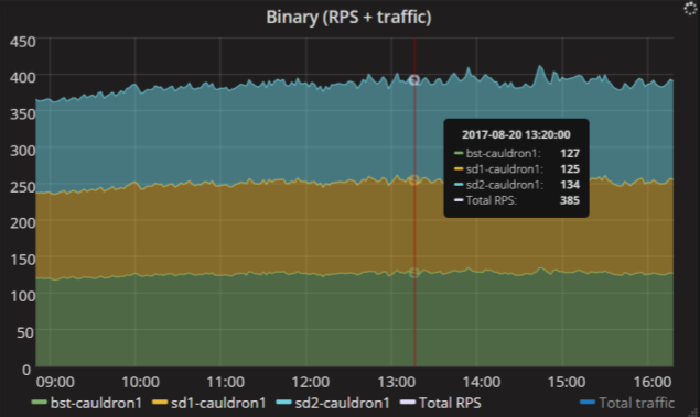
Requests.count.byhost. * Metric
Quantitative metrics. The simplest metric for any web service is the number of requests that fly into it per unit of time. Usually this metric is called RPS, requests per second.
Here is an example. This service has three replicas, and a total of nearly 400 requests per second fly into them. This schedule is very simple, but gives a lot of information. It can be seen that the load is evenly distributed over the replicas of the service, each replica receives approximately an equal number of requests. So, with the balancers settings, everything is in order.
Intervals of time. These are more interesting metrics. Usually they are displayed in percentiles. For example, this graph reads like this: 99% of search requests are executed faster than 25 ms; and 95% of requests are faster than 3 ms.
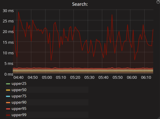
Metric client.requests.search.latency. *
System metrics. This is a separate class of metrics. They are not associated with the application itself, but allow you to diagnose the state of the resources it uses.

Metric system.loadavg. *
On the graph, the metrics of one of the Cassandra clusters is the load average divided by the number of processor cores. It is possible to determine from them whether our cluster subsides on the CPU and whether it is necessary to add more hardware. Here we see that now the value is about 12% and while the CPU is enough.
You can also see the load profile on the graph. Here day, night, again the daily peak of activity and decline in the evening. It is important to know when the application has a peak load. It often happens that the application is not loaded on average, and then 10,000 requests arrive at it, and everything slows down.
Why do we need metrics?
Metrics are our “eyes”. Without metrics, it is impossible to judge the load, performance, and fault tolerance of the application.
- You can quickly respond to problems. An alert is posted on each graph, and when the value exceeds a predetermined threshold, a notification arrives.
- You can watch how the cluster copes with the load and add iron in time.
- You can compare the graphs of application performance before and after release.
How to start collecting metrics?
Suppose you write under .NET. Search the Internet for “metrics for .NET apps” and get a lot of open source libraries: for example, Metrics.NET or the App Metrics . They help collect application metrics.
To store collected metrics, you need a database. And to draw graphs - an interface for visualizing metrics. We in Contour use the conventional Graphite and Grafana .
You configure everything, deploy your application, but once you realize that you screwed up. For example, could not foresee a breakdown. Or just do not understand what the numbers you collect mean. Here are some examples from my work.
Example 1. Cargo programming
All stories start the same way. In the morning, at about 2 pm, I come to work. I look at the graphics and suddenly I see errors from my favorite service.

Huge rush! Although not. The peak height on the vertical axis is only 4 × 10 –17 errors per minute. In this case, the service is OK, the logs are clean. Begin to understand.

I look what happened with the service 15 hours ago. Here the peak is bigger and the values are more adequate. But which metric is displayed on the graph? Errors per minute. Just think: 0.4 errors per minute. This is a little strange, because the application sends the number of errors every minute. It must be an integer: 0, 1, 2 or 100, but not 0.4. There is something wrong here. As often happens at the first meeting with something strange, I decide to ignore. I go on to write code.
True, the problem does not let go and pursues on other graphs.

Here is a chart with a read and write time in Cassandra. Blue lines - write errors to the database. These metrics are not even sent by my code, but by Cassandra itself. It turns out that at 10:10 the mistakes began and ended at 10:35. As many as 25 minutes, Cassandra did not work.
And how many minutes was the problem really? Here are the client metrics, that is, the metrics of the services that write to this database. A completely different picture: in one minute there were 50 thousand of failed entries, and then everything became good again.

When something happens in the second, third, fourth time - it's time to figure out what's going on. What is the easiest way to do? Need a laboratory experiment. We write a trivial counter that counts the number of events thread-safe, and then in an infinite loop sends the value to Graphite and sleeps a minute.
class Counter { private long value; public void Add(long amount) { Interlocked.Add(ref value, amount); } public void Start() { while (true) { var result = Interlocked.Exchange(ref value, 0); SaveToStorage(result); Thread.Sleep(1000 * 60); } } } We write two tests. In one we use our Counter, which works in an understandable way. In the other, we use a counter from a popular library. In my case, this is Meter from Metrics.NET, it has a similar interface.
What is the load? Let 2 minutes be 10 RPS, then within 10 seconds - 100 RPS, and then again 10 RPS within 2 minutes. Here is the schedule:

The green line is what actually happened to the service. And the yellow one is what the popular library gives. Not very similar.
What's going on here? Exponential smoothing .
Here is another example. For the real value of the metric 100, 54 is obtained by weighted addition of all previous points. The coefficients decrease exponentially, and a strange smoothed value is obtained.
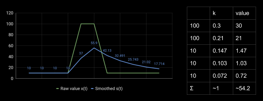
We want to measure the number of requests per second or the number of errors per minute, but we get some strange values. It's a shame that this behavior exists in many popular libraries for collecting metrics for .NET and Java. Changing it is quite difficult.
What reason? I think it's about cargo programming, when developers use a certain technology or write code in a certain way, because grandfathers did it this way. The original causes are forgotten, but everyone continues to do that, because everyone does that.
When calculating web service metrics, exponential anti-aliasing only interferes. It does not allow you to see the exact values, lies in the peaks and gives a long tail, which leads to false alarms alerts. It hides the real profile of the load, because instead of one peak we see a completely different figure, which then fades another 15 hours.
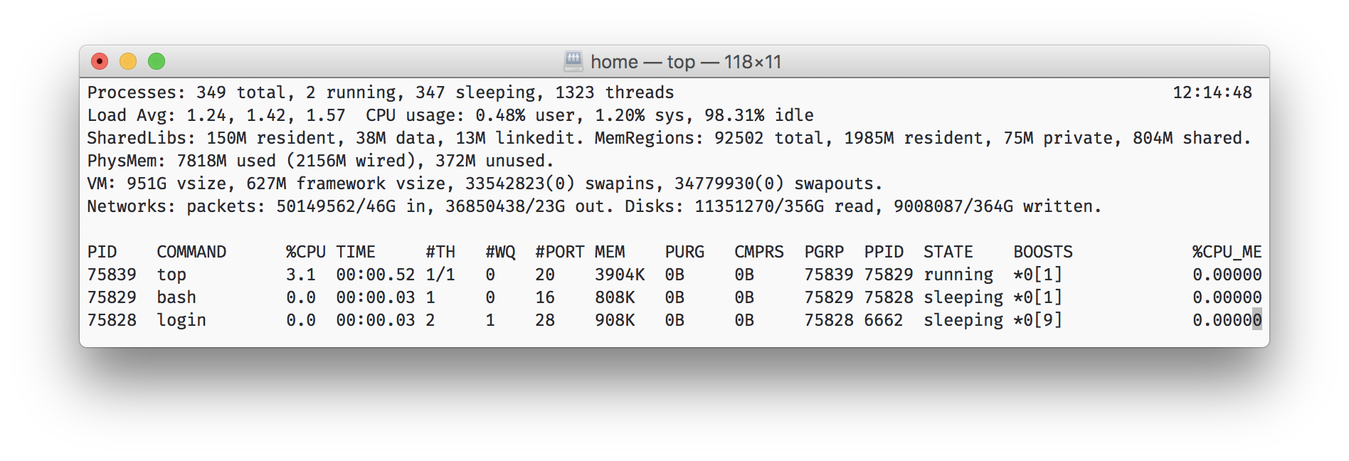
Surely many of you have seen the top utility in * nix. It shows the three numbers of the load average (for 1 minute, 5 minutes and 15 minutes), smoothed in a similar way. They can not be judged on the exact value, but the trend is clearly visible. For example, you can see that in 15 minutes the CPU load has seriously increased. Here smoothing helps, because with it the noisy metric changes smoothly, and does not dangle from 0 to 100.
Example 2. Consolidation
There are also problems with the visualization of metrics.

I come back to work, I look at the charts. Here is the 95th percentile of search time. It is seen that in the morning the search slowed down: 550 ms at one of the points, there are other peaks. Maybe this is the normal behavior of the service? We need to change the scale and see how many such peaks were in a week.
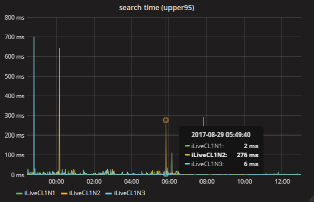
There are also many peaks here. But the same one, at 6 in the morning, changed its meaning! Now 276 ms. How can this be?
The reason for the point merger strategy is to consolidate by to Graphite. When you change the time scale and all points do not fit on the screen, Graphite combines them using the selected function. There are different, but by default it is the average, which is bad for this chart. Usually, in the case of percentiles, the maxima are of interest, sometimes you want to take the sum.
If you forget about the consolidation of points, choose the wrong function or leave the default one, it is easy to draw wrong conclusions from the graphs.
Example 3. Charts lie
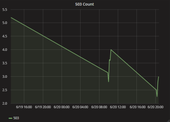
Again I come to work, open the schedule, and everything is quite bad there. Already 24 hours the service consistently returns 503 errors every minute. What is the problem here? It is very simple and fun: just not enough data to render.
In Graphite there is a setting on how to connect the points on the graph, if at some time there was no data. If you choose mindlessly, it is easy to make a wrong conclusion. In fact, there were only a few mistakes in a couple of cases.

What to do? Write zeros to the metrics if there were no errors, or use another type of graph, for example, bars.
Example 4. The physical meaning of metrics
It is known that applications work with RAM. If the application has allocated a lot of memory and can not allocate even more, it begins to fall with strange errors.
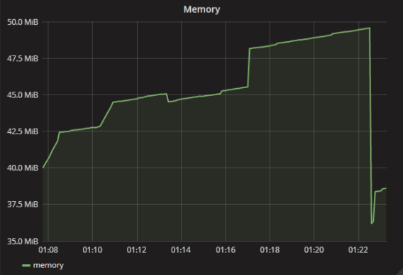
In my case, one of the applications began to fall due to the access violation. I realized that the reason was in the lack of memory, but by the metrics everything was fine - think about it, 40 MB, that's okay.
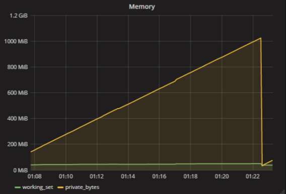
In fact, of course, there is no such metric - “how much memory the application uses”. There are many metrics for RAM. For example, each process in Windows has a working set and private bytes . If roughly, a working set is the amount of used physical memory, and private bytes is how much memory the application has allocated at all. An application may have a lot of data in the paging file, but almost nothing in physical memory. The application will be bad and it will fall apart.
We must remember that there are no such simple metrics as "memory" or "processor load". There are more metrics and they all mean something specific.
findings
- You need to understand what you are measuring. If you just measure "memory", then the values obtained will mean practically nothing.
- You need to understand how the tools work. For example, remember that the library for collecting metrics will do exponential smoothing, and the database will consolidate the points according to some algorithm.
- You need to think if the metrics do not correspond to other data (for example, logs) or the observed behavior of the system. You can not pass by. If you cannot explain the discrepancy, then the resulting metrics are useless for you.
How do you collect and visualize metrics? What difficulties with collecting metrics and their mapping did you have?
')
Source: https://habr.com/ru/post/341326/
All Articles