And you are not too hurried to expel the "hamburger" from your application?
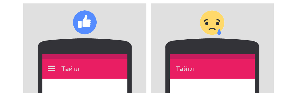
Hey. We all see what happens with the navigation in the applications - the usual "hamburger" is replaced with the lower tabbar. Personally, it bothered me when it happened to my frequently used programs: Pocket, Skype, Youtube, and more recently, VK.
It seems that with this tabbar everything should be fine. But something happened. Last night, my friend and I sat and talked, we were talking about phones, and then she suddenly said:
she : did you, by the way, see what VK turned into?
i : hmm ... what do you mean?
she : yes there is now some kind of bjaka. I therefore do not update it. ( shows on his iPhone his usual old-style navigation menu )
I : lol, well, you do it right.
You know, it surprised me a little. We are used to reading similar reviews in the play-market / eppstore, but not live. I thought that this is a sufficient reason to think about the situation. Under the cut a little thought on this topic.
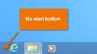
All this reminded me of the situation with the "Start" button in Windows. In the eight it was removed, and from version 8.1 returned to its rightful place. You probably understand why this happened? Yeah, right, because users, to put it mildly, did not like it. They got used to this element and began to experience discomfort when it disappeared.
For the same reason, people got used to the side main menu over time. After seeing it for the first time, a person quickly remembers that all basic functions can be found there. The hamburger button itself was criticized for the unintuitiveness of the icon, as well as the gesture of pushing down the menu with your thumb from the edge of the screen. But then again - both the one and the other need to get used only the first time, after which a solid user experience is developed.
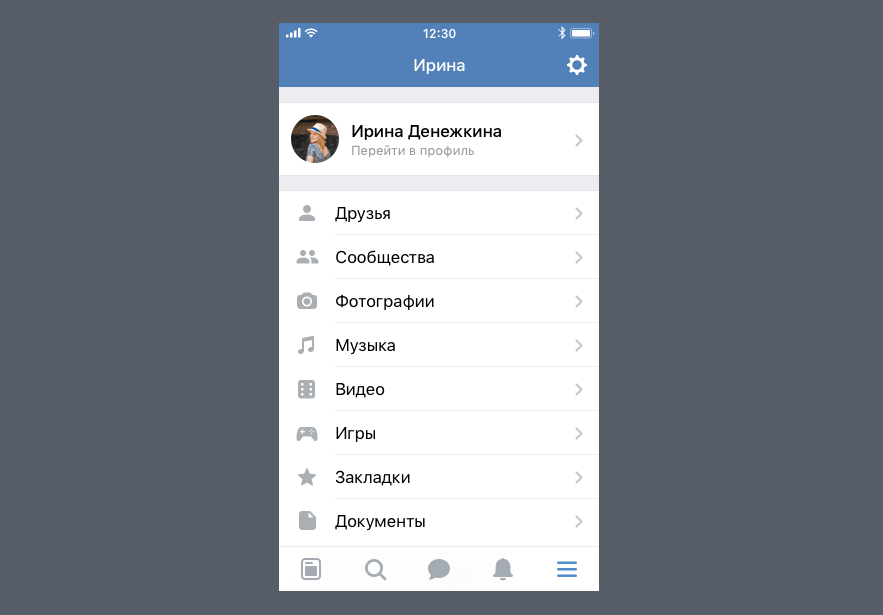
Now back to the VC and consider the navigation on his example.
About navigation redesign
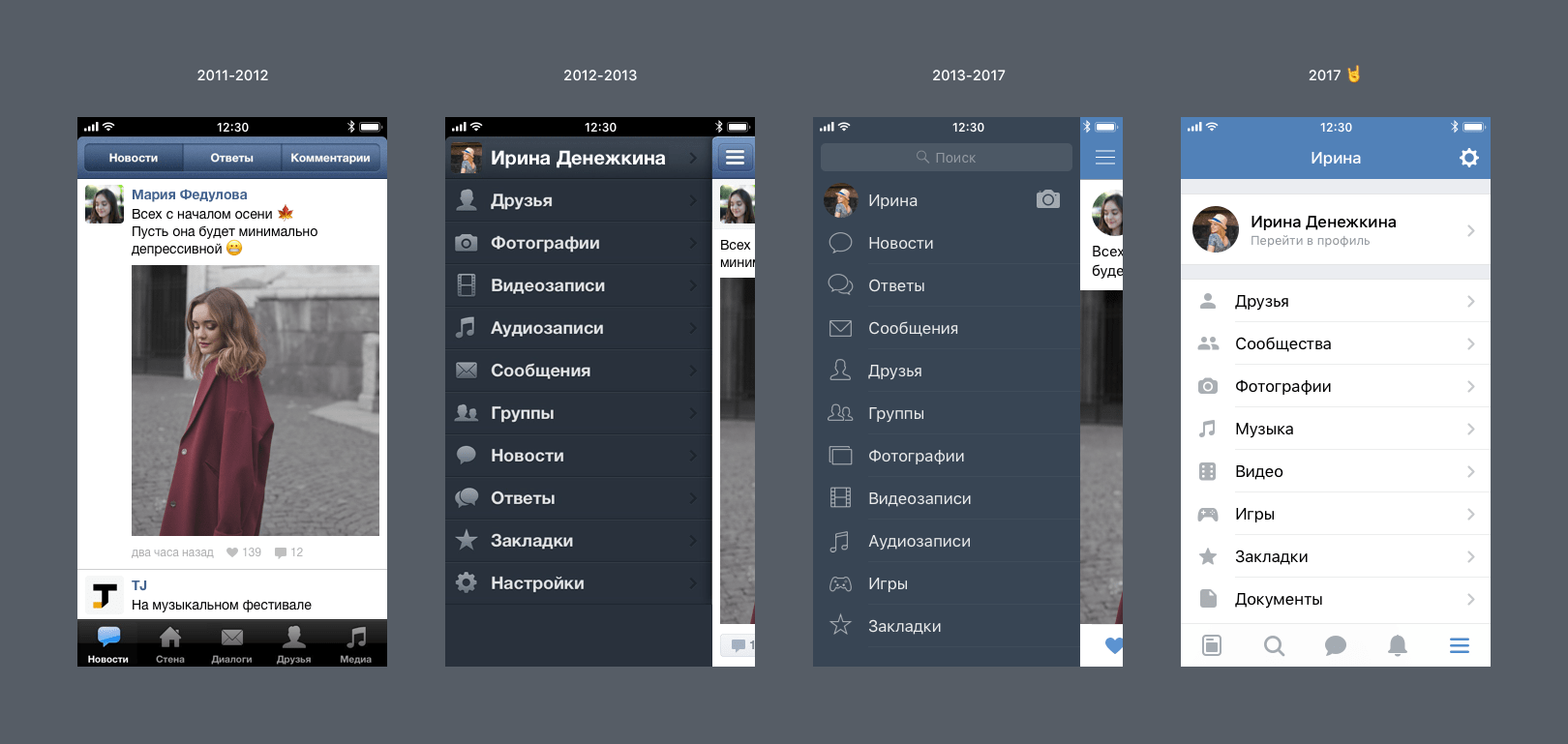
VK developers laid out a post about the last redesign of the application and the post, I think many have seen. There everything is described in detail, in particular, about the decision to replace the side menu with tabbar. For convenience, here is a picture of the evolution of the application interface in terms of navigation:
In general, everything is clear - introduced tabs, which are easier to reach, and at the same time simplify access to frequent functions, i.e. instead of two tapes on the "Hamburger" screen -> "Messages", now you only need one tap on the message icon. It's comfortable.
But now consider the nuances.
New design issues
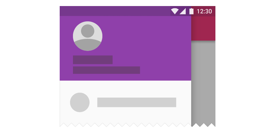
Tabbar fits up to 5 icons. And the remaining items are now transferred to a separate screen, which is called by the last button of the tabbara:
What are the main disadvantages of this solution?
- The most important thing : complete lack of continuity and ignoring, thus, the habits of the user that have been formed for a long time.
- The button for opening the main menu takes place on a new tabbara where something more useful could be placed
- The menu has already become completely modal, and modality is bad for the same reason that Caps Lock is worse than Shift
Ok, but what could be done differently?
Solution: old sidebar plus new tabbar
In this case, Tabbar seems to me convenient, but not capable of assuming the role of the main element of navigation. In this case, it is just a shortcut-panel - that is, a placeholder for shortcuts.
If we consider tabbar in such a role, then it would be possible to realize in the settings the possibility of its customization, so that the user could set himself what labels to put on the panel. Of course, the default tabbar will be configured, for example, as it is now. And besides, you can make available the choice of the "classic" profile, where the tabbar is not shown at all, and all its items, as before, are in the side menu.

And the side menu could be left in the same place. Moreover, there was and is a place for the menu icon on the upper title bar and the user, thus, there will be no feelings - “pancake, where is the button ... was it here ?!”.
If the former side menu will simultaneously exist with the lower tabbar, then the question arises: can menu items be duplicated in both places? Actually, duplication anywhere is still bad, so no. As soon as the main menu item falls into the bottom panel, it is removed from the sidebar, respectively.
Instead of conclusion
Developers and application designers often change something, experiment with interfaces, and this is certainly good for us - the users. But I do not like the changes that are caused more by fashion, the trends that are set by the giants of the industry (Google and Apple, in particular).
More recently, it was believed that small teams have an advantage over corporations - greater flexibility, independence, the ability to better feel user needs. And I would like to believe that this is true today.
')
Source: https://habr.com/ru/post/341234/
All Articles