UX design: 50 things you probably forgot to do
"I'm not angry, I'm just disappointed."
- PM

Sometimes the application seems simple, minimalistic and concise, but it is easy to lose sight of how many screens, molds, buttons, windows and other small things lead to this perception of ease and ease of use.
')
We present you a checklist of 50 points for self-testing. Here are approximate subsections:
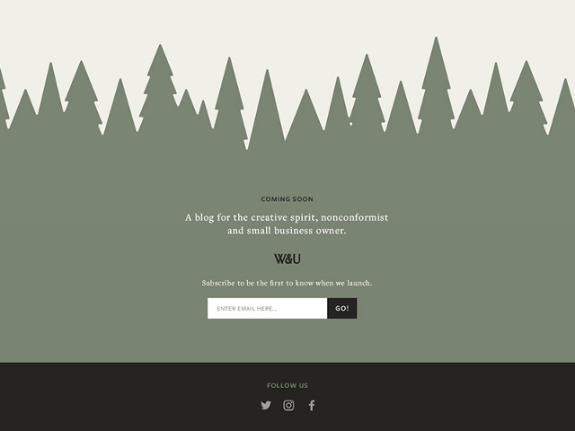
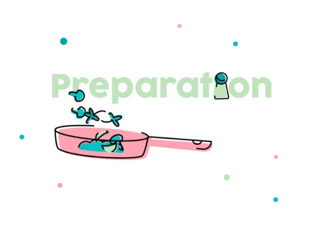
1. Screensaver
The screen that appears when you start a mobile application or when you log into the web application and everything loads.

Here is a beautiful version from James Jackson.
2. Stream of forgotten passwords
Was it “abcd1234” or “1234abcd"? This is important. Don't forget about it.

Majo Puterka does not leave its users locked up near the house in the rain.
3. Page "Thank you for registration"
This screen usually appears after a user creates an account and asks for confirmation of an email address.

What's next? Ask Haley Cattlin.
4. Welcoming the letter
This is an opportunity to create a first impression and set the tone for communication with users. Take this into account.

I really like it. Brian Golatka.
5. Terms of Service and Privacy (ugh)
Help people act within the law.
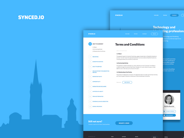
I really appreciate how Marco Prlich tried to make the conditions and privacy more accessible.
6. Onboarding, first user contact
There are a bunch of different ways that you can use. Here are five of my favorites onboardibg .
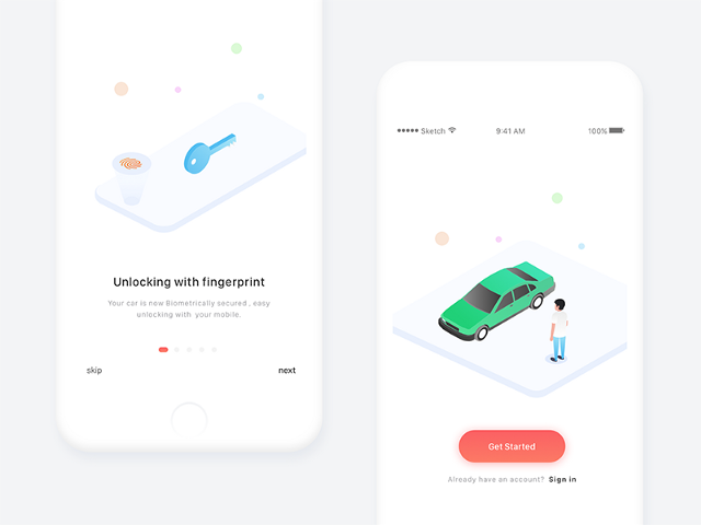
Amazingly helpful, MuNa.
7. Hint if the user forgot something
It's like moving into a house without furniture. Looks pretty empty, huh? Help users push in the right direction. “Put a sofa here.”

I feel that Veli-Johan Veromann loves superheroes.
8. Reference Documents
If this is a big commercial project, then probably there is a whole team for it. But they still continue to receive screenshots of bugs. This deserves as much (or more) effort as for the login page or feed.
Maya Gao is very helpful. Be like Maya.
9. Standard user interface Image / Avatar
Signing up with social accounts or services such as Gravatar really helped us show your smiling faces, but you still get the guy who never wants to upload a profile photo. Give him some beauty and showcase the brand.

Hermes Strange does cute stuff. These are cute avatars.
10. Exit Button
Unfortunately, you must allow users to log out. Just imagine that they use your application in the public library, and they need to log out so that some stranger does not change the account name to “Mr. Butts.
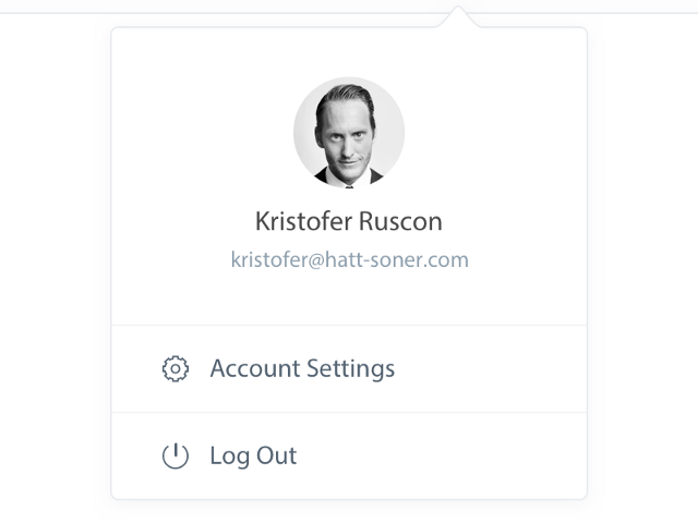
I guess Christopher probably stole Henrik's lunch money. Let him come out and leave the stage.
11. Application Footer
Most of the time, I think the pages can go on forever, just as people believed that the world was flat, and just kept going. Note: Earth is not flat.
Ash Schweitzer may be lost somewhere in the forest. Someone will help her.
12. Favicon (browser icon)
You know ... that little icon that appears on the browser tab. I constantly lose tabs with Medium, because the icon is no longer green. But it is beautiful.

Michael Flarup created an awesome icon template you can download.
13. 404 page
Rizwan stuck in this hole. Go help her.
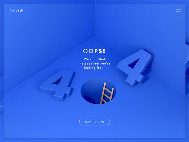
[ Great article on Habré about 404 pages ]
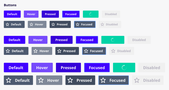
14. The default state of the button / when hovering / focus / when you click / off / etc.
Ugh, so many states. “Focus + Guidance” could be my favorite / unclear. The screenshot below is taken here: UX Power Tools Design System .
15. The order of transition by pressing Tab
The transition order is a special feature that allows users to navigate to the page using the Tab key. I could not find an image to show this, so I took a screenshot of the 2007 Christian Beck specification, where it defined the tab rules for each user interface control in the table. In fact, you can determine the order in which the elements are visited in order to prioritize, which is primary, which is secondary. This is not an easy design task.
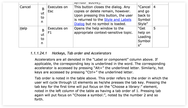
Days of writing 80-page specifications and the development of the method of "Waterfall . "
16. Behavior when scrolling
Not only where and how it scrolls, but what actually scrolls. Is the title fixed? Footer?

Peter Blazy, it looks smooth. Cool.
17. Intercom button
I mean the least you can do is make color combinations in your application.
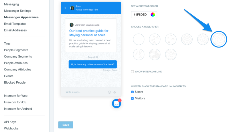
Easier than Doshirak brew.
18. Page Numbering Buttons
I assume that you will not make an infinite scrolling. The user needs a way to get to page 27.
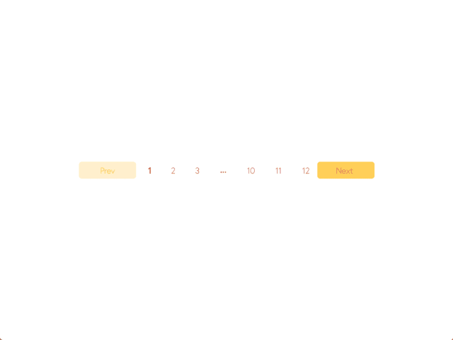
Boronda did a good job. I love this yellow, Borunda.
19. Cursors
Buttons must have cursors. Non-interactive material should have a default cursor. The text must have a text cursor. Developers do not always know it. I just saw an application the other day, where when you hover over a button there was a text cursor. Oh my God.
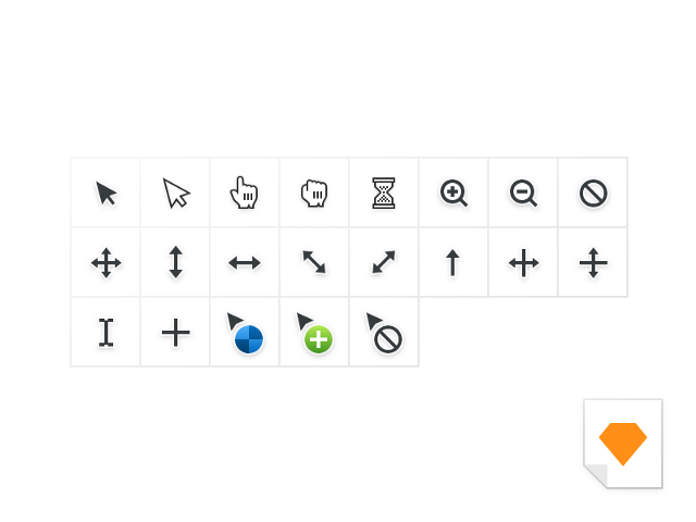
Jeff Broderick likes to push things. He also made a freebie.
20. Sort / filter table / search engines
There should be a faster way to get to the ZZ Top in the Bands with Beards data table.

21. Empty states “without results”
Sometimes you will search for something or add too many filters and you will not get any results. How sad. Cheer your users with cheeky illustrations. Or your bank account and route number.
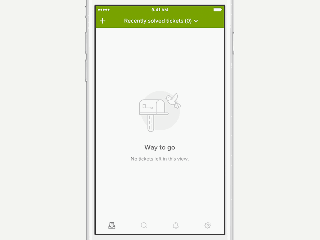
Rainer Wendland tried everything for Zendesk.
22. Error status
Invalid input. Wrong password. Existing account. Too many things selected. There are many options when something can go wrong, especially if you are a grandmother and you got an iPad for Christmas. It was a mistake.

Mike Stozicki really made me think that the letter was sent.
23. System alerts
The system always does something in the background, and sometimes it's nice to know when everything ends successfully (or not). You should definitely inform the user about this.
This is taken from the Google Inbox. “Cancel” is really convenient when you “accidentally” delete a letter from your mom.
24. Empty auto-complete dropdown list
Autocomplete cool if it helps you find something, but sometimes there are no results. In this case, you do not need to show an empty window. Show a small message, or let users do something.

Apparently, Jurrian van Drunen no longer has a “Bra” in his contacts. This is probably for the best.
25. Boot Status
People will use Tinder` on their phones while the page is loading, but if they are really waiting and watching, there must be some kind of visual indication that the material is still loading.
Not the best form , XPLAI . Keep practicing. But it is still painfully delightful.
26. Devil application icon
Yes, probably, it is better not to forget about it.

27. Image for App Store

Daniel Beer did not forget to make an image for the App Store. Give me five, man.
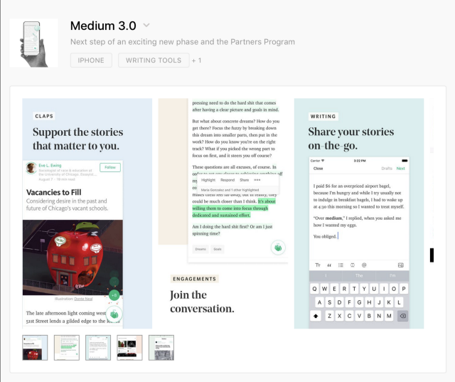
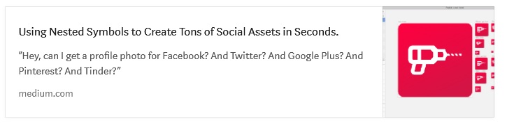
28. Picture for social networks and Open Graph
This is the image that appears when you link to Twitter, post to Facebook, post to Medium, etc.

Here is how it looks on Medium:

29. Picture for Website Marketing
Everyone wants to be like Stripe, so stupidly copy:

30. Images for Sales Deck
Sales deck - "this is a set of slides with infographics and selling content."
You may have to give up a lot and clear the content to look like a brand making deals for 6-digit amounts.

31. Pitch Deck Images
As an image for a sales deck, but a bit more far-sighted. I mean ... you are trying to raise money. You will understand later.
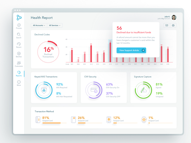
Here is a trade secret, always put dashboards in your deck. It is not joke.
32. Images for Product Hunt
Hey, they just updated the profile pages.
33. Facebook / Twitter Advertising Images
“But we have no ads on Facebook.” Ha, until it appears. And then no one will tell you. Just make the pictures in advance and you will be calm.

34. Profile images in social networks
Yes, you must do one thing for all 938 social networks. Fortunately, we made the Sketch tool to speed it up for you. Welcome, kids.
35. Email banner

Triple dots / commas ( approx. Per billion hint), if you make it an illustration.
^ By the way, this is a distribution of my agency and my colleagues write some really outstanding content.
Here are some recent favorites:

36. Notification Settings
Cool when apps tell you when something happens, even cooler when alert with sound. But after the 19th time, you're really tired of the alerts. You should probably let the user decide when to turn off the sound.

Slack did not become a company worth $ 8 billion, scoring on notification settings. Nailed it.
37. Billing page
Do not forget that people should receive copies of their bills for a product for which they pay you thousands of dollars. And some create an idiotic IT department for their agency and cannot understand how hard it is to look for it ... every ... month .

I don't know what that means, but getting here was easy.
38. Option "Delete my account"
Yes, yes, I know. No one does. But maybe they will again create a new account? As we say to the seller: "I will come back later and buy three." Well, yes, of course.
But there are legitimate reasons that are positive. I deleted the accounts, as I combined into a large team license. I deleted old accounts that collected dust, and I wanted to start from scratch. In any case, it is a good tone to maintain.

Shhh, Mr. President, you can disable your account here.
39. Tool for cropping profile pictures
This is a nightmare for most applications, but can be done by the mind.
40. Option / stream "Update my account"
It is terrible to think how difficult it is for many SaaS products. Shut up and take my money. Shouldn't it be easy? This should be easy.
The buffer has a menu item for updating, a fairly simple form. You have my money.
41. Flow "Change my address"
When you get a luxurious new apartment in the city center and you have to change your address on every credit card you have ever had.
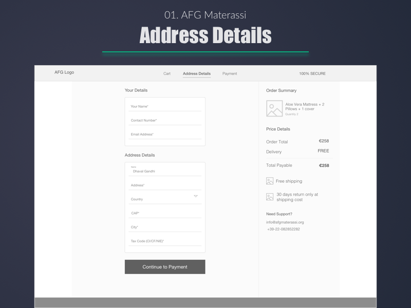
Dhaval S. Gandhi wants to make sure his Aloe Vera is sent to the right place.
42. Add Credit Card Flow
Some people (like me) like to store about a hundred credit / debit cards in a file so that thieves have many accounts to choose from. Therefore, simplify the addition of maps. That's all I have to say about this.

43. Stream "bulk add"
It's one thing to quickly add an object to the system, but it's quite another to make it so that you quickly add a group of objects to the system.
Please, sir, allow more?
44. Stream "Creating a custom filter"
If you have a complicated filter system, it might be a good idea to add the ability to save the filtering profile for later. You no longer need to click a million times.
Oykun Yilmaz can take this step further by allowing the user to save this filter. Do it, Oykun.
45. Feed "Add to cart"
It's funny, but there are people who forget about this stream. It's me.

Apparently, Alberto Conti needs 4 chairs, 4 bedside tables. It must be a big house ...
46. Share Stream
Sharing has become commonplace, but not the fact that you have a ready option. This is a reason to do development.

Tomek Kvyatkovsky really knows how to become social.
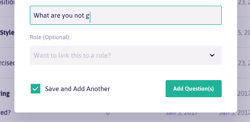
47. Thread "Create from existing"
It's kind of like “create a copy + edit” all in one action. The user can start from the existing version and improve it as necessary.
Kyle Johnston writes many scripts. Maybe secretly Christopher Nolan?
48. Stream "Invite someone"
There is no better way to add “virality” to your product than through invitations and sharing. Take an example with Dribbble .
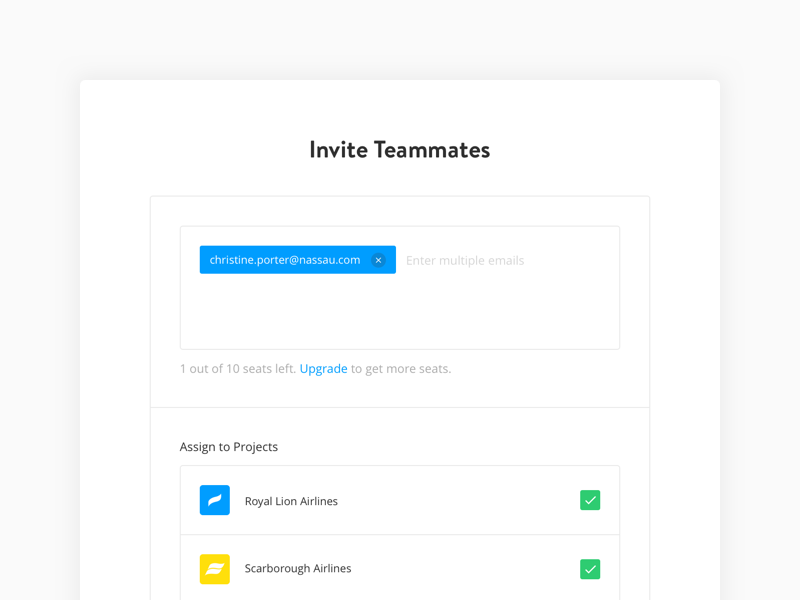
I think Paula Pintarik and Kristina are going on a voyage. Or they work on a project and watch how other people fly. This is even worse.
49. Stream "Change user permissions"
Do you know this guy Greg? Do you know how he perverts everything that concerns? Yes, you can revoke some of Greg's privileges so that he does not remove the integrity of the Internet. Silly Greg.

Matt Schwer, on the other hand ... much less annoying than Greg.
50. Stream "Delete and Restore"
Sometimes you delete something super important and you need to restore it immediately.
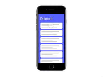
Eric Tsai understands that we are all wrong.
51. Maybe we forgot something? Write in the comments.
The translation was made with the support of EDISON Software , which professionally develops PHP applications and websites for large customers, as well as developing cloud services and mobile Java applications .
- PM
Sometimes the application seems simple, minimalistic and concise, but it is easy to lose sight of how many screens, molds, buttons, windows and other small things lead to this perception of ease and ease of use.
')
We present you a checklist of 50 points for self-testing. Here are approximate subsections:
- Login and registration
- First experience
- Important details
- Launch
- Profile
- Mad flows
Login and registration
1. Screensaver
The screen that appears when you start a mobile application or when you log into the web application and everything loads.
Here is a beautiful version from James Jackson.
2. Stream of forgotten passwords
Was it “abcd1234” or “1234abcd"? This is important. Don't forget about it.
Majo Puterka does not leave its users locked up near the house in the rain.
3. Page "Thank you for registration"
This screen usually appears after a user creates an account and asks for confirmation of an email address.
What's next? Ask Haley Cattlin.
4. Welcoming the letter
This is an opportunity to create a first impression and set the tone for communication with users. Take this into account.
I really like it. Brian Golatka.
5. Terms of Service and Privacy (ugh)
Help people act within the law.
I really appreciate how Marco Prlich tried to make the conditions and privacy more accessible.
First experience
6. Onboarding, first user contact
There are a bunch of different ways that you can use. Here are five of my favorites onboardibg .
Amazingly helpful, MuNa.
7. Hint if the user forgot something
It's like moving into a house without furniture. Looks pretty empty, huh? Help users push in the right direction. “Put a sofa here.”
I feel that Veli-Johan Veromann loves superheroes.
8. Reference Documents
If this is a big commercial project, then probably there is a whole team for it. But they still continue to receive screenshots of bugs. This deserves as much (or more) effort as for the login page or feed.
Maya Gao is very helpful. Be like Maya.
9. Standard user interface Image / Avatar
Signing up with social accounts or services such as Gravatar really helped us show your smiling faces, but you still get the guy who never wants to upload a profile photo. Give him some beauty and showcase the brand.
Hermes Strange does cute stuff. These are cute avatars.
10. Exit Button
Unfortunately, you must allow users to log out. Just imagine that they use your application in the public library, and they need to log out so that some stranger does not change the account name to “Mr. Butts.
I guess Christopher probably stole Henrik's lunch money. Let him come out and leave the stage.
Important details
11. Application Footer
Most of the time, I think the pages can go on forever, just as people believed that the world was flat, and just kept going. Note: Earth is not flat.
Ash Schweitzer may be lost somewhere in the forest. Someone will help her.
12. Favicon (browser icon)
You know ... that little icon that appears on the browser tab. I constantly lose tabs with Medium, because the icon is no longer green. But it is beautiful.
Michael Flarup created an awesome icon template you can download.
13. 404 page
Rizwan stuck in this hole. Go help her.
[ Great article on Habré about 404 pages ]
14. The default state of the button / when hovering / focus / when you click / off / etc.
Ugh, so many states. “Focus + Guidance” could be my favorite / unclear. The screenshot below is taken here: UX Power Tools Design System .
15. The order of transition by pressing Tab
The transition order is a special feature that allows users to navigate to the page using the Tab key. I could not find an image to show this, so I took a screenshot of the 2007 Christian Beck specification, where it defined the tab rules for each user interface control in the table. In fact, you can determine the order in which the elements are visited in order to prioritize, which is primary, which is secondary. This is not an easy design task.
Days of writing 80-page specifications and the development of the method of "Waterfall . "
16. Behavior when scrolling
Not only where and how it scrolls, but what actually scrolls. Is the title fixed? Footer?
Peter Blazy, it looks smooth. Cool.
17. Intercom button
I mean the least you can do is make color combinations in your application.
Easier than Doshirak brew.
18. Page Numbering Buttons
I assume that you will not make an infinite scrolling. The user needs a way to get to page 27.
Boronda did a good job. I love this yellow, Borunda.
19. Cursors
Buttons must have cursors. Non-interactive material should have a default cursor. The text must have a text cursor. Developers do not always know it. I just saw an application the other day, where when you hover over a button there was a text cursor. Oh my God.
Jeff Broderick likes to push things. He also made a freebie.
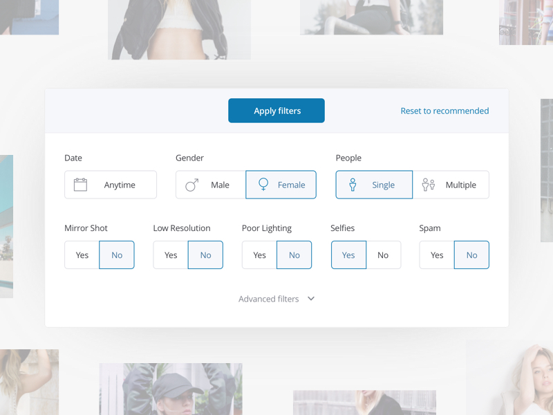
20. Sort / filter table / search engines
There should be a faster way to get to the ZZ Top in the Bands with Beards data table.
21. Empty states “without results”
Sometimes you will search for something or add too many filters and you will not get any results. How sad. Cheer your users with cheeky illustrations. Or your bank account and route number.
Rainer Wendland tried everything for Zendesk.
22. Error status
Invalid input. Wrong password. Existing account. Too many things selected. There are many options when something can go wrong, especially if you are a grandmother and you got an iPad for Christmas. It was a mistake.
Mike Stozicki really made me think that the letter was sent.
23. System alerts
The system always does something in the background, and sometimes it's nice to know when everything ends successfully (or not). You should definitely inform the user about this.
This is taken from the Google Inbox. “Cancel” is really convenient when you “accidentally” delete a letter from your mom.
24. Empty auto-complete dropdown list
Autocomplete cool if it helps you find something, but sometimes there are no results. In this case, you do not need to show an empty window. Show a small message, or let users do something.
Apparently, Jurrian van Drunen no longer has a “Bra” in his contacts. This is probably for the best.
25. Boot Status
People will use Tinder` on their phones while the page is loading, but if they are really waiting and watching, there must be some kind of visual indication that the material is still loading.
Not the best form , XPLAI . Keep practicing. But it is still painfully delightful.
Launch
26. Devil application icon
Yes, probably, it is better not to forget about it.
27. Image for App Store
Daniel Beer did not forget to make an image for the App Store. Give me five, man.
28. Picture for social networks and Open Graph
This is the image that appears when you link to Twitter, post to Facebook, post to Medium, etc.
Here is how it looks on Medium:
29. Picture for Website Marketing
Everyone wants to be like Stripe, so stupidly copy:
30. Images for Sales Deck
Sales deck - "this is a set of slides with infographics and selling content."
You may have to give up a lot and clear the content to look like a brand making deals for 6-digit amounts.
31. Pitch Deck Images
As an image for a sales deck, but a bit more far-sighted. I mean ... you are trying to raise money. You will understand later.
Here is a trade secret, always put dashboards in your deck. It is not joke.
32. Images for Product Hunt
Hey, they just updated the profile pages.
33. Facebook / Twitter Advertising Images
“But we have no ads on Facebook.” Ha, until it appears. And then no one will tell you. Just make the pictures in advance and you will be calm.
34. Profile images in social networks
Yes, you must do one thing for all 938 social networks. Fortunately, we made the Sketch tool to speed it up for you. Welcome, kids.
35. Email banner
Triple dots / commas ( approx. Per billion hint), if you make it an illustration.
^ By the way, this is a distribution of my agency and my colleagues write some really outstanding content.
Here are some recent favorites:
Profile
36. Notification Settings
Cool when apps tell you when something happens, even cooler when alert with sound. But after the 19th time, you're really tired of the alerts. You should probably let the user decide when to turn off the sound.
Slack did not become a company worth $ 8 billion, scoring on notification settings. Nailed it.
37. Billing page
Do not forget that people should receive copies of their bills for a product for which they pay you thousands of dollars. And some create an idiotic IT department for their agency and cannot understand how hard it is to look for it ... every ... month .
I don't know what that means, but getting here was easy.
38. Option "Delete my account"
Yes, yes, I know. No one does. But maybe they will again create a new account? As we say to the seller: "I will come back later and buy three." Well, yes, of course.
But there are legitimate reasons that are positive. I deleted the accounts, as I combined into a large team license. I deleted old accounts that collected dust, and I wanted to start from scratch. In any case, it is a good tone to maintain.
Shhh, Mr. President, you can disable your account here.
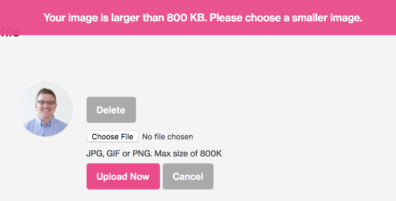
39. Tool for cropping profile pictures
This is a nightmare for most applications, but can be done by the mind.
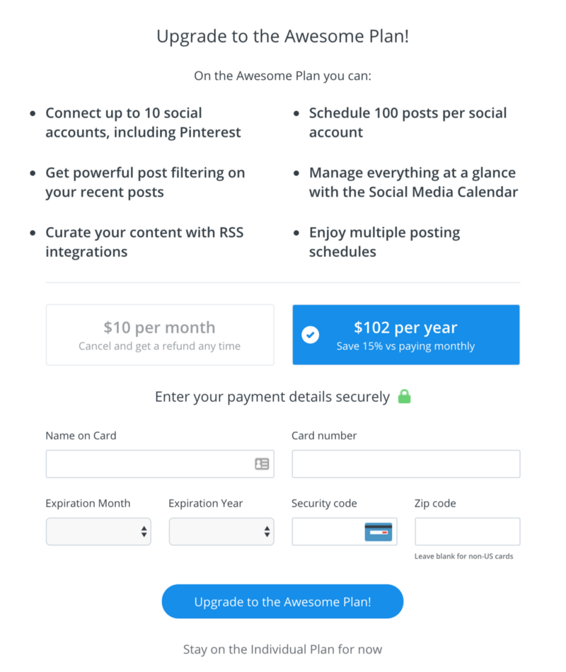
40. Option / stream "Update my account"
It is terrible to think how difficult it is for many SaaS products. Shut up and take my money. Shouldn't it be easy? This should be easy.
The buffer has a menu item for updating, a fairly simple form. You have my money.
Mad flows
41. Flow "Change my address"
When you get a luxurious new apartment in the city center and you have to change your address on every credit card you have ever had.
Dhaval S. Gandhi wants to make sure his Aloe Vera is sent to the right place.
42. Add Credit Card Flow
Some people (like me) like to store about a hundred credit / debit cards in a file so that thieves have many accounts to choose from. Therefore, simplify the addition of maps. That's all I have to say about this.
43. Stream "bulk add"
It's one thing to quickly add an object to the system, but it's quite another to make it so that you quickly add a group of objects to the system.
Please, sir, allow more?
44. Stream "Creating a custom filter"
If you have a complicated filter system, it might be a good idea to add the ability to save the filtering profile for later. You no longer need to click a million times.
Oykun Yilmaz can take this step further by allowing the user to save this filter. Do it, Oykun.
45. Feed "Add to cart"
It's funny, but there are people who forget about this stream. It's me.
Apparently, Alberto Conti needs 4 chairs, 4 bedside tables. It must be a big house ...
46. Share Stream
Sharing has become commonplace, but not the fact that you have a ready option. This is a reason to do development.
Tomek Kvyatkovsky really knows how to become social.
47. Thread "Create from existing"
It's kind of like “create a copy + edit” all in one action. The user can start from the existing version and improve it as necessary.
Kyle Johnston writes many scripts. Maybe secretly Christopher Nolan?
48. Stream "Invite someone"
There is no better way to add “virality” to your product than through invitations and sharing. Take an example with Dribbble .
I think Paula Pintarik and Kristina are going on a voyage. Or they work on a project and watch how other people fly. This is even worse.
49. Stream "Change user permissions"
Do you know this guy Greg? Do you know how he perverts everything that concerns? Yes, you can revoke some of Greg's privileges so that he does not remove the integrity of the Internet. Silly Greg.
Matt Schwer, on the other hand ... much less annoying than Greg.
50. Stream "Delete and Restore"
Sometimes you delete something super important and you need to restore it immediately.
Eric Tsai understands that we are all wrong.
51. Maybe we forgot something? Write in the comments.
The translation was made with the support of EDISON Software , which professionally develops PHP applications and websites for large customers, as well as developing cloud services and mobile Java applications .
Source: https://habr.com/ru/post/341060/
All Articles