10 most simple and frequent mistakes on sites
“Why doesn't my site sell?” - the answer to this question can be very simple, just look at your site through the eyes of a “newbie”.
When a site owner interacts daily with his information resource, he gets used to navigation and finds information with ease. The flaws and flaws in usability become invisible or seem so insignificant that "everything is not up to it." But how to be a new user? Orient, sometimes, not that difficult - impossible! Especially if the site owner failed to find a balance between the information content (after all, everything is so important and everything needs to be told on the pages of the site), its navigation and usability elements. As a result, you can break a leg on the Internet resource.
Is everything okay on your site? Right? Open your website, go through the points and check yourself.
')

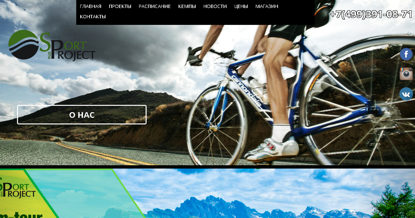
The first mistake. The logo on the website is too small or “lost” in the total mass of elements.
The logo should tell the user: “You have come to the right address! You found what you were looking for! ”Everyone knows what Gazprom specializes in, and what are you doing? In the header of the site, next to the logo should be placed and a brief description of the company. Introduce yourself when a user comes to you. This is a sign of good tone.
Example: what is the company doing, whose website is represented in the screenshot? Write in the comments your guesses, just, mind you, do not google.
The second mistake. A click logo does not take the user to the main page of the site.
To allow the site visitor to return to the main page, make the logo a return button. This is already a conditioned reflex of most users. Therefore, do not be fooled by their expectations.
The third mistake. Phone and contacts are hard to find
If the user does not immediately find the contact information, how will he contact you? The phone number of the company with the city code should be placed in a prominent place, in the expected position for the user - usually it is the upper right corner. It is advisable to designate hours of work.
If the specifics of your work implies that the client can call to clarify / enroll / book / ask questions, make sure that the phone number is always in front of his eyes, no matter where the user is. The simplest solution is to fix the site header.
Another sign of good tone is an indication of an alternative method of communication in the “Contacts” section - this could be email, instant messenger, call center phone number, etc.
Do not overdo it in the desire to "hook" the client to the good old scripts "We will call you back" or "We did not find what you were looking for - we will call you back". Make it better so that the user himself could find what he came for and how to contact you, rather than being nervous, clicking every 15 seconds on the feedback pop-up window.
The fourth mistake. "To the village of the grandfather"
The screenshot below shows the phone without a city code. There is such. Specify belonging to the city, if you work in a particular region, or make it clear that you work in Russia. Users do not like to guess and "scare".

Fifth mistake. Overloaded menu
The golden rule "3-5, maximum 7" (the number of elements that a person is able to perceive at the same time) - says that the site does not need to overload the menu and navigation through services. Even if you really want to show the whole range. Make it easier for the client to choose, quickly orient him to the main directions, combining the elements into groups.
Make 3-5 main sections of the menu, inside each can also be divided into 3-5-7 submenu items. Show individual options already on the product / service description pages.
The sixth mistake. "Basket" in the afternoon with fire you will not find
The requirement applies in large part to online shopping. Often, very often there are incidents with baskets. One client had such a layout that in some browsers the “Add product to cart” button fell outside the screen. The other after adding the product, the button to go to the cart disappeared from the screen. Fixed a bug - sales went. But what about?
There were cases when the “Basket” button was located not in the cap - in the usual place for the eye, but in the right or left block, between the news and the advertising banner.
Recently faced the same problem when ordering on OZON.ru. Quest: buy a book. The description of the book is, reviews, rating, availability, specifications, other recommended products. Scroll the page up and down: how to add to the basket - it is not clear! The button should be next to the price - this is logical: I looked at the product, saw the price, made a decision, put it in the basket.
Found the button, here it is, fixed at the bottom edge, does not scroll with the text, is perceived as a frame. And when scrolling up it overlaps the navigation bar.
Even large online stores have the same problems.
The seventh mistake. Too many fields in the checkout window
Ask the user only the most necessary information, otherwise his patience may not be enough.

Highlight required fields, do not make you think long. Complete the form with tips. The user has sent a request - must see either the request to fill out correctly, if something went wrong, or a confirmation that everything turned out. For example, “Thank you for your order! In the near future our manager will contact you. ”
The eighth mistake. 404. Broken links, or "links to nowhere"
They are periodically found for each user of the World Wide Web when going to sites. Surely "error 404" saw everyone.

From the point of view of search engine optimization, empty pages are evil, they need to be hidden from indexing, as well as duplicates. The presence of such links may adversely affect the position of the site in the issuance of Yandex and Google, as well as cause the inconvenience of a simple user.
Ninth mistake. Too long to wait
In one of the previous articles, we discussed in detail the indicators of the speed of loading pages on the site. According to Kissmetrics, almost half of users expect the site to load in a maximum of two seconds. If the site does not load within three seconds, they leave it. A total of 79% of online shoppers, faced with a slow loading site, never return to it, and about 40% will tell friends about the negative online shopping experience. That is why the site loading speed should be monitored constantly and regular measures should be taken to improve this indicator.
Tenth mistake. The site is incorrectly displayed from a mobile device.
Your site should be correctly displayed in both desktop and mobile versions.

To address the issue of adapting the site for all types of devices, there are two approaches:
• Creating a separate version of the site, which is correctly displayed on the mobile device
• Creating a website with the so-called adaptive layout, which adapts to any screen size.
The most widespread is the second option, since it is cheaper to develop and more practical as a whole. Most modern sites are initially designed so that they are equally convenient to view on different screens.
Why is this so relevant? And the excuse "how many years lived without a mobile version" no longer "ride"?

In competition, the winner is the one whose site is friendlier, more accessible and more convenient to the client. Learn to look at your site through the eyes of a buyer.
When a site owner interacts daily with his information resource, he gets used to navigation and finds information with ease. The flaws and flaws in usability become invisible or seem so insignificant that "everything is not up to it." But how to be a new user? Orient, sometimes, not that difficult - impossible! Especially if the site owner failed to find a balance between the information content (after all, everything is so important and everything needs to be told on the pages of the site), its navigation and usability elements. As a result, you can break a leg on the Internet resource.
Is everything okay on your site? Right? Open your website, go through the points and check yourself.
')
The first mistake. The logo on the website is too small or “lost” in the total mass of elements.
The logo should tell the user: “You have come to the right address! You found what you were looking for! ”Everyone knows what Gazprom specializes in, and what are you doing? In the header of the site, next to the logo should be placed and a brief description of the company. Introduce yourself when a user comes to you. This is a sign of good tone.
Example: what is the company doing, whose website is represented in the screenshot? Write in the comments your guesses, just, mind you, do not google.
The second mistake. A click logo does not take the user to the main page of the site.
To allow the site visitor to return to the main page, make the logo a return button. This is already a conditioned reflex of most users. Therefore, do not be fooled by their expectations.
The third mistake. Phone and contacts are hard to find
If the user does not immediately find the contact information, how will he contact you? The phone number of the company with the city code should be placed in a prominent place, in the expected position for the user - usually it is the upper right corner. It is advisable to designate hours of work.
If the specifics of your work implies that the client can call to clarify / enroll / book / ask questions, make sure that the phone number is always in front of his eyes, no matter where the user is. The simplest solution is to fix the site header.
Another sign of good tone is an indication of an alternative method of communication in the “Contacts” section - this could be email, instant messenger, call center phone number, etc.
Do not overdo it in the desire to "hook" the client to the good old scripts "We will call you back" or "We did not find what you were looking for - we will call you back". Make it better so that the user himself could find what he came for and how to contact you, rather than being nervous, clicking every 15 seconds on the feedback pop-up window.
The fourth mistake. "To the village of the grandfather"
The screenshot below shows the phone without a city code. There is such. Specify belonging to the city, if you work in a particular region, or make it clear that you work in Russia. Users do not like to guess and "scare".
Fifth mistake. Overloaded menu
The golden rule "3-5, maximum 7" (the number of elements that a person is able to perceive at the same time) - says that the site does not need to overload the menu and navigation through services. Even if you really want to show the whole range. Make it easier for the client to choose, quickly orient him to the main directions, combining the elements into groups.
Make 3-5 main sections of the menu, inside each can also be divided into 3-5-7 submenu items. Show individual options already on the product / service description pages.
The sixth mistake. "Basket" in the afternoon with fire you will not find
The requirement applies in large part to online shopping. Often, very often there are incidents with baskets. One client had such a layout that in some browsers the “Add product to cart” button fell outside the screen. The other after adding the product, the button to go to the cart disappeared from the screen. Fixed a bug - sales went. But what about?
There were cases when the “Basket” button was located not in the cap - in the usual place for the eye, but in the right or left block, between the news and the advertising banner.
Recently faced the same problem when ordering on OZON.ru. Quest: buy a book. The description of the book is, reviews, rating, availability, specifications, other recommended products. Scroll the page up and down: how to add to the basket - it is not clear! The button should be next to the price - this is logical: I looked at the product, saw the price, made a decision, put it in the basket.
Found the button, here it is, fixed at the bottom edge, does not scroll with the text, is perceived as a frame. And when scrolling up it overlaps the navigation bar.
Even large online stores have the same problems.
The seventh mistake. Too many fields in the checkout window
Ask the user only the most necessary information, otherwise his patience may not be enough.
Highlight required fields, do not make you think long. Complete the form with tips. The user has sent a request - must see either the request to fill out correctly, if something went wrong, or a confirmation that everything turned out. For example, “Thank you for your order! In the near future our manager will contact you. ”
The eighth mistake. 404. Broken links, or "links to nowhere"
They are periodically found for each user of the World Wide Web when going to sites. Surely "error 404" saw everyone.
From the point of view of search engine optimization, empty pages are evil, they need to be hidden from indexing, as well as duplicates. The presence of such links may adversely affect the position of the site in the issuance of Yandex and Google, as well as cause the inconvenience of a simple user.
Ninth mistake. Too long to wait
In one of the previous articles, we discussed in detail the indicators of the speed of loading pages on the site. According to Kissmetrics, almost half of users expect the site to load in a maximum of two seconds. If the site does not load within three seconds, they leave it. A total of 79% of online shoppers, faced with a slow loading site, never return to it, and about 40% will tell friends about the negative online shopping experience. That is why the site loading speed should be monitored constantly and regular measures should be taken to improve this indicator.
Tenth mistake. The site is incorrectly displayed from a mobile device.
Your site should be correctly displayed in both desktop and mobile versions.
To address the issue of adapting the site for all types of devices, there are two approaches:
• Creating a separate version of the site, which is correctly displayed on the mobile device
• Creating a website with the so-called adaptive layout, which adapts to any screen size.
The most widespread is the second option, since it is cheaper to develop and more practical as a whole. Most modern sites are initially designed so that they are equally convenient to view on different screens.
Why is this so relevant? And the excuse "how many years lived without a mobile version" no longer "ride"?
- More than 50% of buyers are looking for products and services on the Internet from mobile devices. And this figure is increasing very quickly. Google warns that sites that do not have a mobile version will rank very low in search results from mobile devices. Accordingly, if you do not have a mobile version of the site, it will be very difficult for the user to find you.
- More than 40% of users said they would go to another site, it is the current "crooked" displayed in the mobile version. And again, their share is growing steadily. For business, this means that the seller will take possession of the attention of the buyer, whose website is convenient on any device.
- The smartphone allows the user to immediately make a call to the phone number listed on the site (if the site has a click-to-call function). Thus, you become much closer to the potential buyer.
- In the trend of mobile advertising. If you do not have a mobile site, then its effectiveness will be catastrophically low.
- And the last. If your competitors do not yet have a mobile version of the site, then you have a great opportunity to create a powerful competitive advantage and get those customers who leave outdated sites of your opponents. And if competitors already have mobile sites? You simply give them your customers who prefer mobile devices.
In competition, the winner is the one whose site is friendlier, more accessible and more convenient to the client. Learn to look at your site through the eyes of a buyer.
Source: https://habr.com/ru/post/340972/
All Articles