Adaptive emails without pain and suffering
Hi, Habr! Anyone who has ever encountered the layout of email-letters, know that this is tedious, tedious and sometimes very annoying. In most cases, this is due to the fact that email clients cannot support very much of what we use in the layout of the simplest web pages. Therefore, the design of the letter is made simple or not done at all, and the lion's share of time is spent on checking and fixing bugs in numerous mailers.
In this article we want to share with you recipes for the layout of a beautiful, in our opinion, and adaptive letter that will adjust to the screen of your phone, even in Gmail. And also to tell about the nuances, problems and subtleties that we encountered in the process of its creation.
When you type in email, a table layout and a very limited set of css properties are usually used. Table layout implies a large enough nesting, and editing a ready-made template can be a real headache. After making the decision to switch to adaptive letters, the question arose of how to make these same letters. Our choice fell on the rather popular Foundation framework, or rather on its underrated younger brother Foundation for Emails .
')
Foundation for Emails out of the box can do a lot of things that you may need during the layout of letters:
The installation is quite simple and consists of only a few steps:
1. Install foundation-cli , you may need to use sudo
2. Go to the project directory and execute the command.
The CLI will ask you for the name of the future project, after which the project template will be loaded and the necessary dependencies will be installed. The whole process takes less than a minute. To start, just run the
Foundation for Emails takes on most of the difficulties you face. As in Foundation for sites, it uses a 12-column grid, on the basis of which you can build adaptive letters that already have a media query for mobile devices. You can control the number of columns with the .large-n and .small-n classes . By default, if you do not specify the width of the column in the mobile client, it will occupy 100% of the container.
To correctly display your letter, you have to use tables with a rather large nesting. Using Inky's template engine simplifies the layout of emails and makes the code simpler and more readable.
Sample code using Inky:
But do not get involved in too much nesting, because You may encounter a problem that we had at the very beginning of using this framework. Gmail does not like big letters and cuts off part of the letter when the content becomes more than 102 KB (but in fact it starts cutting after 98 KB)
I think we all understand what percentage of users will click "show all".
More information about the Foundation for Email can be found here .
The process of layout of the first adaptive letters took us quite a long time, so we want to share with you the difficulties and subtleties that we had to face:
1. Implementing adaptability in letters is a rather complicated and tedious task, so we recommend that you place this process on the shoulders of the aforementioned Foundation for Emails. He will do the main work, and all you have to do is tell him how many columns you want to see on mobile devices and play around with the font sizes. Of course, this is a slight understatement, but it will really make your job great.
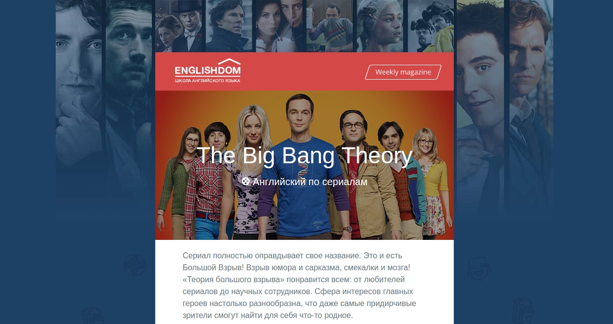
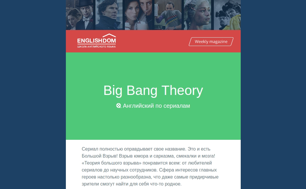
This is how our letter looks in the desktop and mobile client.
Foundation for Emails in its arsenal has only one breakpoint of 596 pixels small = “x” , but no one bothers you to add your own or redefine global ones if you really need to do this. In the file _settings.scss you will find everything you need.
2. If you plan a newsletter with one template and only content changes, or you have the same footer everywhere, and the header and content area are different, we recommend you use Partials .
Your template will look something like this:
In general, Foundation for Emails allows you to use a fairly large set of functions in the Handlebars template language.
3. In the first version of the letter, we noticed its rather large size. On closer examination, it turned out that all the styles in the
duplicated; in addition,
4. Also for template mailings we recommend using Custom Data . This is user data that can be added to the page, and then generated into your HTML via Handlebars. That will allow you to get rid of the need to edit HTML.
5. Instead of vertical indents, use a table with a cell with a height attribute set, this is guaranteed to give you the desired indent in all email clients. Especially with Inky, this is done in a single line.
6. If you decide to use spacer to set the height, but in mobile clients it seems too big for you, you can always hide it by adding the
7. If you make a button, do it in the same way using a table, otherwise you risk getting the text filled with color. Inky has a ready-made button component; the main thing is to remember to specify the href attribute , otherwise you will have to guess why you have plain text instead of a button.
8. Not all email clients support background-image , but since our main header and message body just had this design, we chose a graceful degradation approach , in which the main image uses a background image, and in email clients that do not have this support, color shading is used. Thus we do not lose readability of the text.
9. If you need to make an element whose main purpose is “decoration”, also use the graceful degradation approach.
In our example, the corner is made using the: before pseudo-element. It is not supported in Gmail and Outlook and will not be displayed, but this does not greatly worsen the general form of the letter, and if you make it a picture and place it in a table, then it is likely that it will “live” separately from its block, or it will break you email
10. In the development process, we need to check the resulting result of our layout. We use Litmus Putsmail . It is quite convenient when you have the opportunity to quickly test a part of a letter or a whole letter, simply insert the HTML code and specify your real mailboxes. Please note that the first time you use, you will receive a letter with confirmation on each box, and only then the letter itself. You can also use the plugin for Grunt . He essentially does the same thing.
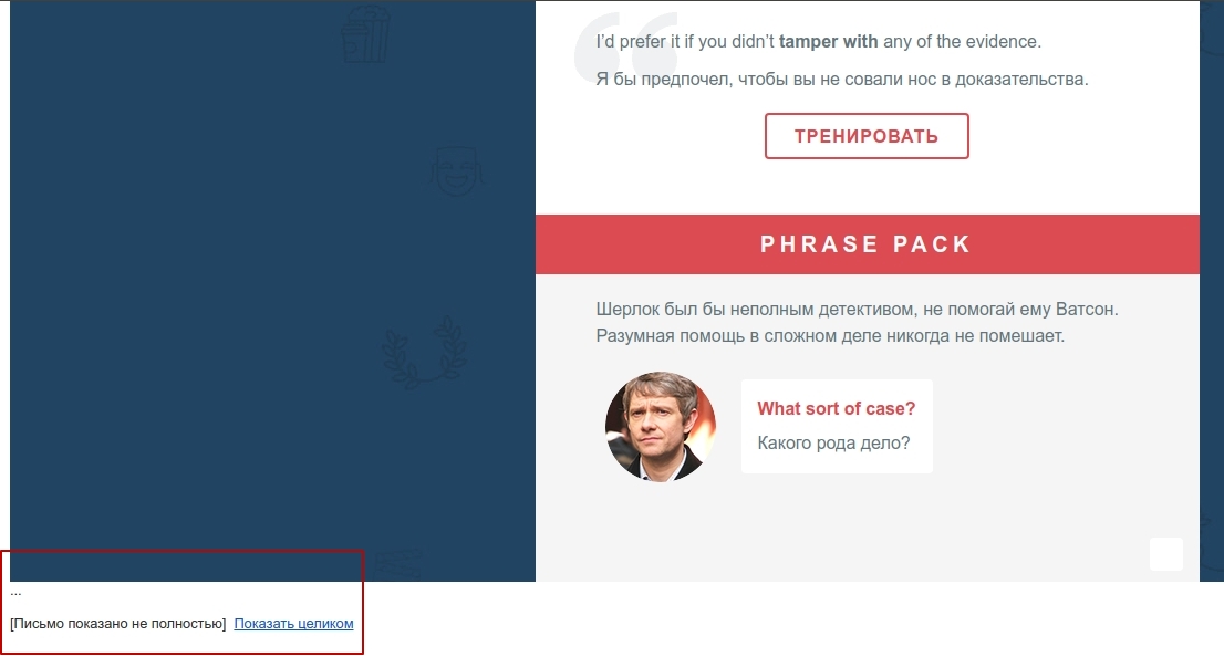
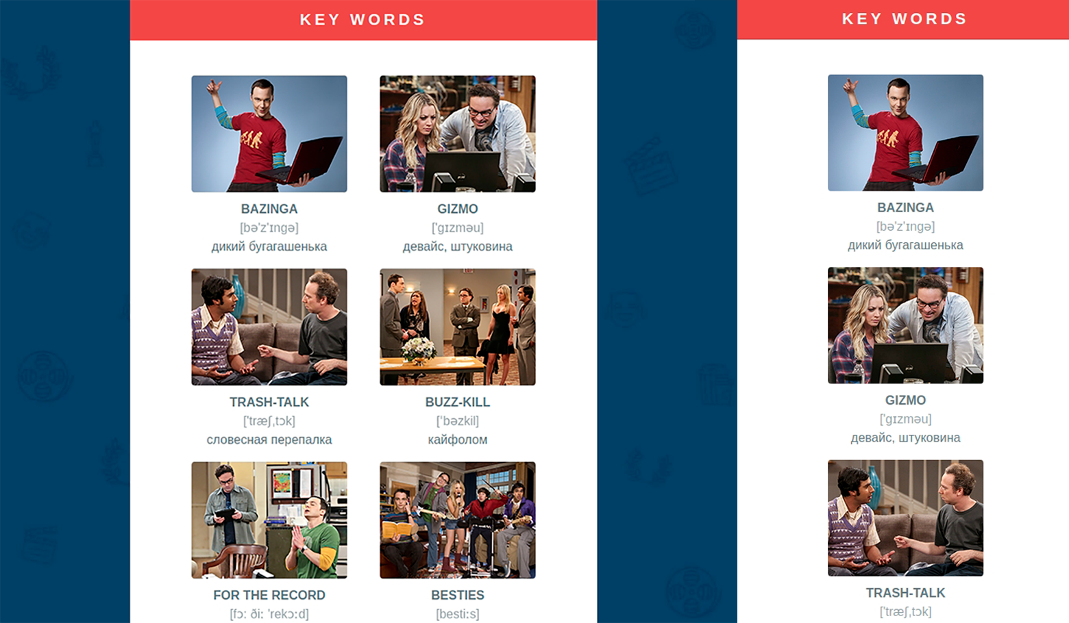
We hope that acquaintance with Foundation for Emails will be useful for you and your next letters will be made in the company of this very convenient framework.
→ Demo Letters
→ Letter sources
We give free access to three months of learning English through our online courses. To do this, simply follow the link until December 31, 2017.
We will be glad to see you at the individual lessons of the course “English for IT-specialists”.
Take a free introductory lesson and get a comprehensive feedback on your level of knowledge, then choose a teacher and a training program for yourself to your liking!
In this article we want to share with you recipes for the layout of a beautiful, in our opinion, and adaptive letter that will adjust to the screen of your phone, even in Gmail. And also to tell about the nuances, problems and subtleties that we encountered in the process of its creation.
Layout of responsive emails with Foundation for Emails
When you type in email, a table layout and a very limited set of css properties are usually used. Table layout implies a large enough nesting, and editing a ready-made template can be a real headache. After making the decision to switch to adaptive letters, the question arose of how to make these same letters. Our choice fell on the rather popular Foundation framework, or rather on its underrated younger brother Foundation for Emails .
')
Foundation for Emails out of the box can do a lot of things that you may need during the layout of letters:
- Gulp: automating the development process
- Inky template engine: converts custom markup to HTML code
- Sass: CSS preprocessor
- Handlebars: generates HTML from JSON data (JavaScript templating engine)
- Paninin: a file compiler that supports the Inky prototyping pattern.
- Inliner: translates from style sheets to inline styles
- BrowserSync: reload the page after changing the source files
- Image Compression: image compression during compilation
The installation is quite simple and consists of only a few steps:
1. Install foundation-cli , you may need to use sudo
npm install --global foundation-cli 2. Go to the project directory and execute the command.
foundation new --framework emails The CLI will ask you for the name of the future project, after which the project template will be loaded and the necessary dependencies will be installed. The whole process takes less than a minute. To start, just run the
npm start command, after which the default web address (usually http: // localhost: 3000 ) with the default template will open in your browser. The npm run build starts a compilation, during which Inky markup is compiled into HTML markup, styles are translated into inline styles, all spaces are removed and images are optimized. At the exit, you get one HTML file and optimized images.Foundation for Emails takes on most of the difficulties you face. As in Foundation for sites, it uses a 12-column grid, on the basis of which you can build adaptive letters that already have a media query for mobile devices. You can control the number of columns with the .large-n and .small-n classes . By default, if you do not specify the width of the column in the mobile client, it will occupy 100% of the container.
To correctly display your letter, you have to use tables with a rather large nesting. Using Inky's template engine simplifies the layout of emails and makes the code simpler and more readable.
Sample code using Inky:
<container> <row> <columns>Put content in me!</columns> </row> </container> HTML output:
<table align="center" class="container"> <tbody> <tr> <td> <table class="row"> <tbody> <tr> <th class="small-12 large-12 columns first last"> <table> <tr> <th>Put content in me!</th> <th class="expander"></th> </tr> </table> </th> </tr> </tbody> </table> </td> </tr> </tbody> </table> But do not get involved in too much nesting, because You may encounter a problem that we had at the very beginning of using this framework. Gmail does not like big letters and cuts off part of the letter when the content becomes more than 102 KB (but in fact it starts cutting after 98 KB)
I think we all understand what percentage of users will click "show all".
More information about the Foundation for Email can be found here .
Subtleties and difficulties
The process of layout of the first adaptive letters took us quite a long time, so we want to share with you the difficulties and subtleties that we had to face:
1. Implementing adaptability in letters is a rather complicated and tedious task, so we recommend that you place this process on the shoulders of the aforementioned Foundation for Emails. He will do the main work, and all you have to do is tell him how many columns you want to see on mobile devices and play around with the font sizes. Of course, this is a slight understatement, but it will really make your job great.
This is how our letter looks in the desktop and mobile client.
Foundation for Emails in its arsenal has only one breakpoint of 596 pixels small = “x” , but no one bothers you to add your own or redefine global ones if you really need to do this. In the file _settings.scss you will find everything you need.
@media only screen and (max-width: #{$global-breakpoint}) 2. If you plan a newsletter with one template and only content changes, or you have the same footer everywhere, and the header and content area are different, we recommend you use Partials .
Your template will look something like this:
<html> <head> <title>Definitely STILL an Email!</title> </head> <body> {{> header}} {{> body}} {{> footer}} </body> </html> In general, Foundation for Emails allows you to use a fairly large set of functions in the Handlebars template language.
3. In the first version of the letter, we noticed its rather large size. On closer examination, it turned out that all the styles in the
head ,duplicated; in addition,
head and body tags, both opening and closing, were duplicated. Having looked through the documentation in more detail, we managed to identify the problem. It consisted in the fact that the Foundation itself creates the head and body with everything necessary, and you just have to impose a letter itself.4. Also for template mailings we recommend using Custom Data . This is user data that can be added to the page, and then generated into your HTML via Handlebars. That will allow you to get rid of the need to edit HTML.
--- title: Page Title description: Lorem ipsum. --- <h1>{{ title }}</h1> 5. Instead of vertical indents, use a table with a cell with a height attribute set, this is guaranteed to give you the desired indent in all email clients. Especially with Inky, this is done in a single line.
<p>Stuff on top</p> <spacer size="100"></spacer> <p>Stuff on bottom</p> HTML output:
<p>Stuff on top</p> <table class="spacer"> <tbody> <tr> <td height="100px"style="font-size:100px;line-height:100px;"> </td> </tr> </tbody> </table> <p>Stuff on bottom</p> 6. If you decide to use spacer to set the height, but in mobile clients it seems too big for you, you can always hide it by adding the
.show-for-large class to your markup and adding indent to the necessary block in your media query using CSS, mobile clients do it better. We also want to draw your attention to the class .hide-for-large . We do not recommend using this class, since It is not supported in Gmail and Yahoo.7. If you make a button, do it in the same way using a table, otherwise you risk getting the text filled with color. Inky has a ready-made button component; the main thing is to remember to specify the href attribute , otherwise you will have to guess why you have plain text instead of a button.
<button href="#">Button</button> HTML output:
<table class="button"> <tr> <td> <table> <tr> <td><a href="#">Button</a></td> </tr> </table> </td> </tr> </table> 8. Not all email clients support background-image , but since our main header and message body just had this design, we chose a graceful degradation approach , in which the main image uses a background image, and in email clients that do not have this support, color shading is used. Thus we do not lose readability of the text.
9. If you need to make an element whose main purpose is “decoration”, also use the graceful degradation approach.
In our example, the corner is made using the: before pseudo-element. It is not supported in Gmail and Outlook and will not be displayed, but this does not greatly worsen the general form of the letter, and if you make it a picture and place it in a table, then it is likely that it will “live” separately from its block, or it will break you email
Another similar example
10. In the development process, we need to check the resulting result of our layout. We use Litmus Putsmail . It is quite convenient when you have the opportunity to quickly test a part of a letter or a whole letter, simply insert the HTML code and specify your real mailboxes. Please note that the first time you use, you will receive a letter with confirmation on each box, and only then the letter itself. You can also use the plugin for Grunt . He essentially does the same thing.
We hope that acquaintance with Foundation for Emails will be useful for you and your next letters will be made in the company of this very convenient framework.
→ Demo Letters
→ Letter sources
Reader Bonuses
Online Courses
We give free access to three months of learning English through our online courses. To do this, simply follow the link until December 31, 2017.
Individually by Skype
We will be glad to see you at the individual lessons of the course “English for IT-specialists”.
Take a free introductory lesson and get a comprehensive feedback on your level of knowledge, then choose a teacher and a training program for yourself to your liking!
Source: https://habr.com/ru/post/340852/
All Articles