My rules are a good design system. Components and interface architecture in Figma
In this article I will show how to organize the structure of the interface, which will allow you to easily create new sections of the product and change their design in the future.
Figma and other modern tools allow you to set the relationship between elements, simplifying the editing of individual components or entire screens; group them into component libraries and give the desired access rights.
')
These principles are now called design language or design system. We lay the algorithm for the development of all graphics modules and we can infinitely scale the project to all types of devices and screen resolutions.
According to Atomic Design , I’ll start with atoms and move on to more complex components. I will work in Figme and demonstrate that Sketch has a serious competitor.
So, modern tools turn the work of a designer into a full-fledged development. The concept of a design system does not mean only a set of ui kit with conceptual rules and beautiful illustrations. This is primarily a system of visual architecture, ordered in a certain way. The concept of product design is closely correlated with it, since A design system can cover several products within the same organization, feeding them to the final consumer using a proprietary “design language”. I will assume that the competent reader has long known about the advantages of this approach.
By the way, if you use Figma , I recommend paying attention to our ready-made design systems . They help freelancers complete more orders per month, programmers can create beautiful applications on their own, and the Timlids run sprints faster using ready-made design systems for teamwork.
And if you have a serious project, our team is ready to deploy a design system within the organization based on our developments and tailor it to specific tasks using Figma. Web / desktop, and any mobile. We are also familiar with React / React Native. Write to T: @kamushken
Once there is the concept of "design language", then you can "speak" on it. And even better is to write. Words form phrases. The phrases consist of a sentence. And from the proposals already built an entire chapter. This is a different Atomic design metaphor and I like it more. When Figma 2.0 came out in July of this year, it immediately became clear that this tool is ideal for writing such a language. Or systems, if you want. Small companies have the opportunity to organize a competent design management for several products and not go beyond the same graphic editor, without resorting to additional add-ins / plug-ins. However, in large companies, too, they are just so mired in the wilds of multi-instrumentalism that it is now extremely difficult for them to restructure. This is me talking about the fact that only Sketch they will not do for a team game. Here, and Craft, and InvisionApp, and Marvel, and Zepplin, and many other curses, about which you probably have not heard.
The second version of Figmy bribed me with its proximity to Sketch, the work under
Let's move on to practice. The essence of this publication is to demonstrate a specific algorithm for visual development. Simply put, develop the interface design in such a way that it can be customized / edited in a minimal number of actions. As a result, a library of components is created, the properties of which are distributed to its associated elements. Changed there - changed everywhere. And developers do not even need to click “refresh” - they see changes in real time on their screens. As I said above, in any design language “phrases” are formed from “words”, a “sentence” is built from “phrases”, and an entire chapter consists of them. In the abstract, we need the ability to quickly replace in one chapter any “word” with another.
The words. Basic elements
I will start with the simplest elements. The “words” include the headings H1, H2, H3 and further, a paragraph of text, icons. Any elementary elements that are part of any ui kit and from which it will be possible to make a “phrase” in the future. I try to train myself to order, so I will follow the naming of the elements. This is especially important if the library will be used by other designers and developers. A good designer begins to make it convenient not only for users, but also for colleagues.
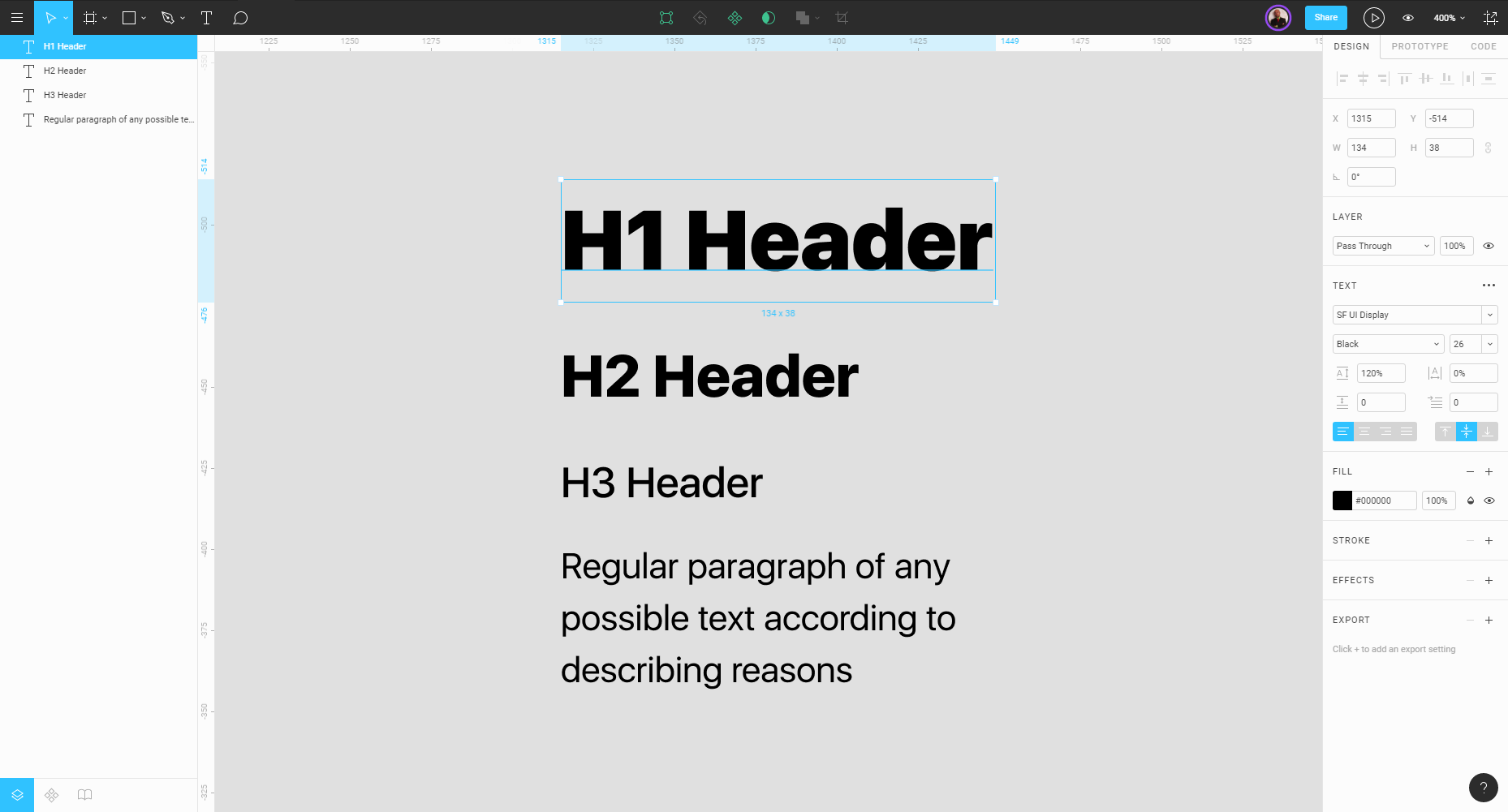
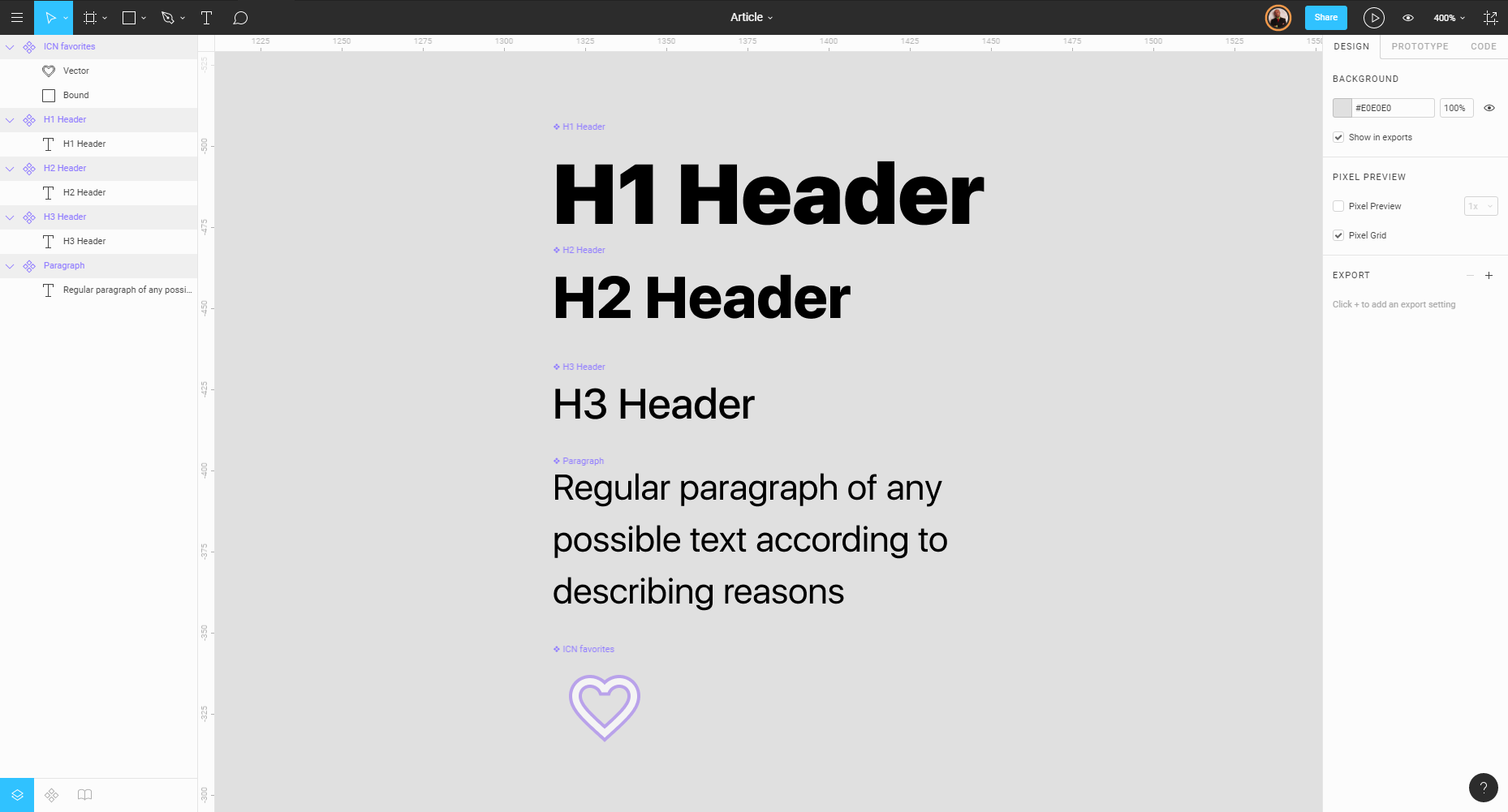
Next, from each element I create a so-called “component” (Ctrl-Alt-K). The component in Figma is the ability to create links between similar units of the interface or entire sections. If I endow with such a property, for example, a paragraph of text and use it on certain interface screens (copy> paste), then it is enough for me to edit the master component so that the changes spread to all screens. In the use of such a hierarchy the whole essence of this article. Figma tints in purple all the “components” in the left column:
Phrases. Multiple components
“Phrase” is a metaphor for more complex modules, which may consist of two or more simple elements. For example, a button. At a minimum, it consists of a background (most often it is a rectangle) and an inscription (label). Or a form for text input (input). In its composition and the background, and title, and placeholder. I will now confine myself to just one “ghost” button. It will consist of a rectangle without a fill and a component H3 Header.
Why is that? If the product uses several different buttons or states (primary, secondary, alternative, disabled, etc.), they are placed on multiple screens and there is a need to change the font, it is enough for me to make changes all in one place. By changing the font for the component- “words” of the H3 Header, I automatically spread these changes to the entire library and to all interface screens. That is why it is important to lay the correct algorithm for visual development at the very beginning.
To visualize the hierarchy more complex modules, I will draw to the right. As a result, it turns out that moving from left to right, we move from simple to more complex. From “words” to a whole “chapter”.
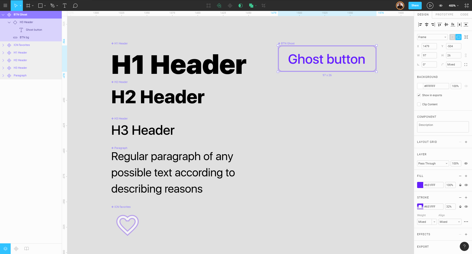
As you can see in the snapshot above, the button is highlighted, turned into component; and in the left turn you can see its composition. Figma allows you to nest a component inside another, creating several levels of hierarchy, each level having its own branches. It all depends on the complexity of the design modules for the product being created. For example, if in the library you use 5 different types of buttons with the same H3 Header component, then you can make changes both globally and locally. For global changes, H3 is edited at the 1st level, and for local ones we edit the nested component already inside a specific button and get changes only for those screens where such a button is present. For greater clarity, I recorded a video: first I change globally the labels on the buttons, and then locally on certain types.
And here some controversial specificity of the tool pops up; if you make changes locally to the necessary category of buttons, Figma considers them as priorities. And trying to change the component globally by the next step, you will not get the result.
Suggestions. From phrases to the case.
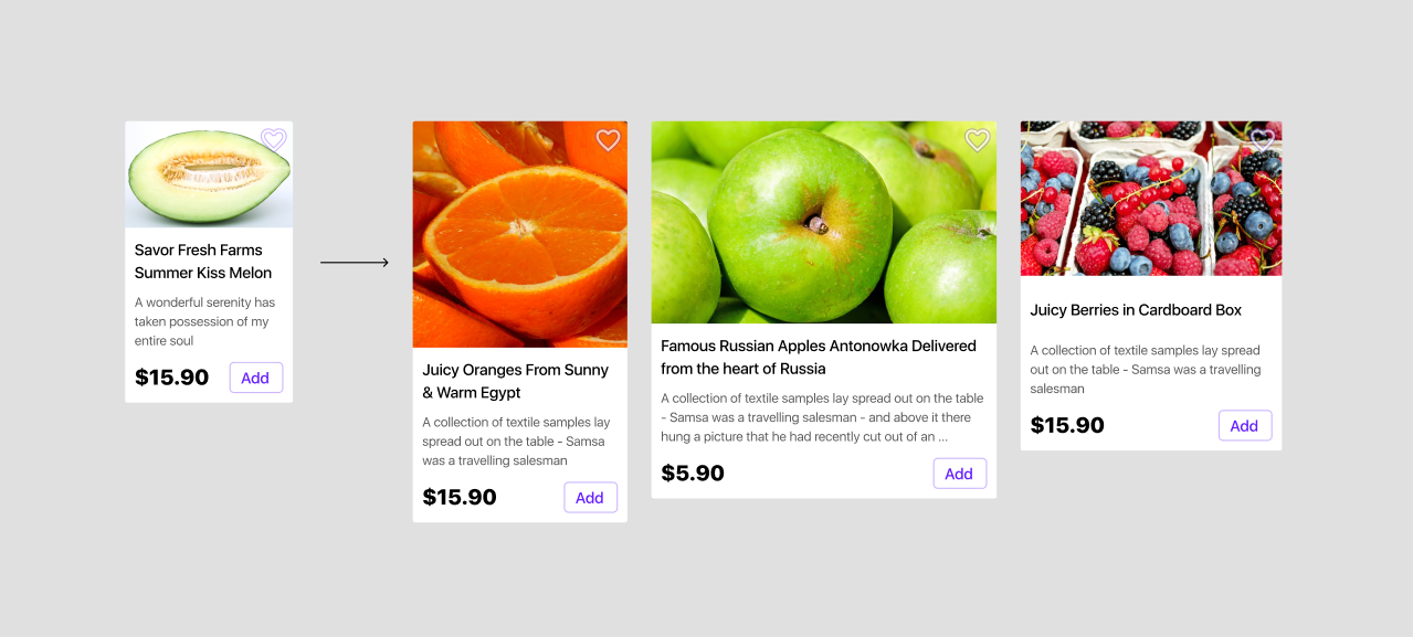
It is time to collect something more complicated from “phrases” and “words”. I will use the components of the 1st and 2nd levels to make a “sentence” - the next 3rd level. Lately, I have a lot of developments on e-commerce, so we will look at this step on the example of a mini-card for the showcase of a mobile online store.
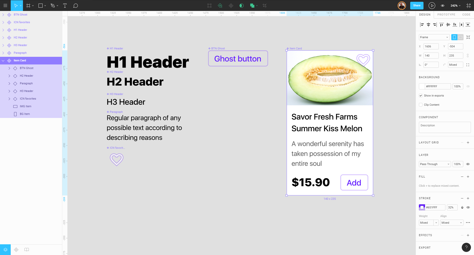
Mini card consists of components: H2 (cost), H3 (product name), Paragraph (short description), BTN Ghost (add button), icons, background and photos. The entire composition is listed on the left of the screen above. The width of the card is chosen in such a way that two in a row fit on the smartphone screen. By analogy, it should be turned into a component in order to write our first “chapter”.
This card can be called modular, because it contains the components of the first two levels. The entire product design may have a modular structure, since collected from similar in structure components. Modularity contributes to the order and pleases developers, because acting on the system, it is better to take a ready mini-card from the library and pave the screen with it. You can change the aspect ratio, height, width, fonts finally. Simply put: there is no need to clone a lot of different master cards in the library, in which you will be lost as your product develops. Figma allows you to make small changes and save this master link for quick editing.
Chapter consisting of sentences
We are close to the fun. In the metaphor with which I started, the “chapter” is the level where independent and full-featured application screens are being served.
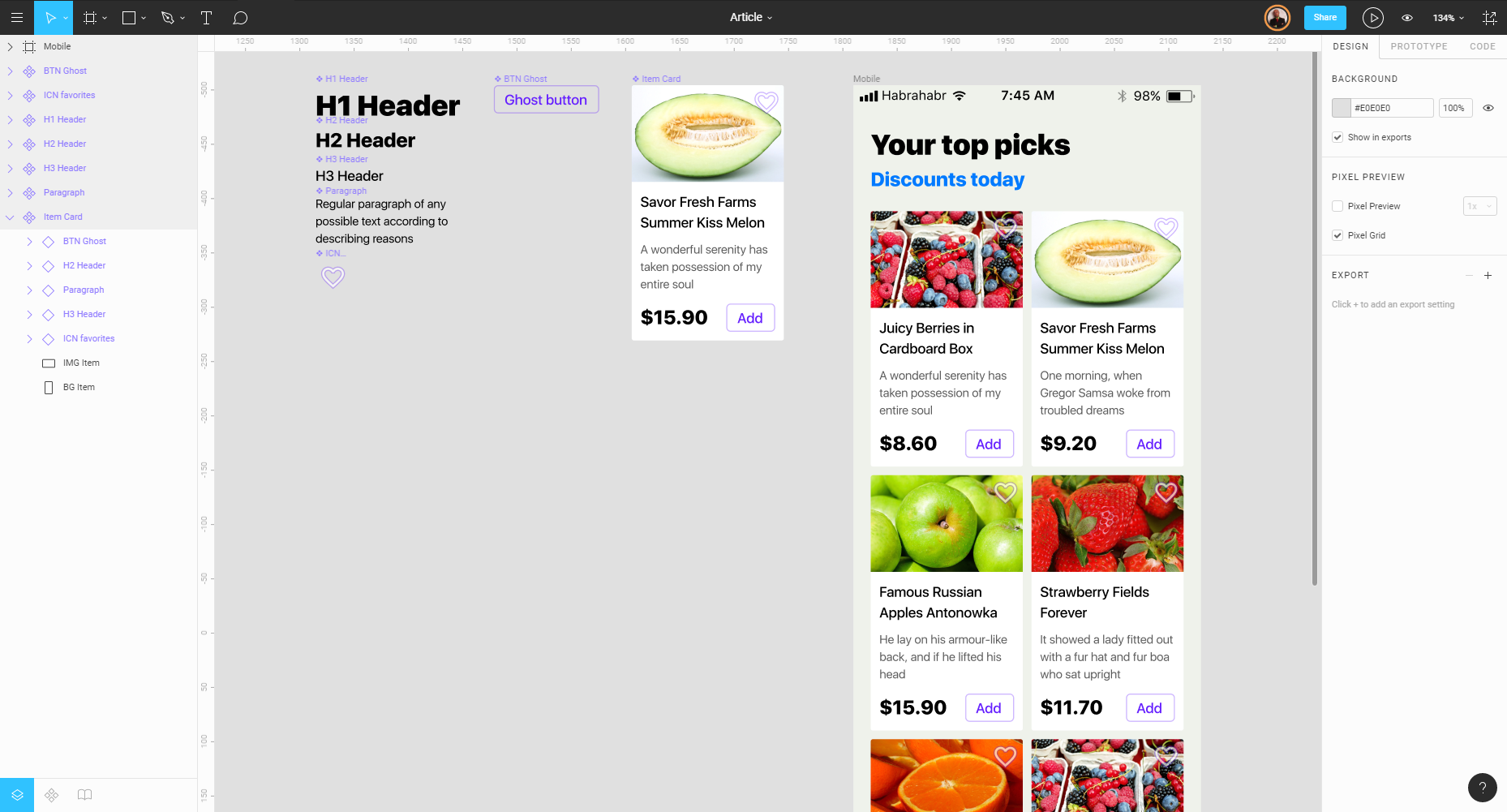
In the “chapter” you can summarize a lot of similar screens, for example, different form factors. Figma allows you to quickly place constraints (adjust adaptability), so that the mini-card can be increased for the tablet or desktop version without losing contact with the master component. In addition to all the developers, the adaptability of any module becomes clear. Questions simply do not arise.
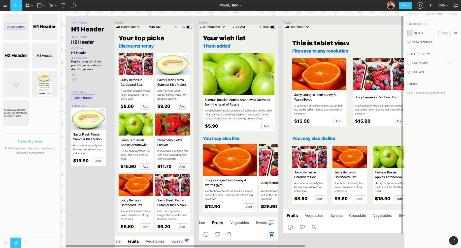
Thus we get even more - the translation of changes for all devices. By the way, just recently, all components were conveniently carried out in a separate section on the left, which can be accessed through the tabs below. You can add modules via drag'n'drop. Prior to that, I had to suffer a lot in searching for components scattered on canvas, when there are many screens.
Result
As a result of the use of such design management, we are able to quickly and quickly implement changes to the set of screens:
It should be said that using only these features will not make you a good designer, but will already demonstrate your competent approach to design management. Solving everyday tasks will now succeed more effectively, which means that product development will definitely accelerate. Figum has an extremely clever mass-select, almost perfect snap and one of the most advanced pen tools. And for optimal team play, the use of such an architecture is already a necessity.
I am sure that among the readers there will be those for whom this approach is already standard. Today, many concepts and principles seem quite natural, although yesterday we said “Wow!”. I think that the final wow factor in the case of Figma is the possibility of using the library created according to the principles described above within the organization without additional tools, plug-ins or add-ons. All you need to do is add all your components to the “Team library” and distribute the link to all the designers and developers in the team. Designers collect new modules and entire screens from the components of such a command design library, and developers instantly receive updates, export all the elements into the code and embed them into production. Success!
Conclusion
Recent years have greatly changed the idea of a team approach in the development of interfaces. HYIP around design systems played a role. When literally every week the next western IT giant releases its design language, its own rules and principles, it is absolutely obvious that the design tool will inevitably fall on the same rails.
Now developers can be attributed to developers too. Because now they have a more efficient environment in which they are comfortable to act systematically and algorithmically, to lay the necessary architecture, to subordinate their visual development to certain principles. Although, we are still far from engaging every designer in coding.
“Designers need to code, but they don't want to . ” It is absolutely normal that the designer does not like to write the code by hand. We are mostly visuals. Techies among designers are very few. And all that is required to push us to coding is to provide a different approach to programming. We need a visual environment in which the cycles, conditions, counts, and animation would be created by simply dragging and dropping objects in the desired sequence.
It is noticeable how the market of design tools has long been moving in one direction. Already there are enough alternatives for Sketch, once located on the top of a mountain. Today there are plenty to choose from; you don’t have to change your preferences in order to work in a more advanced environment. The redivision of this market is approaching (and perhaps has already arrived). Huge companies compete with large injections. Figma closed another $ 17 million round this winter. And in January 2018, InvisionApp should release their Sketch; however, judging by the announcement, their “Studio” does not promise anything new to designers. However, we are very good at these races. So sooner or later an even more convenient workflow will appear, but the other side of the coin is the need to adapt and migrate from tool to tool more often.
I bet that the market will be blown up by the one who first releases the Webflow + Sketch combination in a single tool. The problem has not yet been solved: the designer must see typography such as in the browser, and not ideally rendered in any graphic editor. Especially when the type design rules the ball.
By the way, what is your ideal design tool?
PS: The prototype source code WAS // BECAME . Thanks to habraddesigners, keep on creative right in your browser (login is required)
Source: https://habr.com/ru/post/340774/
All Articles