“4 weddings and one funerals” or linear regression for analyzing the open data of the Moscow government
Despite a lot of great materials on Data Science, for example, from Open Data Science , I continue to collect scraps from the feast of reason and continue to share with you my experience in mastering machine learning skills and analyzing data from scratch.
In the last articles we looked at a couple of tasks for classification, in the process of obtaining data for ourselves in the process of sweat and blood, now it is time to regress. Since there was nothing at hand about lighting this time, I decided to scrape the other bottom of the barrel.
I remember that in one of the articles I was agitating readers to look towards domestic open data. But since I am not a young lady from an advertisement for kefir for digestion or a horsepower shampoo, my conscience did not allow me to advise anything without having experienced it.
')
Where to begin? Of course, with the open data of the Russian government, there is a whole ministry there. My acquaintance with the open data of the government of the Russian Federation was approximately the same as in the illustration for this article. No, it’s not that I’m not at all interested in the registry of the movie halls of the city of New Urengoy or the list of rental equipment of the skating rink in Tula, they are not very suitable for the regression task.
If you think about it, you can find something worthwhile on the OD site of the Russian government, it’s just not very easy.
Data of the Ministry of Finance, I also decided to leave, for later.
Perhaps, I liked the open data of the Moscow government most of all, there I looked at a couple of potential tasks and chose as a result. Information about the civil registration in Moscow by year
What came out of the application of minimal skills in the field of linear regression, you can briefly look at GitHub , and of course, looking under the cat.

UPD: Added section - "Bonus"
As usual, at the beginning of the article I will talk about the skills necessary for understanding this article.
You will need:
If you are completely new to data analysis and machine learning, look at the previous articles in the cycle in order of their succession, there each article was written with “hot pursuit” and you will understand whether you should spend time on Data Science.
All previously prepared articles below the spoiler
Well, as promised earlier now the articles of this cycle will be completed with content.
Content:
Part I: “Marry - Don't Put on My Mouth” - Obtaining and primary analysis of data.
Part II: "One is not a warrior in the field" - Regression on 1 basis
Part III: “One head is good, but much better” - Regression on several grounds with regularization
Part IV: “All is not gold that glitters” - Add signs
Part V: “Cut the new caftan, and try on the old one!” - Trend forecast
Bonus - Increase accuracy, due to a different approach to the months
So, we will move on to the task. Our goal is to dig up any data set sufficient to demonstrate the basic linear regression techniques and determine for ourselves what we will predict.
This time I will be brief and I will not deviate from the topic having considered only linear regression (you probably know about the existence of other methods )
Unfortunately, the open data of the Moscow government are not as extensive and endless as the budget spent on improvement under the My Street program, but nevertheless we managed to find something worthwhile.
The dynamics of the registration of acts of civil status , we are quite fit.
This is almost a hundred records broken down by months, in which there is data on the number of weddings, births, the establishment of parenthood, deaths, name changes, etc.
To solve the regression problem is quite suitable.
The entire code is hosted on GitHub.
Well, in parts, we dissect it right now.
To start importing libraries:
Then load the data. The Pandas library allows you to upload files from a remote server, which is by and large just fine, provided, of course, that the page redirection algorithm does not change on the portal.
(I hope that the download link in the code will not be covered, if it stops working, please write in "lichku" so that I can update)
Let's look at the data:
If we want to use the data about the months, they need to be converted into an understandable model format, scikit-learn has its own methods, but for reliability we will do it with our hands (for not very much work) and at the same time we will remove a couple of useless in our case columns with ID and rubbish
Note: in this case to the column “Month”, I think it would be more correct to apply one-hot coding , but since in this case we are not very interested in the quality of predictions, let’s leave as is.
UPD: I could not stand it and added a revised version in the Bonus section
Since I'm not sure that the tabular view of all will open normally look at the data using the image.

We construct paired diagrams, from which it will be clear which columns of our table are linearly dependent on each other. However, we will not immediately consider all the data, so that later there is something to add, therefore, we first remove some of the data.
A fairly simple way to select (“delete”) a part of the columns from the pandas Dataframe is to simply select the right columns:
Well, now you can build a schedule.
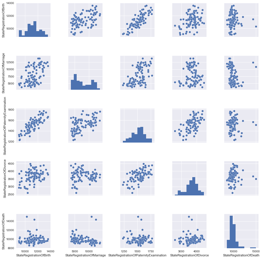
It is a good practice to scale the signs so as not to compare horses with the weight of hay bales and average atmospheric pressure during the month.
In our case, all data are presented in the same quantities (the number of registered acts), but let's still see what changes the scaling.
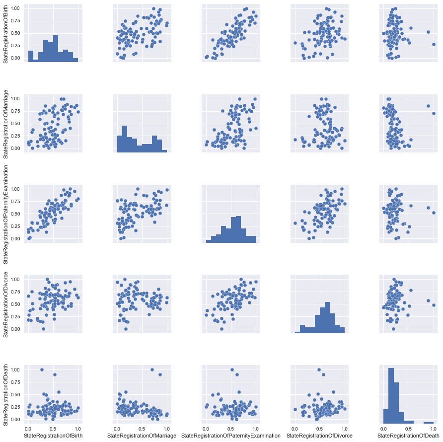
Almost nothing, but for reliability, we will take scaled data for now.
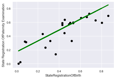
We will look at the pictures and see that the best way to describe the relationship between the two signs of StateRegistrationOfBirth and StateRegistrationOfPaternityExamination can be described in a straight line, which in general is not very surprising (the more often paternity is checked, the more often children are registered).
Prepare the data, namely, select the two columns feature and the objective function, then use the ready-made libraries to divide the data into a training and control sample (the manipulations at the end of the code were needed to bring the data to the desired form)
It is important to note that now, despite the obvious possibility of linking to chronology, in order to demonstrate, we will consider the data simply as a set of records without reference to time.
“Feed” our model data and look at the coefficient with our attribute, as well as estimate the accuracy of the model fitting with R ^ 2 (coefficient of determination).
It turned out not very much, on the other hand much better than if we were “poking at a guess”
Let's look at the graphs, first on the training data:

And now on the control:
To make it more interesting, let's choose another objective function, which is not so obviously linearly dependent on features.
To match the title of the article, we select marriage registration as the target function.
And we will make all the other columns from the set from the pictures of paired charts signs.
First we will teach just a linear regression model.
We get the result a little worse than in the past case (which is not surprising)
To combat retraining and / or feature selection, together with a linear regression model, the regularization mechanism is usually used, in this article we will look at the Lasso mechanism ( L1 - regularization )
The higher the coefficient of regularization of alpha, the more actively the model penalizes large values of attributes, up to the reduction of some coefficients of the regression equation to zero.
It should be noted that here I am doing straight things that are not good, adjusted the regularization coefficient to the test data, in reality you shouldn’t do that, but we’ll get away with it purely for demonstration.
Let's look at the conclusion:
In this case, the model with regularization does not greatly improve the quality, we will try to add more features.
Add an obviously useless feature “total number of registrations”, why is it obvious? Now see for yourself.
To start, look at the results without regularization.
Wow! Almost 100% accuracy!
How could this sign be called useless ?!
Well, let's think sensibly, our number of marriages is included in the total, so if we have information about other signs, then accuracy is nearing 100%. In practice, this is not particularly useful.
Let's move on to our "Lasso"
First, choose a small regularization coefficient:
Well, nothing much has changed, it is not interesting to us, let's see what happens if we increase it.
So, we see that almost all signs were considered useless by the model, and the most useful was a sign of the total number of records, so that if we suddenly had to use only 1-2 signs, we would know what to choose in order to minimize losses.
Let's take it out of curiosity to see how the percentage of registration of marriages could be explained only by the total number of records.
Well, not bad, but objectively less than with the rest of the signs.
Let's look at the graphics:
Let's try to add another useless attribute to the original data set.
State Registration Of Name Change, you can build a model yourself and see how much of the data this attribute explains (take a little word for it).
And we will immediately select the data and train the model on the old 4 signs and this useless
We will not try regularization; it will not fundamentally change anything; as you can see, this feature only spoils us.
Let's finally pick a useful attribute.
Everyone knows that there is a hot season for weddings (summer and early autumn), and there is a quiet season (winter).
By the way, I was surprised that in May there are few weddings.
A good quality improvement and most importantly, everything corresponds to sound logic.
The last thing we probably have left is to look at linear regression as a tool for predicting a trend. In the previous chapters, we took the data randomly, that is, data from the entire time range fell into the training sample. This time we will divide the data into past and future and see if we can predict something.
For convenience, we will consider the period in months from January 2010, for this we will write a simple anonymous function that converts the data to us, eventually replacing the year column with the number of months.
We will be trained on data until 2016, and everything that begins in 2016 will be the future for us.
As can be seen with such a breakdown of data, the accuracy is somewhat reduced, and yet the quality of the prediction is better than a finger to the sky.
Make sure to look at the graphics.
The graphs in blue represent the “past”, green “the future”, and purple a bunch.
So, it is clear that our model imperfectly describes points, but at least takes into account seasonal patterns.
Thus, it is hoped that in the future, according to the data available, the model will be able to guide us somehow, in terms of the registration of marriages.
Although for the analysis of trends there are much more advanced tools that are beyond the scope of this article (and in my opinion, initial skills in Data Science)
Well, we have considered the task of restoring regression, I suggest you look for other dependencies, on the open data portals of the state structures of the country, you may find some interesting dependency. As a “Challenge”, I suggest you dig up something on the open data portal of the Republic of Belarus opendata.by
At the end of the picture, based on Alexander G. communication with journalists and answers to uncomfortable questions.

Colleagues left useful comments with recommendations for improving the quality of the prediction.
In short, all the suggestions came down to the fact that in an attempt to simplify everything, I incorrectly coded the “Month” column (and this is indeed so). We will try to improve this in two ways.
Option 1 - One-hot coding, when for each value of the month a characteristic is created.
First, load the original table without edits.
Then we apply the one-hot encoding implemented in the pandas data frame library (get_dummies function), remove unnecessary columns, and rerun the model's training and graphics drawing.
Will get
The quality has grown greatly!
Option 2 - target encoding, we encode each month with the average value of the objective function for this month in the training sample (thanks to roryorangepants )
We get:
Very similar in terms of quality result, with significantly fewer signs used.
Well, I hope everything.
Here's a goodbye picture with Mr. "Zhoposranchik", I hope she will not offend anyone and will not cause the "holivar" :)

In the last articles we looked at a couple of tasks for classification, in the process of obtaining data for ourselves in the process of sweat and blood, now it is time to regress. Since there was nothing at hand about lighting this time, I decided to scrape the other bottom of the barrel.
I remember that in one of the articles I was agitating readers to look towards domestic open data. But since I am not a young lady from an advertisement for kefir for digestion or a horsepower shampoo, my conscience did not allow me to advise anything without having experienced it.
')
Where to begin? Of course, with the open data of the Russian government, there is a whole ministry there. My acquaintance with the open data of the government of the Russian Federation was approximately the same as in the illustration for this article. No, it’s not that I’m not at all interested in the registry of the movie halls of the city of New Urengoy or the list of rental equipment of the skating rink in Tula, they are not very suitable for the regression task.
If you think about it, you can find something worthwhile on the OD site of the Russian government, it’s just not very easy.
Data of the Ministry of Finance, I also decided to leave, for later.
Perhaps, I liked the open data of the Moscow government most of all, there I looked at a couple of potential tasks and chose as a result. Information about the civil registration in Moscow by year
What came out of the application of minimal skills in the field of linear regression, you can briefly look at GitHub , and of course, looking under the cat.
UPD: Added section - "Bonus"
Introduction
As usual, at the beginning of the article I will talk about the skills necessary for understanding this article.
You will need:
- Read a tutorial or run a simple Machine Learning course.
- A little understanding of Python
- Have almost zero knowledge in mathematics
If you are completely new to data analysis and machine learning, look at the previous articles in the cycle in order of their succession, there each article was written with “hot pursuit” and you will understand whether you should spend time on Data Science.
All previously prepared articles below the spoiler
Other articles of the cycle
1. Learn the basics:
2. Practice first skills
- “ Catch data big and small! "- (Overview of Cognitive Class Data Science Courses)
- " Now he counted you " or Data Science from Scratch
- “ Iceberg instead of Oscar! "Or as I tried to learn the basics of DataScience on kaggle
- “ “ A train that could! ”Or“ Specialization Machine learning and data analysis ”, through the eyes of a newbie in Data Science
2. Practice first skills
- “Rise of Machinery Learning” or combine a hobby in Data Science and analyzing the spectra of light bulbs
- “As per the notes!” Or Machine Learning (Data science) in C # using Accord.NET Framework
- “Use the Power of Machine Learning, Luke!” Or automatic classification of luminaires according to the CIL
Well, as promised earlier now the articles of this cycle will be completed with content.
Content:
Part I: “Marry - Don't Put on My Mouth” - Obtaining and primary analysis of data.
Part II: "One is not a warrior in the field" - Regression on 1 basis
Part III: “One head is good, but much better” - Regression on several grounds with regularization
Part IV: “All is not gold that glitters” - Add signs
Part V: “Cut the new caftan, and try on the old one!” - Trend forecast
Bonus - Increase accuracy, due to a different approach to the months
So, we will move on to the task. Our goal is to dig up any data set sufficient to demonstrate the basic linear regression techniques and determine for ourselves what we will predict.
This time I will be brief and I will not deviate from the topic having considered only linear regression (you probably know about the existence of other methods )
Part I : “Marry - don’t put on your hands” - Acquisition and primary analysis of data
Unfortunately, the open data of the Moscow government are not as extensive and endless as the budget spent on improvement under the My Street program, but nevertheless we managed to find something worthwhile.
The dynamics of the registration of acts of civil status , we are quite fit.
This is almost a hundred records broken down by months, in which there is data on the number of weddings, births, the establishment of parenthood, deaths, name changes, etc.
To solve the regression problem is quite suitable.
The entire code is hosted on GitHub.
Well, in parts, we dissect it right now.
To start importing libraries:
import pandas as pd import matplotlib.pyplot as plt import seaborn as sns import numpy as np from sklearn.preprocessing import MinMaxScaler from sklearn.model_selection import train_test_split from sklearn import linear_model import warnings warnings.filterwarnings('ignore') %matplotlib inline Then load the data. The Pandas library allows you to upload files from a remote server, which is by and large just fine, provided, of course, that the page redirection algorithm does not change on the portal.
(I hope that the download link in the code will not be covered, if it stops working, please write in "lichku" so that I can update)
#download df = pd.read_csv('https://op.mos.ru/EHDWSREST/catalog/export/get?id=230308', compression='zip', header=0, encoding='cp1251', sep=';', quotechar='"') #look at the data df.head(12) Let's look at the data:
| ID | global_id | Year | Month | StateRegistrationOfBirth | StateRegistrationOfDeath | StateRegistrationOfMarriage | StateRegistrationOfDivorce | StateRegistrationOfPaternityExamination | StateRegistrationOfAdoption | StateRegistrationOfNameChange | Totalnumber |
|---|---|---|---|---|---|---|---|---|---|---|---|
| one | 37591658 | 2010 | January | 9206 | 10430 | 4997 | 3302 | 1241 | 95 | 491 | 29762 |
| 2 | 37591659 | 2010 | February | 9060 | 9573 | 4873 | 2937 | 1326 | 97 | 639 | 28505 |
| 3 | 37591660 | 2010 | March | 10934 | 10528 | 3642 | 4361 | 1644 | 147 | 717 | 31973 |
| four | 37591661 | 2010 | April | 10140 | 9501 | 9698 | 3943 | 1530 | 128 | 642 | 35572 |
| five | 37591662 | 2010 | May | 9457 | 9482 | 3726 | 3554 | 1397 | 96 | 492 | 28204 |
| 6 | 62353812 | 2010 | June | 11253 | 9529 | 9148 | 3666 | 1570 | 130 | 556 | 35852 |
| 7 | 62353813 | 2010 | July | 11477 | 14340 | 12473 | 3675 | 1568 | 123 | 564 | 44220 |
| eight | 62353814 | 2010 | August | 10302 | 15016 | 10882 | 3496 | 1512 | 134 | 578 | 41920 |
| 9 | 62353816 | 2010 | September | 10140 | 9573 | 10736 | 3738 | 1480 | 101 | 686 | 36454 |
| ten | 62353817 | 2010 | October | 10776 | 9350 | 8862 | 3899 | 1504 | 89 | 687 | 35167 |
| eleven | 62353818 | 2010 | November | 10293 | 9091 | 6080 | 3923 | 1355 | 97 | 568 | 31407 |
| 12 | 62353819 | 2010 | December | 10600 | 9664 | 6023 | 4145 | 1556 | 124 | 681 | 32793 |
If we want to use the data about the months, they need to be converted into an understandable model format, scikit-learn has its own methods, but for reliability we will do it with our hands (for not very much work) and at the same time we will remove a couple of useless in our case columns with ID and rubbish
Note: in this case to the column “Month”, I think it would be more correct to apply one-hot coding , but since in this case we are not very interested in the quality of predictions, let’s leave as is.
UPD: I could not stand it and added a revised version in the Bonus section
#code months d={'':1, '':2, '':3, '':4, '':5, '':6, '':7, '':8, '':9, '':10, '':11, '':12} df.Month=df.Month.map(d) #delete some unuseful columns df.drop(['ID','global_id','Unnamed: 12'],axis=1,inplace=True) #look at the data df.head(12) Since I'm not sure that the tabular view of all will open normally look at the data using the image.
We construct paired diagrams, from which it will be clear which columns of our table are linearly dependent on each other. However, we will not immediately consider all the data, so that later there is something to add, therefore, we first remove some of the data.
A fairly simple way to select (“delete”) a part of the columns from the pandas Dataframe is to simply select the right columns:
columns_to_show = ['StateRegistrationOfBirth', 'StateRegistrationOfMarriage', 'StateRegistrationOfPaternityExamination', 'StateRegistrationOfDivorce','StateRegistrationOfDeath'] data=df[columns_to_show] Well, now you can build a schedule.
grid = sns.pairplot(data) It is a good practice to scale the signs so as not to compare horses with the weight of hay bales and average atmospheric pressure during the month.
In our case, all data are presented in the same quantities (the number of registered acts), but let's still see what changes the scaling.
# change scale of features scaler = MinMaxScaler() df2=pd.DataFrame(scaler.fit_transform(df)) df2.columns=df.columns data2=df2[columns_to_show] grid2 = sns.pairplot(data2) Almost nothing, but for reliability, we will take scaled data for now.
Part II : “One soldier is not a warrior” - Regression by 1 feature
We will look at the pictures and see that the best way to describe the relationship between the two signs of StateRegistrationOfBirth and StateRegistrationOfPaternityExamination can be described in a straight line, which in general is not very surprising (the more often paternity is checked, the more often children are registered).
Prepare the data, namely, select the two columns feature and the objective function, then use the ready-made libraries to divide the data into a training and control sample (the manipulations at the end of the code were needed to bring the data to the desired form)
X = data2['StateRegistrationOfBirth'].values y = data2['StateRegistrationOfPaternityExamination'].values X_train, X_test, y_train, y_test = train_test_split(X, y, test_size=0.25, random_state=42) X_train=np.reshape(X_train,[X_train.shape[0],1]) y_train=np.reshape(y_train,[y_train.shape[0],1]) X_test=np.reshape(X_test,[X_test.shape[0],1]) y_test=np.reshape(y_test,[y_test.shape[0],1]) It is important to note that now, despite the obvious possibility of linking to chronology, in order to demonstrate, we will consider the data simply as a set of records without reference to time.
“Feed” our model data and look at the coefficient with our attribute, as well as estimate the accuracy of the model fitting with R ^ 2 (coefficient of determination).
#teach model and get predictions lr = linear_model.LinearRegression() lr.fit(X_train, y_train) print('Coefficients:', lr.coef_) print('Score:', lr.score(X_test,y_test)) It turned out not very much, on the other hand much better than if we were “poking at a guess”
Coefficients: [[ 0.78600258]]
Score: 0.611493944197
Let's look at the graphs, first on the training data:
plt.scatter(X_train, y_train, color='black') plt.plot(X_train, lr.predict(X_train), color='blue', linewidth=3) plt.xlabel('StateRegistrationOfBirth') plt.ylabel('State Registration OfPaternity Examination') plt.title="Regression on train data" And now on the control:
plt.scatter(X_test, y_test, color='black') plt.plot(X_test, lr.predict(X_test), color='green', linewidth=3) plt.xlabel('StateRegistrationOfBirth') plt.ylabel('State Registration OfPaternity Examination') plt.title="Regression on test data" Part III : “One head is good, but much better” - Regression on several grounds with regularization
To make it more interesting, let's choose another objective function, which is not so obviously linearly dependent on features.
To match the title of the article, we select marriage registration as the target function.
And we will make all the other columns from the set from the pictures of paired charts signs.
#get main data columns_to_show2=columns_to_show.copy() columns_to_show2.remove("StateRegistrationOfMarriage") #get data for a model X = data2[columns_to_show2].values y = data2['StateRegistrationOfMarriage'].values X_train, X_test, y_train, y_test = train_test_split(X, y, test_size=0.25, random_state=42) y_train=np.reshape(y_train,[y_train.shape[0],1]) y_test=np.reshape(y_test,[y_test.shape[0],1]) First we will teach just a linear regression model.
lr = linear_model.LinearRegression() lr.fit(X_train, y_train) print('Coefficients:', lr.coef_) print('Score:', lr.score(X_test,y_test)) We get the result a little worse than in the past case (which is not surprising)
Coefficients: [[-0.03475475 0.97143632 -0.44298685 -0.18245718]]
Score: 0.38137432065
To combat retraining and / or feature selection, together with a linear regression model, the regularization mechanism is usually used, in this article we will look at the Lasso mechanism ( L1 - regularization )
The higher the coefficient of regularization of alpha, the more actively the model penalizes large values of attributes, up to the reduction of some coefficients of the regression equation to zero.
#let's look at the different alpha parameter: #large Rid=linear_model.Lasso (alpha = 0.01) Rid.fit(X_train, y_train) print(' Appha:', Rid.alpha) print(' Coefficients:', Rid.coef_) print(' Score:', Rid.score(X_test,y_test)) #Small Rid=linear_model.Lasso (alpha = 0.000000001) Rid.fit(X_train, y_train) print('\n Appha:', Rid.alpha) print(' Coefficients:', Rid.coef_) print(' Score:', Rid.score(X_test,y_test)) #Optimal (for these test data) Rid=linear_model.Lasso (alpha = 0.00025) Rid.fit(X_train, y_train) print('\n Appha:', Rid.alpha) print(' Coefficients:', Rid.coef_) print(' Score:', Rid.score(X_test,y_test)) It should be noted that here I am doing straight things that are not good, adjusted the regularization coefficient to the test data, in reality you shouldn’t do that, but we’ll get away with it purely for demonstration.
Let's look at the conclusion:
Appha: 0.01
Coefficients: [ 0. 0.46642996 -0. -0. ]
Score: 0.222071102783

Appha: 1e-09
Coefficients: [-0.03475462 0.97143616 -0.44298679 -0.18245715]
Score: 0.38137433837

Appha: 0.00025
Coefficients: [-0.00387233 0.92989507 -0.42590052 -0.17411615]
Score: 0.385551648602
In this case, the model with regularization does not greatly improve the quality, we will try to add more features.
Part IV : “Not all gold glitters” - Add signs
Add an obviously useless feature “total number of registrations”, why is it obvious? Now see for yourself.
columns_to_show3=columns_to_show2.copy() columns_to_show3.append("TotalNumber") columns_to_show3 X = df2[columns_to_show3].values # y hasn't changed X_train, X_test, y_train, y_test = train_test_split(X, y, test_size=0.25, random_state=42) y_train=np.reshape(y_train,[y_train.shape[0],1]) y_test=np.reshape(y_test,[y_test.shape[0],1]) To start, look at the results without regularization.
lr = linear_model.LinearRegression() lr.fit(X_train, y_train) print('Coefficients:', lr.coef_) print('Score:', lr.score(X_test,y_test)) Coefficients: [[-0.45286477 -0.08625204 -0.19375198 -0.63079401 1.57467774]]
Score: 0.999173764473
Wow! Almost 100% accuracy!
How could this sign be called useless ?!
Well, let's think sensibly, our number of marriages is included in the total, so if we have information about other signs, then accuracy is nearing 100%. In practice, this is not particularly useful.
Let's move on to our "Lasso"
First, choose a small regularization coefficient:
#Optimal (for these test data) Rid=linear_model.Lasso (alpha = 0.00015) Rid.fit(X_train, y_train) print('\n Appha:', Rid.alpha) print(' Coefficients:', Rid.coef_) print(' Score:', Rid.score(X_test,y_test)) Appha: 0.00015
Coefficients: [-0.44718703 -0.07491507 -0.1944702 -0.62034146 1.55890505]
Score: 0.999266251287
Well, nothing much has changed, it is not interesting to us, let's see what happens if we increase it.
#large Rid=linear_model.Lasso (alpha = 0.01) Rid.fit(X_train, y_train) print('\n Appha:', Rid.alpha) print(' Coefficients:', Rid.coef_) print(' Score:', Rid.score(X_test,y_test)) Appha: 0.01
Coefficients: [-0. -0. -0. -0.05177979 0.87991931]
Score: 0.802210158982
So, we see that almost all signs were considered useless by the model, and the most useful was a sign of the total number of records, so that if we suddenly had to use only 1-2 signs, we would know what to choose in order to minimize losses.
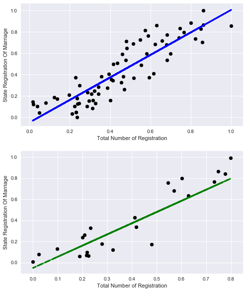
Let's take it out of curiosity to see how the percentage of registration of marriages could be explained only by the total number of records.
X_train=np.reshape(X_train[:,4],[X_train.shape[0],1]) X_test=np.reshape(X_test[:,4],[X_test.shape[0],1]) lr = linear_model.LinearRegression() lr.fit(X_train, y_train) print('Coefficients:', lr.coef_) print('Score:', lr.score(X_train,y_train)) Coefficients: [ 1.0571131]
Score: 0.788270672692
Well, not bad, but objectively less than with the rest of the signs.
Let's look at the graphics:
# plot for train data plt.figure(figsize=(8,10)) plt.subplot(211) plt.scatter(X_train, y_train, color='black') plt.plot(X_train, lr.predict(X_train), color='blue', linewidth=3) plt.xlabel('Total Number of Registration') plt.ylabel('State Registration Of Marriage') plt.title="Regression on train data" # plot for test data plt.subplot(212) plt.scatter(X_test, y_test, color='black') plt.plot(X_test, lr.predict(X_test), '--', color='green', linewidth=3) plt.xlabel('Total Number of Registration') plt.ylabel('State Registration Of Marriage') plt.title="Regression on test data" Let's try to add another useless attribute to the original data set.
State Registration Of Name Change, you can build a model yourself and see how much of the data this attribute explains (take a little word for it).
And we will immediately select the data and train the model on the old 4 signs and this useless
columns_to_show4=columns_to_show2.copy() columns_to_show4.append("StateRegistrationOfNameChange") X = df2[columns_to_show4].values # y hasn't changed X_train, X_test, y_train, y_test = train_test_split(X, y, test_size=0.25, random_state=42) y_train=np.reshape(y_train,[y_train.shape[0],1]) y_test=np.reshape(y_test,[y_test.shape[0],1]) lr = linear_model.LinearRegression() lr.fit(X_train, y_train) print('Coefficients:', lr.coef_) print('Score:', lr.score(X_test,y_test)) Coefficients: [[ 0.06583714 1.1080889 -0.35025999 -0.24473705 -0.4513887 ]]
Score: 0.285094398157
We will not try regularization; it will not fundamentally change anything; as you can see, this feature only spoils us.
Let's finally pick a useful attribute.
Everyone knows that there is a hot season for weddings (summer and early autumn), and there is a quiet season (winter).
By the way, I was surprised that in May there are few weddings.
#get data columns_to_show5=columns_to_show2.copy() columns_to_show5.append("Month") #get data for model X = df2[columns_to_show5].values # y hasn't changed X_train, X_test, y_train, y_test = train_test_split(X, y, test_size=0.25, random_state=42) y_train=np.reshape(y_train,[y_train.shape[0],1]) y_test=np.reshape(y_test,[y_test.shape[0],1]) #teach model and get predictions lr = linear_model.LinearRegression() lr.fit(X_train, y_train) print('Coefficients:', lr.coef_) print('Score:', lr.score(X_test,y_test)) Coefficients: [[-0.10613428 0.91315175 -0.55413198 -0.13253367 0.28536285]]
Score: 0.472057997208
A good quality improvement and most importantly, everything corresponds to sound logic.
Part V : “Cut the new caftan, and try on the old one!” - Trend forecast
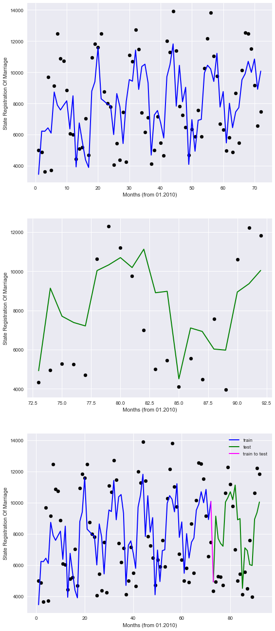
The last thing we probably have left is to look at linear regression as a tool for predicting a trend. In the previous chapters, we took the data randomly, that is, data from the entire time range fell into the training sample. This time we will divide the data into past and future and see if we can predict something.
For convenience, we will consider the period in months from January 2010, for this we will write a simple anonymous function that converts the data to us, eventually replacing the year column with the number of months.
We will be trained on data until 2016, and everything that begins in 2016 will be the future for us.
#get data df3=df.copy() #get new column df3.Year=df.Year.map(lambda x: (x-2010)*12)+df.Month df3.rename(columns={'Year': 'Months'}, inplace=True) #get data for model X=df3[columns_to_show5].values y=df3['StateRegistrationOfMarriage'].values train=[df3.Months<=72] test=[df3.Months>72] X_train=X[train] y_train=y[train] X_test=X[test] y_test=y[test] y_train=np.reshape(y_train,[y_train.shape[0],1]) y_test=np.reshape(y_test,[y_test.shape[0],1]) #teach model and get predictions lr = linear_model.LinearRegression() lr.fit(X_train, y_train) print('Coefficients:', lr.coef_[0]) print('Score:', lr.score(X_test,y_test)) Coefficients: [ 2.60708376e-01 1.30751121e+01 -3.31447168e+00 -2.34368684e-01
2.88096512e+02]
Score: 0.383195050367
As can be seen with such a breakdown of data, the accuracy is somewhat reduced, and yet the quality of the prediction is better than a finger to the sky.
Make sure to look at the graphics.
plt.figure(figsize=(9,23)) # plot for train data plt.subplot(311) plt.scatter(df3.Months.values[train], y_train, color='black') plt.plot(df3.Months.values[train], lr.predict(X_train), color='blue', linewidth=2) plt.xlabel('Months (from 01.2010)') plt.ylabel('State Registration Of Marriage') plt.title="Regression on train data" # plot for test data plt.subplot(312) plt.scatter(df3.Months.values[test], y_test, color='black') plt.plot(df3.Months.values[test], lr.predict(X_test), color='green', linewidth=2) plt.xlabel('Months (from 01.2010)') plt.ylabel('State Registration Of Marriage') plt.title="Regression (prediction) on test data" # plot for all data plt.subplot(313) plt.scatter(df3.Months.values[train], y_train, color='black') plt.plot(df3.Months.values[train], lr.predict(X_train), color='blue', label='train', linewidth=2) plt.scatter(df3.Months.values[test], y_test, color='black') plt.plot(df3.Months.values[test], lr.predict(X_test), color='green', label='test', linewidth=2) plt.title="Regression (prediction) on all data" plt.xlabel('Months (from 01.2010)') plt.ylabel('State Registration Of Marriage') #plot line for link train to test plt.plot([72,73], lr.predict([X_train[-1],X_test[0]]) , color='magenta',linewidth=2, label='train to test') plt.legend() The graphs in blue represent the “past”, green “the future”, and purple a bunch.
So, it is clear that our model imperfectly describes points, but at least takes into account seasonal patterns.
Thus, it is hoped that in the future, according to the data available, the model will be able to guide us somehow, in terms of the registration of marriages.
Although for the analysis of trends there are much more advanced tools that are beyond the scope of this article (and in my opinion, initial skills in Data Science)
Conclusion
Well, we have considered the task of restoring regression, I suggest you look for other dependencies, on the open data portals of the state structures of the country, you may find some interesting dependency. As a “Challenge”, I suggest you dig up something on the open data portal of the Republic of Belarus opendata.by
At the end of the picture, based on Alexander G. communication with journalists and answers to uncomfortable questions.
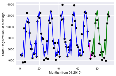
Bonus - Increase accuracy, due to a different approach to the months
Colleagues left useful comments with recommendations for improving the quality of the prediction.
In short, all the suggestions came down to the fact that in an attempt to simplify everything, I incorrectly coded the “Month” column (and this is indeed so). We will try to improve this in two ways.
Option 1 - One-hot coding, when for each value of the month a characteristic is created.
First, load the original table without edits.
df_base = pd.read_csv('https://op.mos.ru/EHDWSREST/catalog/export/get?id=230308', compression='zip', header=0, encoding='cp1251', sep=';', quotechar='"') Then we apply the one-hot encoding implemented in the pandas data frame library (get_dummies function), remove unnecessary columns, and rerun the model's training and graphics drawing.
#get data for model df4=df_base.copy() df4.drop(['Year','StateRegistrationOfMarriage','ID','global_id','Unnamed: 12','TotalNumber','StateRegistrationOfNameChange','StateRegistrationOfAdoption'],axis=1,inplace=True) df4=pd.get_dummies(df4,prefix=['Month']) X=df4.values X_train=X[train] X_test=X[test] #teach model and get predictions lr = linear_model.LinearRegression() lr.fit(X_train, y_train) print('Coefficients:', lr.coef_[0]) print('Score:', lr.score(X_test,y_test)) # plot for all data plt.scatter(df3.Months.values[train], y_train, color='black') plt.plot(df3.Months.values[train], lr.predict(X_train), color='blue', label='train', linewidth=2) plt.scatter(df3.Months.values[test], y_test, color='black') plt.plot(df3.Months.values[test], lr.predict(X_test), color='green', label='test', linewidth=2) plt.title="Regression (prediction) on all data" plt.xlabel('Months (from 01.2010)') plt.ylabel('State Registration Of Marriage') #plot line for link train to test plt.plot([72,73], lr.predict([X_train[-1],X_test[0]]) , color='magenta',linewidth=2, label='train to test') Will get
Coefficients: [ 2.18633008e-01 -1.41397731e-01 4.56991414e-02 -5.17558633e-01
4.48131002e+03 -2.94754108e+02 -1.14429758e+03 3.61201946e+03
2.41208054e+03 -3.23415050e+03 -2.73587261e+03 -1.31020899e+03
4.84757208e+02 3.37280689e+03 -2.40539320e+03 -3.23829714e+03]
Score: 0.869208071831
The quality has grown greatly!
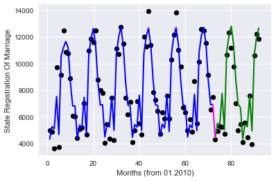
Option 2 - target encoding, we encode each month with the average value of the objective function for this month in the training sample (thanks to roryorangepants )
#get data for pandas data frame df5=df_base.copy() d=dict() #get we obtain the mean value of Registration Of Marriages by months on the training data for mon in df5.Month.unique(): d[mon]=df5.StateRegistrationOfMarriage[df5.Month.values[train]==mon].mean() #d+={} df5['MeanMarriagePerMonth']=df5.Month.map(d) df5.drop(['Month','Year','StateRegistrationOfMarriage','ID','global_id','Unnamed: 12','TotalNumber', 'StateRegistrationOfNameChange','StateRegistrationOfAdoption'],axis=1,inplace=True) #get data for model X=df5.values X_train=X[train] X_test=X[test] #teach model and get predictions lr = linear_model.LinearRegression() lr.fit(X_train, y_train) print('Coefficients:', lr.coef_[0]) print('Score:', lr.score(X_test,y_test)) # plot for all data plt.scatter(df3.Months.values[train], y_train, color='black') plt.plot(df3.Months.values[train], lr.predict(X_train), color='blue', label='train', linewidth=2) plt.scatter(df3.Months.values[test], y_test, color='black') plt.plot(df3.Months.values[test], lr.predict(X_test), color='green', label='test', linewidth=2) plt.title="Regression (prediction) on all data" plt.xlabel('Months (from 01.2010)') plt.ylabel('State Registration Of Marriage') #plot line for link train to test plt.plot([72,73], lr.predict([X_train[-1],X_test[0]]) , color='magenta',linewidth=2, label='train to test')- We get:
Coefficients: [ 0.16556761 -0.12746446 -0.03652408 -0.21649349 0.96971467]
Score: 0.875882918435
Very similar in terms of quality result, with significantly fewer signs used.
Well, I hope everything.
Here's a goodbye picture with Mr. "Zhoposranchik", I hope she will not offend anyone and will not cause the "holivar" :)
Source: https://habr.com/ru/post/340698/
All Articles