UI design in games on the example of NieR: Automata
Hi, my name is Hisayoshi Kijima, I'm a designer of UI and furs for NieR: Automata. The game UI (user interface) often goes unnoticed, so I'm glad to hear that fans have found the NieR: Automata developer diary and asked about my work!
When director NieR: Automata Yoko Taro works on games, he always knows exactly what he wants, and the UI is no exception. I want to tell you about my work on the UI for NieR: Automata, as well as about the tasks that Yoko-san gave me.
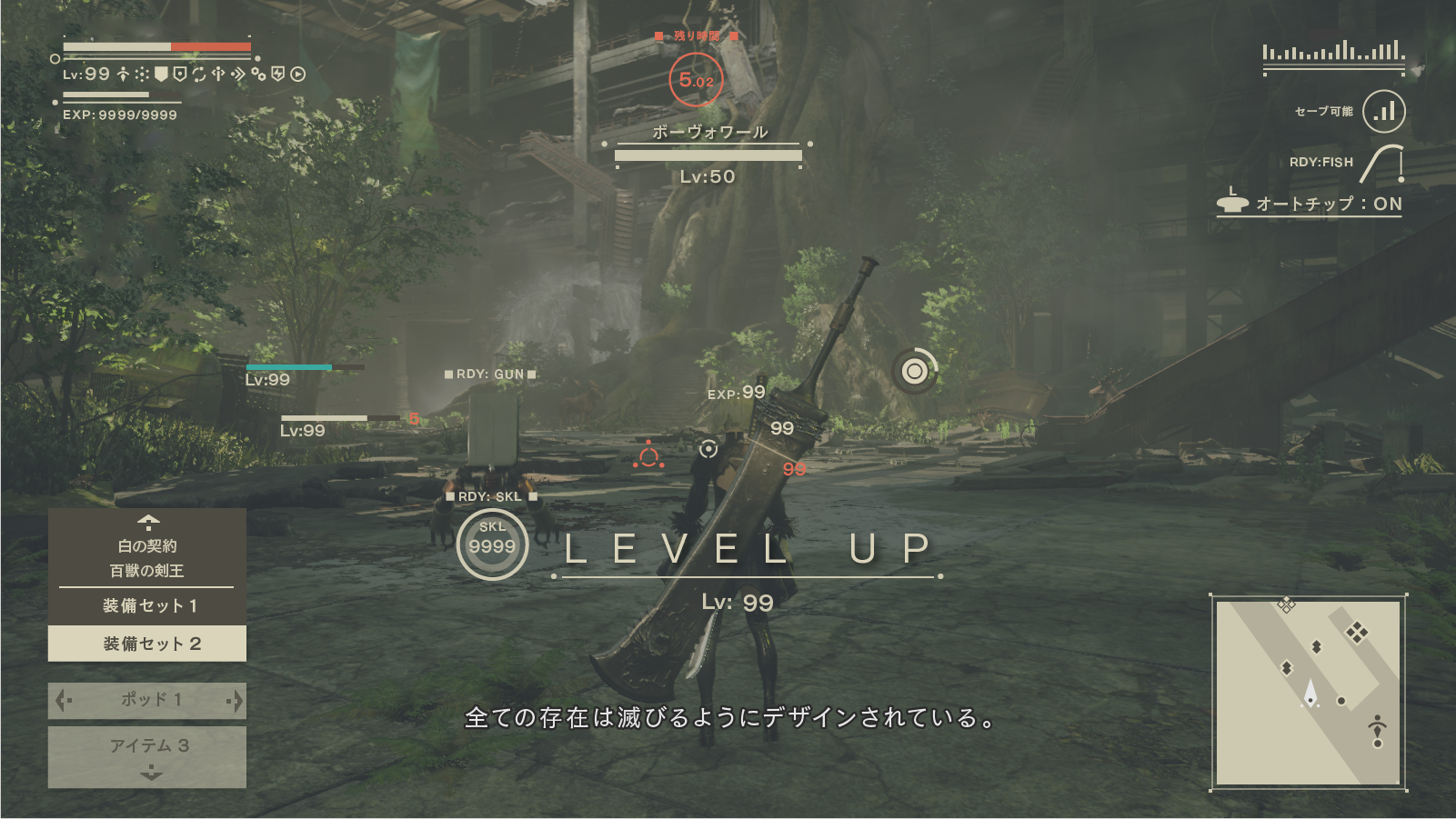
Let's start first: what the UI artist does. In modern games, there are many health indicators, dialog boxes, various menu screens and pop-up windows that convey important information. All of them are made by the same UI artists as me.
')
When developing a user interface design, my workflow looks like this:
- Develop a visual design of the UI concept
- Create a design of several menu screens and screen elements, taking into account the requirements of the director and game designers
- Prepare data for these UI elements and transfer them to programmers so that they insert them into the game.
- Check the UI in the game, find the changes and improvements that need to be made; repeat until you get a ready quality UI!
In this post, I mainly want to talk about items 1 and 2 - the concept and design of menu screens .
Concept Design UI: The Balance of Science Fiction and Fantasy
The world of NieR: Automata to science fiction, but the previous game of the series (NIER Replicant / Gestalt) had rather fantasy aesthetics. When developing the UI NieR: Automata concept, I wanted to make science fiction elements look like the natural continuation of the fantasy style of the first game.
For work, I had several visual landmarks: UI of the previous game; habitual aesthetics of sci-fi; the heroine 2B itself and the general idea of a luxurious and fading world. Mixing all these styles together, I got my basic concept of UI NieR: Automata: a design that will be systematic and sterile, but at the same time beautiful . At that moment I was sure that the best way to convey this style was to avoid embellishment and focus on creating a clean, elegant and flat design . But I soon realized that I had stuck with this idea too much, and the finished design would be dry.
I decided to add to the “systematic and pure” part of the concept a light tune of “musical score” . This helped to emphasize the "fantasy" aura of design.
When I talk about the motive of a “musical score”, I do not mean adding smooth lines of a treble clef. I drew inspiration from such forms as musical rulers, bass clefs and double features that complete musical phrases. Instead of directly adding musical elements, I wanted to hint at them with the help of symbolism . (This is also reflected in the colons of the name of the game, as well as dialogues with Pod - another symbol that often appears in musical scores.)
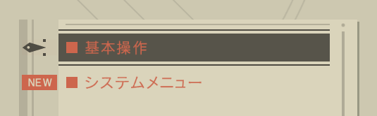
The decorations on the top and bottom of the menu screen are based on similar borders from the first NIER menu. These elements add to the “digital” design an “analog” feel. Thanks to them, in the process of developing the concept of UI, I could manage the balance between fantasy and science fiction .
Design concept UI: from plane to form
At the heart of this concept is for the most part a flat design. To make it a little better match the entourage of the game, I added a weak grid texture, as well as a bit of distortion and darkening around the edges. Thanks to this menu it looks like it is displayed on a monitor with a bulging screen. So we got the finished design:
This GIF shows how the design looks before and after adding a screen / lens effect.
And with the help of this small skeuomorphic stroke, I created something more physical and real on the basis of a simple flat design.
* What is skevomorphism? This is something new, borrowing design elements from the old version of yourself. For example, the “Save As” icon as a diskette in 2017.
I also made light changes to make the UI animations beautiful and smooth on the players' flat screens — they should look a bit richer, not dry and colorless. This smoothness is rather weakly expressed, but I am especially proud of how objects move on the screen when choosing the system menu:
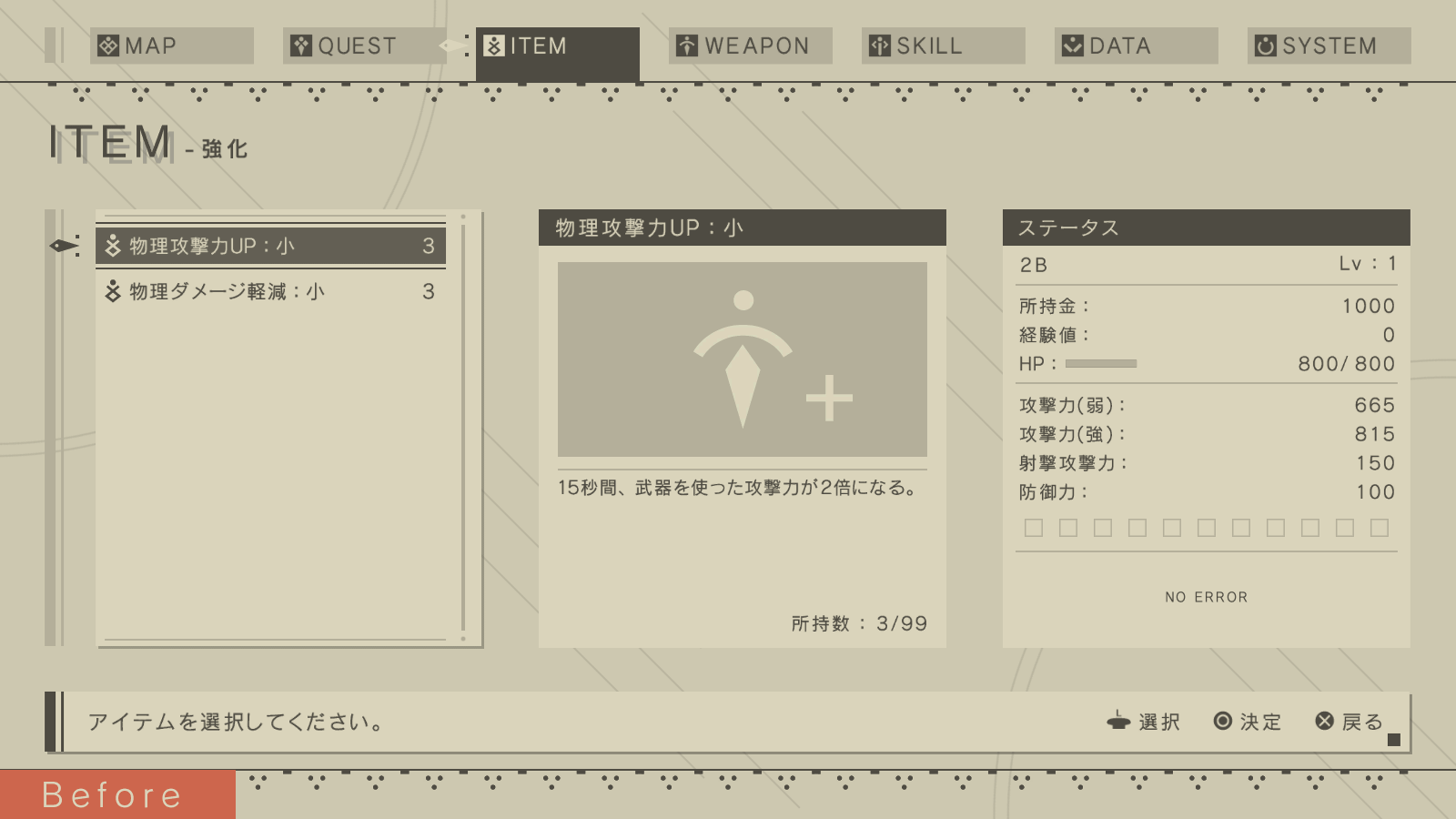
UI Concept Design: Beige as a basis
In the very first UI specification received from Yoko Taro, it was supposed to be " beautiful, warm beige ."
But it is much easier said than done. At first, I could not even imagine how one could recreate the “warm-beige” feeling with the help of cold, numerical digital aesthetics.
I decided to start with something that I can imagine more simply - a sharp, high-contrast black-and-white design - and gradually bring it to a softer beige. Gradually, I came to a color that seemed right. It took a lot of work to find and maintain a distinct color scheme with soft, low-contrast beige shades.
My original color scheme was much more contrast than the final design.

The final color scheme.
Yoko-san also said that he wanted to avoid a wide range of colors , so I had to create such a UI so that it depended on the colors as little as possible, but at the same time communicated information effectively.
For example, this meant a change in the thickness and darkness of font color, symbolizing a change in characteristics:

When I needed to use colors to ensure readability, I limited myself to dirty red-orange. (Well, there are still rare examples of white and pale green.)
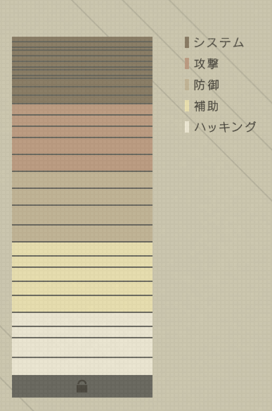
The menu of the inserted chips was a difficult task for me, because it was necessary to set a clear color coding of different types of chips. After much trial and error, I picked up a readable set of colors that differed well from each other, while remaining holistic with the rest of the design.
The UI color scheme was reflected in the hacker mini-game, and in 3D-models on the screen of the world map. This allowed to give the game a uniform visual style .
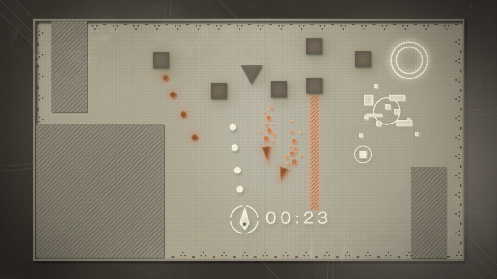
Design concept for a hacker mini-game.

3D models that make up the world map screen.
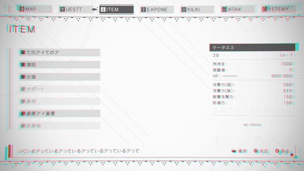
Menu Screen Design: Available Functionality
Throughout the work on NieR: Automata, Yoko-san always emphasized that the menu management should be so simple that even those who do not play serious games can master it. "I want your grandmother to get comfortable with him."
The menu used two fundamental rules:
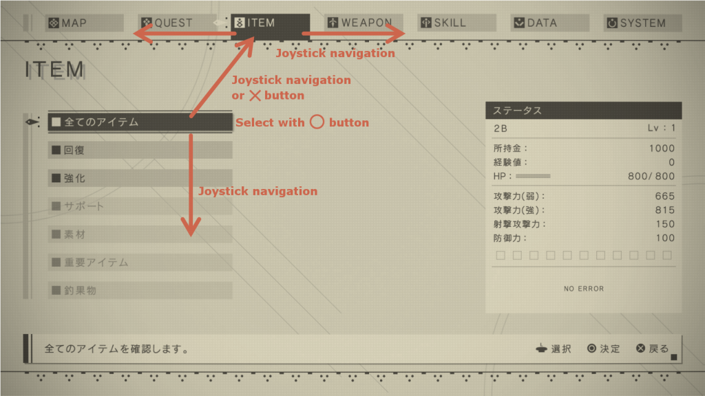
- All menu functions can be accessed with the joystick and O / X buttons .
- The on-screen control tips should be very brief — they usually only need to explain the three controls described above.
In game menus, triggers such as L1 and R1 are often used, as well as other buttons on the front surface. I admit, I had to break my head over how to do when switching between categories screens and other navigation without them. Sometimes it seemed that the requirement of simple control was incompatible with a complex menu structure, which led to the creation of test management options that were difficult to understand. Yoko-san and I often swear ... that is, we discussed the menu, trying to come to a compromise that suits us both.
As a result, we came to the conclusion that people who are already accustomed to playing games with a variety of menus subconsciously feel more comfortable when control is not limited to the stick and O / X buttons. Therefore, they are not necessary when navigating the menu, and the screen prompts do not say anything about them, however there are hidden quick movements using the L1, R1 and triangle / square buttons. (Did you notice them in the game?)
The game has the following hot buttons:
The player can move between the categories screens of the system menu and scroll through the pages of these weapons and units using the L1 and R1 buttons.
From the list of unit data, you can change the equipment of units and control the animation playback using the triangle and square buttons. You can also rotate the model using the right stick.
On the map screen, you can use the right stick and L2 / R2 to quickly navigate to the full screen map.
Anywhere in the system menu hierarchy, you can click the Options button to immediately return to the game. You can also press any button to skip the closing menu animation.
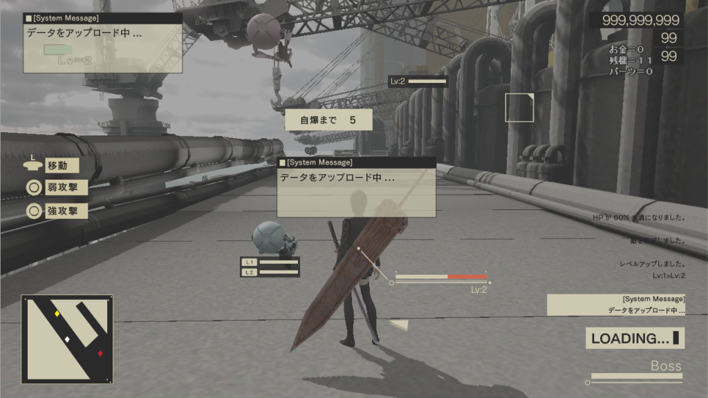
Bonus: weird ui
At our first meeting about the interface for NieR: Automata, Yoko-san said that he wanted to " add something weird . There are a lot of games with a regular UI. I want to make a weird one!". But during the development process, the requirements became more realistic and rigorous, and it was difficult to make something stand out.
But in any development team there are always a couple of “jokers”, for example, a game designer is slightly out of his mind, offering strange ideas, or a programmer who has added an awkward “trick” for his own pleasure. Usually they ran into a strict conversation with the authorities, but thanks to these jokers we got a UI that meets the requirements of the weirdness of Yoko-san. Let's look at the results of their work.
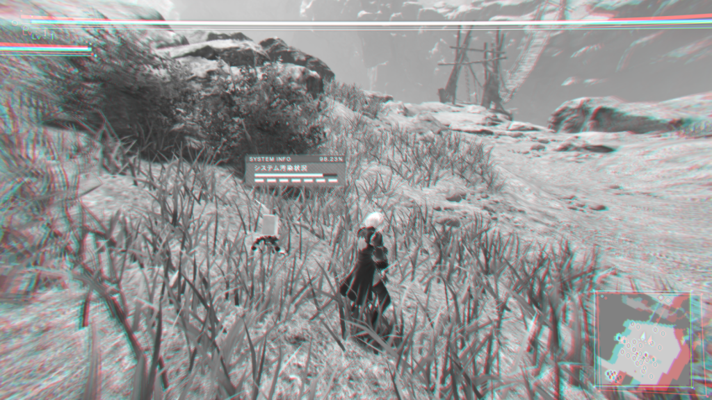
Use the self-destruct feature to see such a “broken” UI.
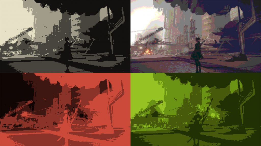
Various "nostalgic filters" inspired by the games of the past.
Finally
I am pleased with my work on UI NieR: Automata, but even more I am pleased with the very good player reviews. Looking back, I am again surprised at how outlandish some of Yoko-san’s demands were!
The article was longer than I expected, thanks for being with me until the very end!
Oh, and by the way - I was developing not only the design of the UI NieR: Automata. I also created a design for all furs. But you probably are no longer interested in my stories ... Or not? I warn you, probably this story will not appear soon either ...
 Hisayoshi Kijima
Hisayoshi Kijima joined PlatinumGames in 2011. He designed the UI for Bayonetta 2 , Metal Gear Rising: Revengeance , The Legend of Korra and TRANSFORMERS: Devastation , but he also likes the bellows! He loves them so much that he chose mechanical engineering as his main profession in college. Unusual education for the artist greatly helped him in developing the UI and mechanical characters of NieR: Automata .
Source: https://habr.com/ru/post/340610/
All Articles