BEM + React: flexible design system architecture

Design is fascism. Fascism needs a nutrient medium. It begins to unfold in full only on a large scale. The ideal environment for fascism is a big company with a huge amount of products. For example, Google or ... Alpha Bank. Fascism is not a priori flexible ...
All buttons on all products of the company must wear the same shirt, only one color of the nomenclature color # F02823. Any link also has its own uniform: color # 0A1E32, underscore at a distance of 2px. If we click on the link, it should immediately execute the command - move us to another section of the application. For insubordination - expulsion from the design of the Alfa-Bank system to the Green Bank or shooting. And it is not known what the link would be in this case.
But this is fascism in the name of love. We love our user: we want the user to get the same experience on each of our products. To him it was easy and simple. That the Bank quickly and effectively solved its tasks.
')
Design is fascism in the name of love.
This is fascism for the sake of drive and speed. We want to develop our applications quickly, so that developers do not reinvent the wheel for new applications each time and can fumble through the best UI / UX practices between teams.
Any fascism presupposes an ideology. Any fascism implies centralized decision making. For any fascism, the company needs to have the Most Important Committee on Censorship and Unification, or the General Committee.
But wait, now Alfa-Bank is a turquoise company with an Agile and Scrum manifesto in its engine. This means that we deliberately adopted a strategy, that all decisions are “sewn up” into teams, and not into committees of the SGCPCIU type ...
How to keep design consistency and not lose development flexibility?
Our library of components ARUI Feather is based on two well-known solutions from the world of the frontend: BEM methodology and React .
There will not be a story about the choice of tools: I would like to tell more about the principles and practices of scaling design systems that we developed in the process of creating ARUI Feather .
Learn more about why we have the BEM-methodology + React , you can find out in this video from Yandex.Money FrontendMix 2017 .
At the heart of engineering solutions ARUI Feather is the philosophy
KISS / YAGNI / DRY
KISS means that we initially decided to avoid complicated solutions. We were faced with the task of making a code for a design system that any team can figure out on its own. ARUI Feather is the AK-47 of the world of design systems. Even lying flat in the sand in the trenches near Baghdad, you can independently disassemble and assemble it without contacting the service center of the US Navy.
Also, following YAGNI , we do only what is necessary, and the last trend is that we remove components more often than create new ones, because in fact many things lie beyond the area of responsibility of the design system.
ARUI Feather is the AK-47 of the world of design systems. Even lying flat in the sand in the trenches near Baghdad, you can independently disassemble and assemble it without contacting the US Navy service center.
For this reason, we use the BEM methodology, which is not fully implemented, excluding mixes and redefinition levels . Both of these approaches are about “mixing”, which, when scaled up, includes “crazy mixer” on projects, making the code hard to debug.
Technically, we support the design system through our own Open Source solution - cn-decorator , which allows you to use the BEM methodology and React together.
We use the BEM methodology not fully implemented,
excluding mixes and override levels
What problems did we encounter when scaling a design system?
Alfa-Bank already has more than 30 teams that develop their frontend independently, using ARUI Feather and cn-decorator .
We do not have a separate dedicated team that focuses on developing the UI / UX library. The development is carried out according to the principles established in Open Source: there are maintainers of the component library, there are contributors and, of course, there are users. And all these people one way or another members of different teams. We deliberately took this step to avoid the appearance of a narrow link in the company in the form of a library development team, to which other teams place an order and wait to be helped.
It also helps to solve problems that are really important for creating a product, and not tasks from a vacuum, which service teams often like to invent.
Next, I will tell you about the top questions from the teams that arrive to the maintainers, and how we solve them ...
And how do I write a component?
This is the simplest component written using cn-decorator .
import cn from 'cn-decorator'; @cn('button') class Button extends React.Component { render(cn) { return <button className={ cn() } />; } } Simply use the @cn decorator and pass the name of the block, in this example, the 'button' . Now the render method will get its cn instance, which can be used to generate class names. And our final HTML BEM block would look something like this:
<button class="button"></button> But there are elements, modifiers,
import cn from 'cn-decorator'; @cn('button') class Button extends React.Component { render(cn) { return ( <button className={ cn({ disabled: true }) }> <span className={ cn('text') }>Text</span> </button> ); } } As a result, we get the following layout:
<button class="button button_disabled"> <span class="button__text">Text</span> </button> The example clearly shows how cn-decorator can handle modifiers and elements. It remains to add a bit of CSS, and the component is ready!
We thought here: if you change the color of the frames here at this button, the conversion will increase by 200%! Do we need a button from scratch?
Alfa-Bank is a 100% grocery company. Our teams regularly conduct dozens of experiments. Sometimes even a slight change in frame color can lead to a change in conversion.
If we had a committee of the Committee, we would have to make a decision on such an insignificant experiment at its nearest meeting, wait for the verdict and, after a long six months, still increase the conversion. Technically, we would use WebComponents and prohibit any intervention in the layout and component API.
But life is richer, and each team has the full right to conduct experiments with the design. For this, the className proxy mechanism is built into cn-decorator ...
import Button from 'arui-feather/button'; class App extends React.Component { render() { return <Button className="my-class" />; } } As a result, we get the following layout:
<button class="button my-class"></button> Now we can simply block a couple of properties of our button on the project in the .my-class selector ...
We still thought and seem to know how to increase conversion by 500%! But, we need a button ... No, it should be pressed as old, but it looks something completely different ... Do we have to do it again from scratch?
And this happens. Agree, it's a shame to write a component, the logic of which you are completely satisfied with, but it looks completely different. Slightly above, I said that we do not like all the blending patterns, but prefer patterns based on composition. Therefore, we have a mechanism for overloading the name of the block , which allows us to disassemble the component into its component parts: styles and logic.

This picture has two buttons. They look completely different, nevertheless they fumble all behavior among themselves. We achieve this by knowing how to overload the base name of the block .

It is enough just to redo the component and write new styles for it:
import cn from 'arui-feather/cn'; import Button from 'arui-feather/button'; import './tag-button.css'; @cn('tag-button') class TagButton extends Button {}; TagButton layout layout:
<button class="tag-button tag-button_disabled"> <span class="tag-button__text">Text</span> </button> Such a simple pattern allows us to fumble the logic of a component between different representations.
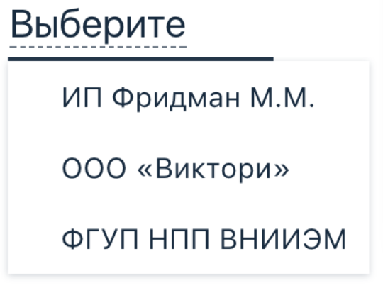
And here we have a designer painted a component that looks like Link, but works like Select ... And you do not have this! And this will increase the conversion by 1000%!
These were simple examples, but often our components are composite (remember, we love composition). For example, such a composite component is Select : it consists of two components, Button and Popup .

Approximately the Select code looks like this:
import cn from 'arui-feather/cn'; import Button from 'arui-feather/button'; import Popup from 'arui-feather/popup'; @cn('select') class Select extends React.Component { render(cn) { return ( <div className={ cn() }> <Button /> <Popup /> </div> ); } } But sometimes teams need to change the composite component. For example, a team needs Popup to drop out of a link, not a button. Something like this:
But we have a modular system on ES6 modules. The only way to replace a composite component is to make a patch at the assembly level. Here again cn-decorator and its feature Dependency Injection Components come to the rescue. Let's pass our composite components via cn :
import cn from 'arui-feather/cn'; import Button from 'arui-feather/button'; import Popup from 'arui-feather/popup'; @cn('select', Button, Popup) class Select extends React.Component { render(cn, Button, Popup) { return ( <div className={ cn() }> <Button /> <Popup /> </div> ); } } Now we can make our own Select by replacing Button with our own.
import cn from 'arui-feather/cn'; import Select from 'arui-feather/select'; import Popup from 'arui-feather/popup'; import MyLinkButton from './my-link-button'; @cn('my-link-select', MyLinkButton, Popup) class MyLinkSelect extends Select {}; 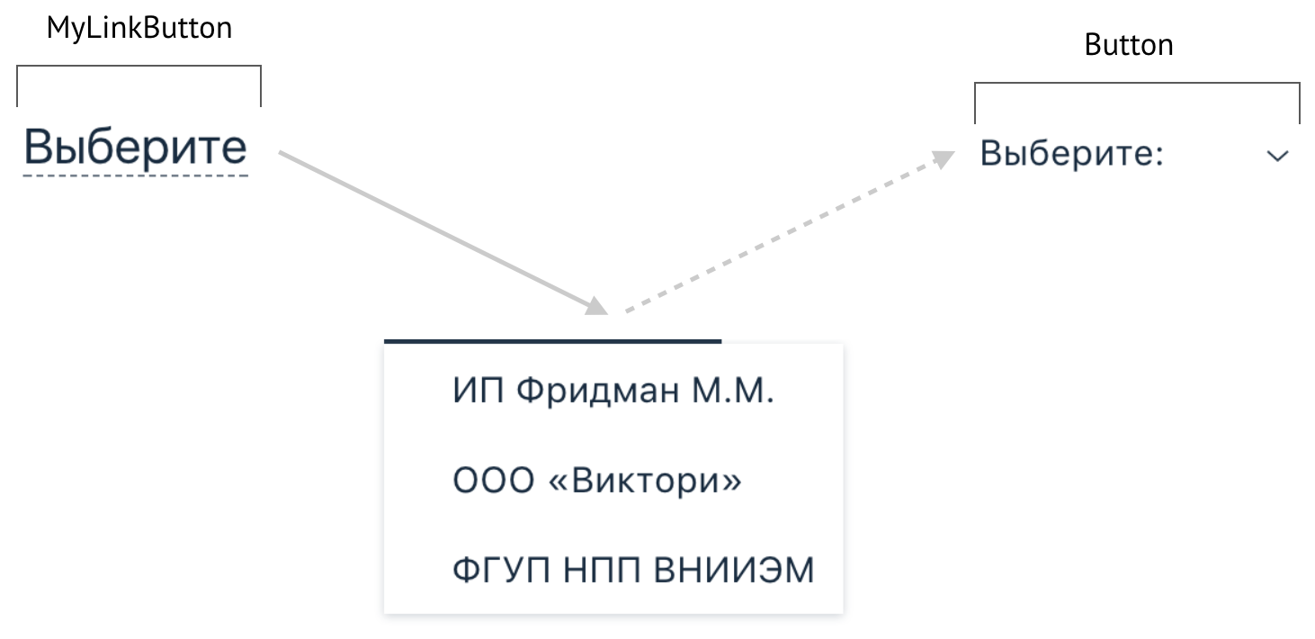
Hooray! Now we can change any composite component of the composition!
Now you have seen everything
A design system in a large company is not about technology: it is not about Angular vs Holivar BEM vs React. A design system is a search for compromises between consistency and the ability to perform quick experiments. A design system is working with a community and working with business requirements at the same time. This is a b2b- and b2c-solution: on one side of the scale is a business that wants quickly, cheaply and efficiently, and on the other hand, developers who want to be flexible, extensible, but predictable and reliable.
I would like to complete this article with one very precise law, which best explains the architecture of design systems (and, in principle, any architecture):
“Organizations that design systems (here we mean a broader interpretation, including not only information systems), inevitably produce a structure whose structure is a copy of the structure of interaction within the organization itself”
—Conway's Law
Our open source solutions:
ARUI Feather - Alpha Bank UI Component Library
cn-decorator - The best way to use the BEM methodology with React
Our vacancies in front-end development and design:
Interface Designer / Digital Product Designer
Front End Development
Design

Source: https://habr.com/ru/post/340522/
All Articles