Technology, sports and finance: 5 redesigns of 2017

Sometimes, even the largest corporations need to redesign. This is due to the new positioning of the company in the market, the expansion of the target audience, or simply when the old logo has “become boring”.
We picked up some interesting examples of redesign, which made large projects in 2017, and diluted them with a story about our own changes.
')
Scale redesign for Dropbox
For 10 years of operation, Dropbox has turned from a regular file hosting service into a platform for interaction between company employees. People upload files to the system, open access to colleagues and discuss the work directly on the site.
The old logo schematically depicted a box symbolizing a place to store data. But the management of the company decided that this symbol does not correspond to the modern mission of the service and turned the box into a set of multi-colored surfaces.

The new logo consists of contrasting colors and varies depending on the situation. This reflects the creative approach and different types of thinking of people who, ultimately, develop into a coherent picture. For the development of a new visual component, photographers and artists were invited, who jointly created illustrations reflecting the Dropbox approach to team collaboration. Also changed the font. Sharp Grotesk is now used on the platform.
The main purpose of Dropbox rebranding is to focus users on the fact that this platform allows not only to store files, but also to interact with each other in the works.

Laconic redesign of Juventus FC
The last time the emblem of the Juventus football club was updated in 2004.

The club management decided to appeal to new audiences: children, women and young people and changed the logo. According to their idea, thanks to the update, people will be drawn to them not only because of the love of football, but also because of their philosophy and style. There are no unnecessary details on the new emblem, but all significant accents are preserved: the stripes of the playing T-shirt, the Scudetto is the symbol of victory and the letter J., canonical for Juventus.

“Juventus” is no longer just a city team from Turin, but an international club that wins serious tournaments. Now on their emblem there is no bull - the symbol of the city, which brings the team closer to the world level. But at the same time in the new logo preserved symbolic characters that will appreciate the old fans who honor the tradition.

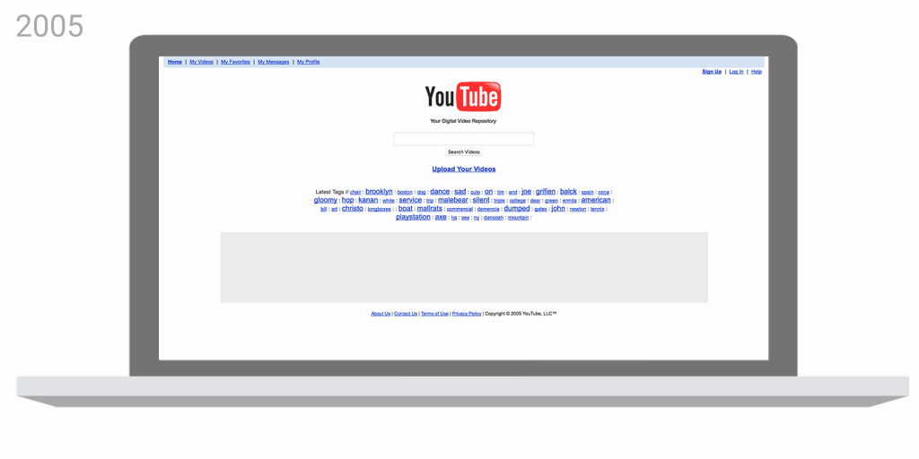
Another Youtube Redesign
Youtube has already updated the interface design in 2016. Then, Google introduced a design option in the style of Material Design, which was available to a limited number of users.
In this design, the search string has moved to the middle of the screen, and the “upload” button has been replaced with an icon from Google’s mobile apps. Also, channel logos and icons in the menu bar have become round.
In 2017, more dramatic changes were made to the YouTube design. For example, the service for the first time since 2005 has updated the logo.
The word "tube" in the name of the video service is translated as "pipe" - the slang name of the TV, which works using a cathode ray tube. But Youtube has little to do with pipes and TVs. The logo was updated by focusing on the “play” button, which became a landmark for the service.

Also in the updated version there is support for vertical and square videos that will adapt to the screens. Now, when viewed from mobile devices, videos will be played without black bars.
In the desktop version there was a dark theme, which previously was available only to a limited number of users. And now you can change the speed of video playback.
Complete rebranding ITinvest
In conclusion, we will talk about our own redesign. On September 30, all companies in the ITI Group began the transition to a new brand. Brokerage company ITinvest also changed its logo and name - now we are ITI Capital .
The following companies will also operate under the ITI Capital brand: ITI Capital Ltd, a broker in London, ITI Trade Ltd, a broker in Guernsey (United Kingdom), as well as an English broker Walbrook Capital Markets Ltd., acquired in August 2017.

The main color for all corporate materials is red, and the additional color is gray. Their combination conveys confidence and a sense of stability.

And what interesting redesigns of the current year do you remember?
Other materials on finance and stock market from ITI Capital :
- ITI Capital Educational Resources
- Analytics and market reviews
- Futures, indices and IPOs: how exchanges really work and why they are needed
- Top 10 books to understand the stock market device
- Futures, indices and IPOs: how exchanges really work and why they are needed
- Infrastructure of the Russian securities market (brief educational program)
- How-to: robots and brokerage trading system APIs
Source: https://habr.com/ru/post/340280/
All Articles