Stone in the designer's garden

* The article is intended for novice designers of online stores, as well as frontend developers who are able to somehow influence them. If you do not belong to these categories, you can not waste your time. I warned.
“All the mistakes that the frontend developer made to him will return to him when building the site, all the flaws that the designer will be too lazy to draw will be thought up by the layout designer”
Having worked for a certain period in the development of online stores on the OpenCart platform, I would like to share my personal experience, as well as the typical mistakes of young designers in creating web-pages. I hope that this article will improve your design skills and you will not allow it to be discussed ...
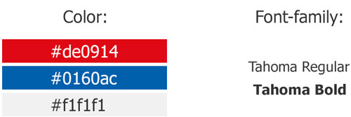
1) Thought over using fonts

When creating a site design, the use of no more than 3-4 different font families for the entire site is encouraged. Preferences should be given to publicly accessible fonts, for example - fonts.google.com/ (At the time of writing, 846 font families are available), this will help in optimizing the site and will not cause problems with copyright infringement. The main font size, 16px (for small inscriptions - 14px). Headings, subheadings 20-26. (More). (I will not describe why this is so if you can read interesting here 20 questions about tourte web fonts or here Opinion: main text in 16px naikom )
')
If you have decided to use something less than 14px, there must be a very good reason for this (for example, a loan agreement, a valid document in charge,
Be especially careful when choosing colors for texts on the site. There should not be many of them (max 5-6). * Do not implement these 50 shades of gray on the site for each sub-category.
It is also considered good practice to attach a file to your ready-made jpg layout on which descriptions of all the used fonts and colors are made.
2) Design the appearance of the menu and their items
Pull-out-pull-out menus should be displayed in at least two states:
- collected;

- decomposed
Menu items should be displayed in 2 views:

passive (the cursor is not pointed)

active (mouse over)
In addition, the texts of menu items should take into account the possibility of a long section title (for example, Storage and transportation, Auction goods) and transfer it to the second line. If the site is going to be multilingual, this moment can also break the layout. (On this topic, I really liked the article Eleventh- grader , or test the layout bugs Diokuz )
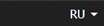
3) Make links
For links, it is very desirable to design 3 statuses: a normal link (link), a link when you hover the cursor (hover link), and a visited link (visited link). Of course, it is necessary that the designer to the designer should draw all 3 states (In practice, of course, it is rare, but demand)
4) Design navigation chains
Navigation chains (they are bread crumbs) should be spelled out taking into account real section titles and word wrap.
How designers like to send layout:
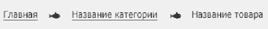
As expected, it will look like on the site:

I am not sure that this is correct from the point of view of the CEO, but I think everyone caught the idea, it’s common for these bread crumbs to turn into full-sized baked goods like noodles in two lines. It would not be bad to take this into account even at the moment of design.
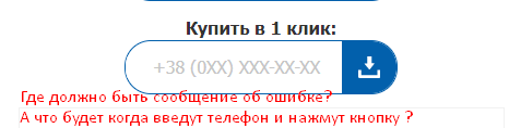
5) The client must know what is making a mistake.
In the layout should be drawn warning messages. (Error messages, confirmation of the operation, and so on.) Otherwise it will sculpt prompts, or even worse - through alert () messages.

★ Registration form ★ by Andry Zirka ( @ BlackStar1991 ) on CodePen
6) The menu of rubrics will expand
Quite often it happens that the initial menu items on the site expand to disgrace.
You are very lucky if you can learn about the maximum nesting of categories of goods before starting the design development It also saves a lot of time and nerves. (This is especially true if the site is being redesigned).
Initial option

And approximately it turned out to be at the exit (branching to the 4th subcategory)

* This, of course, is not entirely correct, but whoever wants to redo an already prepared database or prove to the customer that it is better not to do this and users will not go so deep into the category tree.
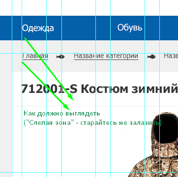
7) Guides and grids in the layout - this is important
In the age of digital devices without proper adaptation anywhere.
Since at the moment developers are not yet ready to switch to the Grid system at all (but everything is proceeding to that), and continue to use life-simplifying frameworks (Bootstrap, Foundation and others ) with their standard 12-column meshes in their work, this should be considered in design. Actually, if you are lucky and you work in a reputable company, you can count on layouts for popular resolutions 1200px, 991px, 768px, 450px, 320px (detailed here ), but in practice this is rare. At best, designers can provide a large layout - 1920px (or 1680px - who has worse monitors) and something similar to a mobile for an extension of 320px. Everything would be fine if there were strictly followed the indents of the guides. I will give a small, but very typical example.
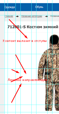
Designer, remember these are two completely different layouts!
Obviously, this is not critical and can be dropped through the class with padding-left: 0! Important; And then when reducing the permissions again to return, but why these mans? Place the content in the right places and everything will look good with lower resolution. In other words, do not create unnecessary problems to the coder, if they can be avoided.
Also, quite often, designers give layouts with “extra” guides. Most often, they do not carry the meaning during layout (especially for vertical guides), but visually litter the layout.
Personally, I ask you to remove everything that is not the Bootstrap net guides. I can already see that on one level with what, and what is not visible, there is a corresponding software ( PerfectPixel , Avocode , Zeplin ) that he will not allow me to create chaos.
8) Divide and conquer
Never, hear, never merge all your project layouts into one PSD file! (Even if you really want and it is so convenient for you, even if you know that there will be fewer errors with transferring different repeated blocks) Not only will you ruin your karma, so you will also make a coder to slander and commemorate your relatives. After all, not all of them have powerful iron, some of you only need to open such a monster file, you will need to seriously harness it.
One page - one layout! (Home, Item Card, Categories, Basket, Authorization….)
If you still got such a layout from the designer
We solve this problem like this:
- Necessary layers are collected in the group.
- In the layers palette, click on the group with the right mouse button.
- In the drop-down menu, select the item Duplicate Group ...
- In the window that appears in the Document column, select New.
- Profit.
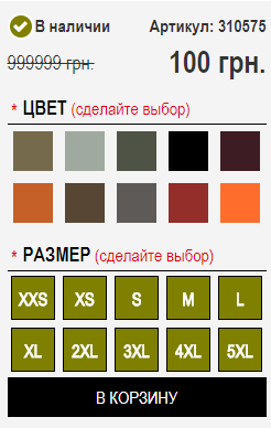
9) What if there is no content?
Quite often it happens that the designed interface at the output is not always in demand. I will give an example:

This is the standard part of the page Cards products for shops selling clothes. But if the store plans to sell not only clothes, but also other related things - fishing rods, knives, lighters, camping equipment, and so on. it may happen that some blocks will be unavailable for interaction, or, more likely, they will simply not connect from the admin panel. (In the example, these are the Size selection blocks and the block Short description, * And yes, there is a separate block There is a full description of the product, do not ask why me.) As a result, we have an empty space, or a broken layout. Obviously, this problem is solved, by requests on the server (like “Is there any content?”, And if not, then we insert the necessary style), but it would be nice if the designer for the layout designer solved this problem and did not reset his deficiencies on other people's shoulders.
Just try to connect parts of your components for a while, and imagine what will happen if one day this unit is not needed.
10) And what will happen next ...?
Before you start to lay out the layout, I like to go to my designer and start asking stupid questions (forgive me my designer, Olya, this is my radish) The questions are always simple and of the same type: - What will happen after the user clicks on that or another item. I consider this behavior quite acceptable if there is no clearly traced element there, or an explanation of how it will work.
Typical errors, unfinished elements.

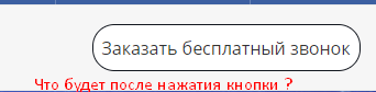
In all examples, the designer was too lazy to think about what will happen after the user interacts with the site elements. Also, the user in these examples will not be displayed in any way if he does something wrong. Designer must provide this.
The coder is also responsible for the correct (preferably intuitive) work of all elements of the interaction.
Here the main thing is always first carefully to understand the layout proposed to you, and not to overdo it (designers, usually, people are vulnerable). The designer should clearly answer the designer if there will be a redirection to another page, the appearance of the PopUp window, the scrolling effect, or something else ... again, if it is intuitively not clear, and there is no clearly traced element.
I advocate direct contact between the designer and the designer, if possible.
It will also be a good idea to show a layered layout to the designer, to remove the shortcomings (and they will definitely be, the crown will not fall).
I hope that these recommendations will be able to improve you as a designer of online stores. Make the web better.
Source: https://habr.com/ru/post/340222/
All Articles