A cohort analysis shows a picture that is completely different from our usual perception.
Let me move you a while ago. Imagine that you are standing instead of me at one of the boards and are trying to explain to your colleagues your new concept of metrics. If you say about my feelings at that moment - it was despair. I clearly understood that, unfortunately, my words could not reach the interlocutors. None of the meeting participants took a single thought of mine at all. They did not believe me.
They did not believe, not because I did not logically explain the essence or said something stupid. Not. From this point of view, everything was fine. “What you propose is really interesting and innovative, but ... let's do it the same way as before.” How insulting it was to hear.
I was developing a system of metrics that several thousand people were supposed to target. Imagine that you are quite clearly aware that the people around you are stubbornly and persistently, with all their strength they are striving to fall into the deepest pit, the price of falling into which is incredibly high. You just have no right to allow this to happen, do you understand? Just do not have the right!
')
But at that moment I, like a dog, looked with devoted eyes at my colleagues and could not say anything. You know, there are some outstanding people in the world that I really like. And one of them - Ilon Musk. After another unsuccessful launch of the Falcon rocket, his company was completely disheartened. Despite the fact that the day was very difficult, despite 20 hours spent on his feet and beating him, Musk spoke to the company, supported the employees and concluded his speech with the words: “I will never give up myself. Never!"
The words of Mask then surfaced by themselves in my head: “I will not give up!”.
The febrile thoughts were ordered into the understanding that my interlocutors simply did not see the differences, did not see the confirmation of my theoretical layouts. Maybe they even believed them, but did not want to spend the company’s money on developing what “most likely would not work”. Those. I had to show the real differences between the cohort representation of metrics and the usual one — to show what an ambush of ordinary “sugary” metrics is and what cohorts beat them.
But how to do it, if there is no data, the necessary metrics are not collected by anyone yet and there is no toolkit for them either? How to be? The only way to show at least something is to model everything in ordinary Excel.
The eyes are afraid, and the hands are doing. Exactly 4 hours later, a demo dataset and visualization for it were ready, showing the fundamental difference between the usual and cohort presentation of metrics. Honestly, the results shocked even me.
What do we use metrics for? To shorten the time-to-market - the time for teams to go through the entire chain of software development.
As an example, the demo dataset analyzed the time it took the DevOps deployment team to successfully pass (distribution checks for correctness).
The task is to understand how much time the teams spend on passing the stand and whether their performance improves. Here's what the data was like (created using the www.generatedata.com service):

The first thing that comes to mind is to see how teams go through the booth.
X axis - a month, starting from 01/01/2017. Y-axis - the number of teams that passed the stand.
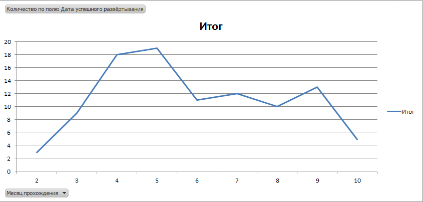
Even a cursory analysis shows that such a schedule is completely useless, because it does not reflect an objective picture - the same team makes many assemblies and passes the stand several times a year and this is not visible on the graph.
And in general, it is not clear how to analyze such a graph and what all these growths and falls mean. In short, the usual useless metrics like site traffic.
OK. Let's try to calculate the average duration of the passage of the stand teams:
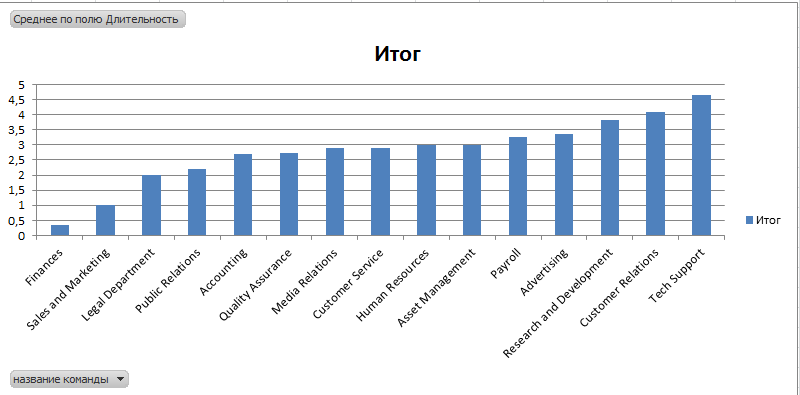
“What a good schedule!” Exclaimed my interlocutor after seeing this picture on the screen.
- Everything is clear: the Finance team is the best, and Tech Support is the worst. The average time to pass a stand is 3 months. Beauty! We will arrange a competition and will give a bonus for reducing the duration of the passage of the stand
- Eeee ... Wait, wait, wait. There is clearly something wrong ...
- Yes, what could be wrong? Everything is super! Exactly what is needed
And it was here that the cohort analysis manifested itself in all its glory. A typical view of a table providing a stand-by time for a cohort:

I am sure that you, too, would not have believed such a table. But despite the apparent incomprehensibility, the table opens up a real new universe of metrics and shows the picture in a completely different light. It turns out that the most “worst” team, Tech Support, is in fact almost the coolest leader, who reduced the time to pass a stand by more than 100%:
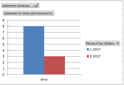
Is it possible to punish for it? Yes, it is necessary to reward!
The hard Accounting middling actually works very badly, constantly worsening its results:
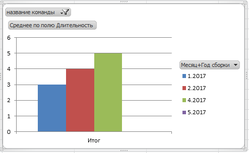
And the most "best" Finance team has so greatly increased the time that the value of the first column is not visible behind the greatly increased second one:

But this completely changes the whole picture! Do you understand? Completely! Everything becomes exactly the opposite, a reverse. Here, it turns out, where that ambush is hiding.
As you can see, the “hospital average” reflects a completely incorrect distorted picture of the world, which in principle cannot be used to make management decisions. Fundamentally can not. But the cohorts, on the contrary, give the right answer - the performance of specific teams improves or worsens and by how much.
Yes, maybe they do not answer the question who is the best, but is it necessary to know this at all? ..
That is why cohort analysis is the future that has come now. This is exactly what needs to be implemented everywhere where there are measurements, metrics and graphs.
Join me with the cohort analysis team! And success in work.
PS: It was nice to see the pendulous jaws of the interlocutors during the rerun.
They did not believe, not because I did not logically explain the essence or said something stupid. Not. From this point of view, everything was fine. “What you propose is really interesting and innovative, but ... let's do it the same way as before.” How insulting it was to hear.
I was developing a system of metrics that several thousand people were supposed to target. Imagine that you are quite clearly aware that the people around you are stubbornly and persistently, with all their strength they are striving to fall into the deepest pit, the price of falling into which is incredibly high. You just have no right to allow this to happen, do you understand? Just do not have the right!
')
But at that moment I, like a dog, looked with devoted eyes at my colleagues and could not say anything. You know, there are some outstanding people in the world that I really like. And one of them - Ilon Musk. After another unsuccessful launch of the Falcon rocket, his company was completely disheartened. Despite the fact that the day was very difficult, despite 20 hours spent on his feet and beating him, Musk spoke to the company, supported the employees and concluded his speech with the words: “I will never give up myself. Never!"
The words of Mask then surfaced by themselves in my head: “I will not give up!”.
The febrile thoughts were ordered into the understanding that my interlocutors simply did not see the differences, did not see the confirmation of my theoretical layouts. Maybe they even believed them, but did not want to spend the company’s money on developing what “most likely would not work”. Those. I had to show the real differences between the cohort representation of metrics and the usual one — to show what an ambush of ordinary “sugary” metrics is and what cohorts beat them.
But how to do it, if there is no data, the necessary metrics are not collected by anyone yet and there is no toolkit for them either? How to be? The only way to show at least something is to model everything in ordinary Excel.
The eyes are afraid, and the hands are doing. Exactly 4 hours later, a demo dataset and visualization for it were ready, showing the fundamental difference between the usual and cohort presentation of metrics. Honestly, the results shocked even me.
What do we use metrics for? To shorten the time-to-market - the time for teams to go through the entire chain of software development.
As an example, the demo dataset analyzed the time it took the DevOps deployment team to successfully pass (distribution checks for correctness).
The task is to understand how much time the teams spend on passing the stand and whether their performance improves. Here's what the data was like (created using the www.generatedata.com service):
The first thing that comes to mind is to see how teams go through the booth.
X axis - a month, starting from 01/01/2017. Y-axis - the number of teams that passed the stand.
Even a cursory analysis shows that such a schedule is completely useless, because it does not reflect an objective picture - the same team makes many assemblies and passes the stand several times a year and this is not visible on the graph.
And in general, it is not clear how to analyze such a graph and what all these growths and falls mean. In short, the usual useless metrics like site traffic.
OK. Let's try to calculate the average duration of the passage of the stand teams:
“What a good schedule!” Exclaimed my interlocutor after seeing this picture on the screen.
- Everything is clear: the Finance team is the best, and Tech Support is the worst. The average time to pass a stand is 3 months. Beauty! We will arrange a competition and will give a bonus for reducing the duration of the passage of the stand
- Eeee ... Wait, wait, wait. There is clearly something wrong ...
- Yes, what could be wrong? Everything is super! Exactly what is needed
And it was here that the cohort analysis manifested itself in all its glory. A typical view of a table providing a stand-by time for a cohort:
I am sure that you, too, would not have believed such a table. But despite the apparent incomprehensibility, the table opens up a real new universe of metrics and shows the picture in a completely different light. It turns out that the most “worst” team, Tech Support, is in fact almost the coolest leader, who reduced the time to pass a stand by more than 100%:
Is it possible to punish for it? Yes, it is necessary to reward!
The hard Accounting middling actually works very badly, constantly worsening its results:
And the most "best" Finance team has so greatly increased the time that the value of the first column is not visible behind the greatly increased second one:
But this completely changes the whole picture! Do you understand? Completely! Everything becomes exactly the opposite, a reverse. Here, it turns out, where that ambush is hiding.
As you can see, the “hospital average” reflects a completely incorrect distorted picture of the world, which in principle cannot be used to make management decisions. Fundamentally can not. But the cohorts, on the contrary, give the right answer - the performance of specific teams improves or worsens and by how much.
Yes, maybe they do not answer the question who is the best, but is it necessary to know this at all? ..
That is why cohort analysis is the future that has come now. This is exactly what needs to be implemented everywhere where there are measurements, metrics and graphs.
Join me with the cohort analysis team! And success in work.
PS: It was nice to see the pendulous jaws of the interlocutors during the rerun.
Source: https://habr.com/ru/post/339982/
All Articles