The book "Python for complex tasks: the science of data and machine learning"
 Hi, Habrozhiteli! This book is a guide to a variety of computational and statistical methods, without which any intensive data processing, research and advanced development is unthinkable. Readers who already have programming experience and want to use Python effectively in the field of Data Science will find answers to all kinds of questions in this book, for example: how to read this data format into a script? How to transform, clear this data and manipulate it? How to visualize this type of data? How to use this data to understand the situation, get answers to questions, build statistical models or implement machine learning?
Below the cut is a review of the book and an excerpt "Histograms, splits by intervals and density"
Who is this book for?
“How exactly should I learn Python?” Is one of the most frequently asked questions to me (the author) at various technology conferences and meetings. It is asked by technology-interested students, developers, or researchers, often with considerable experience writing code and using computational and digital tools. Most of them do not need the Python programming language in their pure form, they would like to study it in order to use it as a tool for solving problems that require calculations with processing large amounts of data.
This book was not intended as an introduction to Python or to programming in general. I assume that the reader is familiar with the Python language, including a description of functions, assigning variables, calling methods on objects, managing the flow of program execution, and solving other simple tasks. It should help Python users learn how to use the Python data research tools stack — libraries such as IPython, NumPy, Pandas, Matplotlib, Scikit-Learn, and appropriate tools — for efficient storage, manipulation, and understanding of data.
')
General structure of the book
Each chapter of the book is devoted to a specific package or tool, which is an essential part of the Python toolkit for data exploration.
- IPython and Jupyter (Chapter 1) provide a computing environment in which many Python-based data researchers work.
- NumPy (Chapter 2) - Provides an ndarray object for efficient storage and handling of dense data sets in Python.
- Pandas (Chapter 3) - Provides a DataFrame object for efficient storage and handling of named / column data in Python.
- Matplotlib (Chapter 4) - provides opportunities for a variety of flexible data visualization in Python.
- Scikit-Learn (Chapter 5) —Provides efficient Python implementations of most important and well-known machine learning algorithms.
The PyData world is much wider than the packages presented, and it is growing day by day. With this in mind, I (the author) use every opportunity in the book to refer to other interesting works, projects, and packages that extend the limits of what can be done in Python. Nonetheless, today these five packages are fundamental to much of what can be done in the application of the Python programming language to data exploration. I believe that they will also retain their importance as the ecosystem grows.
Excerpt Histograms, breaks by intervals and density
A simple bar graph can be of great benefit in the initial analysis of a data set. Earlier, we saw an example of using the Matplotlib library function (see the Comparisons Masks and Boolean section of Chapter 2) to create a simple one-line histogram after performing all the usual imports (Fig. 4.35):
In[1]: %matplotlib inline import numpy as np import matplotlib.pyplot as plt plt.style.use('seaborn-white') data = np.random.randn(1000) In[2]: plt.hist(data); 
The hist () function has many parameters to configure both the calculation and the display. Here is an example of a histogram with detailed user settings (Fig. 4.36):
In[3]: plt.hist(data, bins=30, normed=True, alpha=0.5, histtype='stepfilled', color='steelblue', edgecolor='none'); 
The plt.hist docstring function contains more information about other customization options available. The combination of the histtype = 'stepfilled' option with the given alpha transparency seems to me very convenient for comparing the histograms of several distributions (Fig. 4.37):
In[4]: x1 = np.random.normal(0, 0.8, 1000) x2 = np.random.normal(-2, 1, 1000) x3 = np.random.normal(3, 2, 1000) kwargs = dict(histtype='stepfilled', alpha=0.3, normed=True, bins=40) plt.hist(x1, **kwargs) plt.hist(x2, **kwargs) plt.hist(x3, **kwargs); 
If you need to calculate a histogram (that is, count the number of points in a given interval) and not display it, at your service the np.histogram () function:
In[5]: counts, bin_edges = np.histogram(data, bins=5) print(counts) [ 12 190 468 301 29] Two-dimensional histograms and intervals by intervals
In the same way that we created one-dimensional histograms, breaking the sequence of numbers into intervals, you can also create two-dimensional histograms by distributing points over two-dimensional intervals. Consider several ways to perform. Let's start with a description of the x and y data arrays obtained from the multidimensional Gaussian distribution:
In[6]: mean = [0, 0] cov = [[1, 1], [1, 2]] x, y = np.random.multivariate_normal(mean, cov, 10000).T Function plt.hist2d: two-dimensional histogram
One of the easiest ways to draw a two-dimensional histogram is to use the Mattlotlib library's plt.hist2d function (Fig. 4.38):
In[12]: plt.hist2d(x, y, bins=30, cmap='Blues') cb = plt.colorbar() cb.set_label('counts in bin') # 
The plt.hist2d function, like the plt.hist function, has many additional parameters for fine-tuning the chart and splitting into intervals, described in detail in its docstring. In the same way as the plt.hist function has the equivalent of np.histogram, so the plt.hist2d function has the equivalent of np.histogram2d, which is used as follows:
In[8]: counts, xedges, yedges = np.histogram2d(x, y, bins=30) For a generalization of the partitioning of the histogram into a number of dimensions greater than 2, see the function np.histogramdd.
Function plt.hexbin: hexagonal split into intervals
A two-dimensional histogram creates a mosaic representation of the squares along the coordinate axes. Another geometric shape for a similar mosaic representation is a regular hexagon. For these purposes, the Matplotlib library provides the plt.hexbin function - a two-dimensional data set, divided by intervals on a grid of hexagons (Fig. 4.39):
In[9]: plt.hexbin(x, y, gridsize=30, cmap='Blues') cb = plt.colorbar(label='count in bin') # 
The plt.hexbin function has a lot of interesting parameters, including the ability to set the weight for each point and change the output value for each interval to any summary indicator of the NumPy library (average weights, standard deviation of weights, etc.).
Nuclear density estimation
Another frequently used method for estimating densities in a multidimensional space is kernel density estimation (KDE). We will look at it in more detail in the “Look deeper: nuclear density distribution” section in Chapter 5, but for now, we can say that KDE can be represented as a way of “smearing” points in space and adding up the results to obtain a smooth function. The scipy.stats package has an extremely fast and easy KDE implementation. Here is a short example of using KDE on the above data (fig. 4.40):
In[10]: from scipy.stats import gaussian_kde # [Ndim, Nsamples] data = np.vstack([x, y]) kde = gaussian_kde(data) # xgrid = np.linspace(-3.5, 3.5, 40) ygrid = np.linspace(-6, 6, 40) Xgrid, Ygrid = np.meshgrid(xgrid, ygrid) Z = kde.evaluate(np.vstack([Xgrid.ravel(), Ygrid.ravel()])) # plt.imshow(Z.reshape(Xgrid.shape), origin='lower', aspect='auto', extent=[-3.5, 3.5, -6, 6], cmap='Blues') cb = plt.colorbar() cb.set_label("density") # 
The smoothing length of the KDE method allows you to effectively choose a compromise between smoothness and detail (one example of the ubiquitous tradeoffs between displacement and dispersion). There is an extensive literature on the selection of an appropriate smoothing length: the gaussian_kde function uses a rule of thumb to find a quasi-optimal smoothing length for input data.
The SciPy ecosystem also has other implementations of the KDE method, each with its own strengths and weaknesses, such as the sklearn.neighbors.KernelDensity and statsmodels.nonparametric.kernel_density.KDEMultivariate methods. Using the Matplotlib library for KDE-based visualizations requires writing unnecessary code. The Seaborn library, which we will discuss in the “Rendering with the Seaborn Library” section of this chapter, suggests an API with much more succinct syntax for creating such visualizations.
User legend settings on graphs
Greater clarity of the graphics is provided by setting labels for various elements of the graph. We have previously considered the creation of a simple legend, here we demonstrate the possibility of customizing the location and appearance of the legends in Matplotlib.
Using the plt.legend () command, you can automatically create the simplest legend for any marked chart elements (Fig. 4.41):
In[1]: import matplotlib.pyplot as plt plt.style.use('classic') In[2]: %matplotlib inline import numpy as np In[3]: x = np.linspace(0, 10, 1000) fig, ax = plt.subplots() ax.plot(x, np.sin(x), '-b', label='Sine') # ax.plot(x, np.cos(x), '--r', label='Cosine') # ax.axis('equal') leg = ax.legend(); 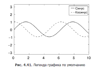
There are many options for custom settings such graphics that we may need. For example, you can set the location of the legend and disable the frame (Fig. 4.42):
In[4]: ax.legend(loc='upper left', frameon=False) fig 
You can also use the ncol command to set the number of columns in the legend (Fig. 4.43):
In[5]: ax.legend(frameon=False, loc='lower center', ncol=2) fig 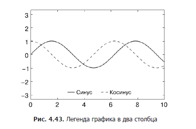
You can use a rounded rectangular frame (fancybox) for the legend or add a shadow, change the transparency (alpha factor) of the frame or field near the text (fig. 4.44):
In[6]: ax.legend(fancybox=True, framealpha=1, shadow=True, borderpad=1) fig 
For more information about the available settings for legends, see the plt.legend docstring function.
Select items for the legend
By default, the legend includes all tagged items. If we do not need this, we can indicate which elements and labels should be present in the legend using the objects returned by the graphing commands. The plt.plot () command can draw multiple lines in one call and return a list of created line instances. To specify which elements to use, it is enough to transfer any of them to the plt.legend () function together with the specified labels (Fig. 4.45):
In[7]: y = np.sin(x[:, np.newaxis] + np.pi * np.arange(0, 2, 0.5)) lines = plt.plot(x, y) # lines plt.Line2D plt.legend(lines[:2], ['first', 'second']); # , 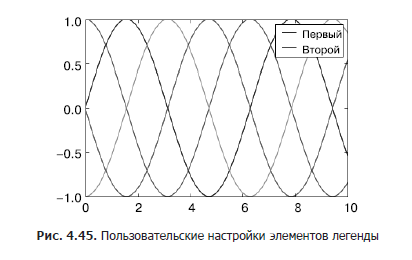
Usually in practice it is more convenient for me to use the first method, indicating the labels directly for the elements that need to be displayed in the legend (Fig. 4.46)
In[8]: plt.plot(x, y[:, 0], label='first') plt.plot(x, y[:, 1], label='second') plt.plot(x, y[:, 2:]) plt.legend(framealpha=1, frameon=True); 
Note that by default, the legend ignores all elements for which the label attribute is not set.
Setting the legend for points of various sizes
Sometimes the default legend capacity is not enough for our schedule. Suppose you use points of different sizes to visualize certain characteristics of the data and would like to create a legend that reflects this. Here is an example in which we will reflect the population of California cities using point size. We need a legend with a point size scale, and we will create it by displaying tagged data on the chart without the tags themselves (Fig. 4.47):
In[9]: import pandas as pd cities = pd.read_csv('data/california_cities.csv') # lat, lon = cities['latd'], cities['longd'] population, area = cities['population_total'], cities['area_total_km2'] # , # , plt.scatter(lon, lat, label=None, c=np.log10(population), cmap='viridis', s=area, linewidth=0, alpha=0.5) plt.axis(aspect='equal') plt.xlabel('longitude') plt.ylabel('latitude') plt.colorbar(label='log$_{10}$(population)') plt.clim(3, 7) # : # for area in [100, 300, 500]: plt.scatter([], [], c='k', alpha=0.3, s=area, label=str(area) + ' km$^2$') plt.legend(scatterpoints=1, frameon=False, labelspacing=1, title='City Area') # plt.title('California Cities: Area and Population'); # : 
The legend always refers to any object on the graph, so if we need to display an object of a particular type, we must first draw it on the graph. In this case, the objects we need (gray circles) are not on the graph, so we go to the trick and display empty lists on the chart. Please note that the legend lists only those graph elements for which a label is specified.
We have created by displaying empty lists marked objects, which are then collected in the legend. Now the legend gives us useful information. This strategy can be used to create more complex visualizations.
Note that in the case of similar geographic data, the graph would become clearer if the state borders and other cartographic elements are displayed on it. A great tool for this is the optional Basemap utility set for the Matplotlib library, which we will look at in the “Displaying Geographic Data with a Basemap” section of this chapter.
Display several legends
Sometimes when plotting a graph, it is necessary to add several legends to it for the same coordinate system. Unfortunately, the Matplotlib library does not greatly simplify this task: using the standard legend interface, you can create only one legend for the entire schedule. If you try to create a second legend using the plt.legend () and ax.legend () functions, it will simply override the first one. This problem can be solved by creating a new painter (artist) initially for the legend, then manually adding the second painter to the chart using the ax.add_artist () low-level method (Fig. 4.48):
In[10]: fig, ax = plt.subplots() lines = [] styles = ['-', '--', '-.', ':'] x = np.linspace(0, 10, 1000) for i in range(4): lines += ax.plot(x, np.sin(x - i * np.pi / 2), styles[i], color='black') ax.axis('equal') # ax.legend(lines[:2], ['line A', 'line B'], # , B loc='upper right', frameon=False) # from matplotlib.legend import Legend leg = Legend(ax, lines[2:], ['line C', 'line D'], # , D loc='lower right', frameon=False) ax.add_artist(leg); 
We briefly reviewed the low-level drawing objects that make up any graph of the Matplotlib library. If you look at the source code for the ax.legend () method (recall that you can do this in the IPython shell notepad using the legend ?? command), you will see that this function simply consists of the logic of creating a suitable Legend painter, which is then saved in the attribute legend_ and added to the picture when drawing graphics.
Custom color scale settings
Graphic legends display the discrete label correspondence to discrete points. In the case of continuous labels based on the color of dots, lines or areas, a tool such as a color scale is perfect. In the Matplotlib library, the color scale is a separate coordinate system that provides the key to the meaning of the colors on the graph. Since this book is printed in black and white, there is an additional online application for this section, in which you can look at the original color charts (https://github.com/jakevdp/PythonDataScienceHandbook). Let's start with setting up a notebook for plotting graphs and importing the necessary functions:
In[1]: import matplotlib.pyplot as plt plt.style.use('classic') In[2]: %matplotlib inline import numpy as np The simplest color scale can be created using the plt.colorbar function (Fig. 4.49):
In[3]: x = np.linspace(0, 10, 1000) I = np.sin(x) * np.cos(x[:, np.newaxis]) plt.imshow(I) plt.colorbar(); 
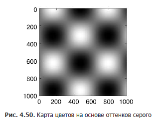
Next, we will look at a few ideas for customizing the color scale and using them effectively in different situations. You can set a color map using the cmap argument of the function for creating a visualization (Fig. 4.50):
In[4]: plt.imshow(I, cmap='gray'); All available color maps are contained in the plt.cm namespace. You can get a complete list of built-in options using TAB autocompletion in the IPython shell:
plt.cm.<TAB> But the possibility of choosing a color map is only the first step, it is much more important to choose among the available options! The choice turns out to be much more subtle than you might expect.
Choosing a color map
Comprehensive consideration of the choice of colors in the visualization is beyond the scope of this book, but on this issue you can read the article Ten Simple Rules for Better Figures ( “Ten simple rules for improving drawings” ). The online documentation of the Matplotlib library also contains interesting information on choosing a color map.
You should be aware that there are three different categories of color cards:
- consecutive color maps. Consist of one continuous sequence of colors (for example, binary or viridis);
- divergent color cards. Usually contain two well distinguishable colors reflecting positive and negative deviations from the mean (for example, RdBu or PuOr);
- high-quality color maps. They mix colors without any clear order (for example, rainbow or jet).
The jet color map, used by default in the Matplotlib library up to version 2.0, is an example of a quality color map. Her choice as the default color map was very unfortunate, since quality color maps are poorly suited to reflect quantitative data: they usually do not reflect a uniform increase in brightness when moving along the scale.
This can be demonstrated by converting the jet color scale into a black and white representation (Fig. 4.51):
In[5]: from matplotlib.colors import LinearSegmentedColormap def grayscale_cmap(cmap): """ """ cmap = plt.cm.get_cmap(cmap) colors = cmap(np.arange(cmap.N)) # RGBA # . http://alienryderflex.com/hsp.html RGB_weight = [0.299, 0.587, 0.114] luminance = np.sqrt(np.dot(colors[:, :3] ** 2, RGB_weight)) colors[:, :3] = luminance[:, np.newaxis] return LinearSegmentedColormap.from_list(cmap.name + "_gray", colors, cmap.N) def view_colormap(cmap): """ """ cmap = plt.cm.get_cmap(cmap) colors = cmap(np.arange(cmap.N)) cmap = grayscale_cmap(cmap) grayscale = cmap(np.arange(cmap.N)) fig, ax = plt.subplots(2, figsize=(6, 2), subplot_kw=dict(xticks=[], yticks=[])) ax[0].imshow([colors], extent=[0, 10, 0, 1]) ax[1].imshow([grayscale], extent=[0, 10, 0, 1]) In[6]: view_colormap('jet') 
Note the bright bands in the achromatic image. Even in full color, this uneven brightness means that certain parts of the range of colors will attract attention, potentially leading to an emphasis on irrelevant colors.
parts of the data set. It is better to use color maps such as viridis (used by default, starting from version 2.0 of the Matplotlib library), specially designed to evenly change the brightness over a range. Thus, they are not only consistent with our color perception, but also are converted for printing purposes in shades of gray (Fig. 4.52):
In[7]: view_colormap('viridis') 
If you prefer rainbow color schemes, a cubehelix colormap (Fig. 4.53) is a good option for continuous data:
In[8]: view_colormap('cubehelix') 
In other cases, for example, to display positive and negative deviations from the mean, such two-color color scale maps like RdBu (short for Red - Blue - "red - blue") may be convenient. However, as you can see in fig. 4.54, such information will be lost upon transition to shades of gray!
In[9]: view_colormap('RdBu') 
Next we will see examples of using some of these color maps.
There are many color maps in the Matplotlib library, to view their list, you can use the IPython shell to view the contents of the plt.cm sub-module. A more basic approach to using colors in the Python language can be found in the tools and documentation for the Seaborn library (see the "Rendering with the Seaborn Library" section of this chapter).
»In more detail with the book can be found publisher site
» Table of Contents
» Excerpt
For Habrozhiteley a discount of 20% for the coupon - Python
Source: https://habr.com/ru/post/339766/
All Articles