Battle of applications: am.ru, auto.ru, drom.ru
The car has become an integral part of our lives. For someone - this is a means of transportation, for someone - a means of self-expression. Sooner or later, each of us thought about his purchase. In the Russian market there are now 3 leaders who help to solve the problem of searching and “buying” a car. I want to compare them with each other and answer the question: which of the Android applications best solves this problem.
In each of the tested scenarios, I will identify the winner and, depending on the place occupied, I will award points (1st place - 2 points, 2nd place - 1 point, 3rd place - 0 points). At the end, by summing up the points received, I determine the winner
')
User activation
The first acquaintance is the most important scenario that should be thought out with the utmost care. You need to make it as simple and clear as possible, because if at this step the user is confused and / or he was unable to solve his problem, at least partially, then he will no longer use your application.
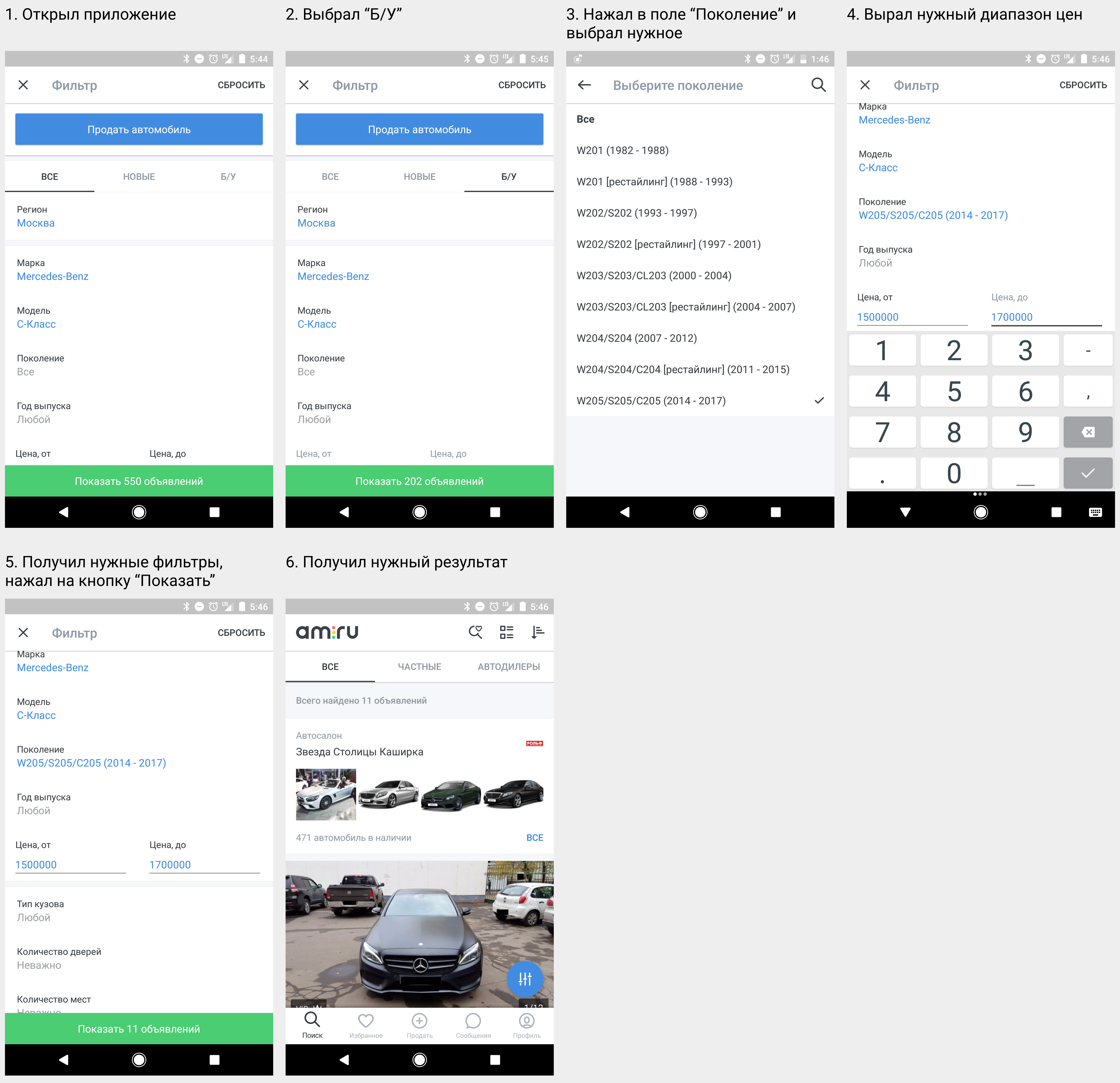
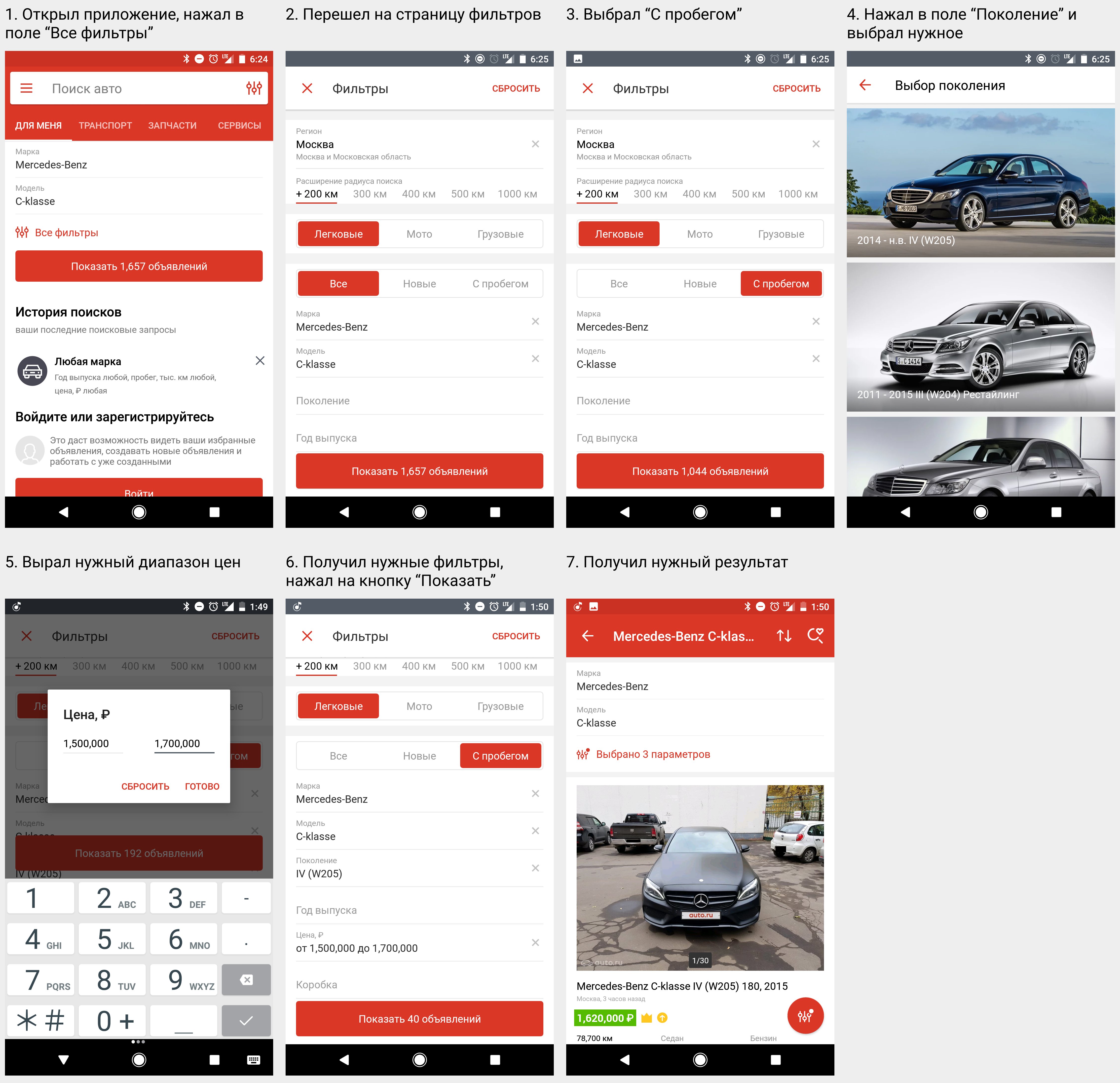
We put ourselves in the user's place and formulate the problem that he wants to solve by going to the application for the first time. Suppose I want to see what offers in the secondary market for the Mercedes-Benz C-class. Let's see what needs to be done to satisfy this request.
Application am.ru
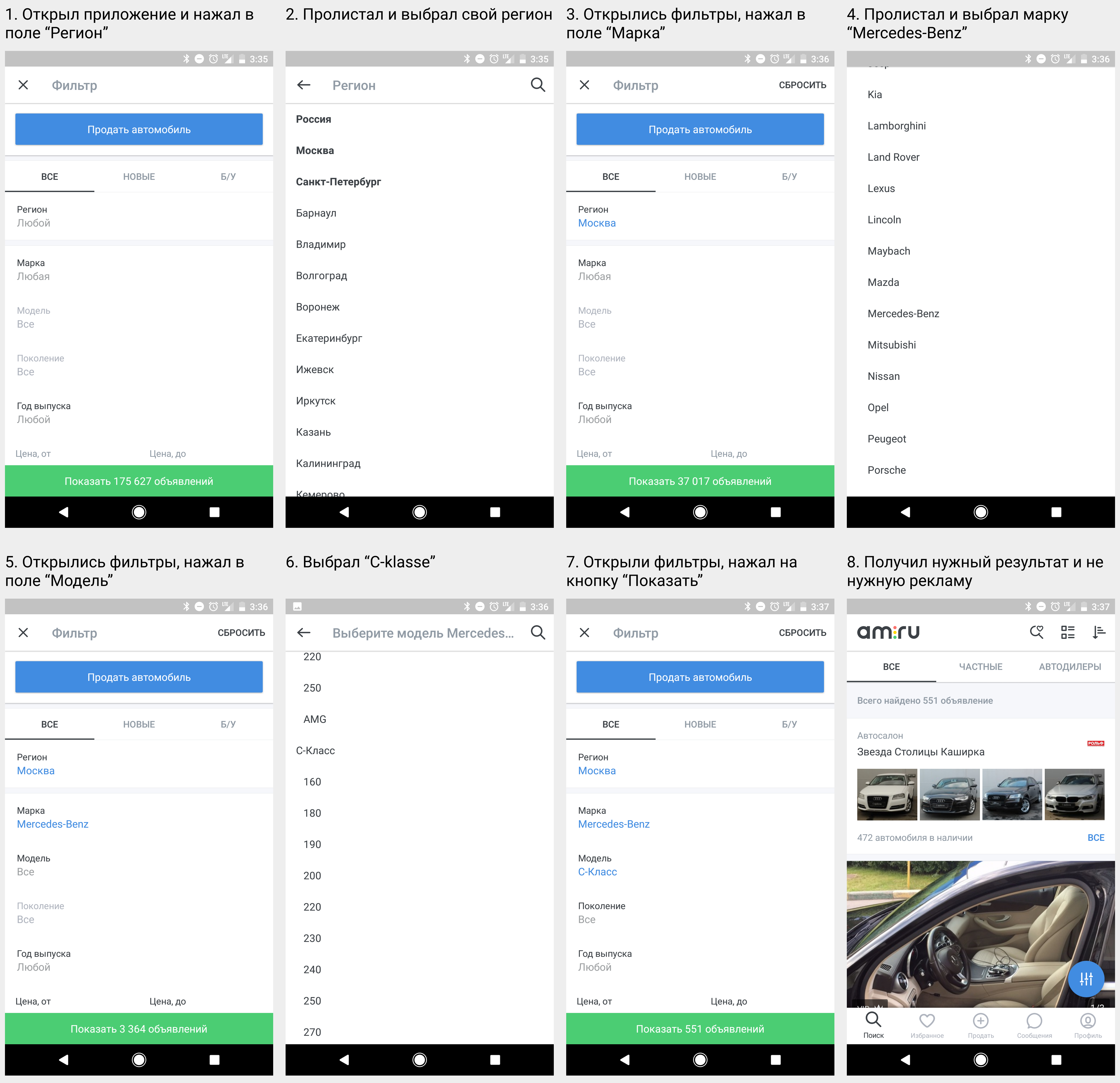
In 8 steps I got the desired result. I did not hesitate anywhere and did not think, everything was very simple and clear.
Auto.ru application
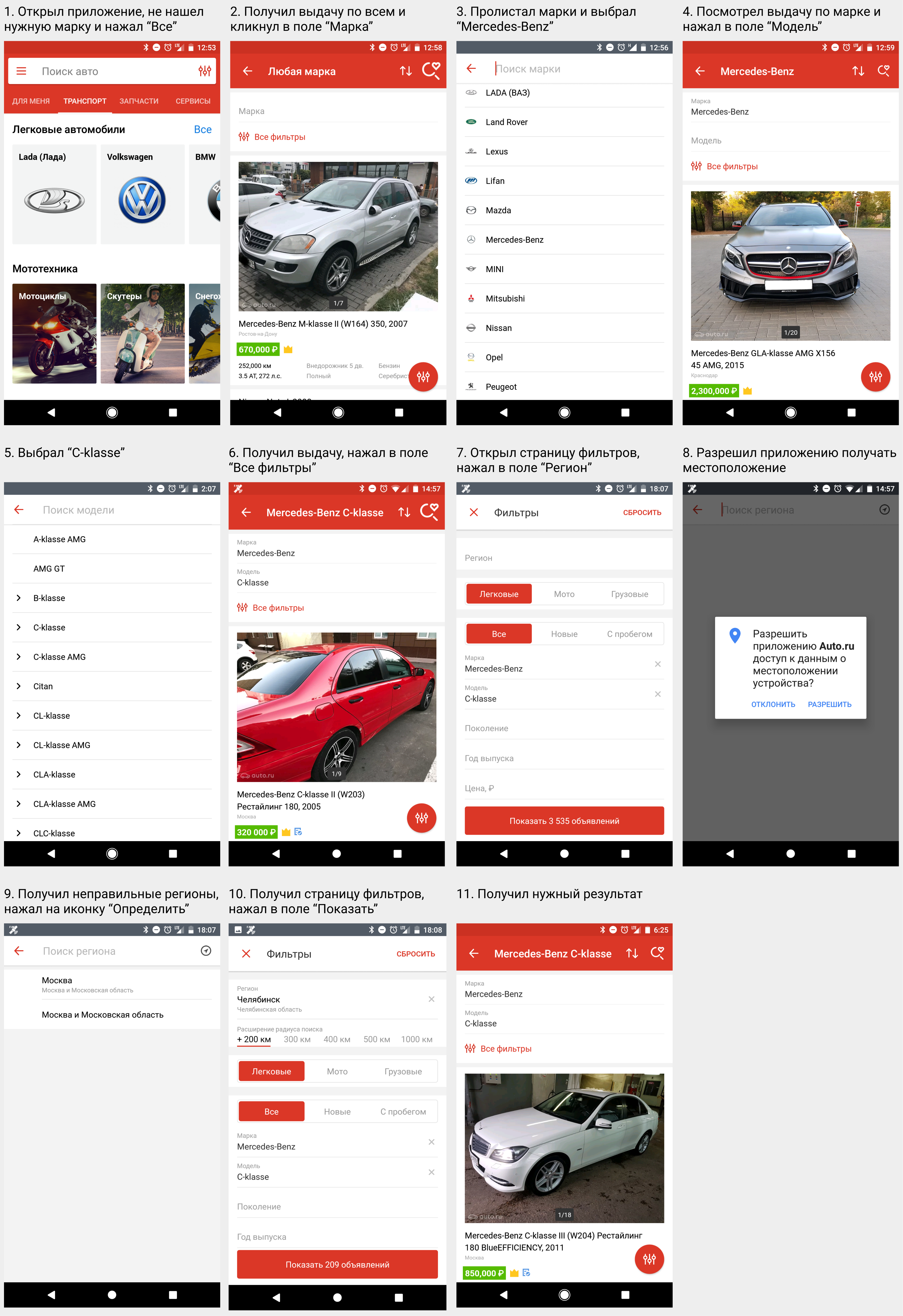
At the first start I got a bunch of unnecessary information, I flipped through the marks in search of the right one, but I didn’t find it, then I went to the filter selection page (screen No. 2), where in the third step I had to leaf through the marks again. In my opinion, this scenario can be simplified.
Unnecessary steps arose when I chose a region. If I’m in Moscow, I don’t need to choose a region, it’s installed by default. But if I am, for example, in Chelyabinsk, then I click in the "Region" field (screen No. 7), after which I am asked to allow the application to receive the location (screen No. 8). At the same time, I expect that my region will be determined and selected automatically, but this does not happen. I need to take an additional step: click on the icon "Determine" in the upper right corner (screenshot No. 9), only after that my region will be selected. The guys from drom.ru solve this problem in 1 step instead of 3.
The choice of the remaining filters did not cause problems.
Drom.ru application
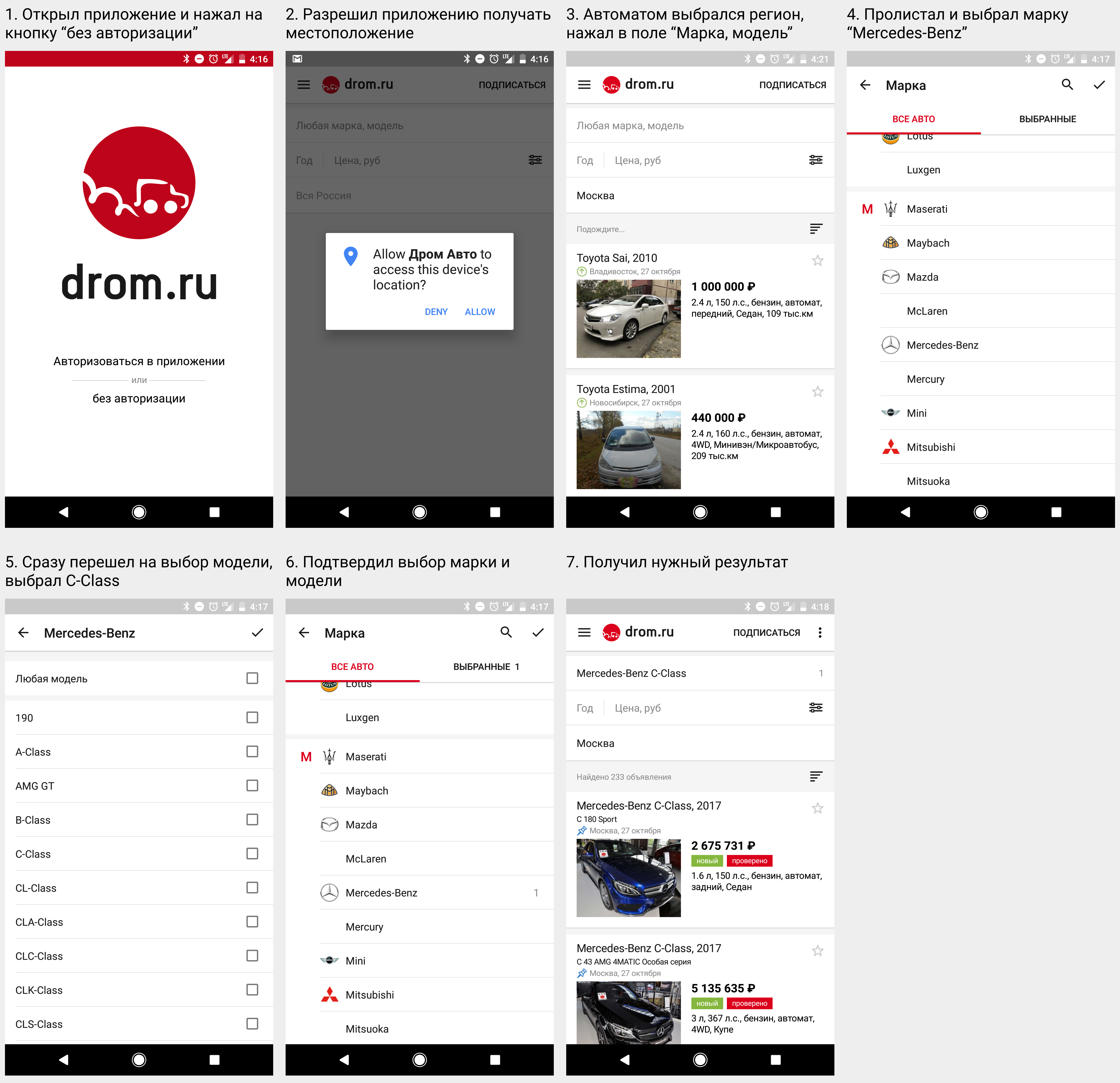
I think that the authorization screen is superfluous. Yes, you can skip it, but why then show it, if the vast majority of new users miss it? It is better to embed authorization in a deeper and understandable way to explain to the user why it is needed.
I liked that, giving permission to determine the location, I automatically select my region. This is convenient, because if I am not from Moscow or St. Petersburg (they are at the top of the list), then I will have to search for my city in the long list or use the search, which is much longer.
Conveniently, when after selecting a model, a screen with a choice of brand immediately opened - this allows you to increase the speed of selection. But he stopped when it was necessary to click the tick in ActionBar (screen No. 5) after selecting the model, and then press the check mark again (screen No. 6) to confirm the selection of all parameters. This is a normal behavior when you can choose several brands and models at once, but for the first acquaintance with the application this is a complex logic.
The outcome of the 1st scenario
1st place - am.ru. Yes, he had more steps than drom.ru, but everything was very simple and clear.
2 place - drom.ru. Excess authorization screen, multiple choice of stamps is more difficult for the first acquaintance than step-wise, like am.ru.
3rd place - auto.ru. A lot of steps, and not everything works correctly.
Advanced use
The first step behind, the user satisfied his requests, his efforts were rewarded. Search results before his eyes, he looks at the old / new models, expensive / cheap offers. In the process of choosing a car, we begin to specify various parameters, and begin to use the application to the maximum.
Suppose that I clarified my desire this way: I want to find a used Mercedes-Benz C-class in a new last body, worth between 1,500,000 - 1,700,000 p.
Application am.ru
Again, everything is simple and clear. Convenient filter "Generation". For our scenario, it fits more than the "Year of release" filter, because if you use "Year of release", then the old models will also fall into the results, but they are not of interest to us.
Auto.ru application
Cool filter "Generation", it is even more convenient and clearer than that of am.ru, because I choose a generation by design, and not by abbreviation, which I may not know.
Drom.ru application

It is very nice when you open the application and immediately see the results of the last search - it is more interesting and more useful to the user than to show a page with filters. If you put several brands in one filter at once, then from the main page you can immediately get all the offers that I’m interested in. The rest of the chips are not, and to track several brands you need to use different searches. By the way, because of this functionality, this application does not and cannot be a “Generation” filter.
It is very convenient that the "Year of release" and "Price" can be specified directly on the search results page, without going to the page of all filters.
There is no “Used” or “Used” filter, and I didn’t immediately realize that you can set the mileage in order to get the desired result.
Results of the 2nd scenario
I could not choose the best solution, each has its own advantages. At am.ru, the setting of filters is very convenient and user-friendly, auto.ru implements an excellent “Generation” filter, at drom.ru the start page immediately displays the search results and the ability to quickly set up basic filters. No one gets points. Draw.
View offers
Let's see how applications cope with the scenario of viewing offers.
Application am.ru
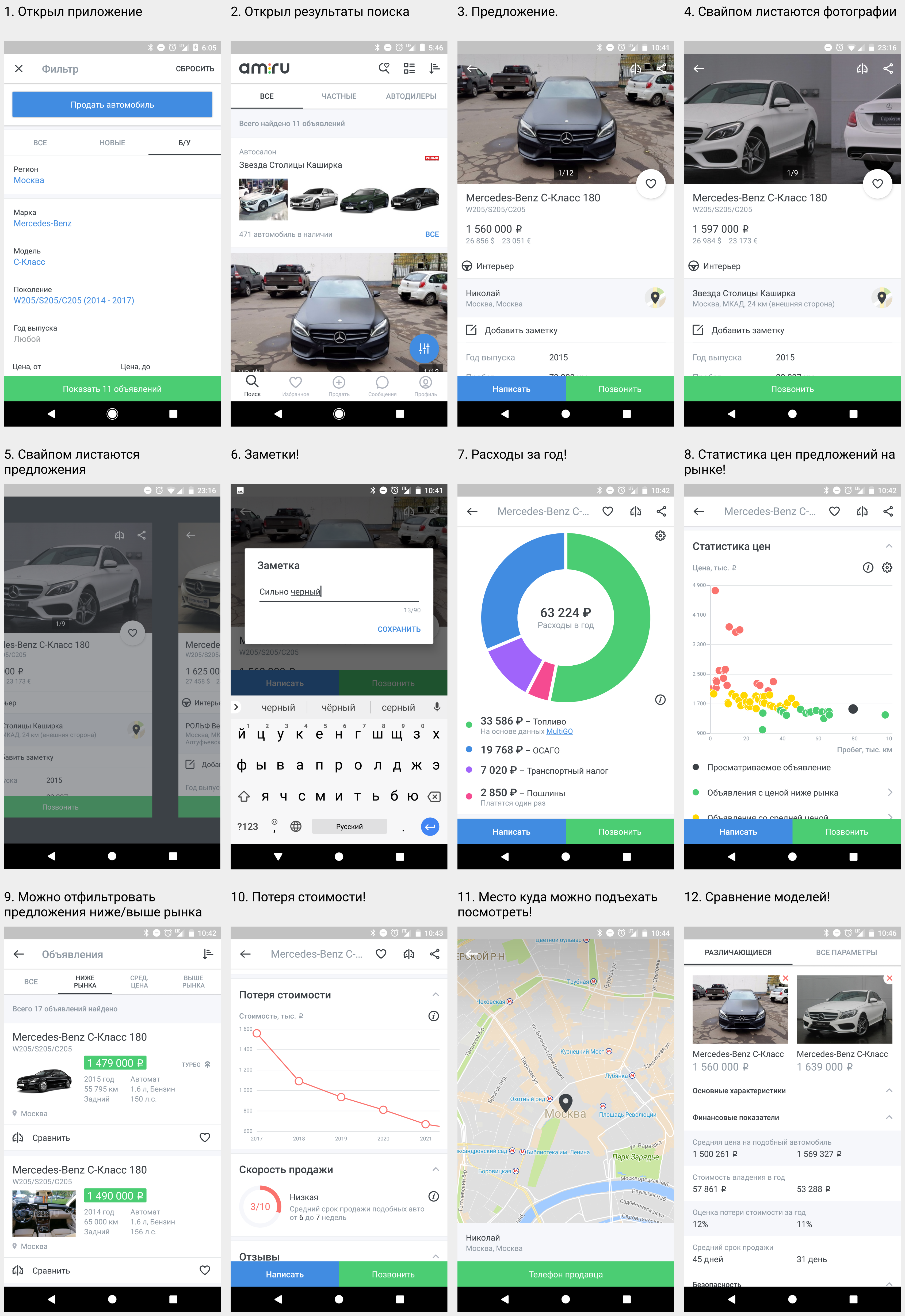
Everything is done very cool, informative and useful, the only remark is, looking through the pictures (screen No. 4), I sometimes switch to another sentence (screen No. 5), because the same gesture is used. Is it really so useful to change the sentences by brushing? Maybe users often make mistakes with this gesture, but statistics show that they are actively using it?
Auto.ru application
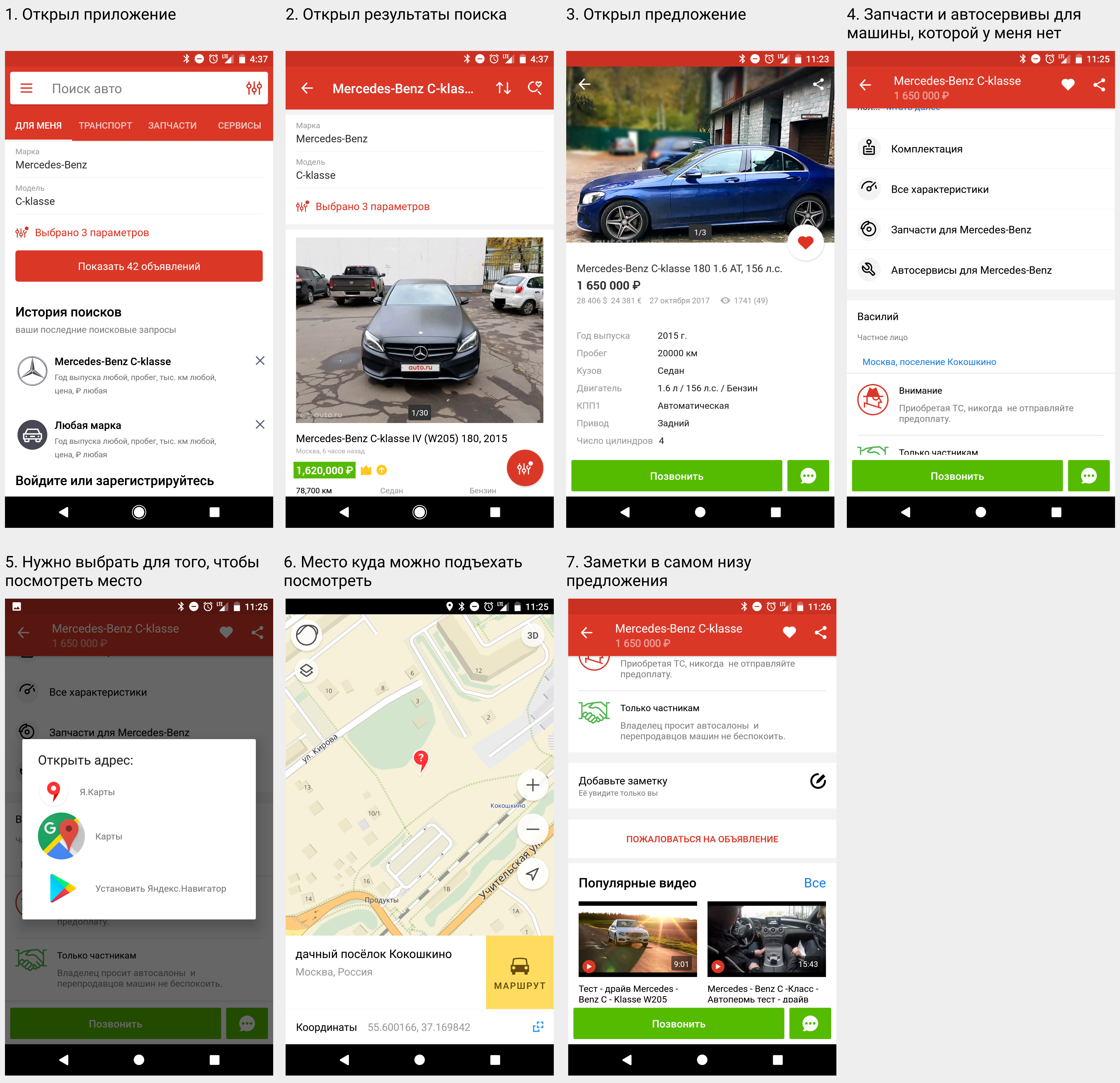
Scrolling down the current offer, I see parts and service stations (screen number 4). But why should they, if I have not bought a car yet?
I'm not sure that to view the location (screen number 5) you need to transfer the user to another application. It seems to me that it is more convenient to show the place on the map immediately, rather than transfer to other applications.
The field “Add note” is at the bottom of the list so far that I did not notice it for a long time and at first I thought that there was no such function at all. I believe that this is an important and useful function, which should be located above.
Drom.ru application
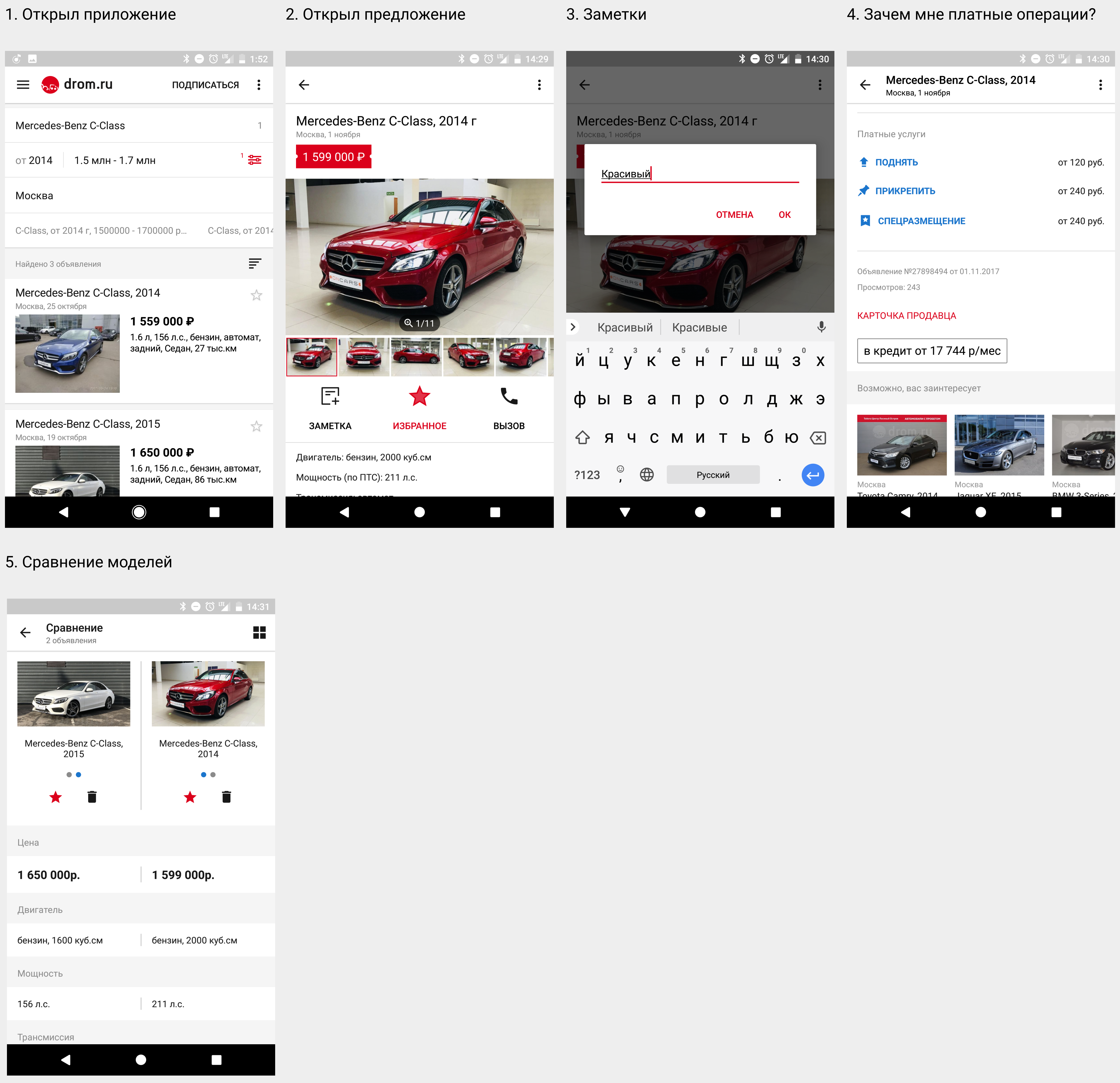
Very embarrassed "Paid features" (screen number 4). Why are they there? Colleagues, are you offering me to raise an advertisement I liked for money, so that someone else can buy it faster?
The outcome of the third scenario
1st place - am.ru. A lot of cool and useful features.
2 place - drom.ru. Cool photo preview and handy notes.
3rd place - auto.ru.
Save favorite offers / filters
Choosing a car is not a quick process. Let's see how applications cope with the task of storing offers / filters for further tracking.
Application am.ru
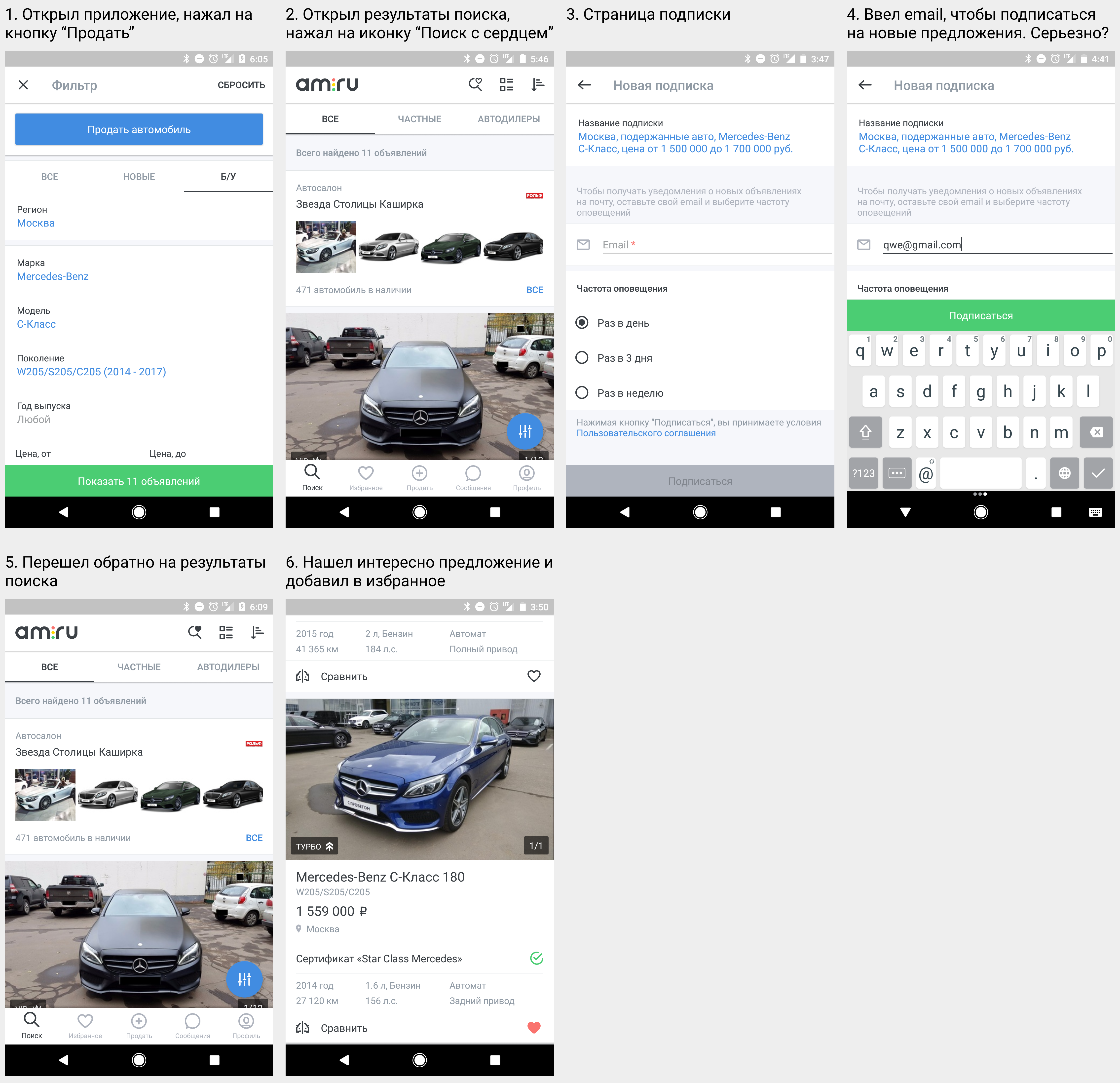
In order to subscribe to receive new offers, I have to leave my email (screen number 2), which is very inconvenient. Using the application, I want to receive push notifications. Even if I have already entered email in one filter, then saving another - the application again asks for an email. What for?
It is convenient to add your favorite suggestions to your favorites immediately on the search results screen, without going into the offer itself (screen No. 6).
Auto.ru application
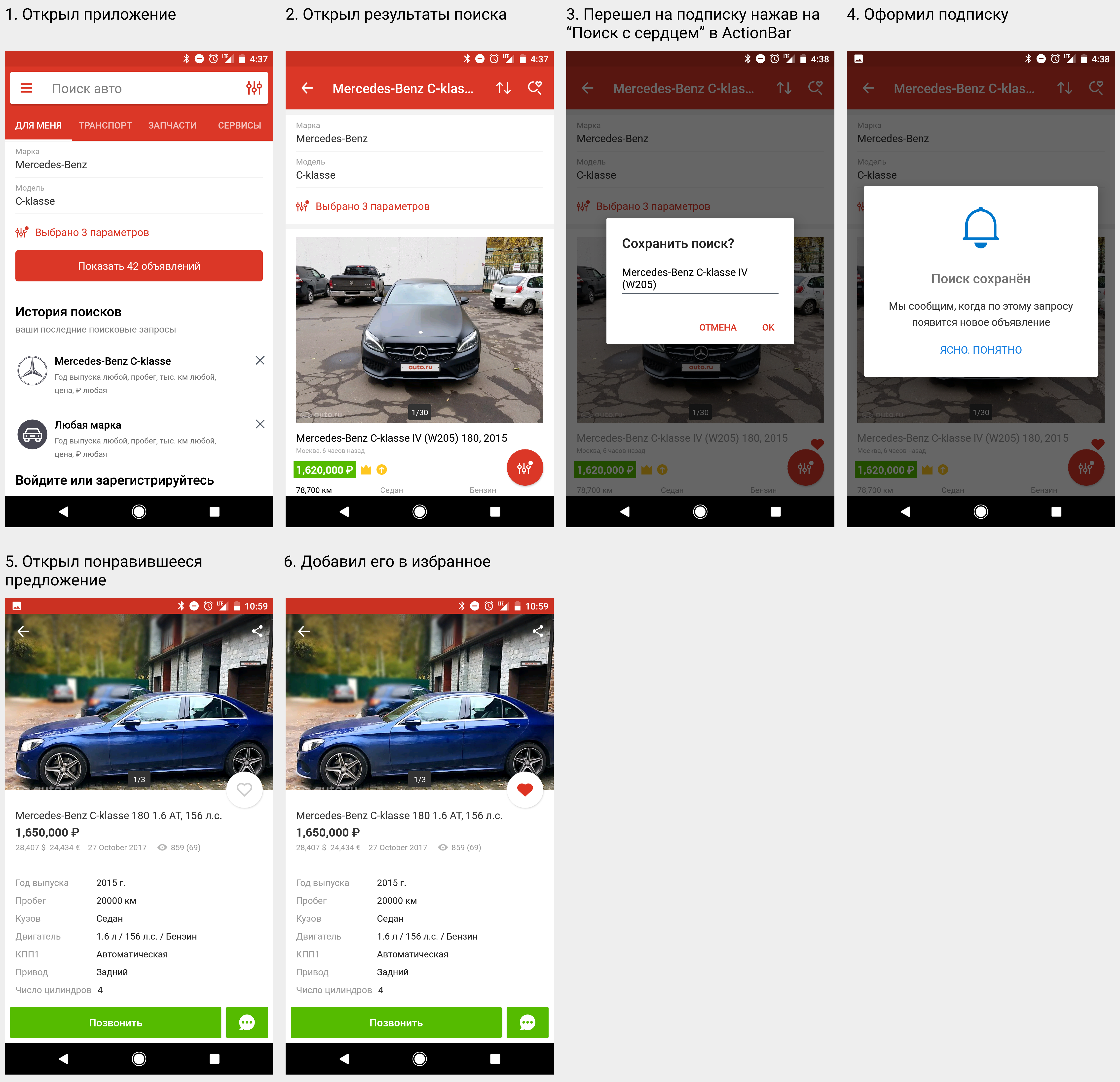
What you need. Everything is done very simply and clearly!
Drom.ru application
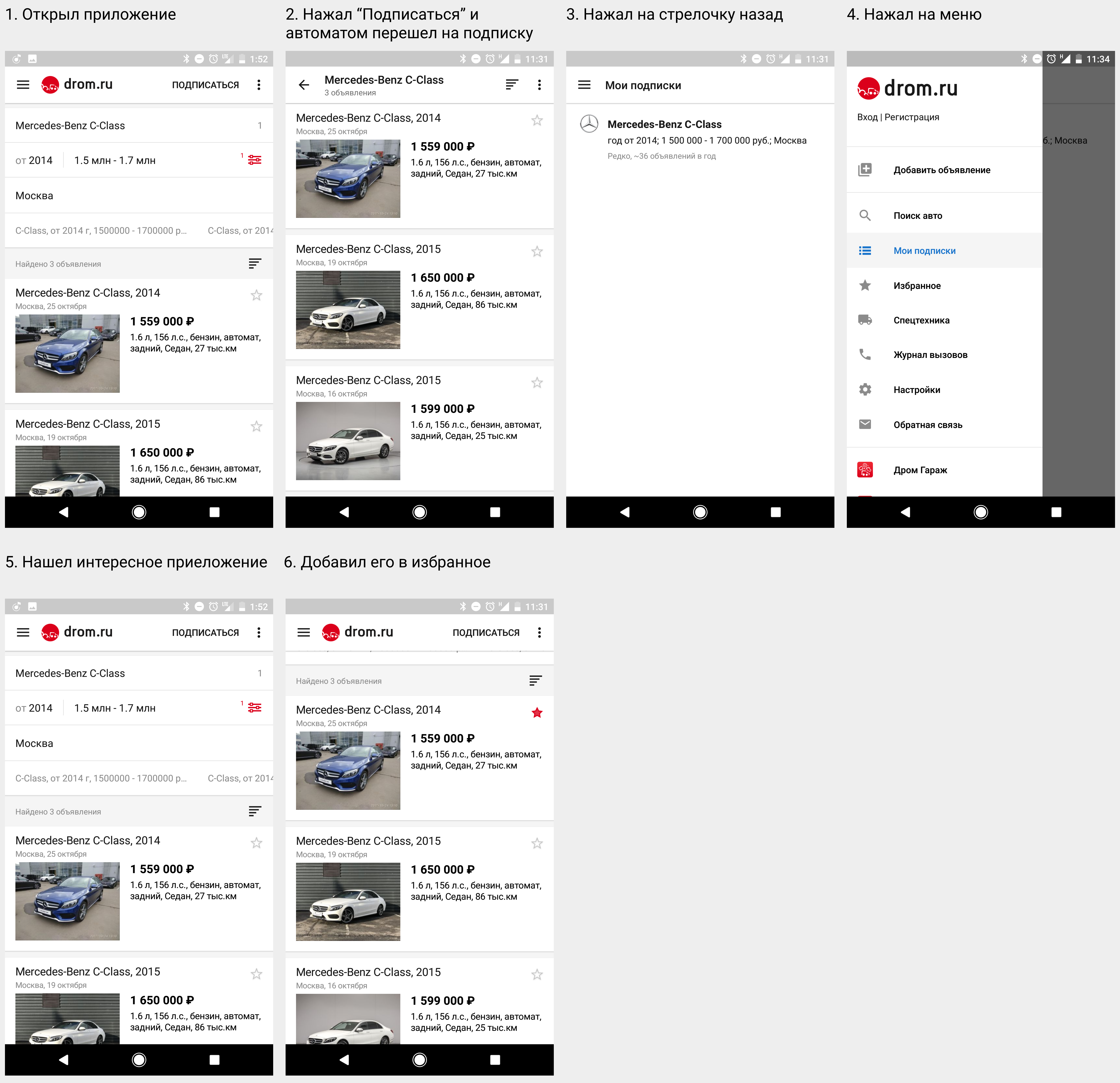
After signing up for a new offer, I am transferred to another “Subscriptions” screen (screenshot No. 2). I do not understand why this is done, it is illogical. By clicking on the subscription, I want to save it, and not go somewhere else. By the way, to get back to the search results, I need to take three additional steps (screen 3-5).
The outcome of the 4th scenario
1st place - auto.ru. Everything is simple and clear.
2 place - drom.ru. Inconvenient saving subscriptions.
3rd place - am.ru. I want to receive push notifications, not emails.
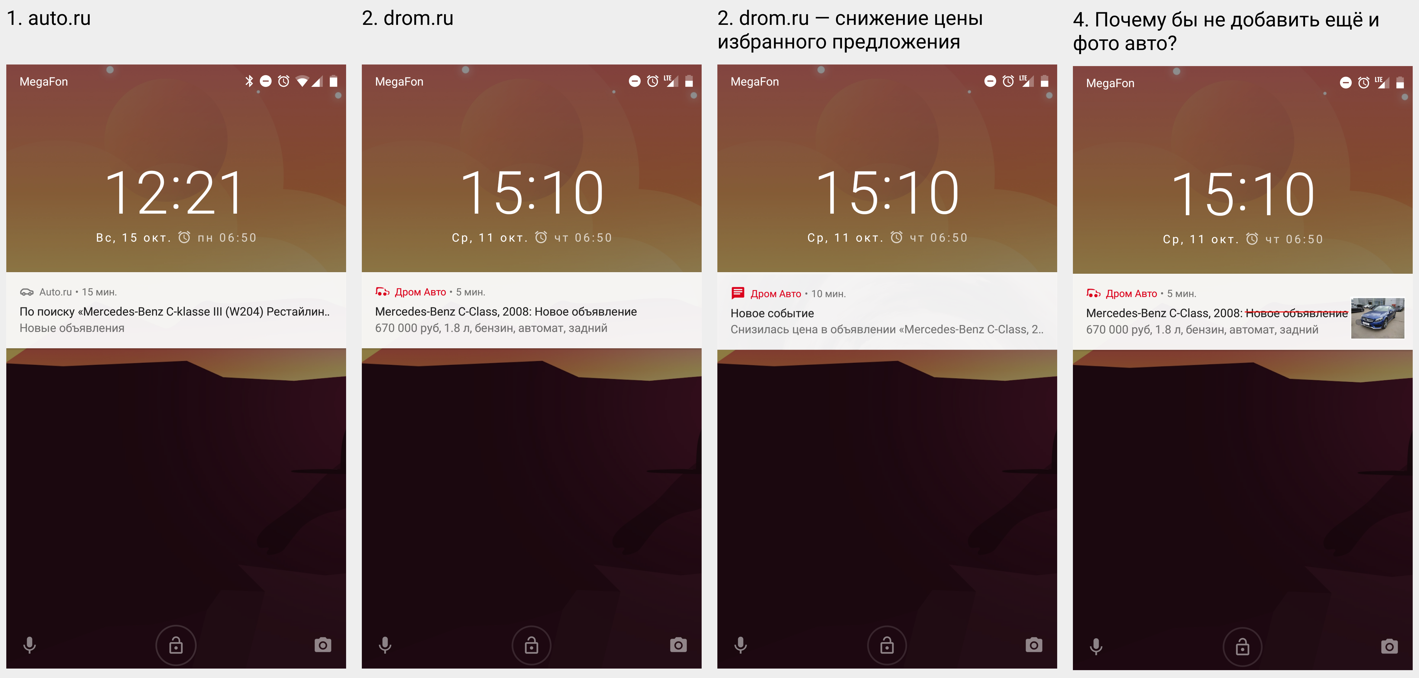
Notification of new offers
Application am.ru
Push notifications. 21 century, and we receive them in the mail.
Auto.ru application
There are notifications, but it is not clear what characteristics of the new proposal (screen No. 2).
Drom.ru application
Cool and clear notifications. Receiving such a notification, I already read a lot of useful information, on the basis of which I can already make a decision - whether I spend time for a more detailed view of it or not. If these notifications are still slightly refined by installing a photo of the car (screenshot No. 4), it will be even better.
The only application that sends a notification about the change in the price of the offer (screenshot No. 3), which I added to my favorites. It is also very useful to learn that the machine you like has become cheaper. I do not understand why others have not yet implemented it.
The outcome of the 5th scenario
1st place - drom.ru. Cool notifications.
2 place - auto.ru. There are notifications.
3rd place - am.ru. No notifications.
Communication with the seller
It is clear that each of the applications allows you to contact the seller by phone, but now phone calls are used extremely rarely, and users prefer to write messages via telegram or other instant messengers. Let's see how our candidates deal with it.
Application am.ru
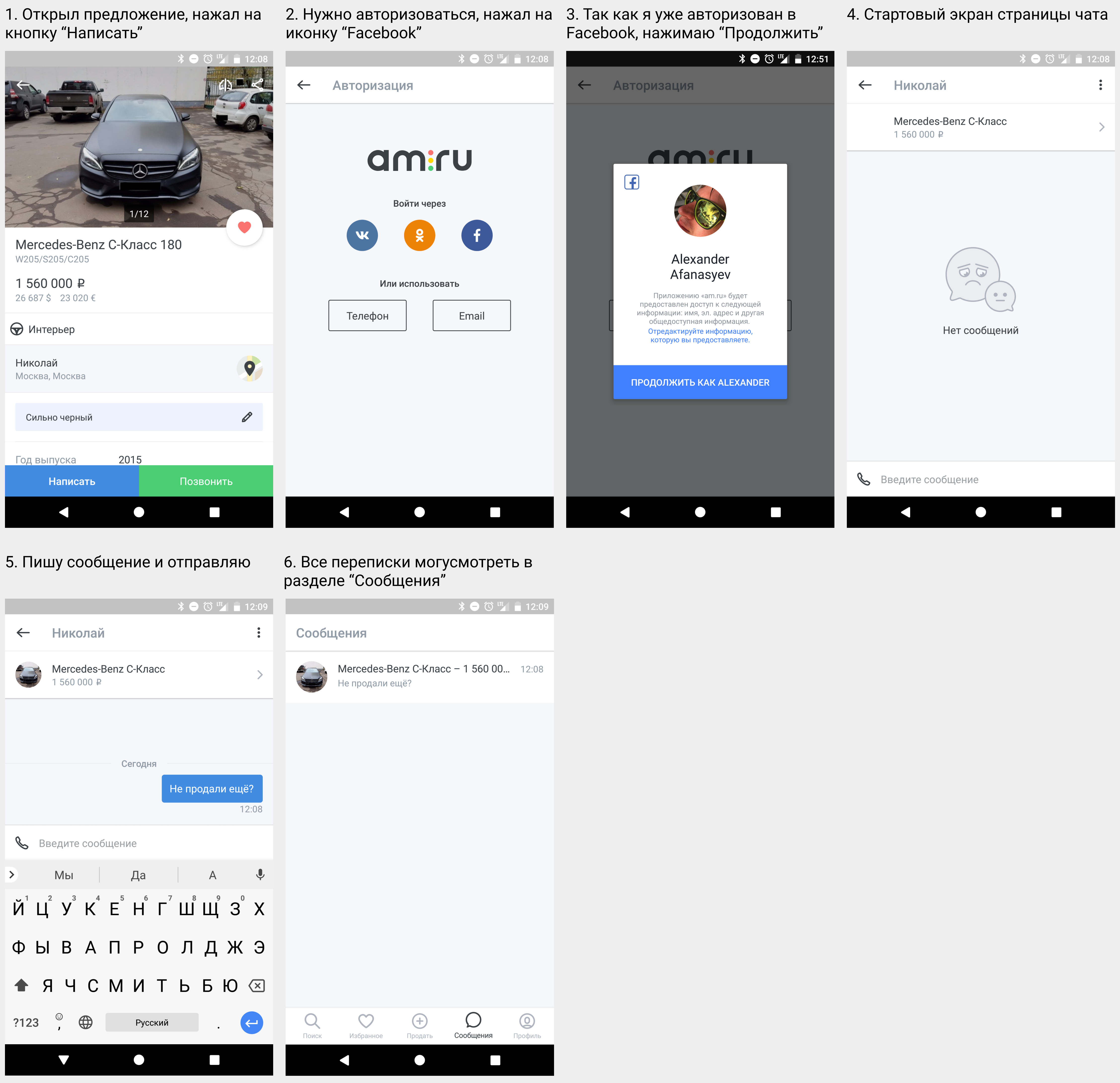
Again, everything is very convenient and understandable. It is a pity that there is no sending pictures in the chat.
Auto.ru application
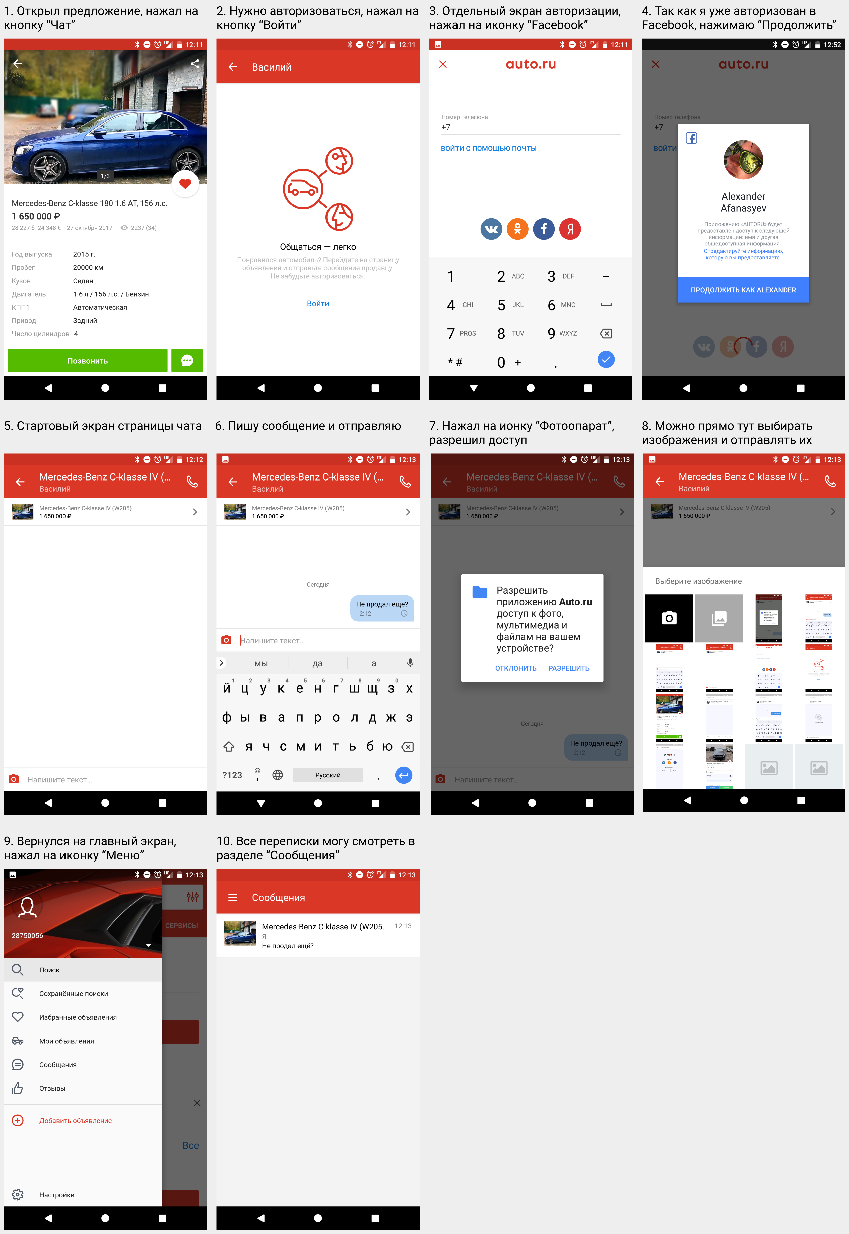
It is possible to send pictures - it is convenient. You can ask to send an additional photo of the machine, parts, etc.
Screen number 2 and screen number 3 can be combined to have fewer steps.
Drom.ru application
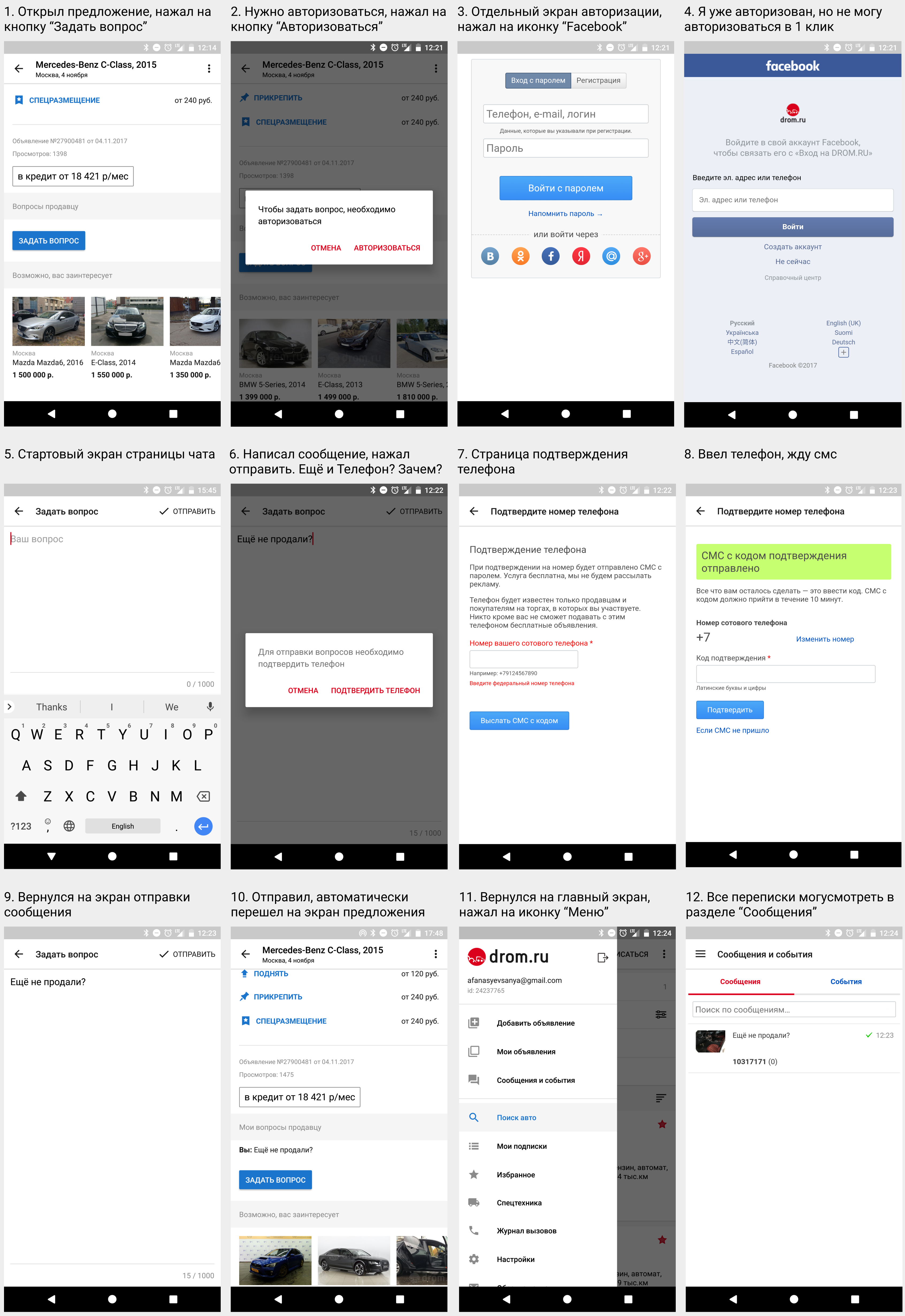
To send a message / return to the correspondence, it takes a lot of steps. And also it is not clear why you need to enter another phone, if I have already logged in to the application.
Why authorization through Facebook (screen No. 4) does not work as well as works with competitors? If I’m already logged in to Facebook on the phone, then don’t ask me to re-enter my login and password. You need to ask for this data from Facebook, so that I could login in one click.
The outcome of the 6th scenario
1st place - am.ru. Minimum steps to write to the seller.
2 place - auto.ru. Conveniently, it is possible to send photos.
3rd place - drom.ru. Messaging inconvenient.
Assistance in checking and buying the selected car
And finally, you have found a dream car and it seems that it remains only to buy it, but the most difficult scenario remains. We are always told that all the cars on the market are “not bits and crashes,” but I would like to hear the answer to this question from the third “disinterested” party, who is competent in this.
Application am.ru
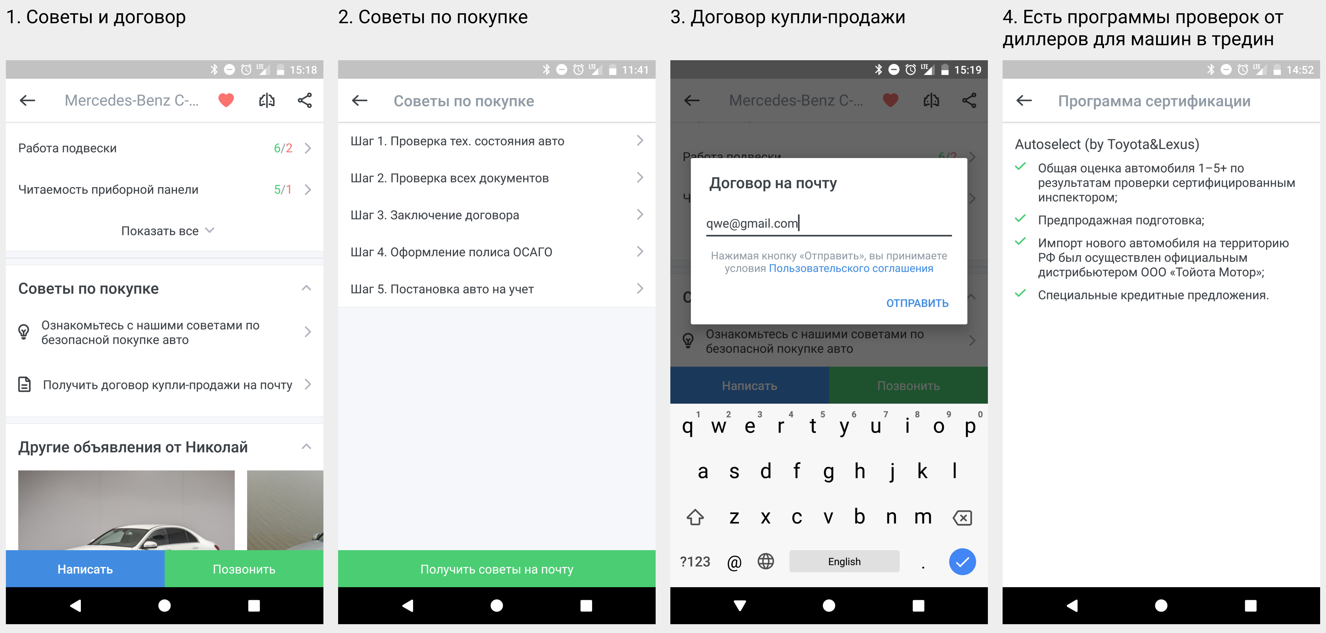
You can read the tips on buying and send the contract by mail.
Auto.ru application
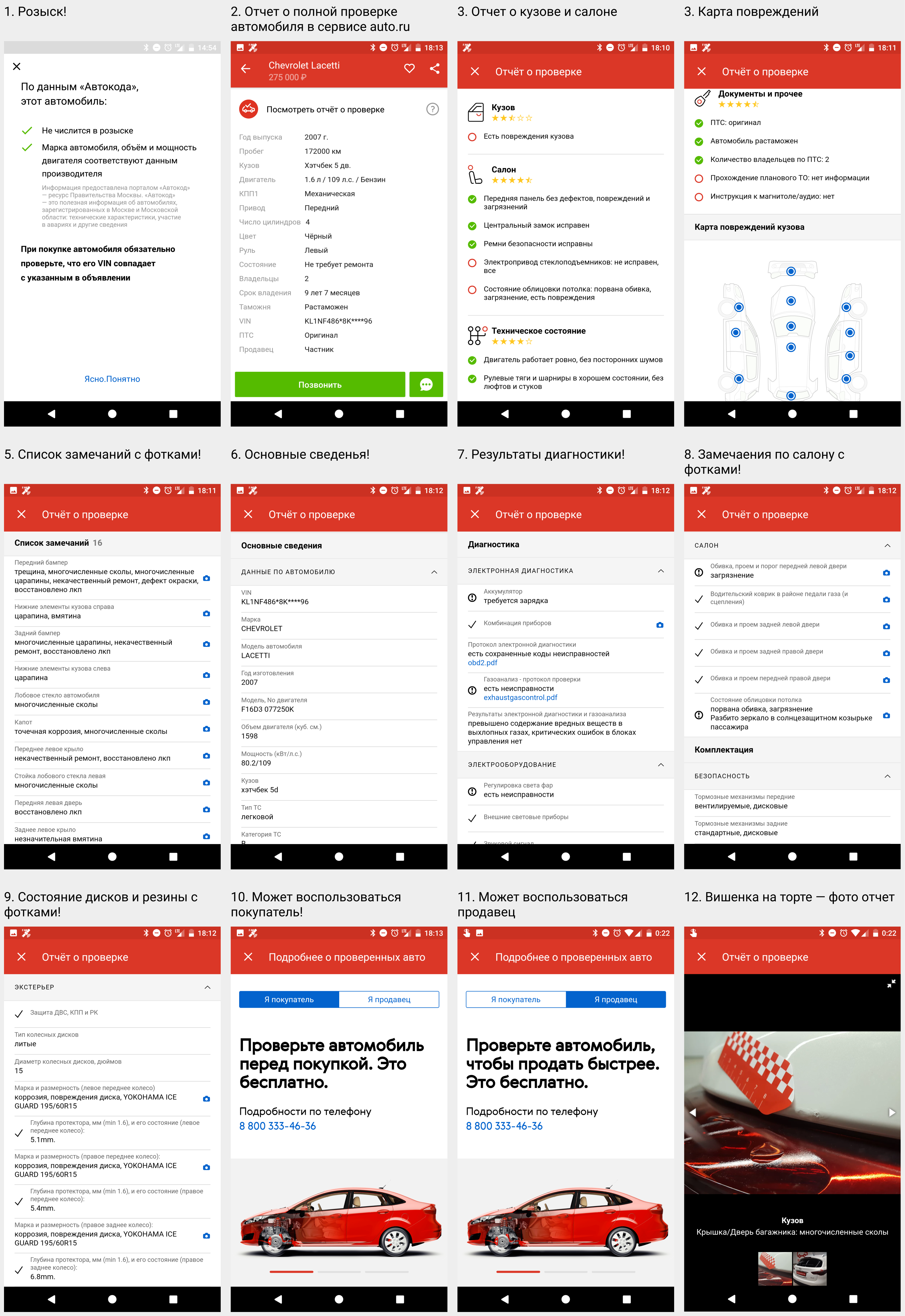
Any seller or buyer can check the car in their service and get a detailed and useful report (see screenshots). Sign up for such a check can be here . It is very strange that about this in few places is indicated in the application itself and there is no link in each sentence. The service is very cool. If all sellers had passed such a check, the probability of buying a car that didn’t meet the stated specifications would be very low.
Drom.ru application
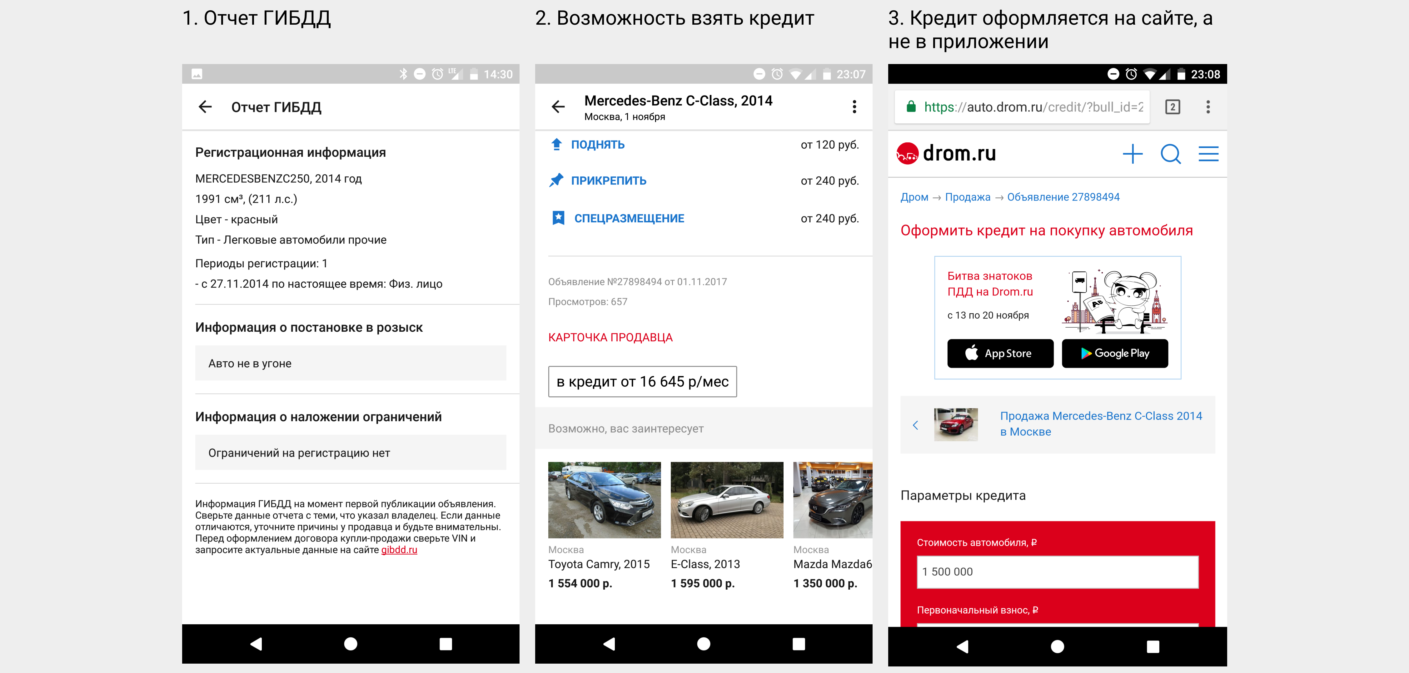
The application provides a minimum of information from the traffic police. It is possible to get a loan, but I did not use this function and I can’t say anything about its work.
The outcome of the 7th scenario
1st place - auto.ru.
2 place - am.ru.
3rd place - drom.ru.
Completeness of the database
This question is important, but I will not consider it, since I do not have such data. If in Moscow and the Moscow region the leader is auto.ru, then for Vladivostok, Novosibirsk or some other city, the question remains open.
Summarizing
1st place and 7 points - am.ru. In my opinion, this is a deserved victory. The application is a little more thoughtful and convenient than the rest. Weakness - notifications.
2nd place and 6 points - auto.ru. The application has very strong sides, but it is necessary to reduce the steps and simplify the use cases.
3rd place and 5 points - drom.ru. Does not lag behind competitors and is more than sure that it can catch up and overtake.
From the results it can be seen that all applications are about the same level, which indicates healthy competition. I really liked that all of them are developed according to android material desing guidelines. Well, when using standard controls, and they are located on the standard places - this allows the user to quickly understand the application.
Conclusion
Each of the applicants solves the problem of finding a car, but the problem of buying is not all and not completely. Imagine such an application with the help of which you not only chose the right car, but also managed to carry out a test like auto.ru, consult on legal issues of sale and purchase, prepare and print the contract, and book a negotiation room and make a purchase transaction. I am willing to pay for such a service. And you?
I really hope that this article will help teams make the applications even better. Thanks for attention.
PS Perhaps not everyone will agree with my conclusions and assessments. There is a poll below, please vote for who you think should win.
Source: https://habr.com/ru/post/339722/
All Articles