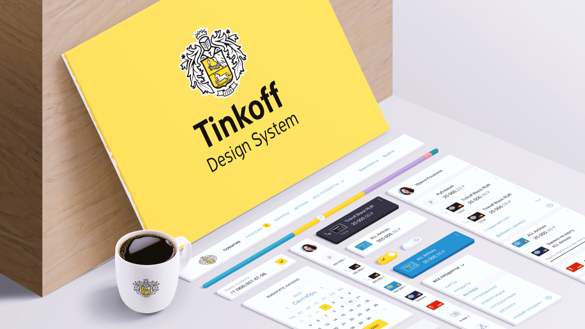
Creating a Tinkoff Design System. UI Kit, versioning and showcase components
In a previous publication, I talked about how we came to understand the need to create a design system, and how much profit we can get from its implementation. And, of course, the processes of creation and implementation are not as simple as they seem at first glance. We are faced with a number of serious problems that we had to solve. It is about the process of creation and the difficulties that will be discussed in this article.
UI Kit and its assembly problems
Those who revolve in a designer or near-designer get-together are already familiar with the concept of the UI Kit (hereinafter “the whale”). For those who do not know, this is a set of interface elements in the same style intended for assembling pages. Usually these are Sketch or Photoshop files, in which components are laid out on the shelves, by arranging which, you will get a ready-made layout. But we are interested in exactly the whale, which is used not only by designers, but also by developers, managers and technologists. That it can be called a full-fledged working tool for a grocery company.
In our case, there were several whales: one basic and several food ones. In the base kit, we put either common components for all products, or those components that are used in at least two products. Components that are unique to a particular product fall into the food kit.
')
Below I list the problems that we had to solve as part of the assembly of the first version of the basic whale:
- Components. There were a lot of them. The 2,700 components that repeated each other were old and unnecessary, some derived from existing ones. Some looked the same, but worked differently.
- Grid and layout. It was necessary to make changes in order to implement the first end-to-end component assembled on the whale - the side navigation in the personal account of the bank (hereinafter referred to as the board). This meant that absolutely all pages of the site would be affected, and nothing could be broken.
2700 components, Carl!
There was a question about which components should be put into the base whale. Buttons, navigation, basic controls are beyond doubt. And what else?
We took the path of adding those components that are most often used on the platform Tinkoff.ru. The development team helped us to upload a list of all components with statistics on the number of their references.

This was not enough, since the frequent mention of the component does not mean that it is used in the most popular client scenarios. It was necessary to enter from the other side, and we went along a less automated way: we took our most visited pages in the products and wrote out the most important components that could be reused. This concerned both the external pages of Tinkoff.ru and the internal pages of the Internet bank.
Start with the components that are involved in the typical usage patterns of your product.
The result was not long in coming:
- in these two ways we covered 70% of the base whale;
- the number of basic components was reduced to 70;
- for some components, the functionality has been extended so that they can participate in different products;
- synchronized component names between design and development;
- determined the structure and dependencies of each component. For example, the selector of accounts at us is under construction on base of an input;
- Now we can iteratively change components.
Grid and layout
On Tinkoff.ru there is no separate area of your personal account - you can log in and continue to surf the grocery pages of the site. Sections of the authorized zone appear in the main menu, and in the board, the client has access to his cards, accounts and other products.
The layout that existed at that time was difficult technically and heavy. He had interest ears, and when he entered his personal account, the content narrowed dynamically to make room for a dark board leaving to the right (yes, the board was still dark and to the right). As a result, we received braking when entering the private office, since the render of all these dynamic changes in the content area went to the front. Plus, on some pages, bugs were caught that somewhere something did not fit. But there were few such situations.
What was done:
- discarding interest ears and fixing the minimum indentation of the content area for minimal resolutions;
- recording and a slight increase in the content area for the external site and personal account;
- take authorization process from the board to a separate page;
- building a new behavior of the layout, taking as a basis a personal account, where content exists along with the board.
The work done has given us an increase in performance, because now the content is not narrowed dynamically, but is simply shifted to the right, and it does not matter what state of the board is active, minimized or developed. New behavior, fixing and a small increase in the content area simplified our testing of pages and saved us from minor bugs because something didn’t fit.
Versioning and synchronization
Already at the early stage of creating a basic whale, we understood that we wanted to take the experience of developers in working with the code and implement it in our design kitchen. What we have in the whale must be theirs. There should be no discrepancies. We needed to create a single space in order to maintain the relevance of the whale.
Instruments
For developers, this has long been good. No major project is complete without a version control system (Git, Github, SVN, Mercurial). As for the design, here the tools are just beginning to appear, and Abstract is one of them. Its advantages:
- the possibility of working together on one project;
- access control;
- creating branches;
- versioning and change history;
- saving and description of each change in design layouts;
- clear interface;
- process transparency;
- high speed work.
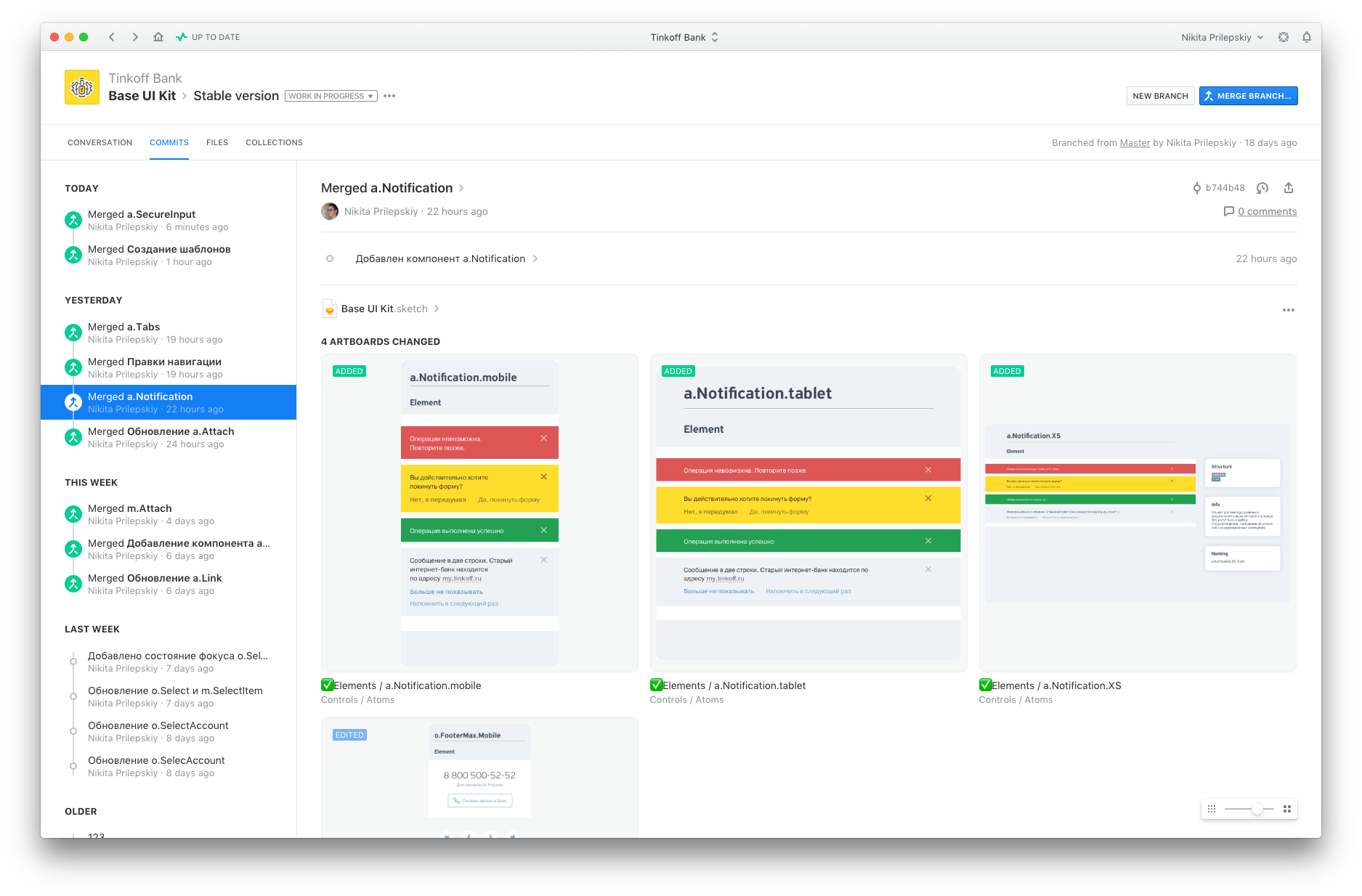
We are actively using Abstract to version the base whale. With it, you can monitor and save the history of any changes, as well as have access to any version of any component at the time of need. Abstract records everything.
Any version. Any component. Anytime.
An approach
From the point of view of design and development, we use one approach - semantic versioning (semver) of components. This means that the version is represented as three integers separated by a period (for example, 2.4.1). The first digit is called the major version, the second is minor, and the third is the patch.
Change version for design:
- A patch version is a fix for minor bugs in the design layout of a component;
- The minor version adds a new state that does not affect other states of the component;
- Major version - global functional and stylistic component changes.
Change version for developers:
- Patch version - edits of bugs and changes that do not affect the behavior of the component;
- Minor version - adding new component states;
- Major version - changes that can break a component. For example, changed the appearance and size.
Each component is versioned by this approach.
Synchronization
One of the important tasks is to form a complete correspondence of the components of the design team with the components used by the developers. Given the fact that designers and developers are versioning each component, we needed to understand at which of the three levels synchronization was possible.
There was no point in comparing the components on the patch version, since the bugs that may appear in the design and development are significantly different. But if a new state appears in the component's layout, then it is logical that it should appear in its live counterpart. Having discussed this moment with the developers, we made it a rule that the components are synchronized, starting with the minor version, and the patch versions may be different.
The result of such simple manipulations:
- access to any components of any version of the designer and developer;
- full compliance of components;
- understanding of where the component is used and what version it is.
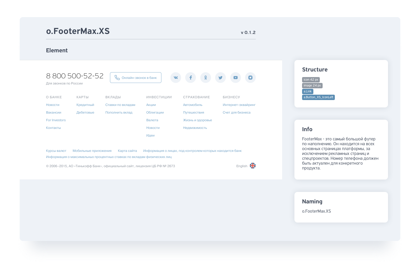
Showcase
We use React Storybook to display and use our components, but in its original form: it is inconvenient for everyone except developers. And we wanted to collect all the information on the design system in one place and make it accessible to all:
- general principles of building interfaces;
- components for all products;
- documentation and specifications for them;
- resources for designers and developers.
This tool will be useful to absolutely all team members: designers, developers, managers and technologists.
- This is a great way to familiarize yourself with the principles and all the components of a design system, to understand how it all works and is assembled into a single whole.
- He will give an understanding of how large this or that product is, what components it consists of.
- Allows you to more accurately assess when making changes or developing features.
- Answers questions about how the component is arranged, where the data comes from, and what happens to it.
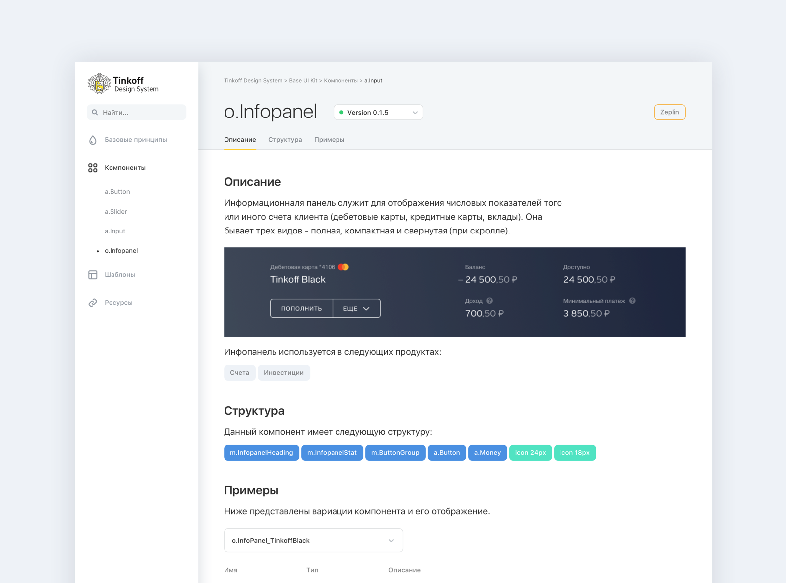
We began developing our own showcase for our design system and endowed it with the following functionality:
- UI Kit for all products. The storefront home page is breeding for all existing whales for products.
- The basic principles of building interfaces. Each whale has its own section, which presents colors, typography, components and patterns.
- Structure and dependencies. You can see in which products each component is used, and if it is a molecule or organism, see its structure.
- Versions. For each component, you can see its version from the moment it appears on the storefront. You can see the current version and the version that is in development.
- Documentation and specifications. Each component is described in detail in terms of design and development. There are links to current layouts in Zeplin.
- Behavior. You can see how the components behave at different resolutions.
- Use code. For each component are given all the necessary parameters that can be changed. They are immediately displayed in snippet for code, the content of which can be copied and pasted to itself.
Afterword
Creating and implementing a design system is a complicated, but necessary process for large companies with a large number of different products. And we will try to tell about all the pitfalls that we had to face. The following articles will focus on regulations, business and design processes.
Source: https://habr.com/ru/post/339660/
All Articles