Technical composition of process diagrams
Business processes, projects, and it is convenient to display any sequence of related tasks in the form of process diagrams. It is not an easy task to study the process, display its plot and present it in the form of a diagram, therefore, having overcome the first difficulties, we often hurry to immediately share the achieved results. Such haste can play a cruel joke with us, since charts are visual data, and if they are badly decorated, their effectiveness will be reduced. Therefore, having received the first sketches and checking their correctness, you should think about fine-tuning their visual presentation.
Recall that a practical way to build process diagrams is described in the previous article “The Art of Creating Process Diagrams, ” which is recommended to be read in advance.
The basis of any graphical representation of the data is its composition - the ratio and mutual arrangement of the parts of this representation. A successful compositional solution can make the diagram easier to understand, enrich it with additional meaning and increase its attractiveness. Unfortunately, in order to find such a composition, you need to have a composite sense and experience, however, if you follow certain rules, you can get quite a decent result, even being a novice. First, consider the technical approach to finding a composite solution.
')

Frame
One of the main components of any visual presentation is its frame. Fortunately, modern means of building diagrams offer us a virtually infinite field for placing objects, so at the initial stage you can not worry too much about the correct framing of the image, leaving this question for later. However, you need to first examine the possibilities of the available media formats, on which a diagram will be presented, in order to evaluate the preferred sizes of the diagram objects and make sure that the text placed on them is readable.
Flow direction
The process diagram has a dynamic nature, and it is assumed that the viewer must read it in a certain order, so you need to choose the direction in which the process will develop along the surface of the sheet. A universal solution to this issue is the configuration in which the direction of movement of the diagram corresponds to the direction of reading the text on the diagram. In the Western tradition, this movement is from top to bottom and from left to right. Of course, individual links in the diagram may not follow this rule, it is enough that the overall process vector is maintained in the chosen direction.
For example, the standard of the functional description of business processes IDEF0 directly requires that each subsequent block of the diagram be located on the right and below the previous one.
Object Configuration
The shape and size of objects have a strong influence on the optimal composition; therefore, one should first determine the possible configuration of objects. Estimate the amount of information that will be displayed on the object, as a rule, its name and description, as well as additional data in the form of illustrations, dates, service parameters, links and the like.
The area of the object should be sufficient to accommodate all the important data, and the aspect ratio should contribute to comfortable reading. Avoid narrow and high objects: this form is inconvenient for reading, for short phrases (less than 50 text characters) there can be enough width to put 15 characters in a line, for longer texts a line width of less than 25-30 characters makes reading much more difficult.

Note that the larger the object, the more significant it looks on the diagram, avoid placing long texts and extensive additional information on secondary objects, and if the need arises, use the additional comment next to the object, keeping the size of the object itself commensurate with its importance. If necessary, you can also make the size of important objects larger than is required to accommodate their data.
Location of objects
The most important principle of the organization of graphic information is the principle of proximity , according to which the stronger the elements are connected, the closer they should be to each other . From this principle many useful rules are derived, and we will often return to it. At the stage of building a composition, this means that it is desirable to place objects of a diagram related to each other side by side, this will simplify the understanding of the scheme and will allow minimizing the length of the connections.
Boundary objects
It is very important that the viewer quickly finds the beginning of the process and its completion, so initial objects that do not have predecessors, as well as finite objects that have no descendants, should be placed at the borders of the diagram, since they are the inputs and outputs of our process and such positioning will emphasize their role. It is easy to see that the proximity principle also works here: the inputs and outputs are related to the external environment of the process, so they should be closer to the external frames.
Connections
The configuration of connections between objects plays a key role in the perception of the dynamics of composition and sometimes it may turn out to be even more important than the location of objects. Therefore, avoid applications that have limited ability to edit links, without careful control over the trace of links, it is impossible to build any complex diagram qualitatively.
The next key principle of organizing graphic information is the principle of minimum means , or Occam's razor, which states that you should not use more entities than is necessary . If any element of the diagram does not explain the process and does not bear the functional load, then it should be immediately abandoned, since the diagram serves only one purpose - the explanation of the process.
In accordance with this principle one should manage as far as possible with short links between objects. Every bend and turn of a connection is an additional entity that you should try to get rid of.
However, the most harmful in terms of impact on the reader diagrams and forming a strong "parasitic" essence are cases of intersection of bonds. Paradoxically, but I intend to reinforce this argument with a fictional fact from Peter Watts’s “False Blindness” novel. The novel describes “reconstructed vampires” with a specific failure of perception:
By locally rearranging the diagram objects, part of the intersection can be avoided. It may also be useful to move the attachment points of connections (ports) to different sides of the object.
If the description formalism assumes links of a different type that are visually different from each other, then it is preferable that the remaining intersections be between links of a different type rather than peer-to-peer ones (see the example “TradeShow” below). “Bridges” play an important role in the correct perception of intersections; if possible, try to use this technique.

Free areas
The next important element of the diagram is the empty space between the objects. Do not neglect this element, which can greatly affect the expressiveness of the composition. When presenting a chart, it is important not only to convey the essence of the described business process, but also to set a visual reference point that makes it easy to recall the chart configuration. If objects are tightly arranged in a diagram, then they will generally represent one visual “spot”, but if you skillfully operate with empty spaces, then the “spot” can be given a characteristic shape that makes it easy to recall the diagram.
Consider a small example.
Here is the user's original diagram, which was compiled for compactness reasons; it has already been used to optimize connections and align objects. Let me remind you that the examples used the results of the work of the author’s own application, and this diagram is a real working example of one of the application users.

As you can see, the diagram has a rather complex structure of links and dense packing of objects. Now add spaces and reassemble the diagram.

The new diagram follows the recommendations given earlier, as a result: communications have become simpler, peer-to-peer intersections have been avoided, and the general perception of the essence of the process has improved significantly. If at a quick glance the previous diagram was perceived as a visual “com”, then the new diagram is already perceived as a remembered figure.
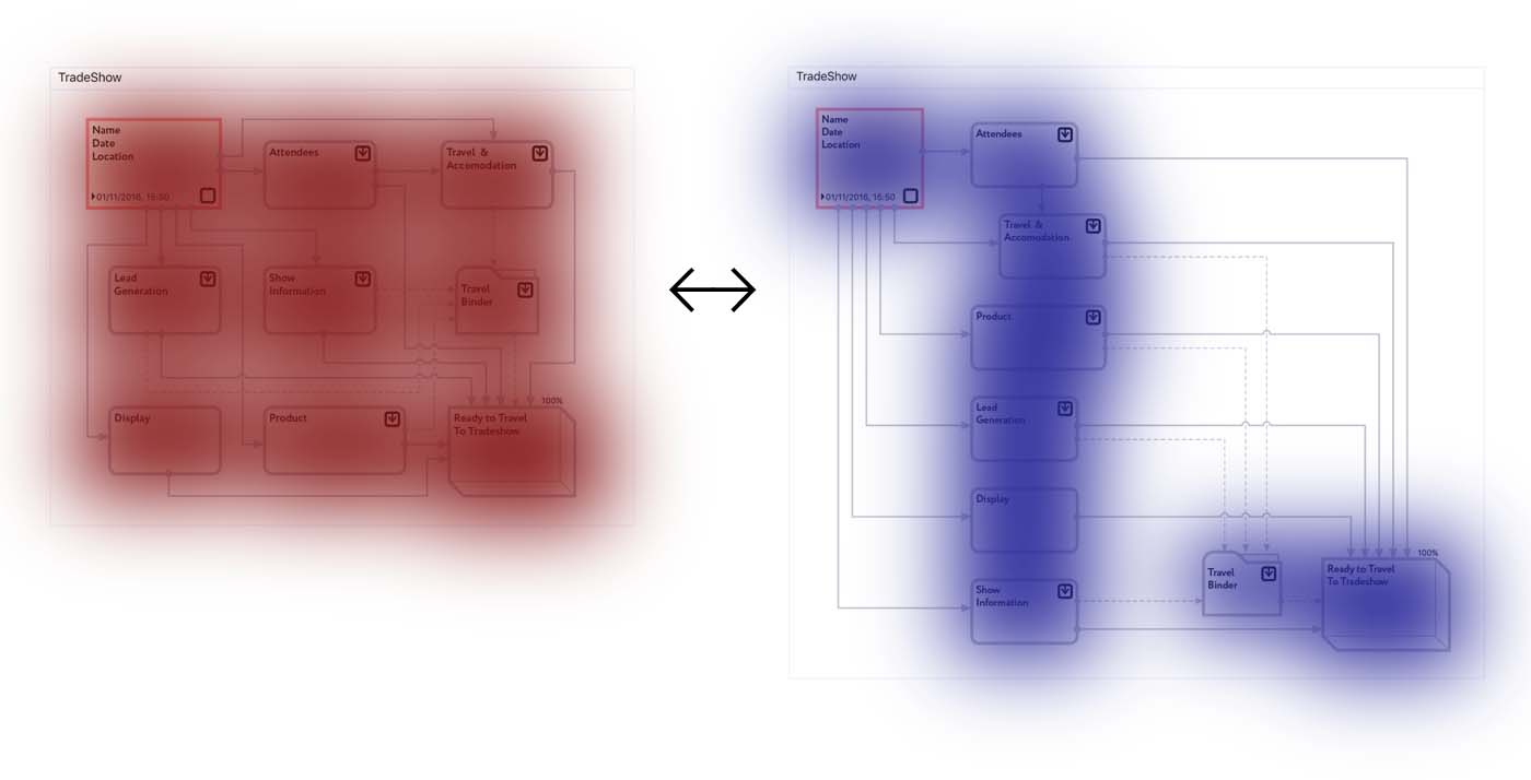
Do not underestimate this aspect, it is essential when discussing processes and for real activity - after all, schemes that are easier to remember always work better.
Metaphors
Also, a significant advantage of the new diagram is the use of empty space as a metaphor, note that the work on preparing for the presentation is visually more close to the beginning of the process than to completion. This arrangement represents the estimated timeline of the business process, encouraging to begin preparing for the show as soon as possible. The process of preparing the product is also done a little more than the rest, to emphasize its complexity and importance. When between tasks there are significant characteristic time intervals or geographical distances, then adding space to the composition can be emphasized. Such work with details improves the understanding of the process by the audience and stimulates attention to it.
So, this part contained several recommendations on the technical construction of the composition, these recommendations are of a general nature and are effective for most cases. In the next part, cases of a special composition will be considered when additional principles are used in the arrangement of objects and configuration of connections. For most working applications, it is quite sufficient to follow the rules of the technical composition, however, in rare cases, when particularly expressive diagrams are required, the use of additional creative techniques is useful.
Recall that a practical way to build process diagrams is described in the previous article “The Art of Creating Process Diagrams, ” which is recommended to be read in advance.
The basis of any graphical representation of the data is its composition - the ratio and mutual arrangement of the parts of this representation. A successful compositional solution can make the diagram easier to understand, enrich it with additional meaning and increase its attractiveness. Unfortunately, in order to find such a composition, you need to have a composite sense and experience, however, if you follow certain rules, you can get quite a decent result, even being a novice. First, consider the technical approach to finding a composite solution.
')
Technical composition
Frame
One of the main components of any visual presentation is its frame. Fortunately, modern means of building diagrams offer us a virtually infinite field for placing objects, so at the initial stage you can not worry too much about the correct framing of the image, leaving this question for later. However, you need to first examine the possibilities of the available media formats, on which a diagram will be presented, in order to evaluate the preferred sizes of the diagram objects and make sure that the text placed on them is readable.
Flow direction
The process diagram has a dynamic nature, and it is assumed that the viewer must read it in a certain order, so you need to choose the direction in which the process will develop along the surface of the sheet. A universal solution to this issue is the configuration in which the direction of movement of the diagram corresponds to the direction of reading the text on the diagram. In the Western tradition, this movement is from top to bottom and from left to right. Of course, individual links in the diagram may not follow this rule, it is enough that the overall process vector is maintained in the chosen direction.
For example, the standard of the functional description of business processes IDEF0 directly requires that each subsequent block of the diagram be located on the right and below the previous one.
Object Configuration
The shape and size of objects have a strong influence on the optimal composition; therefore, one should first determine the possible configuration of objects. Estimate the amount of information that will be displayed on the object, as a rule, its name and description, as well as additional data in the form of illustrations, dates, service parameters, links and the like.
The area of the object should be sufficient to accommodate all the important data, and the aspect ratio should contribute to comfortable reading. Avoid narrow and high objects: this form is inconvenient for reading, for short phrases (less than 50 text characters) there can be enough width to put 15 characters in a line, for longer texts a line width of less than 25-30 characters makes reading much more difficult.
Note that the larger the object, the more significant it looks on the diagram, avoid placing long texts and extensive additional information on secondary objects, and if the need arises, use the additional comment next to the object, keeping the size of the object itself commensurate with its importance. If necessary, you can also make the size of important objects larger than is required to accommodate their data.
Location of objects
The most important principle of the organization of graphic information is the principle of proximity , according to which the stronger the elements are connected, the closer they should be to each other . From this principle many useful rules are derived, and we will often return to it. At the stage of building a composition, this means that it is desirable to place objects of a diagram related to each other side by side, this will simplify the understanding of the scheme and will allow minimizing the length of the connections.
Boundary objects
It is very important that the viewer quickly finds the beginning of the process and its completion, so initial objects that do not have predecessors, as well as finite objects that have no descendants, should be placed at the borders of the diagram, since they are the inputs and outputs of our process and such positioning will emphasize their role. It is easy to see that the proximity principle also works here: the inputs and outputs are related to the external environment of the process, so they should be closer to the external frames.
Connections
The configuration of connections between objects plays a key role in the perception of the dynamics of composition and sometimes it may turn out to be even more important than the location of objects. Therefore, avoid applications that have limited ability to edit links, without careful control over the trace of links, it is impossible to build any complex diagram qualitatively.
The next key principle of organizing graphic information is the principle of minimum means , or Occam's razor, which states that you should not use more entities than is necessary . If any element of the diagram does not explain the process and does not bear the functional load, then it should be immediately abandoned, since the diagram serves only one purpose - the explanation of the process.
In accordance with this principle one should manage as far as possible with short links between objects. Every bend and turn of a connection is an additional entity that you should try to get rid of.
However, the most harmful in terms of impact on the reader diagrams and forming a strong "parasitic" essence are cases of intersection of bonds. Paradoxically, but I intend to reinforce this argument with a fictional fact from Peter Watts’s “False Blindness” novel. The novel describes “reconstructed vampires” with a specific failure of perception:
Another side effect of the cascade changes was the “cross glitch” - the merging of two normally separate receptor networks of the visual cortex (10), which leads to large epileptic seizures if the networks responsible for perceiving vertical and horizontal lines are simultaneously stimulated on a sufficiently large plot of view. Since right angles are practically absent in nature, natural selection did not sift out the “cross glitch” until H. sapiens sapiens created Euclidean architecture. By this time, the trait was fixed in the population of H. sapiens whedonum through genetic drift, and the entire subspecies, having lost access to the main prey overnight, died out soon after the appearance of writing in humans.Of course, modern man in his perception is very different from the example described, but nevertheless, in a uniform visual field, “crosses” are often perceived as additional entities. Unfortunately, in most cases they do not carry any meaning and only complicate the reading of the diagram.
By locally rearranging the diagram objects, part of the intersection can be avoided. It may also be useful to move the attachment points of connections (ports) to different sides of the object.
If the description formalism assumes links of a different type that are visually different from each other, then it is preferable that the remaining intersections be between links of a different type rather than peer-to-peer ones (see the example “TradeShow” below). “Bridges” play an important role in the correct perception of intersections; if possible, try to use this technique.
Free areas
The next important element of the diagram is the empty space between the objects. Do not neglect this element, which can greatly affect the expressiveness of the composition. When presenting a chart, it is important not only to convey the essence of the described business process, but also to set a visual reference point that makes it easy to recall the chart configuration. If objects are tightly arranged in a diagram, then they will generally represent one visual “spot”, but if you skillfully operate with empty spaces, then the “spot” can be given a characteristic shape that makes it easy to recall the diagram.
Consider a small example.
Here is the user's original diagram, which was compiled for compactness reasons; it has already been used to optimize connections and align objects. Let me remind you that the examples used the results of the work of the author’s own application, and this diagram is a real working example of one of the application users.
As you can see, the diagram has a rather complex structure of links and dense packing of objects. Now add spaces and reassemble the diagram.
The new diagram follows the recommendations given earlier, as a result: communications have become simpler, peer-to-peer intersections have been avoided, and the general perception of the essence of the process has improved significantly. If at a quick glance the previous diagram was perceived as a visual “com”, then the new diagram is already perceived as a remembered figure.
Do not underestimate this aspect, it is essential when discussing processes and for real activity - after all, schemes that are easier to remember always work better.
Metaphors
Also, a significant advantage of the new diagram is the use of empty space as a metaphor, note that the work on preparing for the presentation is visually more close to the beginning of the process than to completion. This arrangement represents the estimated timeline of the business process, encouraging to begin preparing for the show as soon as possible. The process of preparing the product is also done a little more than the rest, to emphasize its complexity and importance. When between tasks there are significant characteristic time intervals or geographical distances, then adding space to the composition can be emphasized. Such work with details improves the understanding of the process by the audience and stimulates attention to it.
So, this part contained several recommendations on the technical construction of the composition, these recommendations are of a general nature and are effective for most cases. In the next part, cases of a special composition will be considered when additional principles are used in the arrangement of objects and configuration of connections. For most working applications, it is quite sufficient to follow the rules of the technical composition, however, in rare cases, when particularly expressive diagrams are required, the use of additional creative techniques is useful.
Source: https://habr.com/ru/post/339278/
All Articles