How we did design for bitcoin

Satoshi Nakamoto contacted Logomashina - he asked to work on the Bitcoin style. In this article we will describe in detail how we invented and visualized the style for the most popular cryptocurrency and what it led to.
Of course, this is a joke - we ourselves decided to make a logo and corporate identity for Bitcoin. Cryptocurrency has symbols, but we wanted to visualize the phenomenon itself - a futuristic currency, the “gold” of our time. This is an interesting design challenge that will attract attention and show you how to describe a new phenomenon with visual images.
')
Vika from the content department acted as Satoshi Nakamoto - she filled out our standard brief as a customer. I became the project manager and chose designers to work on the logo and style.
As befits a decent manager, I translated the wishes of the “client” into a design language. It turned out that we need to develop an abstract futuristic style that reflects the idea of mining cryptocurrency and will be a visual metaphor for the “gold of a new generation”.
Designating the task, we began to dive into the topic:
We collect abstract references with particles, waves and other metaphors
Turn first thoughts into graphics:
Marina goes through the options


The first options resemble a coin
We tried to throw futuristic style:

We depict a coin emitting light

Trying a more "bold" and unusual combination of colors
We are embracing the theme of the cosmos as something boundless and unexplored:

The colors are still unusual, but not so bright.

We are working on the topic of radiation and particles
It turns out too contradictory - it seems that most will not appreciate such motives. We leave the idea to show the meaning of the blockchain through the metaphor of "particles gathering into one whole", we try different styles:

Making a solid round "coin"

We are trying to make waves-nebulae.

We play with the shape, density and color, went to the theme of clouds

We try to make pixels from particles and make ornaments

We try not to depart from the idea of "modern gold"
We come to the final version, combining the ideas of "dynamic, abstract essence" and "modern gold". It looks like water circles and nebulae and, of course, is animated:
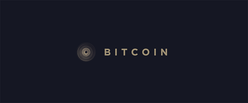 Bitcoin final logo
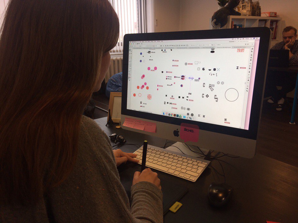
We immediately knew that we would do the dynamics, so we immediately prepared all the particles for animation:

Designer Sasha is working on the animation of the logo
In addition to the animation for the presentation, we made a simple three-dimensional model of a futuristic ATM:

Bitcoin ATM model in 3D Max

Bitcoin ATM interface presentation (ATM scans the user's retina to identify it)
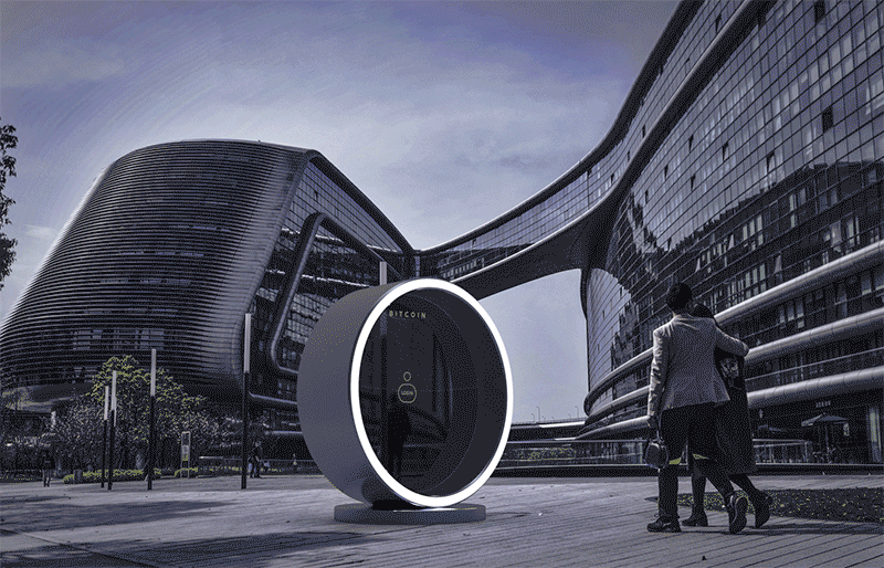
ATM visualization day and night
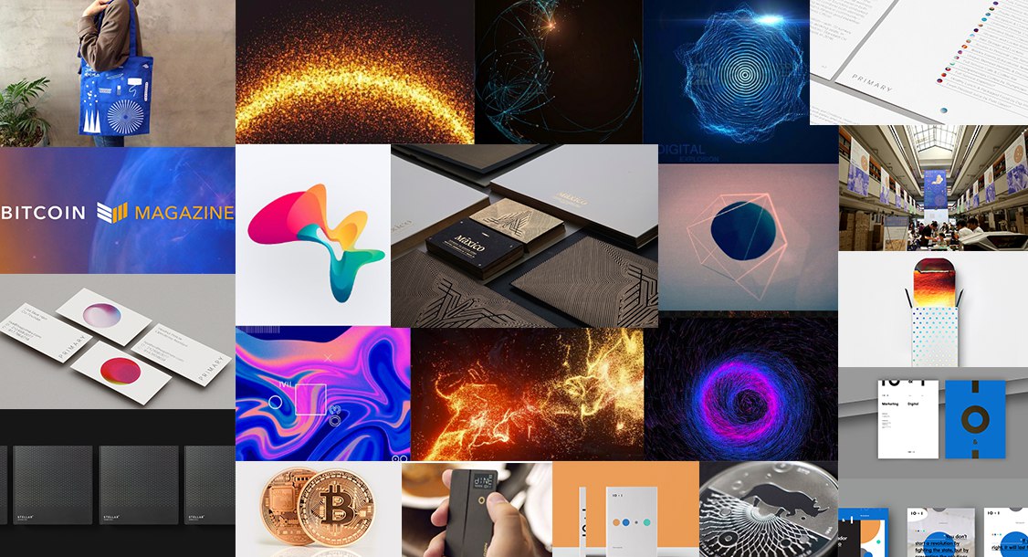
Total:
You can watch the full presentation here !
At the moment, the project looked more than twenty thousand people from around the world. We received an award for it - “ribbon” from Behance in the category “graphic design”. In addition, we were approached by several projects related to the IT and cryptocurrency sphere with offers to buy this concept, but we are not in a hurry to sell it. Several blockchain projects have become our clients.Now we are preparing the next concept in order not to miss it - subscribe to VKontakom's Log Machine !
Source: https://habr.com/ru/post/338854/
All Articles