$ mol_app_calc: Spreadsheet Party
Hello, my name is Dmitry Karlovsky and I ... I love math. Once I couldn’t sleep and I filed a service for the same repulsed as I - lightweight spreadsheet with custom formulas, sharing and downloading .
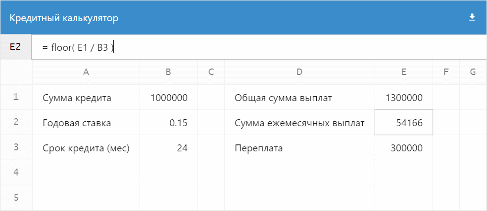
A live example with the calculation of the loan:
And then I'll tell you how to create the same for the evening using the $ mol framework ...
What is this pokemon?
$ mol is a modern framework for quickly creating cross-platform responsive web applications. It is based on the MAM architecture setting the following rules for all modules:
- A module is a directory containing source codes.
- Source codes can be in a variety of languages.
- All languages are equal within the module.
- Modules can form a hierarchy.
- The module name strictly corresponds to the path to it in the file system.
- There may be dependencies between modules.
- Information about the dependencies of the module is obtained by static analysis of its source codes.
- Any module can be assembled as a set of independent bundles in different languages (js, css, tree ...).
- Only those modules that are actually used fall into the bundles.
- All source codes of the module are included in the bundle.
- Modules have no versions - the actual code is always used.
- The module interface should be open for expansion, but closed for modification.
- If you need a different interface, you need to create a new module. For example,
/my/file/and/my/file2/. This allows you to use both interfaces without confusing them.
Work environment
Starting $ mol is easy. Once you unfold the working environment and then rivet the applications / libraries like patties.
First you need to install:
- Git
- Nodejs
- Any editor. Recommended: VSCode
- Editor plugin for highlighting tree syntax.
- Editor plugin to support EditorConfig .
If you are working under Windows, then you should configure GIT so that it does not change the line ends in your source code:
git config --global core.autocrlf input Now you need to deploy a MAM project that will automatically bring you a development server:
git clone https://github.com/eigenmethod/mam.git cd mam npm install npm start Everything, the developer's server is running, you can open the editor. Please note that in the editor you need to open the MAM project directory, and not the project of a specific application or your company.
As you can see, it’s very easy to start developing at $ mol. The basic principle of MAM architecture - out of the box everything should work as it should, and not require a long tedious setting.
Application framework
For conspiracy, our application will have the call sign $mol_app_calc . According to the MAM rules, it should be placed in the /mol/app/calc/ directory, respectively. All the files in the future we will create there.
First, create an entry point — a simple index.html :
<!doctype html> <html style="height:100%"> <head> <meta charset="utf-8" /> <meta name="viewport" content="width=device-width, height=device-height, initial-scale=1"> <link href="-/web.css" rel="stylesheet"/> </head> <body mol_view_root="$mol_app_calc"> <script src="-/web.js" charset="utf-8"></script> </body> </html> Nothing special, except that we have specified the mount point of the application with the special attribute mol_view_root in which it was mol_view_root that it is necessary to mount our application. The $ mol architecture is such that any component can act as the root of the application. Conversely, any $ mol application is nothing more than a regular component and can be easily used inside another application. For example, in the gallery of applications .
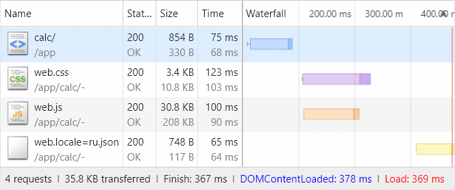
Please note that we have already registered the paths to the scripts and styles - these bundles will be built automatically for our application and include only those source codes that are really necessary for it. Looking ahead, it is worth noting that the total volume of the application will be some 36KB without minification, but with ziping:
So, to declare a component that will be our application, we need to create a file calc.view.tree , the simplest content of which consists of just one line:
$mol_app_calc $mol_page The second word is the name of the base component, and the first is the name of ours, which will be inherited from the base one. Thus, each component is the successor to any other. The most basic component from which all the others come is $ mol_view . It gives all components only the most basic styles and behavior. In our case, the base component will be the $ mol_page component, which is a page with a header, body and basement.
The calc.view.tree class of the component will be automatically generated from calc.view.tree and placed in -view.tree/calc.view.tree.ts so that the development environment can pick it up:
namespace $ { export class $mol_app_calc extends $mol_page { } } Actually, now the application can already be opened at http://localhost:8080/mol/app/calc/ and see the empty page with the callsign as the title:

The view.tree syntax is rather unusual, but it is simple and concise. Let me quote one of the reviews about him:
The syntax of a tree is very easy to read, but you need to get used to it a bit and do not drop everything ahead of time. My brain digested and resented for about a week, and then enlightenment comes and you understand how much this framework simplifies the development process. © Vitaly Makeev
So don't get scared, but dive! And let's start with the general layout of the page - it will consist of a header, a panel for editing the current cell and the actual data table.
Each component has a sub() property that returns a list of what should be rendered directly inside the component. At $ mol_page, the values of the Head() , Body() and Foot() properties are rendered, which return the appropriate subcomponents:
$mol_page $mol_view sub / <= Head $mol_view <= Body $mol_scroll <= Foot $mol_view In this code, the implementation details of the subcomponent are omitted so that the essence is visible. When declaring a subcomponent (aka “Element” in BEM terminology), we indicate its name in the context of our component and the name of the class to be instantiated. An instance of the component created in this way will be cached and accessible through the property of the same name. For example, this.Body() in the context of our application will return a customized instance of $ mol_scroll . Speaking of patterns, the Body() property acts as a local lazy factory.
Let's preset the sub() property so that it returns the components we need:
$mol_app_calc $mol_page sub / <= Head - <= Current $mol_bar <= Body $mol_grid Here we left the cap from $ mol_page, added $ mol_bar as the editing pane for the current cell, used $ mol_grid , the component for drawing virtual tables, as the page body, and removed the basement, since we did not need it.
Let's take a look at how the generated class has changed:
namespace $ { export class $mol_app_calc extends $mol_page { /// sub / /// <= Head - /// <= Current - /// <= Body - sub() { return [].concat( this.Head() , this.Current() , this.Body() ) } /// Current $mol_bar @ $mol_mem Current() { return new this.$.$mol_bar } /// Body $mol_grid @ $mol_mem Body() { return new this.$.$mol_grid } } } The $ mol business card is a very “readable” code. This concerns not only the generated code, but also the code of the $ mol modules itself, and the application code of the applications created on its base.
Perhaps you noticed that objects are not created by direct instantiation by the name of the class new $mol_grid , but through this.$ . The $ field is in any component and returns a global context or registry, using patterns. A distinctive feature of accessing global values through the $ field is the ability for any component to redefine the context for all components nested at any depth. Thus, $ mol in an extremely practical and unobtrusive form implements an inversion of control , allowing to substitute the implementations used somewhere in the depth of the reusable component.
Table formation
Well, let's increase a little meat and adjust the embedded components for ourselves: the grid needs to explain which column identifiers we have, which row identifiers, as well as the lists of cells in the header and body of the table.
Body $mol_grid col_ids <= col_ids / row_ids <= row_ids / head_cells <= head_cells / cells!row <= cells!row / The generated class will expand with the following description:
/// Body $mol_grid /// col_ids <= col_ids - /// row_ids <= row_ids - /// head_cells <= head_cells - /// cells!row <= cells!row - @ $mol_mem Body() { const obj = new this.$.$mol_grid obj.col_ids = () => this.col_ids() obj.row_ids = () => this.row_ids() obj.head_cells = () => this.head_cells() obj.cells = ( row ) => this.cells( row ) return obj } As you can see, we simply redefined the corresponding properties of the nested component to our implementations. This is a very simple, but at the same time powerful technique that allows you to reactively link components together. The syntax view.tree supports 3 types of binding:
- Left-sided (as in the code above), when we indicate to the nested component which value its property should return.
- Right-handedly, when we create a property that acts as an alias for the property of the nested component.
- Bilateral, when we specify the embedded component to read from and write to our property, thinking that it works with its own.
To illustrate the two-way binding, let's detail the editing pane of the current cell:
Current $mol_bar sub / <= Pos $mol_string enabled false value <= pos \ <= Edit $mol_string hint \= value?val <=> formula_current?val \ As you can see, it will consist of two input fields:
- Cell coordinates. For now, we will not allow them to be changed via the
enabledproperty - we will leave this functionality for the future. - Formula entry field. Here we already bind the
valueproperty of the input field and our property of theformula_current, which we declare right away, specifying the default value - an empty string.
The code for the Edit and formula_current will be generated like this:
/// Edit $mol_string /// hint \= /// value?val <=> formula_current?val - @ $mol_mem Edit() { const obj = new this.$.$mol_string obj.hint = () => "=" obj.value = ( val? ) => this.formula_current( val ) return obj } /// formula_current?val \ @ $mol_mem formula_current( val? : string , force? : $mol_atom_force ) { return ( val !== undefined ) ? val : "" } Thanks to the reactive memoizing decorator $ mol_mem , the value returned by the formula_current method is cached until someone needs it.
So far, we only had a declarative description of the composition of the component. Before we begin to describe the logic of work, let's immediately declare how our cells will look like:
Col_head!id $mol_float dom_name \th horizontal false sub / <= col_title!id \ - Row_head!id $mol_float dom_name \th vertical false sub / <= row_title!id \ - Cell!id $mol_app_calc_cell value <= result!id \ selected?val <=> selected!id?val false The row and column headers will be floating, so we use the $ mol_float component for them, which tracks the scrolling position provided by the $ mol_scroll component through the context and shifts the component so that it is always in the visible area. And for the cell, we have a separate component $mol_app_calc_cell :
$mol_app_calc_cell $mol_button dom_name \td sub / <= value \ attr * ^ mol_app_calc_cell_selected <= selected?val false mol_app_calc_cell_type <= type?val \ event_click?event <=> select?event null This component will be clickable, so we inherit it from $ mol_button . Click events are sent to the select property, which we will later switch the cell editor to the one we clicked. In addition, we add a couple of attributes here in order to stylize the selected cell in a special way and to provide the cells of the numeric type with right alignment. Running over the line, we will have simple cell styles:
[mol_app_calc_cell] { user-select: text; /* $mol_button */ background: var(--mol_skin_card); /* css-variables post-css */ } [mol_app_calc_cell_selected] { box-shadow: var(--mol_skin_focus_outline); z-index: 1; } [mol_app_calc_cell_type="number"] { text-align: right; } Pay attention to the selector component of the same name [mol_app_calc_cell] - the corresponding attribute is added to the dom node automatically, completely saving the programmer from manual work on the placement of css-classes. This simplifies development and ensures consistency of naming.
Finally, to add our own logic, we create calc.view.ts , where we create a class in the $.$$ namespace, which we inherit from the automatically generated class of the same name from the $ namespace:
namespace $.$$ { export class $mol_app_calc_cell extends $.$mol_app_calc_cell { // } } During execution, both namespaces will point to the same object, which means our logic class will simply take its place after it is inherited from the autogenerated class. Due to such cunning manipulation, adding a class with logic remains optional, and is applied only when the declarative description is not enough. For example, override the select() property so that when you try to write an event object to it, it changes the selected() property to true :
select( event? : Event ) { if( event ) this.selected( true ) } And the type() property will return the cell type by analyzing the value() property:
type() { const value = this.value() return isNaN( Number( value ) ) ? 'string' : 'number' } But let's go back to the table. Similarly, we add logic to the $mol_app_calc component:
export class $mol_app_calc extends $.$mol_app_calc { } First we need to create lists of row_ids() row identifiers and row_ids() columns:
@ $mol_mem col_ids() { return Array( this.dimensions().cols ).join(' ').split(' ').map( ( _ , i )=> this.number2string( i ) ) } @ $mol_mem row_ids() { return Array( this.dimensions().rows ).join(' ').split(' ').map( ( _ , i )=> i + 1 ) } They depend on the dimensions() property, which we will calculate based on the occupancy of the cells, so that any filled cell has at least two more empty ones to the right and below:
@ $mol_mem dimensions() { const dims = { rows : 2 , cols : 3 , } for( let key of Object.keys( this.formulas() ) ) { const parsed = /^([AZ]+)(\d+)$/.exec( key ) const rows = Number( parsed[2] ) + 2 const cols = this.string2number( parsed[1] ) + 3 if( rows > dims.rows ) dims.rows = rows if( cols > dims.cols ) dims.cols = cols } return dims } The string2number() and number2string() methods simply convert the literal coordinates of columns to numeric and vice versa:
number2string( numb : number ) { const letters = 'ABCDEFGHIJKLMNOPQRSTUVWXYZ' let str = '' do { str = letters[ numb % 26 ] + str numb = Math.floor( numb / 26 ) } while ( numb ) return str } string2number( str : string ) { let numb = 0 for( let symb of str.split( '' ) ) { numb = numb * 26 numb += symb.charCodeAt( 0 ) - 65 } return numb } We calculate the dimension of the table based on the formula registry, which we take from the formulas() property. It should return json of the form:
{ "A1" : "12" , "B1" : "=A1*2" } And we will take the formulas themselves and address strings of the form #A1=12/B1=%3DA1*2 :
@ $mol_mem formulas( next? : { [ key : string ] : string } ) { const formulas : typeof next = {} let args = this.$.$mol_state_arg.dict() if( next ) args = this.$.$mol_state_arg.dict({ ... args , ... next }) const ids = Object.keys( args ).filter( param => /^[AZ]+\d+$/.test( param ) ) for( let id of ids ) formulas[ id ] = args[ id ] return formulas } As you can see, the formulas() property is changeable, that is, we can both read formulas for the cells and write the update in the address bar. For example, if you execute: this.formulas({ 'B1' : '24' }) , then in the address bar we will see #A1=12/B1=24 .
Address bar
The $ mol_state_arg cross-platform module allows us to work with application parameters as a dictionary, but as a rule, it is more convenient to receive and write a specific parameter by name. For example, let the user change the name of our table, which we will again save in the address bar:
title( next? : string ) { const title = this.$.$mol_state_arg.value( `title` , next ) return title == undefined ? super.title() : title } As you can see, if the name of the table is not specified in the address bar, the name specified in the parent class that is generated from calc.view.tree , which we will update by adding the header I / O field to the header instead of simple header output, will be taken:
head / <= Title_edit $mol_string value?val <=> title?val @ \Spreedsheet <= Tools - head() is a property from $ mol_page that returns a list of what should be rendered inside the Head() subcomponent. This is a typical pattern in $ mol - to call an embedded component and its contents in the same word, with the only difference that the name of the component is written with a capital letter.
Tools() - toolbar from $ mol_page displayed on the right side of the header. Let's fill it right away by placing a table download button in the form of a CSV file:
tools / <= Download $mol_link hint <= download_hint @ \Download file_name <= download_file \ uri <= download_uri?val \ click?event <=> download_generate?event null sub / <= Download_icon $mol_icon_load $ mol_link - component for forming links. If you specify file_name() , then on click it will offer to download the file by reference, saving it under the specified name. Let's immediately form this name based on the table name:
download_file() { return `${ this.title() }.csv` } Localization
Note the dog character before the default in English:
download_hint @ \Download Inserting this symbol is all you need to add localization support to your application. In the generated class there will be no "Download" line - there will only be a query for localized text:
/// download_hint @ \Download download_hint() { return $mol_locale.text( "$mol_app_calc_download_hint" ) } And the English texts themselves will be automatically moved to a separate file -view.tree/calc.view.tree.locale=en.json :
{ "$mol_app_calc_title": "Spreedsheet", "$mol_app_calc_download_hint": "Download" } As you can see, unique human-readable keys were formed for the texts. You can give this file to translators and translate them from them into files of the form *.locale=*.json . For example, add our component translations into Russian in the file calc.locale=ru.json :
{ "$mol_app_calc_title" : " " , "$mol_app_calc_download_hint" : "" } Now, if you have Russian as the main language in the browser, then when the application starts, a bundle with Russian texts will be loaded asynchronously -/web.locale=ru.json . In the meantime, the components depending on the translations will automatically show the loading indicator.
Fill the cells
So, we have row and column identifiers. Let's create lists of cells. First column headings:
@ $mol_mem head_cells() { return [ this.Col_head( '' ) , ... this.col_ids().map( colId => this.Col_head( colId ) ) ] } Please note that we added an extra column at the beginning, since we will have row headers in it. And here are the cells for the rows:
cells( row_id : number ) { return [ this.Row_head( row_id ) , ... this.col_ids().map( col_id => this.Cell({ row : row_id , col : col_id }) ) ] } Next, we recall the properties that we knit for the cells:
Cell!id $mol_app_calc_cell value <= result!id \ selected?val <=> selected!id?val false In a cell, these are just ordinary properties, but here they take a key - a cell identifier.
Let's enter the current() property which will store the identifier of the current cell:
current?val * row 1 col \A And in the implementation of selected() we will simply compare the cell by the passed identifier and the current one:
@ $mol_mem_key selected( id : { row : number , col : string } , next? : boolean ) { return this.Cell( this.current( next ? id : undefined ) ) === this.Cell( id ) } Of course, if true passed to selected() , then the new identifier will be set as the current identifier and the comparison of the cells will also give true .
The final touch - when choosing a cell, it would not be a bad thing to transfer the focus from itself to the value editor:
@ $mol_mem current( next? : { row : number , col : string } ) { new $mol_defer( ()=> this.Edit().focused( true ) ) return next || super.current() } Here we use $ mol_defer to set a deferred task to shift the focus to the editor whenever the current cell ID changes. Deferred tasks are performed in the same animation frame, which means that the user will not see any flickering from refocusing. If we moved the focus right away, we would subscribe to the state of focus of the editor and when moving the focus, the current cell ID would also be reset, which of course we don’t need.
Keyboard navigation
Constantly poking the mouse into the cells to move between them is not very convenient. The arrows on the keyboard would be faster. Traditionally, spreadsheets have two modes: navigation mode and editing mode. Constantly switching between them is also annoying. Therefore, we will make a knight's move and combine editing and navigation. The focus will always remain on the cell editing panel, but when the Alt key is held down, pressing the arrows will change the edited cell to one of its neighbors. For such frills, there is a special component $ mol_nav , which is a plugin component.
There are 3 types of components in $ mol:
- Common components that create a dom node and control its state.
- Ghost components that do not create dom-nodes, but use the dom-node of the component passed to them to add behavior / display.
- Plug-in components that also do not create dom-nodes, but use the owner component's dom-node to add behavior / display.
plugins() . , :
plugins / <= Nav $mol_nav mod_alt true keys_x <= col_ids / keys_y <= row_ids / current_x?val <=> current_col?val \A current_y?val <=> current_row?val 1 , , , . current_col() current_row() , current() :
current_row( next? : number ) { return this.current( next === undefined ? undefined : { ... this.current() , row : next } ).row } current_col( next? : number ) { return this.current( next === undefined ? undefined : { ... this.current() , col : next } ).col } , Alt+Right , , , .
, td dom-, . ctrl , . , Tab Separated Values , . :
event * paste?event <=> paste?event null :
paste( event? : ClipboardEvent ) { const table = event.clipboardData.getData( 'text/plain' ).trim().split( '\n' ).map( row => row.split( '\t' ) ) as string[][] if( table.length === 1 && table[0].length === 1 ) return const anchor = this.current() const row_start = anchor.row const col_start = this.string2number( anchor.col ) const patch = {} for( let row in table ) { for( let col in table[ row ] ) { const id = `${ this.number2string( col_start + Number( col ) ) }${ row_start + Number( row ) }` patch[ id ] = table[ row ][ col ] } } this.formulas( patch ) event.preventDefault() } , — , Microsoft Excel LibreOffice Calc.
— . . . data-uri data:text/csv;charset=utf-8,{'url- } . CSV Microsoft Excel :
- .
- .
download_generate( event? : Event ) { const table : string[][] = [] const dims = this.dimensions() for( let row = 1 ; row < dims.rows ; ++ row ) { const row_data = [] as any[] table.push( row_data ) for( let col = 0 ; col < dims.cols ; ++ col ) { row_data[ col ] = String( this.result({ row , col : this.number2string( col ) }) ) } } const content = table.map( row => row.map( val => `"${ val.replace( /"/g , '""' ) }"` ).join( ',' ) ).join( '\n' ) this.download_uri( `data:text/csv;charset=utf-8,${ encodeURIComponent( content ) }` ) $mol_defer.run() } , , dom- . , , .
Formulas
— , , . , .
. — , . = , , , .
— , , JavaScript JS . , , - , $mol_func_sandbox , JavaScript :
@ $mol_mem sandbox() { return new $mol_func_sandbox( Math , { 'formula' : this.formula.bind( this ) , 'result' : this.result.bind( this ) , } ) } , , : .
, .
@ $mol_mem_key func( id : { row : number , col : string } ) { const formula = this.formula( id ) if( formula[0] !== '=' ) return ()=> formula const code = 'return ' + formula.slice( 1 ) .replace( /@([AZ]+)([0-9]+)\b/g , 'formula({ row : $2 , col : "$1" })' ) .replace( /\b([AZ]+)([0-9]+)\b/g , 'result({ row : $2 , col : "$1" })' ) return this.sandbox().eval( code ) } result — . , , AB34 , result . , , , : @AB34 . — , , , .
— result() :
@ $mol_mem_key result( id : { row : number , col : string } ) { const res = this.func( id ).call() if( res === undefined ) return '' if( res === '' ) return '' if( isNaN( res ) ) return res return Number( res ) } undefined , .
Final chord
. $mol_app_calc . . - . . So...

')
Source: https://habr.com/ru/post/338804/
All Articles