[Translation] Around the circle: optical effects when designing interfaces
Which "circle" is perceived as the most "round"?
Our eyes are a rather strange organ that often deceives us. But if you know the peculiarities of human visual perception, then you can create a more clear and clean design. Typographers are not the only ones who use optical tricks to create readable and harmonious looking fonts. This knowledge is also useful for interface designers who organize communication between the user and the machine.
')
How to create visually proportional icons, correctly position objects of different shapes and perform a perfect rounding of corners. In the post presents more than 50 images.
What's more: a 400px square or a 400px circle? In terms of geometry, their width and height are equal. But take a look at the picture below. Our eyes instantly determine that the square outweighs the circle. By the way, words related to weight are better suited for describing optical effects.
If you do not believe that the sizes of the figures correspond exactly to each other, here is a version with auxiliary lines and numbers.
Let's look at another picture with a square and a circle. If you rely on visual weight, do they look the same to you?

For me, definitely yes. At least, it is already difficult to say right away which of them outweighs whom. Not surprising, because I increased the diameter of the circle by 50 pixels.
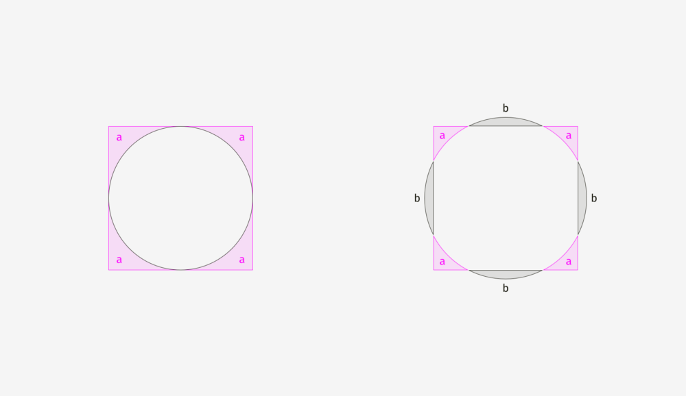
To show why this happens, I superimposed the shapes on each other, both in the first example (400-pixel square and circle) and in the second (400-pixel square and 450-pixel circle). As you can see in the picture below, the square outweighs the circle in area “a”, while the circle outweighs the square in area “b”. On the left, the square completely presses the circle under itself, as if embracing it from four sides. On the right, the circle and the square are balanced; nobody restricts anyone; each has four free zones.
The same effect can be observed in the example of rhombuses or triangles. In order to visually look proportional to the background of squares, they must be larger.

How to use this feature in interfaces? For example, when creating a set of icons, it is important to make them all proportionate, so that no icon stands out too much or looks too small. If we directly enter the icons in square areas, then those of them, whose form is closer to the square, will look larger.
To compensate for the "weight" of icons of various forms, I recommend giving visually smaller icons to get out of the region, as well as leave some space between the visually large icons and the border of their region.
And now look at a few real optically proportional icons.

Now it is clear why the area of the icon is always larger than the icon itself - just so that non-square icons fit well and do not look smaller than their square neighbors.
Visual balance is easiest to check through the blur of objects. If you turn the icons into more or less similar spots, then they will have the same optical weight.
But sometimes we deal with already existing graphic elements. For example, the logos of social networks are used on the buttons "Share" and "Like". The Facebook and Instagram icons are square, while on Twitter it takes the silhouette of a bird, and on Pinterest is represented by the letter “P” inside the circle. Therefore, the Twitter and Pinterest icons are slightly larger, so that they do not look isolated against the background of the Facebook and Instagram icons.
Another example of a violation of visual harmony is the text box next to the round button. If the button diameter is equal to the height of the text field, the button will appear visually smaller, but if we increase it slightly, the whole composition will look better.
But if you change the style of the button, then the integration will not be needed. In the picture below, the height of the button and the text field is 80 pixels, but the button on the right against the background with the text field looks better due to the black fill.

Important to remember
Optical alignment is a logical continuation of the topic of optical harmony and such a phenomenon as optical weight. Look at the bars below. Do they have the same length?
Regarding pixels, a solid "yes." However, at first glance, the lower bar looks shorter than the upper one.

Another picture with two stripes. Has anything changed?

For the bottom strip, I applied optical compensation. I made it so that its sharp tips extend 20 pixels beyond the border of the length of the upper bar. So you can compensate for the gap between objects and make them visually equal.
And now a more complex example with stripes.
So, if you create a poster where there are bent strips with text, or you place a bright strip with the word "discount" on the product card in the online store, keep in mind that they must be visually balanced. Sharp corners should slightly extend beyond the rest of the shape, especially for rectangles.

What about aligning plain text and paragraph paragraphs with a background? It all depends on the visual density of the background. If it is light, the selected paragraph is aligned with the main part of the text.
Since the background is light, then nothing breaks the harmony of the text.
Completely different, you need to do with a dense background. In the image below, the black background is aligned with the border of the main part of the text, and the white paragraph inside it contains indents.

Unlike a light background, black has a significant optical weight, and if you need a paragraph to fit well into the overall structure of the text, it is better to align it as in the figure below.
The same principle applies to buttons with input fields. Of course, this should not be taken as the truth in the highest instance. Treat this as a way of representing an interface through the lens of optical phenomena.

The light background of the input fields on the left may exceed the bounds of the headers and user input. The right edge of the “Send” button is a little behind the right border of the input field background, since The button is darker and visually looks more massive.
On the right, the input fields have clear boundaries, and I have aligned them with the headings, and inside the form with user input I have indents. The “Send” button acquired a triangular edge, so it is slightly shifted to the right, so as not to stand out from the general structure of rectangular fields on top.
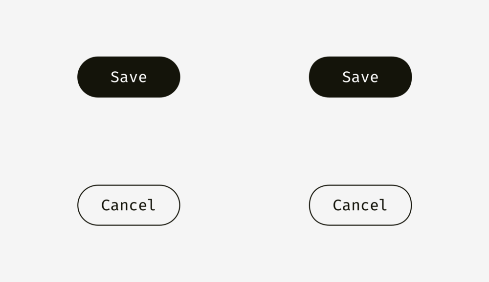
And here we come to another aspect of alignment - the alignment of text and buttons with icons. Take a look at the buttons below. The text is centered, right?
The whole thing is that on the button on the right I shifted the word a bit to the left, because the right edge has a triangular shape. Moreover, the button in the form of an arrow is 40 pixels longer, so that optically its size coincides with a rectangular button.
In buttons with text, not only horizontal alignment is applied, but also vertical, both for text and background. The first approach, which I would like to talk about, is used in the interfaces of various operating systems, sites and applications. It is an alignment based on the height of the capital letter of the font (cap height), which is equal to the height of either the letter “H” or “I”.

Initially, the distances above and below the capital letter to the edge of the button are equal. This makes sense, because Command names are usually written with a capital letter, and among the letters of the English alphabet there are more letters with the top callout (when part of the letter is on the top: l, t, d, b, k, h) than letters with the bottom callout (when part of the letter goes down: y, j, g, p).
You can also align the title and background based on the height of the letter in lower case (x-height). In sans and sans serif fonts, it is equal to the height of the letter "x", as you already understood.
And this approach also makes sense, because the main optical weight of the text is concentrated in the region of lowercase letters.

Is there a difference between these approaches? Yes there is. But it is not particularly noticeable.
Below are more examples for comparison. The approach based on the height of the capital letter, presented in the column on the left, is definitely better for the “Cancel” and “OK” buttons (so often used), because there are no letters in the “Cancel” with the lower detailing element, and capital letters The approach based on the height of the lower case letter (shown in the column on the right) wins only in the case of the “Sync” button, in the title of which there are both upper and lower remote elements; and “Cancel” and “OK” seem to be located higher than they should.

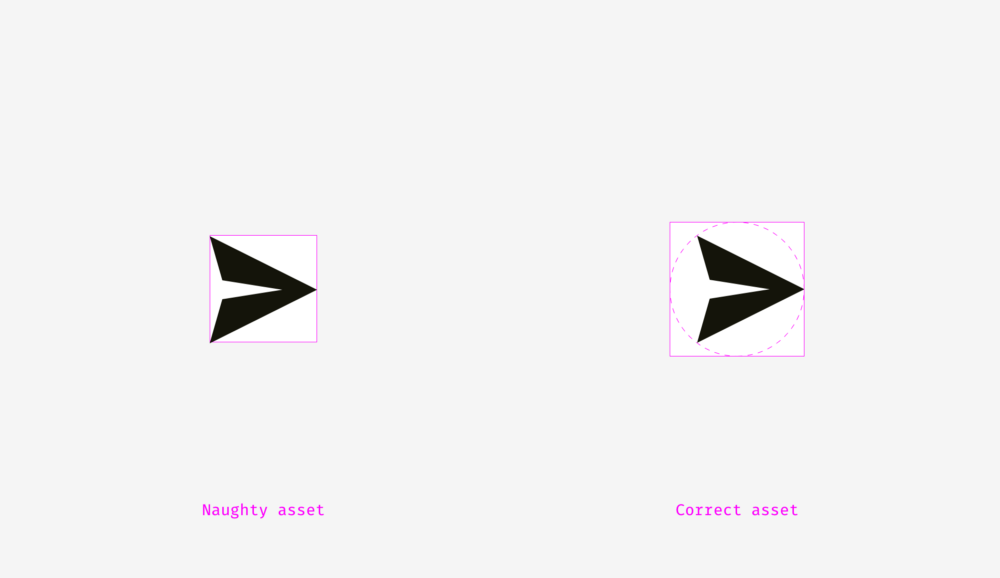
The situation with buttons-icons is slightly different. Let's put the popular "Send" icon on a round button. Which option looks better?

I hope you noticed that something is wrong with the left button. This happens because different alignment methods are used. The first handles the icon as a rectangle. In some ways, this is correct, because when you send a SVG or PNG file to a developer, they represent a rectangular area with a paper airplane image. The right-hand option places the icon so that all its sharp corners are at the same distance from the background border of the round button.

If you are preparing a file for a developer, then you need to reserve a certain area in it so that the icon can be visually centered correctly.
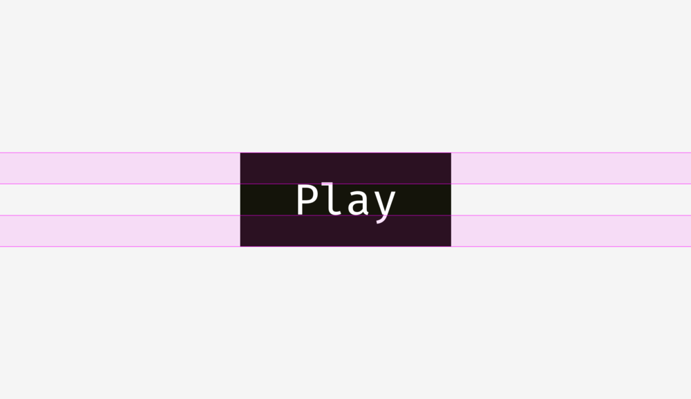
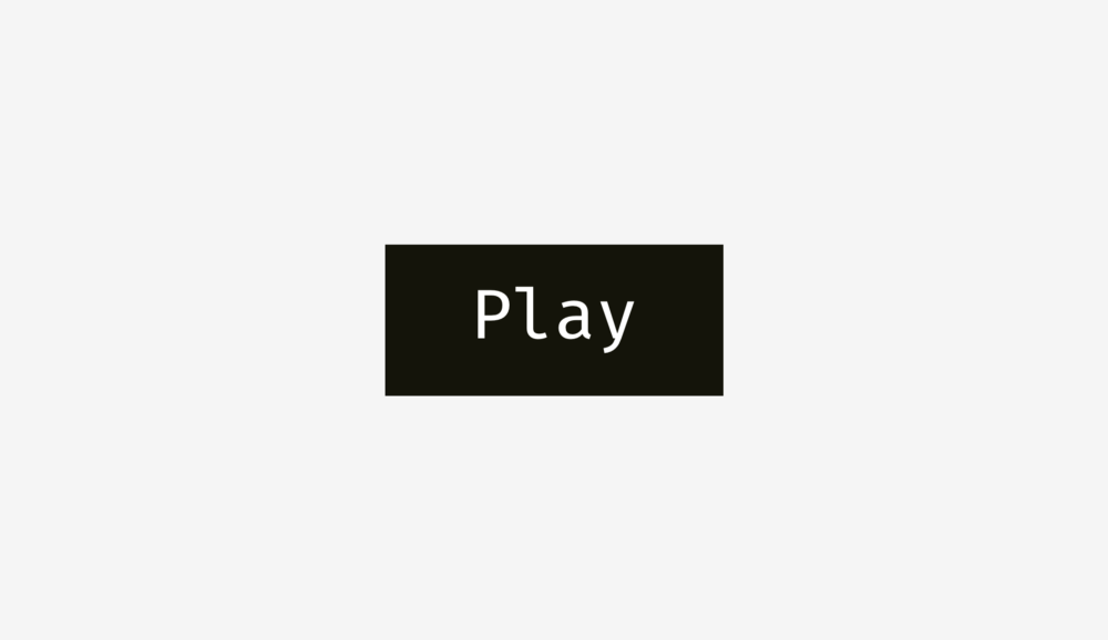
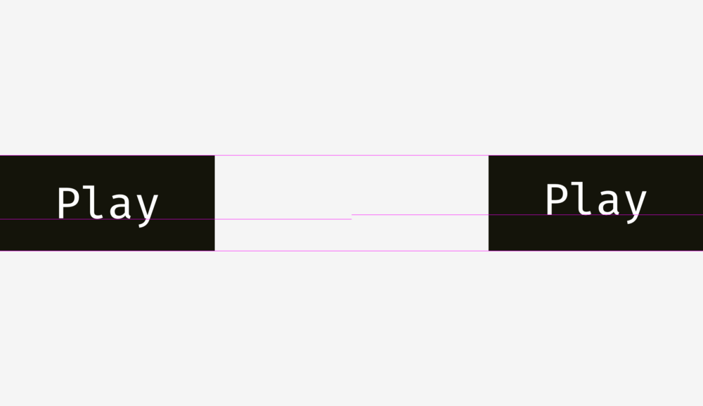
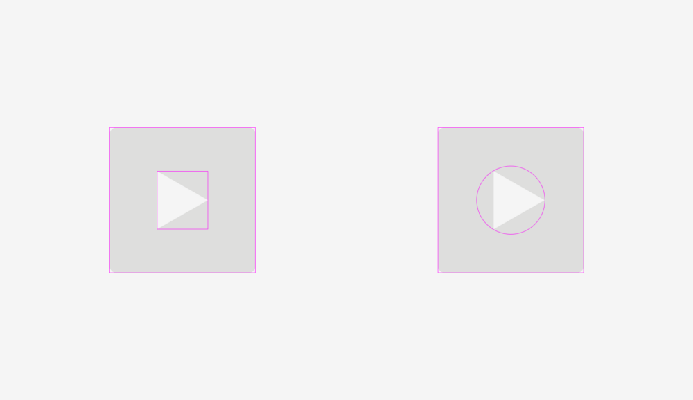
Same with the “Play” buttons. If you just align the shapes (a rectangle with round corners and a triangle) in the center, then it will look strange.

If you want to find the optically correct location of the triangle, then enter it into a circle, which should be aligned with the background of the button.
Important to remember
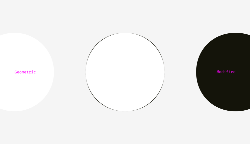
What could be more rounded than a circle? I used to think that nothing, but, as I noted at the beginning of the article, our eyes work rather strangely, and sometimes perceive things not at all as expected. So, what circle in the figure below has the most even round shape?
The people I interviewed earlier chose between 3 and 4. Numbers 1 and 2 are too “skinny”, and 5 are too “plump”. If we put the number 3 on the number 4 (geometric circle and modified circle), we find that the second object is slightly heavier than the first and, therefore, looks rounder in our eyes.
To demonstrate what I mean, I took the letters “o” from the three well-known geometric fonts Futura, Circe, and Geometria. Considering that high-quality fonts are built on the basis of human visual perception, and they use a complex system of optical construction, I think their rounded shapes look rounder than geometric ones. You look at these letters, and the eye rejoices. Is not it so?

Let's put a geometric circle on them. The letter "o" even in the most geometric font Futura has four protruding parts. Well, the letters from Circe and Geometria are also wider than the circle, but even if they had the same width and height, these four tummies would not hide from us, as if they were terribly hungry and ate too much.
Thus, a visually modified circle (on the right) may look even rounder than the geometric circle itself (on the left).

How can we take advantage of this phenomenon? Of course, when we need to smooth the corners! If you use the built-in smoothing function in a popular graphic editor (Photoshop, Illustrator, or Sketch), then the result will not visually please you.
The human eye will immediately determine the point where the straight line suddenly turns into a curve. And such a round does not look natural.

I fixed this, given our visual perception.
In the round of this kind there is an additional area that extends beyond the boundary of the geometric circle, which makes invisible the point of junction of the line and curve.
Just try to catch the difference between these methods.
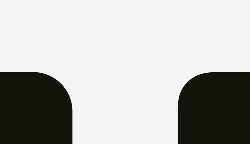
Now this approach can be applied to rounded buttons.
You, probably, noticed that the rounding on the buttons on the right is smoother, and it is more pleasant to look at it.
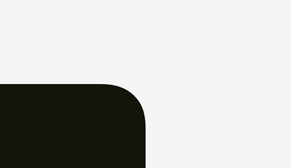
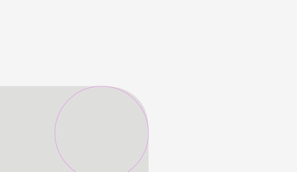
The same with application icons. You can not just take and apply the standard corner rounding, and at the same time get the perfect result. But before fully diving into this topic, let's consider two figures for which different rounding methods were used.
The first shape is a rounded rectangle created in Sketch. The second is a superellipse or Lame curve. This object was discovered by the French mathematician Gabriel Lamé and, depending on the formula used, it can take various forms, ranging from a four-pointed star to something similar to a rounded square.
Marc Edwards proposed the Lamé curve formula, which forms a smooth and visually perfect figure. Icons, starting with iOS 7, have exactly this form.
Later, this figure was modified by adding the proportions of the golden section, and they invented a special grid to help the designers of new icons, but this is a completely different story.

The main benefit from the use of the superellipse is that it gives a rounded and smooth contour. On the other hand, such non-standard shapes are difficult to apply in a real interface. You need to either combine many SVG files, supplement the code with special formulas or scripts, or use PNG masks, like Apple does for its icons.
As for the design process itself, the solution is simple. You need to convert the result to round the contour, go to the shape editing mode and manually move the ends of the segments going to the curve points closer to each other.
The difference is even more noticeable when rounding sharp corners, which is an important component in drawing optically correct metro and road maps.
Important to remember
Sometimes a non-perfect geometric square looks square. You probably thought, “What nonsense?” Then what do you say about the squares below? Which figure looks "squarer"?
If you chose the left, then you managed to hear the voice of your objective visual perception.
Personally, I was surprised when I learned that our eyes are more sensitive to the height of an object than to its width. This explains why even in geometric fonts the letters “o” are always wider than the geometric circle, and the vertical lines of the letters “H” are always thicker than the horizontal ones.
Optical alignment and user interfaces
Our eyes are a rather strange organ that often deceives us. But if you know the peculiarities of human visual perception, then you can create a more clear and clean design. Typographers are not the only ones who use optical tricks to create readable and harmonious looking fonts. This knowledge is also useful for interface designers who organize communication between the user and the machine.
')
How to create visually proportional icons, correctly position objects of different shapes and perform a perfect rounding of corners. In the post presents more than 50 images.
1. Actual and optical size
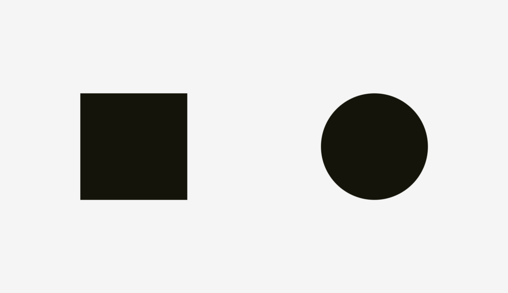
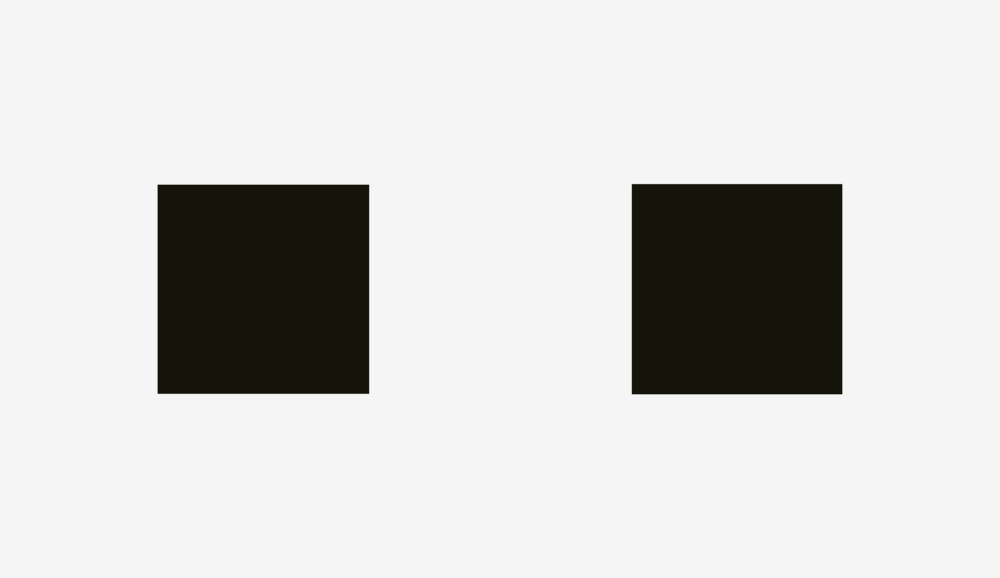
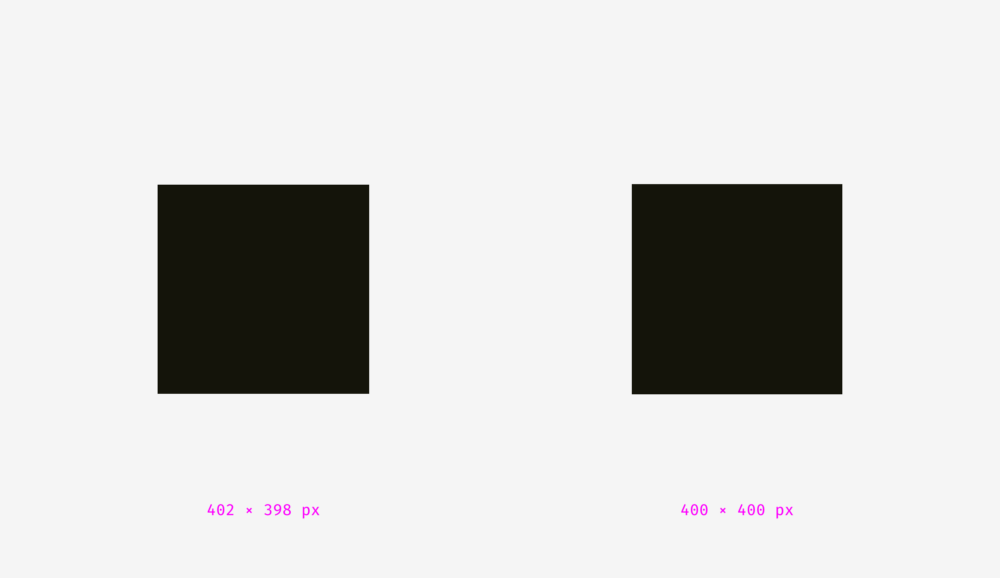
What's more: a 400px square or a 400px circle? In terms of geometry, their width and height are equal. But take a look at the picture below. Our eyes instantly determine that the square outweighs the circle. By the way, words related to weight are better suited for describing optical effects.
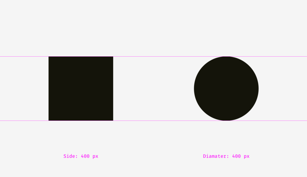
If you do not believe that the sizes of the figures correspond exactly to each other, here is a version with auxiliary lines and numbers.
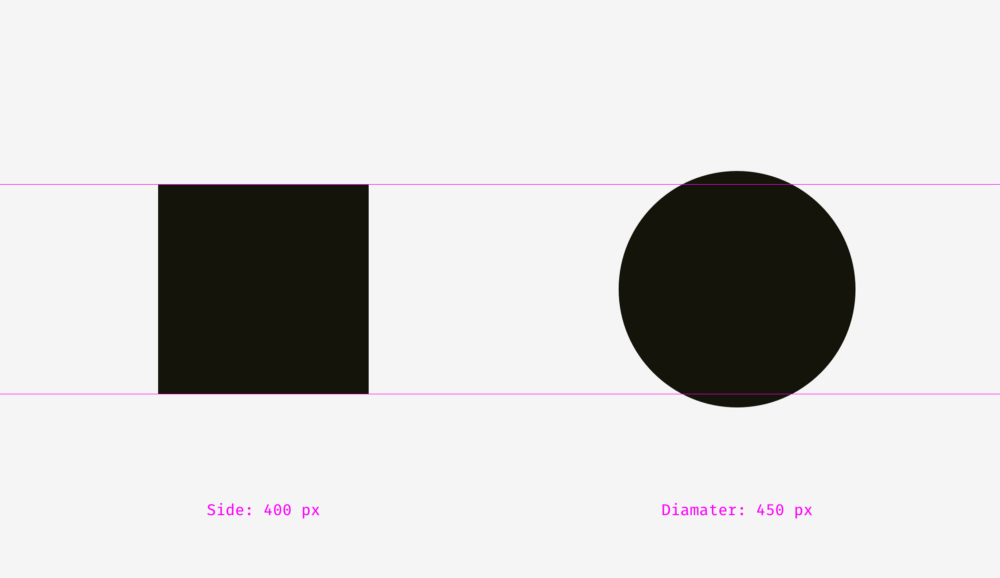
Let's look at another picture with a square and a circle. If you rely on visual weight, do they look the same to you?
For me, definitely yes. At least, it is already difficult to say right away which of them outweighs whom. Not surprising, because I increased the diameter of the circle by 50 pixels.
To show why this happens, I superimposed the shapes on each other, both in the first example (400-pixel square and circle) and in the second (400-pixel square and 450-pixel circle). As you can see in the picture below, the square outweighs the circle in area “a”, while the circle outweighs the square in area “b”. On the left, the square completely presses the circle under itself, as if embracing it from four sides. On the right, the circle and the square are balanced; nobody restricts anyone; each has four free zones.
The same effect can be observed in the example of rhombuses or triangles. In order to visually look proportional to the background of squares, they must be larger.
How to use this feature in interfaces? For example, when creating a set of icons, it is important to make them all proportionate, so that no icon stands out too much or looks too small. If we directly enter the icons in square areas, then those of them, whose form is closer to the square, will look larger.
To compensate for the "weight" of icons of various forms, I recommend giving visually smaller icons to get out of the region, as well as leave some space between the visually large icons and the border of their region.
And now look at a few real optically proportional icons.
Now it is clear why the area of the icon is always larger than the icon itself - just so that non-square icons fit well and do not look smaller than their square neighbors.
Visual balance is easiest to check through the blur of objects. If you turn the icons into more or less similar spots, then they will have the same optical weight.
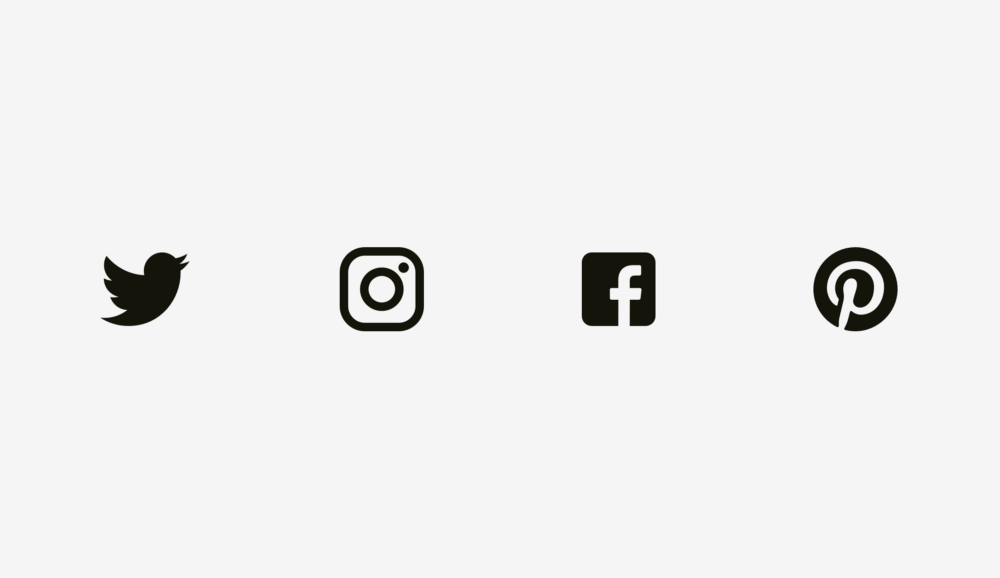
But sometimes we deal with already existing graphic elements. For example, the logos of social networks are used on the buttons "Share" and "Like". The Facebook and Instagram icons are square, while on Twitter it takes the silhouette of a bird, and on Pinterest is represented by the letter “P” inside the circle. Therefore, the Twitter and Pinterest icons are slightly larger, so that they do not look isolated against the background of the Facebook and Instagram icons.
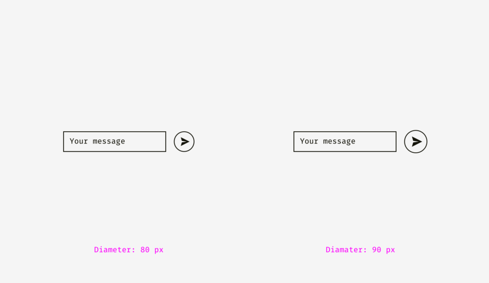
Another example of a violation of visual harmony is the text box next to the round button. If the button diameter is equal to the height of the text field, the button will appear visually smaller, but if we increase it slightly, the whole composition will look better.
But if you change the style of the button, then the integration will not be needed. In the picture below, the height of the button and the text field is 80 pixels, but the button on the right against the background with the text field looks better due to the black fill.
Important to remember
- Optical weight is what human eyes perceive the size and significance of an object, and it is determined not only on the basis of the size in pixels.
- Circles, rhombuses, triangles and other non-square shapes should be made larger so that square-like figures do not suppress them visually.
- Icon areas should have some free space for optical balance. This is very important when creating a set of icons so that all the elements in it look uniform.
2. Alignment of objects of different shapes
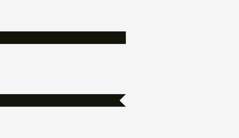
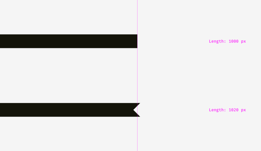
Optical alignment is a logical continuation of the topic of optical harmony and such a phenomenon as optical weight. Look at the bars below. Do they have the same length?
Regarding pixels, a solid "yes." However, at first glance, the lower bar looks shorter than the upper one.
Another picture with two stripes. Has anything changed?
For the bottom strip, I applied optical compensation. I made it so that its sharp tips extend 20 pixels beyond the border of the length of the upper bar. So you can compensate for the gap between objects and make them visually equal.
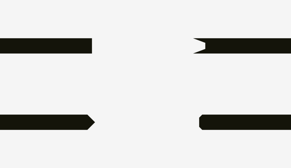
And now a more complex example with stripes.
So, if you create a poster where there are bent strips with text, or you place a bright strip with the word "discount" on the product card in the online store, keep in mind that they must be visually balanced. Sharp corners should slightly extend beyond the rest of the shape, especially for rectangles.
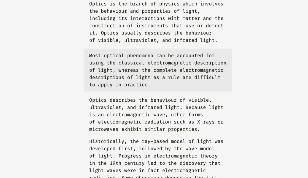
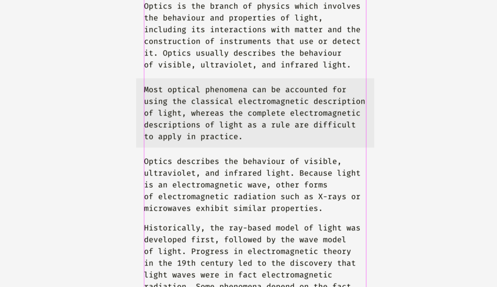
What about aligning plain text and paragraph paragraphs with a background? It all depends on the visual density of the background. If it is light, the selected paragraph is aligned with the main part of the text.
Since the background is light, then nothing breaks the harmony of the text.
Completely different, you need to do with a dense background. In the image below, the black background is aligned with the border of the main part of the text, and the white paragraph inside it contains indents.
Unlike a light background, black has a significant optical weight, and if you need a paragraph to fit well into the overall structure of the text, it is better to align it as in the figure below.
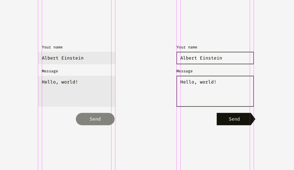
The same principle applies to buttons with input fields. Of course, this should not be taken as the truth in the highest instance. Treat this as a way of representing an interface through the lens of optical phenomena.
The light background of the input fields on the left may exceed the bounds of the headers and user input. The right edge of the “Send” button is a little behind the right border of the input field background, since The button is darker and visually looks more massive.
On the right, the input fields have clear boundaries, and I have aligned them with the headings, and inside the form with user input I have indents. The “Send” button acquired a triangular edge, so it is slightly shifted to the right, so as not to stand out from the general structure of rectangular fields on top.
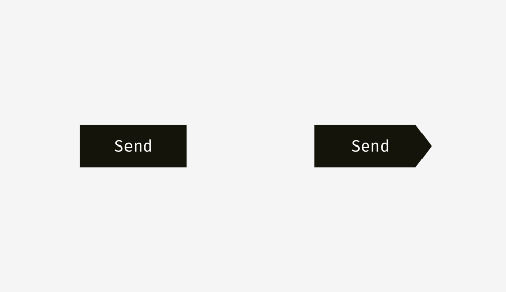
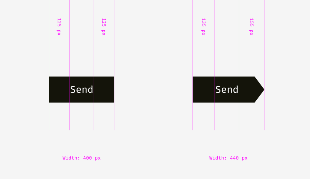
And here we come to another aspect of alignment - the alignment of text and buttons with icons. Take a look at the buttons below. The text is centered, right?
The whole thing is that on the button on the right I shifted the word a bit to the left, because the right edge has a triangular shape. Moreover, the button in the form of an arrow is 40 pixels longer, so that optically its size coincides with a rectangular button.
In buttons with text, not only horizontal alignment is applied, but also vertical, both for text and background. The first approach, which I would like to talk about, is used in the interfaces of various operating systems, sites and applications. It is an alignment based on the height of the capital letter of the font (cap height), which is equal to the height of either the letter “H” or “I”.
Initially, the distances above and below the capital letter to the edge of the button are equal. This makes sense, because Command names are usually written with a capital letter, and among the letters of the English alphabet there are more letters with the top callout (when part of the letter is on the top: l, t, d, b, k, h) than letters with the bottom callout (when part of the letter goes down: y, j, g, p).
You can also align the title and background based on the height of the letter in lower case (x-height). In sans and sans serif fonts, it is equal to the height of the letter "x", as you already understood.
And this approach also makes sense, because the main optical weight of the text is concentrated in the region of lowercase letters.
Is there a difference between these approaches? Yes there is. But it is not particularly noticeable.
Below are more examples for comparison. The approach based on the height of the capital letter, presented in the column on the left, is definitely better for the “Cancel” and “OK” buttons (so often used), because there are no letters in the “Cancel” with the lower detailing element, and capital letters The approach based on the height of the lower case letter (shown in the column on the right) wins only in the case of the “Sync” button, in the title of which there are both upper and lower remote elements; and “Cancel” and “OK” seem to be located higher than they should.
The situation with buttons-icons is slightly different. Let's put the popular "Send" icon on a round button. Which option looks better?
I hope you noticed that something is wrong with the left button. This happens because different alignment methods are used. The first handles the icon as a rectangle. In some ways, this is correct, because when you send a SVG or PNG file to a developer, they represent a rectangular area with a paper airplane image. The right-hand option places the icon so that all its sharp corners are at the same distance from the background border of the round button.
If you are preparing a file for a developer, then you need to reserve a certain area in it so that the icon can be visually centered correctly.
Same with the “Play” buttons. If you just align the shapes (a rectangle with round corners and a triangle) in the center, then it will look strange.
If you want to find the optically correct location of the triangle, then enter it into a circle, which should be aligned with the background of the button.
Important to remember
- Sharp-edged figures should be larger than neighboring rectangular objects so that it would look better compositionally.
- Capitalization is an effective and widely used method of positioning a button header inside its background area.
- One of the effective ways to correctly position the triangular icon on the button is to fit the icon in a circle, and align this circle with the background.
3. Optical anti-aliasing.
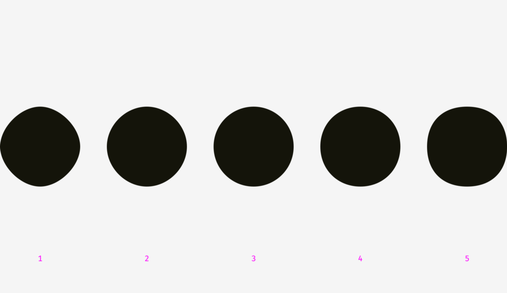
What could be more rounded than a circle? I used to think that nothing, but, as I noted at the beginning of the article, our eyes work rather strangely, and sometimes perceive things not at all as expected. So, what circle in the figure below has the most even round shape?
The people I interviewed earlier chose between 3 and 4. Numbers 1 and 2 are too “skinny”, and 5 are too “plump”. If we put the number 3 on the number 4 (geometric circle and modified circle), we find that the second object is slightly heavier than the first and, therefore, looks rounder in our eyes.
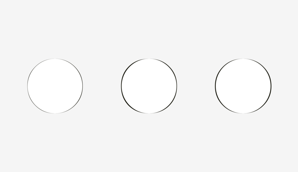
To demonstrate what I mean, I took the letters “o” from the three well-known geometric fonts Futura, Circe, and Geometria. Considering that high-quality fonts are built on the basis of human visual perception, and they use a complex system of optical construction, I think their rounded shapes look rounder than geometric ones. You look at these letters, and the eye rejoices. Is not it so?
Let's put a geometric circle on them. The letter "o" even in the most geometric font Futura has four protruding parts. Well, the letters from Circe and Geometria are also wider than the circle, but even if they had the same width and height, these four tummies would not hide from us, as if they were terribly hungry and ate too much.
Thus, a visually modified circle (on the right) may look even rounder than the geometric circle itself (on the left).
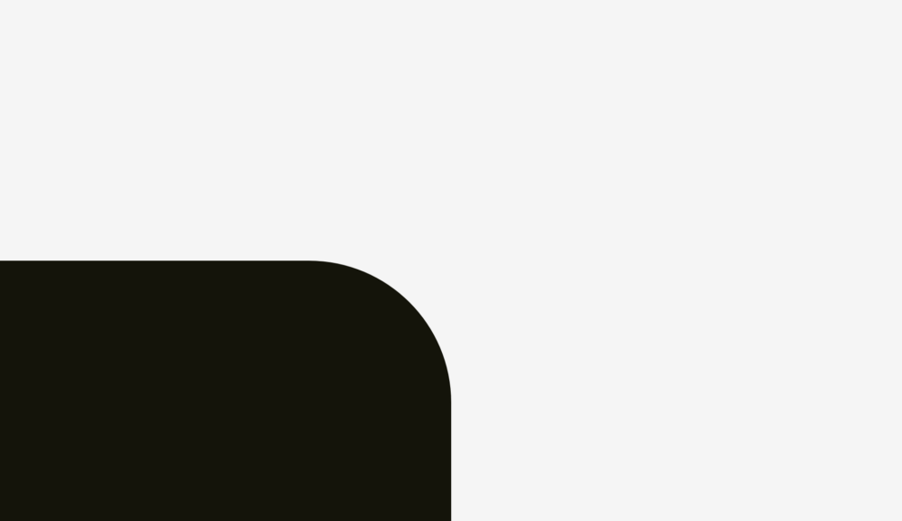
How can we take advantage of this phenomenon? Of course, when we need to smooth the corners! If you use the built-in smoothing function in a popular graphic editor (Photoshop, Illustrator, or Sketch), then the result will not visually please you.
The human eye will immediately determine the point where the straight line suddenly turns into a curve. And such a round does not look natural.
I fixed this, given our visual perception.
In the round of this kind there is an additional area that extends beyond the boundary of the geometric circle, which makes invisible the point of junction of the line and curve.
Just try to catch the difference between these methods.
Now this approach can be applied to rounded buttons.
You, probably, noticed that the rounding on the buttons on the right is smoother, and it is more pleasant to look at it.
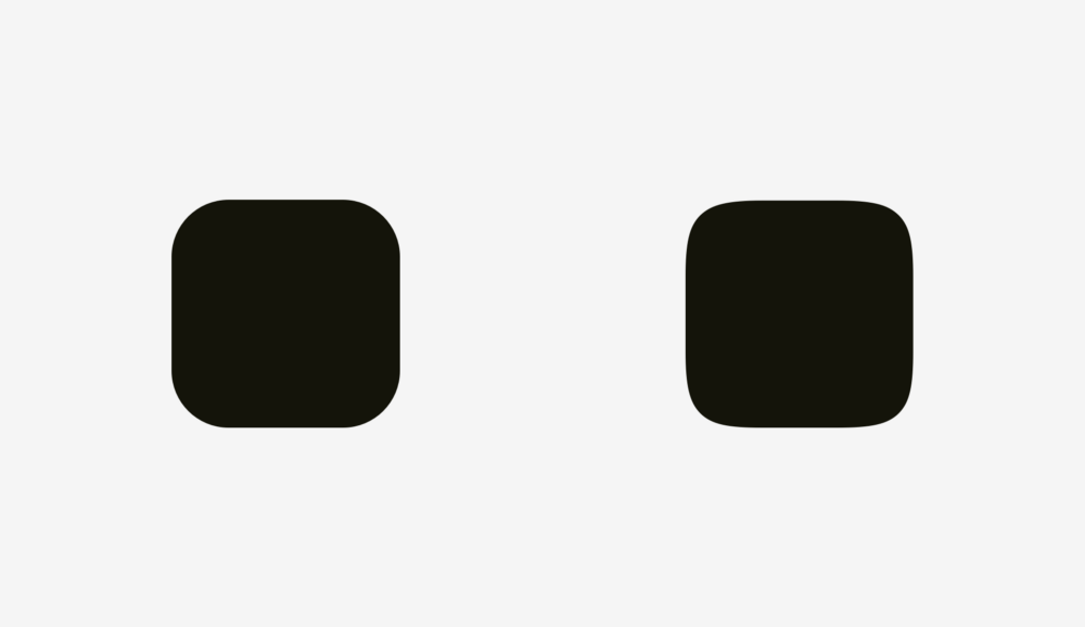
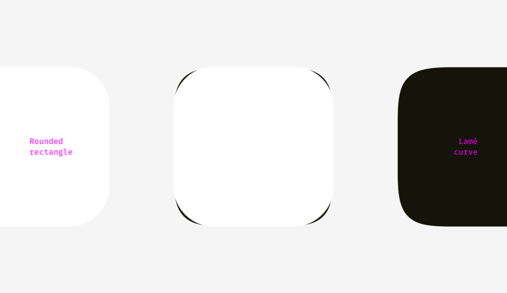
The same with application icons. You can not just take and apply the standard corner rounding, and at the same time get the perfect result. But before fully diving into this topic, let's consider two figures for which different rounding methods were used.
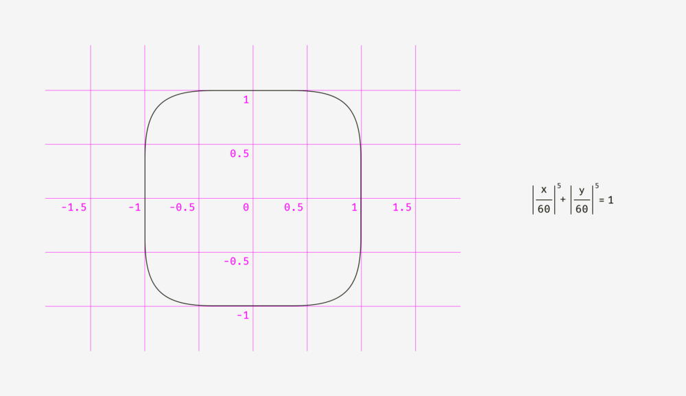
The first shape is a rounded rectangle created in Sketch. The second is a superellipse or Lame curve. This object was discovered by the French mathematician Gabriel Lamé and, depending on the formula used, it can take various forms, ranging from a four-pointed star to something similar to a rounded square.
Marc Edwards proposed the Lamé curve formula, which forms a smooth and visually perfect figure. Icons, starting with iOS 7, have exactly this form.
Later, this figure was modified by adding the proportions of the golden section, and they invented a special grid to help the designers of new icons, but this is a completely different story.
The main benefit from the use of the superellipse is that it gives a rounded and smooth contour. On the other hand, such non-standard shapes are difficult to apply in a real interface. You need to either combine many SVG files, supplement the code with special formulas or scripts, or use PNG masks, like Apple does for its icons.
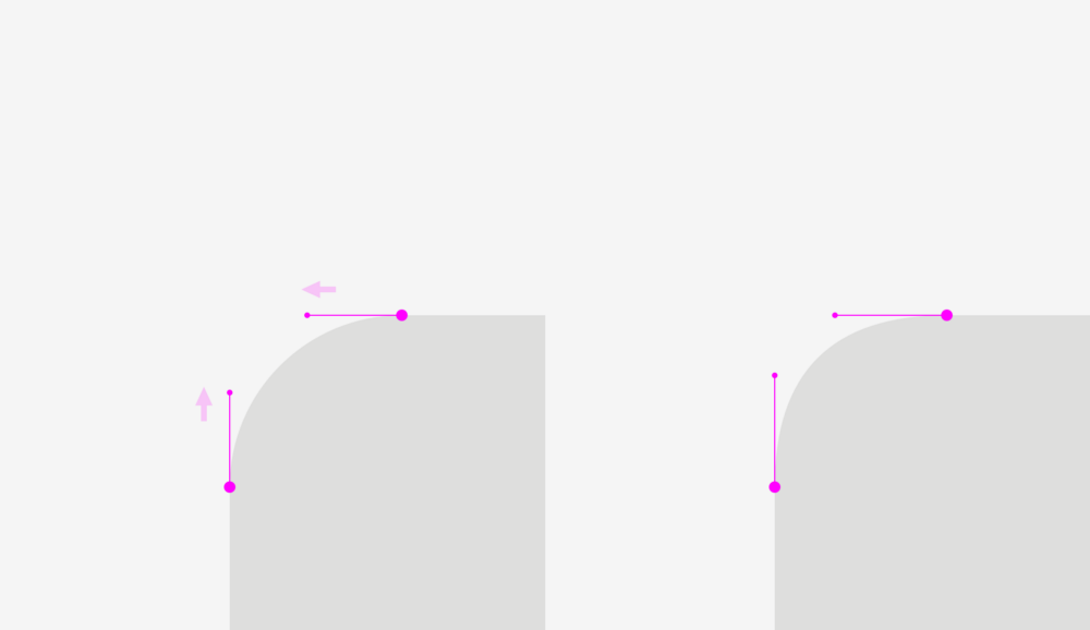
As for the design process itself, the solution is simple. You need to convert the result to round the contour, go to the shape editing mode and manually move the ends of the segments going to the curve points closer to each other.
The difference is even more noticeable when rounding sharp corners, which is an important component in drawing optically correct metro and road maps.
Important to remember
- Geometrically rounded corners look unnatural due to the fact that you immediately see the transition points of a straight line to a curve.
- For optically correct rounding, special formulas or manual fit of the figure are needed.
Bonus
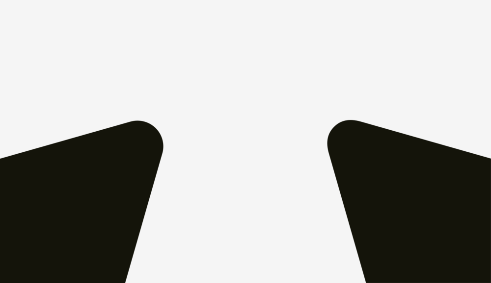
Sometimes a non-perfect geometric square looks square. You probably thought, “What nonsense?” Then what do you say about the squares below? Which figure looks "squarer"?
If you chose the left, then you managed to hear the voice of your objective visual perception.
Personally, I was surprised when I learned that our eyes are more sensitive to the height of an object than to its width. This explains why even in geometric fonts the letters “o” are always wider than the geometric circle, and the vertical lines of the letters “H” are always thicker than the horizontal ones.
Read more
Optical alignment and user interfaces
Source: https://habr.com/ru/post/338780/
All Articles