Visualization of election results in Moscow on a map in Jupyter Notebook
Hello!
Today we will talk about the visualization of geodata. Having statistics, obviously having a spatial reference, you always want to make a beautiful map. Preferably, with navigation and infoboxes In notebooks. And, of course, so that later you can show your progress in visualization to the entire Internet!
As an example, we take the recently passed municipal elections in Moscow. The data itself can be taken from the Moscow City Election Committee site, you can simply pick up data from https://gudkov.ru/ . There is even some visualization there, but we will go deeper. So, what should we get in the end?
Having spent some time writing the Parser of the Election Commission website, I received the data I needed. So let's start with imports.
import pandas as pd import numpy as np import os import pickle I work in a jupyter notebook on a Linux machine. If you want to use my code on a Windows machine, then pay attention to writing paths, as well as important digressions in the text.
I usually use a separate folder for the project, so for simplicity I set the current directory:
os.chdir('/data01/jupyter/notebooks/habr/ods_votes/') Then we are asked to collect data from the Election Commission website itself. To parse the data, I wrote a separate parser. The whole process takes 10-15 minutes. You can pick it up from the repository .
I decided to create a large dictionary with data frames inside. To turn html pages into data frames, I used read_html, I empirically selected the necessary data frames, and after that I did a little processing, throwing out the excess and adding the missing. I previously processed the data by batch. Initially, they were not particularly readable. In addition, there is a different spelling of the same parties (funny, but in some cases it is not a different spelling, but really different parties).
Parsing election committee data
Directly build directory. What's going on here:
- structure of administrative and municipal districts;
- all references to Territorial Election Commissions (TECs) are collected;
- a list of candidates is compiled for each TEC;
- within each TEC, District Election Commissions (DECs) are convened;
- for each DEC, statistics on DEC and statistics on candidates are collected;
- from the received dataset we collect statistics on municipal districts.
In the repository of this article are already ready data. We will use them.
import glob # with open('tmp/party_aliases.pkl', 'rb') as f: party_aliases = pickle.load(f) votes = {} # votes['atd'] = pd.read_csv('tmp/atd.csv', index_col=0, sep=';') votes['data'] = {} # for v in votes['atd']['municipal'].values: votes['data'][v] = {} # candidates = glob.glob('tmp/data_{}_candidates.csv'.format(v))[0] votes['data'][v]['candidates'] = pd.read_csv(candidates, index_col=0, sep=';') votes['data'][v]['votes'] = {} # # okrug_stats_list = glob.glob('tmp/data_{}*_okrug_stats.csv'.format(v)) for okrug_stats in okrug_stats_list: okrug = int(okrug_stats.split('_')[2]) try: votes['data'][v]['votes'][okrug] except: votes['data'][v]['votes'][okrug] = {} votes['data'][v]['votes'][okrug]['okrug_stats'] = pd.read_csv(okrug_stats, index_col=0, sep=';') # candidates_stats_list = glob.glob('tmp/data_{}*_candidates_stats.csv'.format(v)) for candidates_stats in candidates_stats_list: okrug = int(candidates_stats.split('_')[2]) votes['data'][v]['votes'][okrug]['candidates_stats'] = pd.read_csv(candidates_stats, index_col=0, sep=';') # data = [] # for okrug in list(votes['data'].keys()): # candidates = votes['data'][okrug]['candidates'].replace(to_replace={'party':party_aliases}) group_parties = candidates[['party','elected']].groupby('party').count() # stats = np.zeros(shape=(12)) for oik in votes['data'][okrug]['votes'].keys(): stat = votes['data'][okrug]['votes'][oik]['okrug_stats'].iloc[:,1] stats += stat # # sum_parties = group_parties.sum().values[0] # data_parties = candidates[['party','elected']].groupby('party').count().reset_index() # data_parties['percent'] = data_parties['elected']/sum_parties*100 # tops = data_parties.sort_values('elected', ascending=False) c = pd.DataFrame({'okrug':okrug}, index=[0]) c['top1'], c['top1_elected'], c['top1_percent'] = tops.iloc[0,:3] c['top2'], c['top2_elected'], c['top2_percent'] = tops.iloc[1,:3] c['top3'], c['top3_elected'], c['top3_percent'] = tops.iloc[2,:3] c['voters_oa'], c['state_rec'], c['state_given'], c['state_anticip'], c['state_out'], c['state_fired'], c['state_box'], c['state_move'], c['state_error'], c['state_right'], c['state_lost'] , c['state_unacc'] = stats c['voters_percent'] = (c['state_rec'] - c['state_fired'])/c['voters_oa']*100 c['total'] = sum_parties c['full'] = (c['top1_elected']== sum_parties) # data.append(c) # winners = pd.concat(data,axis=0) We received a data frame with turnout statistics, ballots (from the number of issued to the number of damaged), the distribution of seats between the parties.
You can start visualization!
Basic work with geodata in geopandas
To work with geodata we will use the library geopandas. What is geopandas? This extension of pandas functionality is geographic abstractions (inherited from Shapely), which allow us to perform analytical geographic operations with geodata: samples, overlay, aggregation (as, for example, in PostGIS for Postgresql).
Let me remind you that there are three basic types of geometry - a point, a line (or rather, a polyline, since it consists of connected segments) and a polygon. All of them have a variant of multi- (Multi), where the geometry is the union of individual geographic formations into one. For example, a metro exit may be a point, but several exits, combined into a “station” entity, are already a multipoint.
It should be noted that geopandas are reluctant to install via pip in a standard Python installation in the Windows environment. The problem, as usual, is in dependencies. Geopandas relies on the abstraction of the library fiona, which does not have official assemblies for Windows. Ideal to use the Linux environment, for example, in a docker-container. In addition, in Windows, you can use the conda manager, it pulls all dependencies from its repositories.
With the geometry of municipalities, everything is quite simple. They can be easily picked up from OpenStreetMap ( read more here ) or, for example, from NextGIS downloads . I use already made shapes.
So, let's begin! Perform the necessary imports, activate the matplotlib graphics ...
import geopandas as gpd %matplotlib inline mo_gdf = gpd.read_file('atd/mo.shp') mo_gdf.head() 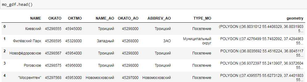
As you can see, this is a familiar DataFrame. The geometry field is a representation of geographic objects (in this case polygons) in the form of WKT, well known text (for more information see https://en.wikipedia.org/wiki/Well-known_text ). You can quite simply build a map of our objects.
mo_gdf.plot() 
Guessing Moscow! True, not quite familiar looks. The reason is in the projection of the map. On Habré there is already an excellent educational program for them.
So, let's present our data in a more familiar projection of the Web Mercator (the initial projection can be easily obtained using the crs parameter). Color the polygons by the name of the administrative district. Line width set at 0.5. The cmap coloring method uses the standard matplotlib values (if you, like me, do not remember them by heart, then here is the cheat sheet ). To see the map legend, set the legend parameter. Well, figsize is responsible for the size of our map.
mo_gdf_wm = mo_gdf.to_crs({'init' :'epsg:3857'}) # mo_gdf_wm.plot(column = 'ABBREV_AO', linewidth=0.5, cmap='plasma', legend=True, figsize=[15,15]) 
You can build a map and the type of municipality:
mo_gdf_wm.plot(column = 'TYPE_MO', linewidth=0.5, cmap='plasma', legend=True, figsize=[15,15]) 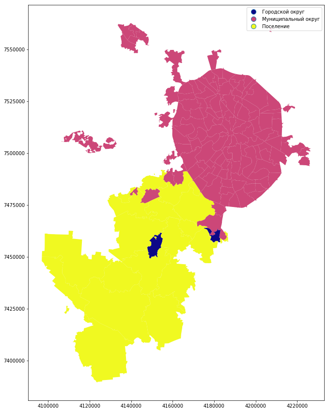
So, we will construct a map of statistics on municipal districts. We have already created a winners data frame.
We need to connect our data frame with a geodataframe to create a map. We’ll mix the names of the municipal districts in order to make the connection without surprises.
winners['municipal_low'] = winners['okrug'].str.lower() winners['municipal_low'] = winners['municipal_low'].str.replace('', '') mo_gdf_wm['name_low'] = mo_gdf_wm['NAME'].str.lower() mo_gdf_wm['name_low'] = mo_gdf_wm['name_low'].str.replace('', '') full_gdf = winners.merge(mo_gdf_wm[['geometry', 'name_low']], left_on='municipal_low', right_on='name_low', how='left') full_gdf = gpd.GeoDataFrame(full_gdf) Let's build a simple categorical map, where the winning parties are shown. In the Shchukino area this year there really were no elections.
full_gdf.plot(column = 'top1', linewidth=0, cmap='GnBu', legend=True, figsize=[15,15]) 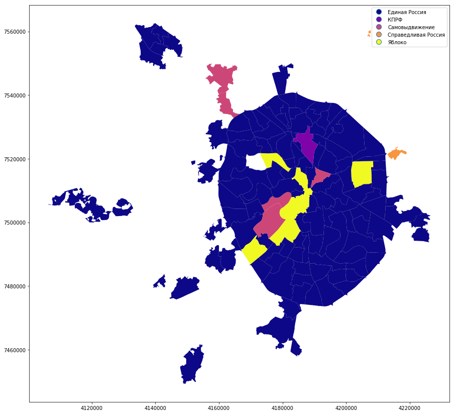
Turnout:
full_gdf.plot(column = 'voters_percent', linewidth=0, cmap='BuPu', legend=True, figsize=[15,15]) 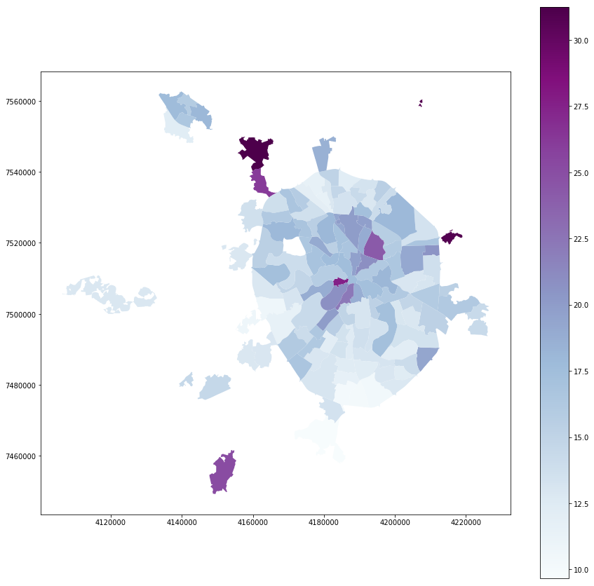
Residents:
full_gdf.plot(column = 'voters_oa', linewidth=0, cmap='YlOrRd', legend=True, figsize=[15,15]) 
Fine! We got a nice visualization. But I want a base map and navigation! The cartoframes library will come to our rescue.
Visualization of geodata using cartoframes
One of the most convenient tools for visualizing geodata is Carto. To work with this service, there is the cartoframes library, which allows you to work with the service functions directly from Jupyter notebooks.
The cartoframes library requires careful attention under Windows due to the design features (for example, when filling datasets, the library tries to use the linux folder style, which leads to sad consequences). With Cyrillic data, you can easily shoot yourself a leg (cp1251 encoding can be turned into cracks). It is better to use it either in a docker container, or on a full-fledged Linux. Put the library only through pip. In windows, it can be successfully installed by first putting geopandas through a conda (or placing all dependencies with your hands).
Cartoframes works with the projection of WGS84. In it and we will reproject ours. After connecting two data frames, projection information may be lost. Define it and re-project it.
full_gdf.crs = ({'init' :'epsg:3857'}) full_gdf = full_gdf.to_crs({'init' :'epsg:4326'}) Making the necessary imports ...
import cartoframes import json import warnings warnings.filterwarnings("ignore") Add data from the Carto account:
USERNAME = ' Carto' APIKEY = ' API' And finally, connect to Carto and fill our dataset:
cc = cartoframes.CartoContext(api_key=APIKEY, base_url='https://{}.carto.com/'.format(USERNAME)) cc.write(full_gdf, encode_geom=True, table_name='mo_votes', overwrite=True) Dataset can be unloaded from Carto back. But the full geodataframe is only in the project. However, using gdal and shapely, you can convert the binary representation of PostGIS geometry back to WKT.
A feature of the plug-in is type conversion. Alas, in the current version, the data frame is poured into a table with an assignment of type str for each column. This must be remembered when working with maps.
Finally, the map! We color the data, put it on the base map and turn on the navigation. You can check the coloring schemes here .
For normal work with partitioning of classes we will write request with coercion of types. PostgreSQL syntax
query_layer = 'select cartodb_id, the_geom, the_geom_webmercator, voters_oa::integer, voters_percent::float, state_out::float from mo_votes' So, turnout:
from cartoframes import Layer, BaseMap, styling, QueryLayer l = QueryLayer(query_layer, color={'column': 'voters_percent', 'scheme': styling.darkMint(bins=7)}) map = cc.map(layers=[BaseMap(source='light', labels='front'), l], size=(990, 500), interactive=False) 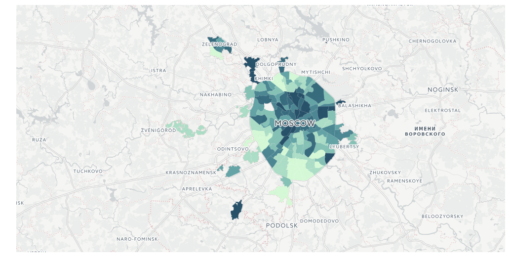
Number of inhabitants
l = QueryLayer(query_layer, color={'column': 'voters_oa', 'scheme': styling.burg(bins=7)}) map = cc.map(layers=[BaseMap(source='light', labels='front'), l], size=(990, 500), interactive=False) 
And, for example, home-based voting
l = QueryLayer(query_layer, color={'column': 'state_out', 'scheme': styling.sunsetDark(bins=5)}) map = cc.map(layers=[BaseMap(source='light', labels='front'), l], size=(990, 500), interactive=False)
It should be noted that at the moment cartoframes does not allow embedding the info window directly into the notebook window, showing the legend, as well as publishing the maps on Carto. But these options are in the implementation process.
And now let's try a more complicated, but very flexible way to embed maps in Jupyter Notebook ...
Visualization of geodata using folium
So, we would like to receive not only the navigation, but also the info window on the map. And also get the opportunity to publish a visualization on your server or on github. We will help folium.
The folium library is a pretty specific thing. It is a python wrapper around the Leaflet JS library, which is responsible for cartographic visualization. The following manipulations don't look very pythonic, but don't be scared, I'll explain everything.
import folium Simple visualization like Carto is pretty simple. What's happening?
- we create an instance map, m, centered on the selected coordinates;
- add instance cartogram (choropleth)
In the cartogram instance, we specify many attributes: - geo_data - geodata, we convert the data of our data frame into geojson;
- name - set the name of the layer;
- data - the data itself, we also select them from the data frame;
- key_on is the key for the connection (note that in geojson all attributes are put in a separate element, properties);
- columns - key and attribute for coloring;
- fill_color, fill_opacity, line_weight, line_opacity - fill color scale, fill transparency, width and transparency of lines;
- legend_name - the title of the legend;
- highlight - the addition of interactive (lights when hovering and approximation when clicking) on objects.
The color scale is based on the Color Brewer library . I highly recommend using it when working with cards.
m = folium.Map(location=[55.764414, 37.647859]) m.choropleth( geo_data=full_gdf[['okrug', 'geometry']].to_json(), name='choropleth', data=full_gdf[['okrug', 'voters_oa']], key_on='feature.properties.okrug', columns=['okrug', 'voters_oa'], fill_color='YlGnBu', line_weight=1, fill_opacity=0.7, line_opacity=0.2, legend_name='type', highlight = True ) m 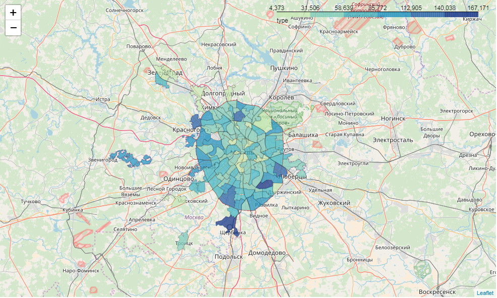
So, we have an interactive cartogram. But I would also like the info window ...
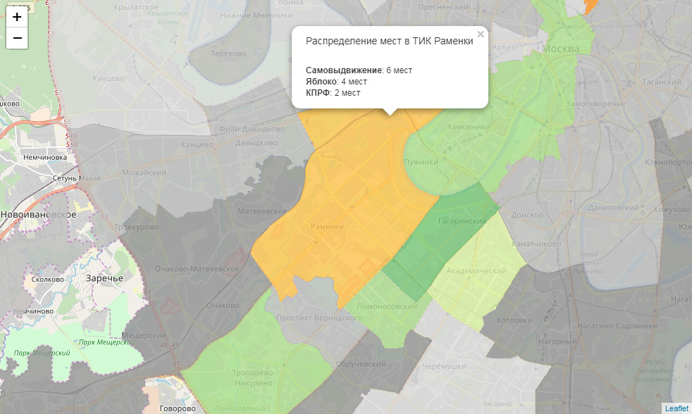
Here we have to hack the library a bit. We have winning parties in every TEC. For each of them, we define the base color. But not in every district the victory of the party means 100% of the vote. For each base color, we define 3 gradations: absolute power (100%), a controlling stake (> 50%) and cooperation (<50%). Let's write the color detection function:
def party_color(feature): party = feature['properties']['top1'] percent = feature['properties']['top1_percent'] if party == ' ': if percent == 100: color = '#969696' elif 50 < percent < 100: color = '#bdbdbd' else: color = '#d9d9d9' elif party == '': if percent == 100: color = '#78c679' elif 50 < percent < 100: color = '#addd8e' else: color = '#d9f0a3' elif party == '': if percent == 100: color = '#ef3b2c' elif 50 < percent < 100: color = '#fb6a4a' else: color = '#fc9272' elif party == ' ': if percent == 100: color = '#2171b5' elif 50 < percent < 100: color = '#4292c6' else: color = '#6baed6' elif party == '': if percent == 100: color = '#ec7014' elif 50 < percent < 100: color = '#fe9929' else: color = '#fec44f' return {"fillColor":color, "fillOpacity":0.8,"opacity":0} Now let's write the html generation function for the info window:
def popup_html(feature): html = '<h5> {}</h5>'.format(feature['properties']['okrug']) for p in ['top1', 'top2', 'top3']: if feature['properties'][p + '_elected'] > 0: html += '<br><b>{}</b>: {} '.format(feature['properties'][p], feature['properties'][p + '_elected']) return html Finally, we convert each data frame object into a geojson and add it to the map, attaching style, hover behavior and the info window to each map.
m = folium.Map(location=[55.764414, 37.647859], zoom_start=9) for mo in json.loads(full_gdf.to_json())['features']: gj = folium.GeoJson(data=mo, style_function = party_color, control=False, highlight_function=lambda x:{"fillOpacity":1, "opacity":1}, smooth_factor=0) folium.Popup(popup_html(mo)).add_to(gj) gj.add_to(m) m 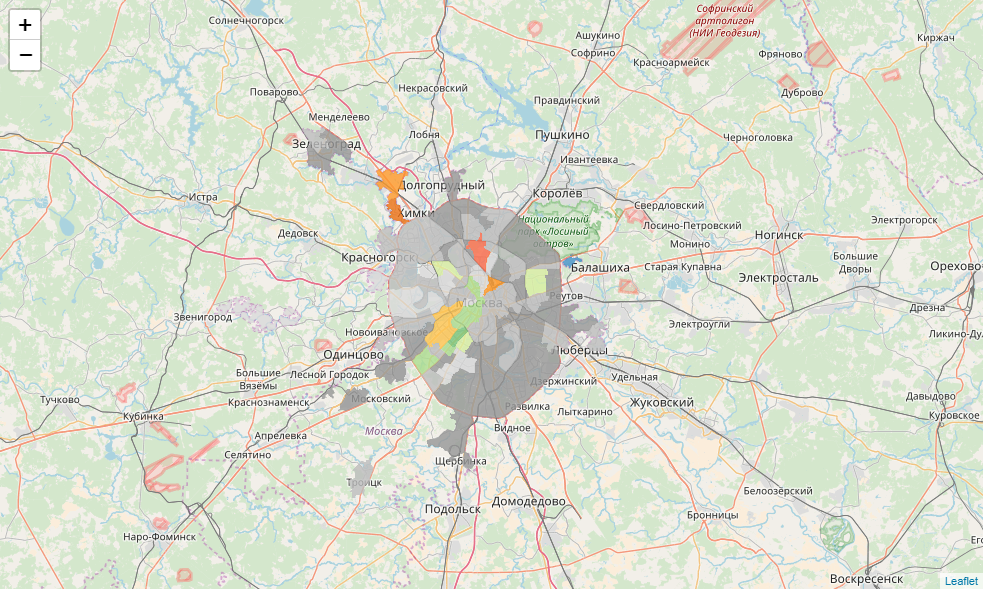
Finally, we save our map. It can be published, for example, on Github :
m.save('tmp/map.html') Conclusion
With the help of simple geodata visualization tools, you can find endless space for insights. And after some work on the data and visualization, you can successfully publish your insights on Carto or on github. The repository of this article .
Congratulations, now you are a political scientist!
You have learned to analyze the election results. Share insights in comments!
')
Source: https://habr.com/ru/post/338554/
All Articles