Acronis design system. Part one. Unified Component Library

My name is Sergey, I work as a senior designer at Acronis. In the department of product design for business, I am responsible for the development and implementation of a single component library.
Since we have a lot of products and services, and the design in these products and services is very different, we decided to unify it and lead to a single UI. What for? It's simple: this approach makes it possible to optimize the work of the department, focus designers on UX, speed up the development process and launch new products, reduce the burden on testing departments and significantly reduce the number of bugs on the front-end side. In this article I will talk about our experience, focus on the tools and show how the library is designed from the inside.
Hello. I am your curator in the game "Actual UI-kit"
For a long time, the role of the library was played by a PDF file compiled in Illustrator with a palette of colors, a scanty set of elements and big plans for the future in the form of 70 blank pages. In order to find any already existing element, it was necessary to constantly jerk other designers or shovel other people's sources, and then check the relevance with the implemented element on one of the test stands. The peak of despair came at a time when, on a test stand, the desired element looked somewhat different and did not behave exactly as planned in the layouts. It turned out to be a fairly standard situation: the designers pulled the blanket to their side, motivating their decisions with the authoritative “I want this to happen!”, And the developers tried to hide behind little meaningful “But there are technical limitations ?!”. This approach, naturally, led to not the best results on both sides of the barricades and had to be changed. Looking ahead, I will say that now we take the majority of complex UI decisions collectively and try to find a compromise between beauty and adaptability. So:
The main problems that needed to be addressed
- Centralized UI Element Library
- File versioning and change control
- Unified and clear workflow
- Basic set of tools for work
- Developer Relations
The first thing to do was to find tools that would cover most of the department’s needs. After a long study of various approaches to the formation of libraries and design systems, after a lot of articles on Medium and testing a huge number of applications and services, we built the following scheme:

Abstract is responsible for version control and the history of changes to the master library file. Craft is used as a library for the color picker and a replacement for the native color inspector. Lingo is responsible for storing, connecting and updating library components in Sketch files.
Such a scheme now makes it easy to keep the library up to date, monitor changes and, most importantly, quickly deliver updates to designers. At the same time, only the Owner has access to the library master file, and the rest of the process participants receive the elements as symbols and composite components from Lingo. To access the Angular components, we raised a sandbox on each machine, so that designers with the help of “npm start” in the console could quickly launch the node server and work with the code.
Looking ahead again, I’ll say that one of our main, long-term and ambitious tasks is to transfer most of the design work from a graphic editor to a browser.

Abstract
Desktop application allows you to control the change history, roll back to previous versions and keep one, always up-to-date, master file that every member of the team has access to. To start working with Abstract, just add an existing project to the application or create a new one. Changes go in one or several parallel branches with the subsequent addition of approved pieces to the master file.

Since Abstract does not allow you to create a new branch or merge a branch with a master file without a comment, the change history appears by itself. Thanks to such comments, the probability of random or uncontrolled changes is significantly reduced. In addition, it is convenient to open the project after some time and read the story, see how and why the elements have changed.

If we talk about shortcomings, the key for some teams may be the lack of the ability to resolve conflicts at the level of layers in one artboard, which is why parallel work on one screen is impossible, there will always be a version conflict and a suggestion to choose one of two options. There is no such problem in our team, since we are not simultaneously working on one artboard. The remaining minor irregularities and roughness are leveled by complete control over what is happening; no more folders by dates, no md. files with the description of changes and heaps of sources in the internal storage.
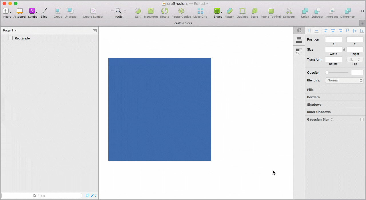
Craft
At the moment we are using Craft as a library for the color palette and replacing the native color inspector. At hand is not only all the colors, but also the names of the variables. Thanks to this approach, another important problem was solved. Designers stopped “pipetting”, and developers stopped being reasonably indignant, why in two layouts the same element has different color values. Who works in Sketch and uses several monitors knows that on each connected monitor the same color taken by the pipette will, in most cases, have a different HEX.
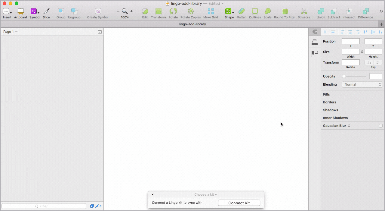
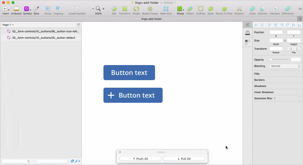
Lingo
Desktop application with which we solved all the problems associated with connecting the current library to new files and updating components in already connected projects.
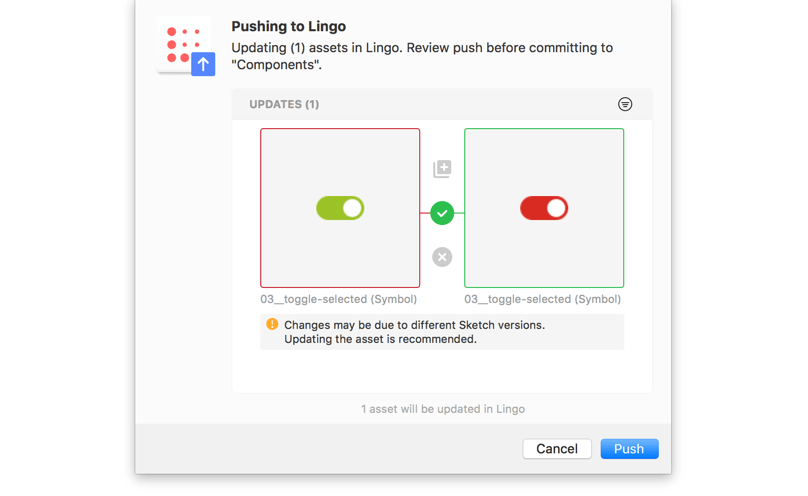
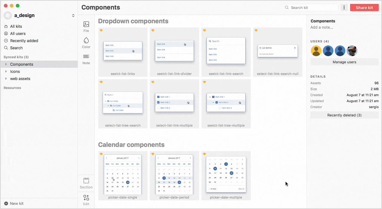
You can create multiple libraries, split the library into categories, tag each item, and when you import items, select which item to add and which one to not. When updating an existing component in the library, Lingo will suggest replacing it, making a duplicate, or discarding changes.
Also, in Lingo, you can store composite components in the form of folders with layers or artboards entirely. For us, this opportunity is particularly relevant, since we deliberately do not make components with a large number of overrides due to difficulties in support and customization.
Despite the fact that in Sketch 47 there will be libraries of symbols that are already available in the beta version (they work, by the way, cool), we are not in a hurry to leave with Lingo due to its capabilities and greater flexibility in work.
Plugins
Centrally, we use three plugins:
The first is Shared Text Styles for working with text styles. Allows you to export text styles in JSON, add styles to the new Sketch document and update already loaded.
The second is the Relabel button for working with buttons. One of the best implementations of this kind of plugin, in my opinion. It is enough to properly configure the binding elements inside the symbol.
The third is Acronis data. Since we work a lot with tables and large data arrays, I have assembled a plugin that generates specialized values for these tables (offering items, agents name, schedule options, machines, etc.). The plugin works on the basis of dummy data and pulls values from JSON. Before you collect a custom solution, there was an unsuccessful attempt to make friends a single JSON with Craft, but alas. As it turned out, Craft is not able to the original markup of the document and shows the fields are not in order.
')
Icons
Sooner or later, every designer working in Sketch has the problem of reusing an icon symbol with a different color. In particular cases, you can untie an icon from a symbol or keep several symbols with different colors, which is not very relevant when there are many icons. I solved the problem as follows: I collected the rectangles with the necessary colors in separate symbols, and then added these symbols in the form of masks to icons that may have several colors. Thus, the color change becomes available through overrides.
Despite the convenience, this method has a significant disadvantage. When exporting SVG code will be present in the mask. If there is no way to automate the mask removal process on the development side, you will need to keep a separate library of clean icons.
Angular 4 components
No matter how pumped and convenient the library is, as long as it exists solely as a Sketch file. If the component in the browser does not look like in the layouts, the library is no longer relevant, and the source code is outdated and does not correspond to reality. Thanks to Sergey Saburov, Kirill Savyolov and the entire monitoring team, our components smoothly flow into the code and work exactly as planned. Despite the fact that we have already begun to assemble some of the new products and services with the help of current components, not all front-end teams are ready to introduce and use these components in themselves. Somewhere the front is written in Ext JS, somewhere Vue is used and a quick transition from one framework or library to another is technically impossible for several reasons. About why the company chose Angular, let's talk in detail in the next article. For now let's go back to the library and see how the components work.
Each component has a set of properties. Properties allow you to control the state of the component, its appearance and functionality. This is the standard input in the Sketch library:

And so in the code:

To change the size and appearance of the input it is enough to specify in the properties
[size] = "'sm'" Now let's look at a more complex example:

Two types of dropdowns. In the first case, this is a list of values; in the second, a search string is added to the list of values. Switch to code:

Using #selectChild, we get an embedded component for the active value of the field, (select) subscribe to the event of the current component, and with the * ngFor directive we pass through the array from the values and display them in the drop-down list. To enable the search string and the ability to search the list, in the second example, turn on the [search] property. As I said above, in more detail about Angular and the work of components on the front-end side, we will describe in the next article. Stay tuned!
Designers and code
One of our ambitious and long-term tasks is to transfer the design from Sketch to the browser so that the designer can transfer to the development not static sources or prototypes collected in third-party applications, but ready-made code. Until the moment when Angular components appeared, I promoted Framer for complex prototypes, every week I prepared lectures, talked about the principles and intricacies of working with Coffee Script. Despite the efforts spent, Framer did not catch on for several reasons:
- Low entry threshold only at the initial stage
- High entry threshold if you need to do something harder turning the screens
- Sandbox. Code can not be transferred to developers
- Unreasonably long
We didn’t completely abandon Framer and occasionally collect shots for Dribbble in it. Hammer nails with a microscope, yes.
Now, in the department, we are just starting to take the first steps to the code and do not force designers to impose or teach JS, but we give this opportunity. The ability to grow and develop, better understand the developers and speak with them in the same language.
Conclusion
Of course, we are only at the beginning, but the first results were not long in coming. In addition to introducing new tools, streamlining processes and speeding up work, it was possible to improve communication not only within the department, but also between the teams. We began to agree more often, discuss and make joint decisions, got a transparent and understandable workflow that is easy to scale and added another development vector for designers in the form of working with code. Despite the first successes and small victories, there are still a lot of tasks and problems to be solved. We test the solutions every day, describe the rules and lay down the basic principles in order to make the work process even more transparent and comfortable.
By the way, we are always glad to experienced designers. If you are one, send me an email: sergey.nikishkin@acronis.com
List of links
Source: https://habr.com/ru/post/338246/
All Articles