Volkov Design System

Greetings to you colleagues! In this article I would like to share the experience of creating design systems. Having read various clever books and having seen enough useful videos on this issue, I decided to put the knowledge into practice. After several attempts, I highlighted important points for myself. Which I will describe in this article. It is very interesting for me to learn how the design of the systems is solved by other practitioners, so I am waiting for a lot of comments.
As you all know (and who does not know, that knows), interfaces consist of many elements that are grouped together, in accordance with the needs of the final product, and which form more complex systems. These complex systems working in close conjunction form the final interface of any software product, be it an application, portal or something else.
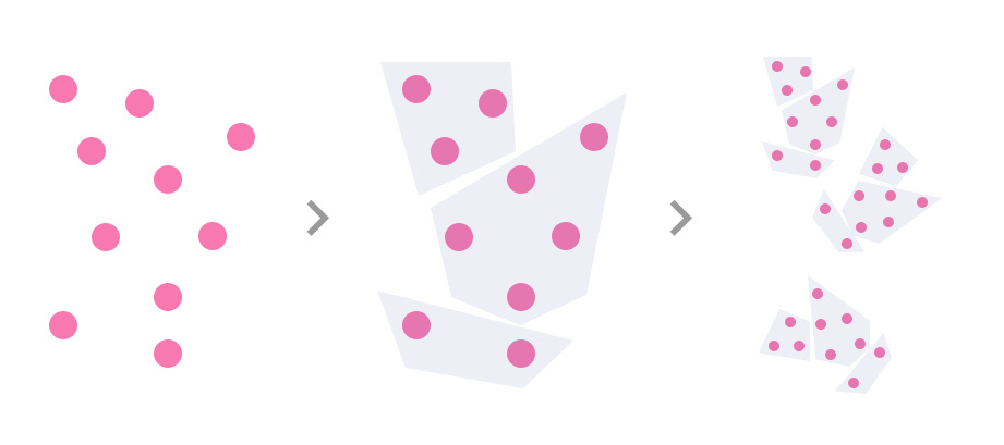
Having created a design system that covers all the needs of the product, we can quite easily observe the uniformity of the elements of all the states of the interface and easily form its new parts.
')
I adhere to the concept of "Atomic Design". For those who do not know about Atomic Design, I will explain:
Atomic design is a hierarchical interface design. Those. from the simplest to the complex. At the very bottom are the individual interface elements (buttons, text fields, etc.) and at the very top are finished screens or pages consisting of these elements.
Let's move on to practice. I will try to show the formation of system design elements with specific examples.
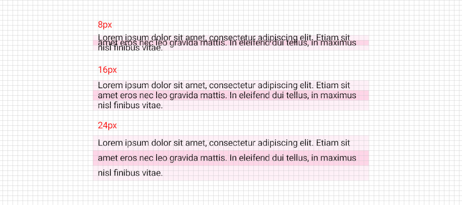
First you need to decide on the grid. After all, the grid will align all the elements and set indents from each other.
For example, google recommends using an 8x8px grid when designing mobile applications. Take it as a basis.
The next step, after defining the grid, is a regular text block. Those. our main text will be used throughout the product.
Since the grid is 8x8px, the height of the line of text should be a multiple of 8. For example, we decided to use the Roboto regular font size 14px. This means that the line height is either 8 (which doesn’t fit into any gate at all), or 16 (the text is also compressed), or 24px (which is very good).
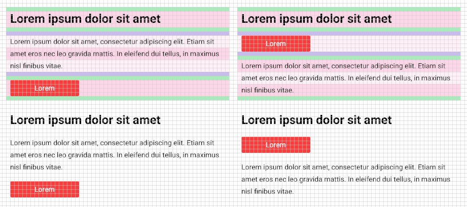
Grid and the main font is. So we can add the next element of the system - the title. The title is also calculated as the font. For example, we will have the first level header (in the H1 web) made by Roboto bold and 24px in size. Line height can not be less than the font size. Therefore, let us set the row height as 32 = 24 + 8.

Add another element of our future system design - the button.
The button can be the height corresponding to our grid. I can make it in height and 24px, and 32px. The button will have its name written in the main text.

Now the main thing. And the main thing is the answer to the question: - "And here the actions above and the design of the system?"
I will try to answer briefly.
Above, we described the main elements that will be involved in our design system. And we will have it from as many as three elements.
The first rule is building a system design, in my opinion would be:
“Use element link checks”
Your system elements should be folded in any order. Imagine that this is a constructor. And you have to wonder how one element will look next to another.
In our interface of the three elements can be such combinations:
- Title + Text + Button
- Header + button
- Button + text
- etc.
Those. going through the elements of the future system, we see how certain elements look with each other.
The second rule:
"Design system - a variable organism"
When your design system is formed, already prepared elements can undergo changes. Certain rules may be added to them.
In the example above, we have all the elements of the system pressed together. There are not enough rules on which indents will be applied.
I have the following approach. I try to make equal indents for all elements and try to strike a balance.
For example, we add equal indents to the header, text block and button. And going through all the elements as in the example above, we get a completely different picture.
Now we have any element of the system not just by itself, but an element of the system + indent.
The picture has changed.
Third rule:
“By adding a new element to the design of the system, check how it works with the other parts”
It's simple. Your combinations are complicated. Checking the interaction of elements and making the required changes you get a more harmonious picture.
The fourth rule:
“Describe the logic of building interfaces based on your system design”
Documenting and giving examples of building interfaces for your design system allows you to adjust the bridge between developers and UI designers. It can also help new UI designers not to make mistakes when rendering interfaces.
Fifth rule:
“Create clear libraries of system design elements”
Then I tried to say that all elements should be divided into groups, clearly signed and have a legend where they are more often used.
You can still write a few rules for which I work, but these are the main ones I wanted to pay attention to.
I also want to note that in many projects it is impossible to work on these principles. They have a nuance: "Time is money." A lot of time, effort and money are spent on developing a system design, so there is a rejection of system design in favor of speed.
Thank you for reading the article.
I am waiting for your comments on how such processes are formed in your work.
Source: https://habr.com/ru/post/338020/
All Articles